

Calculator Tip
Original · freetip and split calculator
Copy prompt gives Claude Code, Cursor or v0 a ready-to-paste prompt that recreates this exact component.
npx shadcn@latest add https://webinnoventix.com/r/calc-tip.json"use client";
import { useCallback, useEffect, useId, useMemo, useState } from "react";
import {
AnimatePresence,
motion,
useMotionValue,
useReducedMotion,
useSpring,
} from "motion/react";
const PRESETS = [10, 15, 18, 20, 25] as const;
const CURRENCIES = [
{ code: "USD", label: "USD — US dollar" },
{ code: "EUR", label: "EUR — Euro" },
{ code: "GBP", label: "GBP — Pound sterling" },
{ code: "INR", label: "INR — Indian rupee" },
{ code: "JPY", label: "JPY — Japanese yen" },
] as const;
type CurrencyCode = (typeof CURRENCIES)[number]["code"];
const DEFAULT_BILL = "84.50";
const DEFAULT_TIP = 18;
const DEFAULT_PEOPLE = "4";
function clamp(n: number, min: number, max: number): number {
return Math.min(max, Math.max(min, n));
}
function sanitizeMoney(raw: string): string {
let next = raw.replace(/[^\d.]/g, "");
const dot = next.indexOf(".");
if (dot !== -1) {
const head = next.slice(0, dot);
const tail = next.slice(dot + 1).replace(/\./g, "");
next = `${head}.${tail.slice(0, 2)}`;
}
return next.slice(0, 12);
}
function AnimatedMoney({
value,
format,
reduced,
}: {
value: number;
format: (n: number) => string;
reduced: boolean;
}) {
const raw = useMotionValue(value);
const spring = useSpring(raw, { stiffness: 240, damping: 32, mass: 0.55 });
const [shown, setShown] = useState<string>(() => format(value));
useEffect(() => {
if (reduced) return;
const stop = spring.on("change", (v: number) => setShown(format(v)));
return () => stop();
}, [spring, format, reduced]);
useEffect(() => {
raw.set(value);
if (reduced) setShown(format(value));
}, [raw, value, reduced, format]);
return (
<>
<span aria-hidden="true" className="tabular-nums">
{shown}
</span>
<span className="sr-only">{format(value)}</span>
</>
);
}
export default function CalcTip() {
const uid = useId();
const reduced = useReducedMotion() ?? false;
const [currency, setCurrency] = useState<CurrencyCode>("USD");
const [billRaw, setBillRaw] = useState<string>(DEFAULT_BILL);
const [tipPct, setTipPct] = useState<number>(DEFAULT_TIP);
const [isCustom, setIsCustom] = useState<boolean>(false);
const [peopleRaw, setPeopleRaw] = useState<string>(DEFAULT_PEOPLE);
const [roundUp, setRoundUp] = useState<boolean>(false);
const nf = useMemo(
() =>
new Intl.NumberFormat("en-US", {
style: "currency",
currency,
minimumFractionDigits: currency === "JPY" ? 0 : 2,
maximumFractionDigits: currency === "JPY" ? 0 : 2,
}),
[currency],
);
const format = useCallback((n: number) => nf.format(n), [nf]);
const symbol = useMemo(
() => nf.formatToParts(0).find((p) => p.type === "currency")?.value ?? "$",
[nf],
);
const bill = Number.parseFloat(billRaw);
const billValue = Number.isFinite(bill) ? bill : 0;
const people = clamp(Number.parseInt(peopleRaw, 10) || 1, 1, 50);
const hasBill = billValue > 0;
const baseTip = billValue * (tipPct / 100);
const baseTotal = billValue + baseTip;
const perPerson = roundUp
? Math.ceil(baseTotal / people)
: baseTotal / people;
const total = roundUp ? perPerson * people : baseTotal;
const tipTotal = total - billValue;
const tipPerPerson = tipTotal / people;
const effectivePct = hasBill ? (tipTotal / billValue) * 100 : 0;
const uplift = total - baseTotal;
const setPeople = (n: number) => setPeopleRaw(String(clamp(n, 1, 50)));
const reset = () => {
setCurrency("USD");
setBillRaw(DEFAULT_BILL);
setTipPct(DEFAULT_TIP);
setIsCustom(false);
setPeopleRaw(DEFAULT_PEOPLE);
setRoundUp(false);
};
const pillSpring = reduced
? { duration: 0 }
: { type: "spring" as const, stiffness: 420, damping: 34 };
return (
<section className="relative w-full overflow-hidden bg-slate-50 px-5 py-20 sm:px-8 sm:py-24 dark:bg-zinc-950">
<style>{`
@keyframes calctip-sheen {
0% { transform: translateX(-120%); }
55%, 100% { transform: translateX(220%); }
}
@keyframes calctip-rise {
from { opacity: 0; transform: translateY(10px); }
to { opacity: 1; transform: translateY(0); }
}
.calctip-sheen { animation: calctip-sheen 4.6s ease-in-out infinite; }
.calctip-rise { animation: calctip-rise .5s cubic-bezier(.22,1,.36,1) both; }
.calctip-tear {
-webkit-mask-image: radial-gradient(circle at 50% 100%, transparent 0 5px, #000 5.5px);
mask-image: radial-gradient(circle at 50% 100%, transparent 0 5px, #000 5.5px);
-webkit-mask-size: 14px 10px;
mask-size: 14px 10px;
-webkit-mask-repeat: repeat-x;
mask-repeat: repeat-x;
}
@media (prefers-reduced-motion: reduce) {
.calctip-sheen, .calctip-rise { animation: none !important; }
}
`}</style>
<div
aria-hidden="true"
className="pointer-events-none absolute -top-32 left-1/2 h-72 w-[46rem] -translate-x-1/2 rounded-full bg-indigo-300/25 blur-3xl dark:bg-indigo-600/15"
/>
<div className="relative mx-auto w-full max-w-5xl">
<header className="mb-10 max-w-2xl">
<p className="text-xs font-semibold uppercase tracking-[0.18em] text-indigo-600 dark:text-indigo-400">
Table math, settled
</p>
<h2 className="mt-3 text-3xl font-semibold tracking-tight text-slate-900 sm:text-4xl dark:text-slate-50">
Tip & split calculator
</h2>
<p className="mt-3 text-base leading-relaxed text-slate-600 dark:text-slate-400">
Punch in the bill, pick a tip, say how many people are paying. Turn
on round-up and everyone hands over a whole note — the leftover
just becomes a slightly bigger tip.
</p>
</header>
<div className="grid gap-8 lg:grid-cols-[1fr_20rem] lg:items-start lg:gap-10">
{/* ---------------- Controls ---------------- */}
<div className="rounded-3xl border border-slate-200 bg-white p-6 shadow-sm sm:p-8 dark:border-zinc-800 dark:bg-zinc-900">
{/* Bill + currency */}
<div className="flex flex-col gap-4 sm:flex-row sm:items-end">
<div className="flex-1">
<label
htmlFor={`${uid}-bill`}
className="block text-sm font-medium text-slate-700 dark:text-slate-300"
>
Bill amount
</label>
<div className="mt-2 flex items-center rounded-xl border border-slate-300 bg-slate-50 focus-within:border-indigo-500 focus-within:ring-2 focus-within:ring-indigo-500/40 dark:border-zinc-700 dark:bg-zinc-950">
<span
aria-hidden="true"
className="pl-3.5 pr-1 text-base font-medium text-slate-400 dark:text-zinc-500"
>
{symbol}
</span>
<input
id={`${uid}-bill`}
type="text"
inputMode="decimal"
autoComplete="off"
value={billRaw}
onChange={(e) => setBillRaw(sanitizeMoney(e.target.value))}
placeholder="0.00"
aria-describedby={hasBill ? undefined : `${uid}-bill-hint`}
className="w-full bg-transparent py-3 pr-3.5 text-xl font-semibold tabular-nums text-slate-900 outline-none placeholder:font-normal placeholder:text-slate-400 dark:text-slate-50 dark:placeholder:text-zinc-600"
/>
</div>
</div>
<div className="sm:w-44">
<label
htmlFor={`${uid}-currency`}
className="block text-sm font-medium text-slate-700 dark:text-slate-300"
>
Currency
</label>
<select
id={`${uid}-currency`}
value={currency}
onChange={(e) =>
setCurrency(e.target.value as CurrencyCode)
}
className="mt-2 w-full appearance-none rounded-xl border border-slate-300 bg-slate-50 px-3.5 py-3.5 text-sm font-medium text-slate-900 outline-none focus-visible:border-indigo-500 focus-visible:ring-2 focus-visible:ring-indigo-500/40 dark:border-zinc-700 dark:bg-zinc-950 dark:text-slate-100"
>
{CURRENCIES.map((c) => (
<option key={c.code} value={c.code}>
{c.label}
</option>
))}
</select>
</div>
</div>
{!hasBill && (
<p
id={`${uid}-bill-hint`}
className="mt-2 text-sm font-medium text-rose-600 dark:text-rose-400"
>
Enter an amount above zero to see the split.
</p>
)}
{/* Tip percentage */}
<fieldset className="mt-8 border-0 p-0">
<legend className="mb-3 flex w-full items-baseline justify-between p-0 text-sm font-medium text-slate-700 dark:text-slate-300">
<span>Tip percentage</span>
<span className="text-xs font-semibold tabular-nums text-indigo-600 dark:text-indigo-400">
{tipPct.toFixed(tipPct % 1 === 0 ? 0 : 1)}%
</span>
</legend>
<div className="grid grid-cols-3 gap-2.5 sm:grid-cols-6">
{PRESETS.map((p) => {
const active = !isCustom && tipPct === p;
return (
<label
key={p}
className="relative cursor-pointer select-none"
>
<input
type="radio"
name={`${uid}-tip`}
value={p}
checked={active}
onChange={() => {
setIsCustom(false);
setTipPct(p);
}}
className="peer sr-only"
/>
{active && (
<motion.span
layoutId={`${uid}-tip-pill`}
transition={pillSpring}
aria-hidden="true"
className="absolute inset-0 rounded-xl bg-indigo-600 shadow-sm shadow-indigo-600/30 dark:bg-indigo-500"
/>
)}
<span
className={`relative z-10 flex h-11 items-center justify-center rounded-xl border text-sm font-semibold tabular-nums transition-colors peer-focus-visible:ring-2 peer-focus-visible:ring-indigo-500 peer-focus-visible:ring-offset-2 peer-focus-visible:ring-offset-white dark:peer-focus-visible:ring-offset-zinc-900 ${
active
? "border-transparent text-white"
: "border-slate-300 text-slate-700 hover:border-indigo-400 hover:text-indigo-700 dark:border-zinc-700 dark:text-slate-300 dark:hover:border-indigo-500 dark:hover:text-indigo-300"
}`}
>
{p}%
</span>
</label>
);
})}
<label className="relative cursor-pointer select-none">
<input
type="radio"
name={`${uid}-tip`}
value="custom"
checked={isCustom}
onChange={() => setIsCustom(true)}
className="peer sr-only"
/>
{isCustom && (
<motion.span
layoutId={`${uid}-tip-pill`}
transition={pillSpring}
aria-hidden="true"
className="absolute inset-0 rounded-xl bg-indigo-600 shadow-sm shadow-indigo-600/30 dark:bg-indigo-500"
/>
)}
<span
className={`relative z-10 flex h-11 items-center justify-center rounded-xl border text-sm font-semibold transition-colors peer-focus-visible:ring-2 peer-focus-visible:ring-indigo-500 peer-focus-visible:ring-offset-2 peer-focus-visible:ring-offset-white dark:peer-focus-visible:ring-offset-zinc-900 ${
isCustom
? "border-transparent text-white"
: "border-slate-300 text-slate-700 hover:border-indigo-400 hover:text-indigo-700 dark:border-zinc-700 dark:text-slate-300 dark:hover:border-indigo-500 dark:hover:text-indigo-300"
}`}
>
Custom
</span>
</label>
</div>
<AnimatePresence initial={false}>
{isCustom && (
<motion.div
key="slider"
initial={reduced ? false : { height: 0, opacity: 0 }}
animate={{ height: "auto", opacity: 1 }}
exit={reduced ? { opacity: 0 } : { height: 0, opacity: 0 }}
transition={{ duration: reduced ? 0 : 0.28, ease: [0.22, 1, 0.36, 1] }}
className="overflow-hidden"
>
<div className="pt-5">
<label
htmlFor={`${uid}-slider`}
className="block text-xs font-medium uppercase tracking-wide text-slate-500 dark:text-zinc-400"
>
Fine-tune the tip
</label>
<input
id={`${uid}-slider`}
type="range"
min={0}
max={40}
step={0.5}
value={tipPct}
onChange={(e) => setTipPct(Number(e.target.value))}
className="mt-3 h-2 w-full cursor-pointer appearance-none rounded-full bg-slate-200 accent-indigo-600 focus-visible:outline-none focus-visible:ring-2 focus-visible:ring-indigo-500 focus-visible:ring-offset-2 focus-visible:ring-offset-white dark:bg-zinc-700 dark:accent-indigo-400 dark:focus-visible:ring-offset-zinc-900"
/>
<div
aria-hidden="true"
className="mt-2 flex justify-between text-[11px] font-medium tabular-nums text-slate-400 dark:text-zinc-500"
>
<span>0%</span>
<span>20%</span>
<span>40%</span>
</div>
</div>
</motion.div>
)}
</AnimatePresence>
</fieldset>
{/* People */}
<div className="mt-8">
<label
htmlFor={`${uid}-people`}
className="block text-sm font-medium text-slate-700 dark:text-slate-300"
>
Splitting between
</label>
<div className="mt-2 flex items-center gap-2">
<button
type="button"
onClick={() => setPeople(people - 1)}
disabled={people <= 1}
aria-label="Remove one person"
className="flex h-11 w-11 shrink-0 items-center justify-center rounded-xl border border-slate-300 text-slate-600 transition-colors hover:border-indigo-400 hover:text-indigo-600 focus-visible:outline-none focus-visible:ring-2 focus-visible:ring-indigo-500 focus-visible:ring-offset-2 focus-visible:ring-offset-white disabled:cursor-not-allowed disabled:opacity-40 disabled:hover:border-slate-300 disabled:hover:text-slate-600 dark:border-zinc-700 dark:text-slate-300 dark:focus-visible:ring-offset-zinc-900 dark:disabled:hover:border-zinc-700 dark:disabled:hover:text-slate-300"
>
<svg
viewBox="0 0 20 20"
className="h-4 w-4"
fill="none"
stroke="currentColor"
strokeWidth="2"
strokeLinecap="round"
aria-hidden="true"
>
<path d="M4 10h12" />
</svg>
</button>
<div className="relative flex-1">
<input
id={`${uid}-people`}
type="text"
inputMode="numeric"
autoComplete="off"
value={peopleRaw}
onChange={(e) =>
setPeopleRaw(e.target.value.replace(/\D/g, "").slice(0, 2))
}
onBlur={() => setPeople(people)}
className="h-11 w-full rounded-xl border border-slate-300 bg-slate-50 pl-10 pr-3 text-base font-semibold tabular-nums text-slate-900 outline-none focus-visible:border-indigo-500 focus-visible:ring-2 focus-visible:ring-indigo-500/40 dark:border-zinc-700 dark:bg-zinc-950 dark:text-slate-50"
/>
<svg
viewBox="0 0 20 20"
className="pointer-events-none absolute left-3.5 top-1/2 h-4 w-4 -translate-y-1/2 text-slate-400 dark:text-zinc-500"
fill="none"
stroke="currentColor"
strokeWidth="1.6"
strokeLinecap="round"
strokeLinejoin="round"
aria-hidden="true"
>
<circle cx="7.5" cy="6.5" r="2.75" />
<path d="M2.5 16.5c0-2.6 2.24-4.5 5-4.5s5 1.9 5 4.5" />
<path d="M13.5 4.2a2.75 2.75 0 0 1 0 4.6M14.8 12.4c1.7.6 2.7 2.1 2.7 4.1" />
</svg>
</div>
<button
type="button"
onClick={() => setPeople(people + 1)}
disabled={people >= 50}
aria-label="Add one person"
className="flex h-11 w-11 shrink-0 items-center justify-center rounded-xl border border-slate-300 text-slate-600 transition-colors hover:border-indigo-400 hover:text-indigo-600 focus-visible:outline-none focus-visible:ring-2 focus-visible:ring-indigo-500 focus-visible:ring-offset-2 focus-visible:ring-offset-white disabled:cursor-not-allowed disabled:opacity-40 dark:border-zinc-700 dark:text-slate-300 dark:focus-visible:ring-offset-zinc-900"
>
<svg
viewBox="0 0 20 20"
className="h-4 w-4"
fill="none"
stroke="currentColor"
strokeWidth="2"
strokeLinecap="round"
aria-hidden="true"
>
<path d="M10 4v12M4 10h12" />
</svg>
</button>
</div>
</div>
{/* Round up switch */}
<div className="mt-6 flex items-start gap-4 rounded-2xl border border-amber-200 bg-amber-50/70 p-4 dark:border-amber-500/25 dark:bg-amber-500/10">
<button
type="button"
role="switch"
aria-checked={roundUp}
aria-labelledby={`${uid}-round-label`}
onClick={() => setRoundUp((v) => !v)}
className={`relative mt-0.5 h-6 w-11 shrink-0 rounded-full transition-colors focus-visible:outline-none focus-visible:ring-2 focus-visible:ring-amber-500 focus-visible:ring-offset-2 focus-visible:ring-offset-amber-50 dark:focus-visible:ring-offset-zinc-900 ${
roundUp
? "bg-amber-500"
: "bg-slate-300 dark:bg-zinc-700"
}`}
>
<motion.span
aria-hidden="true"
animate={{ x: roundUp ? 20 : 0 }}
transition={pillSpring}
className="absolute left-0.5 top-0.5 h-5 w-5 rounded-full bg-white shadow"
/>
</button>
<div>
<span
id={`${uid}-round-label`}
className="block text-sm font-semibold text-amber-900 dark:text-amber-200"
>
Round up so everyone pays a whole {symbol}
</span>
<p className="mt-0.5 text-sm leading-relaxed text-amber-800/80 dark:text-amber-200/70">
No coins, no arguing over the odd cent. The difference rolls
into the tip.
</p>
</div>
</div>
<button
type="button"
onClick={reset}
className="mt-6 inline-flex items-center gap-2 rounded-lg px-2 py-1.5 text-sm font-medium text-slate-500 transition-colors hover:text-indigo-600 focus-visible:outline-none focus-visible:ring-2 focus-visible:ring-indigo-500 focus-visible:ring-offset-2 focus-visible:ring-offset-white dark:text-zinc-400 dark:hover:text-indigo-400 dark:focus-visible:ring-offset-zinc-900"
>
<svg
viewBox="0 0 20 20"
className="h-3.5 w-3.5"
fill="none"
stroke="currentColor"
strokeWidth="1.8"
strokeLinecap="round"
strokeLinejoin="round"
aria-hidden="true"
>
<path d="M16.5 8.5A6.5 6.5 0 1 0 15 14" />
<path d="M16.8 4.2v4.3h-4.3" />
</svg>
Reset to defaults
</button>
</div>
{/* ---------------- Receipt ---------------- */}
<div className="lg:sticky lg:top-8">
<div className="relative overflow-hidden rounded-t-3xl bg-slate-900 p-6 sm:p-7 dark:bg-slate-950">
<div
aria-hidden="true"
className="pointer-events-none absolute inset-0 overflow-hidden"
>
<span className="calctip-sheen absolute -inset-y-8 left-0 w-24 rotate-12 bg-gradient-to-r from-transparent via-white/[0.07] to-transparent" />
</div>
<div className="relative">
<div className="flex items-center justify-between">
<p className="text-[11px] font-semibold uppercase tracking-[0.2em] text-slate-500">
Per person
</p>
<span className="rounded-full bg-white/5 px-2.5 py-1 text-[11px] font-semibold tabular-nums text-slate-300 ring-1 ring-inset ring-white/10">
{people} {people === 1 ? "payer" : "payers"}
</span>
</div>
<p
aria-live="polite"
className="mt-2 text-4xl font-semibold tracking-tight text-emerald-400 sm:text-[2.75rem]"
>
<AnimatedMoney
value={hasBill ? perPerson : 0}
format={format}
reduced={reduced}
/>
</p>
<p className="mt-1.5 text-sm text-slate-400">
including{" "}
<span className="font-medium text-slate-200">
<AnimatedMoney
value={hasBill ? tipPerPerson : 0}
format={format}
reduced={reduced}
/>
</span>{" "}
of tip each
</p>
<div className="my-6 border-t border-dashed border-white/15" />
<dl className="space-y-3 text-sm">
<div className="flex items-baseline justify-between gap-4">
<dt className="text-slate-400">Bill</dt>
<dd className="font-medium text-slate-200">
<AnimatedMoney
value={billValue}
format={format}
reduced={reduced}
/>
</dd>
</div>
<div className="flex items-baseline justify-between gap-4">
<dt className="text-slate-400">
Tip{" "}
<span className="tabular-nums text-slate-500">
({effectivePct.toFixed(1)}%)
</span>
</dt>
<dd className="font-medium text-slate-200">
<AnimatedMoney
value={hasBill ? tipTotal : 0}
format={format}
reduced={reduced}
/>
</dd>
</div>
<div className="flex items-baseline justify-between gap-4 border-t border-white/10 pt-3">
<dt className="font-semibold text-slate-100">Total</dt>
<dd className="text-lg font-semibold text-slate-50">
<AnimatedMoney
value={hasBill ? total : 0}
format={format}
reduced={reduced}
/>
</dd>
</div>
</dl>
<AnimatePresence initial={false}>
{roundUp && hasBill && uplift > 0.004 && (
<motion.p
key="uplift"
initial={reduced ? false : { opacity: 0, y: 6 }}
animate={{ opacity: 1, y: 0 }}
exit={{ opacity: 0 }}
transition={{ duration: reduced ? 0 : 0.24 }}
className="mt-4 rounded-xl bg-amber-400/10 px-3 py-2.5 text-xs leading-relaxed text-amber-200 ring-1 ring-inset ring-amber-400/25"
>
Rounding added {format(uplift)} on top of a{" "}
{tipPct.toFixed(tipPct % 1 === 0 ? 0 : 1)}% tip — the
table actually leaves {effectivePct.toFixed(1)}%.
</motion.p>
)}
</AnimatePresence>
</div>
</div>
<div
aria-hidden="true"
className="calctip-tear h-2.5 bg-slate-900 dark:bg-slate-950"
/>
<p className="calctip-rise mt-5 text-xs leading-relaxed text-slate-500 dark:text-zinc-500">
Nothing is sent anywhere — every number is worked out in your
browser as you type.
</p>
</div>
</div>
</div>
</section>
);
}Dependencies
Licence
Built by Web Innoventix. Free for personal and commercial use, no attribution required.
Built by Web Innoventix
Need a custom interface, a full website, or SEO that gets you cited by AI? We design, build and rank it end to end.
Get a free quoteSimilar components
Browse all →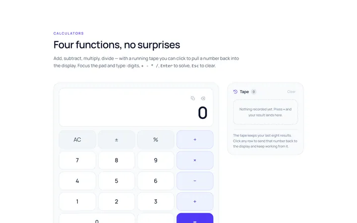
Calculator Basic
Originalbasic calculator keypad UI
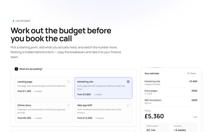
Calculator Pricing
Originalinteractive pricing calculator
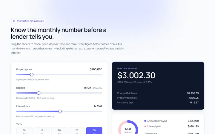
Calculator Loan
Originalloan / mortgage calculator with sliders
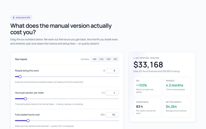
Calculator ROI
OriginalROI / savings calculator
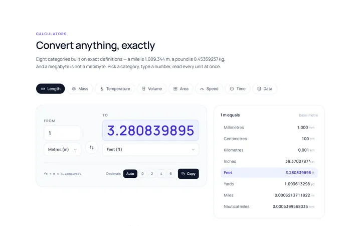
Calculator Unit Converter
Originalunit converter

Spotlight Hero
OriginalA centred hero with a soft radial spotlight, badge and dual call-to-action.

Split Hero
OriginalA two-column hero pairing a headline and CTAs with a product mock and social proof.

Gradient Spotlight Hero
OriginalA minimal centred hero with a soft gradient-mesh backdrop, announcement pill and dual call-to-action buttons.

App Preview Hero
OriginalA centred hero that pairs headline copy with a realistic product dashboard mock built entirely from markup, complete with browser chrome and a floating notification card.

Waitlist Capture Hero
OriginalA dark, focused hero with an inline email capture form and avatar social proof, ready for pre-launch waitlists.

Image Backdrop Hero
OriginalA cinematic full-bleed hero with a layered image-style backdrop, overlaid left-aligned copy and a trusted-by logos strip.
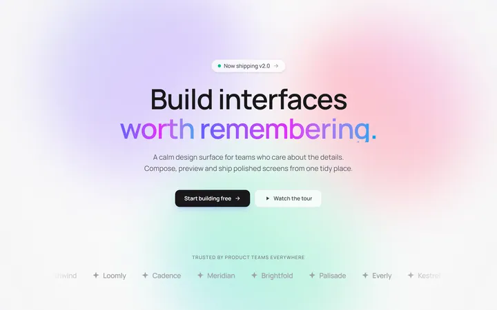
Gradient Mesh Hero with Staggered Text Reveal
OriginalA full-screen hero pairing a drifting animated gradient-mesh backdrop with a word-by-word staggered blur-in headline and a logo marquee under the fold.