

Calendar Time Picker
Original · freetime picker with hour/minute
byWeb InnoventixReact + Tailwind
calendartimepickercalendars
Copy prompt gives Claude Code, Cursor or v0 a ready-to-paste prompt that recreates this exact component.
npx shadcn@latest add https://webinnoventix.com/r/calendar-time-picker.jsoncalendar-time-picker.tsx
"use client";
import { useMemo, useRef, useState, type KeyboardEvent } from "react";
import { AnimatePresence, motion, useReducedMotion } from "motion/react";
type Period = "AM" | "PM";
type MinuteStep = 1 | 5 | 15;
type Preset = {
key: string;
label: string;
note: string;
hour24: number;
minute: number;
};
const PRESETS: Preset[] = [
{ key: "early", label: "Early bird", note: "08:30", hour24: 8, minute: 30 },
{ key: "mid", label: "Mid-morning", note: "10:00", hour24: 10, minute: 0 },
{ key: "lunch", label: "After lunch", note: "13:30", hour24: 13, minute: 30 },
{ key: "late", label: "Golden hour", note: "16:45", hour24: 16, minute: 45 },
];
const RING =
"focus-visible:outline-none focus-visible:ring-2 focus-visible:ring-indigo-500 focus-visible:ring-offset-2 focus-visible:ring-offset-white dark:focus-visible:ring-offset-zinc-950";
function ChevronUp() {
return (
<svg viewBox="0 0 24 24" className="h-4 w-4" aria-hidden="true" fill="none">
<path
d="M6 15l6-6 6 6"
stroke="currentColor"
strokeWidth="2"
strokeLinecap="round"
strokeLinejoin="round"
/>
</svg>
);
}
function ChevronDown() {
return (
<svg viewBox="0 0 24 24" className="h-4 w-4" aria-hidden="true" fill="none">
<path
d="M6 9l6 6 6-6"
stroke="currentColor"
strokeWidth="2"
strokeLinecap="round"
strokeLinejoin="round"
/>
</svg>
);
}
function Segmented<T extends string>({
label,
options,
value,
onChange,
}: {
label: string;
options: readonly { value: T; label: string }[];
value: T;
onChange: (v: T) => void;
}) {
const refs = useRef<(HTMLButtonElement | null)[]>([]);
const idx = options.findIndex((o) => o.value === value);
const onKey = (e: KeyboardEvent<HTMLDivElement>) => {
let next = -1;
if (e.key === "ArrowRight" || e.key === "ArrowDown")
next = (idx + 1) % options.length;
else if (e.key === "ArrowLeft" || e.key === "ArrowUp")
next = (idx - 1 + options.length) % options.length;
else if (e.key === "Home") next = 0;
else if (e.key === "End") next = options.length - 1;
if (next === -1) return;
e.preventDefault();
onChange(options[next].value);
refs.current[next]?.focus();
};
return (
<div
role="radiogroup"
aria-label={label}
onKeyDown={onKey}
className="inline-flex items-center gap-1 rounded-xl border border-slate-200 bg-slate-100/70 p-1 dark:border-zinc-800 dark:bg-zinc-900"
>
{options.map((o, i) => {
const active = o.value === value;
return (
<button
key={o.value}
ref={(el) => {
refs.current[i] = el;
}}
type="button"
role="radio"
aria-checked={active}
tabIndex={active ? 0 : -1}
onClick={() => onChange(o.value)}
className={`rounded-lg px-3 py-1.5 text-sm font-semibold tabular-nums transition-colors ${RING} ${
active
? "bg-white text-indigo-700 shadow-sm dark:bg-zinc-800 dark:text-indigo-300"
: "text-slate-500 hover:text-slate-800 dark:text-zinc-400 dark:hover:text-zinc-200"
}`}
>
{o.label}
</button>
);
})}
</div>
);
}
function WheelColumn({
label,
items,
value,
valueText,
format,
onSelect,
}: {
label: string;
items: number[];
value: number;
valueText: string;
format: (n: number) => string;
onSelect: (v: number) => void;
}) {
const n = items.length;
const idx = Math.max(0, items.indexOf(value));
const rows = [-2, -1, 0, 1, 2];
const onKey = (e: KeyboardEvent<HTMLDivElement>) => {
let ni = -1;
switch (e.key) {
case "ArrowUp":
ni = (idx + 1) % n;
break;
case "ArrowDown":
ni = (idx - 1 + n) % n;
break;
case "PageUp":
ni = (idx + Math.min(5, n)) % n;
break;
case "PageDown":
ni = (idx - Math.min(5, n) + n * 5) % n;
break;
case "Home":
ni = 0;
break;
case "End":
ni = n - 1;
break;
default:
return;
}
e.preventDefault();
onSelect(items[ni]);
};
return (
<div className="flex flex-col items-center gap-1.5">
<button
type="button"
aria-label={`Increase ${label}`}
onClick={() => onSelect(items[(idx + 1) % n])}
className={`flex h-8 w-11 items-center justify-center rounded-lg text-slate-400 transition-colors hover:bg-slate-100 hover:text-indigo-600 dark:text-zinc-500 dark:hover:bg-zinc-800 dark:hover:text-indigo-400 ${RING}`}
>
<ChevronUp />
</button>
<div
role="spinbutton"
tabIndex={0}
aria-label={label}
aria-valuemin={items[0]}
aria-valuemax={items[n - 1]}
aria-valuenow={value}
aria-valuetext={valueText}
onKeyDown={onKey}
className={`relative h-[168px] w-[84px] overflow-hidden rounded-2xl border border-slate-200 bg-gradient-to-b from-white to-slate-50 dark:border-zinc-800 dark:from-zinc-900 dark:to-zinc-950 ${RING}`}
>
<div
aria-hidden="true"
className="pointer-events-none absolute inset-x-2 top-[66px] h-9 rounded-lg border border-indigo-200 bg-indigo-50/80 dark:border-indigo-500/30 dark:bg-indigo-500/10"
/>
<div
aria-hidden="true"
className="pointer-events-none absolute inset-x-0 top-0 z-10 h-9 bg-gradient-to-b from-white to-transparent dark:from-zinc-900"
/>
<div
aria-hidden="true"
className="pointer-events-none absolute inset-x-0 bottom-0 z-10 h-9 bg-gradient-to-t from-slate-50 to-transparent dark:from-zinc-950"
/>
<div className="relative flex flex-col">
{rows.map((pos) => {
const vi = (idx - pos + n * 10) % n;
const dist = Math.abs(pos);
const center = dist === 0;
return (
<button
key={pos}
type="button"
tabIndex={-1}
aria-hidden="true"
onClick={() => onSelect(items[vi])}
style={{ opacity: center ? 1 : dist === 1 ? 0.5 : 0.2 }}
className={`flex h-9 items-center justify-center text-2xl tabular-nums transition-opacity ${
center
? "font-semibold text-indigo-700 dark:text-indigo-300"
: "font-medium text-slate-500 dark:text-zinc-400"
}`}
>
{format(items[vi])}
</button>
);
})}
</div>
</div>
<button
type="button"
aria-label={`Decrease ${label}`}
onClick={() => onSelect(items[(idx - 1 + n) % n])}
className={`flex h-8 w-11 items-center justify-center rounded-lg text-slate-400 transition-colors hover:bg-slate-100 hover:text-indigo-600 dark:text-zinc-500 dark:hover:bg-zinc-800 dark:hover:text-indigo-400 ${RING}`}
>
<ChevronDown />
</button>
<span className="text-[11px] font-medium uppercase tracking-wider text-slate-400 dark:text-zinc-500">
{label}
</span>
</div>
);
}
export default function CalendarTimePicker() {
const reduce = useReducedMotion();
const [hour24, setHour24] = useState(9);
const [minute, setMinute] = useState(30);
const [is24h, setIs24h] = useState(false);
const [step, setStep] = useState<MinuteStep>(5);
const [confirmed, setConfirmed] = useState(false);
const period: Period = hour24 < 12 ? "AM" : "PM";
const displayHour = ((hour24 + 11) % 12) + 1;
const mm = String(minute).padStart(2, "0");
const hourItems = useMemo(
() =>
is24h
? Array.from({ length: 24 }, (_, i) => i)
: Array.from({ length: 12 }, (_, i) => i + 1),
[is24h],
);
const minuteItems = useMemo(() => {
const arr: number[] = [];
for (let m = 0; m < 60; m += step) arr.push(m);
return arr;
}, [step]);
const hourValue = is24h ? hour24 : displayHour;
const touch = () => setConfirmed(false);
const handleHour = (v: number) => {
touch();
setHour24(is24h ? v : (v % 12) + (period === "PM" ? 12 : 0));
};
const handleMinute = (v: number) => {
touch();
setMinute(v);
};
const handlePeriod = (p: Period) => {
touch();
if (p === "PM" && hour24 < 12) setHour24(hour24 + 12);
else if (p === "AM" && hour24 >= 12) setHour24(hour24 - 12);
};
const handleFormat = (v: "12" | "24") => {
touch();
setIs24h(v === "24");
};
const handleStep = (v: MinuteStep) => {
touch();
setStep(v);
setMinute((prev) => Math.min(Math.round(prev / v) * v, 60 - v));
};
const applyPreset = (p: Preset) => {
touch();
setHour24(p.hour24);
setMinute(p.minute);
};
const timeLabel = is24h
? `${String(hour24).padStart(2, "0")}:${mm}`
: `${displayHour}:${mm} ${period}`;
const liveText = is24h
? `${String(hour24).padStart(2, "0")}:${mm} selected`
: `${displayHour} ${mm} ${period} selected`;
const minuteAngle = minute * 6;
const hourAngle = (hour24 % 12) * 30 + minute * 0.5;
const handTransition = reduce
? "none"
: "transform 0.55s cubic-bezier(0.22, 1, 0.36, 1)";
const ticks = Array.from({ length: 12 }, (_, i) => i);
const numbers = Array.from({ length: 12 }, (_, i) => i + 1);
return (
<section className="relative w-full bg-slate-50 px-4 py-16 text-slate-900 sm:px-6 dark:bg-zinc-950 dark:text-slate-100">
<style>{`
@keyframes ctp-pulse {
0%, 100% { opacity: 0.35; transform: scale(1); }
50% { opacity: 0.12; transform: scale(1.12); }
}
@keyframes ctp-rise {
from { opacity: 0; transform: translateY(6px); }
to { opacity: 1; transform: translateY(0); }
}
.ctp-pulse-anim { animation: ctp-pulse 3.6s ease-in-out infinite; }
.ctp-rise-anim { animation: ctp-rise 0.5s ease-out both; }
@media (prefers-reduced-motion: reduce) {
.ctp-pulse-anim, .ctp-rise-anim { animation: none !important; }
}
`}</style>
<div className="mx-auto max-w-4xl">
<header className="mb-8 flex flex-col gap-3 sm:flex-row sm:items-end sm:justify-between">
<div>
<p className="mb-1 text-xs font-semibold uppercase tracking-[0.2em] text-indigo-600 dark:text-indigo-400">
Step 2 of 3
</p>
<h2 className="text-2xl font-bold tracking-tight sm:text-3xl">
Book your discovery call
</h2>
<p className="mt-1 max-w-md text-sm text-slate-500 dark:text-zinc-400">
Choose a start time — all slots show in your local timezone.
</p>
</div>
<span className="inline-flex w-fit items-center gap-2 rounded-full border border-slate-200 bg-white px-3 py-1.5 text-xs font-medium text-slate-600 dark:border-zinc-800 dark:bg-zinc-900 dark:text-zinc-300">
<span className="h-1.5 w-1.5 rounded-full bg-emerald-500" />
GMT+5 · Karachi
</span>
</header>
<div className="grid gap-6 rounded-3xl border border-slate-200 bg-white p-6 shadow-xl shadow-slate-200/50 sm:p-8 md:grid-cols-[minmax(0,320px)_1fr] dark:border-zinc-800 dark:bg-zinc-900 dark:shadow-black/40">
{/* Clock + digital preview */}
<div className="flex flex-col items-center justify-center gap-6 rounded-2xl bg-gradient-to-br from-indigo-50 to-violet-50 p-6 dark:from-indigo-950/40 dark:to-violet-950/30">
<div className="relative flex h-56 w-56 items-center justify-center">
<div className="ctp-pulse-anim absolute h-44 w-44 rounded-full bg-indigo-400/30 blur-2xl dark:bg-indigo-500/20" />
<svg
viewBox="0 0 220 220"
className="relative h-56 w-56"
role="img"
aria-label={`Clock showing ${timeLabel}`}
>
<circle
cx="110"
cy="110"
r="98"
className="fill-white stroke-slate-200 dark:fill-zinc-950 dark:stroke-zinc-800"
strokeWidth="2"
/>
<circle
cx="110"
cy="110"
r="88"
className="fill-transparent stroke-slate-100 dark:stroke-zinc-900"
strokeWidth="1"
/>
{ticks.map((i) => {
const a = (i * 30 * Math.PI) / 180;
const outer = 92;
const inner = i % 3 === 0 ? 80 : 85;
return (
<line
key={i}
x1={110 + outer * Math.sin(a)}
y1={110 - outer * Math.cos(a)}
x2={110 + inner * Math.sin(a)}
y2={110 - inner * Math.cos(a)}
className={
i % 3 === 0
? "stroke-slate-400 dark:stroke-zinc-500"
: "stroke-slate-300 dark:stroke-zinc-700"
}
strokeWidth={i % 3 === 0 ? 2.5 : 1.5}
strokeLinecap="round"
/>
);
})}
{numbers.map((num) => {
const a = (num * 30 * Math.PI) / 180;
const r = 68;
return (
<text
key={num}
x={110 + r * Math.sin(a)}
y={110 - r * Math.cos(a) + 5}
textAnchor="middle"
className="fill-slate-500 text-[13px] font-semibold dark:fill-zinc-400"
>
{num}
</text>
);
})}
{/* hour hand */}
<g
style={{
transformBox: "view-box",
transformOrigin: "110px 110px",
transform: `rotate(${hourAngle}deg)`,
transition: handTransition,
}}
>
<line
x1="110"
y1="118"
x2="110"
y2="62"
className="stroke-slate-800 dark:stroke-slate-100"
strokeWidth="6"
strokeLinecap="round"
/>
</g>
{/* minute hand */}
<g
style={{
transformBox: "view-box",
transformOrigin: "110px 110px",
transform: `rotate(${minuteAngle}deg)`,
transition: handTransition,
}}
>
<line
x1="110"
y1="120"
x2="110"
y2="40"
className="stroke-indigo-600 dark:stroke-indigo-400"
strokeWidth="4"
strokeLinecap="round"
/>
</g>
<circle
cx="110"
cy="110"
r="6"
className="fill-indigo-600 dark:fill-indigo-400"
/>
<circle cx="110" cy="110" r="2.5" className="fill-white dark:fill-zinc-950" />
</svg>
</div>
<div className="text-center">
<AnimatePresence mode="popLayout" initial={false}>
<motion.p
key={timeLabel}
initial={reduce ? false : { opacity: 0, y: 8 }}
animate={{ opacity: 1, y: 0 }}
exit={reduce ? { opacity: 0 } : { opacity: 0, y: -8 }}
transition={{ duration: 0.28, ease: "easeOut" }}
className="text-4xl font-bold tracking-tight tabular-nums"
>
{timeLabel}
</motion.p>
</AnimatePresence>
<p className="mt-1 text-sm text-slate-500 dark:text-zinc-400">
Thursday, July 16, 2026
</p>
</div>
</div>
{/* Controls */}
<div className="flex flex-col gap-6">
<div className="flex items-end justify-center gap-3 sm:gap-4">
<WheelColumn
label="Hours"
items={hourItems}
value={hourValue}
valueText={
is24h ? `${hour24} hours` : `${displayHour} ${period}`
}
format={(v) => (is24h ? String(v).padStart(2, "0") : String(v))}
onSelect={handleHour}
/>
<span
aria-hidden="true"
className="pb-16 text-3xl font-bold text-slate-300 dark:text-zinc-700"
>
:
</span>
<WheelColumn
label="Minutes"
items={minuteItems}
value={minute}
valueText={`${mm} minutes`}
format={(v) => String(v).padStart(2, "0")}
onSelect={handleMinute}
/>
{!is24h && (
<div className="flex flex-col gap-2 pb-8 pl-1">
{(["AM", "PM"] as const).map((p) => {
const active = period === p;
return (
<button
key={p}
type="button"
role="radio"
aria-checked={active}
aria-label={`Set ${p}`}
onClick={() => handlePeriod(p)}
className={`w-12 rounded-xl border px-2 py-2.5 text-sm font-bold transition-colors ${RING} ${
active
? "border-indigo-500 bg-indigo-600 text-white dark:border-indigo-400 dark:bg-indigo-500"
: "border-slate-200 bg-white text-slate-500 hover:border-slate-300 hover:text-slate-800 dark:border-zinc-800 dark:bg-zinc-900 dark:text-zinc-400 dark:hover:text-zinc-100"
}`}
>
{p}
</button>
);
})}
</div>
)}
</div>
<div className="flex flex-wrap items-center gap-x-6 gap-y-3">
<label className="flex items-center gap-2.5">
<span className="text-sm font-medium text-slate-600 dark:text-zinc-300">
24-hour
</span>
<button
type="button"
role="switch"
aria-checked={is24h}
aria-label="Use 24-hour format"
onClick={() => handleFormat(is24h ? "12" : "24")}
className={`relative inline-flex h-6 w-11 items-center rounded-full transition-colors ${RING} ${
is24h
? "bg-indigo-600 dark:bg-indigo-500"
: "bg-slate-300 dark:bg-zinc-700"
}`}
>
<span
className={`inline-block h-4 w-4 transform rounded-full bg-white shadow transition-transform ${
is24h ? "translate-x-6" : "translate-x-1"
}`}
/>
</button>
</label>
<div className="flex items-center gap-2.5">
<span className="text-sm font-medium text-slate-600 dark:text-zinc-300">
Interval
</span>
<Segmented<string>
label="Minute interval"
options={[
{ value: "1", label: "1m" },
{ value: "5", label: "5m" },
{ value: "15", label: "15m" },
]}
value={String(step)}
onChange={(v) => handleStep(Number(v) as MinuteStep)}
/>
</div>
</div>
<div>
<p className="mb-2 text-xs font-semibold uppercase tracking-wider text-slate-400 dark:text-zinc-500">
Popular slots
</p>
<div className="grid grid-cols-2 gap-2 sm:grid-cols-4">
{PRESETS.map((p) => {
const active = p.hour24 === hour24 && p.minute === minute;
return (
<button
key={p.key}
type="button"
onClick={() => applyPreset(p)}
aria-pressed={active}
className={`flex flex-col items-start rounded-xl border px-3 py-2.5 text-left transition-colors ${RING} ${
active
? "border-indigo-500 bg-indigo-50 dark:border-indigo-400/60 dark:bg-indigo-500/10"
: "border-slate-200 bg-white hover:border-indigo-300 hover:bg-slate-50 dark:border-zinc-800 dark:bg-zinc-900 dark:hover:border-indigo-500/40 dark:hover:bg-zinc-800/60"
}`}
>
<span className="text-sm font-semibold text-slate-800 dark:text-zinc-100">
{p.label}
</span>
<span className="text-xs tabular-nums text-slate-500 dark:text-zinc-400">
{p.note}
</span>
</button>
);
})}
</div>
</div>
<div className="mt-auto flex flex-col gap-3 border-t border-slate-100 pt-5 sm:flex-row sm:items-center sm:justify-between dark:border-zinc-800">
<AnimatePresence mode="wait" initial={false}>
{confirmed ? (
<motion.p
key="done"
initial={reduce ? false : { opacity: 0, x: -6 }}
animate={{ opacity: 1, x: 0 }}
exit={{ opacity: 0 }}
className="flex items-center gap-2 text-sm font-medium text-emerald-600 dark:text-emerald-400"
>
<svg
viewBox="0 0 24 24"
className="h-4 w-4"
fill="none"
aria-hidden="true"
>
<path
d="M5 13l4 4L19 7"
stroke="currentColor"
strokeWidth="2.5"
strokeLinecap="round"
strokeLinejoin="round"
/>
</svg>
Locked in for {timeLabel} — invite sent to 3 guests.
</motion.p>
) : (
<motion.p
key="pending"
initial={reduce ? false : { opacity: 0 }}
animate={{ opacity: 1 }}
exit={{ opacity: 0 }}
className="text-sm text-slate-500 dark:text-zinc-400"
>
Starts{" "}
<span className="font-semibold text-slate-800 tabular-nums dark:text-zinc-100">
{timeLabel}
</span>{" "}
· 45 min call
</motion.p>
)}
</AnimatePresence>
<button
type="button"
onClick={() => setConfirmed(true)}
disabled={confirmed}
className={`inline-flex items-center justify-center gap-2 rounded-xl bg-indigo-600 px-5 py-2.5 text-sm font-semibold text-white shadow-sm transition-colors hover:bg-indigo-500 disabled:cursor-not-allowed disabled:bg-emerald-600 disabled:opacity-100 dark:bg-indigo-500 dark:hover:bg-indigo-400 dark:disabled:bg-emerald-600 ${RING}`}
>
{confirmed ? "Confirmed" : `Confirm ${timeLabel}`}
</button>
</div>
</div>
</div>
</div>
<span aria-live="polite" className="sr-only">
{liveText}
</span>
</section>
);
}Dependencies
motion
Licence
Built by Web Innoventix. Free for personal and commercial use, no attribution required.
Built by Web Innoventix
Need a custom interface, a full website, or SEO that gets you cited by AI? We design, build and rank it end to end.
Get a free quoteSimilar components
Browse all →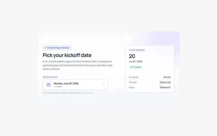
Calendar Date Picker
Originaldate picker with a dropdown calendar
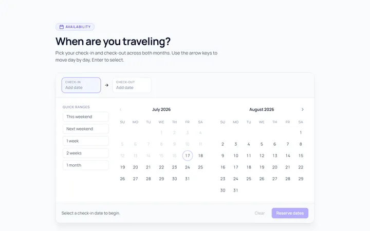
Calendar Range Picker
Originaldate range picker with two months
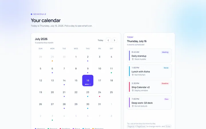
Calendar Inline
Originalalways-visible inline calendar
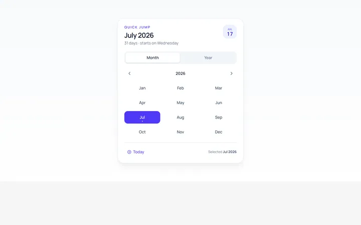
Calendar Month Year
Originalmonth and year quick selector
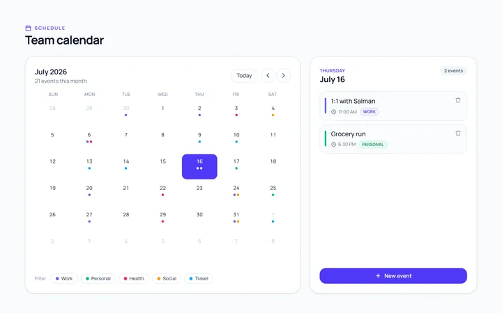
Calendar Event
Originalmonth calendar with event dots
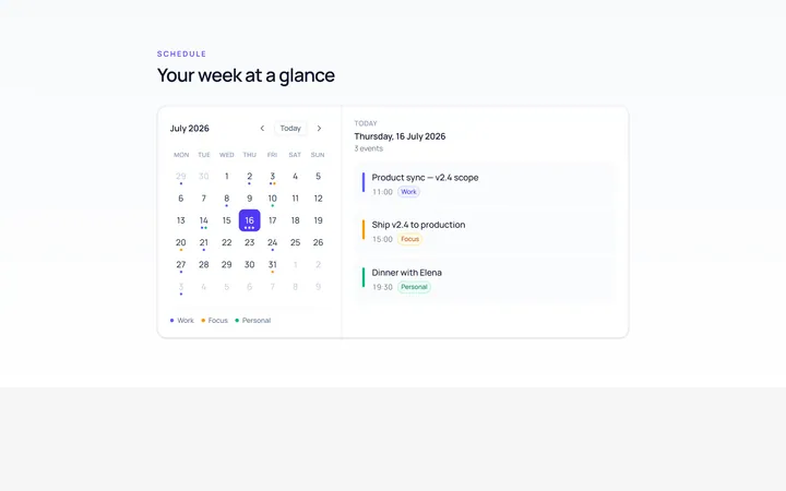
Calendar Mini
Originalcompact mini calendar widget
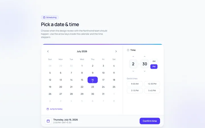
Calendar Datetime
Originalcombined date and time picker
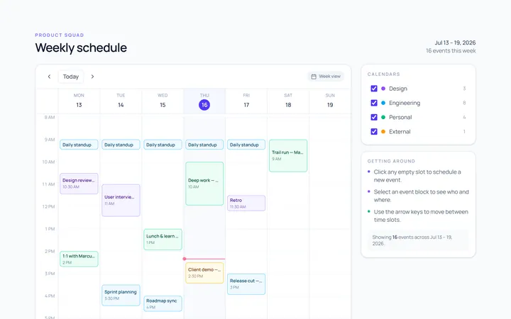
Calendar Week
Originalweek view with time slots
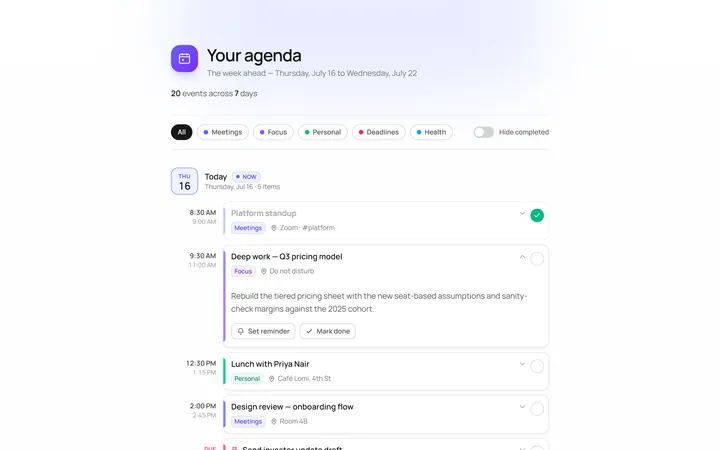
Calendar Agenda
Originalagenda list of upcoming days
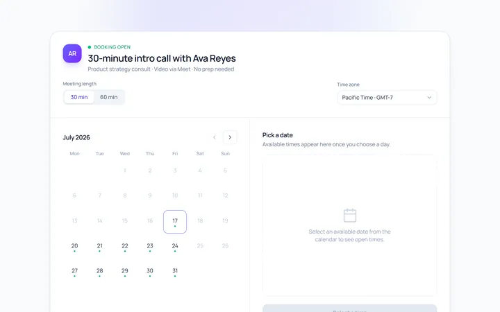
Calendar Availability
Originalavailability slot picker
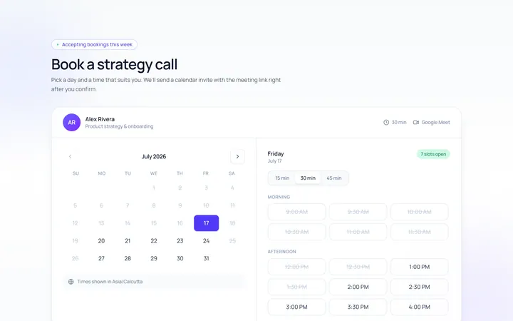
Calendar Booking
Originalbooking calendar with time slots
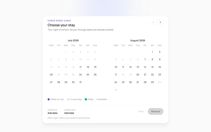
Calendar Multi Month
Originaltwo-month scrolling calendar