

3D Tilt Cards
Original · freeA responsive grid of cards that tilt in 3D toward your cursor with a light glare and lifted depth layers, powered by Framer Motion springs.
Copy prompt gives Claude Code, Cursor or v0 a ready-to-paste prompt that recreates this exact component.
npx shadcn@latest add https://webinnoventix.com/r/card-3d-tilt.json"use client";
import { useRef, type PointerEvent as ReactPointerEvent } from "react";
import {
motion,
useMotionTemplate,
useMotionValue,
useSpring,
useTransform,
} from "motion/react";
const EASE = [0.16, 1, 0.3, 1] as const;
type TiltItem = {
eyebrow: string;
title: string;
copy: string;
stat: string;
statLabel: string;
};
const ITEMS: TiltItem[] = [
{
eyebrow: "Analytics",
title: "Live revenue pulse",
copy: "Watch every signup, upgrade and renewal land in real time without refreshing a single tab.",
stat: "+38%",
statLabel: "vs last quarter",
},
{
eyebrow: "Automation",
title: "Hands-off workflows",
copy: "Route work to the right person the moment a deal changes stage, day or night.",
stat: "12h",
statLabel: "saved weekly",
},
{
eyebrow: "Insight",
title: "Forecasts you trust",
copy: "Blend historic trends with live pipeline so next quarter stops being a guessing game.",
stat: "99.2%",
statLabel: "model accuracy",
},
];
function TiltCard({ item, index }: { item: TiltItem; index: number }) {
const ref = useRef<HTMLElement>(null);
const px = useMotionValue(0.5);
const py = useMotionValue(0.5);
const rotateX = useSpring(useTransform(py, [0, 1], [11, -11]), {
stiffness: 150,
damping: 16,
});
const rotateY = useSpring(useTransform(px, [0, 1], [-11, 11]), {
stiffness: 150,
damping: 16,
});
const glareX = useTransform(px, (v) => `${v * 100}%`);
const glareY = useTransform(py, (v) => `${v * 100}%`);
const glare = useMotionTemplate`radial-gradient(circle at ${glareX} ${glareY}, rgba(255,255,255,0.45), transparent 55%)`;
function handleMove(e: ReactPointerEvent<HTMLElement>) {
const el = ref.current;
if (!el) return;
const rect = el.getBoundingClientRect();
px.set((e.clientX - rect.left) / rect.width);
py.set((e.clientY - rect.top) / rect.height);
}
function handleLeave() {
px.set(0.5);
py.set(0.5);
}
return (
<motion.div
initial={{ opacity: 0, y: 42 }}
whileInView={{ opacity: 1, y: 0 }}
viewport={{ once: true, margin: "-60px" }}
transition={{ duration: 0.6, delay: index * 0.12, ease: EASE }}
style={{ perspective: 1100 }}
>
<motion.article
ref={ref}
onPointerMove={handleMove}
onPointerLeave={handleLeave}
style={{ rotateX, rotateY, transformStyle: "preserve-3d" }}
className="group relative overflow-hidden rounded-3xl border border-zinc-200 bg-white p-7 shadow-xl shadow-zinc-900/5 transition-shadow duration-300 hover:shadow-2xl hover:shadow-indigo-500/10 dark:border-zinc-800 dark:bg-zinc-900"
>
<motion.div
aria-hidden="true"
style={{ background: glare }}
className="pointer-events-none absolute inset-0 opacity-0 transition-opacity duration-300 group-hover:opacity-100"
/>
<div
aria-hidden="true"
className="pointer-events-none absolute -right-16 -top-16 h-44 w-44 rounded-full bg-gradient-to-br from-indigo-400/40 to-violet-500/40 blur-2xl"
/>
<div style={{ transform: "translateZ(45px)" }} className="relative">
<span className="inline-flex items-center gap-2 rounded-full border border-zinc-200 bg-zinc-50 px-3 py-1 text-xs font-semibold uppercase tracking-widest text-indigo-600 dark:border-zinc-700 dark:bg-zinc-800 dark:text-indigo-300">
<span className="h-1.5 w-1.5 rounded-full bg-indigo-500" />
{item.eyebrow}
</span>
</div>
<h3
style={{ transform: "translateZ(60px)" }}
className="relative mt-5 text-xl font-bold text-zinc-900 dark:text-white"
>
{item.title}
</h3>
<p
style={{ transform: "translateZ(35px)" }}
className="relative mt-2 text-sm leading-relaxed text-zinc-600 dark:text-zinc-400"
>
{item.copy}
</p>
<div
style={{ transform: "translateZ(75px)" }}
className="relative mt-6 flex items-end justify-between"
>
<div>
<div className="text-3xl font-bold tracking-tight text-zinc-900 dark:text-white">
{item.stat}
</div>
<div className="text-xs text-zinc-500 dark:text-zinc-500">
{item.statLabel}
</div>
</div>
<a
href="#"
aria-label={`View ${item.title}`}
className="inline-flex h-10 w-10 items-center justify-center rounded-full bg-zinc-900 text-white shadow-lg shadow-zinc-900/20 transition-transform duration-300 group-hover:scale-110 focus-visible:outline-none focus-visible:ring-2 focus-visible:ring-indigo-500 focus-visible:ring-offset-2 focus-visible:ring-offset-white dark:bg-white dark:text-zinc-900 dark:focus-visible:ring-offset-zinc-900"
>
<svg
viewBox="0 0 24 24"
fill="none"
stroke="currentColor"
strokeWidth={2}
strokeLinecap="round"
strokeLinejoin="round"
className="h-4 w-4"
aria-hidden="true"
>
<path d="M7 17 17 7M7 7h10v10" />
</svg>
</a>
</div>
</motion.article>
</motion.div>
);
}
export default function Card3dTilt() {
return (
<section className="bg-zinc-50 px-6 py-20 dark:bg-zinc-950 md:py-28">
<div className="mx-auto max-w-6xl">
<div className="mx-auto max-w-2xl text-center">
<motion.p
initial={{ opacity: 0, y: 16 }}
whileInView={{ opacity: 1, y: 0 }}
viewport={{ once: true }}
transition={{ duration: 0.5, ease: EASE }}
className="text-sm font-semibold uppercase tracking-widest text-indigo-600 dark:text-indigo-400"
>
Interactive
</motion.p>
<motion.h2
initial={{ opacity: 0, y: 20 }}
whileInView={{ opacity: 1, y: 0 }}
viewport={{ once: true }}
transition={{ duration: 0.6, delay: 0.08, ease: EASE }}
className="mt-4 text-balance text-3xl font-bold tracking-tight text-zinc-900 sm:text-4xl dark:text-white"
>
Cards that lean into every move
</motion.h2>
<motion.p
initial={{ opacity: 0, y: 20 }}
whileInView={{ opacity: 1, y: 0 }}
viewport={{ once: true }}
transition={{ duration: 0.6, delay: 0.16, ease: EASE }}
className="mx-auto mt-4 max-w-lg text-zinc-600 dark:text-zinc-400"
>
Move your cursor across a card to feel the depth. Layers lift, light
tracks the pointer and the whole thing tilts in real time.
</motion.p>
</div>
<div className="mt-14 grid gap-6 sm:grid-cols-2 lg:grid-cols-3">
{ITEMS.map((item, i) => (
<TiltCard key={item.title} item={item} index={i} />
))}
</div>
</div>
</section>
);
}Dependencies
Licence
Built by Web Innoventix. Free for personal and commercial use, no attribution required.
Built by Web Innoventix
Need a custom interface, a full website, or SEO that gets you cited by AI? We design, build and rank it end to end.
Get a free quoteSimilar components
Browse all →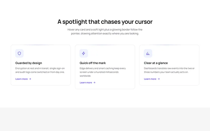
Spotlight Follow Cards
OriginalFeature cards where a soft radial spotlight and a glowing border chase the cursor on hover, with a staggered scroll reveal and an animated shimmer line.
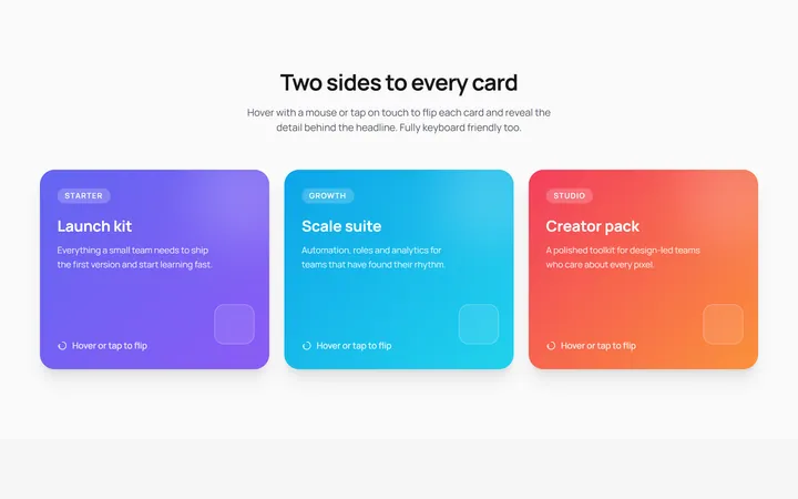
3D Flip Cards
OriginalPricing-style cards that flip in 3D on hover or tap to reveal details on the back, keyboard accessible with a staggered entrance animation.
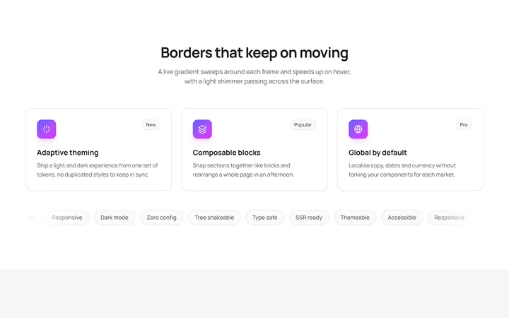
Animated Gradient Border Cards
OriginalCards wrapped in a live conic gradient border that rotates and speeds up on hover, with a shimmer sweep and a scrolling tag marquee.
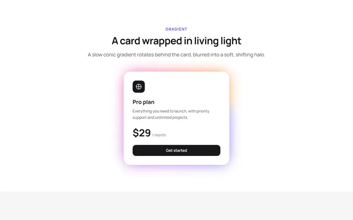
Glow Effect Card
primitivesA reusable glow effect card for React and Tailwind, with hover and motion.
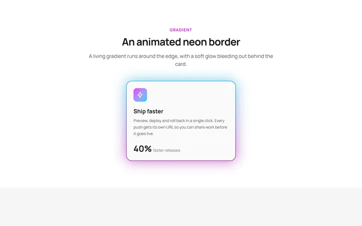
Neon Gradient Card
gradient-card.tsxA reusable neon gradient card for React and Tailwind, with hover and motion.
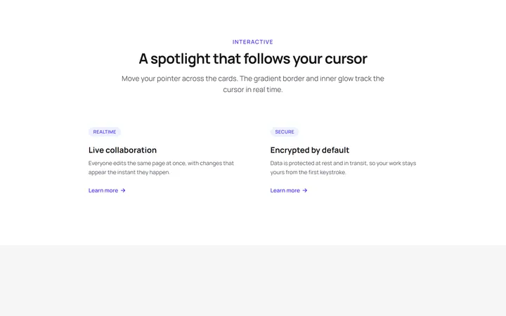
Spotlight Magic Card
card.tsxA reusable spotlight magic card for React and Tailwind, with hover and motion.
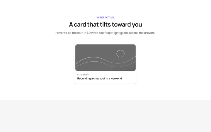
Tilt Spotlight Card
primitivesA reusable tilt spotlight card for React and Tailwind, with hover and motion.

Spotlight Hero
OriginalA centred hero with a soft radial spotlight, badge and dual call-to-action.

Split Hero
OriginalA two-column hero pairing a headline and CTAs with a product mock and social proof.

Gradient Spotlight Hero
OriginalA minimal centred hero with a soft gradient-mesh backdrop, announcement pill and dual call-to-action buttons.

App Preview Hero
OriginalA centred hero that pairs headline copy with a realistic product dashboard mock built entirely from markup, complete with browser chrome and a floating notification card.

Waitlist Capture Hero
OriginalA dark, focused hero with an inline email capture form and avatar social proof, ready for pre-launch waitlists.