

Comments Reviews
Original · freeproduct review comments with stars
Copy prompt gives Claude Code, Cursor or v0 a ready-to-paste prompt that recreates this exact component.
npx shadcn@latest add https://webinnoventix.com/r/comment-reviews.json"use client";
import { useId, useMemo, useRef, useState, type KeyboardEvent } from "react";
import { AnimatePresence, motion, useReducedMotion } from "motion/react";
type Rating = 1 | 2 | 3 | 4 | 5;
type Review = {
id: string;
author: string;
initials: string;
handle: string;
verified: boolean;
rating: Rating;
date: string;
dateLabel: string;
title: string;
body: string;
size: string;
helpful: number;
replies: Reply[];
};
type Reply = {
id: string;
author: string;
role: string;
body: string;
dateLabel: string;
};
const REVIEWS: Review[] = [
{
id: "rv-1",
author: "Marta Kowalczyk",
initials: "MK",
handle: "@martak",
verified: true,
rating: 5,
date: "2026-06-28",
dateLabel: "28 Jun 2026",
title: "Held up through 40 nights in the Tatras",
body:
"I bought the Ridgeline 45 for a guiding season and it has taken more abuse than anything else I own. The hip belt is the real story — it transfers load properly at 16 kg, which my old pack never managed. One honest gripe: the water bottle pockets are too shallow for a 1L Nalgene when the pack is stuffed.",
size: "45L / Slate",
helpful: 214,
replies: [
{
id: "rp-1",
author: "Ridgeline Support",
role: "Seller",
body:
"Thanks Marta — the shallow bottle pocket is fair. The 2026 run adds 3 cm of gusset height. Email us your order number and we'll send the deeper pocket retrofit free.",
dateLabel: "29 Jun 2026",
},
],
},
{
id: "rv-2",
author: "Devon Reyes",
initials: "DR",
handle: "@dreyes",
verified: true,
rating: 4,
date: "2026-06-11",
dateLabel: "11 Jun 2026",
title: "Great pack, questionable zipper pulls",
body:
"Fit is excellent on a short torso and the frame sheet doesn't bow out like the previous generation. Docking a star because the zipper pulls are thin cord that ices over — I swapped them for paracord in week two and it's been fine since.",
size: "38L / Moss",
helpful: 97,
replies: [],
},
{
id: "rv-3",
author: "Aisha Bello",
initials: "AB",
handle: "@aishab",
verified: false,
rating: 5,
date: "2026-05-30",
dateLabel: "30 May 2026",
title: "Finally a pack that fits carry-on rules",
body:
"Measured it against the 55 x 40 x 20 cm sizer at the gate and it slid in with the compression straps cinched. Three weeks in Vietnam, one bag, no check-in fees. The laptop sleeve is suspended off the base, which I appreciate more than I expected.",
size: "38L / Slate",
helpful: 63,
replies: [],
},
{
id: "rv-4",
author: "Tomás Iglesias",
initials: "TI",
handle: "@tomasi",
verified: true,
rating: 3,
date: "2026-05-14",
dateLabel: "14 May 2026",
title: "Good build, wrong pack for my torso",
body:
"No complaints about materials — the 210D ripstop shrugged off two weeks of scree. But I'm 195 cm and the long frame still tops out short, so the load rides on my shoulders after about six hours. Sizing chart could be clearer about the effective torso range.",
size: "45L / Ember",
helpful: 41,
replies: [
{
id: "rp-2",
author: "Ridgeline Support",
role: "Seller",
body:
"You're right that the chart undersells the limit. We've published a measured torso range (43–53 cm) on the product page as of this week. Returns are open for 90 days if you'd rather size out.",
dateLabel: "15 May 2026",
},
],
},
{
id: "rv-5",
author: "Priya Raman",
initials: "PR",
handle: "@priyar",
verified: true,
rating: 5,
date: "2026-04-22",
dateLabel: "22 Apr 2026",
title: "The lid pocket alone is worth it",
body:
"Small thing that changed my routine: the lid has a rigid, lined pocket that keeps a headlamp and glasses from getting crushed. Two seasons of ski touring later, the seams are untouched and the DWR still beads.",
size: "45L / Moss",
helpful: 88,
replies: [],
},
{
id: "rv-6",
author: "Ben Osei",
initials: "BO",
handle: "@benosei",
verified: false,
rating: 2,
date: "2026-04-03",
dateLabel: "3 Apr 2026",
title: "Mine arrived with a torn mesh panel",
body:
"Back panel mesh was split along the lumbar seam straight out of the box. Support replaced it in four days, no argument, so the service is real — but QC clearly let one through and I'd rather not gamble on a second.",
size: "38L / Ember",
helpful: 29,
replies: [],
},
];
const RATING_FILTERS = [
{ value: "all" as const, label: "All ratings" },
{ value: 5 as const, label: "5 stars" },
{ value: 4 as const, label: "4 stars" },
{ value: 3 as const, label: "3 stars" },
{ value: 2 as const, label: "2 stars" },
{ value: 1 as const, label: "1 star" },
];
type FilterValue = "all" | Rating;
type SortValue = "recent" | "helpful" | "critical";
const SORTS: { value: SortValue; label: string }[] = [
{ value: "recent", label: "Most recent" },
{ value: "helpful", label: "Most helpful" },
{ value: "critical", label: "Most critical" },
];
function StarIcon({ fill }: { fill: "full" | "half" | "empty" }) {
const gid = useId();
return (
<svg viewBox="0 0 20 20" aria-hidden="true" className="h-full w-full">
{fill === "half" ? (
<defs>
<linearGradient id={gid} x1="0" x2="1" y1="0" y2="0">
<stop offset="50%" stopColor="currentColor" />
<stop offset="50%" stopColor="currentColor" stopOpacity="0.22" />
</linearGradient>
</defs>
) : null}
<path
d="M10 1.6l2.47 5.01 5.53.8-4 3.9.94 5.5L10 14.21l-4.94 2.6.94-5.5-4-3.9 5.53-.8L10 1.6z"
fill={
fill === "full"
? "currentColor"
: fill === "half"
? `url(#${gid})`
: "currentColor"
}
fillOpacity={fill === "empty" ? 0.22 : 1}
/>
</svg>
);
}
function Stars({ value, size = "h-4 w-4" }: { value: number; size?: string }) {
return (
<span className="inline-flex items-center gap-0.5 text-amber-500 dark:text-amber-400">
{[0, 1, 2, 3, 4].map((i) => {
const diff = value - i;
const fill: "full" | "half" | "empty" =
diff >= 0.75 ? "full" : diff >= 0.25 ? "half" : "empty";
return (
<span key={i} className={size}>
<StarIcon fill={fill} />
</span>
);
})}
</span>
);
}
function CheckIcon() {
return (
<svg viewBox="0 0 16 16" aria-hidden="true" className="h-3.5 w-3.5">
<path
d="M8 1.2l1.72 1.1 2.03-.2.86 1.86 1.86.86-.2 2.03L15.37 8.5l-1.1 1.72.2 2.03-1.86.86-.86 1.86-2.03-.2L8 15.8l-1.72-1.1-2.03.2-.86-1.86-1.86-.86.2-2.03L.63 8.5l1.1-1.72-.2-2.03 1.86-.86.86-1.86 2.03.2L8 1.2z"
fill="currentColor"
fillOpacity="0.18"
/>
<path
d="M5.1 8.3l1.9 1.9 4-4.3"
fill="none"
stroke="currentColor"
strokeWidth="1.6"
strokeLinecap="round"
strokeLinejoin="round"
/>
</svg>
);
}
function ThumbIcon() {
return (
<svg viewBox="0 0 16 16" aria-hidden="true" className="h-3.5 w-3.5">
<path
d="M5.4 14V6.9l3-4.9c.9.1 1.5.9 1.4 1.8L9.4 6.2h3.3c.9 0 1.6.8 1.4 1.7l-.9 4.7c-.1.8-.8 1.4-1.6 1.4H5.4zM2 14V6.9h2.6V14H2z"
fill="none"
stroke="currentColor"
strokeWidth="1.3"
strokeLinejoin="round"
/>
</svg>
);
}
function ChevronIcon({ open }: { open: boolean }) {
return (
<svg
viewBox="0 0 16 16"
aria-hidden="true"
className={`h-3.5 w-3.5 transition-transform duration-200 ${open ? "rotate-180" : ""}`}
>
<path
d="M4 6.2L8 10l4-3.8"
fill="none"
stroke="currentColor"
strokeWidth="1.6"
strokeLinecap="round"
strokeLinejoin="round"
/>
</svg>
);
}
const AVATAR_TONES = [
"bg-indigo-100 text-indigo-700 dark:bg-indigo-500/15 dark:text-indigo-300",
"bg-emerald-100 text-emerald-700 dark:bg-emerald-500/15 dark:text-emerald-300",
"bg-rose-100 text-rose-700 dark:bg-rose-500/15 dark:text-rose-300",
"bg-violet-100 text-violet-700 dark:bg-violet-500/15 dark:text-violet-300",
"bg-sky-100 text-sky-700 dark:bg-sky-500/15 dark:text-sky-300",
"bg-amber-100 text-amber-700 dark:bg-amber-500/15 dark:text-amber-300",
];
export default function CommentReviews() {
const reduced = useReducedMotion();
const [filter, setFilter] = useState<FilterValue>("all");
const [sort, setSort] = useState<SortValue>("helpful");
const [voted, setVoted] = useState<Record<string, boolean>>({});
const [openReplies, setOpenReplies] = useState<Record<string, boolean>>({});
const [live, setLive] = useState("");
const filterRefs = useRef<(HTMLButtonElement | null)[]>([]);
const listId = useId();
const total = REVIEWS.length;
const average = useMemo(
() => REVIEWS.reduce((s, r) => s + r.rating, 0) / total,
[total],
);
const histogram = useMemo(() => {
const counts: Record<Rating, number> = { 1: 0, 2: 0, 3: 0, 4: 0, 5: 0 };
for (const r of REVIEWS) counts[r.rating] += 1;
return ([5, 4, 3, 2, 1] as Rating[]).map((star) => ({
star,
count: counts[star],
pct: Math.round((counts[star] / total) * 100),
}));
}, [total]);
const shown = useMemo(() => {
const base =
filter === "all" ? REVIEWS.slice() : REVIEWS.filter((r) => r.rating === filter);
return base.sort((a, b) => {
if (sort === "recent") return a.date < b.date ? 1 : -1;
if (sort === "critical") return a.rating - b.rating || b.helpful - a.helpful;
return b.helpful - a.helpful;
});
}, [filter, sort]);
function applyFilter(value: FilterValue) {
setFilter(value);
const count =
value === "all" ? total : REVIEWS.filter((r) => r.rating === value).length;
setLive(
`${count} review${count === 1 ? "" : "s"} shown for ${
value === "all" ? "all ratings" : `${value} star${value === 1 ? "" : "s"}`
}.`,
);
}
function onFilterKeyDown(e: KeyboardEvent<HTMLButtonElement>, index: number) {
const last = RATING_FILTERS.length - 1;
let next = -1;
if (e.key === "ArrowRight" || e.key === "ArrowDown") next = index === last ? 0 : index + 1;
else if (e.key === "ArrowLeft" || e.key === "ArrowUp") next = index === 0 ? last : index - 1;
else if (e.key === "Home") next = 0;
else if (e.key === "End") next = last;
if (next < 0) return;
e.preventDefault();
applyFilter(RATING_FILTERS[next].value);
filterRefs.current[next]?.focus();
}
function toggleVote(id: string, author: string) {
setVoted((prev) => {
const on = !prev[id];
setLive(on ? `Marked ${author}'s review helpful.` : `Removed helpful vote from ${author}'s review.`);
return { ...prev, [id]: on };
});
}
return (
<section className="relative w-full bg-white px-5 py-20 text-slate-900 sm:px-8 sm:py-28 dark:bg-slate-950 dark:text-slate-100">
<style>{`
@keyframes crvw-bar-grow {
from { transform: scaleX(0); }
to { transform: scaleX(1); }
}
@keyframes crvw-pop {
0% { transform: scale(1); }
45% { transform: scale(1.28) rotate(-8deg); }
100% { transform: scale(1); }
}
.crvw-bar { transform-origin: left center; animation: crvw-bar-grow 700ms cubic-bezier(0.22, 1, 0.36, 1) both; }
.crvw-pop { animation: crvw-pop 380ms cubic-bezier(0.34, 1.56, 0.64, 1); }
@media (prefers-reduced-motion: reduce) {
.crvw-bar, .crvw-pop { animation: none !important; }
}
`}</style>
<div className="mx-auto w-full max-w-4xl">
<p className="text-xs font-semibold uppercase tracking-[0.18em] text-indigo-600 dark:text-indigo-400">
Ridgeline 45 · Customer reviews
</p>
<h2 className="mt-3 text-3xl font-semibold tracking-tight text-slate-900 sm:text-4xl dark:text-white">
What 6 verified buyers actually said
</h2>
<p className="mt-3 max-w-2xl text-sm leading-relaxed text-slate-600 sm:text-base dark:text-slate-400">
Every review below comes from a confirmed order. We publish the critical ones unedited —
including the two-star.
</p>
<div className="mt-10 grid gap-8 rounded-2xl border border-slate-200 bg-slate-50/70 p-6 sm:p-8 md:grid-cols-[minmax(0,180px)_minmax(0,1fr)] md:gap-10 dark:border-slate-800 dark:bg-slate-900/50">
<div className="flex flex-col items-start justify-center">
<div className="flex items-baseline gap-1.5">
<span className="text-5xl font-semibold tracking-tight tabular-nums text-slate-900 dark:text-white">
{average.toFixed(1)}
</span>
<span className="text-sm text-slate-500 dark:text-slate-500">/ 5</span>
</div>
<div className="mt-2">
<Stars value={average} size="h-5 w-5" />
<span className="sr-only">{average.toFixed(1)} out of 5 stars</span>
</div>
<p className="mt-2 text-sm text-slate-600 dark:text-slate-400">
Based on {total} verified reviews
</p>
</div>
<div>
<ul className="space-y-2">
{histogram.map((row, i) => (
<li key={row.star} className="flex items-center gap-3">
<span className="w-12 shrink-0 text-xs tabular-nums text-slate-600 dark:text-slate-400">
{row.star} star
</span>
<span
className="h-2 flex-1 overflow-hidden rounded-full bg-slate-200 dark:bg-slate-800"
role="img"
aria-label={`${row.count} of ${total} reviews gave ${row.star} star${row.star === 1 ? "" : "s"}`}
>
<span
className="crvw-bar block h-full rounded-full bg-amber-400 dark:bg-amber-400/80"
style={{
width: `${row.pct}%`,
animationDelay: reduced ? "0ms" : `${i * 70}ms`,
}}
/>
</span>
<span className="w-8 shrink-0 text-right text-xs tabular-nums text-slate-500 dark:text-slate-500">
{row.count}
</span>
</li>
))}
</ul>
</div>
</div>
<div className="mt-8 flex flex-col gap-4 sm:flex-row sm:items-center sm:justify-between">
<div
role="tablist"
aria-label="Filter reviews by rating"
className="flex flex-wrap gap-1.5"
>
{RATING_FILTERS.map((f, i) => {
const active = filter === f.value;
return (
<button
key={String(f.value)}
ref={(el) => {
filterRefs.current[i] = el;
}}
role="tab"
type="button"
id={`${listId}-tab-${String(f.value)}`}
aria-selected={active}
aria-controls={listId}
tabIndex={active ? 0 : -1}
onClick={() => applyFilter(f.value)}
onKeyDown={(e) => onFilterKeyDown(e, i)}
className={`rounded-full border px-3.5 py-1.5 text-xs font-medium transition-colors focus-visible:outline-none focus-visible:ring-2 focus-visible:ring-indigo-500 focus-visible:ring-offset-2 focus-visible:ring-offset-white dark:focus-visible:ring-offset-slate-950 ${
active
? "border-slate-900 bg-slate-900 text-white dark:border-white dark:bg-white dark:text-slate-900"
: "border-slate-300 bg-white text-slate-700 hover:border-slate-400 hover:bg-slate-50 dark:border-slate-700 dark:bg-slate-900 dark:text-slate-300 dark:hover:border-slate-600 dark:hover:bg-slate-800"
}`}
>
{f.label}
</button>
);
})}
</div>
<div className="flex items-center gap-2">
<label
htmlFor={`${listId}-sort`}
className="text-xs font-medium text-slate-600 dark:text-slate-400"
>
Sort
</label>
<select
id={`${listId}-sort`}
value={sort}
onChange={(e) => setSort(e.target.value as SortValue)}
className="rounded-lg border border-slate-300 bg-white px-2.5 py-1.5 text-xs font-medium text-slate-800 transition-colors hover:border-slate-400 focus-visible:outline-none focus-visible:ring-2 focus-visible:ring-indigo-500 focus-visible:ring-offset-2 focus-visible:ring-offset-white dark:border-slate-700 dark:bg-slate-900 dark:text-slate-200 dark:hover:border-slate-600 dark:focus-visible:ring-offset-slate-950"
>
{SORTS.map((s) => (
<option key={s.value} value={s.value}>
{s.label}
</option>
))}
</select>
</div>
</div>
<p aria-live="polite" className="sr-only">
{live}
</p>
<ul
id={listId}
role="tabpanel"
aria-labelledby={`${listId}-tab-${String(filter)}`}
className="mt-6 space-y-4"
>
<AnimatePresence initial={false} mode="popLayout">
{shown.map((r, i) => {
const on = Boolean(voted[r.id]);
const repliesOpen = Boolean(openReplies[r.id]);
return (
<motion.li
key={r.id}
layout={!reduced}
initial={reduced ? false : { opacity: 0, y: 12 }}
animate={{ opacity: 1, y: 0 }}
exit={reduced ? { opacity: 0 } : { opacity: 0, y: -8, scale: 0.98 }}
transition={
reduced
? { duration: 0 }
: { duration: 0.32, delay: i * 0.03, ease: [0.22, 1, 0.36, 1] }
}
className="rounded-2xl border border-slate-200 bg-white p-5 shadow-sm transition-colors hover:border-slate-300 sm:p-6 dark:border-slate-800 dark:bg-slate-900/40 dark:hover:border-slate-700"
>
<div className="flex items-start gap-3.5">
<span
aria-hidden="true"
className={`grid h-10 w-10 shrink-0 place-items-center rounded-full text-xs font-semibold ${
AVATAR_TONES[i % AVATAR_TONES.length]
}`}
>
{r.initials}
</span>
<div className="min-w-0 flex-1">
<div className="flex flex-wrap items-center gap-x-2 gap-y-1">
<span className="text-sm font-semibold text-slate-900 dark:text-white">
{r.author}
</span>
<span className="text-xs text-slate-500 dark:text-slate-500">{r.handle}</span>
{r.verified ? (
<span className="inline-flex items-center gap-1 rounded-full bg-emerald-100 px-2 py-0.5 text-[11px] font-medium text-emerald-700 dark:bg-emerald-500/15 dark:text-emerald-300">
<CheckIcon />
Verified purchase
</span>
) : null}
</div>
<div className="mt-1.5 flex flex-wrap items-center gap-x-2.5 gap-y-1">
<Stars value={r.rating} />
<span className="sr-only">{r.rating} out of 5 stars</span>
<time
dateTime={r.date}
className="text-xs text-slate-500 dark:text-slate-500"
>
{r.dateLabel}
</time>
<span aria-hidden="true" className="text-slate-300 dark:text-slate-700">
·
</span>
<span className="text-xs text-slate-500 dark:text-slate-500">{r.size}</span>
</div>
<h3 className="mt-3 text-sm font-semibold text-slate-900 dark:text-slate-100">
{r.title}
</h3>
<p className="mt-1.5 text-sm leading-relaxed text-slate-600 dark:text-slate-400">
{r.body}
</p>
<div className="mt-4 flex flex-wrap items-center gap-2">
<button
type="button"
onClick={() => toggleVote(r.id, r.author)}
aria-pressed={on}
className={`inline-flex items-center gap-1.5 rounded-full border px-3 py-1.5 text-xs font-medium transition-colors focus-visible:outline-none focus-visible:ring-2 focus-visible:ring-indigo-500 focus-visible:ring-offset-2 focus-visible:ring-offset-white dark:focus-visible:ring-offset-slate-950 ${
on
? "border-indigo-300 bg-indigo-50 text-indigo-700 dark:border-indigo-500/40 dark:bg-indigo-500/15 dark:text-indigo-300"
: "border-slate-300 bg-white text-slate-700 hover:border-slate-400 hover:bg-slate-50 dark:border-slate-700 dark:bg-slate-900 dark:text-slate-300 dark:hover:border-slate-600 dark:hover:bg-slate-800"
}`}
>
<span key={String(on)} className={on && !reduced ? "crvw-pop" : undefined}>
<ThumbIcon />
</span>
Helpful
<span className="tabular-nums">({r.helpful + (on ? 1 : 0)})</span>
</button>
{r.replies.length > 0 ? (
<button
type="button"
aria-expanded={repliesOpen}
aria-controls={`${r.id}-replies`}
onClick={() =>
setOpenReplies((p) => ({ ...p, [r.id]: !p[r.id] }))
}
className="inline-flex items-center gap-1.5 rounded-full border border-slate-300 bg-white px-3 py-1.5 text-xs font-medium text-slate-700 transition-colors hover:border-slate-400 hover:bg-slate-50 focus-visible:outline-none focus-visible:ring-2 focus-visible:ring-indigo-500 focus-visible:ring-offset-2 focus-visible:ring-offset-white dark:border-slate-700 dark:bg-slate-900 dark:text-slate-300 dark:hover:border-slate-600 dark:hover:bg-slate-800 dark:focus-visible:ring-offset-slate-950"
>
{r.replies.length} seller {r.replies.length === 1 ? "reply" : "replies"}
<ChevronIcon open={repliesOpen} />
</button>
) : null}
</div>
{r.replies.length > 0 ? (
<AnimatePresence initial={false}>
{repliesOpen ? (
<motion.div
id={`${r.id}-replies`}
key="replies"
initial={reduced ? false : { height: 0, opacity: 0 }}
animate={{ height: "auto", opacity: 1 }}
exit={reduced ? { opacity: 0 } : { height: 0, opacity: 0 }}
transition={
reduced ? { duration: 0 } : { duration: 0.26, ease: [0.22, 1, 0.36, 1] }
}
className="overflow-hidden"
>
<ul className="mt-4 space-y-3 border-l-2 border-slate-200 pl-4 dark:border-slate-800">
{r.replies.map((rp) => (
<li key={rp.id}>
<div className="flex flex-wrap items-center gap-x-2 gap-y-1">
<span className="text-xs font-semibold text-slate-900 dark:text-slate-100">
{rp.author}
</span>
<span className="rounded-full bg-violet-100 px-1.5 py-0.5 text-[10px] font-semibold uppercase tracking-wide text-violet-700 dark:bg-violet-500/15 dark:text-violet-300">
{rp.role}
</span>
<span className="text-xs text-slate-500 dark:text-slate-500">
{rp.dateLabel}
</span>
</div>
<p className="mt-1 text-sm leading-relaxed text-slate-600 dark:text-slate-400">
{rp.body}
</p>
</li>
))}
</ul>
</motion.div>
) : null}
</AnimatePresence>
) : null}
</div>
</div>
</motion.li>
);
})}
</AnimatePresence>
</ul>
{shown.length === 0 ? (
<div className="mt-6 rounded-2xl border border-dashed border-slate-300 p-10 text-center dark:border-slate-700">
<p className="text-sm font-medium text-slate-700 dark:text-slate-300">
No {filter === "all" ? "" : `${filter}-star `}reviews yet
</p>
<p className="mt-1 text-sm text-slate-500 dark:text-slate-500">
Try a different rating filter to see what buyers are saying.
</p>
</div>
) : null}
</div>
</section>
);
}Dependencies
Licence
Built by Web Innoventix. Free for personal and commercial use, no attribution required.
Built by Web Innoventix
Need a custom interface, a full website, or SEO that gets you cited by AI? We design, build and rank it end to end.
Get a free quoteSimilar components
Browse all →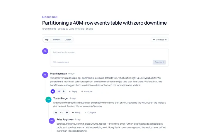
Comments Thread
Originalcomment thread with votes
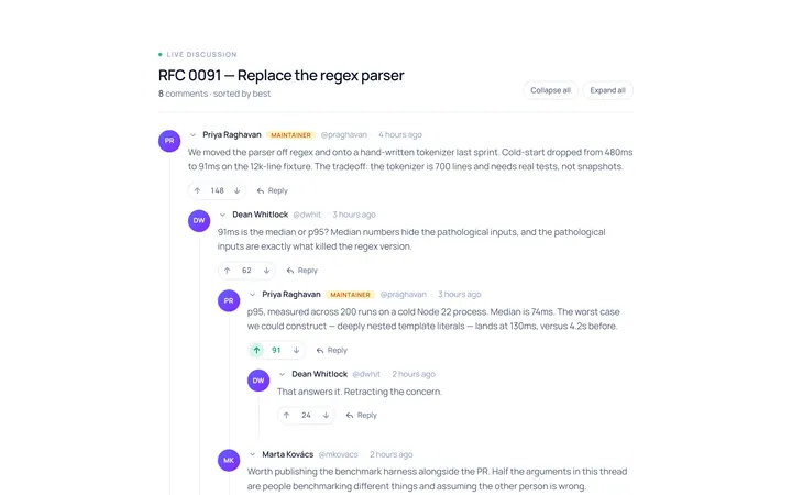
Comments Nested
Originalnested reply comments
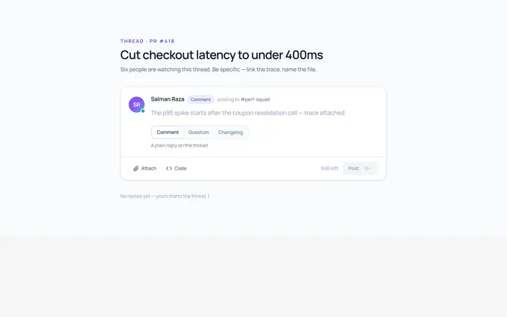
Comments Form
Originalcomment composer with avatar
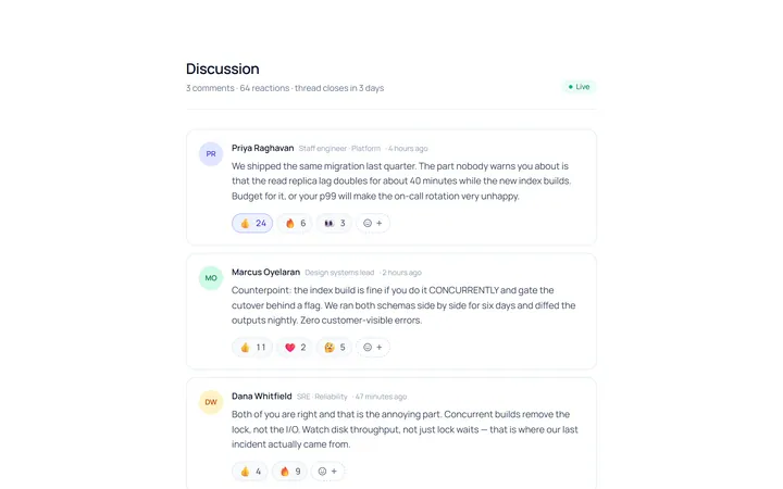
Comments Reactions
Originalcomments with emoji reactions
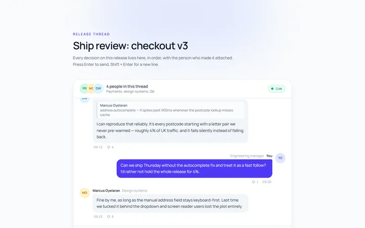
Comments Chat Style
Originalchat-style comment section
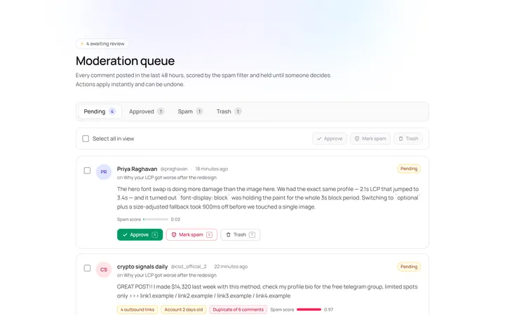
Comments Moderation
Originalcomments with moderation actions
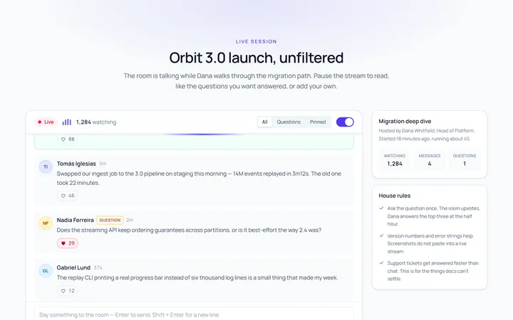
Comments Live
Originallive comment stream

Spotlight Hero
OriginalA centred hero with a soft radial spotlight, badge and dual call-to-action.

Split Hero
OriginalA two-column hero pairing a headline and CTAs with a product mock and social proof.

Gradient Spotlight Hero
OriginalA minimal centred hero with a soft gradient-mesh backdrop, announcement pill and dual call-to-action buttons.

App Preview Hero
OriginalA centred hero that pairs headline copy with a realistic product dashboard mock built entirely from markup, complete with browser chrome and a floating notification card.

Waitlist Capture Hero
OriginalA dark, focused hero with an inline email capture form and avatar social proof, ready for pre-launch waitlists.