

Empty Inbox
Original · freeempty inbox / all caught up
Copy prompt gives Claude Code, Cursor or v0 a ready-to-paste prompt that recreates this exact component.
npx shadcn@latest add https://webinnoventix.com/r/empty-inbox.json"use client";
import { useCallback, useId, useMemo, useRef, useState, type KeyboardEvent } from "react";
import { motion, useReducedMotion } from "motion/react";
type FilterId = "unread" | "assigned" | "snoozed";
type Filter = {
id: FilterId;
label: string;
hint: string;
clearedAt: string;
};
type Suggestion = {
id: string;
title: string;
detail: string;
meta: string;
icon: "draft" | "snooze" | "rule";
};
const FILTERS: Filter[] = [
{
id: "unread",
label: "Unread",
hint: "Nothing new since 4:12 PM. The last message was a shipping receipt from Kestrel Logistics.",
clearedAt: "Cleared 41 minutes ago",
},
{
id: "assigned",
label: "Assigned to me",
hint: "All 7 tickets you owned this week are closed. Priya took the last two overnight.",
clearedAt: "Cleared Tuesday, 9:03 AM",
},
{
id: "snoozed",
label: "Snoozed",
hint: "Two threads come back tomorrow at 8:00 AM. Neither is waiting on you right now.",
clearedAt: "Next wake-up in 16 hours",
},
];
const SUGGESTIONS: Suggestion[] = [
{
id: "s1",
title: "Finish the draft to Amara Okafor",
detail: "Started 3 days ago, 2 paragraphs in. Subject: Q3 renewal terms.",
meta: "Drafts",
icon: "draft",
},
{
id: "s2",
title: "Review 2 threads waking tomorrow",
detail: "Contract redlines from Vega Studio and a warehouse audit reminder.",
meta: "Snoozed",
icon: "snooze",
},
{
id: "s3",
title: "Turn receipts into a folder rule",
detail: "You archived 31 receipts by hand this month. A rule would take 20 seconds.",
meta: "Automation",
icon: "rule",
},
];
function IconCheck({ className }: { className?: string }) {
return (
<svg viewBox="0 0 24 24" fill="none" aria-hidden="true" className={className}>
<path
d="M5 12.5 10 17.5 19 7"
stroke="currentColor"
strokeWidth="2.25"
strokeLinecap="round"
strokeLinejoin="round"
/>
</svg>
);
}
function IconDraft({ className }: { className?: string }) {
return (
<svg viewBox="0 0 24 24" fill="none" aria-hidden="true" className={className}>
<path
d="M4 20h4l10-10a2.83 2.83 0 0 0-4-4L4 16v4Z"
stroke="currentColor"
strokeWidth="1.6"
strokeLinejoin="round"
/>
<path d="M13.5 6.5 17.5 10.5" stroke="currentColor" strokeWidth="1.6" strokeLinecap="round" />
</svg>
);
}
function IconSnooze({ className }: { className?: string }) {
return (
<svg viewBox="0 0 24 24" fill="none" aria-hidden="true" className={className}>
<circle cx="12" cy="13" r="8" stroke="currentColor" strokeWidth="1.6" />
<path d="M12 9.5V13l2.5 1.75" stroke="currentColor" strokeWidth="1.6" strokeLinecap="round" />
<path d="M4.5 5.5 7.5 3M19.5 5.5 16.5 3" stroke="currentColor" strokeWidth="1.6" strokeLinecap="round" />
</svg>
);
}
function IconRule({ className }: { className?: string }) {
return (
<svg viewBox="0 0 24 24" fill="none" aria-hidden="true" className={className}>
<path d="M4 7h16M7 12h10M10 17h4" stroke="currentColor" strokeWidth="1.6" strokeLinecap="round" />
</svg>
);
}
function IconArrow({ className }: { className?: string }) {
return (
<svg viewBox="0 0 24 24" fill="none" aria-hidden="true" className={className}>
<path d="M5 12h14M13 6l6 6-6 6" stroke="currentColor" strokeWidth="1.8" strokeLinecap="round" strokeLinejoin="round" />
</svg>
);
}
function SuggestionIcon({ kind, className }: { kind: Suggestion["icon"]; className?: string }) {
if (kind === "draft") return <IconDraft className={className} />;
if (kind === "snooze") return <IconSnooze className={className} />;
return <IconRule className={className} />;
}
export default function EmptyInbox() {
const reduced = useReducedMotion();
const headingId = useId();
const statusId = useId();
const [active, setActive] = useState<FilterId>("unread");
const [dismissed, setDismissed] = useState<string[]>([]);
const tabRefs = useRef<(HTMLButtonElement | null)[]>([]);
const activeFilter = useMemo(
() => FILTERS.find((f) => f.id === active) ?? FILTERS[0],
[active],
);
const visible = useMemo(
() => SUGGESTIONS.filter((s) => !dismissed.includes(s.id)),
[dismissed],
);
const onTabKeyDown = useCallback(
(event: KeyboardEvent<HTMLButtonElement>, index: number) => {
const last = FILTERS.length - 1;
let next = -1;
if (event.key === "ArrowRight") next = index === last ? 0 : index + 1;
else if (event.key === "ArrowLeft") next = index === 0 ? last : index - 1;
else if (event.key === "Home") next = 0;
else if (event.key === "End") next = last;
if (next < 0) return;
event.preventDefault();
setActive(FILTERS[next].id);
tabRefs.current[next]?.focus();
},
[],
);
return (
<section
className="relative w-full overflow-hidden bg-slate-50 px-5 py-20 sm:px-8 sm:py-28 dark:bg-slate-950"
aria-labelledby={headingId}
>
<style>{`
@keyframes einbox-drift {
0%, 100% { transform: translate3d(0, 0, 0); }
50% { transform: translate3d(0, -10px, 0); }
}
@keyframes einbox-sweep {
0% { transform: translateX(-120%); opacity: 0; }
40% { opacity: 1; }
100% { transform: translateX(120%); opacity: 0; }
}
@keyframes einbox-pulse-ring {
0% { transform: scale(0.85); opacity: 0.55; }
100% { transform: scale(1.5); opacity: 0; }
}
.einbox-drift { animation: einbox-drift 7s ease-in-out infinite; }
.einbox-sweep { animation: einbox-sweep 3.6s cubic-bezier(0.4, 0, 0.2, 1) infinite; }
.einbox-ring { animation: einbox-pulse-ring 2.8s ease-out infinite; }
@media (prefers-reduced-motion: reduce) {
.einbox-drift, .einbox-sweep, .einbox-ring {
animation: none !important;
}
}
`}</style>
<div
aria-hidden="true"
className="pointer-events-none absolute inset-x-0 top-0 h-72 bg-[radial-gradient(60%_100%_at_50%_0%,rgba(99,102,241,0.14),transparent_70%)] dark:bg-[radial-gradient(60%_100%_at_50%_0%,rgba(129,140,248,0.16),transparent_70%)]"
/>
<div className="relative mx-auto w-full max-w-3xl">
<div className="rounded-3xl border border-slate-200/80 bg-white/80 p-6 shadow-[0_1px_2px_rgba(15,23,42,0.04),0_24px_60px_-30px_rgba(15,23,42,0.28)] backdrop-blur-sm sm:p-10 dark:border-slate-800 dark:bg-slate-900/70 dark:shadow-[0_24px_60px_-30px_rgba(0,0,0,0.9)]">
<div className="flex flex-col items-center text-center">
<div className="relative mb-7 grid h-24 w-24 place-items-center">
<span
aria-hidden="true"
className="einbox-ring absolute inset-0 rounded-full border border-emerald-400/50 dark:border-emerald-400/40"
/>
<motion.div
initial={reduced ? false : { scale: 0.8, opacity: 0 }}
animate={{ scale: 1, opacity: 1 }}
transition={{ type: "spring", stiffness: 260, damping: 18 }}
className="einbox-drift relative grid h-20 w-20 place-items-center overflow-hidden rounded-2xl bg-emerald-500 text-white shadow-lg shadow-emerald-500/25 dark:bg-emerald-400 dark:text-emerald-950 dark:shadow-emerald-400/20"
>
<IconCheck className="h-9 w-9" />
<span
aria-hidden="true"
className="einbox-sweep absolute inset-y-0 -left-1/3 w-1/3 skew-x-12 bg-white/30"
/>
</motion.div>
</div>
<h2
id={headingId}
className="text-balance text-3xl font-semibold tracking-tight text-slate-900 sm:text-4xl dark:text-slate-50"
>
Inbox zero. Actually.
</h2>
<p className="mt-3 max-w-md text-pretty text-base leading-relaxed text-slate-600 dark:text-slate-400">
You closed 24 threads today and the queue is empty. Nothing is waiting on a reply from you.
</p>
</div>
<div className="mt-8">
<div
role="tablist"
aria-label="Inbox filters"
className="mx-auto flex w-full max-w-md gap-1 rounded-full border border-slate-200 bg-slate-100/70 p-1 dark:border-slate-800 dark:bg-slate-950/60"
>
{FILTERS.map((filter, index) => {
const selected = filter.id === active;
return (
<button
key={filter.id}
ref={(node) => {
tabRefs.current[index] = node;
}}
role="tab"
type="button"
id={`${headingId}-tab-${filter.id}`}
aria-selected={selected}
aria-controls={statusId}
tabIndex={selected ? 0 : -1}
onClick={() => setActive(filter.id)}
onKeyDown={(event) => onTabKeyDown(event, index)}
className={`relative flex-1 rounded-full px-3 py-2 text-sm font-medium transition-colors focus-visible:outline-none focus-visible:ring-2 focus-visible:ring-indigo-500 focus-visible:ring-offset-2 focus-visible:ring-offset-white dark:focus-visible:ring-indigo-400 dark:focus-visible:ring-offset-slate-900 ${
selected
? "text-slate-900 dark:text-slate-50"
: "text-slate-500 hover:text-slate-800 dark:text-slate-400 dark:hover:text-slate-200"
}`}
>
{selected ? (
<motion.span
layoutId={`${headingId}-pill`}
transition={
reduced
? { duration: 0 }
: { type: "spring", stiffness: 420, damping: 34 }
}
className="absolute inset-0 rounded-full bg-white shadow-sm dark:bg-slate-800"
/>
) : null}
<span className="relative">{filter.label}</span>
</button>
);
})}
</div>
<div
role="tabpanel"
id={statusId}
aria-labelledby={`${headingId}-tab-${activeFilter.id}`}
tabIndex={0}
className="mt-5 rounded-2xl border border-dashed border-slate-300 bg-slate-50/70 px-5 py-5 text-center focus-visible:outline-none focus-visible:ring-2 focus-visible:ring-indigo-500 dark:border-slate-700 dark:bg-slate-950/40 dark:focus-visible:ring-indigo-400"
>
<motion.p
key={activeFilter.id}
initial={reduced ? false : { opacity: 0, y: 6 }}
animate={{ opacity: 1, y: 0 }}
transition={{ duration: 0.28, ease: "easeOut" }}
className="text-pretty text-sm leading-relaxed text-slate-600 dark:text-slate-400"
>
{activeFilter.hint}
</motion.p>
<p className="mt-2 text-xs font-medium uppercase tracking-wider text-emerald-600 dark:text-emerald-400">
{activeFilter.clearedAt}
</p>
</div>
</div>
<div className="mt-9">
<div className="flex items-baseline justify-between gap-4">
<h3 className="text-sm font-semibold text-slate-900 dark:text-slate-100">
While you’re here
</h3>
{dismissed.length > 0 ? (
<button
type="button"
onClick={() => setDismissed([])}
className="rounded-md text-xs font-medium text-indigo-600 underline-offset-4 hover:underline focus-visible:outline-none focus-visible:ring-2 focus-visible:ring-indigo-500 focus-visible:ring-offset-2 focus-visible:ring-offset-white dark:text-indigo-400 dark:focus-visible:ring-indigo-400 dark:focus-visible:ring-offset-slate-900"
>
Restore {dismissed.length} dismissed
</button>
) : null}
</div>
<ul className="mt-4 space-y-2.5">
{visible.map((item) => (
<motion.li
key={item.id}
layout={!reduced}
initial={reduced ? false : { opacity: 0, y: 8 }}
animate={{ opacity: 1, y: 0 }}
transition={{ duration: 0.25, ease: "easeOut" }}
className="group flex items-start gap-4 rounded-2xl border border-slate-200 bg-white p-4 transition-colors hover:border-indigo-300 dark:border-slate-800 dark:bg-slate-900 dark:hover:border-indigo-500/60"
>
<span className="mt-0.5 grid h-9 w-9 shrink-0 place-items-center rounded-xl bg-indigo-50 text-indigo-600 dark:bg-indigo-500/10 dark:text-indigo-400">
<SuggestionIcon kind={item.icon} className="h-5 w-5" />
</span>
<span className="min-w-0 flex-1 text-left">
<span className="flex flex-wrap items-center gap-x-2 gap-y-1">
<span className="text-sm font-medium text-slate-900 dark:text-slate-100">
{item.title}
</span>
<span className="rounded-full bg-slate-100 px-2 py-0.5 text-[11px] font-medium text-slate-500 dark:bg-slate-800 dark:text-slate-400">
{item.meta}
</span>
</span>
<span className="mt-1 block text-pretty text-sm leading-relaxed text-slate-500 dark:text-slate-400">
{item.detail}
</span>
</span>
<button
type="button"
onClick={() => setDismissed((prev) => [...prev, item.id])}
className="shrink-0 rounded-lg p-1.5 text-slate-400 transition-colors hover:bg-slate-100 hover:text-slate-700 focus-visible:outline-none focus-visible:ring-2 focus-visible:ring-indigo-500 dark:hover:bg-slate-800 dark:hover:text-slate-200 dark:focus-visible:ring-indigo-400"
>
<span className="sr-only">Dismiss: {item.title}</span>
<svg viewBox="0 0 24 24" fill="none" aria-hidden="true" className="h-4 w-4">
<path
d="M6 6l12 12M18 6L6 18"
stroke="currentColor"
strokeWidth="1.8"
strokeLinecap="round"
/>
</svg>
</button>
</motion.li>
))}
</ul>
{visible.length === 0 ? (
<p className="mt-4 rounded-2xl border border-dashed border-slate-300 px-5 py-6 text-center text-sm text-slate-500 dark:border-slate-700 dark:text-slate-400">
That’s everything. Close the tab and go outside.
</p>
) : null}
</div>
<div className="mt-9 flex flex-col gap-3 border-t border-slate-200 pt-7 sm:flex-row sm:justify-center dark:border-slate-800">
<a
href="#compose"
className="inline-flex items-center justify-center gap-2 rounded-xl bg-slate-900 px-5 py-2.5 text-sm font-semibold text-white transition-colors hover:bg-slate-800 focus-visible:outline-none focus-visible:ring-2 focus-visible:ring-indigo-500 focus-visible:ring-offset-2 focus-visible:ring-offset-white dark:bg-slate-100 dark:text-slate-900 dark:hover:bg-white dark:focus-visible:ring-indigo-400 dark:focus-visible:ring-offset-slate-900"
>
Write a message
<IconArrow className="h-4 w-4" />
</a>
<a
href="#archive"
className="inline-flex items-center justify-center gap-2 rounded-xl border border-slate-300 px-5 py-2.5 text-sm font-semibold text-slate-700 transition-colors hover:bg-slate-100 focus-visible:outline-none focus-visible:ring-2 focus-visible:ring-indigo-500 focus-visible:ring-offset-2 focus-visible:ring-offset-white dark:border-slate-700 dark:text-slate-200 dark:hover:bg-slate-800 dark:focus-visible:ring-indigo-400 dark:focus-visible:ring-offset-slate-900"
>
Browse the archive
</a>
</div>
</div>
<p className="mt-5 text-center text-xs text-slate-500 dark:text-slate-500">
Synced 2 minutes ago across 3 devices · 1,284 messages archived this quarter
</p>
</div>
</section>
);
}Dependencies
Licence
Built by Web Innoventix. Free for personal and commercial use, no attribution required.
Built by Web Innoventix
Need a custom interface, a full website, or SEO that gets you cited by AI? We design, build and rank it end to end.
Get a free quoteSimilar components
Browse all →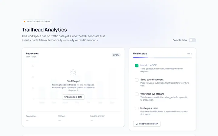
Empty No Data
Originalempty data state with illustration
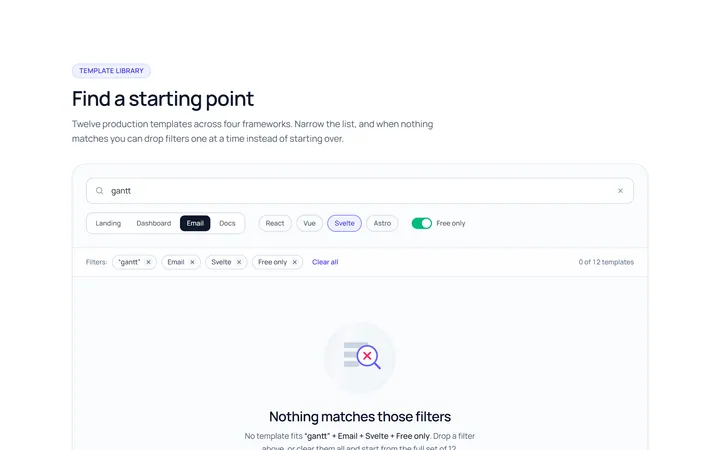
Empty No Results
Originalno results with clear filters
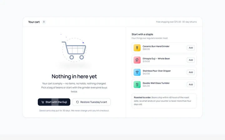
Empty Cart
Originalempty shopping cart state
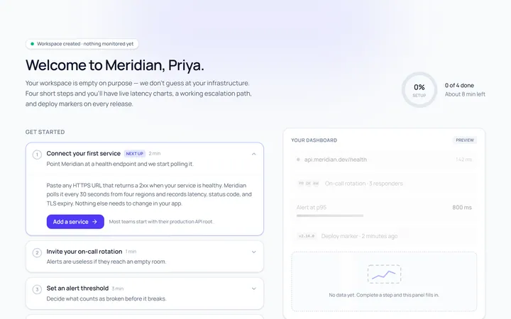
Empty First Run
Originalfirst-run get started empty state
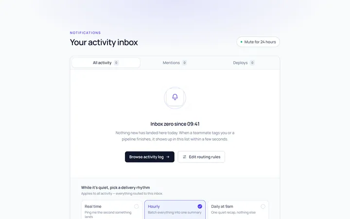
Empty Notifications
Originalno notifications state
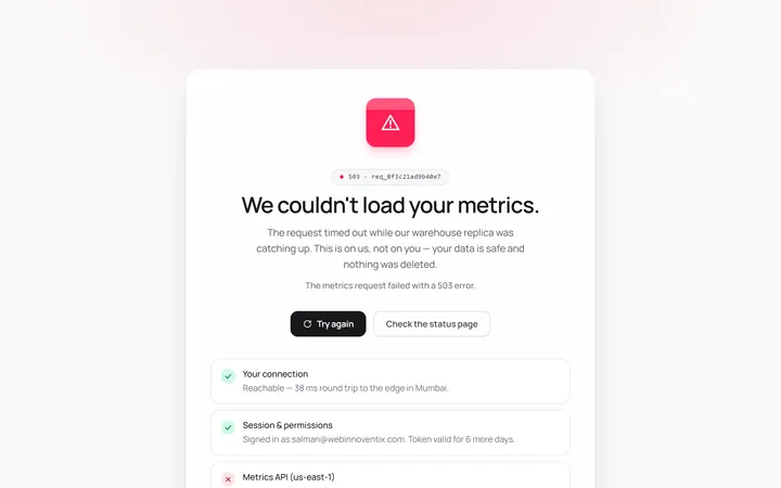
Empty Error
Originalsomething went wrong empty state
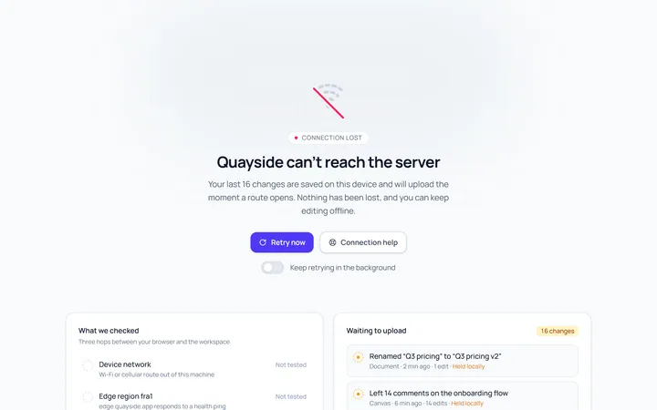
Empty No Connection
Originalno connection empty state
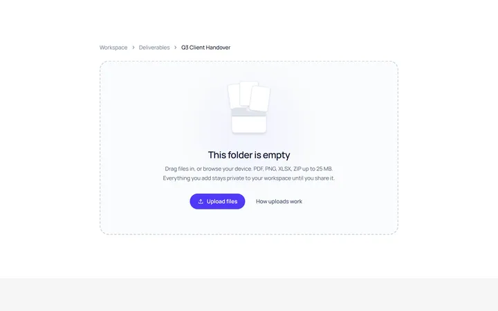
Empty Folder
Originalempty folder with upload CTA
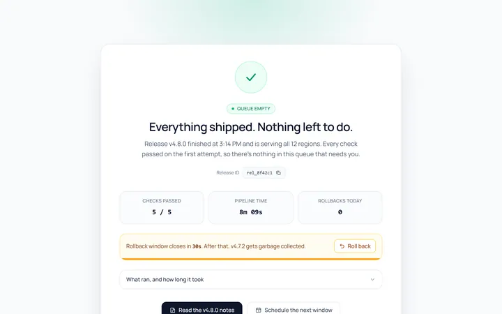
Empty Success
Originalsuccess / done empty state

Spotlight Hero
OriginalA centred hero with a soft radial spotlight, badge and dual call-to-action.

Split Hero
OriginalA two-column hero pairing a headline and CTAs with a product mock and social proof.

Gradient Spotlight Hero
OriginalA minimal centred hero with a soft gradient-mesh backdrop, announcement pill and dual call-to-action buttons.