

Timeline Feature Section
Original · freefeature timeline/how-it-works
Copy prompt gives Claude Code, Cursor or v0 a ready-to-paste prompt that recreates this exact component.
npx shadcn@latest add https://webinnoventix.com/r/featx-timeline.json"use client";
import { useId, useRef, useState, type ReactNode } from "react";
import { AnimatePresence, motion, useReducedMotion } from "motion/react";
function IconLink() {
return (
<svg
aria-hidden="true"
viewBox="0 0 24 24"
fill="none"
stroke="currentColor"
strokeWidth={1.6}
strokeLinecap="round"
strokeLinejoin="round"
className="h-5 w-5"
>
<path d="M13.19 8.69a4.5 4.5 0 0 1 1.24 7.24l-4.5 4.5a4.5 4.5 0 0 1-6.36-6.36l1.76-1.76" />
<path d="M10.81 15.31a4.5 4.5 0 0 1-1.24-7.24l4.5-4.5a4.5 4.5 0 0 1 6.36 6.36l-1.76 1.76" />
</svg>
);
}
function IconBoard() {
return (
<svg
aria-hidden="true"
viewBox="0 0 24 24"
fill="none"
stroke="currentColor"
strokeWidth={1.6}
strokeLinecap="round"
strokeLinejoin="round"
className="h-5 w-5"
>
<rect x="3" y="4.5" width="18" height="15" rx="1.6" />
<path d="M9 4.5v15M15 4.5v15" />
</svg>
);
}
function IconBolt() {
return (
<svg
aria-hidden="true"
viewBox="0 0 24 24"
fill="none"
stroke="currentColor"
strokeWidth={1.6}
strokeLinecap="round"
strokeLinejoin="round"
className="h-5 w-5"
>
<path d="M12.75 2.25 4.5 13.5h6l-1.5 8.25L18 10.5h-6l.75-8.25Z" />
</svg>
);
}
function IconRocket() {
return (
<svg
aria-hidden="true"
viewBox="0 0 24 24"
fill="none"
stroke="currentColor"
strokeWidth={1.6}
strokeLinecap="round"
strokeLinejoin="round"
className="h-5 w-5"
>
<path d="M4.5 15c-1 .9-1.5 2.4-1.5 4.5 2.1 0 3.6-.5 4.5-1.5" />
<path d="M9 14.25 5.4 13.5a15 15 0 0 1 9.9-9.3l3.9-.6-.6 3.9a15 15 0 0 1-9.3 9.9L8.55 15" />
<path d="M13.5 10.5a1.5 1.5 0 1 0 0-3 1.5 1.5 0 0 0 0 3Z" />
</svg>
);
}
function IconLayers() {
return (
<svg
aria-hidden="true"
viewBox="0 0 24 24"
fill="none"
stroke="currentColor"
strokeWidth={1.6}
strokeLinecap="round"
strokeLinejoin="round"
className="h-5 w-5"
>
<path d="M12 3 3 7.5l9 4.5 9-4.5L12 3Z" />
<path d="m3 12 9 4.5L21 12" />
<path d="m3 16.5 9 4.5 9-4.5" />
</svg>
);
}
function IconData() {
return (
<svg
aria-hidden="true"
viewBox="0 0 24 24"
fill="none"
stroke="currentColor"
strokeWidth={1.6}
strokeLinecap="round"
strokeLinejoin="round"
className="h-5 w-5"
>
<path d="M12 6.75c4.28 0 7.5-1.4 7.5-2.63S16.28 1.5 12 1.5 4.5 2.9 4.5 4.13 7.72 6.75 12 6.75Z" />
<path d="M4.5 4.13v15.74C4.5 21.1 7.72 22.5 12 22.5s7.5-1.4 7.5-2.63V4.13" />
<path d="M19.5 12c0 1.24-3.22 2.63-7.5 2.63S4.5 13.24 4.5 12" />
</svg>
);
}
function IconShield() {
return (
<svg
aria-hidden="true"
viewBox="0 0 24 24"
fill="none"
stroke="currentColor"
strokeWidth={1.6}
strokeLinecap="round"
strokeLinejoin="round"
className="h-5 w-5"
>
<path d="M12 2.5 4.5 5.5v5.5c0 4.6 3.2 8.4 7.5 9.5 4.3-1.1 7.5-4.9 7.5-9.5V5.5L12 2.5Z" />
<path d="m9 12 2 2 4-4" />
</svg>
);
}
function IconTrend() {
return (
<svg
aria-hidden="true"
viewBox="0 0 24 24"
fill="none"
stroke="currentColor"
strokeWidth={1.6}
strokeLinecap="round"
strokeLinejoin="round"
className="h-5 w-5"
>
<path d="M3 17.25 9 11.25l3.75 3.75A13 13 0 0 1 19.5 9.6" />
<path d="M15.75 8.25h4.5v4.5" />
</svg>
);
}
function IconCheck() {
return (
<svg
aria-hidden="true"
viewBox="0 0 24 24"
fill="none"
stroke="currentColor"
strokeWidth={2.2}
strokeLinecap="round"
strokeLinejoin="round"
className="h-3.5 w-3.5"
>
<path d="m5 12.5 4.5 4.5L19 7" />
</svg>
);
}
type Step = {
id: string;
title: string;
meta: string;
blurb: string;
detail: string;
points: string[];
icon: ReactNode;
};
type Track = {
id: string;
label: string;
tagline: string;
steps: Step[];
};
const TRACKS: Track[] = [
{
id: "launch",
label: "Launch a team",
tagline: "Go from an empty workspace to your first shipped cycle in a single afternoon.",
steps: [
{
id: "connect",
title: "Connect your stack",
meta: "~2 min",
blurb: "Link the tools your team already lives in and let the work flow in on its own.",
detail:
"Cadence reads from your issue tracker, docs, and chat, then keeps them in sync both ways — so nobody re-types a status they already posted somewhere else.",
points: [
"Two-way sync with your tracker, docs, and chat channels",
"No CSV imports — open work appears automatically on day one",
],
icon: <IconLink />,
},
{
id: "map",
title: "Map the workflow",
meta: "Day one",
blurb: "Drop your stages onto the board or start from a proven template.",
detail:
"Every handoff becomes a visible step. Drag to reorder, add owners, and set the exit criteria that move a task from one stage to the next — no rules language to learn.",
points: [
"Start from 40+ templates or build a board in minutes",
"Each handoff is a step the whole team can actually see",
],
icon: <IconBoard />,
},
{
id: "automate",
title: "Automate the handoffs",
meta: "Set once",
blurb: "Write a rule one time and never chase a status update again.",
detail:
"Cadence assigns owners the moment work is ready, nudges stale tasks before they slip, and posts updates to your channel — so the standup becomes a formality, not a bottleneck.",
points: [
"Auto-assign, auto-nudge, and auto-post cycle updates",
"Stale-work alerts fire before a deadline is at risk",
],
icon: <IconBolt />,
},
{
id: "ship",
title: "Ship and review",
meta: "Every cycle",
blurb: "Watch work move from draft to done, then learn from the cycle.",
detail:
"As tasks close, Cadence turns the cycle into a plain-language recap: what shipped, what stalled, and where the time actually went — a retro you can read in ninety seconds.",
points: [
"Live view of every task from draft to done",
"Auto-generated cycle recap with real throughput numbers",
],
icon: <IconRocket />,
},
],
},
{
id: "scale",
label: "Scale across the org",
tagline: "Take a workflow that already works and roll it out to every team with real control.",
steps: [
{
id: "standardize",
title: "Standardize what works",
meta: "Week one",
blurb: "Turn one team's best workflow into a template every squad inherits.",
detail:
"Publish a workflow as a shared blueprint with guardrails baked in. New teams start from the proven version instead of reinventing a process from a blank board.",
points: [
"Shared blueprints keep every team on the same playbook",
"Guardrails prevent one-off boards from drifting out of policy",
],
icon: <IconLayers />,
},
{
id: "warehouse",
title: "Wire up your data",
meta: "~1 hr",
blurb: "Pipe cycle data into the warehouse and dashboards leaders already trust.",
detail:
"Stream throughput, cycle time, and load into your warehouse or BI tool. Leaders read velocity from the same charts as everything else — decisions on numbers, not vibes.",
points: [
"Native connectors to your warehouse and BI layer",
"Throughput and cycle-time metrics refresh continuously",
],
icon: <IconData />,
},
{
id: "roles",
title: "Set roles and guardrails",
meta: "Ongoing",
blurb: "Give the right people the right access without locking everyone else out.",
detail:
"Fine-grained roles keep sensitive projects private while the rest of the org stays open by default. Audit logs record every change, so compliance never has to guess.",
points: [
"Per-project roles with a sensible open-by-default posture",
"Full audit trail for every permission and status change",
],
icon: <IconShield />,
},
{
id: "forecast",
title: "Forecast capacity",
meta: "Live",
blurb: "See overload coming before the sprint quietly slips.",
detail:
"Cadence models each team's velocity against committed work and flags the ones running hot — so you rebalance before a deadline moves, not after the retro.",
points: [
"Velocity model projects delivery dates in real time",
"Overload flags surface at-risk teams a sprint early",
],
icon: <IconTrend />,
},
],
},
];
export default function FeatxTimeline() {
const reduce = useReducedMotion();
const uid = useId();
const [trackId, setTrackId] = useState<string>(TRACKS[0].id);
const [activeIndex, setActiveIndex] = useState<number>(0);
const track = TRACKS.find((t) => t.id === trackId) ?? TRACKS[0];
const steps = track.steps;
const total = steps.length;
const tabRefs = useRef<Array<HTMLButtonElement | null>>([]);
const stepRefs = useRef<Array<HTMLButtonElement | null>>([]);
const panelId = `${uid}-panel`;
const selectTrack = (id: string) => {
setTrackId(id);
setActiveIndex(0);
};
const go = (dir: number) => {
setActiveIndex((i) => Math.min(Math.max(i + dir, 0), total - 1));
};
const keyframes = `
@keyframes featx-drift {
0%, 100% { transform: translate3d(0, 0, 0) scale(1); }
50% { transform: translate3d(0, -6%, 0) scale(1.08); }
}
@keyframes featx-pulse {
0%, 100% { box-shadow: 0 0 0 0 rgba(99, 102, 241, 0.45); }
50% { box-shadow: 0 0 0 8px rgba(99, 102, 241, 0); }
}
@keyframes featx-sheen {
0% { transform: translateY(-120%); opacity: 0; }
45% { opacity: 0.9; }
100% { transform: translateY(220%); opacity: 0; }
}
.featx-blob { animation: featx-drift 20s ease-in-out infinite; }
.featx-dot-live { animation: featx-pulse 2.6s ease-in-out infinite; }
.featx-sheen { animation: featx-sheen 3.2s linear infinite; }
@media (prefers-reduced-motion: reduce) {
.featx-blob, .featx-dot-live, .featx-sheen { animation: none !important; }
}
`;
return (
<section className="relative w-full overflow-hidden bg-white py-24 text-slate-900 sm:py-28 dark:bg-slate-950 dark:text-slate-100">
<style>{keyframes}</style>
<div
aria-hidden="true"
className="featx-blob pointer-events-none absolute -top-24 -left-24 h-80 w-80 rounded-full bg-indigo-300/40 blur-3xl dark:bg-indigo-600/20"
/>
<div
aria-hidden="true"
className="featx-blob pointer-events-none absolute -right-24 top-1/3 h-96 w-96 rounded-full bg-violet-300/30 blur-3xl dark:bg-violet-700/15"
/>
<div className="relative mx-auto max-w-6xl px-6">
<div className="mx-auto max-w-2xl text-center">
<span className="inline-flex items-center gap-2 rounded-full border border-slate-200 bg-white px-3 py-1 text-xs font-medium uppercase tracking-wider text-indigo-600 dark:border-slate-800 dark:bg-slate-900 dark:text-indigo-300">
<span className="h-1.5 w-1.5 rounded-full bg-indigo-500" />
How Cadence works
</span>
<h2 className="mt-5 text-3xl font-semibold tracking-tight text-balance sm:text-4xl">
From first login to shipped, in four clear steps
</h2>
<p className="mt-4 text-base leading-relaxed text-slate-600 dark:text-slate-400">
Cadence connects your tools, maps the work, and automates the handoffs — so every
project keeps moving without another status meeting on the calendar.
</p>
</div>
<div className="mt-10 flex justify-center">
<div
role="tablist"
aria-label="Choose a workflow"
className="inline-flex rounded-full border border-slate-200 bg-slate-100 p-1 dark:border-slate-800 dark:bg-slate-900"
>
{TRACKS.map((t, i) => {
const selected = t.id === trackId;
return (
<button
key={t.id}
ref={(el) => {
tabRefs.current[i] = el;
}}
role="tab"
id={`${uid}-tab-${t.id}`}
aria-selected={selected}
aria-controls={panelId}
tabIndex={selected ? 0 : -1}
onClick={() => selectTrack(t.id)}
onKeyDown={(e) => {
if (e.key === "ArrowRight" || e.key === "ArrowLeft") {
e.preventDefault();
const next =
e.key === "ArrowRight"
? (i + 1) % TRACKS.length
: (i - 1 + TRACKS.length) % TRACKS.length;
selectTrack(TRACKS[next].id);
tabRefs.current[next]?.focus();
}
}}
className={`rounded-full px-4 py-2 text-sm font-medium transition-colors focus-visible:outline-none focus-visible:ring-2 focus-visible:ring-indigo-500 focus-visible:ring-offset-2 focus-visible:ring-offset-slate-100 dark:focus-visible:ring-offset-slate-900 ${
selected
? "bg-white text-slate-900 shadow-sm dark:bg-slate-800 dark:text-white"
: "text-slate-500 hover:text-slate-800 dark:text-slate-400 dark:hover:text-slate-200"
}`}
>
{t.label}
</button>
);
})}
</div>
</div>
<div
role="tabpanel"
id={panelId}
aria-labelledby={`${uid}-tab-${trackId}`}
className="mt-12 grid gap-10 lg:grid-cols-[320px_1fr] lg:gap-14"
>
<div className="self-start lg:sticky lg:top-24">
<div className="rounded-2xl border border-slate-200 bg-slate-50 p-6 dark:border-slate-800 dark:bg-slate-900/60">
<p className="text-sm leading-relaxed text-slate-600 dark:text-slate-300">
{track.tagline}
</p>
<div className="mt-6">
<div className="flex items-center justify-between text-xs font-medium text-slate-500 dark:text-slate-400">
<span>
Step {activeIndex + 1} of {total}
</span>
<span className="text-indigo-600 dark:text-indigo-300">
{steps[activeIndex].meta}
</span>
</div>
<div className="mt-2 h-1.5 w-full overflow-hidden rounded-full bg-slate-200 dark:bg-slate-800">
<motion.div
className="h-full rounded-full bg-gradient-to-r from-indigo-500 to-violet-500"
initial={false}
animate={{ width: `${((activeIndex + 1) / total) * 100}%` }}
transition={reduce ? { duration: 0 } : { duration: 0.4, ease: "easeOut" }}
/>
</div>
</div>
<p className="mt-5 text-lg font-semibold tracking-tight text-slate-900 dark:text-white">
{steps[activeIndex].title}
</p>
<p className="mt-1.5 text-sm leading-relaxed text-slate-600 dark:text-slate-400">
{steps[activeIndex].blurb}
</p>
<div className="mt-6 flex gap-3">
<button
type="button"
onClick={() => go(-1)}
disabled={activeIndex === 0}
className="inline-flex flex-1 items-center justify-center gap-1.5 rounded-lg border border-slate-200 bg-white px-3 py-2 text-sm font-medium text-slate-700 transition-colors hover:bg-slate-50 disabled:cursor-not-allowed disabled:opacity-40 focus-visible:outline-none focus-visible:ring-2 focus-visible:ring-indigo-500 focus-visible:ring-offset-2 focus-visible:ring-offset-slate-50 dark:border-slate-700 dark:bg-slate-800 dark:text-slate-200 dark:hover:bg-slate-700 dark:focus-visible:ring-offset-slate-900"
>
<svg aria-hidden="true" viewBox="0 0 24 24" fill="none" stroke="currentColor" strokeWidth={1.8} strokeLinecap="round" strokeLinejoin="round" className="h-4 w-4">
<path d="M15 18l-6-6 6-6" />
</svg>
Prev
</button>
<button
type="button"
onClick={() => go(1)}
disabled={activeIndex === total - 1}
className="inline-flex flex-1 items-center justify-center gap-1.5 rounded-lg bg-indigo-600 px-3 py-2 text-sm font-medium text-white transition-colors hover:bg-indigo-500 disabled:cursor-not-allowed disabled:opacity-40 focus-visible:outline-none focus-visible:ring-2 focus-visible:ring-indigo-500 focus-visible:ring-offset-2 focus-visible:ring-offset-slate-50 dark:focus-visible:ring-offset-slate-900"
>
Next
<svg aria-hidden="true" viewBox="0 0 24 24" fill="none" stroke="currentColor" strokeWidth={1.8} strokeLinecap="round" strokeLinejoin="round" className="h-4 w-4">
<path d="M9 6l6 6-6 6" />
</svg>
</button>
</div>
</div>
</div>
<ol className="relative">
{steps.map((step, i) => {
const isActive = i === activeIndex;
const isDone = i < activeIndex;
const detailId = `${uid}-detail-${step.id}`;
return (
<motion.li
key={step.id}
className="relative pb-2 pl-16"
initial={reduce ? false : { opacity: 0, y: 18 }}
whileInView={reduce ? undefined : { opacity: 1, y: 0 }}
viewport={{ once: true, margin: "-60px" }}
transition={{ duration: 0.4, ease: "easeOut", delay: i * 0.06 }}
>
{i < total - 1 && (
<span
aria-hidden="true"
className={`absolute left-6 top-8 bottom-0 w-px -translate-x-1/2 transition-colors duration-300 ${
isDone ? "bg-indigo-400 dark:bg-indigo-500" : "bg-slate-200 dark:bg-slate-800"
}`}
/>
)}
<span
aria-hidden="true"
className={`absolute left-6 top-2 flex h-8 w-8 -translate-x-1/2 items-center justify-center rounded-full border text-xs font-semibold transition-colors duration-300 ${
isActive
? "featx-dot-live border-indigo-500 bg-indigo-600 text-white"
: isDone
? "border-indigo-400 bg-indigo-500 text-white dark:border-indigo-500"
: "border-slate-300 bg-white text-slate-400 dark:border-slate-700 dark:bg-slate-900 dark:text-slate-500"
}`}
>
{isDone ? <IconCheck /> : i + 1}
</span>
<button
ref={(el) => {
stepRefs.current[i] = el;
}}
type="button"
aria-expanded={isActive}
aria-controls={detailId}
onClick={() => setActiveIndex(i)}
onKeyDown={(e) => {
if (e.key === "ArrowDown" || e.key === "ArrowUp") {
e.preventDefault();
const next =
e.key === "ArrowDown"
? Math.min(i + 1, total - 1)
: Math.max(i - 1, 0);
setActiveIndex(next);
stepRefs.current[next]?.focus();
} else if (e.key === "Home") {
e.preventDefault();
setActiveIndex(0);
stepRefs.current[0]?.focus();
} else if (e.key === "End") {
e.preventDefault();
setActiveIndex(total - 1);
stepRefs.current[total - 1]?.focus();
}
}}
className={`block w-full rounded-xl border p-5 text-left transition-colors focus-visible:outline-none focus-visible:ring-2 focus-visible:ring-indigo-500 focus-visible:ring-offset-2 focus-visible:ring-offset-white dark:focus-visible:ring-offset-slate-950 ${
isActive
? "border-indigo-300 bg-indigo-50/70 dark:border-indigo-500/40 dark:bg-indigo-500/10"
: "border-slate-200 bg-white hover:border-slate-300 hover:bg-slate-50 dark:border-slate-800 dark:bg-slate-900/50 dark:hover:border-slate-700 dark:hover:bg-slate-900"
}`}
>
<div className="flex items-start gap-4">
<span
className={`flex h-10 w-10 shrink-0 items-center justify-center rounded-lg transition-colors ${
isActive
? "bg-indigo-600 text-white"
: "bg-slate-100 text-slate-500 dark:bg-slate-800 dark:text-slate-400"
}`}
>
{step.icon}
</span>
<div className="min-w-0 flex-1">
<div className="flex flex-wrap items-center gap-x-3 gap-y-1">
<h3 className="text-base font-semibold tracking-tight text-slate-900 dark:text-white">
{step.title}
</h3>
<span className="rounded-full bg-slate-100 px-2 py-0.5 text-[11px] font-medium text-slate-500 dark:bg-slate-800 dark:text-slate-400">
{step.meta}
</span>
</div>
<p className="mt-1.5 text-sm leading-relaxed text-slate-600 dark:text-slate-400">
{step.blurb}
</p>
</div>
<svg
aria-hidden="true"
viewBox="0 0 24 24"
fill="none"
stroke="currentColor"
strokeWidth={1.8}
strokeLinecap="round"
strokeLinejoin="round"
className={`mt-1 h-4 w-4 shrink-0 text-slate-400 transition-transform duration-300 ${
isActive ? "rotate-180" : ""
}`}
>
<path d="M6 9l6 6 6-6" />
</svg>
</div>
<AnimatePresence initial={false}>
{isActive && (
<motion.div
key="detail"
id={detailId}
role="region"
aria-label={`${step.title} details`}
initial={reduce ? false : { height: 0, opacity: 0 }}
animate={reduce ? { height: "auto", opacity: 1 } : { height: "auto", opacity: 1 }}
exit={reduce ? { opacity: 0 } : { height: 0, opacity: 0 }}
transition={reduce ? { duration: 0 } : { duration: 0.3, ease: "easeOut" }}
className="overflow-hidden"
>
<div className="pt-4">
<p className="text-sm leading-relaxed text-slate-600 dark:text-slate-300">
{step.detail}
</p>
<ul className="mt-3 space-y-2">
{step.points.map((point) => (
<li key={point} className="flex items-start gap-2.5 text-sm text-slate-600 dark:text-slate-400">
<span className="mt-0.5 flex h-4 w-4 shrink-0 items-center justify-center rounded-full bg-emerald-100 text-emerald-600 dark:bg-emerald-500/15 dark:text-emerald-400">
<svg aria-hidden="true" viewBox="0 0 24 24" fill="none" stroke="currentColor" strokeWidth={3} strokeLinecap="round" strokeLinejoin="round" className="h-2.5 w-2.5">
<path d="m5 12.5 4.5 4.5L19 7" />
</svg>
</span>
{point}
</li>
))}
</ul>
</div>
</motion.div>
)}
</AnimatePresence>
</button>
</motion.li>
);
})}
</ol>
</div>
</div>
</section>
);
}Dependencies
Licence
Built by Web Innoventix. Free for personal and commercial use, no attribution required.
Built by Web Innoventix
Need a custom interface, a full website, or SEO that gets you cited by AI? We design, build and rank it end to end.
Get a free quoteSimilar components
Browse all →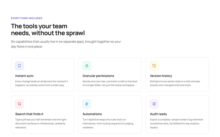
Three Column Icon Grid
OriginalA responsive icon grid that presents six product capabilities as scannable cards, each with an inline SVG icon, title and short description.
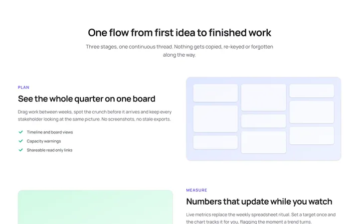
Alternating Media Rows
OriginalThree feature rows that alternate a text column with a CSS-built visual panel, walking the reader through a plan, measure and ship story.
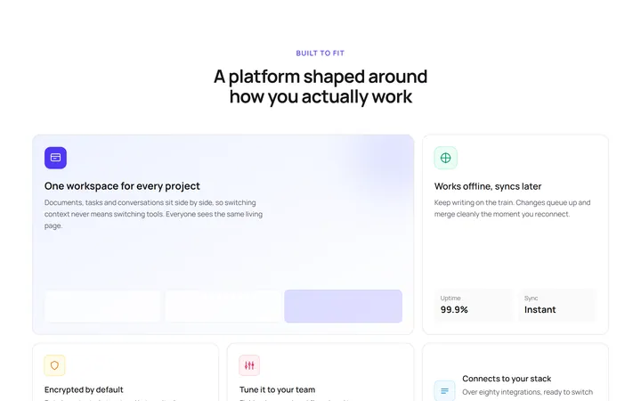
Bento Feature Grid
OriginalA bento-style grid mixing one large hero cell, a tall stat cell and several compact cards to give features a clear visual hierarchy.
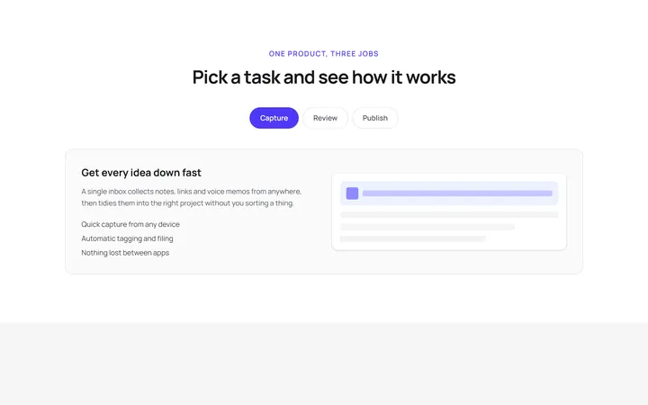
Tabbed Feature Switcher
OriginalA tabbed feature preview that switches panels using only native radio inputs and Tailwind peer variants, so it works with no JavaScript.
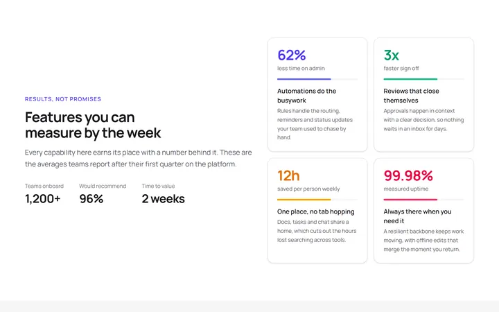
Stat Backed Features
OriginalA feature layout that pairs each capability with a headline metric, so every claim is anchored to a measurable result.
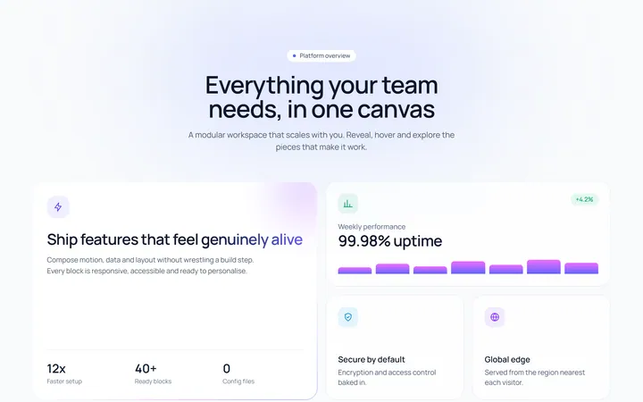
Scroll-reveal bento grid
OriginalAn asymmetric bento feature grid whose cards stagger into view on scroll, lift on hover and feature an animated conic gradient border, shimmering headline, growing bar chart and a masked marquee tag strip.
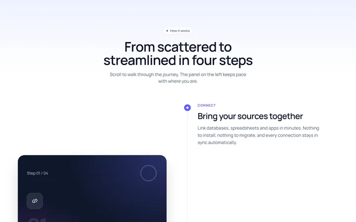
Sticky scroll steps
OriginalA scroll-linked how-it-works section where a sticky panel cross-fades between steps and a progress ring plus filling timeline track advance as you scroll through the process.
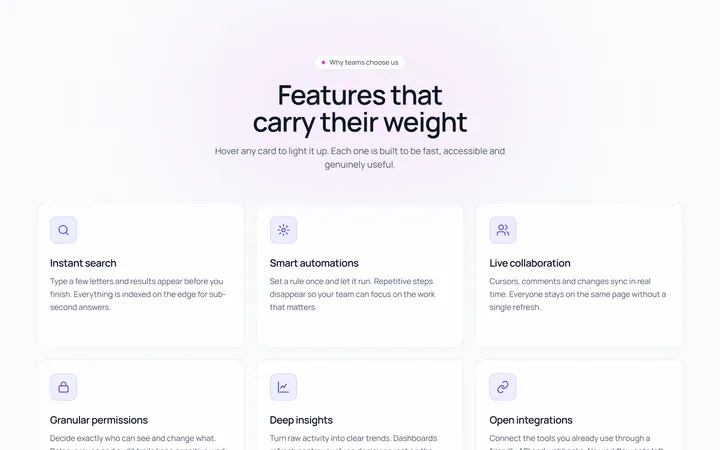
Spotlight hover feature cards
OriginalA responsive feature card grid where each card follows the cursor with a radial spotlight glow, lifts and rotates its icon on hover, reveals a call to action, and sits above a scrolling logo marquee.
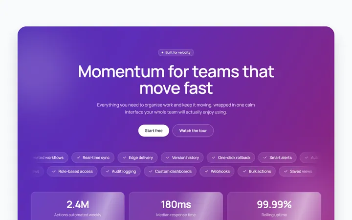
Animated marquee highlights band
OriginalA bold feature band with an animated gradient background, floating blurred orbs, blur-in staggered headline, two opposing marquee pill rows and shimmering stat cards.
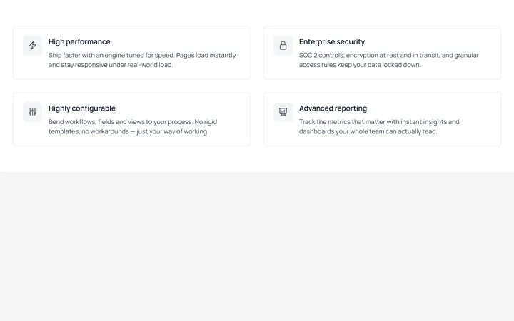
Bordered Feature Grid (2x2)
MITA two-column grid of bordered feature cards, each pairing an outlined icon with a title and supporting copy. Clean, enterprise-leaning layout with full dark-mode support.
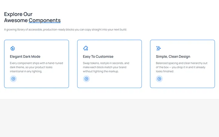
Outlined Feature Cards with CTA
MITA three-column feature section with heading and intro, plus blue-outlined cards that each carry an icon, description, and a circular arrow call-to-action. Fully theme-aware.
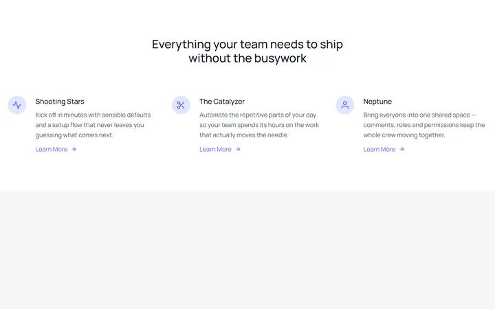
Icon-Left Feature List
MITA centered heading over a three-column feature list, each row leading with a rounded icon badge and a 'Learn More' link. Classic marketing feature block, ported with added dark variants.