

Hover-Reveal Bento Grid
MIT · attributedThe Magic UI bento pattern: a mixed-span grid of cards where the icon shrinks and the description lifts on hover to reveal a call-to-action. Self-contained (no framer-motion, no icon libs), pure CSS group-hover, with a glow background and full dark styling.
Copy prompt gives Claude Code, Cursor or v0 a ready-to-paste prompt that recreates this exact component.
npx shadcn@latest add https://webinnoventix.com/r/src-magicui-bento-grid.json/* Source: Magic UI — https://github.com/magicuidesign/magicui/blob/main/apps/www/registry/magicui/bento-grid.tsx — MIT. Included under its original licence. */
/* Copyright (c) Magic UI — MIT License. */
import type { ComponentPropsWithoutRef, ElementType, ReactNode } from "react";
function cn(...classes: (string | false | null | undefined)[]) {
return classes.filter(Boolean).join(" ");
}
function ArrowRightIcon({ className }: { className?: string }) {
return (
<svg
aria-hidden="true"
viewBox="0 0 24 24"
fill="none"
stroke="currentColor"
strokeWidth={2}
strokeLinecap="round"
strokeLinejoin="round"
className={className}
>
<path d="M5 12h14M13 6l6 6-6 6" />
</svg>
);
}
interface BentoGridProps extends ComponentPropsWithoutRef<"div"> {
children: ReactNode;
className?: string;
}
interface BentoCardProps extends ComponentPropsWithoutRef<"div"> {
name: string;
className: string;
background: ReactNode;
Icon: ElementType;
description: string;
href: string;
cta: string;
}
function BentoGrid({ children, className, ...props }: BentoGridProps) {
return (
<div
className={cn(
"grid w-full auto-rows-[22rem] grid-cols-3 gap-4",
className
)}
{...props}
>
{children}
</div>
);
}
function BentoCard({
name,
className,
background,
Icon,
description,
href,
cta,
...props
}: BentoCardProps) {
return (
<div
key={name}
className={cn(
"group relative col-span-3 flex flex-col justify-between overflow-hidden rounded-xl",
// light styles
"bg-white [box-shadow:0_0_0_1px_rgba(0,0,0,.03),0_2px_4px_rgba(0,0,0,.05),0_12px_24px_rgba(0,0,0,.05)]",
// dark styles
"transform-gpu dark:bg-zinc-950 dark:[border:1px_solid_rgba(255,255,255,.1)] dark:[box-shadow:0_-20px_80px_-20px_#ffffff1f_inset]",
className
)}
{...props}
>
<div>{background}</div>
<div className="pointer-events-none z-10 flex transform-gpu flex-col gap-1 p-6 transition-all duration-300 lg:group-hover:-translate-y-10">
<Icon className="h-12 w-12 origin-left transform-gpu text-neutral-700 transition-all duration-300 ease-in-out group-hover:scale-75 dark:text-neutral-300" />
<h3 className="text-xl font-semibold text-neutral-700 dark:text-neutral-300">
{name}
</h3>
<p className="max-w-lg text-neutral-400">{description}</p>
</div>
<div className="pointer-events-none absolute bottom-0 flex w-full translate-y-10 transform-gpu flex-row items-center p-6 opacity-0 transition-all duration-300 group-hover:translate-y-0 group-hover:opacity-100">
<a
href={href}
className="pointer-events-auto inline-flex items-center text-sm font-medium text-neutral-700 dark:text-neutral-300"
>
{cta}
<ArrowRightIcon className="ms-2 h-4 w-4" />
</a>
</div>
<div className="pointer-events-none absolute inset-0 transform-gpu transition-all duration-300 group-hover:bg-black/[.03] dark:group-hover:bg-neutral-800/10" />
</div>
);
}
function GridIcon({ className }: { className?: string }) {
return (
<svg
aria-hidden="true"
viewBox="0 0 24 24"
fill="none"
stroke="currentColor"
strokeWidth={1.6}
strokeLinecap="round"
strokeLinejoin="round"
className={className}
>
<rect x="3" y="3" width="7" height="7" rx="1.5" />
<rect x="14" y="3" width="7" height="7" rx="1.5" />
<rect x="14" y="14" width="7" height="7" rx="1.5" />
<rect x="3" y="14" width="7" height="7" rx="1.5" />
</svg>
);
}
function BellIcon({ className }: { className?: string }) {
return (
<svg
aria-hidden="true"
viewBox="0 0 24 24"
fill="none"
stroke="currentColor"
strokeWidth={1.6}
strokeLinecap="round"
strokeLinejoin="round"
className={className}
>
<path d="M6 8a6 6 0 0 1 12 0c0 7 3 9 3 9H3s3-2 3-9" />
<path d="M10.3 21a1.94 1.94 0 0 0 3.4 0" />
</svg>
);
}
function SearchIcon({ className }: { className?: string }) {
return (
<svg
aria-hidden="true"
viewBox="0 0 24 24"
fill="none"
stroke="currentColor"
strokeWidth={1.6}
strokeLinecap="round"
strokeLinejoin="round"
className={className}
>
<circle cx="11" cy="11" r="8" />
<path d="m21 21-4.3-4.3" />
</svg>
);
}
function CalendarIcon({ className }: { className?: string }) {
return (
<svg
aria-hidden="true"
viewBox="0 0 24 24"
fill="none"
stroke="currentColor"
strokeWidth={1.6}
strokeLinecap="round"
strokeLinejoin="round"
className={className}
>
<rect x="3" y="4" width="18" height="18" rx="2" />
<path d="M16 2v4M8 2v4M3 10h18" />
</svg>
);
}
const glow = (
<div
aria-hidden="true"
className="absolute -right-16 -top-16 h-56 w-56 rounded-full bg-gradient-to-br from-indigo-400/30 to-fuchsia-400/20 blur-2xl dark:from-indigo-500/20 dark:to-fuchsia-500/10"
/>
);
const features = [
{
Icon: GridIcon,
name: "Save your files",
description: "We automatically save your files as you type, everywhere.",
href: "#",
cta: "Learn more",
className: "lg:col-span-2 lg:row-start-1",
background: glow,
},
{
Icon: SearchIcon,
name: "Full-text search",
description: "Search through all your files in one place, instantly.",
href: "#",
cta: "Learn more",
className: "lg:col-span-1 lg:row-start-1",
background: glow,
},
{
Icon: BellIcon,
name: "Notifications",
description: "Get notified when something happens, on any device.",
href: "#",
cta: "Learn more",
className: "lg:col-span-1 lg:row-start-2",
background: glow,
},
{
Icon: CalendarIcon,
name: "Calendars",
description: "Use the calendar to filter your files by date and stay on track.",
href: "#",
cta: "Learn more",
className: "lg:col-span-2 lg:row-start-2",
background: glow,
},
];
export default function SrcMagicuiBentoGrid() {
return (
<section className="bg-white px-6 py-16 dark:bg-zinc-950 md:py-24">
<div className="mx-auto max-w-5xl">
<BentoGrid className="lg:grid-rows-2">
{features.map((feature) => (
<BentoCard key={feature.name} {...feature} />
))}
</BentoGrid>
</div>
</section>
);
}Dependencies
Licence
Magic UI (original) · Licensed under MIT.
Built by Web Innoventix
Need a custom interface, a full website, or SEO that gets you cited by AI? We design, build and rank it end to end.
Get a free quoteSimilar components
Browse all →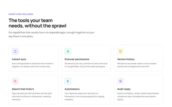
Three Column Icon Grid
OriginalA responsive icon grid that presents six product capabilities as scannable cards, each with an inline SVG icon, title and short description.
Alternating Media Rows
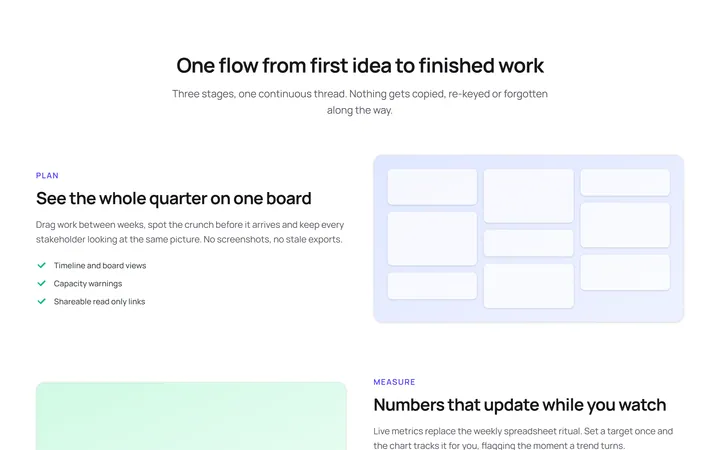
OriginalThree feature rows that alternate a text column with a CSS-built visual panel, walking the reader through a plan, measure and ship story.
Bento Feature Grid
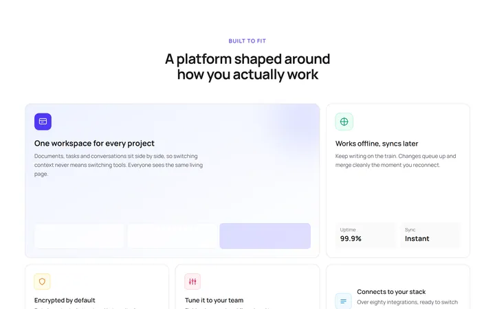
OriginalA bento-style grid mixing one large hero cell, a tall stat cell and several compact cards to give features a clear visual hierarchy.
Tabbed Feature Switcher
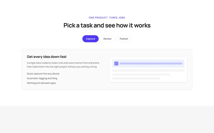
OriginalA tabbed feature preview that switches panels using only native radio inputs and Tailwind peer variants, so it works with no JavaScript.
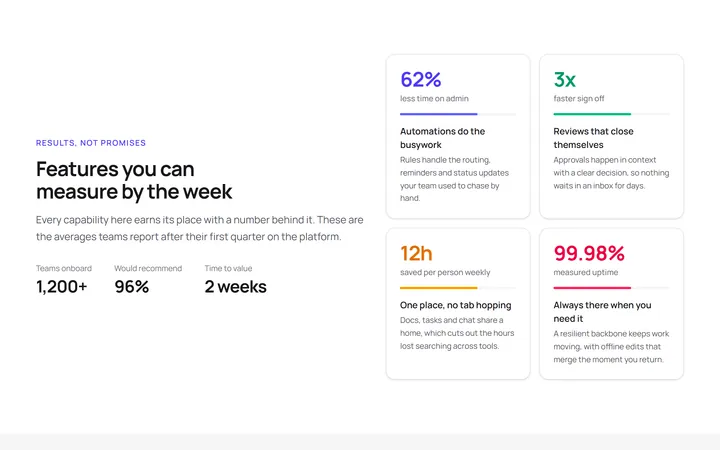
Stat Backed Features
OriginalA feature layout that pairs each capability with a headline metric, so every claim is anchored to a measurable result.
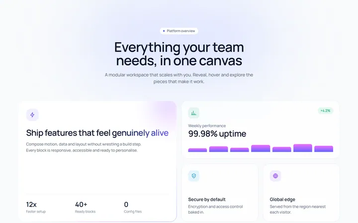
Scroll-reveal bento grid
OriginalAn asymmetric bento feature grid whose cards stagger into view on scroll, lift on hover and feature an animated conic gradient border, shimmering headline, growing bar chart and a masked marquee tag strip.
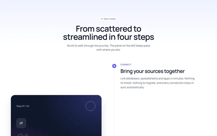
Sticky scroll steps
OriginalA scroll-linked how-it-works section where a sticky panel cross-fades between steps and a progress ring plus filling timeline track advance as you scroll through the process.
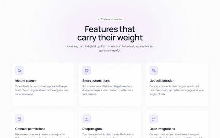
Spotlight hover feature cards
OriginalA responsive feature card grid where each card follows the cursor with a radial spotlight glow, lifts and rotates its icon on hover, reveals a call to action, and sits above a scrolling logo marquee.
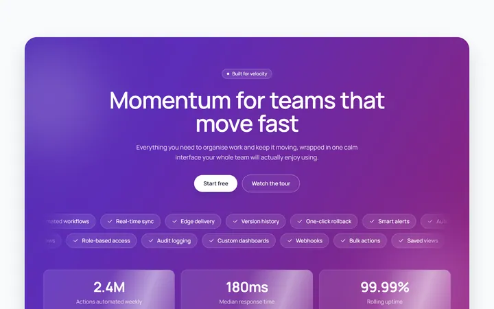
Animated marquee highlights band
OriginalA bold feature band with an animated gradient background, floating blurred orbs, blur-in staggered headline, two opposing marquee pill rows and shimmering stat cards.
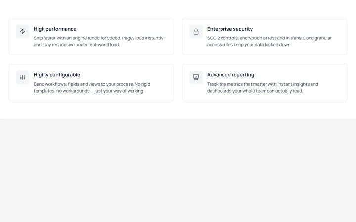
Bordered Feature Grid (2x2)
MITA two-column grid of bordered feature cards, each pairing an outlined icon with a title and supporting copy. Clean, enterprise-leaning layout with full dark-mode support.
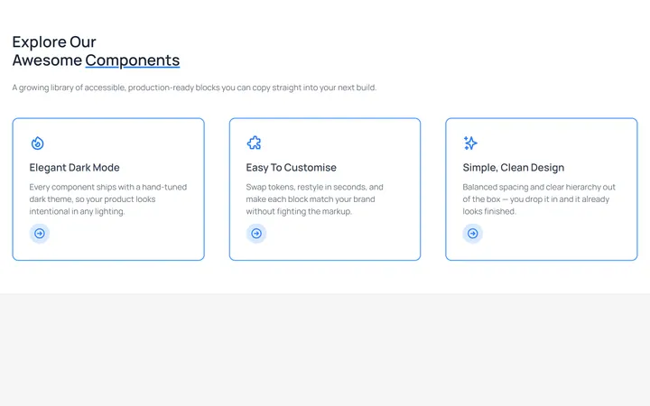
Outlined Feature Cards with CTA
MITA three-column feature section with heading and intro, plus blue-outlined cards that each carry an icon, description, and a circular arrow call-to-action. Fully theme-aware.
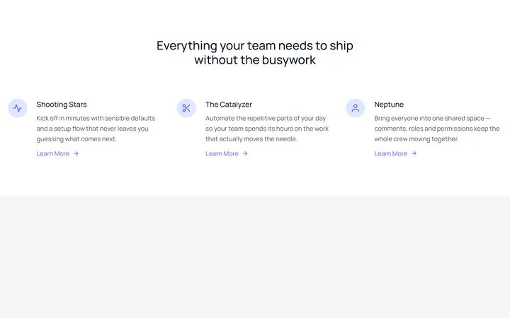
Icon-Left Feature List
MITA centered heading over a three-column feature list, each row leading with a rounded icon badge and a 'Learn More' link. Classic marketing feature block, ported with added dark variants.