

Multi Column Footer With Newsletter
Original · freeA brand block with an inline email newsletter signup sits beside three navigation columns, over a bottom bar with copyright and social icons.
Copy prompt gives Claude Code, Cursor or v0 a ready-to-paste prompt that recreates this exact component.
npx shadcn@latest add https://webinnoventix.com/r/footer-multi-column-newsletter.jsonexport default function FooterMultiColumnNewsletter() {
const columns = [
{
heading: "Product",
links: ["Features", "Integrations", "Pricing", "Changelog", "Roadmap"],
},
{
heading: "Company",
links: ["About us", "Careers", "Press kit", "Partners", "Contact"],
},
{
heading: "Resources",
links: ["Documentation", "Guides", "Help centre", "Community", "Status"],
},
];
return (
<section className="bg-white px-6 py-16 dark:bg-zinc-950 md:py-24">
<footer className="mx-auto max-w-6xl">
<div className="grid grid-cols-1 gap-12 lg:grid-cols-12">
<div className="lg:col-span-4">
<a href="#" className="inline-flex items-center gap-2" aria-label="Northwind home">
<span className="flex h-9 w-9 items-center justify-center rounded-lg bg-indigo-600 text-white">
<svg viewBox="0 0 24 24" fill="none" className="h-5 w-5" aria-hidden="true">
<path
d="M12 3 3 8.5v7L12 21l9-5.5v-7L12 3Z"
stroke="currentColor"
strokeWidth="1.6"
strokeLinejoin="round"
/>
<path d="M12 3v18M3 8.5 21 15.5M21 8.5 3 15.5" stroke="currentColor" strokeWidth="1.2" opacity="0.5" />
</svg>
</span>
<span className="text-lg font-bold tracking-tight text-zinc-900 dark:text-white">
Northwind
</span>
</a>
<p className="mt-4 max-w-sm text-sm leading-relaxed text-zinc-600 dark:text-zinc-400">
Tools that help small teams plan, build and ship without the busywork. Join the
newsletter for product tips, once a fortnight.
</p>
<form className="mt-6 flex max-w-sm flex-col gap-3 sm:flex-row" aria-label="Newsletter signup">
<label htmlFor="newsletter-email" className="sr-only">
Email address
</label>
<input
id="newsletter-email"
type="email"
required
placeholder="you@example.com"
className="min-w-0 flex-1 rounded-lg border border-zinc-300 bg-white px-3.5 py-2.5 text-sm text-zinc-900 placeholder:text-zinc-400 focus:border-indigo-500 focus:outline-none focus:ring-2 focus:ring-indigo-500/40 dark:border-zinc-700 dark:bg-zinc-900 dark:text-white dark:placeholder:text-zinc-500"
/>
<button
type="submit"
className="shrink-0 rounded-lg bg-zinc-900 px-4 py-2.5 text-sm font-semibold text-white transition hover:bg-zinc-700 dark:bg-white dark:text-zinc-900 dark:hover:bg-zinc-200"
>
Subscribe
</button>
</form>
</div>
<div className="grid grid-cols-2 gap-8 sm:grid-cols-3 lg:col-span-8">
{columns.map((col) => (
<nav key={col.heading} aria-label={col.heading}>
<h3 className="text-sm font-semibold text-zinc-900 dark:text-white">
{col.heading}
</h3>
<ul className="mt-4 space-y-3">
{col.links.map((link) => (
<li key={link}>
<a
href="#"
className="text-sm text-zinc-600 transition hover:text-indigo-600 dark:text-zinc-400 dark:hover:text-indigo-400"
>
{link}
</a>
</li>
))}
</ul>
</nav>
))}
</div>
</div>
<div className="mt-14 flex flex-col items-center justify-between gap-6 border-t border-zinc-200 pt-8 dark:border-zinc-800 sm:flex-row">
<p className="text-sm text-zinc-500 dark:text-zinc-500">
© {new Date().getFullYear()} Northwind Labs. All rights reserved.
</p>
<div className="flex items-center gap-4">
<a
href="#"
aria-label="Northwind on X"
className="text-zinc-500 transition hover:text-zinc-900 dark:text-zinc-400 dark:hover:text-white"
>
<svg viewBox="0 0 24 24" fill="currentColor" className="h-5 w-5" aria-hidden="true">
<path d="M17.5 3h3.2l-7 8 8.2 10.9h-6.4l-5-6.6-5.8 6.6H1.5l7.5-8.6L1 3h6.6l4.5 6 5.4-6Zm-1.1 16.9h1.8L7.7 4.8H5.8l10.6 15.1Z" />
</svg>
</a>
<a
href="#"
aria-label="Northwind on GitHub"
className="text-zinc-500 transition hover:text-zinc-900 dark:text-zinc-400 dark:hover:text-white"
>
<svg viewBox="0 0 24 24" fill="currentColor" className="h-5 w-5" aria-hidden="true">
<path
fillRule="evenodd"
clipRule="evenodd"
d="M12 2C6.48 2 2 6.58 2 12.25c0 4.53 2.87 8.37 6.85 9.73.5.1.68-.22.68-.49 0-.24-.01-.87-.01-1.71-2.79.62-3.38-1.38-3.38-1.38-.45-1.19-1.11-1.5-1.11-1.5-.91-.64.07-.63.07-.63 1.01.07 1.54 1.06 1.54 1.06.9 1.58 2.36 1.12 2.93.86.09-.67.35-1.12.63-1.38-2.22-.26-4.56-1.14-4.56-5.07 0-1.12.39-2.03 1.03-2.75-.1-.26-.45-1.3.1-2.71 0 0 .84-.28 2.75 1.05a9.32 9.32 0 0 1 5 0c1.91-1.33 2.75-1.05 2.75-1.05.55 1.41.2 2.45.1 2.71.64.72 1.03 1.63 1.03 2.75 0 3.94-2.34 4.81-4.57 5.06.36.32.68.94.68 1.9 0 1.37-.01 2.48-.01 2.82 0 .27.18.6.69.49A10.03 10.03 0 0 0 22 12.25C22 6.58 17.52 2 12 2Z"
/>
</svg>
</a>
<a
href="#"
aria-label="Northwind on LinkedIn"
className="text-zinc-500 transition hover:text-zinc-900 dark:text-zinc-400 dark:hover:text-white"
>
<svg viewBox="0 0 24 24" fill="currentColor" className="h-5 w-5" aria-hidden="true">
<path d="M4.98 3.5a2.5 2.5 0 1 0 0 5 2.5 2.5 0 0 0 0-5ZM3 9h4v12H3V9Zm6 0h3.8v1.7h.05c.53-1 1.83-2.05 3.77-2.05C20.6 8.65 22 10.3 22 13.6V21h-4v-6.6c0-1.57-.03-3.6-2.2-3.6-2.2 0-2.54 1.72-2.54 3.49V21H9V9Z" />
</svg>
</a>
</div>
</div>
</footer>
</section>
);
}Dependencies
Licence
Built by Web Innoventix. Free for personal and commercial use, no attribution required.
Built by Web Innoventix
Need a custom interface, a full website, or SEO that gets you cited by AI? We design, build and rank it end to end.
Get a free quoteSimilar components
Browse all →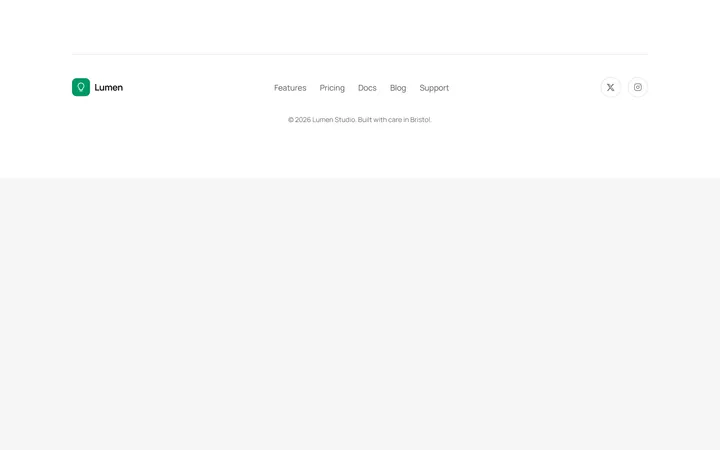
Minimal Single Row Footer
OriginalA compact single-row footer that centres a wordmark, inline link list and social icons above a slim copyright line.
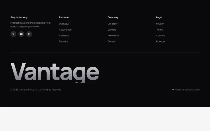
Dark Footer With Oversized Brand
OriginalA dark footer pairing four compact link columns with an oversized gradient brand wordmark and a live status indicator.
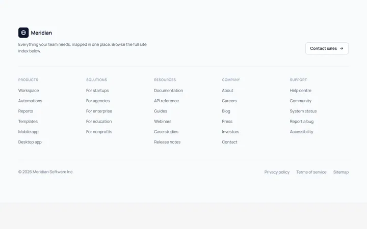
Sitemap Style Footer
OriginalA five-column sitemap-style footer with a brand intro and contact CTA above a full site index and a legal bottom bar.

Spotlight Hero
OriginalA centred hero with a soft radial spotlight, badge and dual call-to-action.

Split Hero
OriginalA two-column hero pairing a headline and CTAs with a product mock and social proof.

Gradient Spotlight Hero
OriginalA minimal centred hero with a soft gradient-mesh backdrop, announcement pill and dual call-to-action buttons.

App Preview Hero
OriginalA centred hero that pairs headline copy with a realistic product dashboard mock built entirely from markup, complete with browser chrome and a floating notification card.

Waitlist Capture Hero
OriginalA dark, focused hero with an inline email capture form and avatar social proof, ready for pre-launch waitlists.

Image Backdrop Hero
OriginalA cinematic full-bleed hero with a layered image-style backdrop, overlaid left-aligned copy and a trusted-by logos strip.
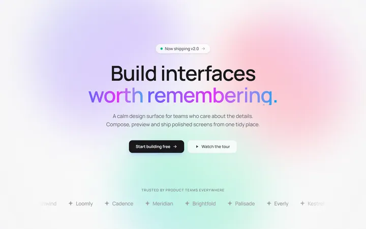
Gradient Mesh Hero with Staggered Text Reveal
OriginalA full-screen hero pairing a drifting animated gradient-mesh backdrop with a word-by-word staggered blur-in headline and a logo marquee under the fold.
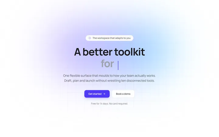
Typewriter Rotating Words Hero
OriginalA hero whose headline cycles through rotating words with a live typewriter caret over an animated grid backdrop, degrading to a gentle word swap when reduced motion is on.
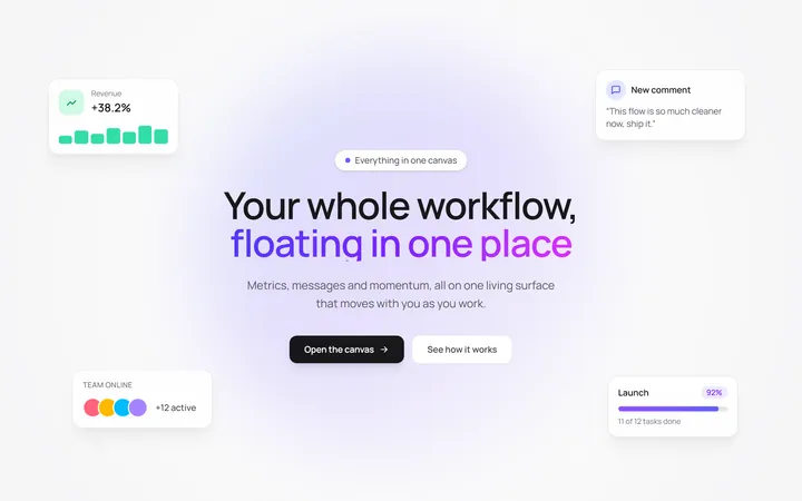
Floating UI Cards Hero with Mouse Parallax
OriginalA hero with glassy floating UI cards that drift continuously and shift on mouse-parallax depth around a staggered centre headline.