

Hover Zoom Out Effect
Original · freeImage starts zoomed and settles to normal on hover.
Copy prompt gives Claude Code, Cursor or v0 a ready-to-paste prompt that recreates this exact component.
npx shadcn@latest add https://webinnoventix.com/r/imgfx-hover-zoom-out.json"use client";
import { useId } from "react";
type ZoomShot = {
src: string;
alt: string;
caption: string;
};
const SHOTS: ZoomShot[] = [
{
src: "/img/gallery/g07.webp",
alt: "Mountain ridge softening into layered morning haze",
caption: "Ridgeline, first light",
},
{
src: "/img/gallery/g19.webp",
alt: "Quiet city street framed by tall shadowed buildings",
caption: "Downtown, empty hour",
},
{
src: "/img/gallery/g28.webp",
alt: "Still lake reflecting a pale overcast sky",
caption: "Lake, no wind",
},
];
export default function ImgfxHoverZoomOut() {
const uid = useId().replace(/[^a-zA-Z0-9]/g, "");
const prefix = `hzo-${uid}`;
return (
<section className="relative w-full overflow-hidden bg-neutral-50 px-6 py-20 sm:px-10 sm:py-28 dark:bg-neutral-950">
<style>{`
.${prefix}-frame {
overflow: hidden;
}
.${prefix}-img {
transform: scale(1.42);
transition:
transform 900ms cubic-bezier(0.16, 1, 0.3, 1),
filter 900ms cubic-bezier(0.16, 1, 0.3, 1);
will-change: transform;
filter: saturate(1.06);
}
.${prefix}-frame:hover .${prefix}-img,
.${prefix}-frame:focus-within .${prefix}-img {
transform: scale(1);
filter: saturate(1);
}
@media (prefers-reduced-motion: reduce) {
.${prefix}-img {
transform: none;
filter: none;
transition: none;
}
}
`}</style>
<div className="mx-auto max-w-6xl">
<div className="mb-12 text-center">
<p className="mb-3 text-xs font-semibold uppercase tracking-[0.28em] text-indigo-600 dark:text-indigo-400">
Image Effect / Hover Zoom-Out
</p>
<h2 className="text-balance text-3xl font-semibold tracking-tight text-neutral-900 sm:text-4xl dark:text-neutral-50">
Overzoomed until you look closer
</h2>
<p className="mx-auto mt-4 max-w-xl text-pretty text-sm leading-relaxed text-neutral-600 dark:text-neutral-400">
Each frame loads pushed in tight, then eases back to its true crop the
moment you hover or focus it. Hover to reveal the full scene.
</p>
</div>
<div className="grid grid-cols-1 gap-6 sm:grid-cols-2 lg:grid-cols-3">
{SHOTS.map((shot, i) => (
<figure
key={shot.src}
tabIndex={0}
className={`${prefix}-frame group relative aspect-[4/5] rounded-2xl bg-neutral-200 shadow-sm outline-none ring-1 ring-neutral-900/5 transition-shadow duration-500 hover:shadow-xl focus-visible:ring-2 focus-visible:ring-indigo-500 dark:bg-neutral-800 dark:ring-white/10`}
>
{/* eslint-disable-next-line @next/next/no-img-element */}
<img
src={shot.src}
alt={shot.alt}
loading="lazy"
draggable={false}
className={`${prefix}-img h-full w-full rounded-2xl object-cover`}
/>
<figcaption className="pointer-events-none absolute inset-x-0 bottom-0 flex items-center justify-between rounded-b-2xl bg-gradient-to-t from-neutral-950/70 via-neutral-950/20 to-transparent px-4 py-3">
<span className="text-sm font-medium text-white drop-shadow">
{shot.caption}
</span>
<span className="rounded-full bg-white/15 px-2 py-0.5 text-[11px] font-medium uppercase tracking-wider text-white/90 backdrop-blur-sm">
{String(i + 1).padStart(2, "0")}
</span>
</figcaption>
</figure>
))}
</div>
<p className="mt-8 text-center text-xs text-neutral-500 dark:text-neutral-500">
Pure CSS transform · keyboard focusable · respects reduced-motion
</p>
</div>
</section>
);
}Dependencies
Licence
Built by Web Innoventix. Free for personal and commercial use, no attribution required.
Built by Web Innoventix
Need a custom interface, a full website, or SEO that gets you cited by AI? We design, build and rank it end to end.
Get a free quoteSimilar components
Browse all →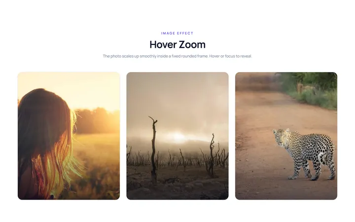
Hover Zoom Effect
OriginalImage zooms in smoothly inside a fixed rounded frame on hover.
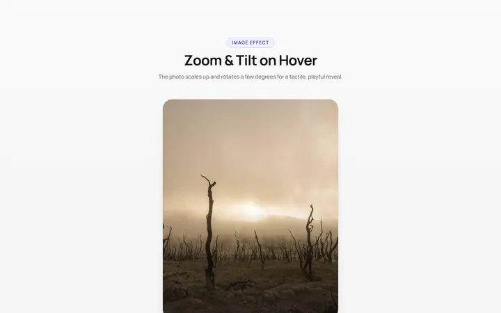
Zoom Rotate Effect
OriginalImage zooms and rotates slightly on hover.
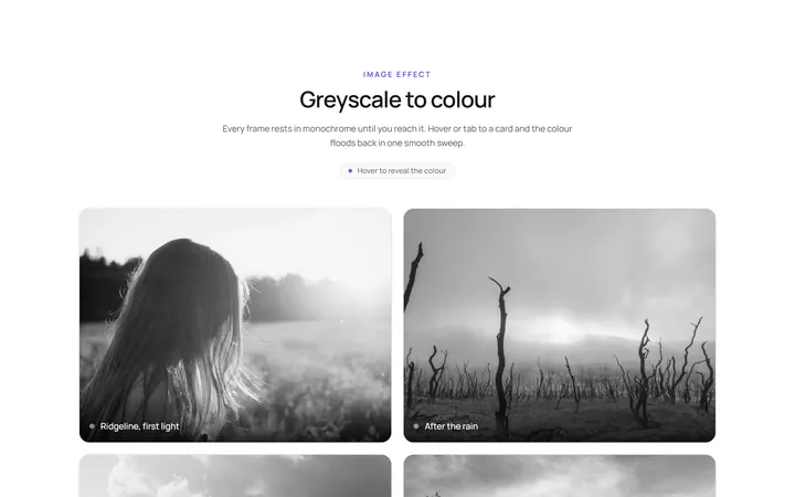
Grayscale Color Effect
OriginalGreyscale image turns to full colour on hover.
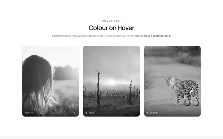
Color Grayscale Effect
OriginalFull-colour image fades to greyscale on hover.
Blur Sharp Effect
OriginalBlurred image sharpens on hover.
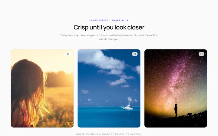
Sharp Blur Effect
OriginalSharp image blurs with a caption appearing on hover.
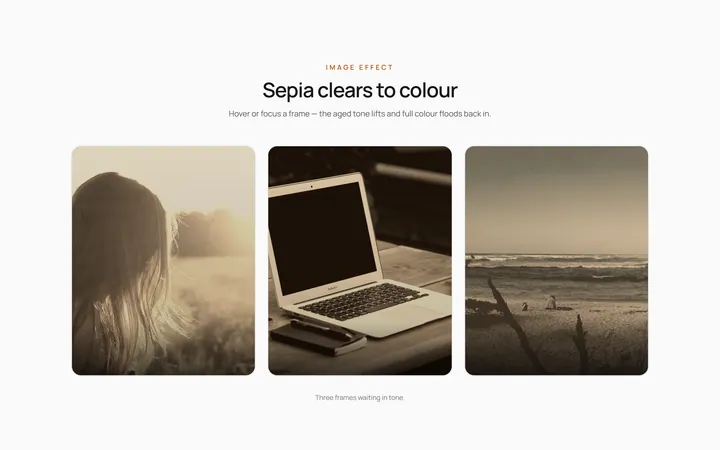
Sepia Clear Effect
OriginalSepia-toned image clears to full colour on hover.
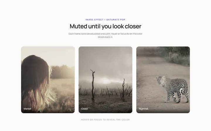
Saturate Pop Effect
OriginalMuted image saturates and pops on hover.
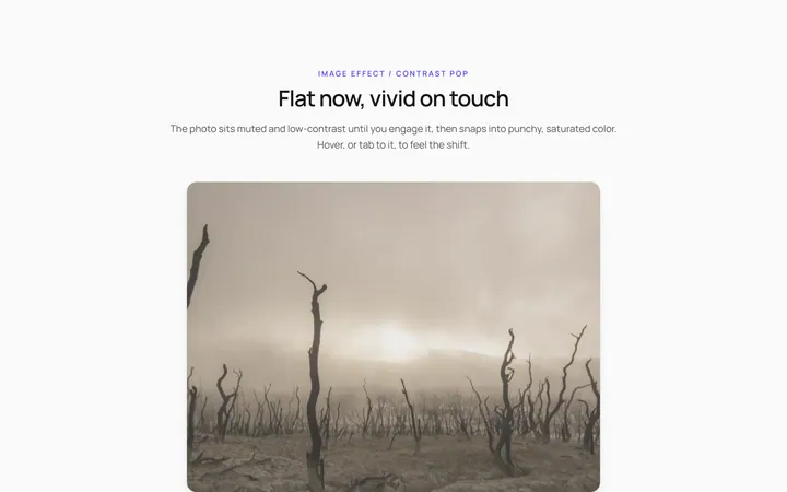
Contrast Pop Effect
OriginalLow-contrast image gains punchy contrast on hover.
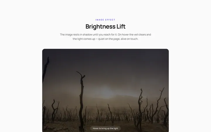
Brightness Lift Effect
OriginalDim image brightens on hover.
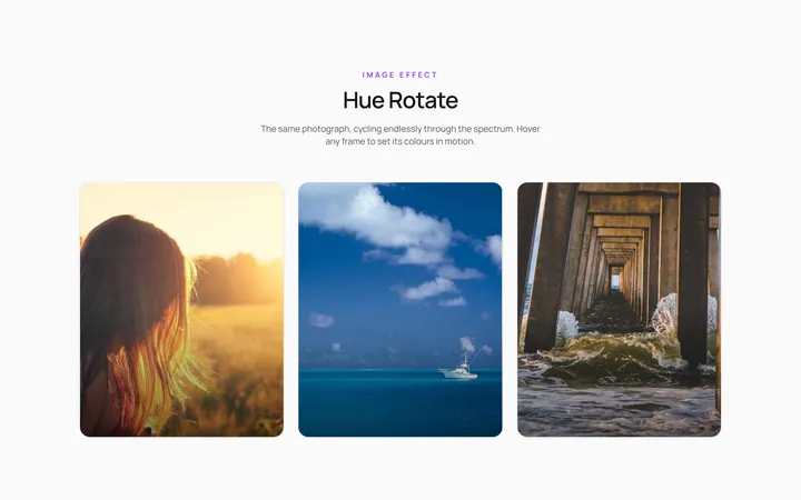
Hue Rotate Effect
OriginalImage hue-shifts through colours on hover.
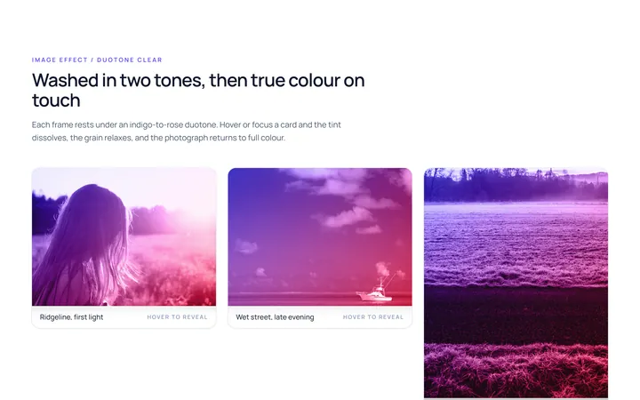
Duotone Clear Effect
OriginalDuotone-washed image clears to colour on hover.