

Media Mini Player
Original · freecompact sticky mini player
Copy prompt gives Claude Code, Cursor or v0 a ready-to-paste prompt that recreates this exact component.
npx shadcn@latest add https://webinnoventix.com/r/media-mini-player.json"use client";
import type { CSSProperties } from "react";
import { useCallback, useEffect, useId, useMemo, useRef, useState } from "react";
import { AnimatePresence, motion, useReducedMotion } from "motion/react";
type Episode = {
id: string;
number: number;
title: string;
guest: string;
role: string;
duration: number;
published: string;
summary: string;
art: string;
};
type CssVars = CSSProperties & Record<string, string | number>;
type IconProps = { className?: string };
const EPISODES: Episode[] = [
{
id: "ep-41",
number: 41,
title: "The Design System Nobody Asked For",
guest: "Priya Raghunathan",
role: "Staff engineer, Kestrel Health",
duration: 2538,
published: "14 Jul 2026",
summary:
"Three teams, four button components, and the quiet politics of getting anyone to adopt the fifth one.",
art: "from-indigo-500 via-violet-500 to-sky-400",
},
{
id: "ep-40",
number: 40,
title: "Shipping at 2am: A Postmortem",
guest: "Tomas Lindqvist",
role: "Platform lead, Northbeam",
duration: 1974,
published: "7 Jul 2026",
summary:
"A rollback that took eleven minutes and a retro that took eleven weeks. What the incident doc left out.",
art: "from-rose-500 via-amber-400 to-orange-400",
},
{
id: "ep-39",
number: 39,
title: "Your Tokens Are Lying to You",
guest: "Amara Boateng",
role: "Design systems architect, Lumen",
duration: 2211,
published: "30 Jun 2026",
summary:
"Semantic naming survives exactly until the first marketing page. A field guide to token drift.",
art: "from-emerald-500 via-teal-400 to-sky-500",
},
{
id: "ep-38",
number: 38,
title: "Why We Deleted 400 Components",
guest: "Joon-ho Park",
role: "Principal engineer, Farrow",
duration: 2874,
published: "23 Jun 2026",
summary:
"The audit found 612 components. Only 90 shipped to production twice. Here is how the cut went.",
art: "from-sky-500 via-indigo-500 to-violet-500",
},
{
id: "ep-37",
number: 37,
title: "The Accessibility Debt Ledger",
guest: "Rafael Duarte",
role: "Accessibility practice lead, Vantis",
duration: 2405,
published: "16 Jun 2026",
summary:
"Treating contrast failures and focus traps like interest-bearing debt, with a real repayment schedule.",
art: "from-amber-400 via-rose-400 to-violet-500",
},
{
id: "ep-36",
number: 36,
title: "Dark Mode Was a Mistake (We Did It Anyway)",
guest: "Ingrid Sorensen",
role: "Product designer, Halden Labs",
duration: 1806,
published: "9 Jun 2026",
summary:
"Two themes means two of every bug. A candid look at the maintenance bill nobody forecasts.",
art: "from-violet-500 via-indigo-500 to-emerald-400",
},
];
const SPEEDS = [0.75, 1, 1.25, 1.5, 2] as const;
const MMP_CSS = `
.mmp-scope { --mmp-accent: #6366f1; --mmp-track: rgba(148,163,184,0.38); }
.mmp-range { -webkit-appearance: none; appearance: none; width: 100%; background: transparent; cursor: pointer; }
.mmp-range:focus { outline: none; }
.mmp-range::-webkit-slider-runnable-track { height: 6px; border-radius: 999px; background: linear-gradient(to right, var(--mmp-accent) 0 var(--mmp-pos, 0%), var(--mmp-track) var(--mmp-pos, 0%) 100%); }
.mmp-range::-webkit-slider-thumb { -webkit-appearance: none; appearance: none; height: 14px; width: 14px; margin-top: -4px; border-radius: 999px; background: #ffffff; border: 2px solid var(--mmp-accent); box-shadow: 0 1px 3px rgba(2,6,23,0.45); transition: transform 140ms ease; }
.mmp-range:hover::-webkit-slider-thumb, .mmp-range:focus-visible::-webkit-slider-thumb, .mmp-range:active::-webkit-slider-thumb { transform: scale(1.24); }
.mmp-range::-moz-range-track { height: 6px; border-radius: 999px; background: var(--mmp-track); }
.mmp-range::-moz-range-progress { height: 6px; border-radius: 999px; background: var(--mmp-accent); }
.mmp-range::-moz-range-thumb { height: 12px; width: 12px; border-radius: 999px; background: #ffffff; border: 2px solid var(--mmp-accent); box-shadow: 0 1px 3px rgba(2,6,23,0.45); transition: transform 140ms ease; }
.mmp-range:hover::-moz-range-thumb, .mmp-range:focus-visible::-moz-range-thumb, .mmp-range:active::-moz-range-thumb { transform: scale(1.24); }
@keyframes mmp-eq-bounce { 0%, 100% { transform: scaleY(0.26); } 50% { transform: scaleY(1); } }
@keyframes mmp-art-sheen { 0% { transform: translateX(-140%) skewX(-18deg); } 60%, 100% { transform: translateX(260%) skewX(-18deg); } }
@keyframes mmp-dock-rise { from { opacity: 0; transform: translateY(16px); } to { opacity: 1; transform: none; } }
.mmp-eq-bar { transform-origin: bottom; animation: mmp-eq-bounce 900ms ease-in-out infinite; }
.mmp-art-sheen { animation: mmp-art-sheen 2800ms ease-in-out infinite; }
.mmp-dock { animation: mmp-dock-rise 460ms cubic-bezier(0.22, 1, 0.36, 1) both; }
@media (prefers-reduced-motion: reduce) {
.mmp-eq-bar, .mmp-art-sheen, .mmp-dock { animation: none !important; }
.mmp-range::-webkit-slider-thumb, .mmp-range::-moz-range-thumb { transition: none !important; }
}
`;
function formatTime(seconds: number): string {
const safe = Math.max(0, Math.floor(seconds));
const m = Math.floor(safe / 60);
const s = safe % 60;
return `${m}:${s.toString().padStart(2, "0")}`;
}
function spokenTime(seconds: number): string {
const safe = Math.max(0, Math.floor(seconds));
const m = Math.floor(safe / 60);
const s = safe % 60;
return `${m} minute${m === 1 ? "" : "s"} ${s} second${s === 1 ? "" : "s"}`;
}
function PlayIcon({ className }: IconProps) {
return (
<svg viewBox="0 0 24 24" fill="currentColor" aria-hidden="true" className={className}>
<path d="M8 5.14v13.72a1 1 0 0 0 1.53.85l10.72-6.86a1 1 0 0 0 0-1.7L9.53 4.29A1 1 0 0 0 8 5.14Z" />
</svg>
);
}
function PauseIcon({ className }: IconProps) {
return (
<svg viewBox="0 0 24 24" fill="currentColor" aria-hidden="true" className={className}>
<rect x="6.5" y="4.5" width="4" height="15" rx="1.4" />
<rect x="13.5" y="4.5" width="4" height="15" rx="1.4" />
</svg>
);
}
function SkipBackIcon({ className }: IconProps) {
return (
<svg viewBox="0 0 24 24" fill="currentColor" aria-hidden="true" className={className}>
<path d="M19 5.7v12.6a1 1 0 0 1-1.55.83l-9.3-6.3a1 1 0 0 1 0-1.66l9.3-6.3A1 1 0 0 1 19 5.7Z" />
<rect x="4" y="5" width="2.6" height="14" rx="1.3" />
</svg>
);
}
function SkipForwardIcon({ className }: IconProps) {
return (
<svg viewBox="0 0 24 24" fill="currentColor" aria-hidden="true" className={className}>
<path d="M5 5.7v12.6a1 1 0 0 0 1.55.83l9.3-6.3a1 1 0 0 0 0-1.66l-9.3-6.3A1 1 0 0 0 5 5.7Z" />
<rect x="17.4" y="5" width="2.6" height="14" rx="1.3" />
</svg>
);
}
function ChevronIcon({ className }: IconProps) {
return (
<svg
viewBox="0 0 24 24"
fill="none"
stroke="currentColor"
strokeWidth="2"
strokeLinecap="round"
strokeLinejoin="round"
aria-hidden="true"
className={className}
>
<path d="m6 9 6 6 6-6" />
</svg>
);
}
function VolumeIcon({ className, muted }: IconProps & { muted: boolean }) {
return (
<svg viewBox="0 0 24 24" fill="none" aria-hidden="true" className={className}>
<path
d="M11 5.2 6.8 8.6H4a1 1 0 0 0-1 1v4.8a1 1 0 0 0 1 1h2.8L11 18.8a1 1 0 0 0 1.6-.8V6a1 1 0 0 0-1.6-.8Z"
fill="currentColor"
/>
{muted ? (
<g stroke="currentColor" strokeWidth="1.8" strokeLinecap="round">
<path d="m16.5 9.5 5 5" />
<path d="m21.5 9.5-5 5" />
</g>
) : (
<g stroke="currentColor" strokeWidth="1.8" strokeLinecap="round">
<path d="M15.8 9.4a3.8 3.8 0 0 1 0 5.2" />
<path d="M18.6 6.9a7.6 7.6 0 0 1 0 10.2" />
</g>
)}
</svg>
);
}
function BroadcastIcon({ className }: IconProps) {
return (
<svg
viewBox="0 0 24 24"
fill="none"
stroke="currentColor"
strokeWidth="1.8"
strokeLinecap="round"
aria-hidden="true"
className={className}
>
<circle cx="12" cy="12" r="2.2" fill="currentColor" stroke="none" />
<path d="M8.4 8.4a5 5 0 0 0 0 7.2" />
<path d="M15.6 8.4a5 5 0 0 1 0 7.2" />
<path d="M5.6 5.6a9 9 0 0 0 0 12.8" />
<path d="M18.4 5.6a9 9 0 0 1 0 12.8" />
</svg>
);
}
function Equalizer({ playing }: { playing: boolean }) {
const bars = [0, 1, 2, 3];
const delays = ["0ms", "180ms", "90ms", "260ms"];
const heights = ["h-2.5", "h-4", "h-3", "h-3.5"];
return (
<span className="flex h-4 items-end gap-[2px]" aria-hidden="true">
{bars.map((b) => (
<span
key={b}
className={`${heights[b]} w-[2px] rounded-full bg-white ${playing ? "mmp-eq-bar" : ""}`}
style={
playing
? { animationDelay: delays[b] }
: { transform: "scaleY(0.3)", transformOrigin: "bottom" }
}
/>
))}
</span>
);
}
export default function MediaMiniPlayer() {
const reduceMotion = useReducedMotion();
const panelId = useId();
const [index, setIndex] = useState<number>(0);
const [isPlaying, setIsPlaying] = useState<boolean>(false);
const [elapsed, setElapsed] = useState<number>(0);
const [volume, setVolume] = useState<number>(65);
const [lastVolume, setLastVolume] = useState<number>(65);
const [speedIndex, setSpeedIndex] = useState<number>(1);
const [expanded, setExpanded] = useState<boolean>(false);
const [scrubbing, setScrubbing] = useState<boolean>(false);
const episode = EPISODES[index];
const speed = SPEEDS[speedIndex];
const muted = volume === 0;
const progress = episode.duration > 0 ? elapsed / episode.duration : 0;
const endedRef = useRef<boolean>(false);
const goTo = useCallback((next: number, autoplay: boolean) => {
const total = EPISODES.length;
setIndex(((next % total) + total) % total);
setElapsed(0);
endedRef.current = false;
if (autoplay) setIsPlaying(true);
}, []);
const playNext = useCallback(() => {
goTo(index + 1, true);
}, [goTo, index]);
const playPrev = useCallback(() => {
if (elapsed > 3) {
setElapsed(0);
endedRef.current = false;
return;
}
goTo(index - 1, isPlaying);
}, [elapsed, goTo, index, isPlaying]);
const selectEpisode = useCallback(
(i: number) => {
if (i === index) {
setIsPlaying((p) => !p);
return;
}
goTo(i, true);
},
[goTo, index]
);
const toggleMute = useCallback(() => {
if (volume === 0) {
setVolume(lastVolume === 0 ? 55 : lastVolume);
return;
}
setLastVolume(volume);
setVolume(0);
}, [lastVolume, volume]);
useEffect(() => {
if (!isPlaying || scrubbing) return;
let frame = 0;
let last = performance.now();
const tick = (now: number) => {
const delta = (now - last) / 1000;
last = now;
setElapsed((current) => {
const advanced = current + delta * speed;
return advanced >= episode.duration ? episode.duration : advanced;
});
frame = requestAnimationFrame(tick);
};
frame = requestAnimationFrame(tick);
return () => cancelAnimationFrame(frame);
}, [isPlaying, scrubbing, speed, episode.duration]);
useEffect(() => {
if (!isPlaying) return;
if (elapsed < episode.duration) {
endedRef.current = false;
return;
}
if (endedRef.current) return;
endedRef.current = true;
playNext();
}, [elapsed, episode.duration, isPlaying, playNext]);
const upNext = useMemo(
() =>
Array.from({ length: EPISODES.length - 1 }, (_, i) => {
const at = (index + 1 + i) % EPISODES.length;
return { at, episode: EPISODES[at] };
}),
[index]
);
const seekStyle: CssVars = { "--mmp-pos": `${Math.min(100, progress * 100)}%` };
const volumeStyle: CssVars = { "--mmp-pos": `${volume}%` };
const focusRing =
"focus-visible:outline-none focus-visible:ring-2 focus-visible:ring-indigo-500 focus-visible:ring-offset-2 focus-visible:ring-offset-white dark:focus-visible:ring-offset-slate-900";
return (
<section className="mmp-scope relative w-full bg-slate-50 py-16 sm:py-24 dark:bg-slate-950">
<style>{MMP_CSS}</style>
<div
aria-hidden="true"
className="pointer-events-none absolute inset-x-0 top-0 h-72 bg-[radial-gradient(60%_100%_at_50%_0%,rgba(99,102,241,0.14),transparent_70%)] dark:bg-[radial-gradient(60%_100%_at_50%_0%,rgba(99,102,241,0.22),transparent_70%)]"
/>
<div className="relative mx-auto w-full max-w-4xl px-4 sm:px-6">
<span className="inline-flex items-center gap-2 rounded-full border border-indigo-200 bg-white px-3 py-1 text-xs font-semibold text-indigo-700 dark:border-indigo-500/30 dark:bg-indigo-500/10 dark:text-indigo-300">
<BroadcastIcon className="h-3.5 w-3.5" />
Season 4 · New episodes Tuesdays
</span>
<h2 className="mt-5 text-3xl font-semibold tracking-tight text-slate-900 sm:text-4xl dark:text-slate-50">
Signal & Noise
</h2>
<p className="mt-3 max-w-xl text-base leading-relaxed text-slate-600 dark:text-slate-400">
Long conversations with the people who maintain the boring parts of the
web — design systems, incident channels, and the tickets nobody puts on
a roadmap. Start an episode and the player docks to the bottom while you
keep browsing the archive.
</p>
<ol className="mt-10 space-y-2.5">
{EPISODES.map((ep, i) => {
const active = i === index;
const activePlaying = active && isPlaying;
return (
<li key={ep.id}>
<button
type="button"
onClick={() => selectEpisode(i)}
aria-current={active ? "true" : undefined}
aria-label={`${activePlaying ? "Pause" : "Play"} episode ${ep.number}, ${ep.title}, ${spokenTime(ep.duration)}`}
className={`group flex w-full items-start gap-4 rounded-2xl border p-3 text-left transition-colors sm:p-4 ${focusRing} ${
active
? "border-indigo-300 bg-white shadow-sm shadow-indigo-500/5 dark:border-indigo-500/40 dark:bg-slate-900"
: "border-slate-200 bg-white/60 hover:border-slate-300 hover:bg-white dark:border-slate-800 dark:bg-slate-900/40 dark:hover:border-slate-700 dark:hover:bg-slate-900"
}`}
>
<span
className={`relative grid h-14 w-14 shrink-0 place-items-center overflow-hidden rounded-xl bg-gradient-to-br ${ep.art}`}
>
{activePlaying ? (
<Equalizer playing />
) : (
<PlayIcon className="h-4 w-4 translate-x-[1px] text-white/95" />
)}
{activePlaying ? (
<span className="mmp-art-sheen pointer-events-none absolute inset-y-0 -left-6 w-6 bg-white/35 blur-[2px]" />
) : null}
</span>
<span className="min-w-0 flex-1">
<span className="flex flex-wrap items-baseline gap-x-2">
<span className="text-[11px] font-semibold uppercase tracking-wider text-slate-400 dark:text-slate-500">
Ep {ep.number}
</span>
<span
className={`text-[15px] font-semibold leading-snug ${
active
? "text-indigo-700 dark:text-indigo-300"
: "text-slate-900 dark:text-slate-100"
}`}
>
{ep.title}
</span>
</span>
<span className="mt-1 block text-sm leading-relaxed text-slate-600 dark:text-slate-400">
{ep.summary}
</span>
<span className="mt-2 block text-xs text-slate-500 dark:text-slate-500">
{ep.guest} · {ep.role} · {ep.published} ·{" "}
<span className="tabular-nums">{formatTime(ep.duration)}</span>
</span>
</span>
</button>
</li>
);
})}
</ol>
</div>
<div className="sticky bottom-4 z-30 mx-auto mt-10 w-full max-w-3xl px-4 sm:bottom-6 sm:px-6">
<div className="mmp-dock overflow-hidden rounded-2xl border border-slate-200/90 bg-white/85 shadow-xl shadow-slate-900/10 backdrop-blur-xl dark:border-slate-800 dark:bg-slate-900/85 dark:shadow-black/40">
<AnimatePresence initial={false}>
{expanded ? (
<motion.div
key="panel"
id={panelId}
initial={reduceMotion ? { opacity: 0 } : { height: 0, opacity: 0 }}
animate={reduceMotion ? { opacity: 1 } : { height: "auto", opacity: 1 }}
exit={reduceMotion ? { opacity: 0 } : { height: 0, opacity: 0 }}
transition={{
duration: reduceMotion ? 0.001 : 0.3,
ease: [0.22, 1, 0.36, 1],
}}
className="overflow-hidden"
>
<div className="border-b border-slate-200 px-3 py-3.5 sm:px-4 dark:border-slate-800">
<div className="flex flex-wrap items-center justify-between gap-4">
<div className="flex min-w-0 flex-1 items-center gap-2.5">
<button
type="button"
onClick={toggleMute}
aria-pressed={muted}
aria-label={muted ? "Unmute" : "Mute"}
className={`grid h-8 w-8 shrink-0 place-items-center rounded-lg text-slate-600 transition-colors hover:bg-slate-100 hover:text-slate-900 dark:text-slate-400 dark:hover:bg-slate-800 dark:hover:text-slate-100 ${focusRing}`}
>
<VolumeIcon className="h-4 w-4" muted={muted} />
</button>
<input
type="range"
min={0}
max={100}
step={1}
value={volume}
onChange={(e) => {
const v = Number(e.target.value);
setVolume(v);
if (v > 0) setLastVolume(v);
}}
aria-label="Volume"
aria-valuetext={`${volume} percent`}
style={volumeStyle}
className={`mmp-range h-4 max-w-[9rem] flex-1 rounded-full ${focusRing}`}
/>
<span className="w-9 shrink-0 text-xs tabular-nums text-slate-500 dark:text-slate-500">
{volume}%
</span>
</div>
<div className="flex items-center gap-2">
<span className="text-[11px] font-semibold uppercase tracking-wider text-slate-400 dark:text-slate-500">
Speed
</span>
<div className="flex items-center gap-0.5 rounded-lg bg-slate-100 p-0.5 dark:bg-slate-800">
{SPEEDS.map((s, i) => (
<button
key={s}
type="button"
onClick={() => setSpeedIndex(i)}
aria-pressed={i === speedIndex}
aria-label={`Playback speed ${s} times`}
className={`rounded-md px-2 py-1 text-xs font-semibold tabular-nums transition-colors ${focusRing} focus-visible:ring-offset-slate-100 dark:focus-visible:ring-offset-slate-800 ${
i === speedIndex
? "bg-white text-indigo-700 shadow-sm dark:bg-slate-950 dark:text-indigo-300"
: "text-slate-600 hover:text-slate-900 dark:text-slate-400 dark:hover:text-slate-100"
}`}
>
{s}×
</button>
))}
</div>
</div>
</div>
<p className="mt-4 text-[11px] font-semibold uppercase tracking-wider text-slate-400 dark:text-slate-500">
Up next
</p>
<ul className="mt-2 max-h-36 space-y-0.5 overflow-y-auto pr-1">
{upNext.map(({ at, episode: ep }) => (
<li key={ep.id}>
<button
type="button"
onClick={() => goTo(at, true)}
aria-label={`Play episode ${ep.number}, ${ep.title}`}
className={`flex w-full items-center gap-3 rounded-lg px-2 py-1.5 text-left transition-colors hover:bg-slate-100 dark:hover:bg-slate-800 ${focusRing}`}
>
<span
className={`h-6 w-6 shrink-0 rounded-md bg-gradient-to-br ${ep.art}`}
aria-hidden="true"
/>
<span className="min-w-0 flex-1 truncate text-sm font-medium text-slate-700 dark:text-slate-300">
{ep.title}
</span>
<span className="shrink-0 text-xs tabular-nums text-slate-500 dark:text-slate-500">
{formatTime(ep.duration)}
</span>
</button>
</li>
))}
</ul>
</div>
</motion.div>
) : null}
</AnimatePresence>
<div className="flex flex-wrap items-center gap-x-3 gap-y-2.5 p-2.5 sm:p-3">
<div className="flex min-w-0 flex-1 items-center gap-3 sm:w-52 sm:flex-none">
<span
className={`relative grid h-11 w-11 shrink-0 place-items-center overflow-hidden rounded-lg bg-gradient-to-br ${episode.art}`}
aria-hidden="true"
>
<Equalizer playing={isPlaying} />
{isPlaying ? (
<span className="mmp-art-sheen pointer-events-none absolute inset-y-0 -left-5 w-5 bg-white/35 blur-[2px]" />
) : null}
</span>
<span className="min-w-0">
<span className="block truncate text-[13px] font-semibold text-slate-900 dark:text-slate-100">
{episode.title}
</span>
<span className="block truncate text-xs text-slate-500 dark:text-slate-500">
Ep {episode.number} · {episode.guest}
</span>
</span>
</div>
<div className="flex shrink-0 items-center gap-0.5">
<button
type="button"
onClick={playPrev}
aria-label="Previous episode"
className={`grid h-9 w-9 place-items-center rounded-full text-slate-600 transition-colors hover:bg-slate-100 hover:text-slate-900 dark:text-slate-400 dark:hover:bg-slate-800 dark:hover:text-slate-100 ${focusRing}`}
>
<SkipBackIcon className="h-4 w-4" />
</button>
<motion.button
type="button"
onClick={() => setIsPlaying((p) => !p)}
aria-label={isPlaying ? `Pause ${episode.title}` : `Play ${episode.title}`}
whileTap={reduceMotion ? undefined : { scale: 0.92 }}
transition={{ type: "spring", stiffness: 520, damping: 26 }}
className={`grid h-10 w-10 place-items-center rounded-full bg-indigo-600 text-white transition-colors hover:bg-indigo-500 dark:bg-indigo-500 dark:hover:bg-indigo-400 ${focusRing}`}
>
{isPlaying ? (
<PauseIcon className="h-4 w-4" />
) : (
<PlayIcon className="h-4 w-4 translate-x-[1px]" />
)}
</motion.button>
<button
type="button"
onClick={playNext}
aria-label="Next episode"
className={`grid h-9 w-9 place-items-center rounded-full text-slate-600 transition-colors hover:bg-slate-100 hover:text-slate-900 dark:text-slate-400 dark:hover:bg-slate-800 dark:hover:text-slate-100 ${focusRing}`}
>
<SkipForwardIcon className="h-4 w-4" />
</button>
</div>
<div className="order-last flex w-full items-center gap-2 sm:order-none sm:w-auto sm:flex-1">
<span className="w-9 shrink-0 text-right text-[11px] tabular-nums text-slate-500 dark:text-slate-500">
{formatTime(elapsed)}
</span>
<input
type="range"
min={0}
max={episode.duration}
step={1}
value={Math.min(episode.duration, Math.round(elapsed))}
onChange={(e) => {
setElapsed(Number(e.target.value));
endedRef.current = false;
}}
onPointerDown={() => setScrubbing(true)}
onPointerUp={() => setScrubbing(false)}
onPointerCancel={() => setScrubbing(false)}
onKeyDown={() => setScrubbing(true)}
onKeyUp={() => setScrubbing(false)}
onBlur={() => setScrubbing(false)}
aria-label={`Seek within ${episode.title}`}
aria-valuetext={`${spokenTime(elapsed)} of ${spokenTime(episode.duration)}`}
style={seekStyle}
className={`mmp-range h-4 flex-1 rounded-full ${focusRing}`}
/>
<span className="w-9 shrink-0 text-[11px] tabular-nums text-slate-500 dark:text-slate-500">
{formatTime(episode.duration)}
</span>
</div>
<div className="ml-auto flex shrink-0 items-center gap-1 sm:ml-0">
<button
type="button"
onClick={() => setSpeedIndex((i) => (i + 1) % SPEEDS.length)}
aria-label={`Playback speed ${speed} times. Change speed`}
className={`hidden h-8 items-center rounded-lg px-2 text-xs font-semibold tabular-nums text-slate-600 transition-colors hover:bg-slate-100 hover:text-slate-900 sm:inline-flex dark:text-slate-400 dark:hover:bg-slate-800 dark:hover:text-slate-100 ${focusRing}`}
>
{speed}×
</button>
<button
type="button"
onClick={() => setExpanded((v) => !v)}
aria-expanded={expanded}
aria-controls={panelId}
aria-label={expanded ? "Collapse player controls" : "Expand player controls"}
className={`grid h-8 w-8 place-items-center rounded-lg text-slate-600 transition-colors hover:bg-slate-100 hover:text-slate-900 dark:text-slate-400 dark:hover:bg-slate-800 dark:hover:text-slate-100 ${focusRing}`}
>
<ChevronIcon
className={`h-4 w-4 transition-transform duration-200 ${expanded ? "rotate-180" : ""}`}
/>
</button>
</div>
</div>
</div>
<p className="sr-only" role="status" aria-live="polite">
{isPlaying ? "Playing" : "Paused"} episode {episode.number}, {episode.title}, with{" "}
{episode.guest}, at {speed} times speed.{" "}
{muted ? "Audio muted." : `Volume ${volume} percent.`}
</p>
</div>
</section>
);
}Dependencies
Licence
Built by Web Innoventix. Free for personal and commercial use, no attribution required.
Built by Web Innoventix
Need a custom interface, a full website, or SEO that gets you cited by AI? We design, build and rank it end to end.
Get a free quoteSimilar components
Browse all →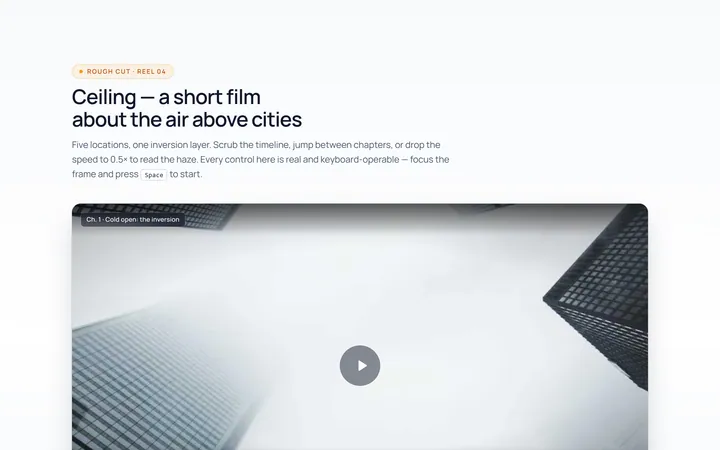
Media Video Player
Originalcustom video player controls UI
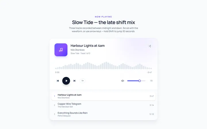
Media Audio Player
Originalaudio player with progress and volume
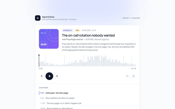
Media Podcast
Originalpodcast episode player card
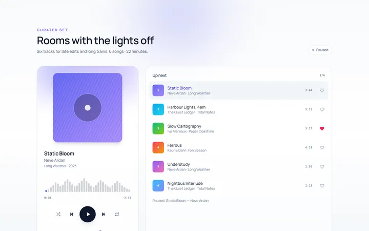
Media Playlist
Originalmusic playlist with now-playing
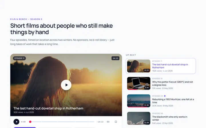
Media Video Card
Originalvideo thumbnail card with play overlay
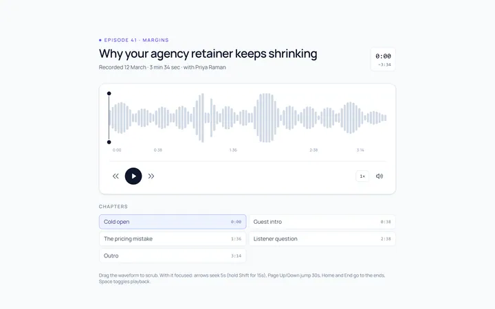
Media Waveform
Originalaudio waveform scrubber
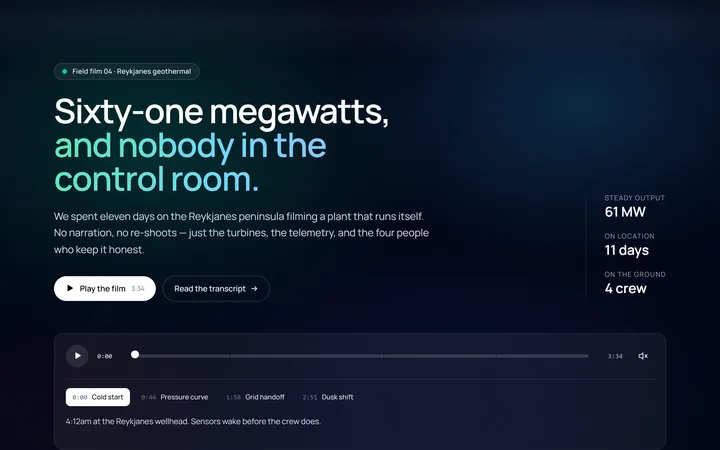
Media Video Hero
Originalhero with a video-style backdrop
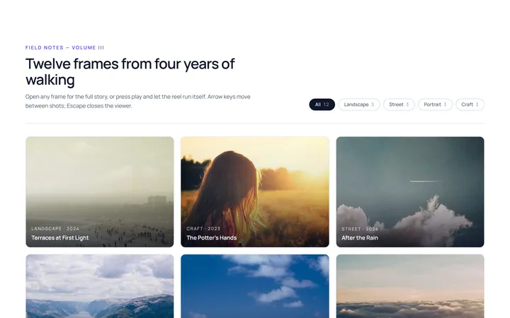
Media Gallery Player
Originalmedia gallery with a lightbox player
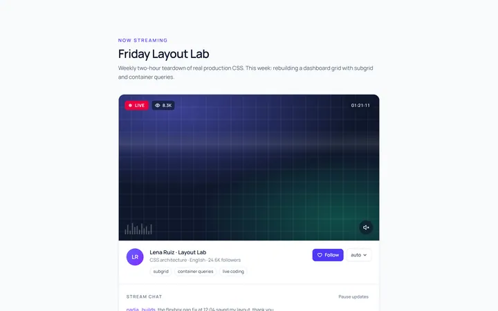
Media Live Badge
Originallive stream card with viewer count

Spotlight Hero
OriginalA centred hero with a soft radial spotlight, badge and dual call-to-action.

Split Hero
OriginalA two-column hero pairing a headline and CTAs with a product mock and social proof.

Gradient Spotlight Hero
OriginalA minimal centred hero with a soft gradient-mesh backdrop, announcement pill and dual call-to-action buttons.