

Dots Pagination
Original · freedot pagination indicators
Copy prompt gives Claude Code, Cursor or v0 a ready-to-paste prompt that recreates this exact component.
npx shadcn@latest add https://webinnoventix.com/r/page-dots.json"use client";
import { useCallback, useEffect, useId, useRef, useState } from "react";
import type { KeyboardEvent as ReactKeyboardEvent, ReactNode } from "react";
import { AnimatePresence, motion, useReducedMotion, type Variants } from "motion/react";
type Slide = {
id: string;
eyebrow: string;
title: string;
body: string;
stat: string;
statLabel: string;
icon: ReactNode;
};
const SLIDES: Slide[] = [
{
id: "sync",
eyebrow: "Live sync",
title: "Two cursors, one truth",
body: "Edits replicate to every connected client in under 120 milliseconds. Two people typing in the same paragraph merge character by character — nobody overwrites anybody.",
stat: "120ms",
statLabel: "median sync",
icon: (
<path
d="M4 12a8 8 0 0 1 13.7-5.6M20 12a8 8 0 0 1-13.7 5.6M17 4v3h-3M7 20v-3h3"
fill="none"
stroke="currentColor"
strokeWidth="1.75"
strokeLinecap="round"
strokeLinejoin="round"
/>
),
},
{
id: "history",
eyebrow: "Version history",
title: "Every change, reversible",
body: "Roll any document back to any moment in the last 90 days. Snapshots are diff-based, so a full year of history costs less to store than a single flat copy of the file.",
stat: "90 days",
statLabel: "of history",
icon: (
<path
d="M12 8v4l2.5 2.5M3.5 12a8.5 8.5 0 1 0 2.6-6.1L3.5 8M3.5 4.5V8h3.5"
fill="none"
stroke="currentColor"
strokeWidth="1.75"
strokeLinecap="round"
strokeLinejoin="round"
/>
),
},
{
id: "access",
eyebrow: "Permissions",
title: "Access that scales down",
body: "Grant view, comment, or edit rights per folder, per person, or per group. Rules cascade downward and can be overridden at any single level without breaking the ones above.",
stat: "4 tiers",
statLabel: "of granular roles",
icon: (
<path
d="M12 3 4 6.5V12c0 4.4 3.4 7.6 8 9 4.6-1.4 8-4.6 8-9V6.5L12 3Zm-2.5 8.5 2 2 4-4"
fill="none"
stroke="currentColor"
strokeWidth="1.75"
strokeLinecap="round"
strokeLinejoin="round"
/>
),
},
{
id: "offline",
eyebrow: "Offline first",
title: "Works without a signal",
body: "Keep writing at 38,000 feet. Changes queue locally and merge cleanly the instant you reconnect, with any genuine conflicts surfaced side by side for a one-tap review.",
stat: "0",
statLabel: "lost edits, ever",
icon: (
<path
d="M7 18a4 4 0 0 1-.5-8A6 6 0 0 1 18 8.5 3.5 3.5 0 0 1 17.5 18M12 12v6m0 0-2.2-2.2M12 18l2.2-2.2"
fill="none"
stroke="currentColor"
strokeWidth="1.75"
strokeLinecap="round"
strokeLinejoin="round"
/>
),
},
{
id: "audit",
eyebrow: "Trust & audit",
title: "A complete paper trail",
body: "See who opened, edited, shared, or exported every file down to the second. Export the log to CSV, or stream it straight into your SIEM in real time for compliance review.",
stat: "SOC 2",
statLabel: "ready by default",
icon: (
<path
d="M8 4h5l5 5v11a1 1 0 0 1-1 1H8a1 1 0 0 1-1-1V5a1 1 0 0 1 1-1Zm5 0v5h5M9.5 14l1.8 1.8 3.5-3.6"
fill="none"
stroke="currentColor"
strokeWidth="1.75"
strokeLinecap="round"
strokeLinejoin="round"
/>
),
},
];
const AUTO_MS = 5200;
export default function PageDots() {
const reduced = useReducedMotion();
const uid = useId();
const count = SLIDES.length;
const [index, setIndex] = useState(0);
const [direction, setDirection] = useState(1);
const [isPlaying, setIsPlaying] = useState(true);
const [isInteracting, setIsInteracting] = useState(false);
const dotRefs = useRef<Array<HTMLButtonElement | null>>([]);
const fillRef = useRef<HTMLSpanElement | null>(null);
const canAuto = !reduced;
const autoRunning = canAuto && isPlaying && !isInteracting;
const goTo = useCallback(
(next: number, dir: number) => {
const n = ((next % count) + count) % count;
setDirection(dir);
setIndex(n);
},
[count],
);
// Auto-advance driven by requestAnimationFrame so the dot fill and the
// slide timing stay in lockstep. Restarts cleanly whenever index changes.
useEffect(() => {
if (!autoRunning) return;
let raf = 0;
let start = 0;
const step = (now: number) => {
if (start === 0) start = now;
const p = Math.min((now - start) / AUTO_MS, 1);
const fill = fillRef.current;
if (fill) fill.style.transform = `scaleX(${p})`;
if (p >= 1) {
goTo(index + 1, 1);
return;
}
raf = requestAnimationFrame(step);
};
raf = requestAnimationFrame(step);
return () => cancelAnimationFrame(raf);
}, [autoRunning, index, goTo]);
const handleKeyNav = (e: ReactKeyboardEvent<HTMLDivElement>) => {
let target = index;
if (e.key === "ArrowRight" || e.key === "ArrowDown") target = (index + 1) % count;
else if (e.key === "ArrowLeft" || e.key === "ArrowUp") target = (index - 1 + count) % count;
else if (e.key === "Home") target = 0;
else if (e.key === "End") target = count - 1;
else return;
e.preventDefault();
const dir = target === index ? 1 : target > index ? 1 : -1;
goTo(target, dir);
requestAnimationFrame(() => dotRefs.current[target]?.focus());
};
const offset = reduced ? 0 : 46;
const variants: Variants = {
enter: (dir: number) => ({ opacity: 0, x: dir >= 0 ? offset : -offset }),
center: { opacity: 1, x: 0 },
exit: (dir: number) => ({ opacity: 0, x: dir >= 0 ? -offset : offset }),
};
const current = SLIDES[index];
const pad = (n: number) => n.toString().padStart(2, "0");
return (
<section
className="relative w-full overflow-hidden bg-gradient-to-b from-slate-50 via-white to-slate-100 py-20 sm:py-28 dark:from-slate-950 dark:via-slate-950 dark:to-slate-900"
aria-labelledby={`${uid}-heading`}
>
<style>{`
@keyframes pagedots-float {
0%, 100% { transform: translate3d(0, 0, 0) scale(1); }
50% { transform: translate3d(0, -18px, 0) scale(1.06); }
}
.pagedots-blob { animation: pagedots-float 15s ease-in-out infinite; }
.pagedots-blob--slow { animation: pagedots-float 21s ease-in-out infinite reverse; }
@media (prefers-reduced-motion: reduce) {
.pagedots-blob, .pagedots-blob--slow { animation: none !important; }
}
`}</style>
{/* Atmosphere */}
<div aria-hidden className="pointer-events-none absolute inset-0">
<div className="pagedots-blob absolute -top-24 -right-16 h-72 w-72 rounded-full bg-indigo-300/40 blur-3xl dark:bg-indigo-600/20" />
<div className="pagedots-blob--slow absolute -bottom-28 -left-20 h-80 w-80 rounded-full bg-violet-300/40 blur-3xl dark:bg-violet-700/20" />
<div
className="absolute inset-0 opacity-[0.4] dark:opacity-[0.25]"
style={{
backgroundImage:
"radial-gradient(circle at 1px 1px, rgb(100 116 139 / 0.14) 1px, transparent 0)",
backgroundSize: "22px 22px",
}}
/>
</div>
<div className="relative mx-auto w-full max-w-2xl px-5 sm:px-6">
<header className="mb-8 text-center">
<span className="inline-flex items-center gap-2 rounded-full border border-slate-300/70 bg-white/70 px-3 py-1 text-xs font-medium tracking-wide text-slate-600 backdrop-blur dark:border-slate-700 dark:bg-slate-900/60 dark:text-slate-300">
<span className="h-1.5 w-1.5 rounded-full bg-indigo-500" />
Product tour
</span>
<h2
id={`${uid}-heading`}
className="mt-4 text-balance text-3xl font-semibold tracking-tight text-slate-900 sm:text-4xl dark:text-white"
>
Everything moves with you
</h2>
<p className="mx-auto mt-3 max-w-md text-pretty text-sm leading-relaxed text-slate-500 dark:text-slate-400">
The five things teams tell us they notice inside the first week.
</p>
</header>
{/* Slide card */}
<div
role="group"
aria-roledescription="carousel"
aria-label="Product highlights"
className="relative overflow-hidden rounded-3xl border border-slate-200/80 bg-white/85 p-6 shadow-xl shadow-slate-900/5 backdrop-blur-xl sm:p-8 dark:border-slate-800 dark:bg-slate-900/70 dark:shadow-black/30"
onMouseEnter={() => setIsInteracting(true)}
onMouseLeave={() => setIsInteracting(false)}
onFocusCapture={() => setIsInteracting(true)}
onBlurCapture={() => setIsInteracting(false)}
>
<div className="min-h-[15rem] sm:min-h-[13rem]">
<AnimatePresence mode="wait" custom={direction} initial={false}>
<motion.div
key={current.id}
custom={direction}
variants={variants}
initial="enter"
animate="center"
exit="exit"
transition={{ duration: reduced ? 0.15 : 0.45, ease: [0.22, 1, 0.36, 1] }}
role="group"
aria-roledescription="slide"
aria-label={`${index + 1} of ${count}`}
>
<div className="flex items-center gap-3">
<span className="flex h-11 w-11 shrink-0 items-center justify-center rounded-2xl bg-indigo-600 text-white shadow-lg shadow-indigo-600/30 dark:bg-indigo-500 dark:shadow-indigo-500/20">
<svg viewBox="0 0 24 24" className="h-6 w-6" aria-hidden>
{current.icon}
</svg>
</span>
<span className="text-xs font-semibold uppercase tracking-[0.18em] text-indigo-600 dark:text-indigo-400">
{current.eyebrow}
</span>
</div>
<h3 className="mt-5 text-2xl font-semibold tracking-tight text-slate-900 sm:text-[1.7rem] dark:text-white">
{current.title}
</h3>
<p className="mt-3 text-pretty text-[0.95rem] leading-relaxed text-slate-600 dark:text-slate-300">
{current.body}
</p>
<div className="mt-6 inline-flex items-baseline gap-2 rounded-full bg-emerald-500/10 px-3.5 py-1.5 ring-1 ring-inset ring-emerald-500/25">
<span className="text-base font-semibold tabular-nums text-emerald-700 dark:text-emerald-300">
{current.stat}
</span>
<span className="text-xs font-medium text-emerald-700/80 dark:text-emerald-400/80">
{current.statLabel}
</span>
</div>
</motion.div>
</AnimatePresence>
</div>
</div>
{/* Controls */}
<div className="mt-7 flex items-center justify-between gap-4">
<button
type="button"
onClick={() => goTo(index - 1, -1)}
aria-label="Previous highlight"
className="flex h-10 w-10 shrink-0 items-center justify-center rounded-full border border-slate-300 bg-white/80 text-slate-600 transition-colors hover:bg-slate-100 hover:text-slate-900 focus-visible:outline-none focus-visible:ring-2 focus-visible:ring-indigo-500 focus-visible:ring-offset-2 focus-visible:ring-offset-slate-50 active:scale-95 dark:border-slate-700 dark:bg-slate-900/70 dark:text-slate-300 dark:hover:bg-slate-800 dark:hover:text-white dark:focus-visible:ring-offset-slate-950"
>
<svg viewBox="0 0 24 24" className="h-5 w-5" aria-hidden>
<path
d="M14.5 6 9 12l5.5 6"
fill="none"
stroke="currentColor"
strokeWidth="1.75"
strokeLinecap="round"
strokeLinejoin="round"
/>
</svg>
</button>
{/* Dot pagination */}
<div
role="group"
aria-label="Choose highlight to display"
onKeyDown={handleKeyNav}
className="flex items-center justify-center gap-2.5"
>
{SLIDES.map((slide, i) => {
const isActive = i === index;
return (
<button
key={slide.id}
ref={(el) => {
dotRefs.current[i] = el;
}}
type="button"
tabIndex={isActive ? 0 : -1}
aria-current={isActive ? "true" : undefined}
aria-label={`Highlight ${i + 1} of ${count}: ${slide.title}`}
onClick={() => goTo(i, i >= index ? 1 : -1)}
className={`group relative h-2.5 overflow-hidden rounded-full transition-[width] duration-300 ease-out focus-visible:outline-none focus-visible:ring-2 focus-visible:ring-indigo-500 focus-visible:ring-offset-2 focus-visible:ring-offset-slate-50 dark:focus-visible:ring-offset-slate-950 ${
isActive
? "w-9"
: "w-2.5 bg-slate-300 hover:bg-slate-400 dark:bg-slate-600 dark:hover:bg-slate-500"
}`}
>
{isActive && (
<>
<span className="absolute inset-0 rounded-full bg-indigo-500/25 dark:bg-indigo-400/25" />
<span
ref={autoRunning ? fillRef : undefined}
style={{ transform: autoRunning ? "scaleX(0)" : "scaleX(1)" }}
className="absolute inset-0 origin-left rounded-full bg-indigo-600 dark:bg-indigo-400"
/>
</>
)}
</button>
);
})}
</div>
<button
type="button"
onClick={() => goTo(index + 1, 1)}
aria-label="Next highlight"
className="flex h-10 w-10 shrink-0 items-center justify-center rounded-full border border-slate-300 bg-white/80 text-slate-600 transition-colors hover:bg-slate-100 hover:text-slate-900 focus-visible:outline-none focus-visible:ring-2 focus-visible:ring-indigo-500 focus-visible:ring-offset-2 focus-visible:ring-offset-slate-50 active:scale-95 dark:border-slate-700 dark:bg-slate-900/70 dark:text-slate-300 dark:hover:bg-slate-800 dark:hover:text-white dark:focus-visible:ring-offset-slate-950"
>
<svg viewBox="0 0 24 24" className="h-5 w-5" aria-hidden>
<path
d="M9.5 6 15 12l-5.5 6"
fill="none"
stroke="currentColor"
strokeWidth="1.75"
strokeLinecap="round"
strokeLinejoin="round"
/>
</svg>
</button>
</div>
{/* Footer row: counter + autoplay toggle */}
<div className="mt-5 flex items-center justify-center gap-4 text-sm">
<span className="font-mono tabular-nums text-slate-500 dark:text-slate-400">
<span className="text-slate-900 dark:text-white">{pad(index + 1)}</span>
<span className="mx-1 text-slate-300 dark:text-slate-600">/</span>
{pad(count)}
</span>
{canAuto && (
<button
type="button"
onClick={() => setIsPlaying((p) => !p)}
aria-pressed={isPlaying}
aria-label={isPlaying ? "Pause automatic rotation" : "Play automatic rotation"}
className="inline-flex items-center gap-1.5 rounded-full border border-slate-300 bg-white/70 px-3 py-1 text-xs font-medium text-slate-600 transition-colors hover:bg-slate-100 hover:text-slate-900 focus-visible:outline-none focus-visible:ring-2 focus-visible:ring-indigo-500 focus-visible:ring-offset-2 focus-visible:ring-offset-slate-50 dark:border-slate-700 dark:bg-slate-900/60 dark:text-slate-300 dark:hover:bg-slate-800 dark:hover:text-white dark:focus-visible:ring-offset-slate-950"
>
<svg viewBox="0 0 24 24" className="h-3.5 w-3.5" aria-hidden>
{isPlaying ? (
<path d="M8 5.5h2.5v13H8zm5.5 0H16v13h-2.5z" fill="currentColor" />
) : (
<path d="M8 5.2 18 12 8 18.8z" fill="currentColor" />
)}
</svg>
{isPlaying ? "Pause" : "Play"}
</button>
)}
</div>
{/* Screen-reader announcement */}
<div aria-live="polite" className="sr-only">
{`Showing highlight ${index + 1} of ${count}: ${current.title}`}
</div>
</div>
</section>
);
}Dependencies
Licence
Built by Web Innoventix. Free for personal and commercial use, no attribution required.
Built by Web Innoventix
Need a custom interface, a full website, or SEO that gets you cited by AI? We design, build and rank it end to end.
Get a free quoteSimilar components
Browse all →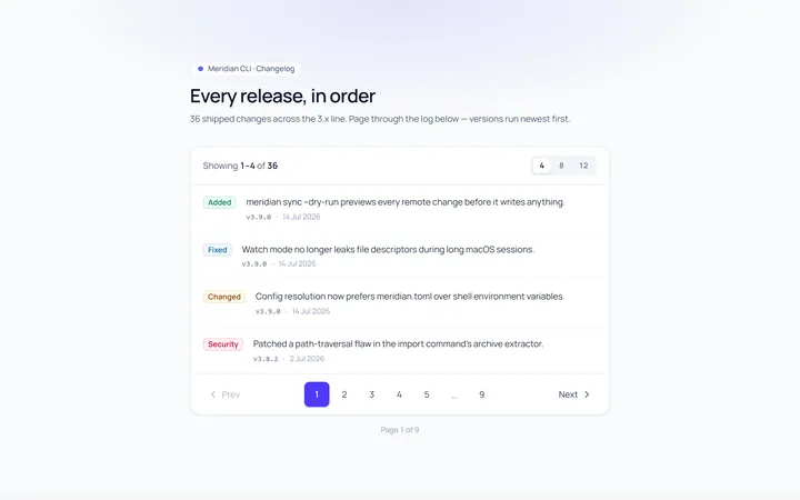
Basic Pagination
Originalbasic numbered pagination
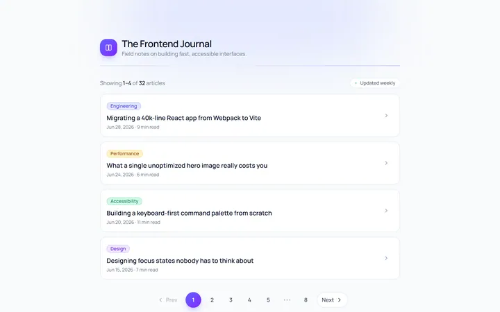
Rounded Pagination
Originalrounded pagination buttons
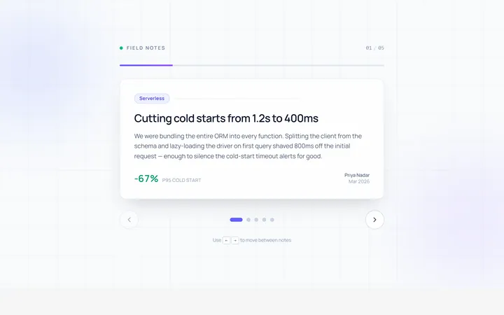
Arrows Pagination
Originalprev/next arrow pagination
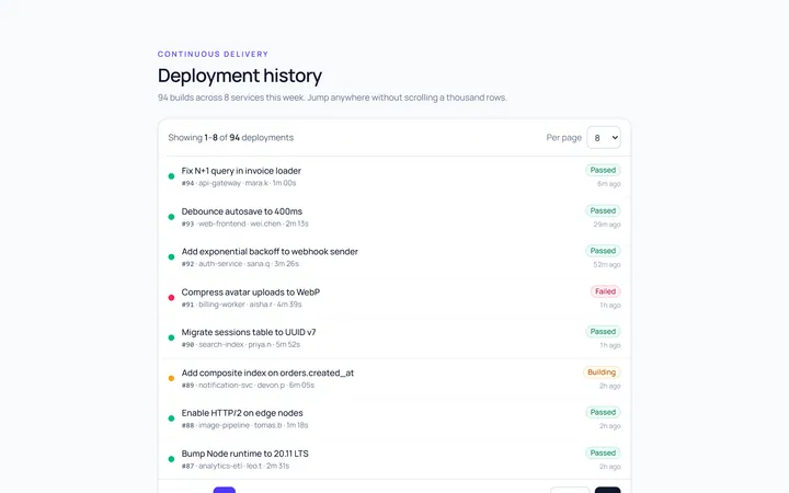
Compact Pagination
Originalcompact pagination with ellipsis
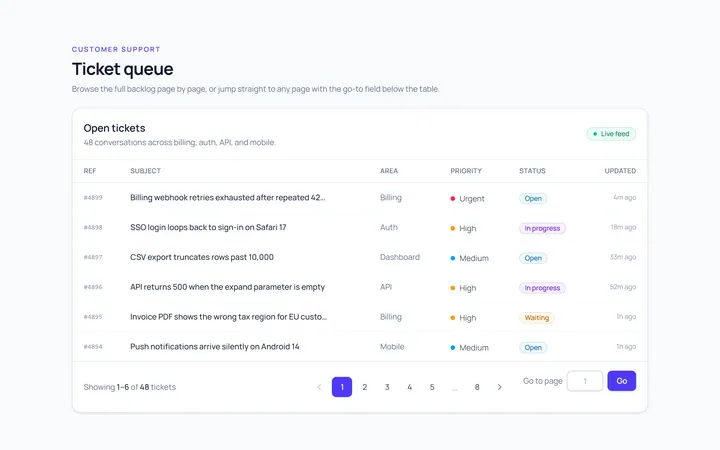
Input Pagination
Originalpagination with a go-to-page input
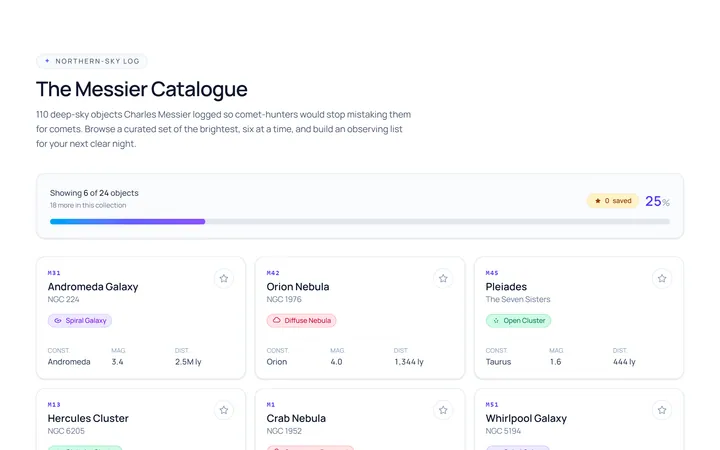
Load More Pagination
Originalload-more button with progress
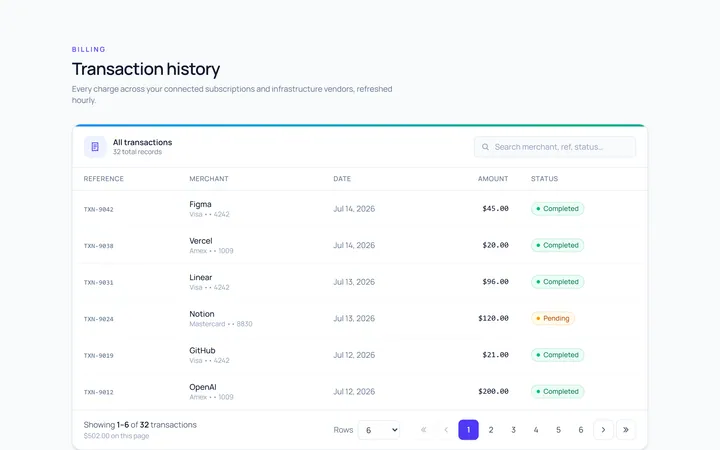
With Info Pagination
Originalpagination with results info

Spotlight Hero
OriginalA centred hero with a soft radial spotlight, badge and dual call-to-action.

Split Hero
OriginalA two-column hero pairing a headline and CTAs with a product mock and social proof.

Gradient Spotlight Hero
OriginalA minimal centred hero with a soft gradient-mesh backdrop, announcement pill and dual call-to-action buttons.

App Preview Hero
OriginalA centred hero that pairs headline copy with a realistic product dashboard mock built entirely from markup, complete with browser chrome and a floating notification card.

Waitlist Capture Hero
OriginalA dark, focused hero with an inline email capture form and avatar social proof, ready for pre-launch waitlists.