

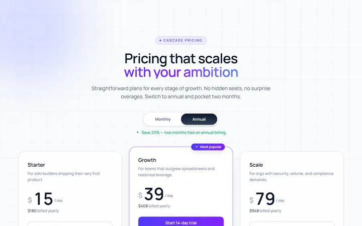
Three Tier Pricing
Original · freethree-tier pricing cards
Copy prompt gives Claude Code, Cursor or v0 a ready-to-paste prompt that recreates this exact component.
npx shadcn@latest add https://webinnoventix.com/r/pricex-three-tier.json"use client";
import { useId, useState } from "react";
import { motion, useReducedMotion } from "motion/react";
type BillingCycle = "monthly" | "annual";
type Feature = {
label: string;
included: boolean;
};
type Tier = {
id: string;
name: string;
tagline: string;
monthly: number;
annual: number;
cta: string;
featured: boolean;
features: Feature[];
};
const TIERS: Tier[] = [
{
id: "starter",
name: "Starter",
tagline: "For solo builders shipping their first workflows.",
monthly: 0,
annual: 0,
cta: "Start for free",
featured: false,
features: [
{ label: "Up to 3 active projects", included: true },
{ label: "5,000 automated actions / mo", included: true },
{ label: "Community support", included: true },
{ label: "7-day activity history", included: true },
{ label: "Role-based permissions", included: false },
{ label: "SSO & audit logs", included: false },
],
},
{
id: "growth",
name: "Growth",
tagline: "For teams turning momentum into a system.",
monthly: 29,
annual: 23,
cta: "Start 14-day trial",
featured: true,
features: [
{ label: "Unlimited projects", included: true },
{ label: "100,000 automated actions / mo", included: true },
{ label: "Priority email & chat support", included: true },
{ label: "Unlimited activity history", included: true },
{ label: "Role-based permissions", included: true },
{ label: "SSO & audit logs", included: false },
],
},
{
id: "scale",
name: "Scale",
tagline: "For orgs that need control, security, and SLAs.",
monthly: 79,
annual: 63,
cta: "Talk to sales",
featured: false,
features: [
{ label: "Everything in Growth", included: true },
{ label: "Unlimited automated actions", included: true },
{ label: "Dedicated success manager", included: true },
{ label: "99.9% uptime SLA", included: true },
{ label: "Role-based permissions", included: true },
{ label: "SSO & audit logs", included: true },
],
},
];
function CheckIcon({ className }: { className?: string }) {
return (
<svg
viewBox="0 0 20 20"
fill="none"
aria-hidden="true"
className={className}
>
<path
d="M4 10.5 8 14.5 16 5.5"
stroke="currentColor"
strokeWidth="2"
strokeLinecap="round"
strokeLinejoin="round"
/>
</svg>
);
}
function DashIcon({ className }: { className?: string }) {
return (
<svg
viewBox="0 0 20 20"
fill="none"
aria-hidden="true"
className={className}
>
<path
d="M5 10h10"
stroke="currentColor"
strokeWidth="2"
strokeLinecap="round"
/>
</svg>
);
}
function SparkIcon({ className }: { className?: string }) {
return (
<svg
viewBox="0 0 20 20"
fill="none"
aria-hidden="true"
className={className}
>
<path
d="M10 2.5 11.6 7.2 16.5 8.4 12.8 11.6 13.6 16.5 10 13.9 6.4 16.5 7.2 11.6 3.5 8.4 8.4 7.2z"
fill="currentColor"
/>
</svg>
);
}
export default function PricexThreeTier() {
const reduceMotion = useReducedMotion();
const [cycle, setCycle] = useState<BillingCycle>("annual");
const toggleId = useId();
const isAnnual = cycle === "annual";
return (
<section className="relative w-full overflow-hidden bg-slate-50 px-5 py-24 text-slate-900 sm:px-8 sm:py-28 dark:bg-slate-950 dark:text-slate-50">
<style>{`
@keyframes pxtt-rise {
from { opacity: 0; transform: translateY(22px); }
to { opacity: 1; transform: translateY(0); }
}
@keyframes pxtt-glow {
0%, 100% { opacity: 0.55; }
50% { opacity: 0.9; }
}
.pxtt-rise {
animation: pxtt-rise 0.7s cubic-bezier(0.22, 1, 0.36, 1) both;
}
.pxtt-glow {
animation: pxtt-glow 6s ease-in-out infinite;
}
@media (prefers-reduced-motion: reduce) {
.pxtt-rise, .pxtt-glow {
animation: none !important;
}
}
`}</style>
{/* Decorative background */}
<div
aria-hidden="true"
className="pointer-events-none absolute inset-0 -z-10"
>
<div className="pxtt-glow absolute -top-24 left-1/2 h-72 w-[42rem] max-w-full -translate-x-1/2 rounded-full bg-gradient-to-r from-indigo-300/40 via-violet-300/40 to-sky-300/40 blur-3xl dark:from-indigo-600/25 dark:via-violet-600/25 dark:to-sky-600/25" />
<div className="absolute inset-0 bg-[radial-gradient(circle_at_center,transparent_55%,rgba(15,23,42,0.04))] dark:bg-[radial-gradient(circle_at_center,transparent_55%,rgba(0,0,0,0.35))]" />
</div>
<div className="mx-auto max-w-6xl">
{/* Heading */}
<div className="mx-auto max-w-2xl text-center">
<span className="inline-flex items-center gap-2 rounded-full border border-slate-200 bg-white/70 px-3.5 py-1 text-xs font-semibold uppercase tracking-wider text-indigo-600 backdrop-blur dark:border-slate-800 dark:bg-slate-900/70 dark:text-indigo-300">
<SparkIcon className="h-3.5 w-3.5" />
Pricing
</span>
<h2 className="mt-5 text-4xl font-bold tracking-tight text-slate-900 sm:text-5xl dark:text-white">
Pricing that scales with Cadence
</h2>
<p className="mt-4 text-lg leading-relaxed text-slate-600 dark:text-slate-400">
Start free, upgrade when the work compounds. No setup fees, no
surprise usage bills, and you can change plans any time.
</p>
</div>
{/* Billing toggle */}
<div className="mt-9 flex flex-col items-center gap-3">
<div
role="radiogroup"
aria-label="Billing cycle"
className="inline-flex items-center rounded-full border border-slate-200 bg-white p-1 shadow-sm dark:border-slate-800 dark:bg-slate-900"
>
<button
type="button"
role="radio"
aria-checked={!isAnnual}
id={`${toggleId}-monthly`}
onClick={() => setCycle("monthly")}
className={`rounded-full px-5 py-2 text-sm font-semibold transition-colors focus:outline-none focus-visible:ring-2 focus-visible:ring-indigo-500 focus-visible:ring-offset-2 focus-visible:ring-offset-white dark:focus-visible:ring-offset-slate-900 ${
!isAnnual
? "bg-slate-900 text-white dark:bg-white dark:text-slate-900"
: "text-slate-600 hover:text-slate-900 dark:text-slate-400 dark:hover:text-white"
}`}
>
Monthly
</button>
<button
type="button"
role="radio"
aria-checked={isAnnual}
id={`${toggleId}-annual`}
onClick={() => setCycle("annual")}
className={`flex items-center gap-2 rounded-full px-5 py-2 text-sm font-semibold transition-colors focus:outline-none focus-visible:ring-2 focus-visible:ring-indigo-500 focus-visible:ring-offset-2 focus-visible:ring-offset-white dark:focus-visible:ring-offset-slate-900 ${
isAnnual
? "bg-slate-900 text-white dark:bg-white dark:text-slate-900"
: "text-slate-600 hover:text-slate-900 dark:text-slate-400 dark:hover:text-white"
}`}
>
Annual
<span
className={`rounded-full px-2 py-0.5 text-[11px] font-bold ${
isAnnual
? "bg-emerald-400/90 text-emerald-950"
: "bg-emerald-100 text-emerald-700 dark:bg-emerald-500/15 dark:text-emerald-300"
}`}
>
Save 20%
</span>
</button>
</div>
<p
aria-live="polite"
className="text-xs font-medium text-slate-500 dark:text-slate-500"
>
{isAnnual
? "Billed annually — two months free vs. paying monthly."
: "Billed monthly — cancel or switch whenever you like."}
</p>
</div>
{/* Cards */}
<div className="mt-14 grid gap-6 lg:grid-cols-3 lg:items-stretch">
{TIERS.map((tier, index) => {
const price = isAnnual ? tier.annual : tier.monthly;
const isFree = price === 0;
const CardTag = reduceMotion ? "div" : motion.div;
const cardMotion = reduceMotion
? {}
: {
initial: { opacity: 0, y: 22 },
whileInView: { opacity: 1, y: 0 },
viewport: { once: true, amount: 0.3 },
transition: {
duration: 0.6,
delay: index * 0.1,
ease: [0.22, 1, 0.36, 1] as const,
},
};
return (
<CardTag
key={tier.id}
{...cardMotion}
className={`relative flex flex-col rounded-3xl border p-7 sm:p-8 ${
tier.featured
? "border-indigo-300 bg-white shadow-xl shadow-indigo-500/10 lg:-translate-y-3 lg:scale-[1.02] dark:border-indigo-500/40 dark:bg-slate-900"
: "border-slate-200 bg-white/80 shadow-sm dark:border-slate-800 dark:bg-slate-900/60"
}`}
>
{tier.featured && (
<>
<div
aria-hidden="true"
className="pointer-events-none absolute inset-0 -z-10 rounded-3xl bg-gradient-to-b from-indigo-500/10 via-transparent to-transparent"
/>
<span className="absolute -top-3 left-1/2 -translate-x-1/2 whitespace-nowrap rounded-full bg-gradient-to-r from-indigo-500 to-violet-500 px-3.5 py-1 text-xs font-bold uppercase tracking-wide text-white shadow-md">
Most popular
</span>
</>
)}
<div className="flex items-baseline justify-between">
<h3 className="text-lg font-bold text-slate-900 dark:text-white">
{tier.name}
</h3>
{tier.featured && (
<SparkIcon className="h-5 w-5 text-indigo-500 dark:text-indigo-300" />
)}
</div>
<p className="mt-2 min-h-[2.75rem] text-sm leading-relaxed text-slate-600 dark:text-slate-400">
{tier.tagline}
</p>
<div className="mt-6 flex items-end gap-1.5">
<span className="text-5xl font-bold tracking-tight text-slate-900 tabular-nums dark:text-white">
${price}
</span>
<span className="pb-2 text-sm font-medium text-slate-500 dark:text-slate-500">
{isFree ? "forever" : "/ seat / mo"}
</span>
</div>
<p className="mt-1 h-4 text-xs font-medium text-slate-500 dark:text-slate-500">
{!isFree && isAnnual
? `$${tier.annual * 12} billed yearly per seat`
: ""}
</p>
<a
href="#get-started"
className={`mt-6 inline-flex w-full items-center justify-center rounded-xl px-5 py-3 text-sm font-semibold transition-all focus:outline-none focus-visible:ring-2 focus-visible:ring-offset-2 focus-visible:ring-offset-white dark:focus-visible:ring-offset-slate-900 ${
tier.featured
? "bg-gradient-to-r from-indigo-500 to-violet-500 text-white shadow-lg shadow-indigo-500/25 hover:from-indigo-600 hover:to-violet-600 focus-visible:ring-indigo-500"
: "border border-slate-300 bg-white text-slate-900 hover:border-slate-400 hover:bg-slate-50 focus-visible:ring-slate-400 dark:border-slate-700 dark:bg-slate-900 dark:text-white dark:hover:border-slate-600 dark:hover:bg-slate-800"
}`}
>
{tier.cta}
</a>
<div
role="separator"
className="my-7 h-px w-full bg-slate-200 dark:bg-slate-800"
/>
<ul className="flex flex-1 flex-col gap-3.5">
{tier.features.map((feature) => (
<li
key={feature.label}
className="flex items-start gap-3 text-sm"
>
<span
className={`mt-0.5 inline-flex h-5 w-5 shrink-0 items-center justify-center rounded-full ${
feature.included
? "bg-emerald-100 text-emerald-600 dark:bg-emerald-500/15 dark:text-emerald-400"
: "bg-slate-100 text-slate-400 dark:bg-slate-800 dark:text-slate-600"
}`}
>
{feature.included ? (
<CheckIcon className="h-3.5 w-3.5" />
) : (
<DashIcon className="h-3.5 w-3.5" />
)}
</span>
<span
className={
feature.included
? "text-slate-700 dark:text-slate-300"
: "text-slate-400 line-through decoration-slate-300 dark:text-slate-600 dark:decoration-slate-700"
}
>
{feature.label}
</span>
</li>
))}
</ul>
</CardTag>
);
})}
</div>
{/* Footnote */}
<p className="mt-12 text-center text-sm text-slate-500 dark:text-slate-500">
All plans include end-to-end encryption, unlimited team members on
Growth and up, and a 30-day money-back guarantee.
</p>
</div>
</section>
);
}Dependencies
Licence
Built by Web Innoventix. Free for personal and commercial use, no attribution required.
Built by Web Innoventix
Need a custom interface, a full website, or SEO that gets you cited by AI? We design, build and rank it end to end.
Get a free quoteSimilar components
Browse all →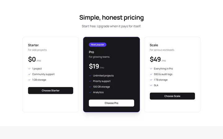
Simple Pricing
OriginalA three-tier pricing section with a highlighted popular plan.
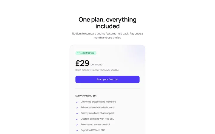
Single Plan Pricing Card
OriginalA focused one-plan pricing card with price, trial badge, feature list, call to action and a money-back trust note, ideal when you sell a single flat-rate product.
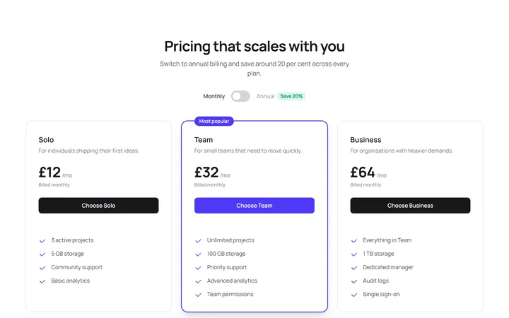
Three Tier Pricing With Monthly Annual Toggle
OriginalA three-tier pricing grid with a pure-CSS monthly and annual billing toggle that swaps every price with no JavaScript, using a native checkbox and Tailwind group-has state.
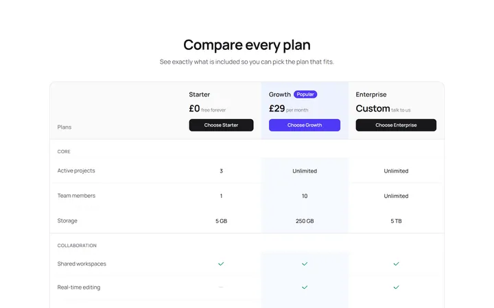
Plan Feature Comparison Table
OriginalA responsive, semantic feature comparison table across three plans with grouped rows, tick and dash indicators and screen-reader labels so visitors can weigh every feature side by side.
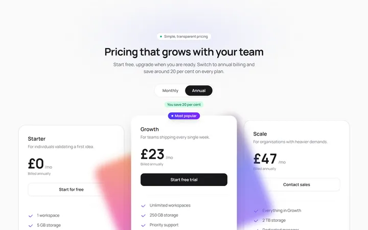
Staggered Glow Pricing Tiers
OriginalA three-tier pricing section whose cards reveal in a staggered spring cascade, with a rotating conic-gradient glow on the popular plan and prices that count up smoothly when you toggle monthly and annual billing.
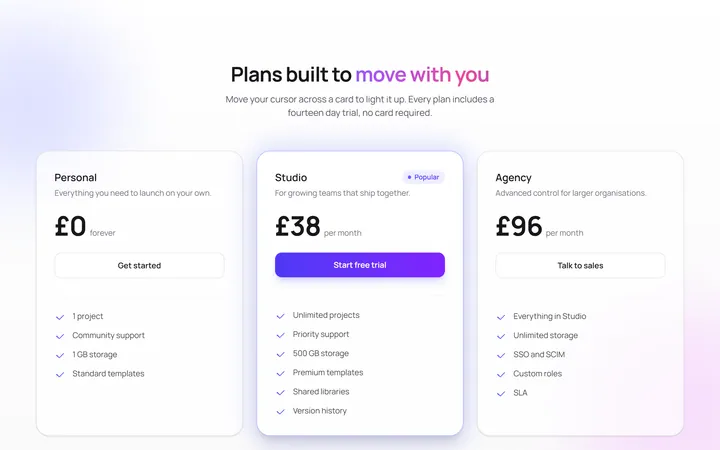
Spotlight Cursor Pricing Cards
OriginalPricing cards that light up with a cursor-following radial spotlight, drift over floating background orbs and rise into view with a staggered spring entrance, plus a pulsing glow on the popular plan.
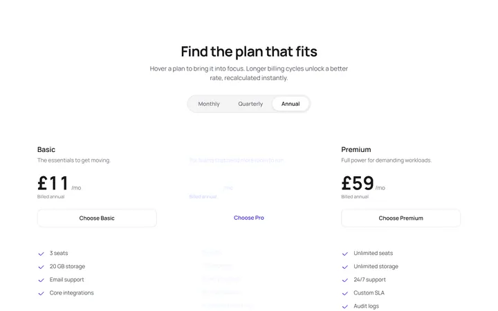
Highlight Follow Pricing Plans
OriginalA pricing row where an animated gradient highlight glides via shared layout animation to whichever plan you hover, a three-way billing switch slides its pill, prices recount instantly and a perks marquee scrolls beneath.
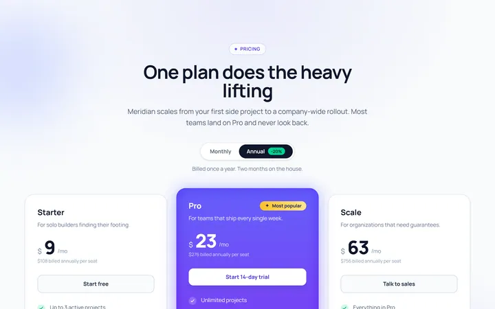
Toggle Annual Pricing
Originalpricing with monthly/annual toggle
Single Highlight Pricing
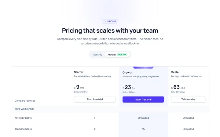
Originalsingle highlighted plan
Comparison Table Pricing
Originalpricing comparison table
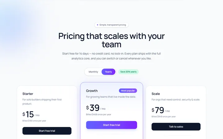
Cards Gradient Pricing
Originalgradient pricing cards
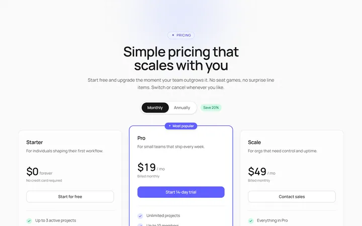
Minimal Pricing
Originalminimal pricing tiers