

Clip-path Image Reveal
Original · freePanels that unmask with a clip-path wipe as they enter the viewport, revealing the media beneath.
Copy prompt gives Claude Code, Cursor or v0 a ready-to-paste prompt that recreates this exact component.
npx shadcn@latest add https://webinnoventix.com/r/scroll-clip-reveal.json"use client";
import { useRef } from "react";
import type { ReactNode } from "react";
import { motion, useScroll, useTransform, useInView } from "motion/react";
type Row = {
eyebrow: string;
title: string;
body: string;
bullets: string[];
visual: ReactNode;
accent: string;
};
function OrbitVisual() {
return (
<div aria-hidden className="absolute inset-0 overflow-hidden">
<div className="absolute inset-0 bg-gradient-to-br from-indigo-500 via-violet-600 to-fuchsia-600" />
<div className="absolute inset-0 opacity-70 [background:radial-gradient(120%_120%_at_15%_15%,rgba(255,255,255,0.55)_0%,transparent_45%)]" />
<div className="absolute -right-16 -top-16 h-64 w-64 rounded-full bg-white/25 blur-2xl" />
<div className="absolute left-1/2 top-1/2 h-56 w-56 -translate-x-1/2 -translate-y-1/2 rounded-full border border-white/40">
<div className="szh-spin absolute inset-0 rounded-full border-t-2 border-white/80" />
</div>
<div className="absolute left-1/2 top-1/2 h-36 w-36 -translate-x-1/2 -translate-y-1/2 rounded-full border border-white/30">
<div className="szh-spin-rev absolute inset-0 rounded-full border-b-2 border-white/70" />
</div>
<div className="absolute left-1/2 top-1/2 h-3 w-3 -translate-x-1/2 -translate-y-1/2 rounded-full bg-white shadow-[0_0_24px_6px_rgba(255,255,255,0.8)]" />
<svg
className="absolute bottom-5 left-5 h-9 w-9 text-white/90"
viewBox="0 0 24 24"
fill="none"
stroke="currentColor"
strokeWidth="1.7"
strokeLinecap="round"
strokeLinejoin="round"
>
<circle cx="12" cy="12" r="3" />
<path d="M12 2v3M12 19v3M2 12h3M19 12h3M4.9 4.9l2.1 2.1M17 17l2.1 2.1M19.1 4.9L17 7M7 17l-2.1 2.1" />
</svg>
</div>
);
}
function GridVisual() {
return (
<div aria-hidden className="absolute inset-0 overflow-hidden">
<div className="absolute inset-0 bg-gradient-to-tr from-emerald-500 via-teal-600 to-sky-600" />
<div className="absolute inset-0 opacity-40 [background:linear-gradient(rgba(255,255,255,0.5)_1px,transparent_1px),linear-gradient(90deg,rgba(255,255,255,0.5)_1px,transparent_1px)] [background-size:34px_34px]" />
<div className="absolute inset-0 flex items-end gap-2 p-8">
{[52, 74, 40, 88, 63, 96, 58].map((h, i) => (
<div
key={i}
className="szh-rise flex-1 rounded-t-md bg-white/85"
style={{ height: `${h}%`, animationDelay: `${i * 0.12}s` }}
/>
))}
</div>
<div className="absolute -left-10 top-6 h-40 w-40 rounded-full bg-white/25 blur-2xl" />
<svg
className="absolute right-5 top-5 h-9 w-9 text-white/90"
viewBox="0 0 24 24"
fill="none"
stroke="currentColor"
strokeWidth="1.7"
strokeLinecap="round"
strokeLinejoin="round"
>
<path d="M3 3v18h18" />
<path d="M7 15l4-5 3 3 5-7" />
</svg>
</div>
);
}
function WaveVisual() {
return (
<div aria-hidden className="absolute inset-0 overflow-hidden">
<div className="absolute inset-0 bg-gradient-to-br from-amber-400 via-orange-500 to-rose-600" />
<div className="absolute inset-0 opacity-60 [background:radial-gradient(90%_90%_at_85%_20%,rgba(255,255,255,0.5)_0%,transparent_50%)]" />
<svg
className="absolute inset-x-0 bottom-0 h-1/2 w-full"
viewBox="0 0 400 120"
preserveAspectRatio="none"
aria-hidden
>
<path
className="szh-wave"
d="M0 70 Q 50 30 100 70 T 200 70 T 300 70 T 400 70 V120 H0 Z"
fill="rgba(255,255,255,0.35)"
/>
<path
className="szh-wave-slow"
d="M0 84 Q 50 54 100 84 T 200 84 T 300 84 T 400 84 V120 H0 Z"
fill="rgba(255,255,255,0.5)"
/>
</svg>
<div className="absolute right-8 top-8 h-16 w-16 rounded-2xl bg-white/30 backdrop-blur-sm rotate-12" />
<div className="absolute right-16 top-16 h-10 w-10 rounded-xl bg-white/50 -rotate-6" />
<svg
className="absolute left-5 top-5 h-9 w-9 text-white/90"
viewBox="0 0 24 24"
fill="none"
stroke="currentColor"
strokeWidth="1.7"
strokeLinecap="round"
strokeLinejoin="round"
>
<path d="M2 12s3-7 10-7 10 7 10 7-3 7-10 7S2 12 2 12Z" />
<circle cx="12" cy="12" r="3" />
</svg>
</div>
);
}
const ROWS: Row[] = [
{
eyebrow: "01 — Discovery",
title: "Map the terrain before you build",
body: "We audit signals, positioning and the competitive gap so every downstream decision compounds instead of colliding. No guesswork, no rework.",
bullets: ["Signal & keyword mapping", "Competitive gap analysis", "Positioning workshop"],
visual: <OrbitVisual />,
accent: "text-violet-600 dark:text-violet-400",
},
{
eyebrow: "02 — Build",
title: "Ship a system, not a one-off page",
body: "Reusable components, measurable structure and content that earns its rank. Everything is instrumented from day one so growth is visible, not vibes.",
bullets: ["Component-driven builds", "Instrumented analytics", "Content that converts"],
visual: <GridVisual />,
accent: "text-emerald-600 dark:text-emerald-400",
},
{
eyebrow: "03 — Compound",
title: "Momentum that keeps returning",
body: "Weekly iteration loops turn early wins into durable advantage. We refresh what decays and double down on what climbs, month after month.",
bullets: ["Weekly iteration loops", "Decay & refresh cycles", "Durable compounding growth"],
visual: <WaveVisual />,
accent: "text-orange-600 dark:text-orange-400",
},
];
function RevealRow({ row, index }: { row: Row; index: number }) {
const flip = index % 2 === 1;
const ref = useRef<HTMLDivElement>(null);
const inView = useInView(ref, { once: true, margin: "-15% 0px -15% 0px" });
const fromLeft = !flip;
return (
<div
ref={ref}
className="grid items-center gap-8 md:grid-cols-2 md:gap-14"
>
{/* Media panel */}
<motion.div
className={flip ? "md:order-2" : ""}
initial={{
clipPath: fromLeft
? "inset(0 100% 0 0 round 24px)"
: "inset(0 0 0 100% round 24px)",
}}
animate={
inView
? { clipPath: "inset(0 0% 0 0% round 24px)" }
: undefined
}
transition={{ duration: 1.05, ease: [0.16, 1, 0.3, 1] }}
>
<div className="relative aspect-[4/3] w-full overflow-hidden rounded-3xl shadow-2xl ring-1 ring-black/5 dark:ring-white/10">
<motion.div
className="absolute inset-0"
initial={{ scale: 1.18 }}
animate={inView ? { scale: 1 } : undefined}
transition={{ duration: 1.3, ease: [0.16, 1, 0.3, 1] }}
>
{row.visual}
</motion.div>
<div className="pointer-events-none absolute inset-0 rounded-3xl ring-1 ring-inset ring-white/20" />
</div>
</motion.div>
{/* Text panel */}
<motion.div
className={flip ? "md:order-1" : ""}
initial={{ scaleX: 0 }}
animate={inView ? { scaleX: 1 } : undefined}
transition={{ duration: 0.7, ease: [0.16, 1, 0.3, 1], delay: 0.15 }}
style={{ transformOrigin: fromLeft ? "right center" : "left center" }}
>
<motion.div
initial={{ scaleX: 1 }}
animate={inView ? { scaleX: 1 } : undefined}
className="origin-left"
>
<div
className={`text-xs font-semibold uppercase tracking-[0.2em] ${row.accent}`}
>
{row.eyebrow}
</div>
<h3 className="mt-3 text-2xl font-bold leading-tight tracking-tight text-slate-900 sm:text-3xl md:text-4xl dark:text-white">
{row.title}
</h3>
<p className="mt-4 max-w-md text-base leading-relaxed text-slate-600 dark:text-slate-300">
{row.body}
</p>
<ul className="mt-6 space-y-3">
{row.bullets.map((b) => (
<li
key={b}
className="flex items-center gap-3 text-sm font-medium text-slate-700 dark:text-slate-200"
>
<span className="flex h-5 w-5 shrink-0 items-center justify-center rounded-full bg-slate-900 text-white dark:bg-white dark:text-slate-900">
<svg
viewBox="0 0 24 24"
className="h-3 w-3"
fill="none"
stroke="currentColor"
strokeWidth="3.5"
strokeLinecap="round"
strokeLinejoin="round"
aria-hidden
>
<path d="M20 6 9 17l-5-5" />
</svg>
</span>
{b}
</li>
))}
</ul>
</motion.div>
</motion.div>
</div>
);
}
export default function ScrollClipReveal() {
const sectionRef = useRef<HTMLElement>(null);
const { scrollYProgress } = useScroll({
target: sectionRef,
offset: ["start start", "end end"],
});
const progressScaleX = useTransform(scrollYProgress, [0, 1], [0, 1]);
return (
<section
ref={sectionRef}
className="relative w-full overflow-hidden bg-slate-50 px-6 py-24 sm:px-10 md:py-32 dark:bg-slate-950"
>
<style>{`
@keyframes szh-spin { to { transform: rotate(360deg); } }
@keyframes szh-spin-rev { to { transform: rotate(-360deg); } }
@keyframes szh-rise {
0%, 100% { transform: scaleY(0.86); }
50% { transform: scaleY(1); }
}
@keyframes szh-wave {
from { transform: translateX(0); }
to { transform: translateX(-25%); }
}
.szh-spin { animation: szh-spin 9s linear infinite; }
.szh-spin-rev { animation: szh-spin-rev 7s linear infinite; }
.szh-rise { transform-origin: bottom; animation: szh-rise 2.4s ease-in-out infinite; }
.szh-wave { animation: szh-wave 6s linear infinite; }
.szh-wave-slow { animation: szh-wave 9s linear infinite; }
@media (prefers-reduced-motion: reduce) {
.szh-spin, .szh-spin-rev, .szh-rise, .szh-wave, .szh-wave-slow {
animation: none !important;
}
}
`}</style>
{/* Ambient background */}
<div
aria-hidden
className="pointer-events-none absolute inset-0 [background:radial-gradient(60%_50%_at_50%_0%,rgba(99,102,241,0.12)_0%,transparent_70%)] dark:[background:radial-gradient(60%_50%_at_50%_0%,rgba(139,92,246,0.18)_0%,transparent_70%)]"
/>
<div className="relative mx-auto max-w-6xl">
{/* Header */}
<div className="mx-auto max-w-2xl text-center">
<span className="inline-flex items-center gap-2 rounded-full border border-slate-200 bg-white px-4 py-1.5 text-xs font-semibold uppercase tracking-[0.18em] text-slate-600 shadow-sm dark:border-slate-800 dark:bg-slate-900 dark:text-slate-300">
<span className="h-1.5 w-1.5 rounded-full bg-indigo-500" />
How we work
</span>
<h2 className="mt-6 text-3xl font-bold tracking-tight text-slate-900 sm:text-4xl md:text-5xl dark:text-white">
Three moves that unlock
<span className="bg-gradient-to-r from-indigo-500 via-violet-500 to-fuchsia-500 bg-clip-text text-transparent">
{" "}
compounding growth
</span>
</h2>
<p className="mx-auto mt-5 max-w-xl text-base leading-relaxed text-slate-600 dark:text-slate-300">
Scroll to watch each stage unmask. A deliberate sequence that turns
scattered effort into a system that keeps paying you back.
</p>
</div>
{/* Scroll progress rail */}
<div className="relative mt-16 md:mt-20">
<div
aria-hidden
className="absolute left-0 top-0 hidden h-full w-px bg-slate-200 md:block dark:bg-slate-800"
>
<motion.div
className="absolute left-0 top-0 w-full origin-top bg-gradient-to-b from-indigo-500 via-violet-500 to-fuchsia-500"
style={{ scaleY: progressScaleX, height: "100%" }}
/>
</div>
<div className="space-y-24 md:space-y-36 md:pl-14">
{ROWS.map((row, i) => (
<RevealRow key={row.eyebrow} row={row} index={i} />
))}
</div>
</div>
</div>
</section>
);
}Dependencies
Licence
Built by Web Innoventix. Free for personal and commercial use, no attribution required.
Built by Web Innoventix
Need a custom interface, a full website, or SEO that gets you cited by AI? We design, build and rank it end to end.
Get a free quoteSimilar components
Browse all →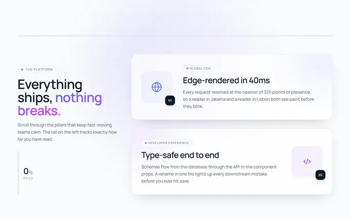
Scroll Progress Reveal
OriginalA section that reveals its content in sequence as you scroll, with a sticky scroll-progress bar showing how far through it you are.
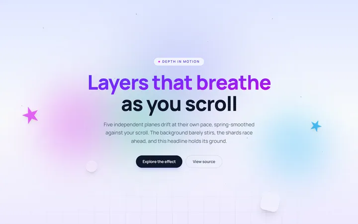
Parallax Layers
OriginalA layered depth scene where background, midground and foreground drift at different speeds, driven by scroll position.
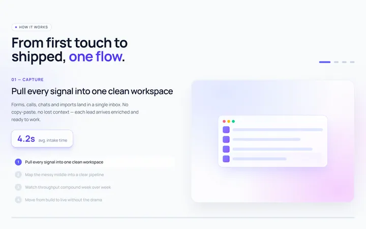
Pinned Scroll Steps
OriginalA pinned, sticky panel whose visual and copy change step by step as you scroll past it, a classic scrollytelling section.
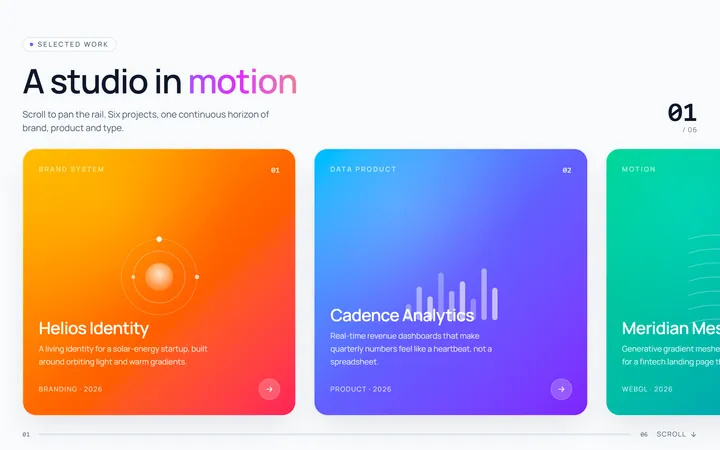
Horizontal Scroll Gallery
OriginalVertical scrolling pans a horizontal rail of cards sideways while the section is pinned, then releases.

Scroll Reveal Timeline
OriginalA vertical timeline whose connecting line fills and whose milestones fade in as they enter the viewport.

Count-up Stats Band
OriginalA metrics band whose numbers count up from zero the moment it scrolls into view.
Stacking Cards
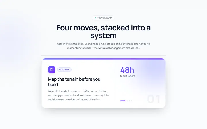
OriginalA deck of cards that pin and scale as you scroll, each settling behind the next.
Scroll Text Highlight
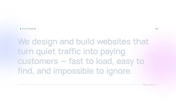
OriginalA statement whose words light up one by one as you scroll through the section.
Scroll Zoom Hero
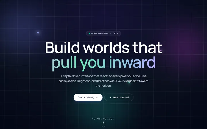
OriginalA hero whose backdrop scales and brightens while the headline parallaxes upward as you scroll.

Spotlight Hero
OriginalA centred hero with a soft radial spotlight, badge and dual call-to-action.

Split Hero
OriginalA two-column hero pairing a headline and CTAs with a product mock and social proof.

Gradient Spotlight Hero
OriginalA minimal centred hero with a soft gradient-mesh backdrop, announcement pill and dual call-to-action buttons.