Overview
Learnerly is an online learning platform offering a wide range of courses in programming, design, business, and more. The platform aims to make education accessible, engaging, and motivating. We redesigned the user interface with a clear focus on ease of navigation, gamified learning elements, and progress tracking to improve overall learning outcomes and experience.
Platform Type: Learning platform
Services provided: Complete UI/UX design
Objective
To design a scalable, user-friendly interface that enhances the learning journey by:
Making course discovery effortless with structured content flow
Introducing gamification to drive motivation and consistency
Creating a seamless experience across devices (desktop, tablet, mobile)
Enhancing visual clarity for better course navigation and progress tracking
Our Approach
We designed an interface that prioritizes clarity, accessibility, and motivation by focusing on key learner behaviors:
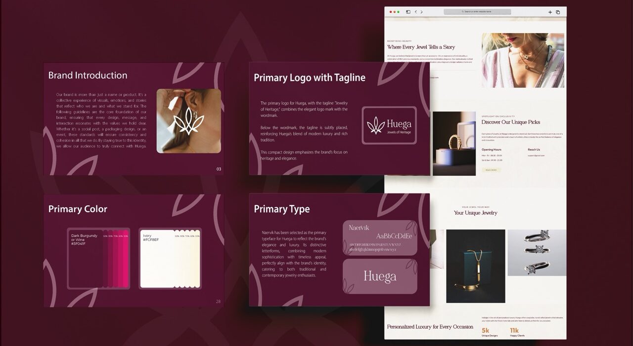
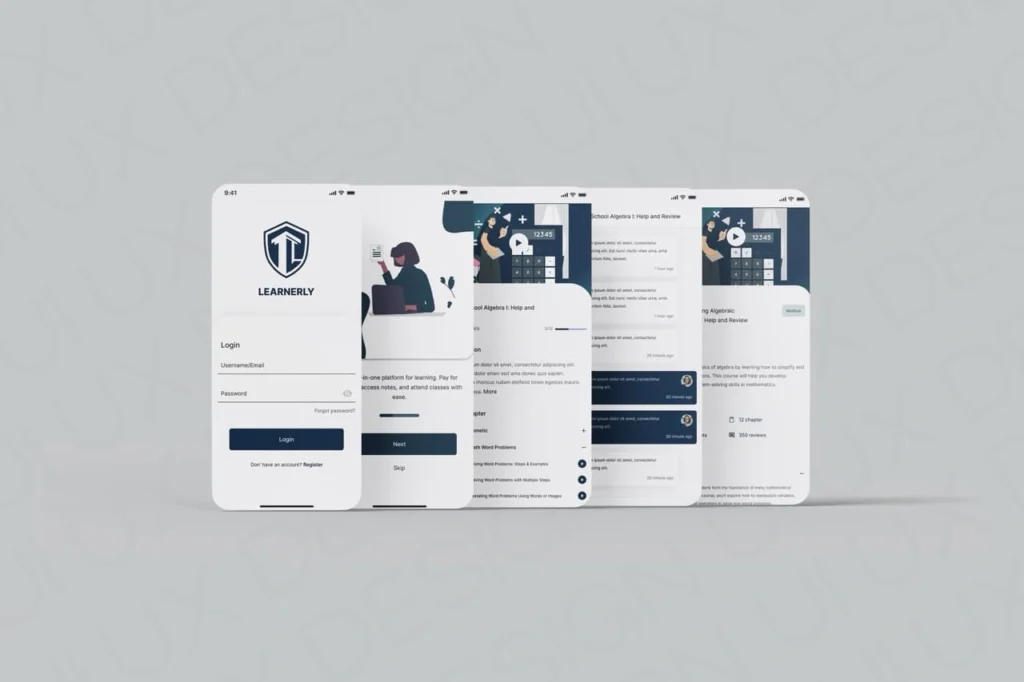
Intuitive Navigation: Simplified UI for course discovery and clear path progression
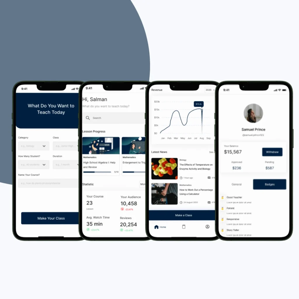
Gamified Learning: Integrated badges, streaks, progress bars, and achievement milestones
Responsive Design: Adapted the platform for mobile, tablet, and desktop views
Visual Hierarchy: Focused layout with learner-centric dashboards and call-to-actions
Wireframes to Prototypes: Complete design lifecycle from low-fidelity concepts to high-fidelity UI
Our Process
Understanding Learners
We began with extensive discovery to uncover how users interact with online learning platforms, what hinders their progress, and what motivates them to complete courses.
What We Did:
Conducted surveys and one-on-one interviews with students and professionals
Analyzed user drop-off points and time-spent metrics
Identified learner personas — from hobbyists to career-focused users
Studied behavioral patterns behind daily engagement and completion rates
Benchmarked leading EdTech platforms for competitive UI/UX insights
Why It Matters:
This helped us empathize with user frustrations and align the product roadmap with real-world learning goals.
Structuring the Experience
Next, we translated the research into simplified user flows and modular wireframes — mapping how learners navigate from discovery to completion.
Designed wireframes for homepage, course catalog, dashboards, and mobile layouts
Prioritized course resumption, easy module access, and quick browsing
Created multi-path flows for different types of users (new, returning, mobile-first)
Focused on reducing cognitive load with minimal clicks and clean content structure
By testing early wireframes, we were able to catch friction points and refine navigation without investing in full visuals.
Designing for Engagement
We introduced motivational design elements that reward learners, encourage streaks, and provide a sense of progression.
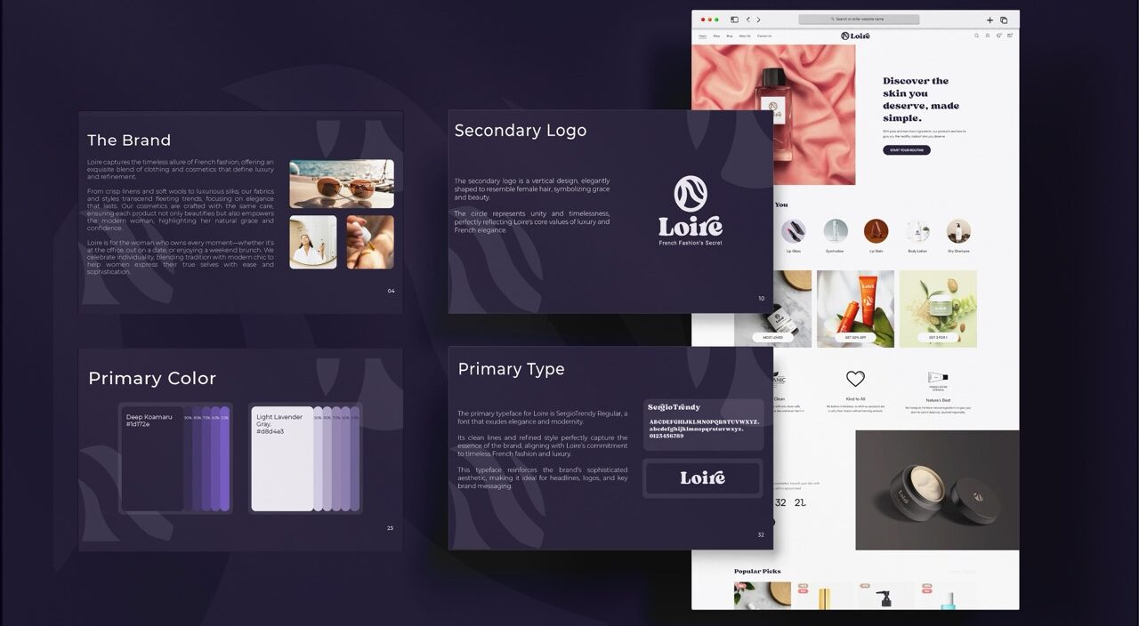
Designed visual achievement systems: badges, points, and streak counters
Introduced “level-up” progress feedback with supportive micro-copy
Created a learner journey tracker with personal milestones
Added motivational nudges like “You’re 1 step away from completing this module”
Optional social sharing for achievements and certificates
Gamification made learning feel like progress rather than pressure, reducing dropouts and increasing re-engagement.
Creating Clarity
We reimagined Learnerly’s look and feel — focusing on simplicity, warmth, and a modern visual identity that enhances learning comfort.
Chose a calm color palette that supports long reading sessions
Crafted custom icons and badges for emotional appeal and visual rewards
Built a scalable design system with cards, progress meters, and alert styles
Used typography that balances clarity with friendliness
Designed UI components to adapt seamlessly to new features
The visual identity supported trust, brand recognition, and long-session comfort — key to a successful learning environment.
Prioritizing Portability
With a majority of users learning on the go, we designed mobile-first — ensuring full functionality and usability on smaller screens.
Created thumb-friendly navigation, buttons, and course controls
Reduced visual clutter for mobile learning sessions
Implemented smart caching and lightweight transitions for quick access
Ensured horizontal scroll and vertical flow consistency
Tested across devices (iOS, Android, tablets, low-end phones)
Learnerly now performs smoothly on all screen sizes — giving users flexibility to learn anytime, anywhere.
Validating & Delivering
Finally, we wrapped the experience into high-fidelity prototypes and ran validation tests with real users and stakeholders.
Built clickable prototypes in Figma to simulate the real user journey
Conducted user testing sessions to validate button placement, dashboard clarity, and flow
Gathered usability feedback to fine-tune animations, spacing, and transitions
Created a detailed design system and dev-ready assets for handoff
Worked with developers to ensure pixel-perfect implementation
The validated prototype ensured faster development and a consistent experience post-launch — with fewer iterations.
Key Outcomes
The updated UI/UX elevated Learnerly’s usability and learner engagement—creating a structured and motivating environment for continuous education.
Gamification features such as streaks and badges encouraged consistent course activity
Personalized dashboard improved clarity of user progress and course roadmap
Mobile-first design increased platform accessibility and daily usage rates
Refined visual identity helped Learnerly stand out in a competitive EdTech market
More Portfolios
Monday – Saturday : 9.00 am – 10:30 pm