Overview
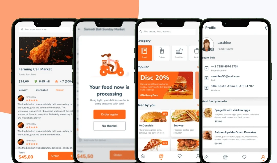
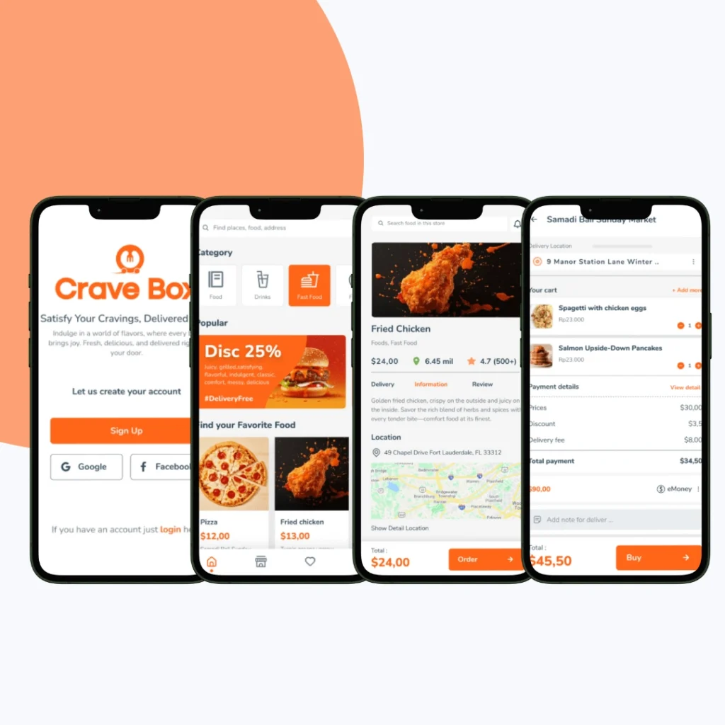
CraveBox is a modern food delivery app that connects users to their favorite local restaurants. Built to deliver a seamless and authentic ordering experience, the platform needed a user-first interface that simplifies browsing, reordering, and customization—all while maintaining visual appeal and intuitive functionality. Our role was to redesign the complete user journey with a focus on clarity, personalization, and speed.
Services provided: UI/UX Design
Objective
The goal was to craft a clutter-free, mobile-optimized app that makes food discovery and ordering quick, enjoyable, and tailored to individual preferences:
Streamline the browsing and checkout flow for fewer taps.
Introduce engaging visuals and animations that reflect brand personality.
Integrate personalization and dark mode for better accessibility and experience.
Ensure smooth, consistent interaction across all screen sizes.
Our Approach
We designed a user-centered mobile experience by balancing performance with aesthetic appeal. Every element—from layout to interaction—was crafted to reduce friction and elevate user engagement.
Minimalist Layout: Clean visual hierarchy and intuitive navigation paths.
High-Impact Visuals: Large food imagery, bold typography, and vibrant category cards.
Simplified Order Flow: Smart reordering, editable cart previews, and quick access menus.
Personalization Features: AI-driven recommendations, favorites, and a full dark mode UI.
Microinteractions: Subtle animations for actions like adding to cart or confirming orders to create feedback loops and enhance usability.
Our Process
Understanding User Behavior in the Food Ordering Journey
We started the project by conducting discovery sessions focused on identifying what users value most in a food delivery app. This included competitor benchmarking, user interviews, and behavior flow mapping to inform design strategy.
Key insights gathered:
Users prefer fewer steps from browsing to checkout
Visuals strongly influence food selection and engagement
Reordering and quick access to past meals improve retention
Personalization (favorites, recommendations) drives satisfaction
With these insights, we mapped core user personas and prioritized key flows to make the experience efficient, delightful, and habit-forming.
Structuring Simplicity and Speed
We focused on creating a clean, lightweight structure that prioritized usability and reduced friction throughout the ordering process.
Our key steps included:
Designing a modular layout with clearly defined entry points (Browse, Favorites, Cart)
Creating intuitive navigation labels and iconography for faster decision-making
Establishing smart grouping for categories (e.g., by cuisine, popularity, or time of day)
Defining a logical user journey from food discovery → customization → checkout
This ensured that even first-time users could explore, select, and place orders without confusion.
Bringing CraveBox’s Flavor to Life
Once the structure was set, we crafted a visually rich interface that echoed CraveBox’s brand personality—fresh, vibrant, and modern.
Highlights of this stage:
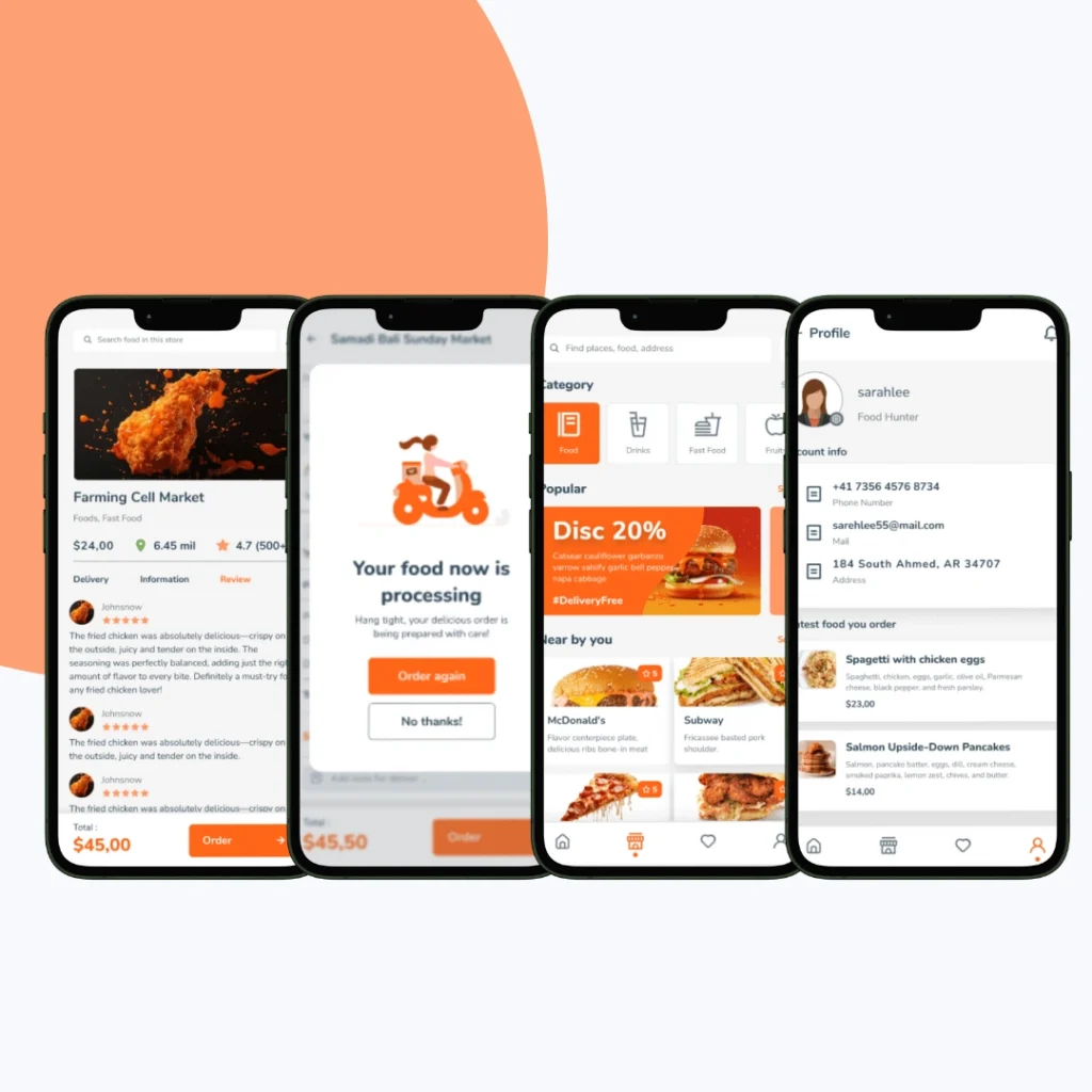
Used large, appetizing food images and bright category cards to draw attention
Paired bold typography with ample white space for clarity and accessibility
Created distinct visual states for browsing, empty carts, loading states, and checkout
Maintained consistency in color palette and icon styles for brand coherence
This layer of design was key to building trust and emotional appeal with the user.
Crafting Tailored and Inclusive Experiences
To deepen engagement, we integrated smart personalization and accessibility features that adapt to different user preferences and contexts.
Key features developed:
AI-driven “Suggested for You” and “Top Reorders” modules based on usage
Favorites list and one-tap reorder cards for frequent items
Full dark mode support for low-light environments
Font and contrast optimization for visual accessibility
These adjustments ensured that the platform not only looked great but worked for everyone.
Refining for Clarity and Confidence
Before final delivery, we built a clickable prototype and tested it across different devices and user segments. Feedback was used to iterate quickly and fine-tune interaction patterns.
Focus areas:
Reducing the number of steps to checkout
Ensuring key buttons are thumb-accessible on smaller screens
Clarifying dish customizations, add-ons, and price transparency
Testing the dark mode interface in various lighting environments
The result was a design system that felt intuitive from the first tap.
Ready for Development and Scale
We delivered a complete design handoff kit with everything needed for seamless development, while ensuring the UI remained scalable for future updates and features.
Deliverables included:
Fully annotated UI components for mobile-first development
A style guide with type, color, spacing, and icon systems
Light and dark mode design tokens and components
Design QA and dev handoff support via Figma comments and walkthroughs
The final outcome was a delightful, scalable food delivery interface ready to launch and grow with CraveBox’s vision.
Key Outcomes
The redesigned interface now offers a fast, intuitive food-ordering experience, empowering users to get what they crave—without distraction or delays.
Smart layout and microinteractions reduce decision fatigue and increase repeat usage.
Adaptive UI ensures smooth performance on both low-end and high-end devices.
Personalized sections improve user connection and session length.
The modern design language reflects CraveBox’s brand ethos and keeps users engaged without clutter.
More Portfolios
Monday – Saturday : 9.00 am – 10:30 pm
