Overview
Doerr is a next-generation task management app designed to boost productivity using proven methods like the Pomodoro technique, Eisenhower matrix, and a buddy system for accountability. The goal was to translate these complex productivity frameworks into an intuitive, highly functional app interface that users can rely on daily.
Provided: 150+ Screens across mobile & web
Target Users: Individuals and teams focused on productivity and task optimization
Objective
To design a user-first productivity platform that blends scientifically proven techniques with everyday usability by:
Simplifying complex productivity methods into digestible UI components
Creating collaborative tools that support accountability (buddy system)
Ensuring ease of navigation across diverse workflows and screen types
Delivering an interface that motivates and rewards consistent progress
Our Approach
We crafted an experience rooted in usability, visual clarity, and behavioral science to ensure the platform boosts consistency and productivity.
Ideation to Execution: Structured design process from wireframes to pixel-perfect UI
Gamified Productivity: Built-in Pomodoro timers, streaks, badges, and rewards
Collaborative UX: Designed the buddy system to encourage peer accountability
Behavior-Driven Layouts: Prioritized task priority, focus modes, and time tracking
150+ Screens: Designed for feature completeness while maintaining simplicity
Our Process
Understanding How People Work Best
We began by diving into the psychology behind productivity methods like Pomodoro, Eisenhower Matrix, and the accountability buddy system. Interviews and user research helped us map real user needs, frustrations, and motivational triggers.
Highlights:
Identified common pain points in current task management tools
Studied productivity science to understand how to support real behavioral change
Mapped out goals for solo users vs. collaborative teams
Outlined the essential features that needed to feel natural, not overwhelming
This phase ensured that every feature had a real purpose — helping users stay focused and get things done.
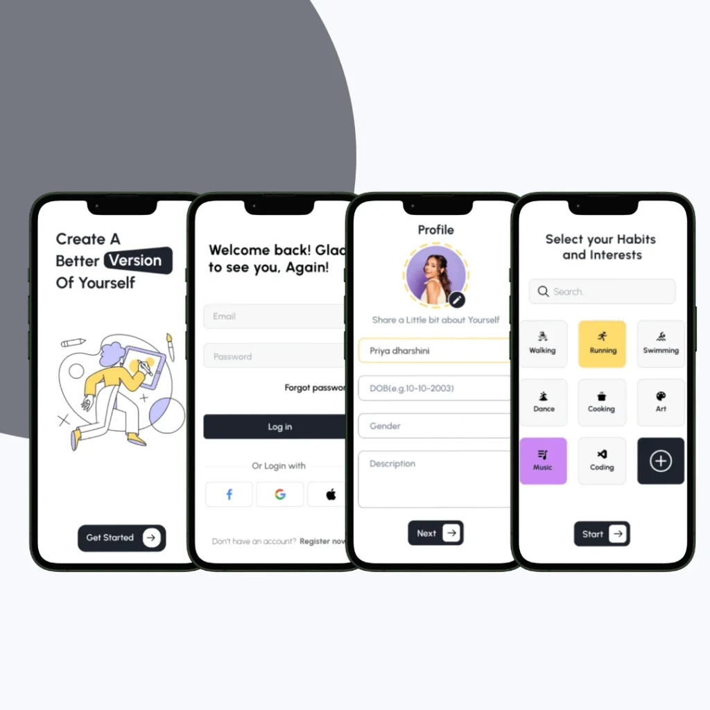
From Theory to User Journey
We sketched out each core workflow, translating complex techniques into simple visual flows that guide users without friction. Every screen was wireframed to match real-life user actions — from adding a task to starting a Pomodoro timer.
Key Actions:
Created user journey maps for solo and team use cases
Drafted low-fidelity wireframes for over 150 mobile and web screens
Defined layout priorities for goal-setting, prioritization, and accountability
Ensured flows adapted well across screen sizes and devices
This helped us lock in structure before styling — keeping usability front and center.
Creating a System That Feels Light, Not Rigid
We introduced a minimal, calming design system that helps users feel in control. Bold colors were used sparingly for priority and motivation cues (e.g., streaks, focus mode), while soft backgrounds and clean typography created visual breathing room.
What We Focused On:
Calming, non-distracting color palette for sustained use
Consistent visual hierarchy across tasks, categories, timers, and reminders
Micro-interactions like progress nudges, badge unlocks, and buddy activity
Mobile-first layouts that expand intuitively to web dashboards
The design needed to feel like a personal assistant — motivating but not overwhelming.
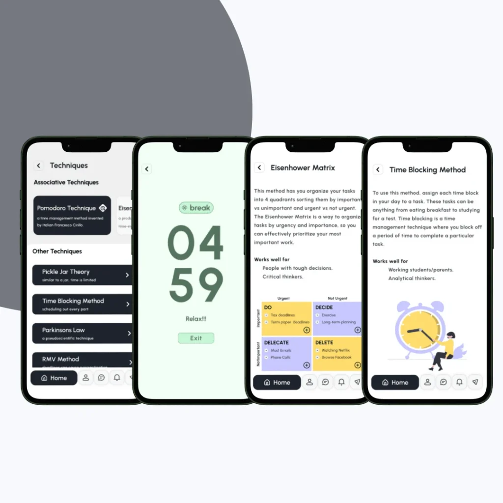
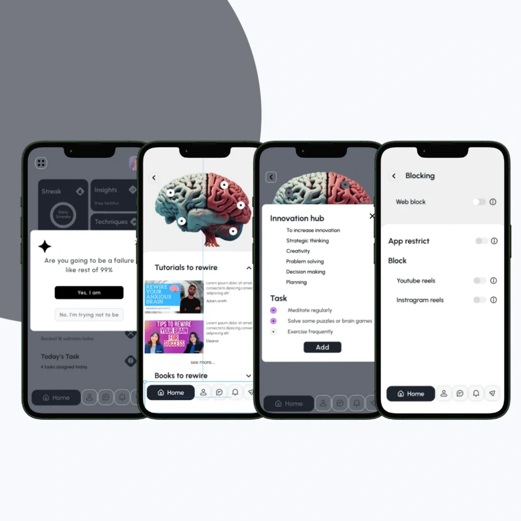
Motivating Through Micro Wins
To encourage daily engagement, we embedded gamified features that align with productivity psychology, like rewarding streaks, visual progress bars, badges, and timed work sessions.
Enhancements Included:
Pomodoro timers with animated break reminders
Streak tracking and badge rewards for completing tasks
Goal-setting milestones with encouraging prompts
A dashboard showing daily, weekly, and monthly progress
Celebratory animations for task completions to boost dopamine feedback
Personal best highlights to track and beat your productivity records.
This helped turn consistency into a rewarding habit, not a chore.
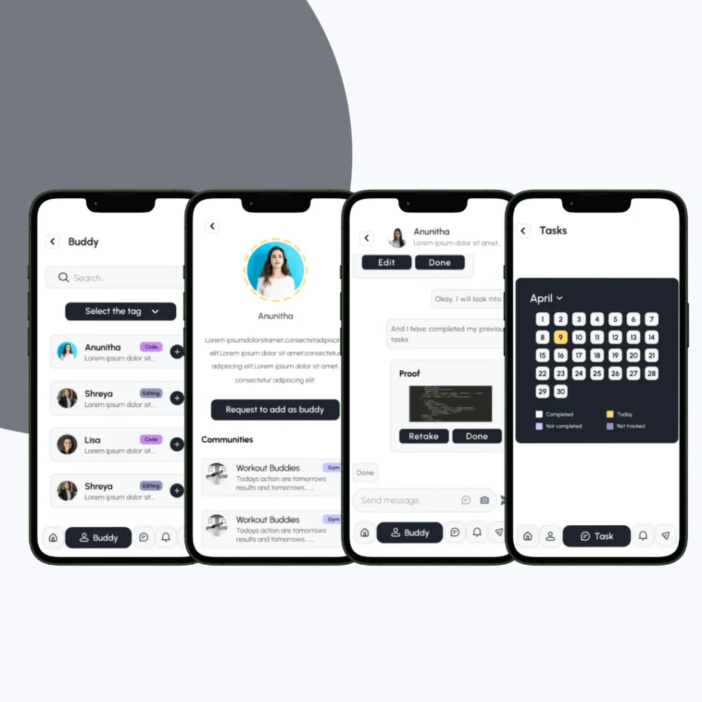
Building the “Buddy System”
Unlike traditional to-do apps, Doerr includes a peer accountability feature that allows users to invite a “buddy” to view progress, share check-ins, and exchange encouragement.
How We Designed It:
Simple buddy invitations via code or link
Check-in reminders and collaborative challenges
Dual dashboards with shared progress highlights
Chat-like notifications and motivational prompts
This human element helped users stay committed — especially during long-term goal pursuits.
150+ Screens, One Unified Language
We developed a modular, reusable design system to support over 150 screens. This made future updates, new features, and platform extensions seamless to implement.
System Included:
Atomic components for tasks, badges, timers, and cards
Standardized spacing, font sizes, and button behaviors
Guidelines for mobile/web handoff with developer-ready assets
Easily expandable for future features like calendar sync, AI task sorting, etc.
The final result is a scalable, user-first productivity platform designed to help people do more — and feel good doing it.
Key Outcomes
The final UI/UX translated productivity science into an easy-to-use digital experience that promotes clarity, focus, and goal progress.
A streamlined task flow allows users to manage complex routines with minimal effort
Visual hierarchy enhances clarity in time-blocking, prioritization, and deadlines
Gamified structure keeps users motivated and engaged with their daily goals
Collaborative features add a human layer to productivity — keeping users accountable
Scalable design system across 150+ screens allows for future expansion without friction
More Portfolios
Monday – Saturday : 9.00 am – 10:30 pm