Overview
InChat is an AI-powered stock market dashboard that delivers real-time analytics, predictive insights, and intelligent alerts. Built for traders and analysts, the platform needed a clean, professional, and data-centric interface that could simplify live stock tracking while enabling faster, AI-driven decisions. Our challenge was to design a high-performance admin panel UI that made complex data feel accessible, actionable, and easy to navigate.
Services Provided: UI/UX Design (Wireframes to High-end Dashboard Interface)
Objective
The goal was to create a responsive and intuitive dashboard experience for high-volume stock data processing with an AI-powered edge:
Simplify data interpretation through clean design and hierarchy.
Integrate predictive AI insights in a non-intrusive, accessible way.
Build an adaptive layout supporting real-time updates and multiple roles.
Enable customization and scalability for future modules and teams.
Our Approach
We crafted a highly functional and visually clear dashboard using user-first UX principles and modular UI systems. With an emphasis on readability, speed, and customization, every design decision supported faster decision-making and long-term scalability.
Designed a collapsible sidebar and smart filtering for ease of navigation.
Developed widgets for live data, AI insights, and smart recommendations.
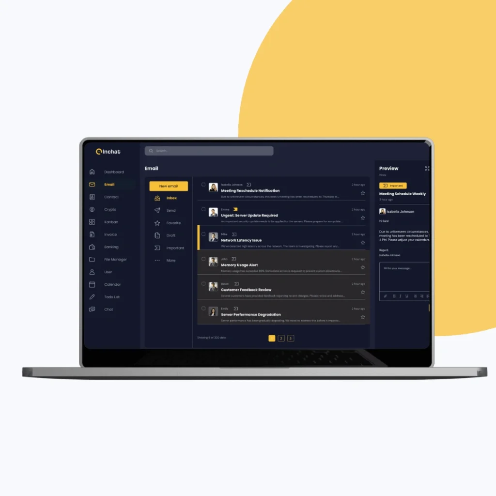
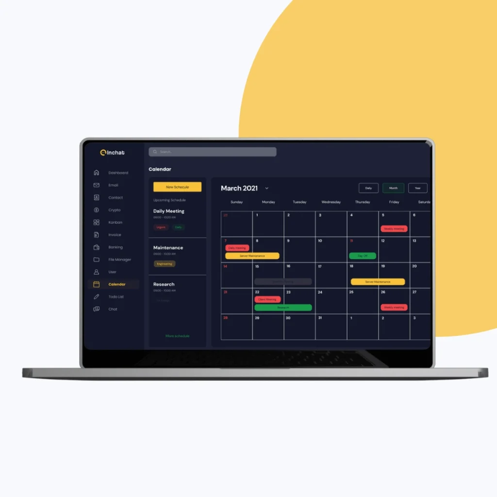
Implemented both Dark and Light modes optimized for usability and readability.
Created wireframes to test layout density, data grouping, and user behavior flows.
Applied clean visual hierarchy, intuitive icons, and clear chart visualizations.
Our Process
Understanding the Needs of Modern Traders
We began with focused strategy sessions to identify core user pain points and expectations from the dashboard. The target users — analysts, traders, and financial managers — needed speed, clarity, and customization.
Key discussions explored:
How do users process high-frequency trading data in real time?
What types of AI insights are valuable — and how should they appear?
What interaction patterns improve trust, not overwhelm, in a data-rich interface?
This phase laid the groundwork for a performance-first UX built around user goals.
Structuring Data for Clarity and Flow
Once user roles and needs were clear, we mapped out a scalable structure that would keep live data easy to follow.
Our approach included:
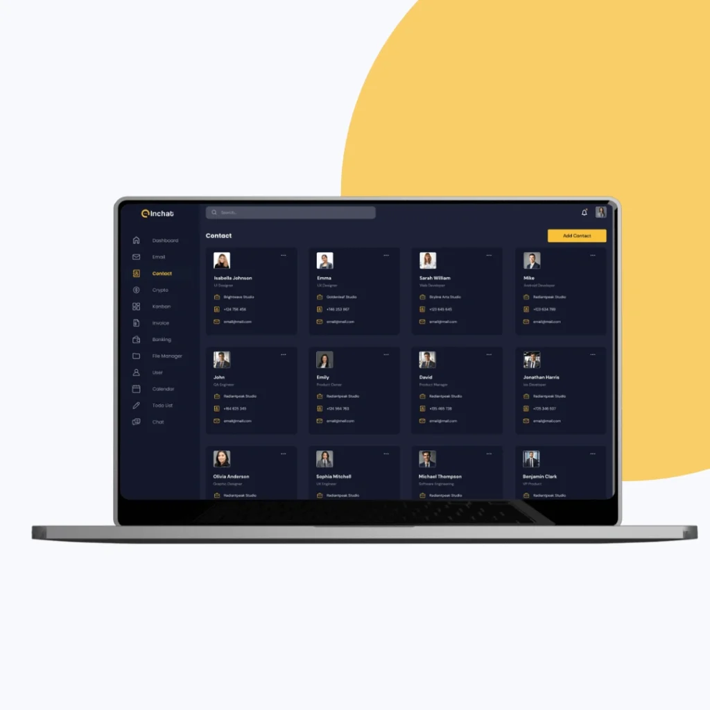
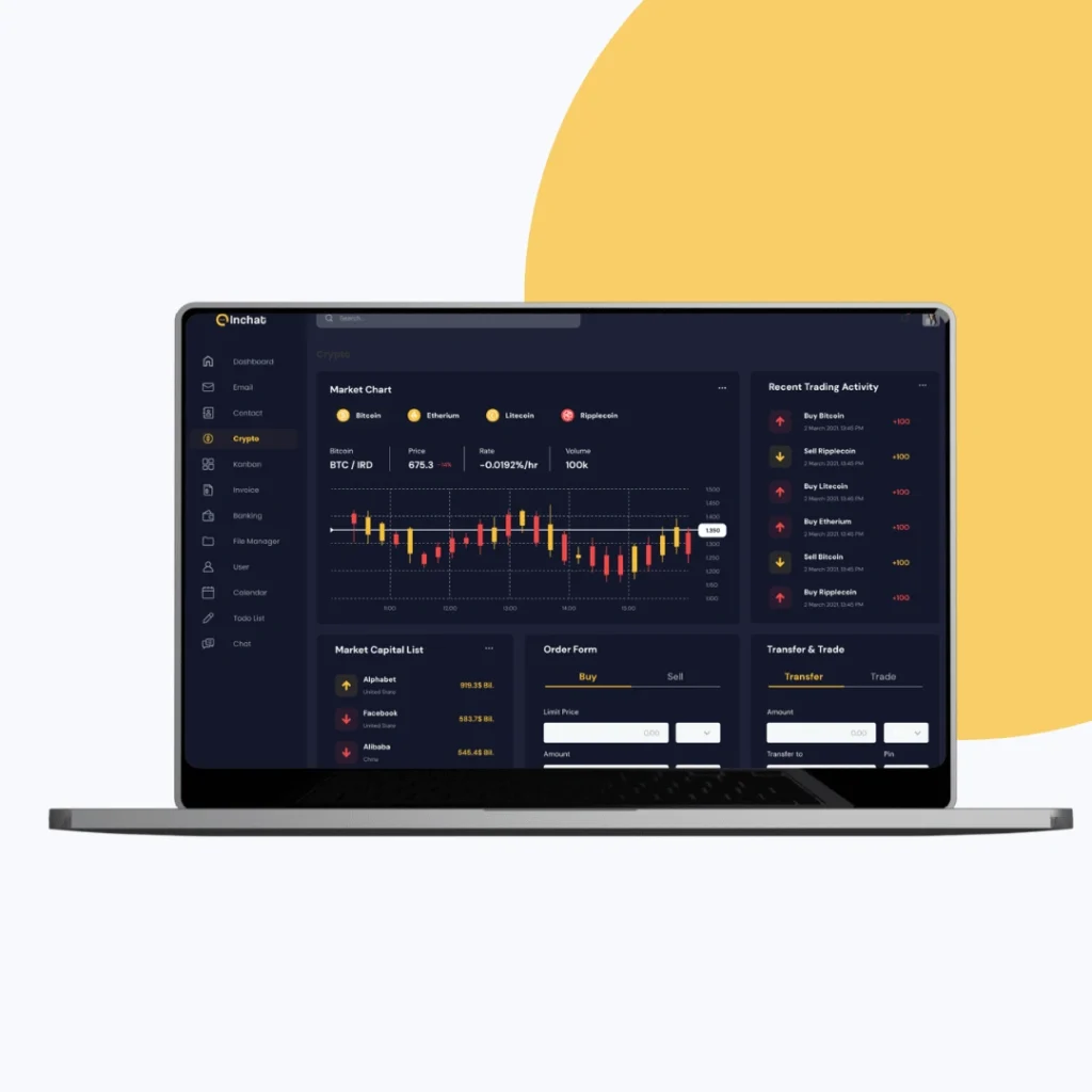
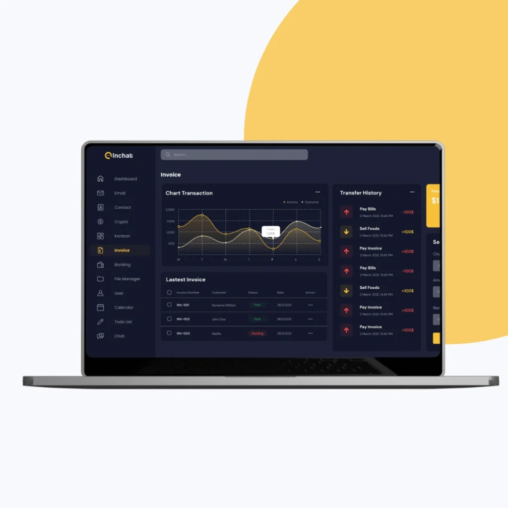
Grouping data modules by priority: watchlist, market overview, and AI suggestions
Creating role-based dashboards (e.g., trader vs. analyst) with modular layouts
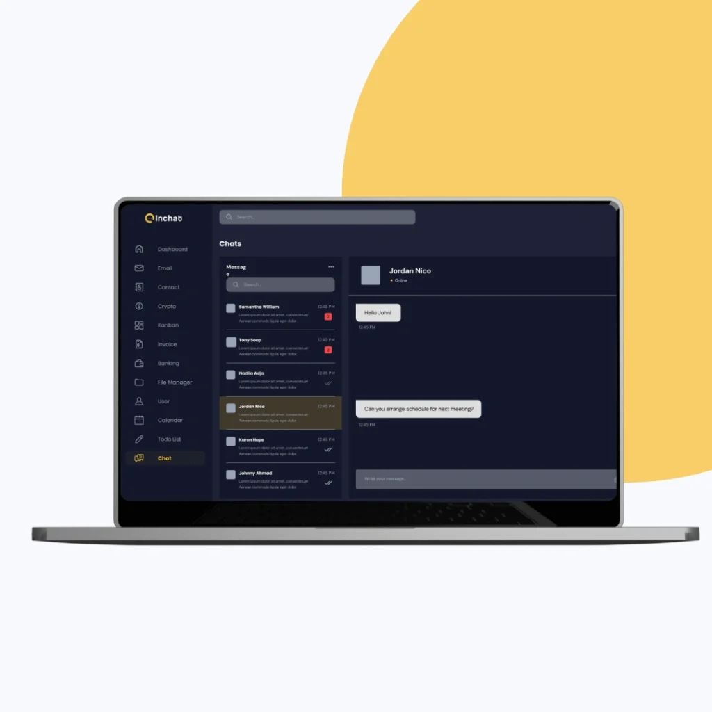
Planning sidebar navigation and dynamic tabs for clean user flow
Introducing keyboard shortcuts and collapsible panels for power users
This ensured that the platform could grow without clutter or confusion.
Validating UX Before Visuals
We translated key flows into wireframes to test how users would navigate, filter, and interact with live data before adding design polish.
Focus areas:
Dashboard widget placement (trend graphs, AI modules, alert history)
Sidebar vs. top nav for faster switching between modules
Layout density tests across screen sizes
A/B tested approaches to prioritize real-time vs. predictive insights
This allowed us to remove friction early and keep the experience intuitive.
Building a Data-Centric Yet Elegant Interface
We brought clarity and precision to the interface with a clean visual hierarchy, purposeful color coding, and streamlined components.
Design highlights:
Created a balanced color palette for both dark and light modes
Used soft contrasts and typography for long-session readability
Developed icon sets that clarify meaning at a glance
Applied consistent spacing, grids, and alignment for scannability
The final visual design supported quick decisions without cognitive overload.
Integrating AI Without Disrupting UX
Our goal was to embed AI-driven suggestions and predictions seamlessly — adding value without being intrusive.
Key enhancements included:
Real-time insights (e.g., “AI Forecast: Stock A may dip 3%”) embedded contextually
In-line nudges when user behavior suggests hesitation or opportunity
Customizable notifications for price movements, volatility, and trends
Visual cueing (badges, colors) to emphasize urgency without alarm
These features encouraged informed, confident actions within the dashboard.
Design System for Growth and Flexibility
The project wrapped with a flexible, scalable design system ready for development and future modules.
Delivered assets included:
Fully responsive high-fidelity UI screens for both web and tablet, built with mobile-responsiveness in mind for future extension.
Design tokens for color palettes, typography, spacing, and themes, supporting seamless toggling between light and dark modes.
Reusable UI components including charts, tables, filters, modals, alerts, and buttons—designed for easy replication and adaptability.
Developer handoff documentation with full design specs, component states (hover, active, disabled), and interaction patterns.
A future-ready AI stock dashboard experience — combining intuitive interaction, advanced data visualization, and UI consistency that supports both entry-level traders and power users. Built not just for launch, but for evolution.
Key Outcomes
The redesigned dashboard UI made InChat’s complex data environment feel approachable and efficient — blending advanced AI logic with minimal, usable design.
A dual-mode UI improves user experience across different work settings.
Drag-and-drop dashboard widgets offer personal layout flexibility.
Visual consistency in components speeds up new feature rollouts.
Data visualization elements such as trend indicators and alerts help users spot signals at a glance.
The intuitive interface enhances both beginner onboarding and power-user workflows.
More Portfolios
Monday – Saturday : 9.00 am – 10:30 pm