Overview
Mini Charms is a playful e-commerce brand offering stylish and high-quality apparel for children. The goal was to design an interface that blends the whimsy of childhood with the practicality parents expect while shopping online. We crafted a UI/UX that balances charm, clarity, and conversion — ensuring a seamless and memorable shopping experience for parents.
Focus Areas: E-commerce UI, Mobile Optimization, Playful Visual Language
Platform: Web & Mobile
Objective
To create a cheerful yet streamlined shopping experience that feels:
Visually joyful, reflecting the innocence and style of children’s fashion
Effortless for parents, minimizing friction in browsing and purchase
Engaging and accessible, across all screen sizes
Informative and helpful, with features like AI-driven recommendations and size guidance
Our Approach
We focused on blending delightful design with practical utility, ensuring parents enjoy the shopping experience while quickly finding what they need.
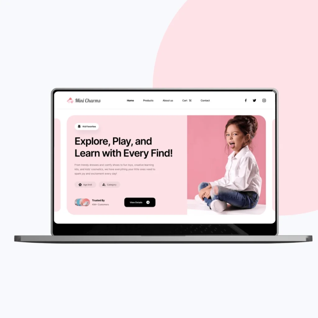
Playful UI Language: Used pastel colors, soft typography, and illustrated elements for a friendly tone
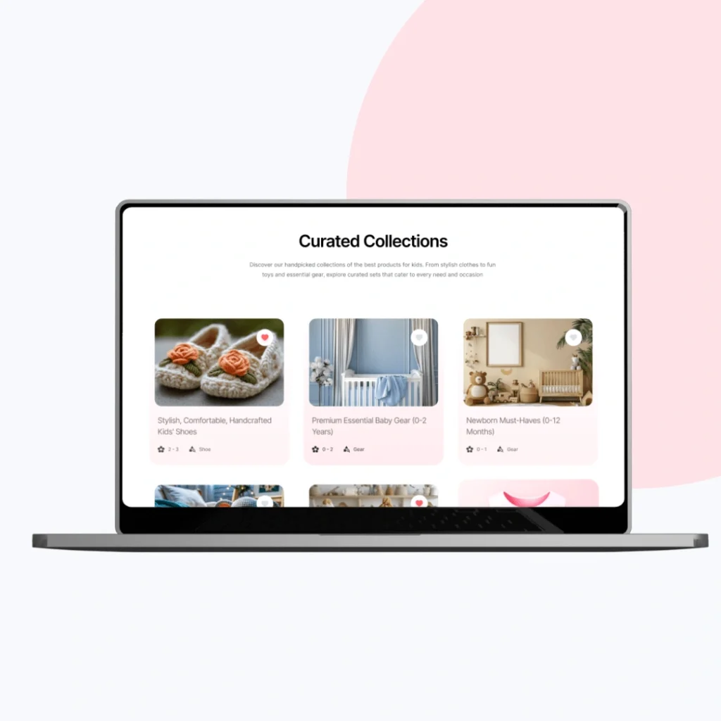
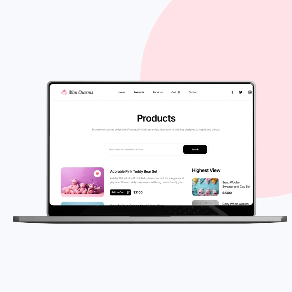
Grid-Based Product Layout: Designed for clean browsing and easy filtering
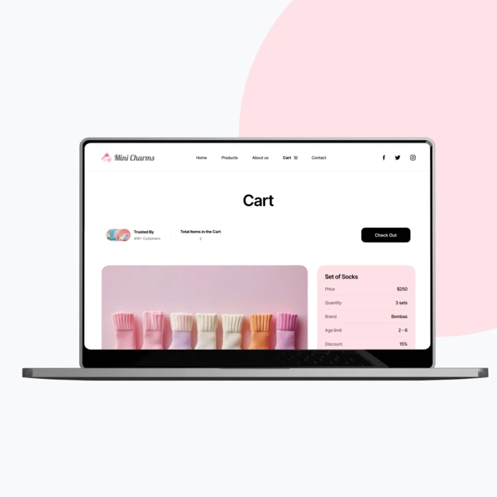
Smart Shopping Flow: Included one-click wishlist, intuitive size selection, and contextual recommendations
Mobile-First Design: Prioritized thumb-friendly zones and fast checkouts for busy parents
Our Process
Understanding Parents and Playfulness
We started with discovery calls and brand research to understand Mini Charms’ target audience — style-conscious parents looking for high-quality, playful kidswear.
What we focused on:
Mapped out buyer personas (parents, gift buyers, returning shoppers)
Identified essential user flows like quick search, wishlist saving, and mobile checkout
Explored competitors in children’s fashion to find design gaps and inspiration
Outlined technical scope for features like size guide and AI-powered suggestions
This step helped us set the tone for a website that’s both charming and easy to shop.
Structuring Joy with Clarity
Once we had a solid understanding of user behavior, we moved into content organization and low-fidelity layouts.
What we created:
Grid-based layouts with category-first browsing (tops, dresses, sets, etc.)
Easy-access filter bars and size options to reduce scroll fatigue
Smooth product discovery paths — homepage → product page → checkout
Featured blocks for bestsellers, seasonal highlights, and recommendations
We kept it simple, keeping attention on the products and user action.
Where Soft Colors Meet Smart Navigation
This phase brought life to the layouts. We designed visuals that blend childhood joy with clean, modern usability.
Design touches included:
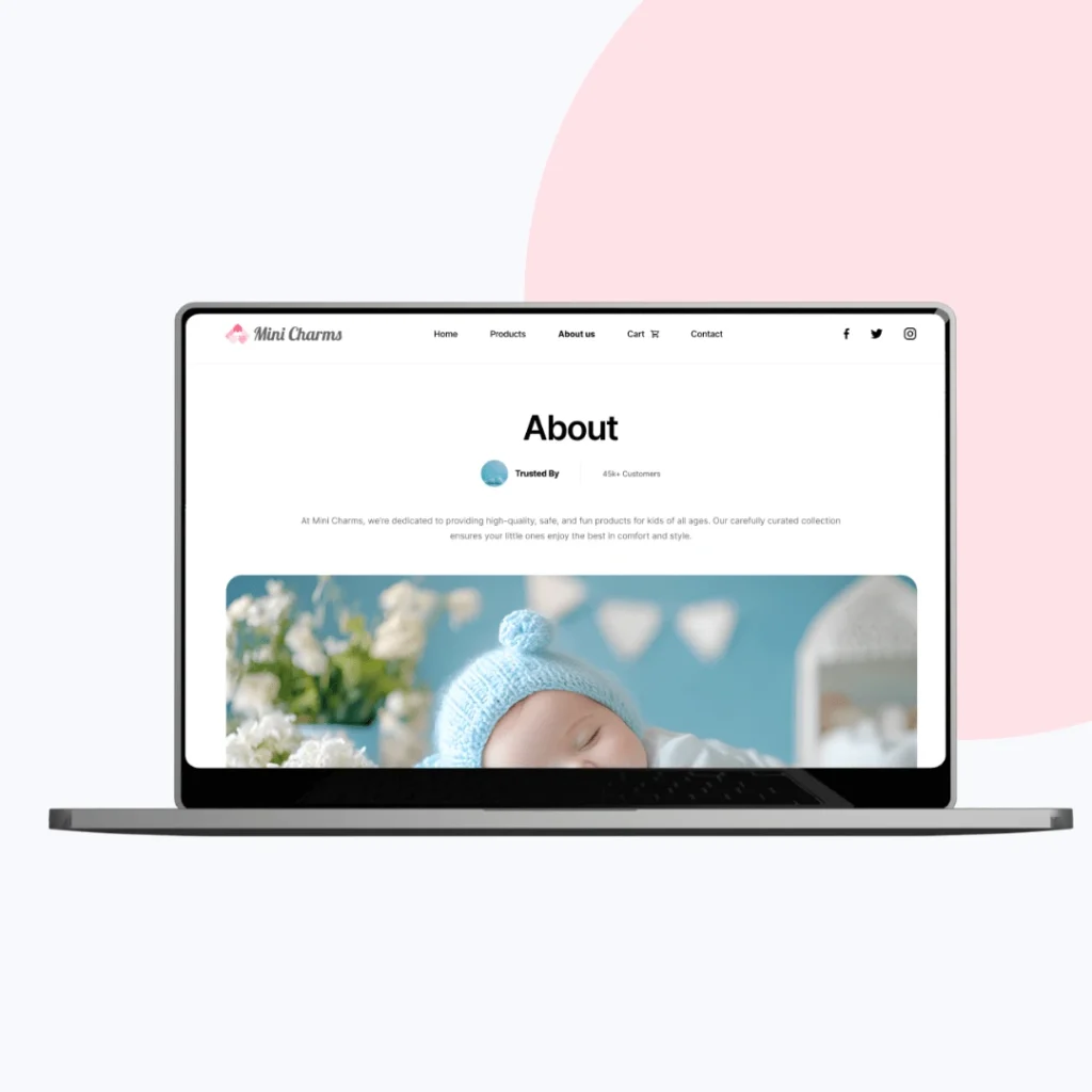
Soft color palette (pastels, creams, and warm tones) to reflect calm, kid-friendly energy
Rounded buttons and playful icons to reinforce the brand tone
Focused product imagery with zoom features and minimal distractions
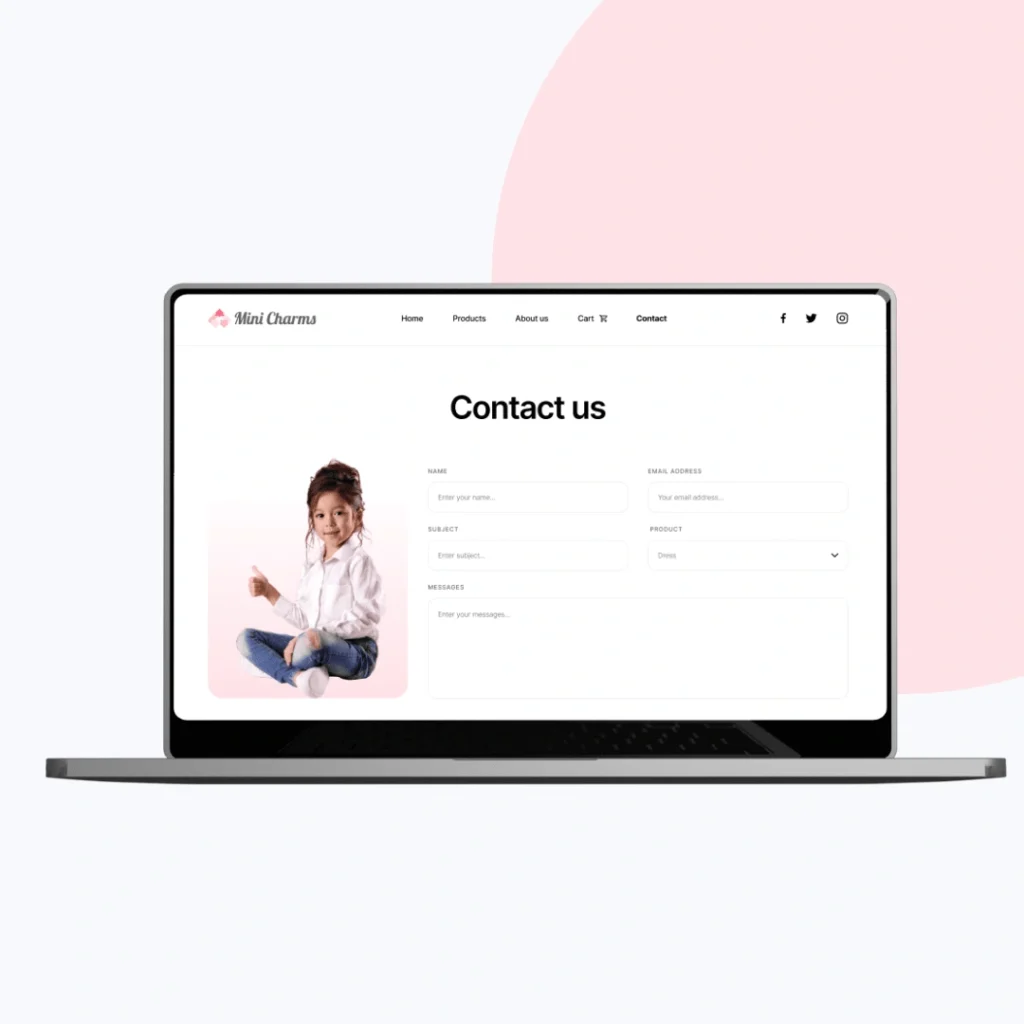
Optimized font sizes and white space for easy reading across ages and screens
We balanced beauty with utility — a joy for both children’s brand lovers and practical parents.
Shopping on the Go Made Easy
With many users browsing from mobile, we prioritized touch-first interaction and fast-loading design.
Mobile-first features included:
Large clickable areas for filtering and add-to-cart
Sticky “Buy Now” and size guide buttons
Streamlined navigation for browsing on small screens
Performance-optimized assets and lazy-loading images
This ensures busy parents can shop easily — whether during school runs or coffee breaks.
Making Every Visit Feel Tailored
We designed interactive features that help shoppers feel guided and supported throughout the experience.
Key add-ons we planned:
AI-driven product recommendations based on previous views and purchases
Pop-up size guides tailored by age and brand sizing info
Wishlist integration that lets parents save and revisit with ease
Smart cart reminders to reduce drop-offs
These tools help turn casual visitors into loyal customers with minimal effort.
Built for Today, Ready for Tomorrow
Before delivery, we reviewed the entire journey for both usability and long-term expansion.
Final checklist:
Handed off scalable design components for future collections and sales pages
Created mobile + desktop testing reports for multiple devices
Delivered editable design files with documentation for future updates
Added space for blogs, gifting guides, and potential multi-language support
Now, Mini Charms has a cheerful, conversion-optimized storefront that delights users, builds trust, and grows with the brand — both online and in parents’ hearts.
Key Outcomes
Mini Charms now stands out with a delightful and conversion-optimized storefront, designed to create trust and delight.
A calming and joyful aesthetic creates emotional appeal without overwhelming users
Streamlined flow helps parents complete purchases with fewer steps
Responsive, accessible interface ensures usability across all devices
Visual design supports brand storytelling — communicating warmth and trustworthiness
More Portfolios
Monday – Saturday : 9.00 am – 10:30 pm