Overview
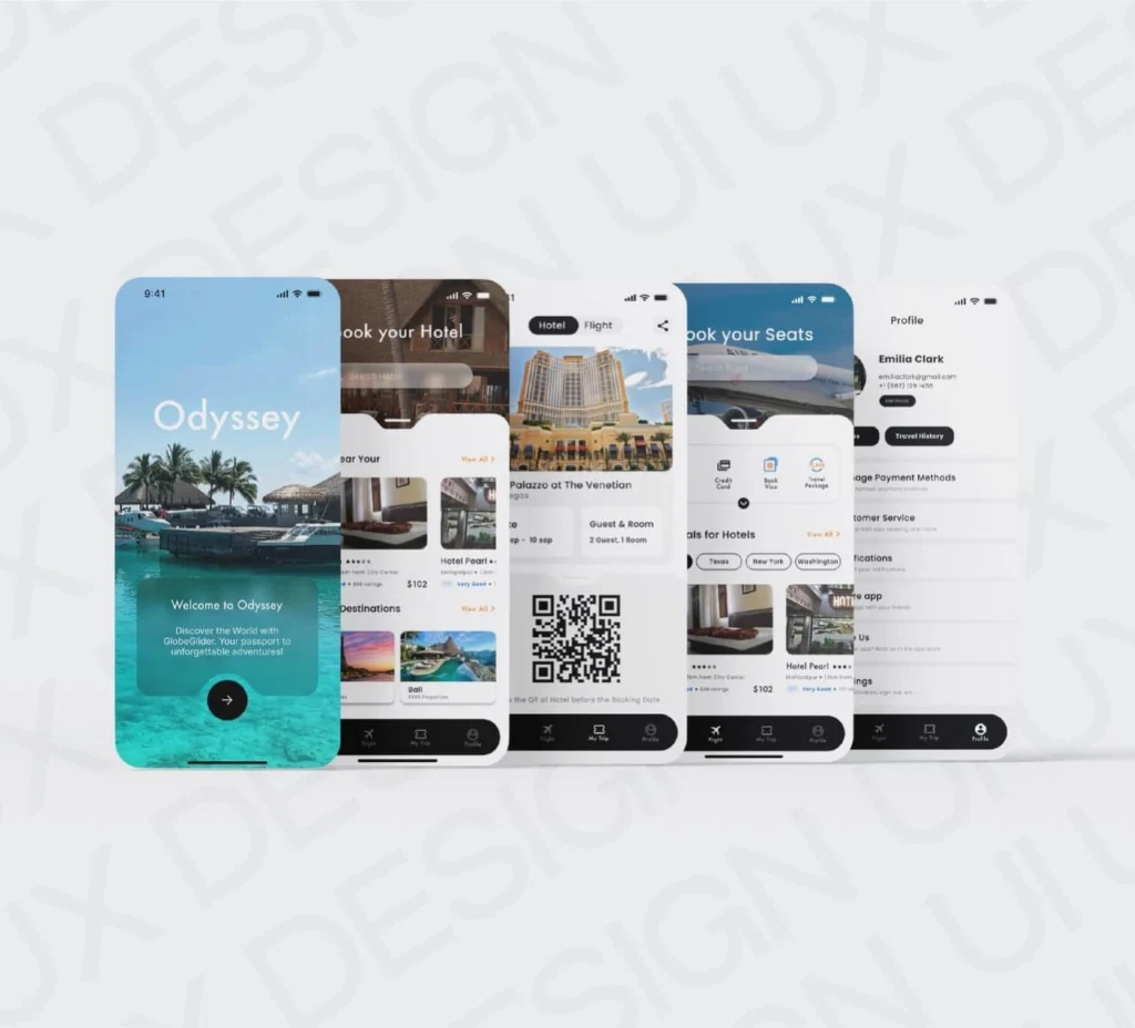
Odyssey is a travel booking app that connects modern explorers with forest resorts, boutique stays, and unique getaways. The brand wanted a design system that mirrored its nature-inspired philosophy, combining elegance with intuitive navigation. We helped them establish a calm, trustworthy identity and built a mobile-first UI to enhance the travel booking experience.
Focus Areas: Logo Design, Visual Identity, Mobile-first UI/UX
Platform: Android & iOS
Objective
To create a nature-inspired visual and digital identity that aligns with Odyssey’s brand values by:
Crafting a logo that symbolizes harmony, growth, and exploration
Designing a clean, intuitive user interface for seamless bookings
Prioritizing a mobile-first experience for modern travelers
Using visual cues from nature to enhance emotional connection and brand recall
Our Approach
We blended simplicity, nature, and usability to deliver an experience travelers can trust and enjoy.
Logo Design: Created a tree-inspired logomark representing growth, roots, and serenity
Color & Typography: Chose a calm green and soft neutral palette paired with modern, legible fonts
User Experience Design: Developed a minimalist layout with high focus on smooth booking flow
Mobile Optimization: Prioritized thumb-friendly interactions and microanimations for better usability
Our Process
Aligning Vision with Values
We began with a brand immersion phase to ensure the visual identity would emotionally resonate with the modern traveler.
Conducted user persona workshops to identify key travel behaviors and expectations.
Explored competitor platforms and identified whitespace for nature-driven differentiation.
Finalized a tone of voice that communicates calmness, confidence, and curiosity.
Defined design keywords: organic, adventurous, serene, mobile-first.
- Mapped user emotions across the travel journey to guide brand messaging and visual storytelling
Designing a Symbol of Nature & Purpose
A tree-inspired symbol was developed to evoke harmony, growth, and rooted exploration.
Integrated subtle curves in the tree branches to mimic natural flow and movement.
Created balanced proportions for logo adaptability across app icons, signage, and web.
Tested the logomark in monochrome and single-color versions to ensure scalability.
Designed alternate logo lockups (vertical, horizontal) for responsive branding flexibility.
Building Calm Through Color & Form
We designed a cohesive brand identity using a nature-forward visual system.
Primary palette: Calming forest green and stone beige — chosen for emotional grounding.
Accent tones added for call-to-action buttons and highlights without visual noise.
Icon set developed with soft edges and line consistency to match the logo style.
Designed scalable UI kits with button states, input fields, badges, and card layouts.
- Typography system chosen for visual softness and high readability across screens.
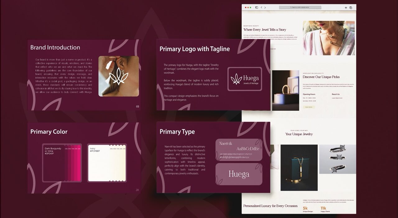
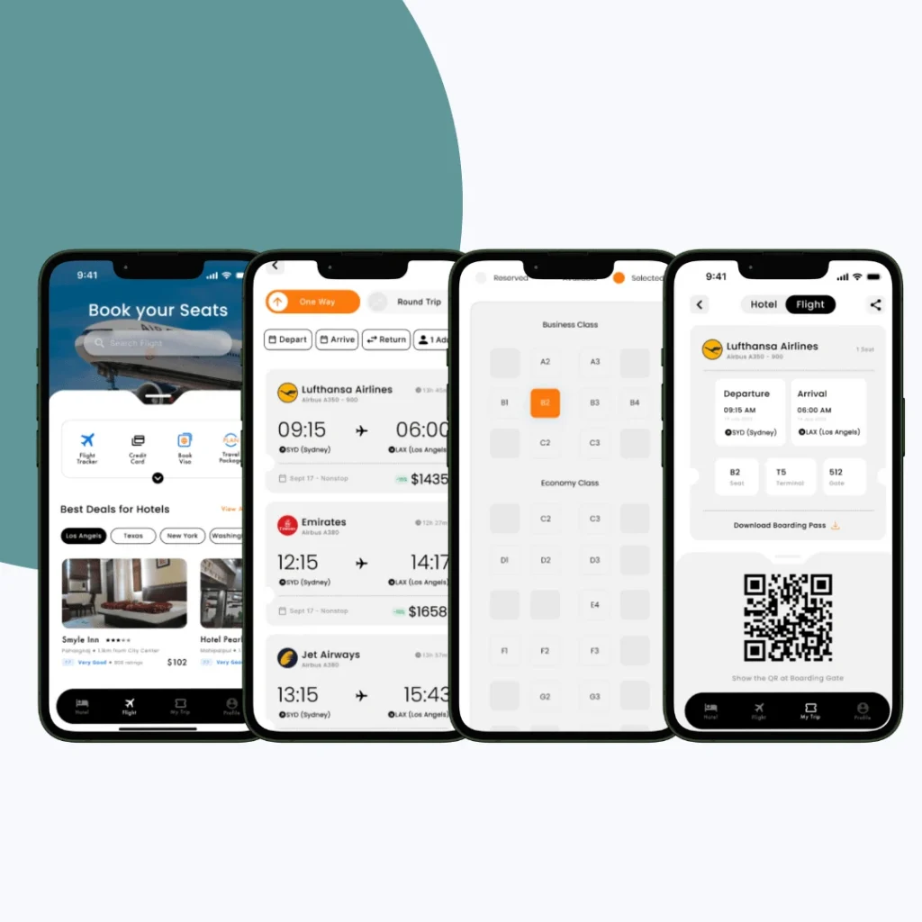
Mapping the Journey from Discovery to Booking
We built an intuitive interface focused on minimal steps and easy exploration.
Designed wireframes for each user flow — including discovery, filtering, booking, and reviews.
Structured navigation with clearly labeled bottom tabs and collapsible filters.
- Incorporated negative space elements to reflect openness and invite visual curiosity
Created a flexible layout system adaptable to various property types and locations.
- Included smart suggestions based on user behavior and trending destinations to enhance discovery
Integrated user profiles, saved favorites, and history into a simplified account section.
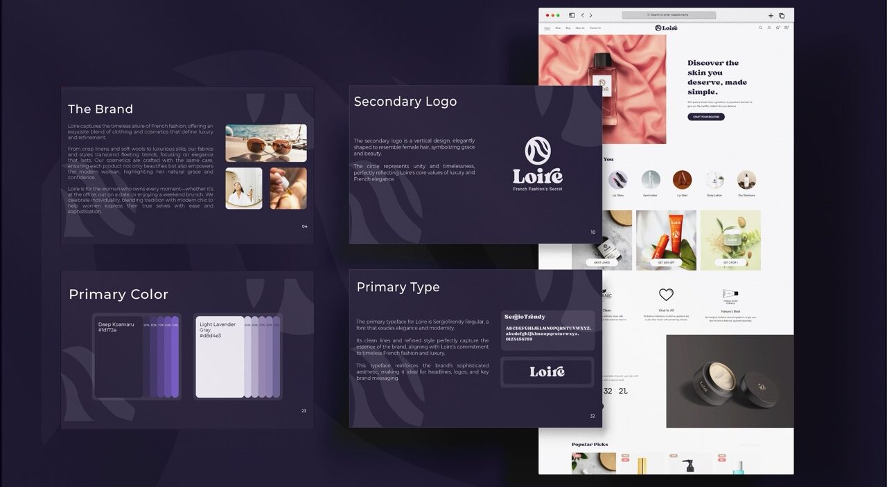
Creating Delight in Every Tap
We brought the interface to life with subtle motion and interactive feedback.
Smooth transitions added between screens to reduce cognitive load.
Micro-animations used for success states (like booking confirmations or saving favorites).
Added gentle sound cues for key actions to elevate the sensory feedback without distraction
Placeholder motion for loading content that mimics natural breathing rhythms.
Hover and press states designed for all interactive elements for better touch experience.
Ready for Rollout Across Devices
We ensured a clean, developer-friendly handoff and built a flexible system with room to grow and scale across platforms.
Delivered annotated design files with proper layer naming, spacing guides, and complete UI specifications for seamless developer implementation.
Provided app icon variations, splash screen designs, onboarding illustrations, and notification templates for a consistent brand presence across devices.
Provided a lightweight design asset library for marketing and growth teams to launch updates quickly with pre-styled UI blocks and banners.
- Built a future roadmap-ready design system capable of supporting new filters, loyalty programs, seasonal offers, and blog content modules.
Included dark mode-ready UI to improve accessibility, reduce eye strain, and extend session durations — especially valuable for users in low-light settings.
Key Outcomes
Odyssey’s identity and experience now speak the language of both adventure and peace, translating brand values into every screen interaction.
The tree-inspired logo adds emotional depth and brand distinction across all touchpoints
A nature-first color palette creates a calming booking experience
Streamlined UI allows users to search, explore, and book effortlessly
Every interface element is optimized for mobile screens and high usability
The visual identity scales across web, app, and offline collateral without losing clarity
More Portfolios
Monday – Saturday : 9.00 am – 10:30 pm