

Pulsating Button
MIT · attributedA solid button that emits a soft, continuously pulsing glow ring to draw the eye to the primary action.
Copy prompt gives Claude Code, Cursor or v0 a ready-to-paste prompt that recreates this exact component.
npx shadcn@latest add https://webinnoventix.com/r/src-pulsating-glow-button.json/* Source: Magic UI — https://github.com/magicuidesign/magicui/blob/main/apps/www/registry/magicui/pulsating-button.tsx — MIT. Included under its original licence. */
/* Copyright (c) Magic UI */
import * as React from "react";
const cx = (...classes: Array<string | false | undefined>) =>
classes.filter(Boolean).join(" ");
export interface PulsatingButtonProps
extends React.ComponentPropsWithoutRef<"button"> {
pulseColor?: string;
duration?: string;
distance?: string;
}
export const PulsatingButton = React.forwardRef<
HTMLButtonElement,
PulsatingButtonProps
>(
(
{
className,
children,
pulseColor = "rgba(99, 102, 241, 0.7)",
duration = "1.5s",
distance = "8px",
...props
},
ref,
) => {
return (
<>
<button
ref={ref}
className={cx(
"relative flex cursor-pointer items-center justify-center rounded-lg bg-indigo-600 px-5 py-2.5 text-center text-sm font-semibold text-white transition-colors hover:bg-indigo-500",
className,
)}
style={
{
"--pulse-color": pulseColor,
"--duration": duration,
"--distance": distance,
} as React.CSSProperties
}
{...props}
>
<span className="relative z-10">{children}</span>
<span
aria-hidden="true"
className="si-pulse pointer-events-none absolute inset-0 rounded-[inherit]"
/>
</button>
<style>{`
.si-pulse { animation: si-pulse var(--duration) ease-out infinite; }
@keyframes si-pulse {
0%, 100% { box-shadow: 0 0 0 0 var(--pulse-color); }
50% { box-shadow: 0 0 0 var(--distance) var(--pulse-color); }
}
`}</style>
</>
);
},
);
PulsatingButton.displayName = "PulsatingButton";
export default function SrcPulsatingGlowButton() {
return (
<section className="flex min-h-[240px] items-center justify-center bg-white px-6 py-20 dark:bg-zinc-950">
<PulsatingButton>Notify Me</PulsatingButton>
</section>
);
}Dependencies
Licence
Magic UI (original) · Licensed under MIT.
Built by Web Innoventix
Need a custom interface, a full website, or SEO that gets you cited by AI? We design, build and rank it end to end.
Get a free quoteSimilar components
Browse all →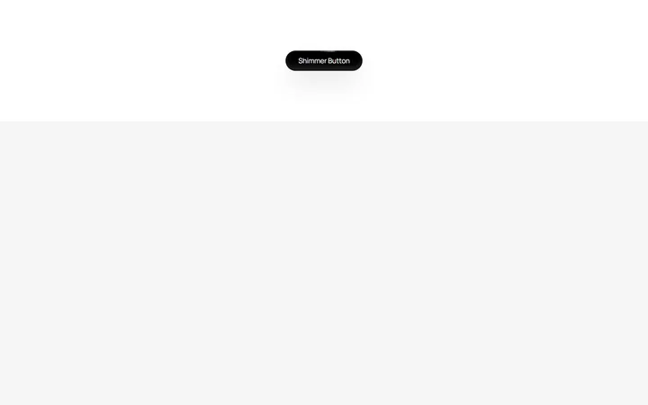
Shimmer Button
MITA dark pill button with a continuous conic-gradient light shimmer sweeping around its border.
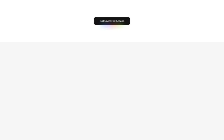
Rainbow Gradient Button
MITA button wrapped in an animated multi-colour gradient border with a matching blurred underglow.
Interactive Hover Button
MITA pill button whose dot expands to fill the surface and reveals an arrow label on hover.
Shiny Button
MITA frosted-glass button with a spring-animated light sweeping across its text and border.

Spotlight Hero
OriginalA centred hero with a soft radial spotlight, badge and dual call-to-action.

Split Hero
OriginalA two-column hero pairing a headline and CTAs with a product mock and social proof.

Gradient Spotlight Hero
OriginalA minimal centred hero with a soft gradient-mesh backdrop, announcement pill and dual call-to-action buttons.

App Preview Hero
OriginalA centred hero that pairs headline copy with a realistic product dashboard mock built entirely from markup, complete with browser chrome and a floating notification card.

Waitlist Capture Hero
OriginalA dark, focused hero with an inline email capture form and avatar social proof, ready for pre-launch waitlists.

Image Backdrop Hero
OriginalA cinematic full-bleed hero with a layered image-style backdrop, overlaid left-aligned copy and a trusted-by logos strip.
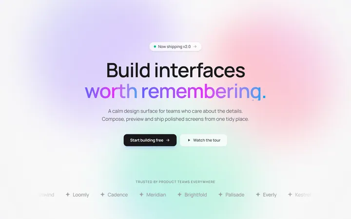
Gradient Mesh Hero with Staggered Text Reveal
OriginalA full-screen hero pairing a drifting animated gradient-mesh backdrop with a word-by-word staggered blur-in headline and a logo marquee under the fold.
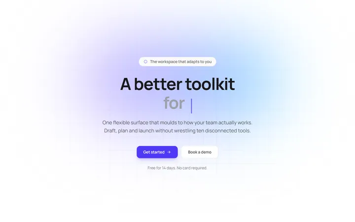
Typewriter Rotating Words Hero
OriginalA hero whose headline cycles through rotating words with a live typewriter caret over an animated grid backdrop, degrading to a gentle word swap when reduced motion is on.