

Rainbow Gradient Button
MIT · attributedA button wrapped in an animated multi-colour gradient border with a matching blurred underglow.
Copy prompt gives Claude Code, Cursor or v0 a ready-to-paste prompt that recreates this exact component.
npx shadcn@latest add https://webinnoventix.com/r/src-rainbow-gradient-button.json/* Source: Magic UI — https://github.com/magicuidesign/magicui/blob/main/apps/www/registry/magicui/rainbow-button.tsx — MIT. Included under its original licence. */
/* Copyright (c) Magic UI */
import * as React from "react";
const cx = (...classes: Array<string | false | undefined>) =>
classes.filter(Boolean).join(" ");
export interface RainbowButtonProps
extends React.ComponentPropsWithoutRef<"button"> {
speed?: string;
}
export const RainbowButton = React.forwardRef<
HTMLButtonElement,
RainbowButtonProps
>(({ className, children, speed = "2s", ...props }, ref) => {
return (
<>
<button
ref={ref}
style={
{
"--rb-speed": speed,
"--color-1": "hsl(0 100% 63%)",
"--color-2": "hsl(270 100% 63%)",
"--color-3": "hsl(210 100% 63%)",
"--color-4": "hsl(195 100% 63%)",
"--color-5": "hsl(90 100% 63%)",
} as React.CSSProperties
}
className={cx(
"si-rainbow group relative inline-flex h-11 shrink-0 cursor-pointer items-center justify-center gap-2 whitespace-nowrap rounded-xl border-0 px-8 text-sm font-medium text-white transition-all focus-visible:outline-none focus-visible:ring-4 focus-visible:ring-white/30 disabled:pointer-events-none disabled:opacity-50 dark:text-zinc-900",
"[background-clip:padding-box,border-box,border-box] [background-origin:border-box] [background:linear-gradient(#121213,#121213),linear-gradient(#121213_50%,rgba(18,18,19,0.6)_80%,rgba(18,18,19,0)),linear-gradient(90deg,var(--color-1),var(--color-5),var(--color-3),var(--color-4),var(--color-2))] bg-[length:200%] [border:calc(0.125rem)_solid_transparent]",
"before:absolute before:bottom-[-20%] before:left-1/2 before:z-0 before:h-1/5 before:w-3/5 before:-translate-x-1/2 before:bg-[length:200%] before:bg-[linear-gradient(90deg,var(--color-1),var(--color-5),var(--color-3),var(--color-4),var(--color-2))] before:[filter:blur(0.75rem)]",
"dark:[background:linear-gradient(#fff,#fff),linear-gradient(#fff_50%,rgba(255,255,255,0.6)_80%,rgba(0,0,0,0)),linear-gradient(90deg,var(--color-1),var(--color-5),var(--color-3),var(--color-4),var(--color-2))]",
className,
)}
{...props}
>
{children}
</button>
<style>{`
.si-rainbow, .si-rainbow::before {
animation: si-rainbow var(--rb-speed, 2s) infinite linear;
}
@keyframes si-rainbow {
0% { background-position: 0%; }
100% { background-position: 200%; }
}
`}</style>
</>
);
});
RainbowButton.displayName = "RainbowButton";
export default function SrcRainbowGradientButton() {
return (
<section className="flex min-h-[240px] items-center justify-center bg-white px-6 py-20 dark:bg-zinc-950">
<RainbowButton>Get Unlimited Access</RainbowButton>
</section>
);
}Dependencies
Licence
Magic UI (original) · Licensed under MIT.
Built by Web Innoventix
Need a custom interface, a full website, or SEO that gets you cited by AI? We design, build and rank it end to end.
Get a free quoteSimilar components
Browse all →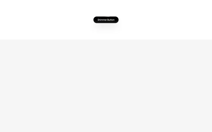
Shimmer Button
MITA dark pill button with a continuous conic-gradient light shimmer sweeping around its border.
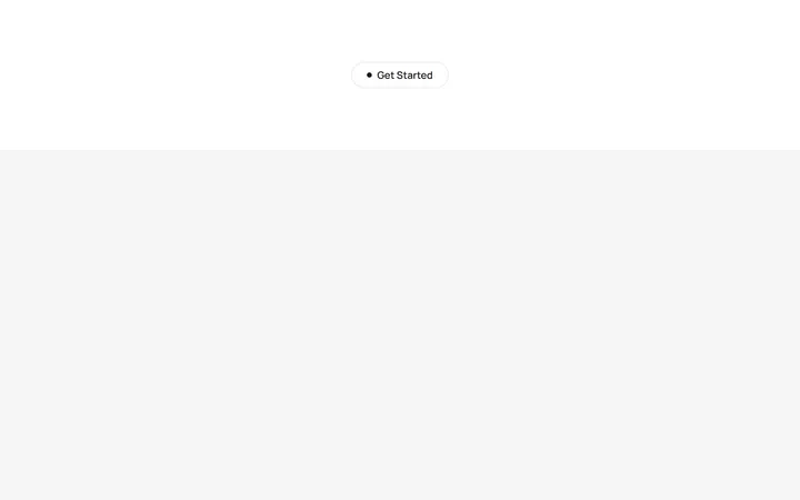
Interactive Hover Button
MITA pill button whose dot expands to fill the surface and reveals an arrow label on hover.
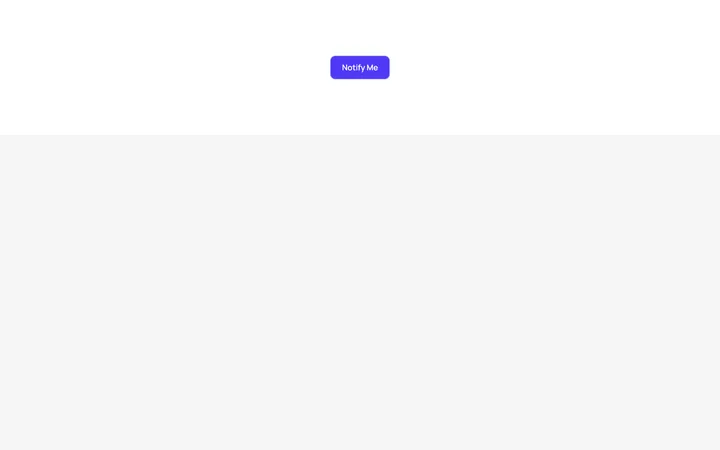
Pulsating Button
MITA solid button that emits a soft, continuously pulsing glow ring to draw the eye to the primary action.
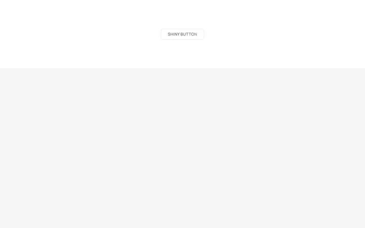
Shiny Button
MITA frosted-glass button with a spring-animated light sweeping across its text and border.

Spotlight Hero
OriginalA centred hero with a soft radial spotlight, badge and dual call-to-action.

Split Hero
OriginalA two-column hero pairing a headline and CTAs with a product mock and social proof.

Gradient Spotlight Hero
OriginalA minimal centred hero with a soft gradient-mesh backdrop, announcement pill and dual call-to-action buttons.

App Preview Hero
OriginalA centred hero that pairs headline copy with a realistic product dashboard mock built entirely from markup, complete with browser chrome and a floating notification card.

Waitlist Capture Hero
OriginalA dark, focused hero with an inline email capture form and avatar social proof, ready for pre-launch waitlists.

Image Backdrop Hero
OriginalA cinematic full-bleed hero with a layered image-style backdrop, overlaid left-aligned copy and a trusted-by logos strip.
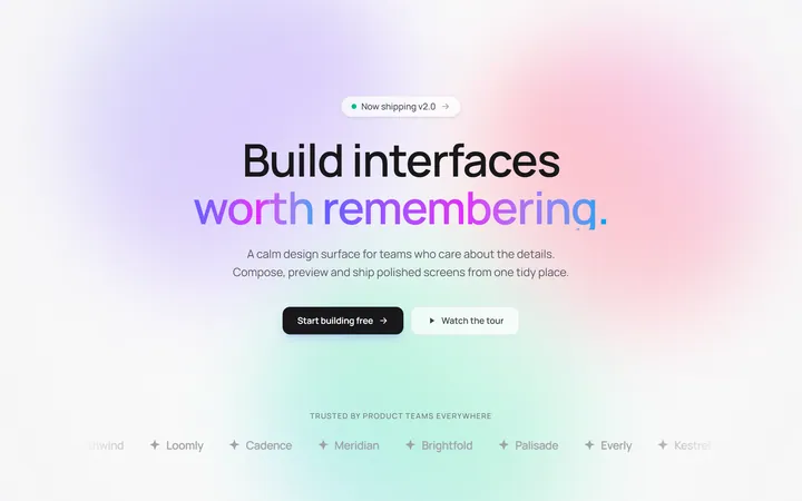
Gradient Mesh Hero with Staggered Text Reveal
OriginalA full-screen hero pairing a drifting animated gradient-mesh backdrop with a word-by-word staggered blur-in headline and a logo marquee under the fold.
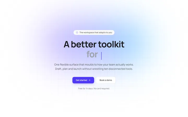
Typewriter Rotating Words Hero
OriginalA hero whose headline cycles through rotating words with a live typewriter caret over an animated grid backdrop, degrading to a gentle word swap when reduced motion is on.