

Feature Icon Card
Original · freeA feature card led by an icon and short supporting copy.
Copy prompt gives Claude Code, Cursor or v0 a ready-to-paste prompt that recreates this exact component.
npx shadcn@latest add https://webinnoventix.com/r/card-feature-icon.json"use client";
import { useId, useState } from "react";
import { AnimatePresence, motion, useReducedMotion } from "motion/react";
type Accent = "indigo" | "emerald" | "rose" | "amber" | "sky" | "violet";
type AccentSkin = {
iconWrap: string;
iconText: string;
glow: string;
badge: string;
link: string;
ring: string;
pinOn: string;
};
const SKINS: Record<Accent, AccentSkin> = {
indigo: {
iconWrap:
"bg-indigo-100 ring-indigo-200 dark:bg-indigo-500/15 dark:ring-indigo-400/20",
iconText: "text-indigo-600 dark:text-indigo-300",
glow: "from-indigo-400/25",
badge:
"bg-indigo-50 text-indigo-700 ring-indigo-200 dark:bg-indigo-500/10 dark:text-indigo-300 dark:ring-indigo-400/20",
link: "text-indigo-600 hover:text-indigo-700 dark:text-indigo-300 dark:hover:text-indigo-200",
ring: "focus-visible:ring-indigo-500 dark:focus-visible:ring-indigo-400",
pinOn: "text-indigo-500 dark:text-indigo-300",
},
emerald: {
iconWrap:
"bg-emerald-100 ring-emerald-200 dark:bg-emerald-500/15 dark:ring-emerald-400/20",
iconText: "text-emerald-600 dark:text-emerald-300",
glow: "from-emerald-400/25",
badge:
"bg-emerald-50 text-emerald-700 ring-emerald-200 dark:bg-emerald-500/10 dark:text-emerald-300 dark:ring-emerald-400/20",
link: "text-emerald-600 hover:text-emerald-700 dark:text-emerald-300 dark:hover:text-emerald-200",
ring: "focus-visible:ring-emerald-500 dark:focus-visible:ring-emerald-400",
pinOn: "text-emerald-500 dark:text-emerald-300",
},
rose: {
iconWrap:
"bg-rose-100 ring-rose-200 dark:bg-rose-500/15 dark:ring-rose-400/20",
iconText: "text-rose-600 dark:text-rose-300",
glow: "from-rose-400/25",
badge:
"bg-rose-50 text-rose-700 ring-rose-200 dark:bg-rose-500/10 dark:text-rose-300 dark:ring-rose-400/20",
link: "text-rose-600 hover:text-rose-700 dark:text-rose-300 dark:hover:text-rose-200",
ring: "focus-visible:ring-rose-500 dark:focus-visible:ring-rose-400",
pinOn: "text-rose-500 dark:text-rose-300",
},
amber: {
iconWrap:
"bg-amber-100 ring-amber-200 dark:bg-amber-500/15 dark:ring-amber-400/20",
iconText: "text-amber-600 dark:text-amber-300",
glow: "from-amber-400/25",
badge:
"bg-amber-50 text-amber-700 ring-amber-200 dark:bg-amber-500/10 dark:text-amber-300 dark:ring-amber-400/20",
link: "text-amber-600 hover:text-amber-700 dark:text-amber-300 dark:hover:text-amber-200",
ring: "focus-visible:ring-amber-500 dark:focus-visible:ring-amber-400",
pinOn: "text-amber-500 dark:text-amber-300",
},
sky: {
iconWrap:
"bg-sky-100 ring-sky-200 dark:bg-sky-500/15 dark:ring-sky-400/20",
iconText: "text-sky-600 dark:text-sky-300",
glow: "from-sky-400/25",
badge:
"bg-sky-50 text-sky-700 ring-sky-200 dark:bg-sky-500/10 dark:text-sky-300 dark:ring-sky-400/20",
link: "text-sky-600 hover:text-sky-700 dark:text-sky-300 dark:hover:text-sky-200",
ring: "focus-visible:ring-sky-500 dark:focus-visible:ring-sky-400",
pinOn: "text-sky-500 dark:text-sky-300",
},
violet: {
iconWrap:
"bg-violet-100 ring-violet-200 dark:bg-violet-500/15 dark:ring-violet-400/20",
iconText: "text-violet-600 dark:text-violet-300",
glow: "from-violet-400/25",
badge:
"bg-violet-50 text-violet-700 ring-violet-200 dark:bg-violet-500/10 dark:text-violet-300 dark:ring-violet-400/20",
link: "text-violet-600 hover:text-violet-700 dark:text-violet-300 dark:hover:text-violet-200",
ring: "focus-visible:ring-violet-500 dark:focus-visible:ring-violet-400",
pinOn: "text-violet-500 dark:text-violet-300",
},
};
type IconKey = "bolt" | "shield" | "globe" | "rewind" | "gauge" | "branch";
function Icon({ name }: { name: IconKey }) {
const common = {
viewBox: "0 0 24 24",
fill: "none",
stroke: "currentColor",
strokeWidth: 1.75,
strokeLinecap: "round" as const,
strokeLinejoin: "round" as const,
"aria-hidden": true,
className: "h-6 w-6",
};
switch (name) {
case "bolt":
return (
<svg {...common}>
<path d="M13 2 4.5 13.5H11l-1 8.5 8.5-11.5H12l1-8.5Z" />
</svg>
);
case "shield":
return (
<svg {...common}>
<path d="M12 3 5 6v5.5c0 4.3 2.9 7.6 7 9 4.1-1.4 7-4.7 7-9V6l-7-3Z" />
<path d="m9.5 12 1.8 1.8L15 10" />
</svg>
);
case "globe":
return (
<svg {...common}>
<circle cx="12" cy="12" r="9" />
<path d="M3 12h18M12 3c2.5 2.4 3.8 5.6 3.8 9S14.5 18.6 12 21c-2.5-2.4-3.8-5.6-3.8-9S9.5 5.4 12 3Z" />
</svg>
);
case "rewind":
return (
<svg {...common}>
<path d="M11 19 4 12l7-7v4h3a6 6 0 1 1 0 12h-2" />
</svg>
);
case "gauge":
return (
<svg {...common}>
<path d="M12 13 16 9" />
<path d="M4.5 17a9 9 0 1 1 15 0" />
<circle cx="12" cy="14" r="1.4" fill="currentColor" stroke="none" />
</svg>
);
case "branch":
return (
<svg {...common}>
<circle cx="6" cy="5" r="2.2" />
<circle cx="6" cy="19" r="2.2" />
<circle cx="18" cy="8" r="2.2" />
<path d="M6 7.2v9.6M8.2 8H14a1.8 1.8 0 0 1 1.8 1.8V6.2M15.8 10v0" />
<path d="M8.2 8H13a3 3 0 0 0 3-3" />
</svg>
);
}
}
type Feature = {
id: string;
accent: Accent;
icon: IconKey;
title: string;
metric: string;
copy: string;
detail: string;
points: string[];
href: string;
};
const FEATURES: Feature[] = [
{
id: "edge",
accent: "indigo",
icon: "globe",
title: "Global edge network",
metric: "310 cities",
copy: "Static assets and functions run from the location nearest each visitor, so pages feel instant everywhere.",
detail:
"Requests are routed to the closest of 310 points of presence with automatic failover. Cold-start times stay under 40ms even on the free tier.",
points: [
"Automatic multi-region failover",
"Sub-40ms cold starts",
"Zero-config asset caching",
],
href: "#edge-network",
},
{
id: "rollback",
accent: "emerald",
icon: "rewind",
title: "Instant rollbacks",
metric: "< 3s",
copy: "Every deploy is immutable and addressable. Roll back to any previous build with a single click.",
detail:
"Because builds are content-addressed, restoring a prior version just re-points the alias. No rebuild, no downtime, no lost traffic.",
points: [
"Immutable, content-addressed builds",
"One-click restore of any deploy",
"Preserved environment variables",
],
href: "#instant-rollback",
},
{
id: "ddos",
accent: "rose",
icon: "shield",
title: "Managed DDoS shield",
metric: "24/7",
copy: "Layer 3, 4 and 7 attacks are absorbed at the edge before they ever reach your origin servers.",
detail:
"Traffic is scored in real time and challenged when anomalous. Rules update automatically as new attack signatures appear worldwide.",
points: [
"Always-on L3/L4/L7 mitigation",
"Adaptive bot scoring",
"No traffic-based surcharges",
],
href: "#ddos-shield",
},
{
id: "analytics",
accent: "sky",
icon: "gauge",
title: "Real-user analytics",
metric: "p75 CWV",
copy: "Core Web Vitals from actual visitors, broken down by route, device and country, with no cookies.",
detail:
"Sampled at 100% on Pro, analytics stream in within seconds of a page load so regressions surface before your customers report them.",
points: [
"Cookie-free, privacy-first collection",
"Per-route LCP, INP and CLS",
"Slack and email alerts on regressions",
],
href: "#real-user-analytics",
},
{
id: "preview",
accent: "violet",
icon: "branch",
title: "Preview deployments",
metric: "Every PR",
copy: "Open a pull request and get a shareable, production-parity URL your whole team can review.",
detail:
"Each preview runs the same runtime as production with isolated environment variables, so what reviewers see is exactly what ships.",
points: [
"Production-parity runtime",
"Isolated per-branch env vars",
"Inline comments on the live URL",
],
href: "#preview-deploys",
},
{
id: "build",
accent: "amber",
icon: "bolt",
title: "Incremental builds",
metric: "8x faster",
copy: "Only the files that changed are rebuilt, turning multi-minute deploys into a few seconds.",
detail:
"A persistent build cache fingerprints your dependency graph and reuses untouched output, so large monorepos deploy in seconds.",
points: [
"Fingerprinted dependency graph",
"Shared cache across branches",
"Parallelised across all cores",
],
href: "#incremental-builds",
},
];
function FeatureCard({ feature }: { feature: Feature }) {
const skin = SKINS[feature.accent];
const [open, setOpen] = useState(false);
const [pinned, setPinned] = useState(false);
const reduce = useReducedMotion();
const panelId = useId();
return (
<article className="cfi-card group relative flex h-full flex-col overflow-hidden rounded-2xl border border-slate-200 bg-white p-6 shadow-sm transition-transform duration-300 will-change-transform hover:-translate-y-1 hover:shadow-xl dark:border-slate-800 dark:bg-slate-900">
<span
aria-hidden
className={`pointer-events-none absolute -right-16 -top-16 h-40 w-40 rounded-full bg-gradient-to-br to-transparent opacity-0 blur-2xl transition-opacity duration-500 group-hover:opacity-100 ${skin.glow}`}
/>
<span
aria-hidden
className="cfi-sheen pointer-events-none absolute inset-y-0 -left-1/3 w-1/3 -skew-x-12 bg-gradient-to-r from-transparent via-white/40 to-transparent dark:via-white/10"
/>
<div className="relative flex items-start justify-between gap-3">
<span
className={`cfi-icon inline-flex h-12 w-12 items-center justify-center rounded-xl ring-1 transition-transform duration-300 group-hover:-rotate-6 group-hover:scale-105 ${skin.iconWrap} ${skin.iconText}`}
>
<Icon name={feature.icon} />
</span>
<button
type="button"
onClick={() => setPinned((v) => !v)}
aria-pressed={pinned}
aria-label={pinned ? `Unpin ${feature.title}` : `Pin ${feature.title}`}
className={`inline-flex h-9 w-9 shrink-0 items-center justify-center rounded-lg border border-slate-200 text-slate-400 transition-colors hover:bg-slate-50 hover:text-slate-600 focus:outline-none focus-visible:ring-2 focus-visible:ring-offset-2 focus-visible:ring-offset-white dark:border-slate-700 dark:hover:bg-slate-800 dark:hover:text-slate-200 dark:focus-visible:ring-offset-slate-900 ${skin.ring} ${
pinned ? skin.pinOn : ""
}`}
>
<svg
viewBox="0 0 24 24"
className="h-5 w-5"
fill={pinned ? "currentColor" : "none"}
stroke="currentColor"
strokeWidth={1.75}
strokeLinecap="round"
strokeLinejoin="round"
aria-hidden
>
<path d="m12 3 2.5 5.6 6.1.6-4.6 4 1.4 6-5.4-3.2L6.6 19l1.4-6L3.4 9l6.1-.6L12 3Z" />
</svg>
</button>
</div>
<div className="relative mt-5 flex items-center gap-2">
<h3 className="text-base font-semibold text-slate-900 dark:text-white">
{feature.title}
</h3>
<span
className={`inline-flex items-center rounded-full px-2 py-0.5 text-xs font-medium ring-1 ${skin.badge}`}
>
{feature.metric}
</span>
</div>
<p className="relative mt-2 text-sm leading-relaxed text-slate-600 dark:text-slate-400">
{feature.copy}
</p>
<AnimatePresence initial={false}>
{open && (
<motion.div
key="detail"
id={panelId}
initial={reduce ? false : { height: 0, opacity: 0 }}
animate={{ height: "auto", opacity: 1 }}
exit={reduce ? { opacity: 0 } : { height: 0, opacity: 0 }}
transition={{ duration: reduce ? 0 : 0.28, ease: [0.22, 1, 0.36, 1] }}
className="relative overflow-hidden"
>
<p className="mt-4 text-sm leading-relaxed text-slate-600 dark:text-slate-400">
{feature.detail}
</p>
<ul className="mt-3 space-y-2">
{feature.points.map((point) => (
<li
key={point}
className="flex items-start gap-2 text-sm text-slate-700 dark:text-slate-300"
>
<svg
viewBox="0 0 24 24"
className={`mt-0.5 h-4 w-4 shrink-0 ${skin.iconText}`}
fill="none"
stroke="currentColor"
strokeWidth={2.25}
strokeLinecap="round"
strokeLinejoin="round"
aria-hidden
>
<path d="m5 12 4.5 4.5L19 7" />
</svg>
{point}
</li>
))}
</ul>
</motion.div>
)}
</AnimatePresence>
<div className="relative mt-5 flex items-center justify-between border-t border-slate-100 pt-4 dark:border-slate-800">
<button
type="button"
onClick={() => setOpen((v) => !v)}
aria-expanded={open}
aria-controls={panelId}
className={`inline-flex items-center gap-1 rounded-md text-sm font-semibold focus:outline-none focus-visible:ring-2 focus-visible:ring-offset-2 focus-visible:ring-offset-white dark:focus-visible:ring-offset-slate-900 ${skin.link} ${skin.ring}`}
>
{open ? "Show less" : "Learn more"}
<svg
viewBox="0 0 24 24"
className={`h-4 w-4 transition-transform duration-300 ${
open ? "rotate-180" : ""
}`}
fill="none"
stroke="currentColor"
strokeWidth={2}
strokeLinecap="round"
strokeLinejoin="round"
aria-hidden
>
<path d="m6 9 6 6 6-6" />
</svg>
</button>
<a
href={feature.href}
className={`inline-flex items-center gap-1 rounded-md text-sm font-medium text-slate-500 transition-colors hover:text-slate-900 focus:outline-none focus-visible:ring-2 focus-visible:ring-offset-2 focus-visible:ring-offset-white dark:text-slate-400 dark:hover:text-white dark:focus-visible:ring-offset-slate-900 ${skin.ring}`}
>
Docs
<svg
viewBox="0 0 24 24"
className="h-4 w-4"
fill="none"
stroke="currentColor"
strokeWidth={2}
strokeLinecap="round"
strokeLinejoin="round"
aria-hidden
>
<path d="M7 17 17 7M9 7h8v8" />
</svg>
</a>
</div>
</article>
);
}
export default function CardFeatureIcon() {
return (
<section className="relative w-full bg-slate-50 px-4 py-20 dark:bg-slate-950 sm:px-6 lg:px-8">
<style>{`
.cfi-scope .cfi-sheen { transform: translateX(0); opacity: 0; }
.cfi-scope .cfi-card:hover .cfi-sheen {
animation: cfi-sweep 0.9s ease forwards;
}
@keyframes cfi-sweep {
0% { transform: translateX(-40%); opacity: 0; }
20% { opacity: 1; }
100% { transform: translateX(520%); opacity: 0; }
}
@keyframes cfi-rise {
from { opacity: 0; transform: translateY(10px); }
to { opacity: 1; transform: translateY(0); }
}
.cfi-scope .cfi-head { animation: cfi-rise 0.5s ease both; }
@media (prefers-reduced-motion: reduce) {
.cfi-scope .cfi-sheen,
.cfi-scope .cfi-card:hover .cfi-sheen,
.cfi-scope .cfi-head { animation: none !important; }
}
`}</style>
<div className="cfi-scope mx-auto max-w-6xl">
<div className="cfi-head mx-auto max-w-2xl text-center">
<span className="inline-flex items-center gap-2 rounded-full border border-slate-200 bg-white px-3 py-1 text-xs font-medium text-slate-600 dark:border-slate-800 dark:bg-slate-900 dark:text-slate-300">
<span className="h-1.5 w-1.5 rounded-full bg-emerald-500" />
Platform features
</span>
<h2 className="mt-4 text-3xl font-bold tracking-tight text-slate-900 dark:text-white sm:text-4xl">
Everything you need to ship fast
</h2>
<p className="mt-3 text-base leading-relaxed text-slate-600 dark:text-slate-400">
A production-grade deployment platform, built for teams who care
about speed, safety and the details in between.
</p>
</div>
<div className="mt-14 grid grid-cols-1 gap-6 sm:grid-cols-2 lg:grid-cols-3">
{FEATURES.map((feature) => (
<FeatureCard key={feature.id} feature={feature} />
))}
</div>
</div>
</section>
);
}Dependencies
Licence
Built by Web Innoventix. Free for personal and commercial use, no attribution required.
Built by Web Innoventix
Need a custom interface, a full website, or SEO that gets you cited by AI? We design, build and rank it end to end.
Get a free quoteSimilar components
Browse all →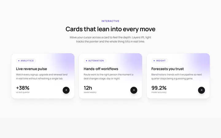
3D Tilt Cards
OriginalA responsive grid of cards that tilt in 3D toward your cursor with a light glare and lifted depth layers, powered by Framer Motion springs.
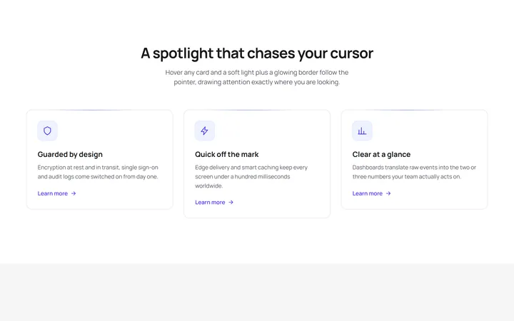
Spotlight Follow Cards
OriginalFeature cards where a soft radial spotlight and a glowing border chase the cursor on hover, with a staggered scroll reveal and an animated shimmer line.
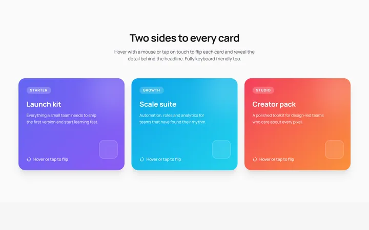
3D Flip Cards
OriginalPricing-style cards that flip in 3D on hover or tap to reveal details on the back, keyboard accessible with a staggered entrance animation.
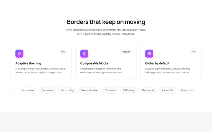
Animated Gradient Border Cards
OriginalCards wrapped in a live conic gradient border that rotates and speeds up on hover, with a shimmer sweep and a scrolling tag marquee.
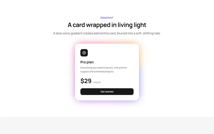
Glow Effect Card
primitivesA reusable glow effect card for React and Tailwind, with hover and motion.
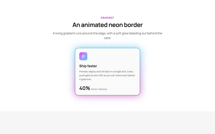
Neon Gradient Card
gradient-card.tsxA reusable neon gradient card for React and Tailwind, with hover and motion.
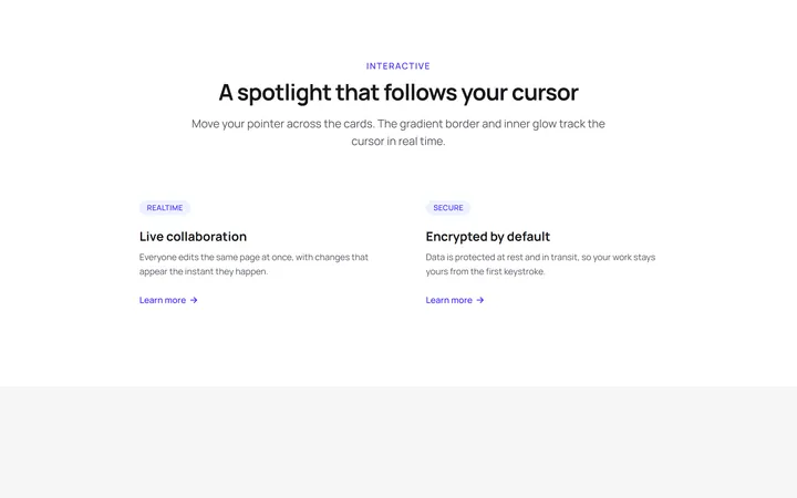
Spotlight Magic Card
card.tsxA reusable spotlight magic card for React and Tailwind, with hover and motion.
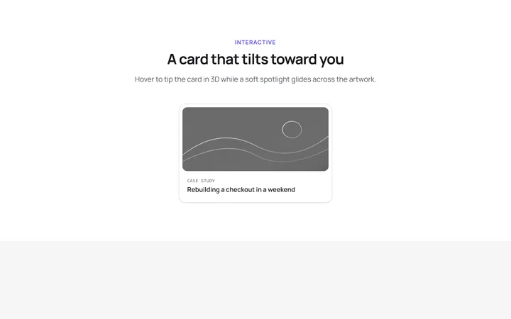
Tilt Spotlight Card
primitivesA reusable tilt spotlight card for React and Tailwind, with hover and motion.
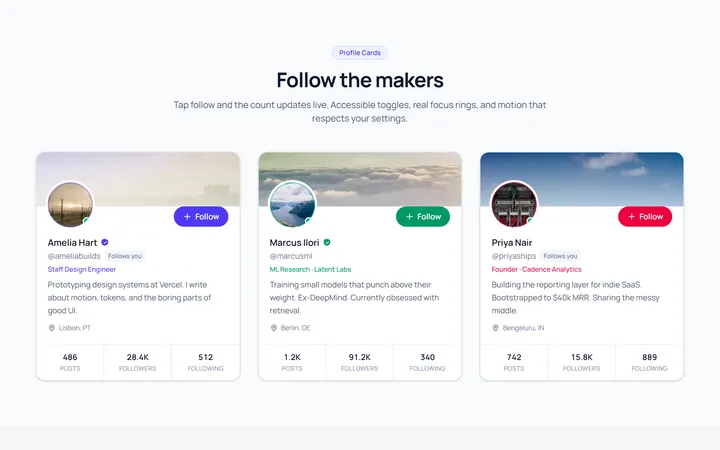
Profile Card
OriginalA user profile card with avatar, stats and a follow toggle.
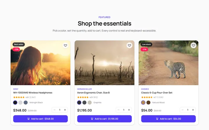
Product Card
OriginalA product card with image, price and add-to-cart feedback.
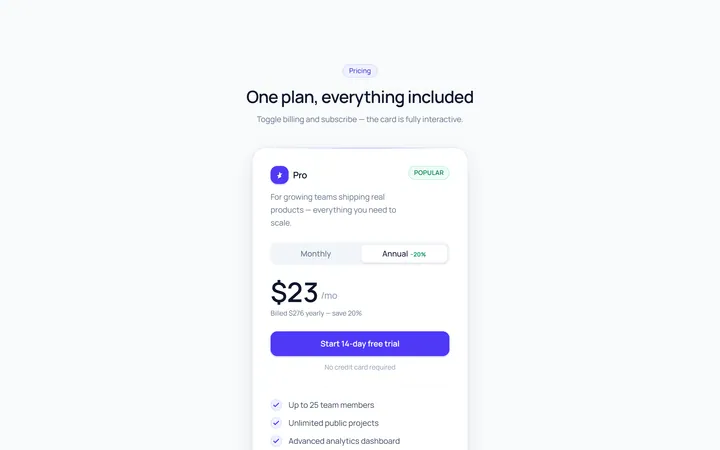
Pricing Single Card
OriginalA single pricing plan card with feature list and CTA.
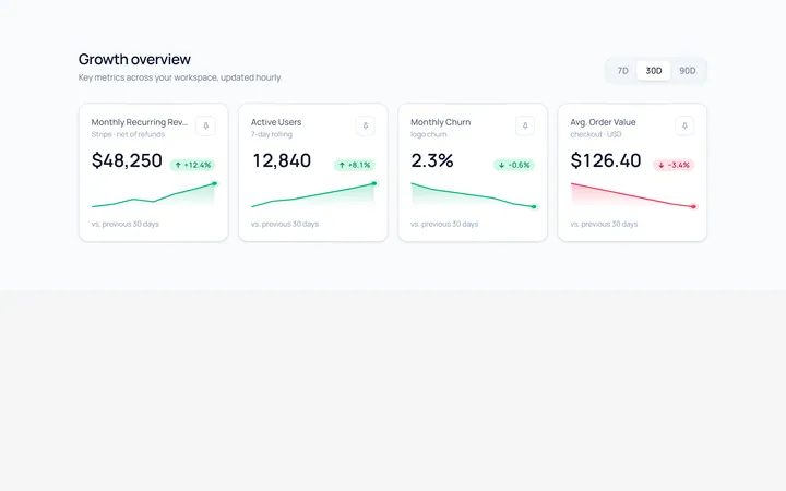
Stat Card
OriginalA metric card with value, trend arrow and a small sparkline.