

Image Overlay Card
Original · freeAn image card with a gradient overlay and a title reveal.
Copy prompt gives Claude Code, Cursor or v0 a ready-to-paste prompt that recreates this exact component.
npx shadcn@latest add https://webinnoventix.com/r/card-image-overlay.json"use client";
import { useState } from "react";
import { motion, useReducedMotion } from "motion/react";
type OverlayCard = {
id: string;
img: string;
category: string;
title: string;
subtitle: string;
place: string;
readTime: string;
href: string;
};
const CARDS: OverlayCard[] = [
{
id: "kyoto",
img: "/img/gallery/g07.webp",
category: "Field Notes",
title: "The Quiet Backstreets of Kyoto",
subtitle: "Where machiya townhouses still keep their lanterns lit.",
place: "Gion, Japan",
readTime: "6 min read",
href: "https://example.com/kyoto",
},
{
id: "dolomites",
img: "/img/gallery/g14.webp",
category: "Trail Log",
title: "Sunrise Over the Dolomites",
subtitle: "A 4am start for the light that lasts ninety seconds.",
place: "Tre Cime, Italy",
readTime: "9 min read",
href: "https://example.com/dolomites",
},
{
id: "lisbon",
img: "/img/gallery/g22.webp",
category: "City Guide",
title: "48 Hours in Alfama",
subtitle: "Fado, custard tarts, and tiled staircases that never end.",
place: "Lisbon, Portugal",
readTime: "5 min read",
href: "https://example.com/lisbon",
},
{
id: "iceland",
img: "/img/gallery/g30.webp",
category: "Long Read",
title: "Chasing the Ring Road in Winter",
subtitle: "Black sand, blue ice, and eleven hours of daylight.",
place: "Vík, Iceland",
readTime: "12 min read",
href: "https://example.com/iceland",
},
];
function HeartIcon({ filled }: { filled: boolean }) {
return (
<svg viewBox="0 0 24 24" aria-hidden="true" className="h-4 w-4">
<path
d="M12 20.5l-1.35-1.23C6.4 15.36 3.5 12.72 3.5 9.5 3.5 7.02 5.42 5.1 7.9 5.1c1.4 0 2.75.65 3.6 1.68A4.77 4.77 0 0 1 15.1 5.1c2.48 0 4.4 1.92 4.4 4.4 0 3.22-2.9 5.86-7.15 9.77z"
fill={filled ? "currentColor" : "none"}
stroke="currentColor"
strokeWidth="1.6"
strokeLinejoin="round"
/>
</svg>
);
}
function LinkIcon() {
return (
<svg viewBox="0 0 24 24" aria-hidden="true" className="h-4 w-4">
<path
d="M10 13.5a3.5 3.5 0 0 0 5 0l2.5-2.5a3.54 3.54 0 0 0-5-5L11 7.5M14 10.5a3.5 3.5 0 0 0-5 0L6.5 13a3.54 3.54 0 0 0 5 5L13 16.5"
fill="none"
stroke="currentColor"
strokeWidth="1.7"
strokeLinecap="round"
strokeLinejoin="round"
/>
</svg>
);
}
function CheckIcon() {
return (
<svg viewBox="0 0 24 24" aria-hidden="true" className="h-4 w-4">
<path
d="M5 12.5l4.2 4.2L19 7"
fill="none"
stroke="currentColor"
strokeWidth="2"
strokeLinecap="round"
strokeLinejoin="round"
/>
</svg>
);
}
function ArrowIcon() {
return (
<svg viewBox="0 0 24 24" aria-hidden="true" className="h-4 w-4">
<path
d="M5 12h14M13 6l6 6-6 6"
fill="none"
stroke="currentColor"
strokeWidth="1.8"
strokeLinecap="round"
strokeLinejoin="round"
/>
</svg>
);
}
function PinIcon() {
return (
<svg viewBox="0 0 24 24" aria-hidden="true" className="h-3.5 w-3.5">
<path
d="M12 21s6.5-5.4 6.5-10.1A6.5 6.5 0 0 0 5.5 10.9C5.5 15.6 12 21 12 21z"
fill="none"
stroke="currentColor"
strokeWidth="1.6"
strokeLinejoin="round"
/>
<circle cx="12" cy="10.6" r="2.2" fill="currentColor" />
</svg>
);
}
function OverlayFigure({
card,
variant,
}: {
card: OverlayCard;
variant: "reveal" | "always" | "tall";
}) {
const reduce = useReducedMotion();
const [liked, setLiked] = useState(false);
const [copied, setCopied] = useState(false);
const [likeCount] = useState(() => 40 + Math.floor(Math.random() * 200));
async function copyLink() {
try {
await navigator.clipboard.writeText(card.href);
setCopied(true);
window.setTimeout(() => setCopied(false), 1600);
} catch {
setCopied(false);
}
}
const isTall = variant === "tall";
const alwaysShown = variant === "always";
return (
<article
className={[
"group/card relative isolate flex flex-col overflow-hidden rounded-3xl",
"bg-zinc-900 text-white shadow-lg shadow-zinc-900/20",
"ring-1 ring-zinc-900/10 dark:ring-white/10",
"transition-transform duration-500 ease-out will-change-transform",
"hover:-translate-y-1 focus-within:-translate-y-1",
isTall ? "aspect-[3/4]" : "aspect-[4/5] sm:aspect-[4/3]",
].join(" ")}
>
{/* eslint-disable-next-line @next/next/no-img-element */}
<img
src={card.img}
alt={`${card.title} — ${card.place}`}
loading="lazy"
draggable={false}
className="cio-img absolute inset-0 -z-10 h-full w-full object-cover transition-transform duration-[900ms] ease-out group-hover/card:scale-[1.06] group-focus-within/card:scale-[1.06] motion-reduce:transform-none"
/>
{/* base gradient — always present so text stays legible */}
<div
aria-hidden="true"
className="absolute inset-0 -z-10 bg-gradient-to-t from-black/85 via-black/25 to-black/5"
/>
{/* deepen-on-hover layer */}
<div
aria-hidden="true"
className="absolute inset-0 -z-10 bg-gradient-to-t from-black/70 via-black/10 to-transparent opacity-0 transition-opacity duration-500 group-hover/card:opacity-100 group-focus-within/card:opacity-100"
/>
{/* accent wash from a corner */}
<div
aria-hidden="true"
className="absolute inset-0 -z-10 bg-[radial-gradient(120%_90%_at_100%_0%,theme(colors.indigo.500/0.35),transparent_55%)] opacity-0 transition-opacity duration-500 group-hover/card:opacity-100 group-focus-within/card:opacity-100"
/>
{/* top row: category chip + actions */}
<div className="relative z-10 flex items-start justify-between gap-3 p-4 sm:p-5">
<span className="inline-flex items-center rounded-full bg-white/15 px-3 py-1 text-[11px] font-semibold uppercase tracking-[0.14em] text-white backdrop-blur-md ring-1 ring-white/25">
{card.category}
</span>
<div className="flex items-center gap-2">
<button
type="button"
aria-pressed={liked}
aria-label={liked ? "Remove from saved" : "Save this story"}
onClick={() => setLiked((v) => !v)}
className={[
"inline-flex h-9 items-center gap-1.5 rounded-full px-3 text-xs font-semibold backdrop-blur-md",
"ring-1 transition-colors duration-300",
"focus:outline-none focus-visible:ring-2 focus-visible:ring-white focus-visible:ring-offset-2 focus-visible:ring-offset-zinc-900",
liked
? "bg-rose-500 text-white ring-rose-300"
: "bg-white/15 text-white ring-white/25 hover:bg-white/25",
].join(" ")}
>
<HeartIcon filled={liked} />
<span className="tabular-nums">{likeCount + (liked ? 1 : 0)}</span>
</button>
<button
type="button"
aria-label={copied ? "Link copied" : "Copy link to this story"}
onClick={copyLink}
className={[
"inline-flex h-9 w-9 items-center justify-center rounded-full backdrop-blur-md ring-1",
"transition-colors duration-300",
"focus:outline-none focus-visible:ring-2 focus-visible:ring-white focus-visible:ring-offset-2 focus-visible:ring-offset-zinc-900",
copied
? "bg-emerald-500 text-white ring-emerald-300"
: "bg-white/15 text-white ring-white/25 hover:bg-white/25",
].join(" ")}
>
{copied ? <CheckIcon /> : <LinkIcon />}
</button>
</div>
</div>
{/* spacer pushes content to the bottom */}
<div className="flex-1" />
{/* bottom content block */}
<div className="relative z-10 mt-auto p-4 sm:p-5">
<div className="mb-2 flex items-center gap-1.5 text-[13px] font-medium text-white/80">
<PinIcon />
<span>{card.place}</span>
<span aria-hidden="true" className="text-white/40">
•
</span>
<span className="text-white/70">{card.readTime}</span>
</div>
<h3 className="text-xl font-semibold leading-snug tracking-tight sm:text-2xl">
{card.href ? (
<a
href={card.href}
target="_blank"
rel="noopener"
className="rounded-sm outline-none after:absolute after:inset-0 after:content-[''] focus-visible:ring-2 focus-visible:ring-white focus-visible:ring-offset-2 focus-visible:ring-offset-zinc-900"
>
{card.title}
</a>
) : (
card.title
)}
</h3>
{/* title reveal: subtitle + CTA slide up unless "always" or reduced motion */}
<div
className={[
"grid transition-all duration-500 ease-out",
alwaysShown || reduce
? "mt-2 grid-rows-[1fr] opacity-100"
: "mt-0 grid-rows-[0fr] opacity-0 group-hover/card:mt-2 group-hover/card:grid-rows-[1fr] group-hover/card:opacity-100 group-focus-within/card:mt-2 group-focus-within/card:grid-rows-[1fr] group-focus-within/card:opacity-100",
"motion-reduce:mt-2 motion-reduce:grid-rows-[1fr] motion-reduce:opacity-100",
].join(" ")}
>
<div className="overflow-hidden">
<p className="text-sm leading-relaxed text-white/80">
{card.subtitle}
</p>
<span className="mt-3 inline-flex items-center gap-1.5 text-sm font-semibold text-indigo-200">
Read the story
<motion.span
aria-hidden="true"
initial={false}
animate={reduce ? {} : { x: [0, 4, 0] }}
transition={
reduce
? undefined
: { duration: 1.4, repeat: Infinity, ease: "easeInOut" }
}
className="inline-flex"
>
<ArrowIcon />
</motion.span>
</span>
</div>
</div>
</div>
</article>
);
}
export default function CardImageOverlay() {
return (
<section className="relative w-full bg-zinc-50 px-5 py-16 text-zinc-900 dark:bg-zinc-950 dark:text-zinc-100 sm:px-8 sm:py-24">
<style>{`
@keyframes cio-fade-up {
from { opacity: 0; transform: translateY(14px); }
to { opacity: 1; transform: translateY(0); }
}
.cio-enter { animation: cio-fade-up 0.6s ease-out both; }
@media (prefers-reduced-motion: reduce) {
.cio-enter { animation: none; }
.cio-img { transition: none !important; }
}
`}</style>
<div className="mx-auto max-w-6xl">
<header className="mx-auto max-w-2xl text-center">
<span className="inline-flex items-center rounded-full bg-indigo-100 px-3 py-1 text-xs font-semibold uppercase tracking-[0.14em] text-indigo-700 dark:bg-indigo-500/15 dark:text-indigo-300">
Dispatches
</span>
<h2 className="mt-4 text-3xl font-semibold tracking-tight sm:text-4xl">
Image cards with a title reveal
</h2>
<p className="mx-auto mt-3 max-w-xl text-base leading-relaxed text-zinc-600 dark:text-zinc-400">
Hover or focus a card to deepen the gradient and slide the details
into view. Each one is a real, keyboard-navigable link with save and
copy actions.
</p>
</header>
{/* Variant 1 — reveal on hover/focus */}
<div className="mt-14">
<div className="mb-5 flex items-baseline justify-between">
<h3 className="text-sm font-semibold uppercase tracking-[0.14em] text-zinc-500 dark:text-zinc-400">
Reveal on hover
</h3>
<span className="text-xs text-zinc-400 dark:text-zinc-500">
details hidden until interaction
</span>
</div>
<div className="grid grid-cols-1 gap-6 sm:grid-cols-2">
{CARDS.slice(0, 2).map((card) => (
<div key={card.id} className="cio-enter">
<OverlayFigure card={card} variant="reveal" />
</div>
))}
</div>
</div>
{/* Variant 2 — always visible */}
<div className="mt-16">
<div className="mb-5 flex items-baseline justify-between">
<h3 className="text-sm font-semibold uppercase tracking-[0.14em] text-zinc-500 dark:text-zinc-400">
Always visible
</h3>
<span className="text-xs text-zinc-400 dark:text-zinc-500">
details persist, gradient still deepens
</span>
</div>
<div className="grid grid-cols-1 gap-6 sm:grid-cols-2">
{CARDS.slice(2, 4).map((card) => (
<div key={card.id} className="cio-enter">
<OverlayFigure card={card} variant="always" />
</div>
))}
</div>
</div>
{/* Variant 3 — tall portrait row */}
<div className="mt-16">
<div className="mb-5 flex items-baseline justify-between">
<h3 className="text-sm font-semibold uppercase tracking-[0.14em] text-zinc-500 dark:text-zinc-400">
Tall portrait
</h3>
<span className="text-xs text-zinc-400 dark:text-zinc-500">
3:4 crop for feature grids
</span>
</div>
<div className="grid grid-cols-2 gap-4 sm:grid-cols-4 sm:gap-6">
{CARDS.map((card) => (
<div key={`tall-${card.id}`} className="cio-enter">
<OverlayFigure card={card} variant="tall" />
</div>
))}
</div>
</div>
</div>
</section>
);
}Dependencies
Licence
Built by Web Innoventix. Free for personal and commercial use, no attribution required.
Built by Web Innoventix
Need a custom interface, a full website, or SEO that gets you cited by AI? We design, build and rank it end to end.
Get a free quoteSimilar components
Browse all →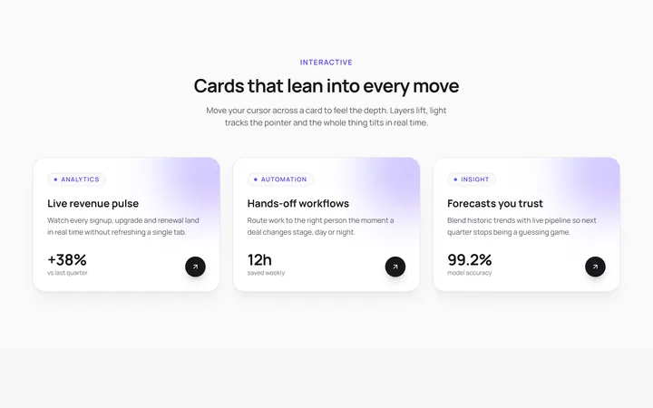
3D Tilt Cards
OriginalA responsive grid of cards that tilt in 3D toward your cursor with a light glare and lifted depth layers, powered by Framer Motion springs.
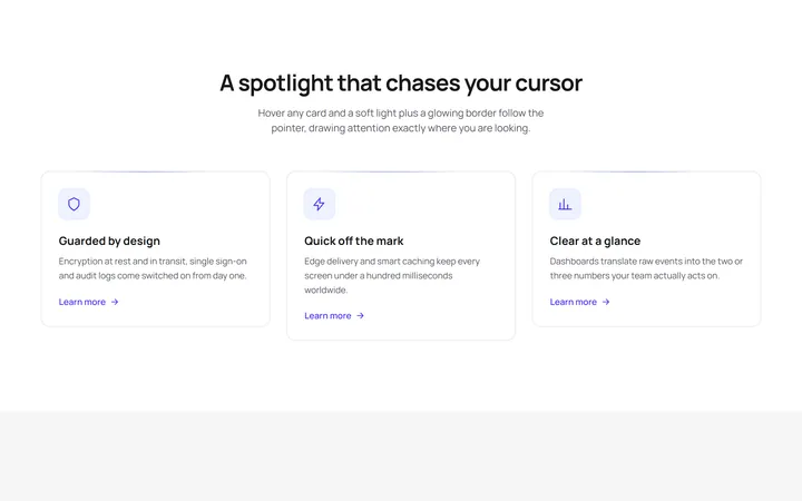
Spotlight Follow Cards
OriginalFeature cards where a soft radial spotlight and a glowing border chase the cursor on hover, with a staggered scroll reveal and an animated shimmer line.
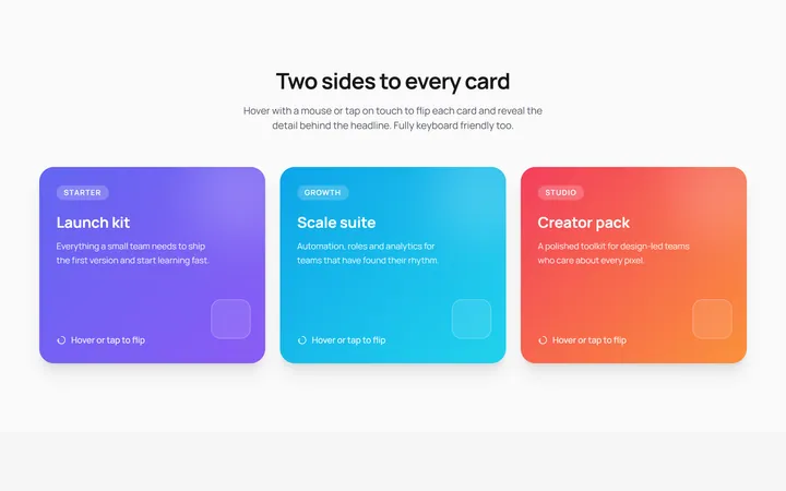
3D Flip Cards
OriginalPricing-style cards that flip in 3D on hover or tap to reveal details on the back, keyboard accessible with a staggered entrance animation.
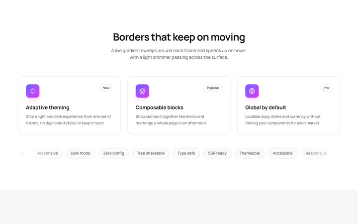
Animated Gradient Border Cards
OriginalCards wrapped in a live conic gradient border that rotates and speeds up on hover, with a shimmer sweep and a scrolling tag marquee.
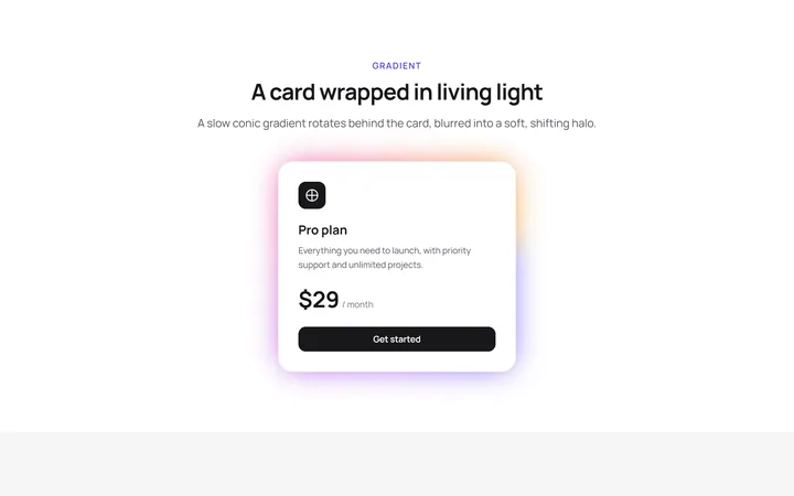
Glow Effect Card
primitivesA reusable glow effect card for React and Tailwind, with hover and motion.
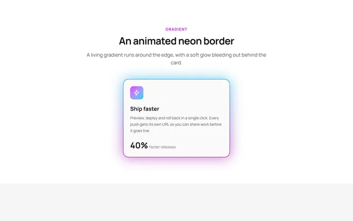
Neon Gradient Card
gradient-card.tsxA reusable neon gradient card for React and Tailwind, with hover and motion.
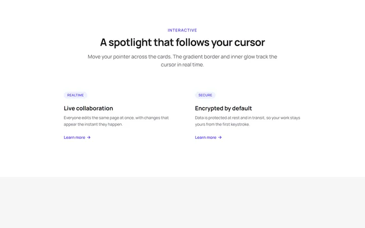
Spotlight Magic Card
card.tsxA reusable spotlight magic card for React and Tailwind, with hover and motion.
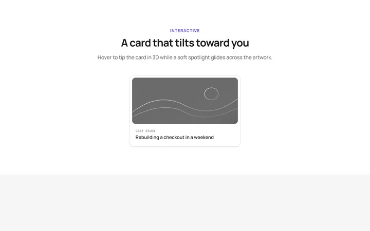
Tilt Spotlight Card
primitivesA reusable tilt spotlight card for React and Tailwind, with hover and motion.
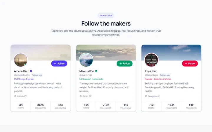
Profile Card
OriginalA user profile card with avatar, stats and a follow toggle.
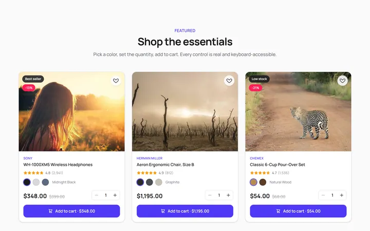
Product Card
OriginalA product card with image, price and add-to-cart feedback.

Pricing Single Card
OriginalA single pricing plan card with feature list and CTA.
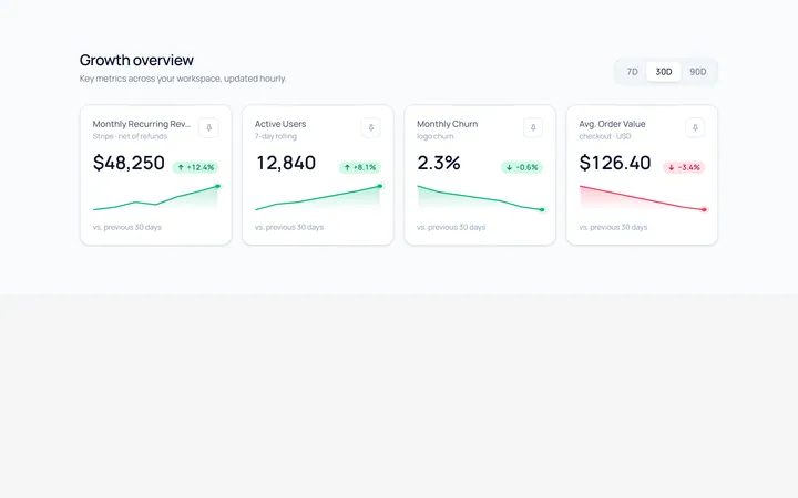
Stat Card
OriginalA metric card with value, trend arrow and a small sparkline.