

Notification Card
Original · freeA notification card with icon, message and inline actions.
Copy prompt gives Claude Code, Cursor or v0 a ready-to-paste prompt that recreates this exact component.
npx shadcn@latest add https://webinnoventix.com/r/card-notification.json"use client";
import { useState, useRef, useEffect, useCallback } from "react";
import { AnimatePresence, motion, useReducedMotion } from "motion/react";
type Tone = "info" | "success" | "warning" | "danger";
type ToastItem = {
id: number;
tone: Tone;
title: string;
body: string;
};
const toneStyles: Record<
Tone,
{
ring: string;
iconWrap: string;
iconColor: string;
bar: string;
dot: string;
}
> = {
info: {
ring: "ring-sky-200/70 dark:ring-sky-500/20",
iconWrap: "bg-sky-50 dark:bg-sky-500/10",
iconColor: "text-sky-600 dark:text-sky-400",
bar: "bg-sky-500",
dot: "bg-sky-500",
},
success: {
ring: "ring-emerald-200/70 dark:ring-emerald-500/20",
iconWrap: "bg-emerald-50 dark:bg-emerald-500/10",
iconColor: "text-emerald-600 dark:text-emerald-400",
bar: "bg-emerald-500",
dot: "bg-emerald-500",
},
warning: {
ring: "ring-amber-200/70 dark:ring-amber-500/20",
iconWrap: "bg-amber-50 dark:bg-amber-500/10",
iconColor: "text-amber-600 dark:text-amber-400",
bar: "bg-amber-500",
dot: "bg-amber-500",
},
danger: {
ring: "ring-rose-200/70 dark:ring-rose-500/20",
iconWrap: "bg-rose-50 dark:bg-rose-500/10",
iconColor: "text-rose-600 dark:text-rose-400",
bar: "bg-rose-500",
dot: "bg-rose-500",
},
};
function ToneIcon({ tone }: { tone: Tone }) {
const common = "h-5 w-5";
switch (tone) {
case "success":
return (
<svg viewBox="0 0 24 24" fill="none" className={common} aria-hidden="true">
<path
d="m5 13 4 4L19 7"
stroke="currentColor"
strokeWidth="2.2"
strokeLinecap="round"
strokeLinejoin="round"
/>
</svg>
);
case "warning":
return (
<svg viewBox="0 0 24 24" fill="none" className={common} aria-hidden="true">
<path
d="M12 9v4m0 4h.01M10.3 3.9 2.4 17.6A2 2 0 0 0 4.1 20.6h15.8a2 2 0 0 0 1.7-3l-7.9-13.7a2 2 0 0 0-3.4 0Z"
stroke="currentColor"
strokeWidth="2"
strokeLinecap="round"
strokeLinejoin="round"
/>
</svg>
);
case "danger":
return (
<svg viewBox="0 0 24 24" fill="none" className={common} aria-hidden="true">
<path
d="M12 8v5m0 3h.01M12 21a9 9 0 1 0 0-18 9 9 0 0 0 0 18Z"
stroke="currentColor"
strokeWidth="2"
strokeLinecap="round"
strokeLinejoin="round"
/>
</svg>
);
default:
return (
<svg viewBox="0 0 24 24" fill="none" className={common} aria-hidden="true">
<path
d="M12 11v5m0-8.5h.01M12 21a9 9 0 1 0 0-18 9 9 0 0 0 0 18Z"
stroke="currentColor"
strokeWidth="2"
strokeLinecap="round"
strokeLinejoin="round"
/>
</svg>
);
}
}
function CloseIcon() {
return (
<svg viewBox="0 0 24 24" fill="none" className="h-4 w-4" aria-hidden="true">
<path
d="M6 6l12 12M18 6 6 18"
stroke="currentColor"
strokeWidth="2"
strokeLinecap="round"
/>
</svg>
);
}
const focusRing =
"focus-visible:outline-none focus-visible:ring-2 focus-visible:ring-offset-2 focus-visible:ring-indigo-500 focus-visible:ring-offset-white dark:focus-visible:ring-offset-zinc-950";
/* ------------------------------------------------------------------ */
/* 1. Standard tone notification with dismiss + action */
/* ------------------------------------------------------------------ */
function ToneNotification({
tone,
title,
body,
primaryLabel,
onDismiss,
}: {
tone: Tone;
title: string;
body: string;
primaryLabel: string;
onDismiss: () => void;
}) {
const s = toneStyles[tone];
return (
<div
role="status"
className={`relative flex gap-3.5 overflow-hidden rounded-2xl bg-white p-4 pr-3 shadow-sm ring-1 ${s.ring} dark:bg-zinc-900`}
>
<span className={`absolute inset-y-0 left-0 w-1 ${s.bar}`} aria-hidden="true" />
<div
className={`mt-0.5 grid h-10 w-10 shrink-0 place-items-center rounded-xl ${s.iconWrap} ${s.iconColor}`}
>
<ToneIcon tone={tone} />
</div>
<div className="min-w-0 flex-1">
<p className="text-sm font-semibold text-zinc-900 dark:text-zinc-50">{title}</p>
<p className="mt-0.5 text-sm leading-relaxed text-zinc-500 dark:text-zinc-400">
{body}
</p>
<div className="mt-3 flex items-center gap-2">
<button
type="button"
className={`rounded-lg px-3 py-1.5 text-xs font-semibold text-white transition-transform active:scale-95 ${s.bar} hover:brightness-110 ${focusRing}`}
>
{primaryLabel}
</button>
<button
type="button"
onClick={onDismiss}
className={`rounded-lg px-3 py-1.5 text-xs font-semibold text-zinc-600 transition-colors hover:bg-zinc-100 dark:text-zinc-300 dark:hover:bg-zinc-800 ${focusRing}`}
>
Dismiss
</button>
</div>
</div>
<button
type="button"
onClick={onDismiss}
aria-label="Close notification"
className={`h-8 w-8 shrink-0 grid place-items-center rounded-lg text-zinc-400 transition-colors hover:bg-zinc-100 hover:text-zinc-600 dark:hover:bg-zinc-800 dark:hover:text-zinc-200 ${focusRing}`}
>
<CloseIcon />
</button>
</div>
);
}
/* ------------------------------------------------------------------ */
/* 2. Mention notification with avatar photo + read state */
/* ------------------------------------------------------------------ */
function MentionNotification() {
const [read, setRead] = useState(false);
const [liked, setLiked] = useState(false);
return (
<div
className={`relative flex gap-3.5 rounded-2xl bg-white p-4 shadow-sm ring-1 transition-colors dark:bg-zinc-900 ${
read
? "ring-zinc-200/70 dark:ring-zinc-800"
: "ring-indigo-200/70 dark:ring-indigo-500/25"
}`}
>
{!read && (
<span
className="absolute right-4 top-4 h-2 w-2 rounded-full bg-indigo-500"
aria-label="Unread"
/>
)}
<div className="relative shrink-0">
{/* eslint-disable-next-line @next/next/no-img-element */}
<img
src="/img/gallery/g14.webp"
alt="Priya Nair"
loading="lazy"
draggable={false}
className="h-11 w-11 rounded-full object-cover ring-2 ring-white dark:ring-zinc-900"
/>
<span className="absolute -bottom-0.5 -right-0.5 grid h-5 w-5 place-items-center rounded-full bg-violet-500 ring-2 ring-white dark:ring-zinc-900">
<svg viewBox="0 0 24 24" fill="none" className="h-3 w-3 text-white" aria-hidden="true">
<path
d="M4 4h16v12H7l-3 3V4Z"
stroke="currentColor"
strokeWidth="2"
strokeLinejoin="round"
/>
</svg>
</span>
</div>
<div className="min-w-0 flex-1 pr-4">
<p className="text-sm leading-relaxed text-zinc-700 dark:text-zinc-200">
<span className="font-semibold text-zinc-900 dark:text-zinc-50">Priya Nair</span>{" "}
mentioned you in{" "}
<span className="font-semibold text-indigo-600 dark:text-indigo-400">
#q3-launch
</span>
</p>
<p className="mt-1 rounded-xl bg-zinc-50 px-3 py-2 text-sm leading-relaxed text-zinc-600 dark:bg-zinc-800/60 dark:text-zinc-300">
Can you push the pricing table live before the demo? Ping me when it's up.
</p>
<div className="mt-2.5 flex items-center gap-2">
<span className="text-xs text-zinc-400 dark:text-zinc-500">2m ago</span>
<span className="text-zinc-300 dark:text-zinc-600">·</span>
<button
type="button"
aria-pressed={liked}
aria-label={liked ? "Remove reaction" : "React with a heart"}
onClick={() => setLiked((v) => !v)}
className={`inline-flex items-center gap-1 rounded-lg px-1.5 py-0.5 text-xs font-medium transition-colors ${
liked
? "text-rose-600 dark:text-rose-400"
: "text-zinc-500 hover:text-zinc-800 dark:text-zinc-400 dark:hover:text-zinc-200"
} ${focusRing}`}
>
<svg
viewBox="0 0 24 24"
className="h-3.5 w-3.5"
fill={liked ? "currentColor" : "none"}
aria-hidden="true"
>
<path
d="M12 20s-7-4.35-7-9.5A3.5 3.5 0 0 1 12 7a3.5 3.5 0 0 1 7 3.5C19 15.65 12 20 12 20Z"
stroke="currentColor"
strokeWidth="1.8"
strokeLinejoin="round"
/>
</svg>
{liked ? "Liked" : "Like"}
</button>
<button
type="button"
onClick={() => setRead((v) => !v)}
aria-pressed={read}
className={`ml-auto rounded-lg px-2.5 py-1 text-xs font-semibold text-indigo-600 transition-colors hover:bg-indigo-50 dark:text-indigo-400 dark:hover:bg-indigo-500/10 ${focusRing}`}
>
{read ? "Mark unread" : "Mark read"}
</button>
</div>
</div>
</div>
);
}
/* ------------------------------------------------------------------ */
/* 3. Deploy notification with expandable log + copy */
/* ------------------------------------------------------------------ */
function DeployNotification() {
const [open, setOpen] = useState(false);
const [copied, setCopied] = useState(false);
const reduce = useReducedMotion();
const timer = useRef<ReturnType<typeof setTimeout> | null>(null);
const sha = "a1f9c02";
const copy = useCallback(async () => {
try {
await navigator.clipboard.writeText(sha);
setCopied(true);
if (timer.current) clearTimeout(timer.current);
timer.current = setTimeout(() => setCopied(false), 1600);
} catch {
setCopied(false);
}
}, []);
useEffect(() => () => {
if (timer.current) clearTimeout(timer.current);
}, []);
return (
<div className="rounded-2xl bg-white p-4 shadow-sm ring-1 ring-zinc-200/70 dark:bg-zinc-900 dark:ring-zinc-800">
<div className="flex gap-3.5">
<div className="mt-0.5 grid h-10 w-10 shrink-0 place-items-center rounded-xl bg-emerald-50 text-emerald-600 dark:bg-emerald-500/10 dark:text-emerald-400">
<svg viewBox="0 0 24 24" fill="none" className="h-5 w-5" aria-hidden="true">
<path
d="M4 17V7a2 2 0 0 1 2-2h12a2 2 0 0 1 2 2v10M4 17l4-4 3 3 4-5 5 6M4 17h16"
stroke="currentColor"
strokeWidth="2"
strokeLinecap="round"
strokeLinejoin="round"
/>
</svg>
</div>
<div className="min-w-0 flex-1">
<div className="flex items-start justify-between gap-2">
<p className="text-sm font-semibold text-zinc-900 dark:text-zinc-50">
Deploy succeeded
</p>
<span className="shrink-0 rounded-full bg-emerald-50 px-2 py-0.5 text-[11px] font-semibold text-emerald-700 dark:bg-emerald-500/10 dark:text-emerald-400">
production
</span>
</div>
<p className="mt-0.5 text-sm text-zinc-500 dark:text-zinc-400">
<span className="font-mono text-zinc-700 dark:text-zinc-300">web-innoventix</span>{" "}
built in 42s
</p>
<div className="mt-2.5 flex flex-wrap items-center gap-2">
<button
type="button"
onClick={copy}
className={`inline-flex items-center gap-1.5 rounded-lg bg-zinc-100 px-2.5 py-1 font-mono text-xs font-medium text-zinc-700 transition-colors hover:bg-zinc-200 dark:bg-zinc-800 dark:text-zinc-200 dark:hover:bg-zinc-700 ${focusRing}`}
aria-label={copied ? "Commit copied" : `Copy commit ${sha}`}
>
{copied ? (
<svg viewBox="0 0 24 24" fill="none" className="h-3.5 w-3.5 text-emerald-500" aria-hidden="true">
<path d="m5 13 4 4L19 7" stroke="currentColor" strokeWidth="2.4" strokeLinecap="round" strokeLinejoin="round" />
</svg>
) : (
<svg viewBox="0 0 24 24" fill="none" className="h-3.5 w-3.5" aria-hidden="true">
<rect x="9" y="9" width="11" height="11" rx="2" stroke="currentColor" strokeWidth="2" />
<path d="M5 15V6a2 2 0 0 1 2-2h8" stroke="currentColor" strokeWidth="2" strokeLinecap="round" />
</svg>
)}
{copied ? "copied" : sha}
</button>
<button
type="button"
onClick={() => setOpen((v) => !v)}
aria-expanded={open}
aria-controls="cnotif-deploy-log"
className={`inline-flex items-center gap-1 rounded-lg px-2.5 py-1 text-xs font-semibold text-zinc-600 transition-colors hover:bg-zinc-100 dark:text-zinc-300 dark:hover:bg-zinc-800 ${focusRing}`}
>
{open ? "Hide log" : "View log"}
<svg
viewBox="0 0 24 24"
fill="none"
className={`h-3.5 w-3.5 transition-transform ${open ? "rotate-180" : ""}`}
aria-hidden="true"
>
<path d="m6 9 6 6 6-6" stroke="currentColor" strokeWidth="2" strokeLinecap="round" strokeLinejoin="round" />
</svg>
</button>
</div>
</div>
</div>
<AnimatePresence initial={false}>
{open && (
<motion.div
id="cnotif-deploy-log"
initial={reduce ? false : { height: 0, opacity: 0 }}
animate={{ height: "auto", opacity: 1 }}
exit={reduce ? { opacity: 0 } : { height: 0, opacity: 0 }}
transition={{ duration: 0.22, ease: [0.4, 0, 0.2, 1] }}
className="overflow-hidden"
>
<pre className="mt-3 overflow-x-auto rounded-xl bg-zinc-950 p-3 font-mono text-[11px] leading-relaxed text-zinc-300">
{`✓ Compiled successfully
✓ Collecting page data
✓ Generating static pages (24/24)
✓ Uploading build outputs
→ Live at web-innoventix.com`}
</pre>
</motion.div>
)}
</AnimatePresence>
</div>
);
}
/* ------------------------------------------------------------------ */
/* 4. Toast stack — genuinely add/dismiss with autoplay progress */
/* ------------------------------------------------------------------ */
const toastSeeds: Omit<ToastItem, "id">[] = [
{ tone: "success", title: "Payment received", body: "Invoice #4821 · $1,290.00 from Acme Co." },
{ tone: "info", title: "New follower", body: "Marcus Bell started following your project." },
{ tone: "warning", title: "Storage almost full", body: "You've used 92% of your 10 GB plan." },
{ tone: "danger", title: "Sync failed", body: "Couldn't reach the server. Retrying in 30s." },
];
function ToastStack() {
const [toasts, setToasts] = useState<ToastItem[]>([]);
const nextId = useRef(0);
const seedIdx = useRef(0);
const reduce = useReducedMotion();
const push = useCallback(() => {
const seed = toastSeeds[seedIdx.current % toastSeeds.length];
seedIdx.current += 1;
setToasts((cur) => [{ id: nextId.current++, ...seed }, ...cur].slice(0, 4));
}, []);
const remove = useCallback((id: number) => {
setToasts((cur) => cur.filter((t) => t.id !== id));
}, []);
return (
<div>
<div className="flex items-center justify-between gap-3">
<p className="text-xs font-medium uppercase tracking-wider text-zinc-400 dark:text-zinc-500">
Toast stack
</p>
<div className="flex gap-2">
<button
type="button"
onClick={push}
className={`rounded-lg bg-indigo-600 px-3 py-1.5 text-xs font-semibold text-white transition-transform active:scale-95 hover:bg-indigo-500 ${focusRing}`}
>
Push toast
</button>
<button
type="button"
onClick={() => setToasts([])}
disabled={toasts.length === 0}
className={`rounded-lg px-3 py-1.5 text-xs font-semibold text-zinc-600 transition-colors enabled:hover:bg-zinc-100 disabled:cursor-not-allowed disabled:opacity-40 dark:text-zinc-300 dark:enabled:hover:bg-zinc-800 ${focusRing}`}
>
Clear all
</button>
</div>
</div>
<div
className="mt-3 flex min-h-[76px] flex-col gap-2"
aria-live="polite"
aria-relevant="additions removals"
>
<AnimatePresence initial={false}>
{toasts.length === 0 && (
<motion.p
key="empty"
initial={reduce ? false : { opacity: 0 }}
animate={{ opacity: 1 }}
exit={{ opacity: 0 }}
className="grid flex-1 place-items-center rounded-xl border border-dashed border-zinc-200 py-5 text-xs text-zinc-400 dark:border-zinc-800 dark:text-zinc-500"
>
No notifications — push one to see it stack.
</motion.p>
)}
{toasts.map((t) => {
const s = toneStyles[t.tone];
return (
<motion.div
key={t.id}
layout={!reduce}
initial={reduce ? { opacity: 0 } : { opacity: 0, x: 24, scale: 0.96 }}
animate={reduce ? { opacity: 1 } : { opacity: 1, x: 0, scale: 1 }}
exit={reduce ? { opacity: 0 } : { opacity: 0, x: 24, scale: 0.96 }}
transition={{ duration: 0.24, ease: [0.4, 0, 0.2, 1] }}
className="flex items-start gap-3 rounded-xl bg-white p-3 shadow-sm ring-1 ring-zinc-200/70 dark:bg-zinc-900 dark:ring-zinc-800"
>
<span className={`mt-0.5 grid h-8 w-8 shrink-0 place-items-center rounded-lg ${s.iconWrap} ${s.iconColor}`}>
<ToneIcon tone={t.tone} />
</span>
<div className="min-w-0 flex-1">
<p className="text-sm font-semibold text-zinc-900 dark:text-zinc-50">{t.title}</p>
<p className="mt-0.5 truncate text-xs text-zinc-500 dark:text-zinc-400">{t.body}</p>
</div>
<button
type="button"
onClick={() => remove(t.id)}
aria-label={`Dismiss ${t.title}`}
className={`grid h-7 w-7 shrink-0 place-items-center rounded-lg text-zinc-400 transition-colors hover:bg-zinc-100 hover:text-zinc-600 dark:hover:bg-zinc-800 dark:hover:text-zinc-200 ${focusRing}`}
>
<CloseIcon />
</button>
</motion.div>
);
})}
</AnimatePresence>
</div>
</div>
);
}
/* ------------------------------------------------------------------ */
/* 5. Undo notification with auto-countdown bar */
/* ------------------------------------------------------------------ */
function UndoNotification() {
const [state, setState] = useState<"visible" | "undone" | "gone">("visible");
const reduce = useReducedMotion();
const timer = useRef<ReturnType<typeof setTimeout> | null>(null);
useEffect(() => {
if (state === "visible") {
timer.current = setTimeout(() => setState("gone"), 6000);
}
return () => {
if (timer.current) clearTimeout(timer.current);
};
}, [state]);
const reset = () => setState("visible");
if (state !== "visible") {
return (
<div className="flex items-center justify-between rounded-2xl border border-dashed border-zinc-200 bg-white/50 p-4 dark:border-zinc-800 dark:bg-zinc-900/40">
<p className="text-sm text-zinc-500 dark:text-zinc-400">
{state === "undone" ? "Restored “Draft-final.fig”." : "“Draft-final.fig” deleted."}
</p>
<button
type="button"
onClick={reset}
className={`rounded-lg px-2.5 py-1 text-xs font-semibold text-indigo-600 transition-colors hover:bg-indigo-50 dark:text-indigo-400 dark:hover:bg-indigo-500/10 ${focusRing}`}
>
Replay
</button>
</div>
);
}
return (
<div className="relative flex items-center gap-3.5 overflow-hidden rounded-2xl bg-zinc-900 p-4 pr-3 shadow-sm ring-1 ring-zinc-900 dark:bg-zinc-800 dark:ring-zinc-700">
<span className="grid h-9 w-9 shrink-0 place-items-center rounded-xl bg-white/10 text-zinc-200">
<svg viewBox="0 0 24 24" fill="none" className="h-5 w-5" aria-hidden="true">
<path
d="M6 7h12M9 7V5a1 1 0 0 1 1-1h4a1 1 0 0 1 1 1v2m2 0-1 12a1 1 0 0 1-1 1H8a1 1 0 0 1-1-1L6 7"
stroke="currentColor"
strokeWidth="1.8"
strokeLinecap="round"
strokeLinejoin="round"
/>
</svg>
</span>
<p className="min-w-0 flex-1 text-sm text-zinc-100">
Moved <span className="font-semibold">“Draft-final.fig”</span> to trash.
</p>
<button
type="button"
onClick={() => setState("undone")}
className={`shrink-0 rounded-lg bg-white/10 px-3 py-1.5 text-xs font-semibold text-white transition-colors hover:bg-white/20 focus-visible:outline-none focus-visible:ring-2 focus-visible:ring-white/70 focus-visible:ring-offset-2 focus-visible:ring-offset-zinc-900`}
>
Undo
</button>
<button
type="button"
onClick={() => setState("gone")}
aria-label="Dismiss"
className="grid h-8 w-8 shrink-0 place-items-center rounded-lg text-zinc-400 transition-colors hover:bg-white/10 hover:text-zinc-200 focus-visible:outline-none focus-visible:ring-2 focus-visible:ring-white/70"
>
<CloseIcon />
</button>
<span
className={`absolute bottom-0 left-0 h-0.5 bg-indigo-400 ${reduce ? "w-full" : "cnotif-countdown"}`}
aria-hidden="true"
/>
</div>
);
}
/* ------------------------------------------------------------------ */
/* Showcase */
/* ------------------------------------------------------------------ */
export default function CardNotification() {
const [toneCards, setToneCards] = useState<
{ id: number; tone: Tone; title: string; body: string; primaryLabel: string }[]
>([
{
id: 1,
tone: "success",
title: "Backup complete",
body: "Your workspace snapshot from July 14 is safely stored.",
primaryLabel: "View backup",
},
{
id: 2,
tone: "warning",
title: "Card expires soon",
body: "The Visa ending 4417 expires next month. Update it to avoid interruptions.",
primaryLabel: "Update card",
},
{
id: 3,
tone: "danger",
title: "Login from a new device",
body: "A sign-in from Chrome on Windows in Karachi was just detected.",
primaryLabel: "Secure account",
},
]);
const reduce = useReducedMotion();
const dismiss = (id: number) => setToneCards((c) => c.filter((x) => x.id !== id));
return (
<section className="relative w-full bg-zinc-50 px-4 py-16 dark:bg-zinc-950 sm:px-6 sm:py-24">
<style>{`
@keyframes cnotif-countdown {
from { width: 100%; }
to { width: 0%; }
}
.cnotif-countdown {
width: 100%;
animation: cnotif-countdown 6s linear forwards;
}
@media (prefers-reduced-motion: reduce) {
.cnotif-countdown { animation: none; width: 100%; }
}
`}</style>
<div className="mx-auto max-w-2xl">
<header className="mb-10 text-center">
<span className="inline-flex items-center gap-1.5 rounded-full bg-white px-3 py-1 text-xs font-semibold text-indigo-600 ring-1 ring-zinc-200 dark:bg-zinc-900 dark:text-indigo-400 dark:ring-zinc-800">
<span className="h-1.5 w-1.5 rounded-full bg-indigo-500" />
Notifications
</span>
<h2 className="mt-4 text-2xl font-bold tracking-tight text-zinc-900 dark:text-zinc-50 sm:text-3xl">
Notification cards
</h2>
<p className="mx-auto mt-2 max-w-md text-sm leading-relaxed text-zinc-500 dark:text-zinc-400">
Icon, message and inline actions — dismiss, undo, react, expand and copy all
genuinely work.
</p>
</header>
<div className="space-y-4">
<AnimatePresence initial={false}>
{toneCards.map((c) => (
<motion.div
key={c.id}
layout={!reduce}
initial={false}
exit={
reduce
? { opacity: 0 }
: { opacity: 0, height: 0, marginTop: 0, x: -16 }
}
transition={{ duration: 0.24, ease: [0.4, 0, 0.2, 1] }}
>
<ToneNotification
tone={c.tone}
title={c.title}
body={c.body}
primaryLabel={c.primaryLabel}
onDismiss={() => dismiss(c.id)}
/>
</motion.div>
))}
</AnimatePresence>
{toneCards.length === 0 && (
<button
type="button"
onClick={() =>
setToneCards([
{
id: Date.now(),
tone: "info",
title: "You're all caught up",
body: "Nice work. Tap to bring the sample notifications back.",
primaryLabel: "Restore samples",
},
])
}
className={`w-full rounded-2xl border border-dashed border-zinc-300 py-6 text-sm font-medium text-zinc-500 transition-colors hover:border-zinc-400 hover:text-zinc-700 dark:border-zinc-700 dark:text-zinc-400 dark:hover:text-zinc-200 ${focusRing}`}
>
Inbox zero — restore sample notifications
</button>
)}
<MentionNotification />
<DeployNotification />
<div className="rounded-2xl bg-white p-4 shadow-sm ring-1 ring-zinc-200/70 dark:bg-zinc-900 dark:ring-zinc-800">
<ToastStack />
</div>
<UndoNotification />
</div>
</div>
</section>
);
}Dependencies
Licence
Built by Web Innoventix. Free for personal and commercial use, no attribution required.
Built by Web Innoventix
Need a custom interface, a full website, or SEO that gets you cited by AI? We design, build and rank it end to end.
Get a free quoteSimilar components
Browse all →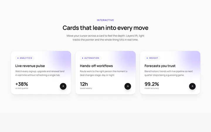
3D Tilt Cards
OriginalA responsive grid of cards that tilt in 3D toward your cursor with a light glare and lifted depth layers, powered by Framer Motion springs.
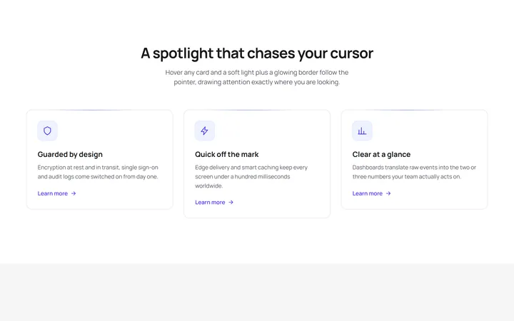
Spotlight Follow Cards
OriginalFeature cards where a soft radial spotlight and a glowing border chase the cursor on hover, with a staggered scroll reveal and an animated shimmer line.
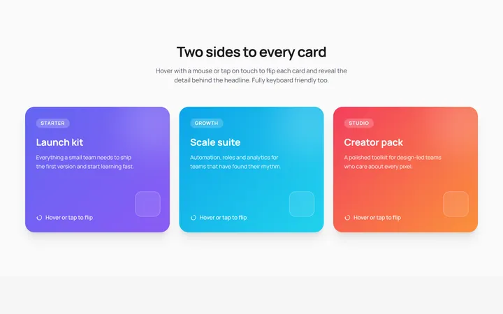
3D Flip Cards
OriginalPricing-style cards that flip in 3D on hover or tap to reveal details on the back, keyboard accessible with a staggered entrance animation.
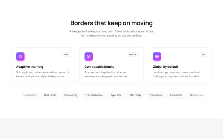
Animated Gradient Border Cards
OriginalCards wrapped in a live conic gradient border that rotates and speeds up on hover, with a shimmer sweep and a scrolling tag marquee.
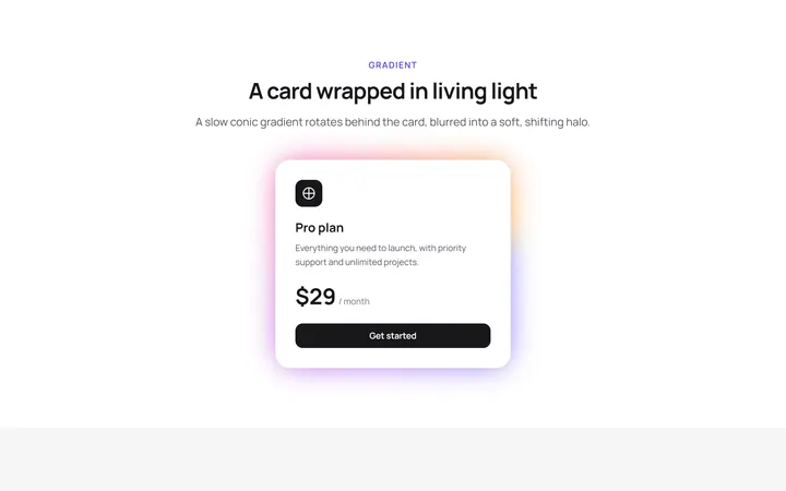
Glow Effect Card
primitivesA reusable glow effect card for React and Tailwind, with hover and motion.
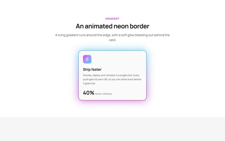
Neon Gradient Card
gradient-card.tsxA reusable neon gradient card for React and Tailwind, with hover and motion.
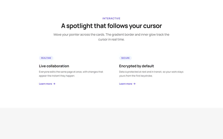
Spotlight Magic Card
card.tsxA reusable spotlight magic card for React and Tailwind, with hover and motion.
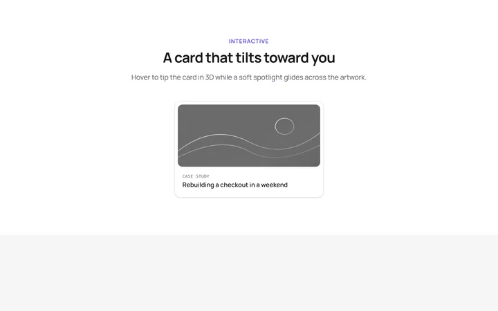
Tilt Spotlight Card
primitivesA reusable tilt spotlight card for React and Tailwind, with hover and motion.
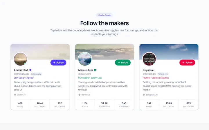
Profile Card
OriginalA user profile card with avatar, stats and a follow toggle.
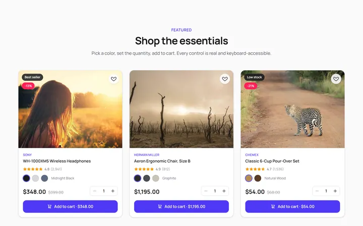
Product Card
OriginalA product card with image, price and add-to-cart feedback.
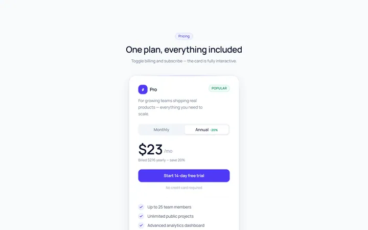
Pricing Single Card
OriginalA single pricing plan card with feature list and CTA.
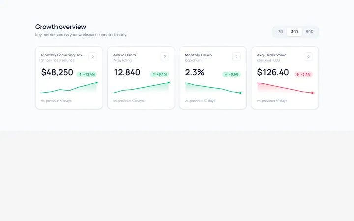
Stat Card
OriginalA metric card with value, trend arrow and a small sparkline.