

Floating Bar CTA
Original · freefloating sticky CTA bar
Copy prompt gives Claude Code, Cursor or v0 a ready-to-paste prompt that recreates this exact component.
npx shadcn@latest add https://webinnoventix.com/r/ctax-floating-bar.json"use client";
import { useEffect, useState } from "react";
import { AnimatePresence, motion, useReducedMotion } from "motion/react";
type BarPosition = "bottom" | "top";
const OFFER_SECONDS = 8 * 3600 + 14 * 60 + 5;
function padTwo(value: number): string {
return value.toString().padStart(2, "0");
}
export default function CtaxFloatingBar() {
const reduceMotion = useReducedMotion();
const [position, setPosition] = useState<BarPosition>("bottom");
const [dismissed, setDismissed] = useState(false);
const [claimed, setClaimed] = useState(false);
const [secondsLeft, setSecondsLeft] = useState(OFFER_SECONDS);
useEffect(() => {
const id = setInterval(() => {
setSecondsLeft((prev) => (prev <= 0 ? 0 : prev - 1));
}, 1000);
return () => clearInterval(id);
}, []);
const hours = Math.floor(secondsLeft / 3600);
const minutes = Math.floor((secondsLeft % 3600) / 60);
const seconds = secondsLeft % 60;
const clock = `${padTwo(hours)}:${padTwo(minutes)}:${padTwo(seconds)}`;
const offset = position === "bottom" ? 26 : -26;
const enter = reduceMotion ? { opacity: 0 } : { opacity: 0, y: offset };
const show = reduceMotion ? { opacity: 1 } : { opacity: 1, y: 0 };
const barTransition = {
duration: reduceMotion ? 0 : 0.4,
ease: [0.22, 1, 0.36, 1] as [number, number, number, number],
};
const reopen = () => {
setDismissed(false);
setClaimed(false);
};
const positions: { id: BarPosition; label: string }[] = [
{ id: "bottom", label: "Bottom" },
{ id: "top", label: "Top" },
];
return (
<section className="relative w-full overflow-hidden bg-slate-50 px-4 py-20 text-slate-900 sm:py-28 dark:bg-slate-950 dark:text-slate-100">
<style>{`
@keyframes ctaxfb-sheen {
0% { transform: translateX(-130%) skewX(-18deg); }
60%, 100% { transform: translateX(260%) skewX(-18deg); }
}
@keyframes ctaxfb-pulse {
0%, 100% { opacity: 1; transform: scale(1); }
50% { opacity: 0.4; transform: scale(1.4); }
}
@keyframes ctaxfb-drift {
0%, 100% { transform: translateY(0); }
50% { transform: translateY(-3px); }
}
.ctaxfb-sheen { animation: ctaxfb-sheen 3.4s ease-in-out infinite; }
.ctaxfb-dot { animation: ctaxfb-pulse 1.8s ease-in-out infinite; }
.ctaxfb-badge { animation: ctaxfb-drift 4.5s ease-in-out infinite; }
@media (prefers-reduced-motion: reduce) {
.ctaxfb-sheen, .ctaxfb-dot, .ctaxfb-badge { animation: none !important; }
}
`}</style>
{/* Ambient background wash */}
<div
aria-hidden="true"
className="pointer-events-none absolute -top-24 left-1/2 h-72 w-[42rem] -translate-x-1/2 rounded-full bg-gradient-to-r from-indigo-300/40 via-violet-300/30 to-sky-300/40 blur-3xl dark:from-indigo-600/25 dark:via-violet-600/20 dark:to-sky-600/25"
/>
<div className="relative mx-auto max-w-5xl">
<header className="mx-auto max-w-2xl text-center">
<span className="inline-flex items-center gap-2 rounded-full border border-indigo-200 bg-white/70 px-3 py-1 text-xs font-semibold uppercase tracking-widest text-indigo-600 backdrop-blur dark:border-indigo-500/30 dark:bg-white/5 dark:text-indigo-300">
<span className="ctaxfb-dot inline-block h-1.5 w-1.5 rounded-full bg-emerald-500" />
Floating CTA
</span>
<h2 className="mt-5 text-balance text-3xl font-bold tracking-tight sm:text-4xl">
A sticky bar that converts without stealing the page
</h2>
<p className="mx-auto mt-4 max-w-xl text-pretty text-base leading-relaxed text-slate-600 dark:text-slate-400">
Vantage keeps your offer in view as visitors read on. Scroll the
preview below, switch the dock, and close it the way a real visitor
would.
</p>
</header>
{/* Controls */}
<div className="mt-8 flex flex-wrap items-center justify-center gap-3">
<div
role="group"
aria-label="Bar dock position"
className="inline-flex rounded-xl border border-slate-200 bg-white p-1 shadow-sm dark:border-slate-800 dark:bg-slate-900"
>
{positions.map((option) => {
const active = position === option.id;
return (
<button
key={option.id}
type="button"
aria-pressed={active}
onClick={() => setPosition(option.id)}
className={`rounded-lg px-4 py-1.5 text-sm font-medium transition focus-visible:outline-none focus-visible:ring-2 focus-visible:ring-indigo-500 ${
active
? "bg-indigo-600 text-white shadow"
: "text-slate-600 hover:bg-slate-100 dark:text-slate-300 dark:hover:bg-slate-800"
}`}
>
{option.label}
</button>
);
})}
</div>
<button
type="button"
onClick={reopen}
className="rounded-xl border border-slate-200 bg-white px-4 py-2 text-sm font-medium text-slate-700 shadow-sm transition hover:bg-slate-100 focus-visible:outline-none focus-visible:ring-2 focus-visible:ring-indigo-500 dark:border-slate-800 dark:bg-slate-900 dark:text-slate-200 dark:hover:bg-slate-800"
>
Reset preview
</button>
</div>
{/* Demo surface */}
<div className="relative mx-auto mt-8 flex h-[440px] max-w-3xl flex-col overflow-hidden rounded-3xl border border-slate-200 bg-white shadow-xl shadow-slate-900/5 dark:border-slate-800 dark:bg-slate-900 dark:shadow-black/40">
{/* Faux browser chrome */}
<div className="flex h-11 flex-none items-center gap-2 border-b border-slate-200 bg-slate-100/80 px-4 dark:border-slate-800 dark:bg-slate-950/60">
<span className="h-3 w-3 rounded-full bg-rose-400" />
<span className="h-3 w-3 rounded-full bg-amber-400" />
<span className="h-3 w-3 rounded-full bg-emerald-400" />
<div className="ml-3 flex-1 truncate rounded-md bg-white px-3 py-1 text-xs text-slate-400 dark:bg-slate-800 dark:text-slate-500">
vantage.example/product
</div>
</div>
{/* Scrolling faux content */}
<div className="relative flex-1 overflow-y-auto px-6 py-6">
<div className="space-y-5">
<div className="h-8 w-2/3 rounded-lg bg-slate-200 dark:bg-slate-800" />
<p className="max-w-prose text-sm leading-relaxed text-slate-500 dark:text-slate-400">
Vantage turns raw event streams into dashboards your whole team
can read. Connect a source, pick a metric, and ship a live board
in minutes — no query language required.
</p>
<div className="grid grid-cols-1 gap-4 sm:grid-cols-3">
{["Sessions", "Retention", "Revenue"].map((label) => (
<div
key={label}
className="rounded-2xl border border-slate-200 bg-slate-50 p-4 dark:border-slate-800 dark:bg-slate-800/40"
>
<p className="text-xs font-medium uppercase tracking-wide text-slate-400">
{label}
</p>
<p className="mt-2 text-2xl font-bold text-slate-800 dark:text-slate-100">
{label === "Sessions"
? "48.2k"
: label === "Retention"
? "91%"
: "$26.4k"}
</p>
<div className="mt-3 h-1.5 w-full overflow-hidden rounded-full bg-slate-200 dark:bg-slate-700">
<div className="h-full w-3/4 rounded-full bg-gradient-to-r from-indigo-500 to-violet-500" />
</div>
</div>
))}
</div>
{[
"Real teams instrument once and reuse everywhere. Every board is versioned, so a rollback is a single click.",
"Alerts fire to the channels you already live in, with the offending cohort attached — not a vague threshold ping.",
"Row-level permissions mean finance sees revenue and support sees tickets, from the same source of truth.",
"Export any view to a scheduled digest your stakeholders actually open on Monday morning.",
].map((line) => (
<p
key={line}
className="max-w-prose text-sm leading-relaxed text-slate-500 dark:text-slate-400"
>
{line}
</p>
))}
<div className="h-28 rounded-2xl border border-dashed border-slate-200 dark:border-slate-700" />
</div>
</div>
{/* Floating sticky CTA */}
<AnimatePresence mode="wait">
{!dismissed ? (
<motion.div
key="bar"
role="region"
aria-label="Limited-time offer"
initial={enter}
animate={show}
exit={enter}
transition={barTransition}
className={`absolute inset-x-3 z-10 ${
position === "bottom" ? "bottom-3" : "top-[52px]"
}`}
>
<div className="overflow-hidden rounded-2xl border border-slate-200/80 bg-white/95 shadow-2xl shadow-slate-900/10 backdrop-blur-xl dark:border-white/10 dark:bg-slate-900/90 dark:shadow-black/50">
<div className="h-1 w-full bg-gradient-to-r from-indigo-500 via-violet-500 to-sky-500" />
<div className="flex flex-col gap-4 p-4 sm:flex-row sm:items-center sm:gap-5">
{claimed ? (
<div className="flex flex-1 items-center gap-3">
<span className="flex h-10 w-10 flex-none items-center justify-center rounded-xl bg-emerald-100 text-emerald-600 dark:bg-emerald-500/15 dark:text-emerald-400">
<svg
viewBox="0 0 24 24"
className="h-5 w-5"
fill="none"
stroke="currentColor"
strokeWidth="2.4"
strokeLinecap="round"
strokeLinejoin="round"
aria-hidden="true"
>
<path d="m5 13 4 4L19 7" />
</svg>
</span>
<div className="min-w-0">
<p className="text-sm font-semibold text-slate-900 dark:text-white">
Trial activated
</p>
<p className="truncate text-xs text-slate-500 dark:text-slate-400">
Check your inbox for the magic sign-in link.
</p>
</div>
</div>
) : (
<>
<span className="ctaxfb-badge flex h-11 w-11 flex-none items-center justify-center rounded-xl bg-gradient-to-br from-indigo-500 to-violet-600 text-white shadow-lg shadow-indigo-500/30">
<svg
viewBox="0 0 24 24"
className="h-5 w-5"
fill="none"
stroke="currentColor"
strokeWidth="2"
strokeLinecap="round"
strokeLinejoin="round"
aria-hidden="true"
>
<path d="M13 2 3 14h7l-1 8 10-12h-7l1-8Z" />
</svg>
</span>
<div className="min-w-0 flex-1">
<div className="flex items-center gap-2">
<p className="text-sm font-semibold text-slate-900 dark:text-white sm:text-[0.95rem]">
Ship your first dashboard free for 14 days
</p>
<span className="hidden items-center gap-1 rounded-full bg-amber-100 px-2 py-0.5 text-[0.65rem] font-bold uppercase tracking-wide text-amber-700 sm:inline-flex dark:bg-amber-400/15 dark:text-amber-300">
<span className="ctaxfb-dot inline-block h-1.5 w-1.5 rounded-full bg-amber-500" />
20% off annual
</span>
</div>
<p className="mt-0.5 text-xs text-slate-500 dark:text-slate-400">
No card required. Offer ends in{" "}
<span
className="font-semibold tabular-nums text-slate-700 dark:text-slate-200"
aria-label={`${hours} hours ${minutes} minutes ${seconds} seconds remaining`}
>
{clock}
</span>
</p>
</div>
</>
)}
<div className="flex flex-none items-center gap-2">
{!claimed ? (
<>
<button
type="button"
onClick={() => setClaimed(true)}
className="group relative inline-flex items-center gap-1.5 overflow-hidden rounded-xl bg-indigo-600 px-4 py-2.5 text-sm font-semibold text-white shadow-lg shadow-indigo-500/30 transition hover:bg-indigo-500 focus-visible:outline-none focus-visible:ring-2 focus-visible:ring-indigo-400 focus-visible:ring-offset-2 focus-visible:ring-offset-white dark:focus-visible:ring-offset-slate-900"
>
<span className="ctaxfb-sheen pointer-events-none absolute inset-y-0 -left-1/3 w-1/3 bg-white/25" />
Start free trial
<svg
viewBox="0 0 24 24"
className="h-4 w-4 transition-transform group-hover:translate-x-0.5"
fill="none"
stroke="currentColor"
strokeWidth="2.2"
strokeLinecap="round"
strokeLinejoin="round"
aria-hidden="true"
>
<path d="M5 12h14M13 6l6 6-6 6" />
</svg>
</button>
<a
href="#pricing"
className="hidden rounded-xl px-3 py-2.5 text-sm font-medium text-slate-600 transition hover:text-slate-900 focus-visible:outline-none focus-visible:ring-2 focus-visible:ring-indigo-500 sm:inline-block dark:text-slate-300 dark:hover:text-white"
>
See pricing
</a>
</>
) : (
<button
type="button"
onClick={reopen}
className="rounded-xl border border-slate-200 px-4 py-2.5 text-sm font-medium text-slate-600 transition hover:bg-slate-100 focus-visible:outline-none focus-visible:ring-2 focus-visible:ring-indigo-500 dark:border-slate-700 dark:text-slate-300 dark:hover:bg-slate-800"
>
Undo
</button>
)}
<button
type="button"
onClick={() => setDismissed(true)}
aria-label="Dismiss offer"
className="flex h-9 w-9 flex-none items-center justify-center rounded-lg text-slate-400 transition hover:bg-slate-100 hover:text-slate-700 focus-visible:outline-none focus-visible:ring-2 focus-visible:ring-indigo-500 dark:hover:bg-slate-800 dark:hover:text-slate-200"
>
<svg
viewBox="0 0 24 24"
className="h-4 w-4"
fill="none"
stroke="currentColor"
strokeWidth="2.2"
strokeLinecap="round"
strokeLinejoin="round"
aria-hidden="true"
>
<path d="M18 6 6 18M6 6l12 12" />
</svg>
</button>
</div>
</div>
</div>
</motion.div>
) : (
<motion.button
key="pill"
type="button"
onClick={reopen}
initial={enter}
animate={show}
exit={enter}
transition={barTransition}
className={`absolute right-3 z-10 inline-flex items-center gap-2 rounded-full border border-slate-200 bg-white px-4 py-2.5 text-sm font-semibold text-slate-800 shadow-xl shadow-slate-900/10 transition hover:bg-slate-50 focus-visible:outline-none focus-visible:ring-2 focus-visible:ring-indigo-500 dark:border-slate-700 dark:bg-slate-900 dark:text-slate-100 dark:hover:bg-slate-800 ${
position === "bottom" ? "bottom-3" : "top-[52px]"
}`}
>
<span className="ctaxfb-dot inline-block h-2 w-2 rounded-full bg-indigo-500" />
Reopen offer
</motion.button>
)}
</AnimatePresence>
</div>
<p className="mt-5 text-center text-xs text-slate-400 dark:text-slate-500">
Tip: the bar stays docked while the content scrolls behind it.
</p>
</div>
</section>
);
}Dependencies
Licence
Built by Web Innoventix. Free for personal and commercial use, no attribution required.
Built by Web Innoventix
Need a custom interface, a full website, or SEO that gets you cited by AI? We design, build and rank it end to end.
Get a free quoteSimilar components
Browse all →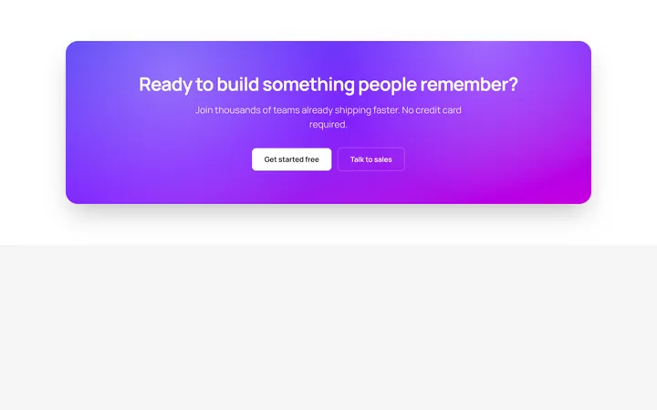
Gradient CTA
OriginalA bold gradient call-to-action banner with two buttons.

Full-Bleed Dark CTA
OriginalA full-bleed dark call-to-action banner with a live status badge, subtle grid backdrop and a primary plus secondary button pair to drive discovery calls.
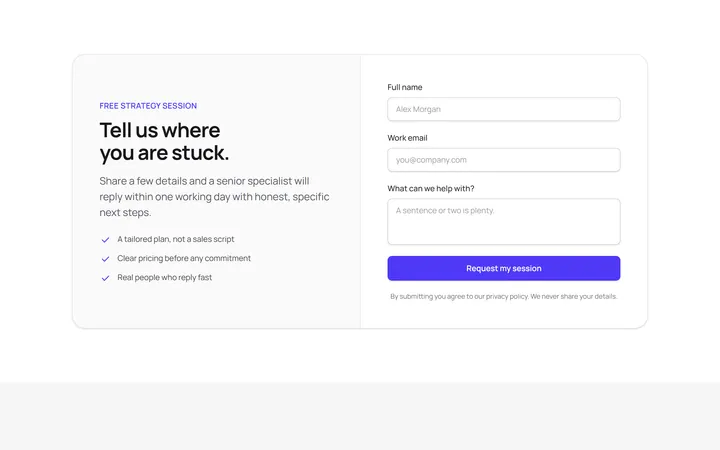
Split CTA With Lead Form
OriginalA two-column call-to-action that pairs a benefit checklist with an inline name, email and message form for capturing qualified leads directly in the section.
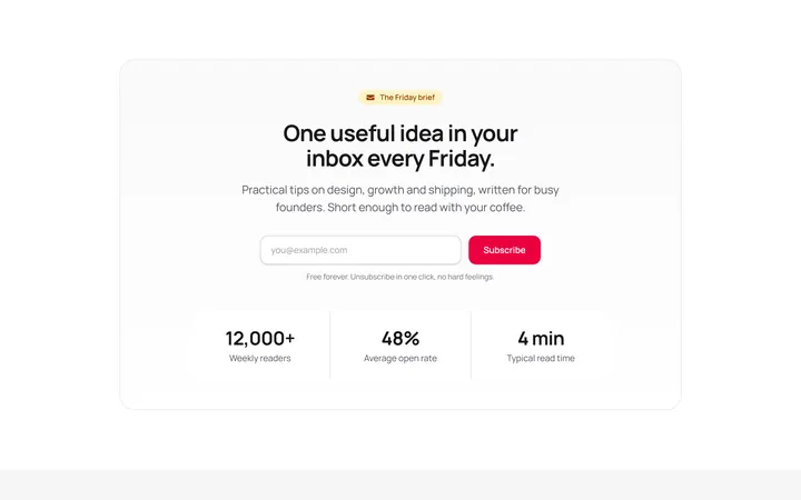
Newsletter CTA With Stats
OriginalA newsletter sign-up call-to-action combining an inline email subscribe form with a three-cell social-proof stat strip to boost conversions.
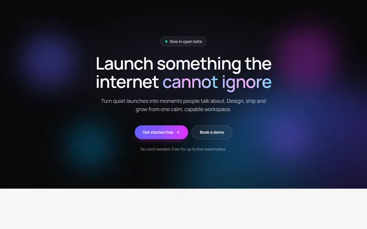
Aurora Glow CTA Banner
OriginalA full-bleed dark call-to-action banner with a rotating aurora gradient, floating orbs and a shine-on-hover button, with staggered blur-in text that reveals on scroll.
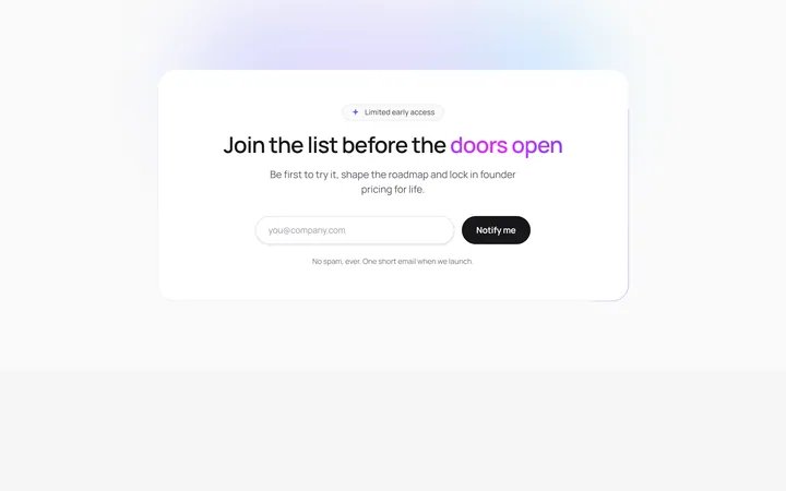
Animated Border Beam CTA
OriginalAn email-capture call-to-action card wrapped in a rotating conic-gradient border beam, with staggered reveal, animated shine text and an inline success state on submit.
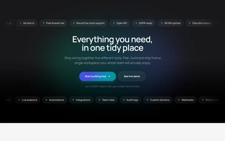
Marquee Ribbon CTA
OriginalA dark call-to-action band framed by two infinite scrolling tag ribbons with a continuously flowing animated-gradient button and staggered centre content.
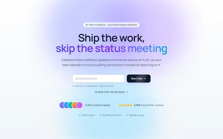
Centered CTA
Originalcentred CTA band
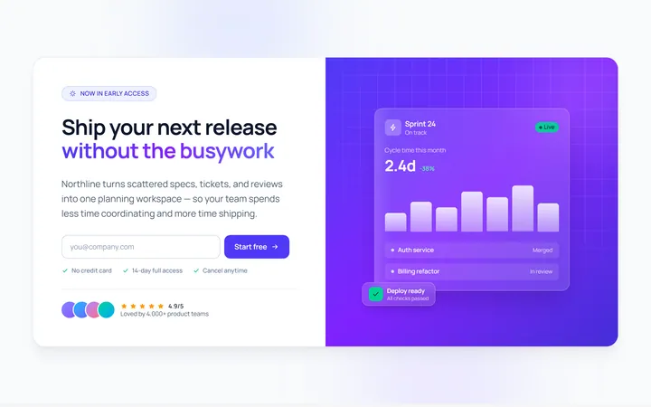
Split CTA
Originalsplit CTA with image side
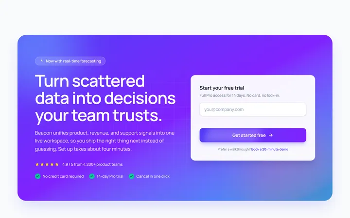
Gradient Band CTA
Originalgradient CTA band
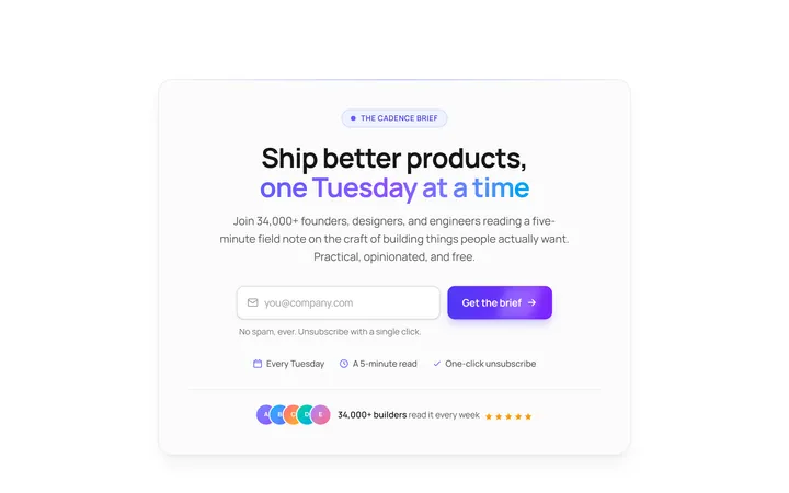
Newsletter CTA
OriginalCTA with newsletter input
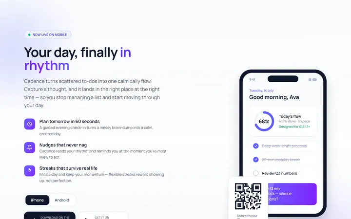
App Download CTA
Originalapp download CTA with store buttons