

Single Column FAQ Accordion
Original · freeA centred single-column accordion where each question expands to reveal its answer using native details and summary, with an animated plus-to-cross toggle icon.
Copy prompt gives Claude Code, Cursor or v0 a ready-to-paste prompt that recreates this exact component.
npx shadcn@latest add https://webinnoventix.com/r/faq-accordion-single.jsonconst faqs = [
{
q: "How long does setup usually take?",
a: "Most teams are up and running within an afternoon. You can import your existing data, invite the people who matter and start working the same day, without help from an engineer.",
},
{
q: "Can I change or cancel my plan later?",
a: "Yes. You can move up, move down or cancel at any point from the billing screen. Changes take effect on your next cycle and we never lock you into a fixed term.",
},
{
q: "Is my data safe and private?",
a: "Everything is encrypted in transit and at rest, and we never sell your information to third parties. You can export or permanently delete your workspace whenever you like.",
},
{
q: "Do you offer support if I get stuck?",
a: "Every plan includes email support, and paid plans add live chat during working hours. Our median first reply lands in under three hours on business days.",
},
{
q: "Will it work with the tools I already use?",
a: "We connect with the most popular calendars, storage services and messaging apps out of the box, and an open API lets your team wire up anything else you need.",
},
];
export default function FaqAccordionSingle() {
return (
<section className="bg-white px-6 py-16 dark:bg-zinc-950 md:py-24">
<div className="mx-auto max-w-3xl">
<div className="text-center">
<p className="text-sm font-semibold uppercase tracking-widest text-indigo-600 dark:text-indigo-400">
Frequently asked
</p>
<h2 className="mt-3 text-balance text-3xl font-bold tracking-tight text-zinc-900 sm:text-4xl dark:text-white">
Questions, answered clearly
</h2>
<p className="mx-auto mt-4 max-w-xl text-lg text-zinc-600 dark:text-zinc-400">
Everything you might want to know before you start. Still unsure? We are one message away.
</p>
</div>
<div className="mt-12 divide-y divide-zinc-200 border-y border-zinc-200 dark:divide-zinc-800 dark:border-zinc-800">
{faqs.map((item) => (
<details key={item.q} className="group">
<summary className="flex cursor-pointer list-none items-center justify-between gap-4 py-5 text-left text-base font-semibold text-zinc-900 transition marker:content-none hover:text-indigo-600 dark:text-white dark:hover:text-indigo-400">
<span>{item.q}</span>
<span
aria-hidden
className="relative grid h-8 w-8 shrink-0 place-items-center rounded-full border border-zinc-300 text-indigo-600 transition group-open:border-indigo-600 group-open:bg-indigo-600 group-open:text-white dark:border-zinc-700 dark:text-indigo-400"
>
<svg className="h-4 w-4" viewBox="0 0 20 20" fill="none" stroke="currentColor" strokeWidth="2">
<path strokeLinecap="round" d="M10 4v12" className="transition duration-200 group-open:opacity-0" />
<path strokeLinecap="round" d="M4 10h12" />
</svg>
</span>
</summary>
<p className="pb-5 pr-12 text-[15px] leading-relaxed text-zinc-600 dark:text-zinc-400">
{item.a}
</p>
</details>
))}
</div>
</div>
</section>
);
}Dependencies
Licence
Built by Web Innoventix. Free for personal and commercial use, no attribution required.
Built by Web Innoventix
Need a custom interface, a full website, or SEO that gets you cited by AI? We design, build and rank it end to end.
Get a free quoteSimilar components
Browse all →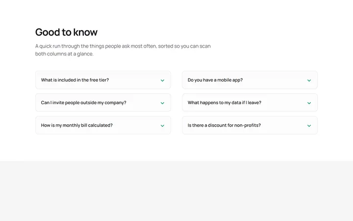
Two Column FAQ Accordion
OriginalA two-column grid of bordered accordion cards that lets visitors scan more questions at once, each disclosing its answer with a rotating chevron and no JavaScript.
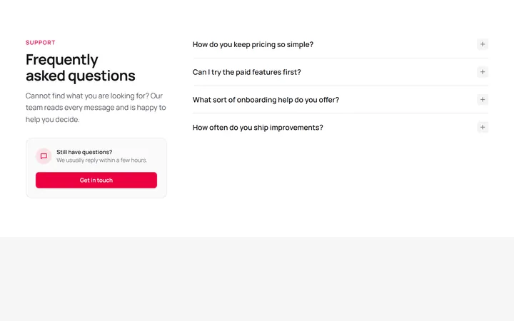
FAQ With Side Heading And CTA
OriginalA split layout pairing a sticky heading and contact call-to-action card on the left with a native accordion list of questions on the right.
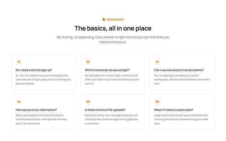
FAQ Q And A Card Grid
OriginalA responsive grid of numbered question-and-answer cards with every answer visible at once, so there is no accordion and nothing to expand.

Spotlight Hero
OriginalA centred hero with a soft radial spotlight, badge and dual call-to-action.

Split Hero
OriginalA two-column hero pairing a headline and CTAs with a product mock and social proof.

Gradient Spotlight Hero
OriginalA minimal centred hero with a soft gradient-mesh backdrop, announcement pill and dual call-to-action buttons.

App Preview Hero
OriginalA centred hero that pairs headline copy with a realistic product dashboard mock built entirely from markup, complete with browser chrome and a floating notification card.

Waitlist Capture Hero
OriginalA dark, focused hero with an inline email capture form and avatar social proof, ready for pre-launch waitlists.

Image Backdrop Hero
OriginalA cinematic full-bleed hero with a layered image-style backdrop, overlaid left-aligned copy and a trusted-by logos strip.
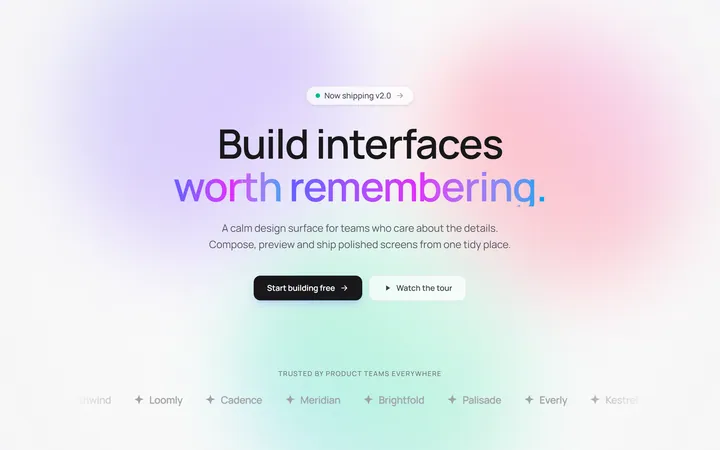
Gradient Mesh Hero with Staggered Text Reveal
OriginalA full-screen hero pairing a drifting animated gradient-mesh backdrop with a word-by-word staggered blur-in headline and a logo marquee under the fold.
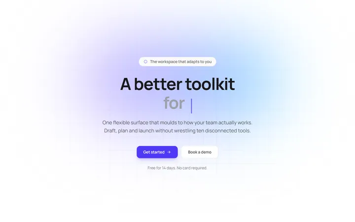
Typewriter Rotating Words Hero
OriginalA hero whose headline cycles through rotating words with a live typewriter caret over an animated grid backdrop, degrading to a gentle word swap when reduced motion is on.
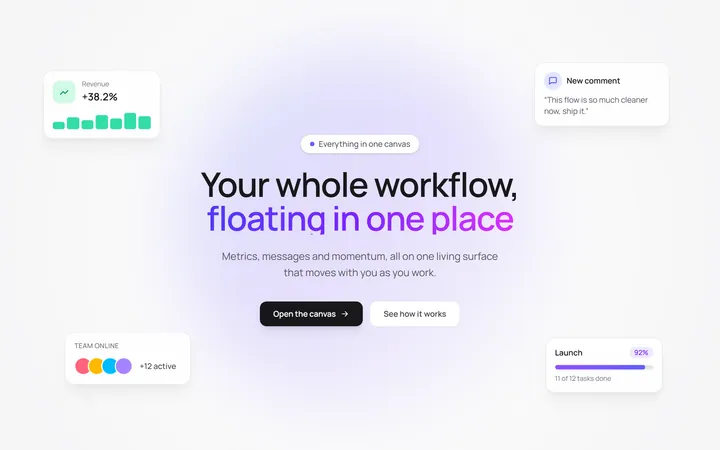
Floating UI Cards Hero with Mouse Parallax
OriginalA hero with glassy floating UI cards that drift continuously and shift on mouse-parallax depth around a staggered centre headline.