

FAQ Q And A Card Grid
Original · freeA responsive grid of numbered question-and-answer cards with every answer visible at once, so there is no accordion and nothing to expand.
Copy prompt gives Claude Code, Cursor or v0 a ready-to-paste prompt that recreates this exact component.
npx shadcn@latest add https://webinnoventix.com/r/faq-grid-cards.jsonconst faqs = [
{
q: "Do I need a card to sign up?",
a: "No. You can create an account and explore the core features straight away without entering any payment details.",
},
{
q: "Which currencies do you accept?",
a: "We take payment in most major currencies and show your total in your local one before you ever confirm.",
},
{
q: "Can I use one account across teams?",
a: "Yes. A single login can belong to several workspaces, and you switch between them with a click.",
},
{
q: "How secure is my information?",
a: "Data is encrypted end to end and stored in certified data centres, with optional two step sign in for extra cover.",
},
{
q: "Is there a limit on file uploads?",
a: "Each plan comes with a storage allowance, and individual files can be as large as five gigabytes on paid tiers.",
},
{
q: "What if I need a custom plan?",
a: "Larger organisations can request tailored limits, invoicing and security reviews through our sales team.",
},
];
export default function FaqGridCards() {
return (
<section className="bg-white px-6 py-16 dark:bg-zinc-950 md:py-24">
<div className="mx-auto max-w-6xl">
<div className="mx-auto max-w-2xl text-center">
<span className="inline-flex items-center gap-2 rounded-full bg-amber-500/10 px-3 py-1 text-sm font-semibold text-amber-700 dark:text-amber-400">
<svg className="h-4 w-4" viewBox="0 0 20 20" fill="currentColor" aria-hidden>
<path
fillRule="evenodd"
d="M18 10a8 8 0 11-16 0 8 8 0 0116 0zm-7-4a1 1 0 10-2 0v5a1 1 0 001 1h4a1 1 0 100-2h-3V6z"
clipRule="evenodd"
/>
</svg>
Quick answers
</span>
<h2 className="mt-4 text-balance text-3xl font-bold tracking-tight text-zinc-900 sm:text-4xl dark:text-white">
The basics, all in one place
</h2>
<p className="mt-4 text-lg text-zinc-600 dark:text-zinc-400">
No clicking, no expanding. Every answer is right here so you can find what you need and move on.
</p>
</div>
<div className="mt-14 grid gap-6 sm:grid-cols-2 lg:grid-cols-3">
{faqs.map((item, i) => (
<div
key={item.q}
className="rounded-2xl border border-zinc-200 bg-white p-6 transition hover:border-amber-400/60 hover:shadow-md dark:border-zinc-800 dark:bg-zinc-900/40 dark:hover:border-amber-400/40"
>
<span className="grid h-9 w-9 place-items-center rounded-lg bg-amber-500/10 text-sm font-bold text-amber-700 dark:text-amber-400">
{String(i + 1).padStart(2, "0")}
</span>
<h3 className="mt-4 text-base font-semibold text-zinc-900 dark:text-white">{item.q}</h3>
<p className="mt-2 text-sm leading-relaxed text-zinc-600 dark:text-zinc-400">{item.a}</p>
</div>
))}
</div>
</div>
</section>
);
}Dependencies
Licence
Built by Web Innoventix. Free for personal and commercial use, no attribution required.
Built by Web Innoventix
Need a custom interface, a full website, or SEO that gets you cited by AI? We design, build and rank it end to end.
Get a free quoteSimilar components
Browse all →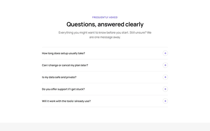
Single Column FAQ Accordion
OriginalA centred single-column accordion where each question expands to reveal its answer using native details and summary, with an animated plus-to-cross toggle icon.
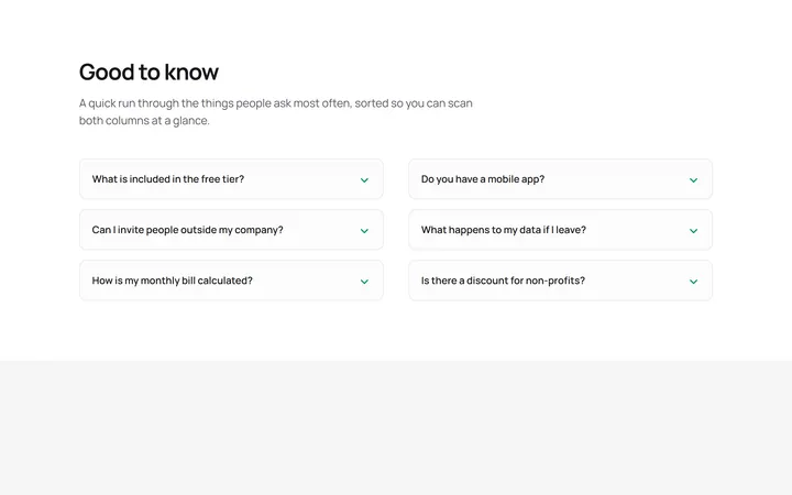
Two Column FAQ Accordion
OriginalA two-column grid of bordered accordion cards that lets visitors scan more questions at once, each disclosing its answer with a rotating chevron and no JavaScript.
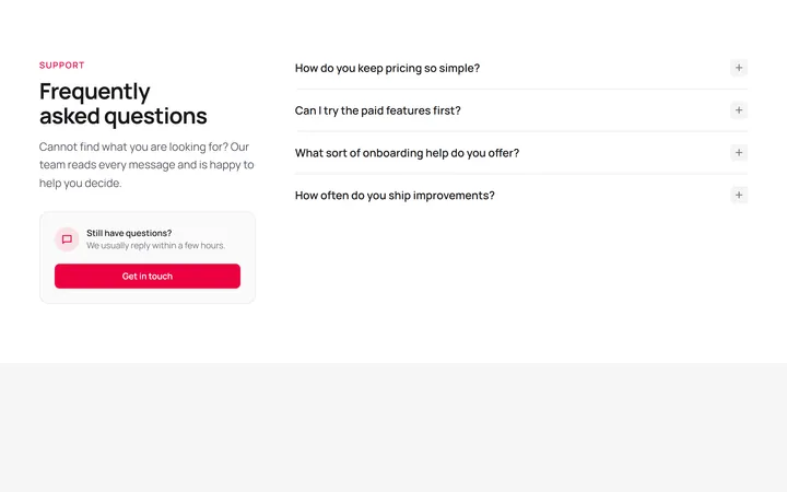
FAQ With Side Heading And CTA
OriginalA split layout pairing a sticky heading and contact call-to-action card on the left with a native accordion list of questions on the right.

Spotlight Hero
OriginalA centred hero with a soft radial spotlight, badge and dual call-to-action.

Split Hero
OriginalA two-column hero pairing a headline and CTAs with a product mock and social proof.

Gradient Spotlight Hero
OriginalA minimal centred hero with a soft gradient-mesh backdrop, announcement pill and dual call-to-action buttons.

App Preview Hero
OriginalA centred hero that pairs headline copy with a realistic product dashboard mock built entirely from markup, complete with browser chrome and a floating notification card.

Waitlist Capture Hero
OriginalA dark, focused hero with an inline email capture form and avatar social proof, ready for pre-launch waitlists.

Image Backdrop Hero
OriginalA cinematic full-bleed hero with a layered image-style backdrop, overlaid left-aligned copy and a trusted-by logos strip.
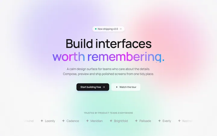
Gradient Mesh Hero with Staggered Text Reveal
OriginalA full-screen hero pairing a drifting animated gradient-mesh backdrop with a word-by-word staggered blur-in headline and a logo marquee under the fold.
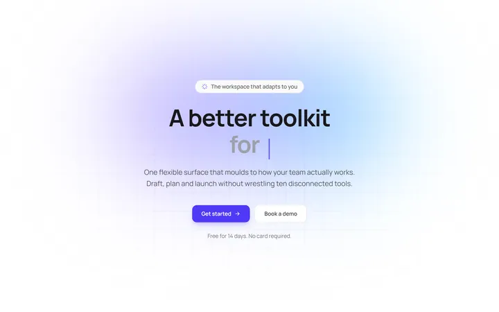
Typewriter Rotating Words Hero
OriginalA hero whose headline cycles through rotating words with a live typewriter caret over an animated grid backdrop, degrading to a gentle word swap when reduced motion is on.
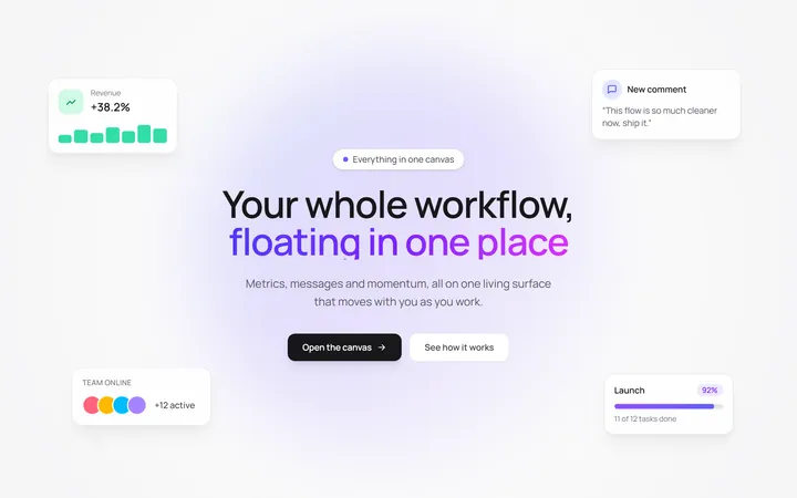
Floating UI Cards Hero with Mouse Parallax
OriginalA hero with glassy floating UI cards that drift continuously and shift on mouse-parallax depth around a staggered centre headline.