

Aurora Hero with Shimmer CTA and Logo Marquee
Original · freeA dark hero with animated aurora light beams, a shimmering sweep across the primary CTA, and dual-direction logo marquees beneath the fold.
Copy prompt gives Claude Code, Cursor or v0 a ready-to-paste prompt that recreates this exact component.
npx shadcn@latest add https://webinnoventix.com/r/ahero-aurora-marquee-shimmer.json"use client";
import { motion, useReducedMotion, type Variants } from "motion/react";
const ROW_ONE = ["Northwind", "Loomly", "Cadence", "Meridian", "Brightfold"];
const ROW_TWO = ["Palisade", "Everly", "Kestrel", "Vantage", "Orbit"];
function LogoPill({ name, hidden }: { name: string; hidden: boolean }) {
return (
<span
aria-hidden={hidden ? "true" : undefined}
className="flex shrink-0 items-center gap-2 rounded-xl border border-white/10 bg-white/5 px-6 py-3 text-base font-semibold tracking-tight text-zinc-300 backdrop-blur-sm"
>
<svg viewBox="0 0 24 24" className="h-5 w-5 fill-indigo-400" aria-hidden="true">
<path d="M12 2l2.6 6.9L22 11l-6.9 2.6L12 22l-2.6-6.9L2 11l6.9-2.1z" />
</svg>
{name}
</span>
);
}
export default function AheroAuroraMarqueeShimmer() {
const reduce = useReducedMotion();
const container: Variants = {
hidden: {},
show: { transition: { staggerChildren: 0.12, delayChildren: 0.05 } },
};
const item: Variants = reduce
? { hidden: { opacity: 0 }, show: { opacity: 1, transition: { duration: 0.5 } } }
: { hidden: { opacity: 0, y: 22 }, show: { opacity: 1, y: 0, transition: { duration: 0.65, ease: "easeOut" } } };
return (
<section className="relative isolate flex min-h-screen flex-col justify-center overflow-hidden bg-zinc-950 px-6 py-24">
<style>{`
@keyframes ahau-aurora1 { 0%,100% { transform: translate3d(-8%,-4%,0) rotate(-8deg) scale(1.1); } 50% { transform: translate3d(10%,6%,0) rotate(6deg) scale(1.3); } }
@keyframes ahau-aurora2 { 0%,100% { transform: translate3d(6%,4%,0) rotate(10deg) scale(1.2); } 50% { transform: translate3d(-10%,-6%,0) rotate(-6deg) scale(1); } }
@keyframes ahau-shine { 0% { transform: translateX(-140%) skewX(-20deg); } 60%,100% { transform: translateX(240%) skewX(-20deg); } }
@keyframes ahau-left { from { transform: translateX(0); } to { transform: translateX(-50%); } }
@keyframes ahau-right { from { transform: translateX(-50%); } to { transform: translateX(0); } }
.ahau-aurora1 { animation: ahau-aurora1 18s ease-in-out infinite; }
.ahau-aurora2 { animation: ahau-aurora2 22s ease-in-out infinite; }
.ahau-shine { animation: ahau-shine 3.2s ease-in-out infinite; }
.ahau-track { display: flex; width: max-content; }
.ahau-left { animation: ahau-left 34s linear infinite; }
.ahau-right { animation: ahau-right 40s linear infinite; }
.ahau-marquee:hover .ahau-track { animation-play-state: paused; }
@media (prefers-reduced-motion: reduce) {
.ahau-aurora1, .ahau-aurora2, .ahau-shine, .ahau-track { animation: none; }
}
`}</style>
<div aria-hidden="true" className="pointer-events-none absolute inset-0 -z-10 overflow-hidden">
<div className="ahau-aurora1 absolute left-1/4 top-[-20%] h-[36rem] w-[52rem] rounded-full bg-[conic-gradient(from_120deg_at_50%_50%,#6366f1,#a855f7,#ec4899,#22d3ee,#6366f1)] opacity-25 blur-[120px]" />
<div className="ahau-aurora2 absolute right-1/4 top-[-10%] h-[32rem] w-[46rem] rounded-full bg-[conic-gradient(from_300deg_at_50%_50%,#22d3ee,#6366f1,#a855f7,#22d3ee)] opacity-20 blur-[120px]" />
<div className="absolute inset-0 bg-[linear-gradient(to_bottom,transparent,rgba(9,9,11,0.85))]" />
</div>
<motion.div variants={container} initial="hidden" animate="show" className="mx-auto w-full max-w-3xl text-center">
<motion.span
variants={item}
className="inline-flex items-center gap-2 rounded-full border border-white/15 bg-white/5 px-4 py-1.5 text-sm font-medium text-zinc-200 backdrop-blur"
>
<span className="relative flex h-2 w-2">
<span className="absolute inline-flex h-full w-full animate-ping rounded-full bg-cyan-400 opacity-75" />
<span className="relative inline-flex h-2 w-2 rounded-full bg-cyan-400" />
</span>
Trusted by 12,000+ teams
</motion.span>
<motion.h1 variants={item} className="mt-8 text-5xl font-semibold tracking-tight text-white sm:text-7xl">
Ship faster under
<span className="block bg-gradient-to-r from-indigo-400 via-fuchsia-400 to-cyan-300 bg-clip-text text-transparent">
the northern lights
</span>
</motion.h1>
<motion.p variants={item} className="mx-auto mt-6 max-w-xl text-lg leading-relaxed text-zinc-400">
A luminous workspace built for teams that move quickly. Plan, build and launch with tools that keep pace with your ambition.
</motion.p>
<motion.div variants={item} className="mt-10 flex flex-col items-center justify-center gap-3 sm:flex-row">
<motion.a
href="#"
whileHover={reduce ? undefined : { scale: 1.03 }}
whileTap={reduce ? undefined : { scale: 0.97 }}
className="group relative inline-flex w-full items-center justify-center gap-2 overflow-hidden rounded-xl bg-gradient-to-r from-indigo-500 to-fuchsia-500 px-6 py-3 text-sm font-semibold text-white shadow-lg shadow-fuchsia-500/25 transition-shadow hover:shadow-fuchsia-500/40 focus-visible:outline-none focus-visible:ring-2 focus-visible:ring-fuchsia-400 focus-visible:ring-offset-2 focus-visible:ring-offset-zinc-950 sm:w-auto"
>
<span className="ahau-shine pointer-events-none absolute inset-y-0 left-0 w-1/3 bg-gradient-to-r from-transparent via-white/40 to-transparent" aria-hidden="true" />
<span className="relative">Start free trial</span>
<svg viewBox="0 0 24 24" fill="none" stroke="currentColor" strokeWidth={2} strokeLinecap="round" strokeLinejoin="round" aria-hidden="true" className="relative h-4 w-4">
<path d="M5 12h14M13 6l6 6-6 6" />
</svg>
</motion.a>
<motion.a
href="#"
whileHover={reduce ? undefined : { scale: 1.03 }}
whileTap={reduce ? undefined : { scale: 0.97 }}
className="inline-flex w-full items-center justify-center gap-2 rounded-xl border border-white/15 bg-white/5 px-6 py-3 text-sm font-semibold text-zinc-100 backdrop-blur transition-colors hover:bg-white/10 focus-visible:outline-none focus-visible:ring-2 focus-visible:ring-white/40 focus-visible:ring-offset-2 focus-visible:ring-offset-zinc-950 sm:w-auto"
>
<svg viewBox="0 0 24 24" fill="currentColor" aria-hidden="true" className="h-4 w-4">
<path d="M8 5v14l11-7z" />
</svg>
Watch demo
</motion.a>
</motion.div>
</motion.div>
<motion.div
initial={reduce ? { opacity: 0 } : { opacity: 0, y: 24 }}
animate={{ opacity: 1, y: 0 }}
transition={{ delay: 0.55, duration: 0.7 }}
className="mx-auto mt-16 w-full max-w-6xl space-y-4"
>
<div className="ahau-marquee relative [mask-image:linear-gradient(to_right,transparent,black_10%,black_90%,transparent)]" aria-label="Companies building with us">
<div className="ahau-track ahau-left gap-4">
{[...ROW_ONE, ...ROW_ONE].map((name, i) => (
<LogoPill key={`r1-${name}-${i}`} name={name} hidden={i >= ROW_ONE.length} />
))}
</div>
</div>
<div className="ahau-marquee relative [mask-image:linear-gradient(to_right,transparent,black_10%,black_90%,transparent)]" aria-hidden="true">
<div className="ahau-track ahau-right gap-4">
{[...ROW_TWO, ...ROW_TWO].map((name, i) => (
<LogoPill key={`r2-${name}-${i}`} name={name} hidden />
))}
</div>
</div>
</motion.div>
</section>
);
}Dependencies
Licence
Built by Web Innoventix. Free for personal and commercial use, no attribution required.
Built by Web Innoventix
Need a custom interface, a full website, or SEO that gets you cited by AI? We design, build and rank it end to end.
Get a free quoteSimilar components
Browse all →
Spotlight Hero
OriginalA centred hero with a soft radial spotlight, badge and dual call-to-action.

Split Hero
OriginalA two-column hero pairing a headline and CTAs with a product mock and social proof.

Gradient Spotlight Hero
OriginalA minimal centred hero with a soft gradient-mesh backdrop, announcement pill and dual call-to-action buttons.

App Preview Hero
OriginalA centred hero that pairs headline copy with a realistic product dashboard mock built entirely from markup, complete with browser chrome and a floating notification card.

Waitlist Capture Hero
OriginalA dark, focused hero with an inline email capture form and avatar social proof, ready for pre-launch waitlists.

Image Backdrop Hero
OriginalA cinematic full-bleed hero with a layered image-style backdrop, overlaid left-aligned copy and a trusted-by logos strip.
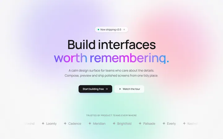
Gradient Mesh Hero with Staggered Text Reveal
OriginalA full-screen hero pairing a drifting animated gradient-mesh backdrop with a word-by-word staggered blur-in headline and a logo marquee under the fold.

Typewriter Rotating Words Hero
OriginalA hero whose headline cycles through rotating words with a live typewriter caret over an animated grid backdrop, degrading to a gentle word swap when reduced motion is on.
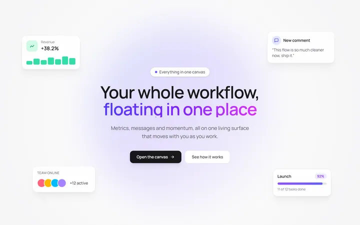
Floating UI Cards Hero with Mouse Parallax
OriginalA hero with glassy floating UI cards that drift continuously and shift on mouse-parallax depth around a staggered centre headline.

Gradient Conversion Hero
MITCentered, full-screen marketing hero with a colour-accent headline word, supporting copy, and dual primary/secondary CTA buttons. Dark-mode ready and dependency-free.
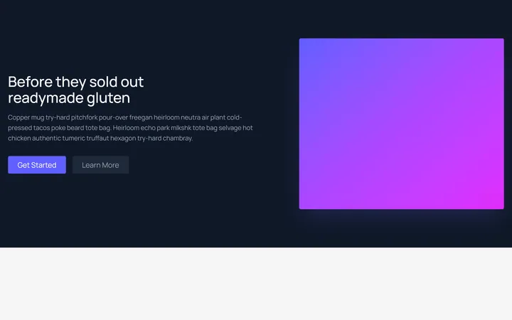
Split Showcase Hero
MITTwo-column hero on a dark background — headline, paragraph, and two buttons beside a gradient media panel. Responsive column stack on mobile.
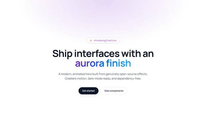
Aurora Gradient Hero
MITAnimated hero with a shimmering animated-gradient badge and an aurora gradient-text headline over an ambient radial glow. Self-contained CSS animations, dependency-free, respects prefers-reduced-motion.