

Gradient Conversion Hero
MIT · attributedCentered, full-screen marketing hero with a colour-accent headline word, supporting copy, and dual primary/secondary CTA buttons. Dark-mode ready and dependency-free.
Copy prompt gives Claude Code, Cursor or v0 a ready-to-paste prompt that recreates this exact component.
npx shadcn@latest add https://webinnoventix.com/r/src-gradient-conversion-hero.json/* Source: Mark Mead (HyperUI) — https://github.com/markmead/hyperui/blob/main/public/examples/marketing/banners/1-dark.html — MIT. Included under its original licence. */
/* Copyright (c) Mark Mead. MIT License. */
export default function SrcGradientConversionHero() {
return (
<section className="bg-white lg:grid lg:h-screen lg:place-content-center dark:bg-gray-900">
<div className="mx-auto w-screen max-w-7xl px-4 py-16 sm:px-6 sm:py-24 lg:px-8 lg:py-32">
<div className="mx-auto max-w-prose text-center">
<h1 className="text-4xl font-bold text-gray-900 sm:text-5xl dark:text-white">
Understand user flow and
<strong className="text-indigo-600"> increase </strong>
conversions
</h1>
<p className="mt-4 text-base text-pretty text-gray-700 sm:text-lg/relaxed dark:text-gray-200">
Lorem ipsum dolor sit amet, consectetur adipisicing elit. Eaque, nisi. Natus,
provident accusamus impedit minima harum corporis iusto.
</p>
<div className="mt-4 flex justify-center gap-4 sm:mt-6">
<a
className="inline-block rounded border border-indigo-600 bg-indigo-600 px-5 py-3 font-medium text-white shadow-sm transition-colors hover:bg-indigo-700"
href="#"
>
Get Started
</a>
<a
className="inline-block rounded border border-gray-200 px-5 py-3 font-medium text-gray-700 shadow-sm transition-colors hover:bg-gray-50 hover:text-gray-900 dark:border-gray-700 dark:text-gray-200 dark:hover:bg-gray-800 dark:hover:text-white"
href="#"
>
Learn More
</a>
</div>
</div>
</div>
</section>
);
}Dependencies
Licence
Mark Mead (HyperUI) (original) · Licensed under MIT.
Built by Web Innoventix
Need a custom interface, a full website, or SEO that gets you cited by AI? We design, build and rank it end to end.
Get a free quoteSimilar components
Browse all →
Spotlight Hero
OriginalA centred hero with a soft radial spotlight, badge and dual call-to-action.

Split Hero
OriginalA two-column hero pairing a headline and CTAs with a product mock and social proof.

Gradient Spotlight Hero
OriginalA minimal centred hero with a soft gradient-mesh backdrop, announcement pill and dual call-to-action buttons.

App Preview Hero
OriginalA centred hero that pairs headline copy with a realistic product dashboard mock built entirely from markup, complete with browser chrome and a floating notification card.

Waitlist Capture Hero
OriginalA dark, focused hero with an inline email capture form and avatar social proof, ready for pre-launch waitlists.

Image Backdrop Hero
OriginalA cinematic full-bleed hero with a layered image-style backdrop, overlaid left-aligned copy and a trusted-by logos strip.
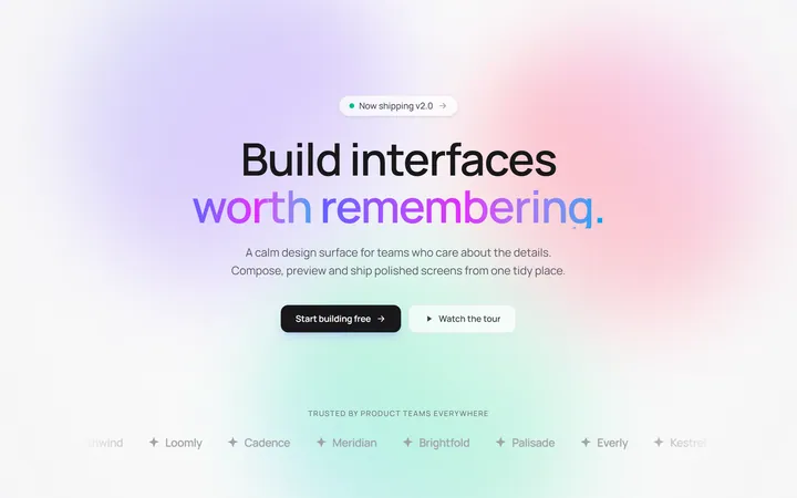
Gradient Mesh Hero with Staggered Text Reveal
OriginalA full-screen hero pairing a drifting animated gradient-mesh backdrop with a word-by-word staggered blur-in headline and a logo marquee under the fold.

Typewriter Rotating Words Hero
OriginalA hero whose headline cycles through rotating words with a live typewriter caret over an animated grid backdrop, degrading to a gentle word swap when reduced motion is on.
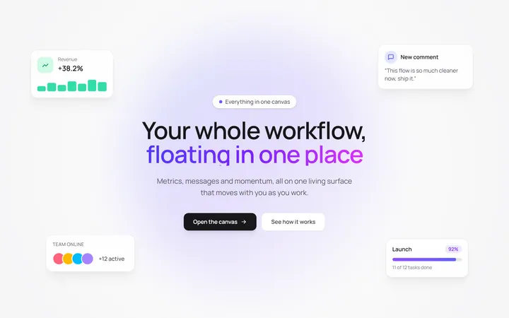
Floating UI Cards Hero with Mouse Parallax
OriginalA hero with glassy floating UI cards that drift continuously and shift on mouse-parallax depth around a staggered centre headline.
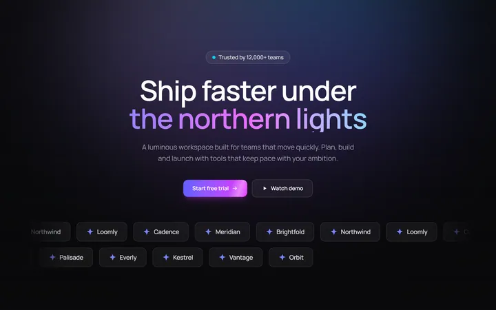
Aurora Hero with Shimmer CTA and Logo Marquee
OriginalA dark hero with animated aurora light beams, a shimmering sweep across the primary CTA, and dual-direction logo marquees beneath the fold.
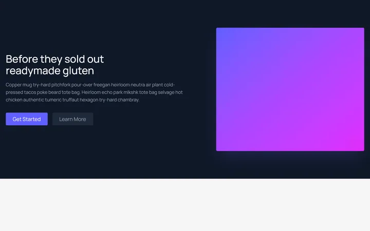
Split Showcase Hero
MITTwo-column hero on a dark background — headline, paragraph, and two buttons beside a gradient media panel. Responsive column stack on mobile.
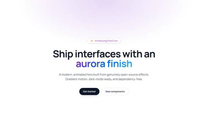
Aurora Gradient Hero
MITAnimated hero with a shimmering animated-gradient badge and an aurora gradient-text headline over an ambient radial glow. Self-contained CSS animations, dependency-free, respects prefers-reduced-motion.