

Card Border Draw Hover Effect
Original · freeA card whose border draws itself in on hover.
Copy prompt gives Claude Code, Cursor or v0 a ready-to-paste prompt that recreates this exact component.
npx shadcn@latest add https://webinnoventix.com/r/hover-card-border-draw.json"use client";
import { useEffect, useRef, useState } from "react";
import { useReducedMotion } from "motion/react";
type CardData = {
kicker: string;
title: string;
body: string;
meta: string;
href: string;
};
const CARDS: CardData[] = [
{
kicker: "Guide",
title: "Ship a design system in a weekend",
body: "Start from tokens, not components. Lock your color, spacing, and type scales first and the rest of the library falls out almost for free.",
meta: "12 min read",
href: "#design-system",
},
{
kicker: "Changelog",
title: "v2.4 — Motion primitives",
body: "New spring presets, a reduced-motion aware Reveal component, and gesture handlers that no longer fight the browser's native scrolling.",
meta: "Released today",
href: "#changelog",
},
{
kicker: "Case study",
title: "How Kettle cut TTFB by 63%",
body: "Streaming server components, an edge cache with stale-while-revalidate, and one very stubborn database query that took a week to find.",
meta: "Engineering",
href: "#case-study",
},
];
function BorderDrawCard({ card, index }: { card: CardData; index: number }) {
const prefersReduced = useReducedMotion();
const ref = useRef<HTMLAnchorElement | null>(null);
const [active, setActive] = useState(false);
const [dims, setDims] = useState<{ w: number; h: number }>({ w: 0, h: 0 });
useEffect(() => {
const el = ref.current;
if (!el) return;
const measure = () => setDims({ w: el.offsetWidth, h: el.offsetHeight });
measure();
const ro = new ResizeObserver(measure);
ro.observe(el);
return () => ro.disconnect();
}, []);
const stroke = 1.75;
const inset = stroke / 2;
const radius = 20;
const drawn = active || prefersReduced;
const duration = prefersReduced ? 0 : 640;
return (
<a
ref={ref}
href={card.href}
onMouseEnter={() => setActive(true)}
onMouseLeave={() => setActive(false)}
onFocus={() => setActive(true)}
onBlur={() => setActive(false)}
style={{ animationDelay: `${index * 90}ms` }}
className="hcbd-enter group relative flex flex-col overflow-hidden rounded-[20px] border border-slate-200 bg-white/80 p-7 outline-none backdrop-blur-sm transition-[transform,box-shadow] duration-500 ease-out hover:-translate-y-1 hover:shadow-[0_24px_60px_-30px_rgba(79,70,229,0.45)] focus-visible:-translate-y-1 focus-visible:ring-2 focus-visible:ring-indigo-500/70 dark:border-slate-800 dark:bg-slate-900/60 dark:hover:shadow-[0_24px_60px_-30px_rgba(139,92,246,0.5)] dark:focus-visible:ring-violet-400/70"
>
{/* soft ambient glow behind the card, revealed on hover */}
<span
aria-hidden="true"
className={`hcbd-glow pointer-events-none absolute -inset-px -z-10 rounded-[20px] bg-[radial-gradient(120%_120%_at_0%_0%,rgba(99,102,241,0.16),transparent_60%)] dark:bg-[radial-gradient(120%_120%_at_0%_0%,rgba(139,92,246,0.22),transparent_60%)] ${
drawn ? "opacity-100" : "opacity-0"
}`}
/>
{/* the self-drawing accent border */}
{dims.w > 0 && (
<svg
aria-hidden="true"
width={dims.w}
height={dims.h}
viewBox={`0 0 ${dims.w} ${dims.h}`}
className="pointer-events-none absolute inset-0"
fill="none"
>
<rect
x={inset}
y={inset}
width={dims.w - stroke}
height={dims.h - stroke}
rx={radius - inset}
pathLength={100}
className="hcbd-draw stroke-indigo-500 dark:stroke-violet-400"
strokeWidth={stroke}
strokeLinecap="round"
style={{
strokeDasharray: 100,
strokeDashoffset: drawn ? 0 : 100,
transitionDuration: `${duration}ms`,
}}
/>
</svg>
)}
<div className="mb-5 flex items-center justify-between">
<span className="inline-flex items-center gap-1.5 rounded-full bg-slate-100 px-2.5 py-1 text-xs font-medium uppercase tracking-wide text-slate-600 dark:bg-slate-800 dark:text-slate-300">
<span className="h-1.5 w-1.5 rounded-full bg-indigo-500 dark:bg-violet-400" />
{card.kicker}
</span>
<span className="text-xs font-medium text-slate-400 dark:text-slate-500">
{card.meta}
</span>
</div>
<h3 className="text-lg font-semibold leading-snug text-slate-900 dark:text-slate-50">
{card.title}
</h3>
<p className="mt-2.5 text-sm leading-relaxed text-slate-600 dark:text-slate-400">
{card.body}
</p>
<span className="mt-6 inline-flex items-center gap-1.5 text-sm font-semibold text-indigo-600 dark:text-violet-400">
Read more
<svg
aria-hidden="true"
viewBox="0 0 16 16"
className="hcbd-arrow h-4 w-4"
fill="none"
stroke="currentColor"
strokeWidth={1.75}
strokeLinecap="round"
strokeLinejoin="round"
>
<path d="M3 8h9" />
<path d="M8.5 4.5 12 8l-3.5 3.5" />
</svg>
</span>
<style>{`
@keyframes hcbd-rise {
from { opacity: 0; transform: translateY(14px); }
to { opacity: 1; transform: translateY(0); }
}
.hcbd-enter {
animation: hcbd-rise 620ms cubic-bezier(0.22, 1, 0.36, 1) both;
}
.hcbd-draw {
transition-property: stroke-dashoffset;
transition-timing-function: cubic-bezier(0.65, 0, 0.35, 1);
}
.hcbd-glow {
transition: opacity 420ms ease;
}
.hcbd-arrow {
transition: transform 320ms cubic-bezier(0.34, 1.56, 0.64, 1);
}
.group:hover .hcbd-arrow,
.group:focus-visible .hcbd-arrow {
transform: translateX(4px);
}
@media (prefers-reduced-motion: reduce) {
.hcbd-enter { animation: none; }
.hcbd-draw,
.hcbd-glow,
.hcbd-arrow { transition: none !important; }
}
`}</style>
</a>
);
}
export default function HoverCardBorderDraw() {
return (
<section className="relative w-full overflow-hidden bg-slate-50 px-6 py-24 dark:bg-slate-950 sm:px-8">
{/* faint grid texture for depth */}
<div
aria-hidden="true"
className="pointer-events-none absolute inset-0 bg-[linear-gradient(to_right,rgba(15,23,42,0.04)_1px,transparent_1px),linear-gradient(to_bottom,rgba(15,23,42,0.04)_1px,transparent_1px)] bg-[size:44px_44px] [mask-image:radial-gradient(80%_60%_at_50%_0%,black,transparent)] dark:bg-[linear-gradient(to_right,rgba(255,255,255,0.05)_1px,transparent_1px),linear-gradient(to_bottom,rgba(255,255,255,0.05)_1px,transparent_1px)]"
/>
<div className="relative mx-auto max-w-5xl">
<div className="mx-auto max-w-2xl text-center">
<span className="inline-block rounded-full border border-slate-200 bg-white px-3 py-1 text-xs font-medium uppercase tracking-widest text-slate-500 dark:border-slate-800 dark:bg-slate-900 dark:text-slate-400">
From the field notes
</span>
<h2 className="mt-5 text-3xl font-semibold tracking-tight text-slate-900 dark:text-slate-50 sm:text-4xl">
Hover to draw the line
</h2>
<p className="mx-auto mt-4 max-w-xl text-base leading-relaxed text-slate-600 dark:text-slate-400">
Point at a card and its border traces itself into place. Every card
is keyboard-focusable, so the same reveal fires on Tab.
</p>
</div>
<div className="mt-14 grid gap-6 sm:grid-cols-2 lg:grid-cols-3">
{CARDS.map((card, i) => (
<BorderDrawCard key={card.href} card={card} index={i} />
))}
</div>
</div>
</section>
);
}Dependencies
Licence
Built by Web Innoventix. Free for personal and commercial use, no attribution required.
Built by Web Innoventix
Need a custom interface, a full website, or SEO that gets you cited by AI? We design, build and rank it end to end.
Get a free quoteSimilar components
Browse all →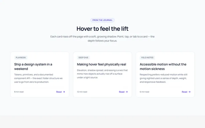
Card Lift Hover Effect
OriginalA card that lifts with a growing shadow on hover.

Card Glow Hover Effect
OriginalA card with a coloured glow that blooms on hover.
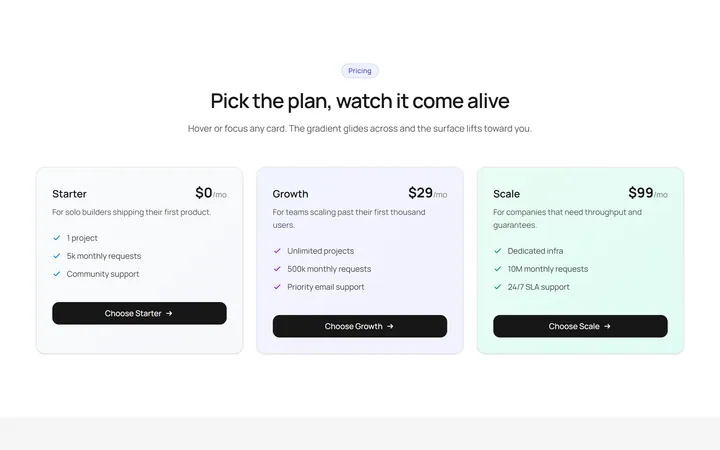
Card Gradient Shift Hover Effect
OriginalA card whose gradient background shifts on hover.
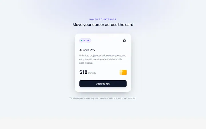
Card Tilt Hover Effect
OriginalA card that tilts in 3D toward the cursor on hover.
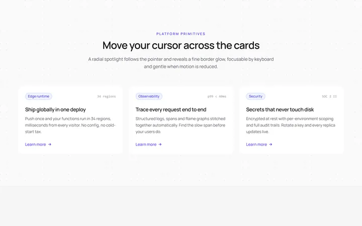
Card Spotlight Hover Effect
OriginalA card with a cursor-following radial spotlight.
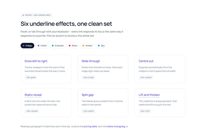
Link Underline Hover Effect
OriginalAnimated link underline effects: grow, slide and centre-out.
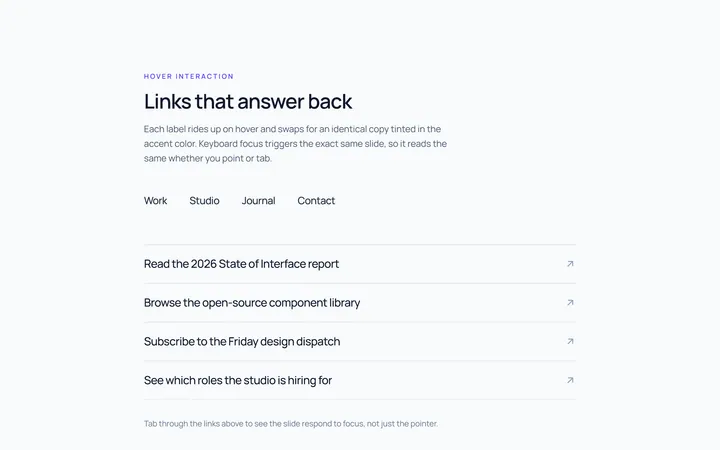
Link Slide Hover Effect
OriginalLinks whose label slides up to a duplicate on hover.
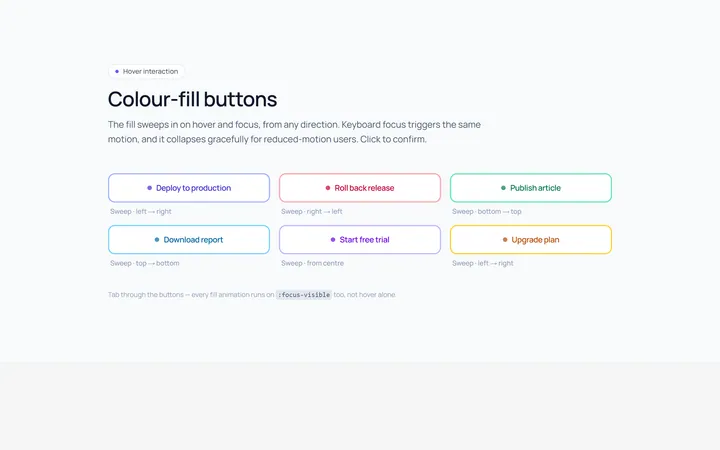
Button Fill Hover Effect
OriginalButtons with a colour fill that sweeps across on hover.
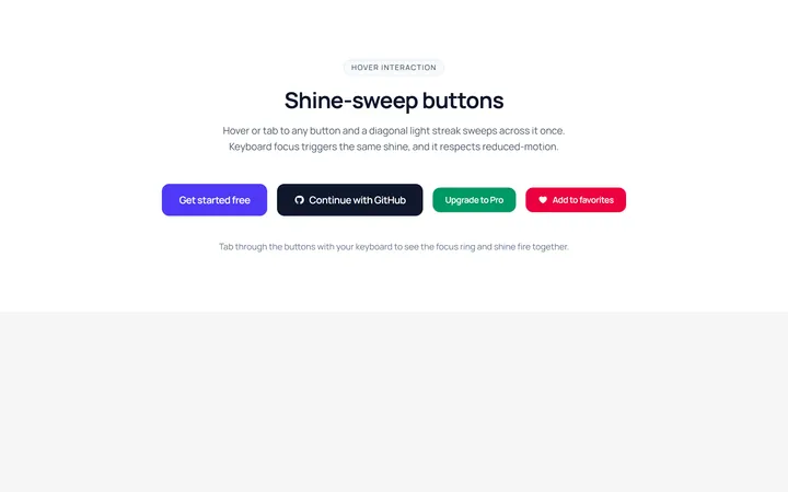
Button Shine Hover Effect
OriginalButtons with a diagonal shine sweep on hover.
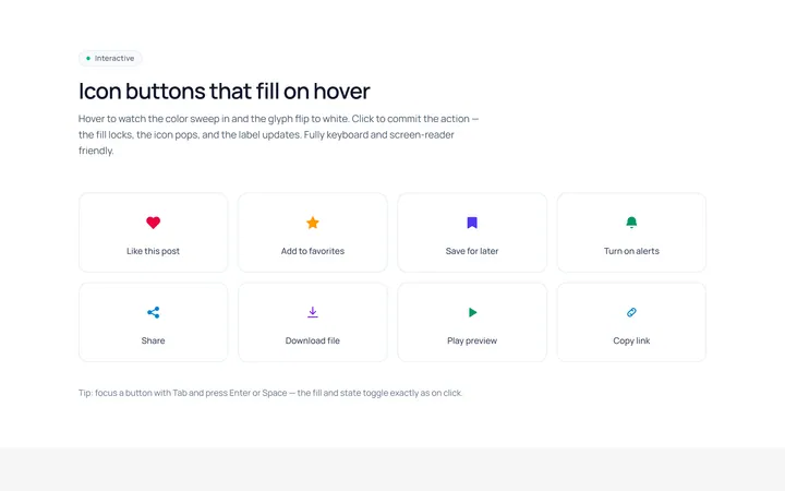
Icon Fill Hover Effect
OriginalIcon buttons whose icon and background fill on hover.
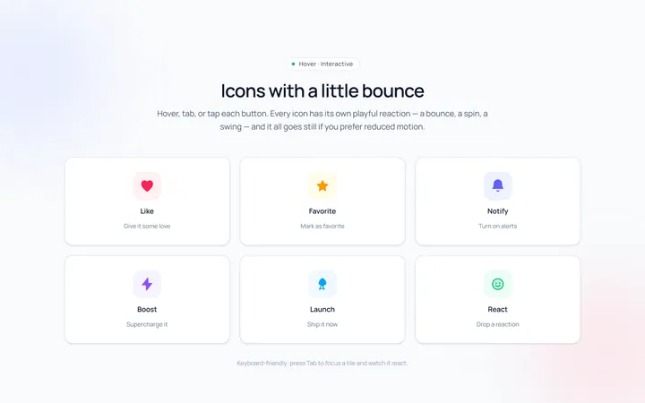
Icon Bounce Hover Effect
OriginalIcons that bounce or spin playfully on hover.
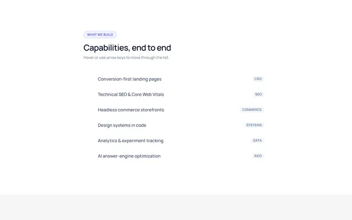
List Highlight Hover Effect
OriginalA list where the hovered row gets a sliding highlight and arrow.