

Link Underline Hover Effect
Original · freeAnimated link underline effects: grow, slide and centre-out.
Copy prompt gives Claude Code, Cursor or v0 a ready-to-paste prompt that recreates this exact component.
npx shadcn@latest add https://webinnoventix.com/r/hover-link-underline.json"use client";
import { useState } from "react";
type Accent = "indigo" | "violet" | "emerald" | "rose" | "amber" | "sky";
type LinkVariant = {
key: string;
label: string;
blurb: string;
href: string;
effectClass: string;
};
const ACCENTS: { key: Accent; label: string; dot: string; text: string }[] = [
{ key: "indigo", label: "Indigo", dot: "bg-indigo-500", text: "text-indigo-600 dark:text-indigo-400" },
{ key: "violet", label: "Violet", dot: "bg-violet-500", text: "text-violet-600 dark:text-violet-400" },
{ key: "emerald", label: "Emerald", dot: "bg-emerald-500", text: "text-emerald-600 dark:text-emerald-400" },
{ key: "rose", label: "Rose", dot: "bg-rose-500", text: "text-rose-600 dark:text-rose-400" },
{ key: "amber", label: "Amber", dot: "bg-amber-500", text: "text-amber-600 dark:text-amber-400" },
{ key: "sky", label: "Sky", dot: "bg-sky-500", text: "text-sky-600 dark:text-sky-400" },
];
const VARIANTS: LinkVariant[] = [
{
key: "grow",
label: "Grow left to right",
blurb: "The bar sweeps in from the start of the word and retracts back the way it came.",
href: "#pricing",
effectClass: "hlu-grow",
},
{
key: "slide",
label: "Slide through",
blurb: "Enters from the left on hover, then exits stage right when you leave.",
href: "#changelog",
effectClass: "hlu-slide",
},
{
key: "center",
label: "Centre out",
blurb: "Expands symmetrically from the midpoint until it spans the full width.",
href: "#docs",
effectClass: "hlu-center",
},
{
key: "reveal",
label: "Static reveal",
blurb: "A faint rule sits under the text; the accent bar wipes across on top.",
href: "#careers",
effectClass: "hlu-reveal",
},
{
key: "split",
label: "Split gap",
blurb: "Two halves grow outward from a hairline seam in the centre.",
href: "#press",
effectClass: "hlu-split",
},
{
key: "lift",
label: "Lift and thicken",
blurb: "The underline is always present, then swells and lifts snug to the text.",
href: "#support",
effectClass: "hlu-lift",
},
];
export default function HoverLinkUnderline() {
const [accent, setAccent] = useState<Accent>("indigo");
const active = ACCENTS.find((a) => a.key === accent) ?? ACCENTS[0];
return (
<section className="relative w-full overflow-hidden bg-white px-6 py-20 text-slate-900 sm:px-8 dark:bg-slate-950 dark:text-slate-100">
<style>{`
.hlu-link {
position: relative;
display: inline-block;
text-decoration: none;
padding-bottom: 3px;
outline: none;
-webkit-tap-highlight-color: transparent;
}
.hlu-link::before,
.hlu-link::after {
content: "";
position: absolute;
bottom: 0;
height: 2px;
background-color: currentColor;
border-radius: 2px;
}
/* Grow: left to right, retract left on leave */
.hlu-grow::after {
left: 0; right: 0;
transform: scaleX(0);
transform-origin: left center;
transition: transform 320ms cubic-bezier(0.65, 0, 0.35, 1);
}
.hlu-grow:hover::after,
.hlu-grow:focus-visible::after {
transform: scaleX(1);
}
/* Slide: in from left on hover, out to right on leave */
.hlu-slide::after {
left: 0; right: 0;
transform: scaleX(0);
transform-origin: right center;
transition: transform 340ms cubic-bezier(0.65, 0, 0.35, 1);
}
.hlu-slide:hover::after,
.hlu-slide:focus-visible::after {
transform: scaleX(1);
transform-origin: left center;
}
/* Centre out */
.hlu-center::after {
left: 0; right: 0;
transform: scaleX(0);
transform-origin: center;
transition: transform 300ms cubic-bezier(0.34, 1.56, 0.64, 1);
}
.hlu-center:hover::after,
.hlu-center:focus-visible::after {
transform: scaleX(1);
}
/* Static reveal: faint base rule + accent wipe */
.hlu-reveal::before {
left: 0; right: 0;
opacity: 0.25;
transform: scaleX(1);
}
.hlu-reveal::after {
left: 0; right: 0;
transform: scaleX(0);
transform-origin: left center;
transition: transform 300ms cubic-bezier(0.65, 0, 0.35, 1);
}
.hlu-reveal:hover::after,
.hlu-reveal:focus-visible::after {
transform: scaleX(1);
}
/* Split gap: two bars from centre seam */
.hlu-split::before {
left: 50%; right: 50%;
transition: left 300ms cubic-bezier(0.65, 0, 0.35, 1),
right 300ms cubic-bezier(0.65, 0, 0.35, 1);
}
.hlu-split:hover::before,
.hlu-split:focus-visible::before {
left: 0; right: 0;
}
/* Lift and thicken: always-on rule that swells */
.hlu-lift::after {
left: 0; right: 0;
height: 1px;
opacity: 0.55;
transition: height 200ms ease, opacity 200ms ease, bottom 200ms ease;
}
.hlu-lift:hover::after,
.hlu-lift:focus-visible::after {
height: 3px;
opacity: 1;
bottom: 1px;
}
.hlu-link:focus-visible {
border-radius: 3px;
box-shadow: 0 0 0 2px rgba(148, 163, 184, 0.55);
}
@media (prefers-reduced-motion: reduce) {
.hlu-grow::after,
.hlu-slide::after,
.hlu-center::after,
.hlu-reveal::after,
.hlu-split::before,
.hlu-lift::after {
transition: none !important;
}
}
`}</style>
<div className="relative mx-auto max-w-5xl">
<header className="max-w-2xl">
<span className="inline-flex items-center gap-2 rounded-full border border-slate-200 bg-slate-50 px-3 py-1 text-xs font-medium uppercase tracking-wider text-slate-500 dark:border-slate-800 dark:bg-slate-900 dark:text-slate-400">
<span className={`h-1.5 w-1.5 rounded-full ${active.dot}`} />
Hover · link underlines
</span>
<h2 className="mt-5 text-3xl font-semibold tracking-tight text-slate-900 sm:text-4xl dark:text-white">
Six underline effects, one clean set
</h2>
<p className="mt-4 text-base leading-relaxed text-slate-600 dark:text-slate-400">
Hover, or tab through with your keyboard — every link responds to
focus the same way it responds to a pointer. Pick an accent to recolour
the whole set.
</p>
</header>
<div
className="mt-8 flex flex-wrap items-center gap-2"
role="radiogroup"
aria-label="Underline accent colour"
>
{ACCENTS.map((a) => {
const selected = a.key === accent;
return (
<button
key={a.key}
type="button"
role="radio"
aria-checked={selected}
onClick={() => setAccent(a.key)}
className={`inline-flex items-center gap-2 rounded-full border px-3 py-1.5 text-sm font-medium transition-colors ${
selected
? "border-slate-900 bg-slate-900 text-white dark:border-white dark:bg-white dark:text-slate-900"
: "border-slate-200 bg-white text-slate-600 hover:border-slate-300 hover:bg-slate-50 dark:border-slate-800 dark:bg-slate-900 dark:text-slate-300 dark:hover:border-slate-700"
}`}
>
<span className={`h-2.5 w-2.5 rounded-full ${a.dot}`} />
{a.label}
</button>
);
})}
</div>
<ul className="mt-10 grid grid-cols-1 gap-x-10 gap-y-8 sm:grid-cols-2 lg:grid-cols-3">
{VARIANTS.map((v) => (
<li
key={v.key}
className="group rounded-2xl border border-slate-200 bg-white p-6 transition-colors hover:border-slate-300 dark:border-slate-800 dark:bg-slate-900/40 dark:hover:border-slate-700"
>
<div className="text-lg font-medium">
<a
href={v.href}
className={`hlu-link ${v.effectClass} ${active.text}`}
onClick={(e) => e.preventDefault()}
>
{v.label}
</a>
</div>
<p className="mt-3 text-sm leading-relaxed text-slate-500 dark:text-slate-400">
{v.blurb}
</p>
<code className="mt-4 inline-block rounded-md bg-slate-100 px-2 py-1 font-mono text-xs text-slate-500 dark:bg-slate-800 dark:text-slate-400">
.{v.effectClass}
</code>
</li>
))}
</ul>
<p className="mt-12 max-w-2xl text-sm leading-relaxed text-slate-500 dark:text-slate-400">
Reading a paragraph? Underlines work inline too. Jump to the{" "}
<a
href="#pricing"
className={`hlu-link hlu-grow ${active.text} font-medium`}
onClick={(e) => e.preventDefault()}
>
pricing table
</a>
, skim the{" "}
<a
href="#changelog"
className={`hlu-link hlu-slide ${active.text} font-medium`}
onClick={(e) => e.preventDefault()}
>
latest changelog
</a>
, or open the{" "}
<a
href="#docs"
className={`hlu-link hlu-center ${active.text} font-medium`}
onClick={(e) => e.preventDefault()}
>
API reference
</a>{" "}
without breaking the flow of the sentence.
</p>
</div>
</section>
);
}Dependencies
Licence
Built by Web Innoventix. Free for personal and commercial use, no attribution required.
Built by Web Innoventix
Need a custom interface, a full website, or SEO that gets you cited by AI? We design, build and rank it end to end.
Get a free quoteSimilar components
Browse all →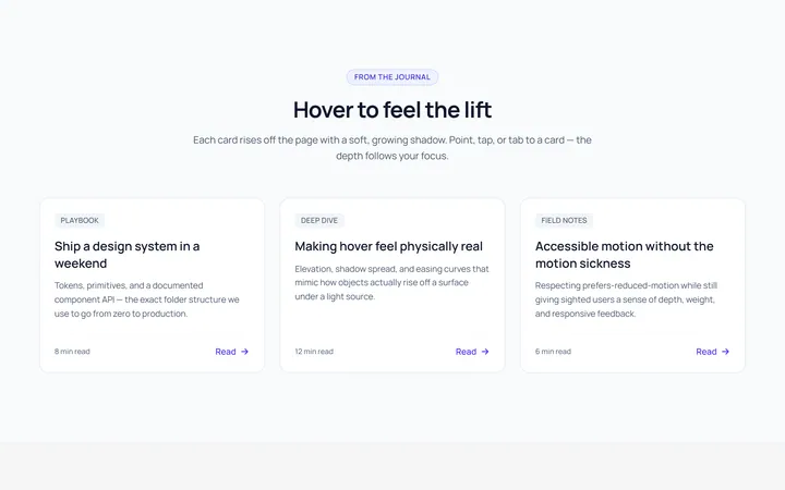
Card Lift Hover Effect
OriginalA card that lifts with a growing shadow on hover.
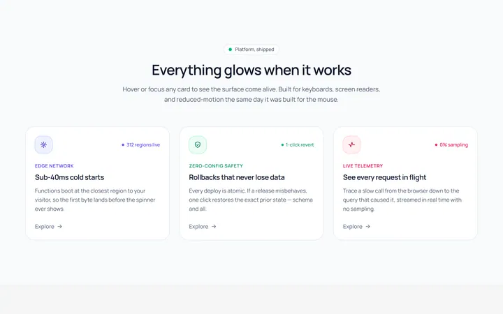
Card Glow Hover Effect
OriginalA card with a coloured glow that blooms on hover.
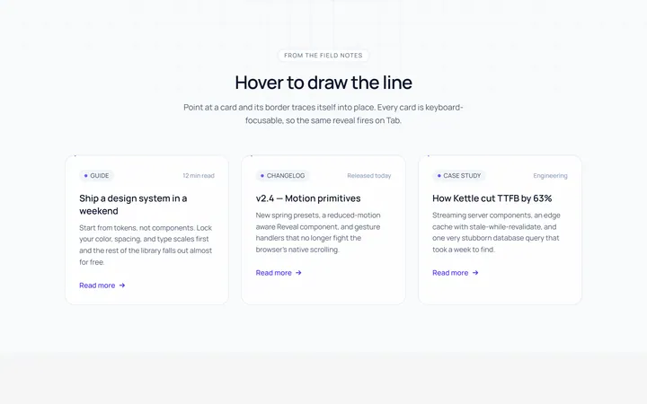
Card Border Draw Hover Effect
OriginalA card whose border draws itself in on hover.
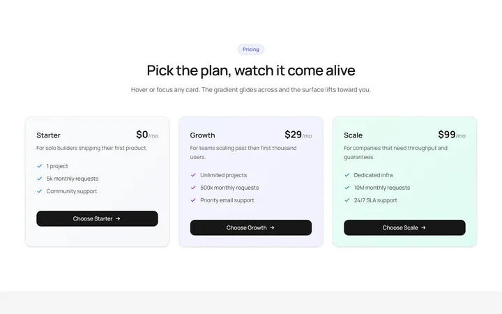
Card Gradient Shift Hover Effect
OriginalA card whose gradient background shifts on hover.
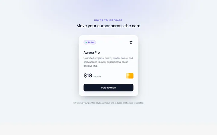
Card Tilt Hover Effect
OriginalA card that tilts in 3D toward the cursor on hover.
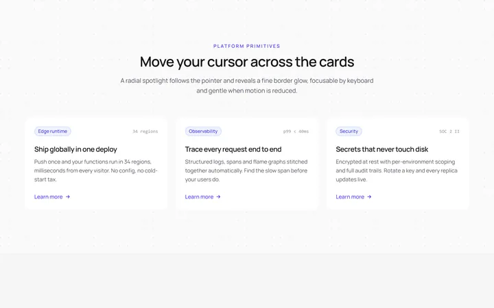
Card Spotlight Hover Effect
OriginalA card with a cursor-following radial spotlight.
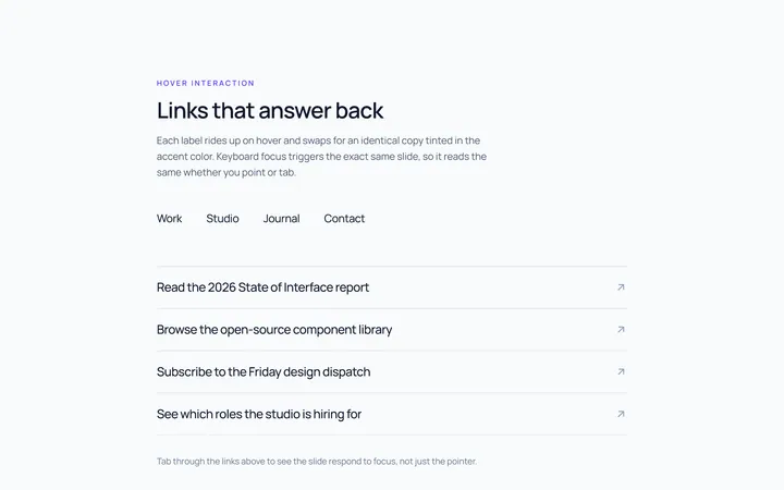
Link Slide Hover Effect
OriginalLinks whose label slides up to a duplicate on hover.
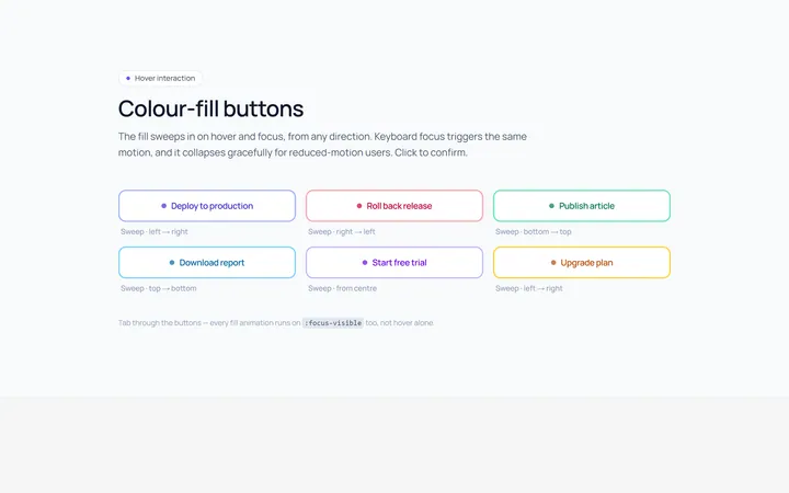
Button Fill Hover Effect
OriginalButtons with a colour fill that sweeps across on hover.
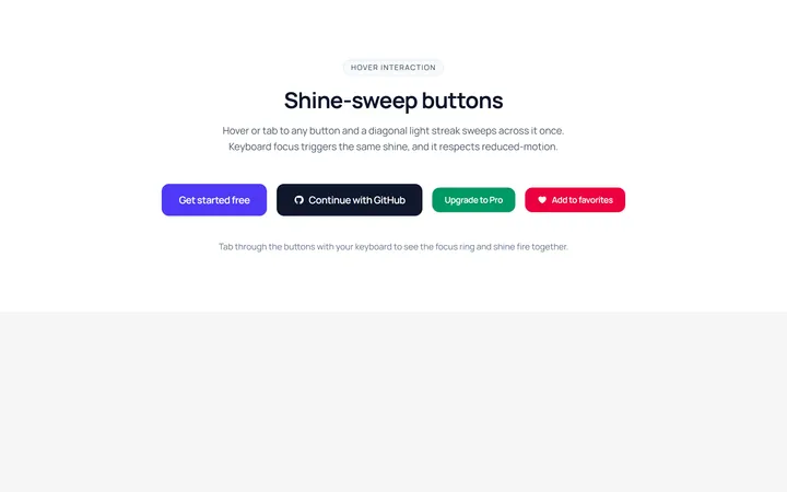
Button Shine Hover Effect
OriginalButtons with a diagonal shine sweep on hover.
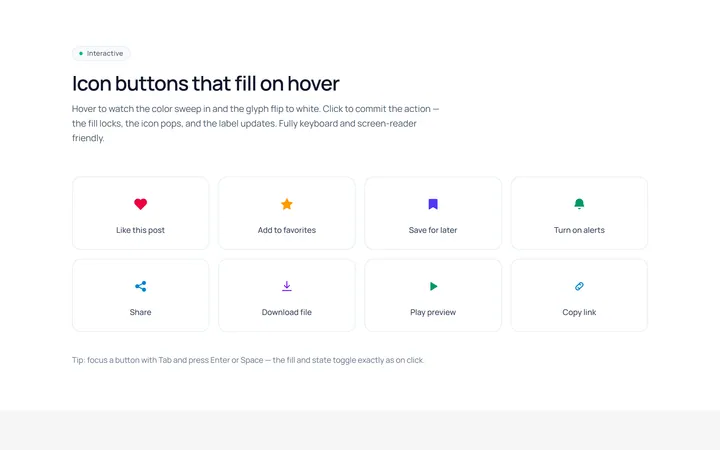
Icon Fill Hover Effect
OriginalIcon buttons whose icon and background fill on hover.
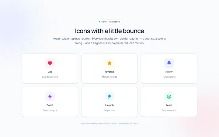
Icon Bounce Hover Effect
OriginalIcons that bounce or spin playfully on hover.
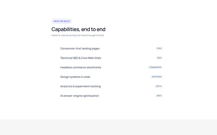
List Highlight Hover Effect
OriginalA list where the hovered row gets a sliding highlight and arrow.