

Diagonal Wipe Effect
Original · freeA diagonal clip-path wipe reveals the image on hover.
Copy prompt gives Claude Code, Cursor or v0 a ready-to-paste prompt that recreates this exact component.
npx shadcn@latest add https://webinnoventix.com/r/imgfx-diagonal-wipe.json"use client";
export default function ImgfxDiagonalWipe() {
return (
<section className="relative w-full bg-white px-6 py-20 sm:py-24 dark:bg-neutral-950">
<style>{`
.dgw-card {
position: relative;
overflow: hidden;
border-radius: 1rem;
isolation: isolate;
outline: none;
}
.dgw-layer {
position: absolute;
inset: 0;
width: 100%;
height: 100%;
object-fit: cover;
user-select: none;
}
.dgw-base {
filter: grayscale(1) brightness(0.82) contrast(1.05);
transition: filter 700ms cubic-bezier(0.22, 1, 0.36, 1);
}
.dgw-reveal {
clip-path: polygon(0 0, -28% 0, -78% 100%, 0 100%);
transition: clip-path 750ms cubic-bezier(0.22, 1, 0.36, 1);
will-change: clip-path;
}
.dgw-card:hover .dgw-reveal,
.dgw-card:focus-visible .dgw-reveal,
.dgw-card:focus-within .dgw-reveal {
clip-path: polygon(0 0, 128% 0, 78% 100%, 0 100%);
}
.dgw-card:hover .dgw-base,
.dgw-card:focus-visible .dgw-base,
.dgw-card:focus-within .dgw-base {
filter: grayscale(0) brightness(1) contrast(1);
}
.dgw-sheen {
position: absolute;
inset: -20% -30%;
pointer-events: none;
transform: translateX(-170%) skewX(-24deg);
background: linear-gradient(
90deg,
transparent 0%,
rgba(129, 140, 248, 0) 38%,
rgba(196, 181, 253, 0.55) 50%,
rgba(129, 140, 248, 0) 62%,
transparent 100%
);
transition: transform 750ms cubic-bezier(0.22, 1, 0.36, 1);
mix-blend-mode: screen;
will-change: transform;
}
.dgw-card:hover .dgw-sheen,
.dgw-card:focus-visible .dgw-sheen,
.dgw-card:focus-within .dgw-sheen {
transform: translateX(170%) skewX(-24deg);
}
.dgw-card:focus-visible {
box-shadow: 0 0 0 3px rgba(99, 102, 241, 0.55);
}
@media (prefers-reduced-motion: reduce) {
.dgw-reveal {
transition: none;
clip-path: polygon(0 0, 128% 0, 78% 100%, 0 100%);
}
.dgw-base {
transition: none;
filter: grayscale(0) brightness(1) contrast(1);
}
.dgw-sheen {
display: none;
}
}
`}</style>
<div className="mx-auto max-w-2xl">
<div className="mb-8 text-center">
<p className="text-xs font-semibold uppercase tracking-[0.2em] text-indigo-600 dark:text-indigo-400">
Image Effect
</p>
<h2 className="mt-2 text-2xl font-semibold tracking-tight text-neutral-900 sm:text-3xl dark:text-neutral-50">
Diagonal Clip-Path Wipe
</h2>
<p className="mt-3 text-sm text-neutral-500 dark:text-neutral-400">
Hover the frame — colour sweeps in along a moving diagonal edge.
</p>
</div>
<figure
className="dgw-card group ring-1 ring-neutral-200/80 shadow-xl shadow-neutral-900/5 dark:ring-white/10 dark:shadow-black/40"
tabIndex={0}
aria-label="Coastal cliffside at golden hour. Focus or hover to reveal the image in full colour."
>
<div className="relative aspect-[4/3] w-full">
{/* eslint-disable-next-line @next/next/no-img-element */}
<img
src="/img/gallery/g07.webp"
alt="Rugged coastal cliffs meeting the sea at golden hour, shown desaturated"
loading="lazy"
draggable={false}
className="dgw-layer dgw-base"
/>
{/* eslint-disable-next-line @next/next/no-img-element */}
<img
src="/img/gallery/g07.webp"
alt="The same coastal cliffs revealed in warm full colour"
loading="lazy"
draggable={false}
className="dgw-layer dgw-reveal"
/>
<span className="dgw-sheen" aria-hidden="true" />
</div>
<figcaption className="pointer-events-none absolute inset-x-0 bottom-0 flex items-center justify-between gap-3 bg-gradient-to-t from-black/70 via-black/25 to-transparent px-4 pb-3 pt-10">
<span className="text-sm font-medium text-white">
Golden Hour, Coastline
</span>
<span className="rounded-full bg-white/15 px-2.5 py-1 text-[11px] font-medium uppercase tracking-wide text-white/90 backdrop-blur-sm">
Hover to reveal
</span>
</figcaption>
</figure>
</div>
</section>
);
}Dependencies
Licence
Built by Web Innoventix. Free for personal and commercial use, no attribution required.
Built by Web Innoventix
Need a custom interface, a full website, or SEO that gets you cited by AI? We design, build and rank it end to end.
Get a free quoteSimilar components
Browse all →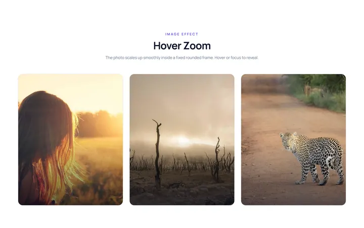
Hover Zoom Effect
OriginalImage zooms in smoothly inside a fixed rounded frame on hover.
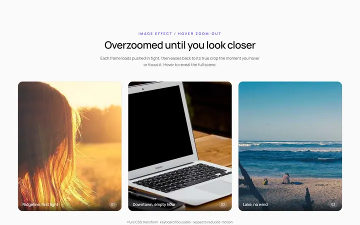
Hover Zoom Out Effect
OriginalImage starts zoomed and settles to normal on hover.
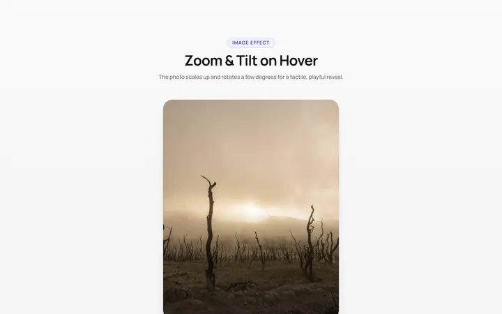
Zoom Rotate Effect
OriginalImage zooms and rotates slightly on hover.
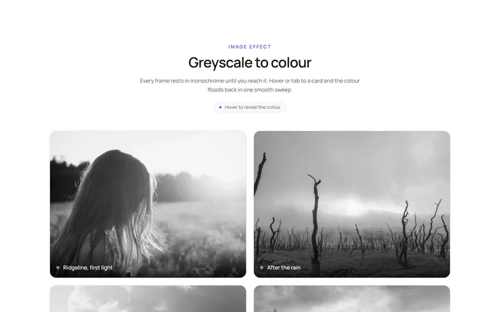
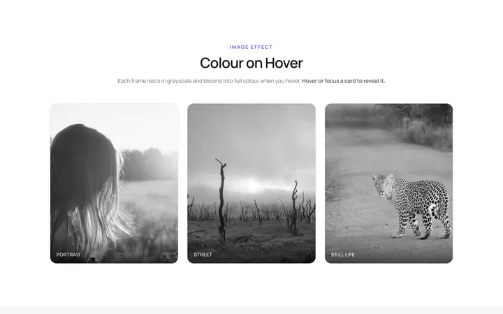
Grayscale Color Effect
OriginalGreyscale image turns to full colour on hover.
Color Grayscale Effect
OriginalFull-colour image fades to greyscale on hover.
Blur Sharp Effect
OriginalBlurred image sharpens on hover.
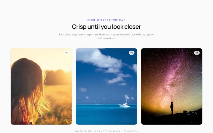
Sharp Blur Effect
OriginalSharp image blurs with a caption appearing on hover.
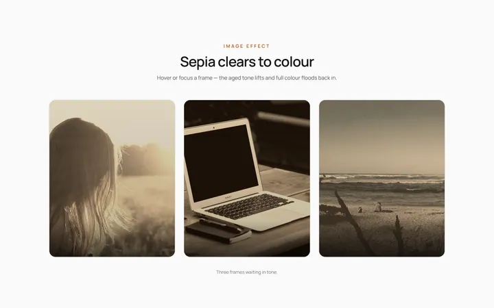
Sepia Clear Effect
OriginalSepia-toned image clears to full colour on hover.
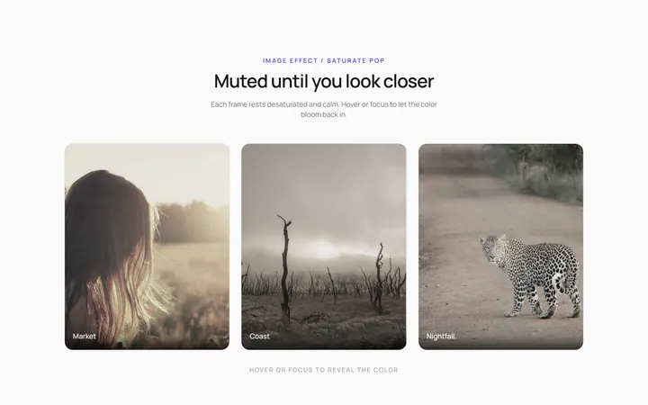
Saturate Pop Effect
OriginalMuted image saturates and pops on hover.
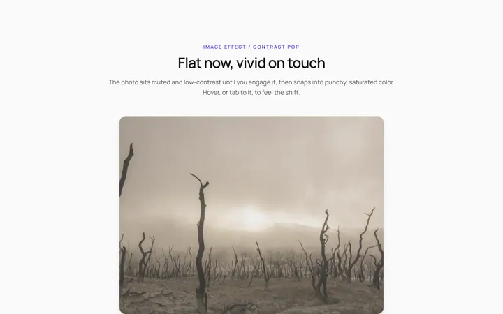
Contrast Pop Effect
OriginalLow-contrast image gains punchy contrast on hover.
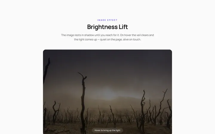
Brightness Lift Effect
OriginalDim image brightens on hover.
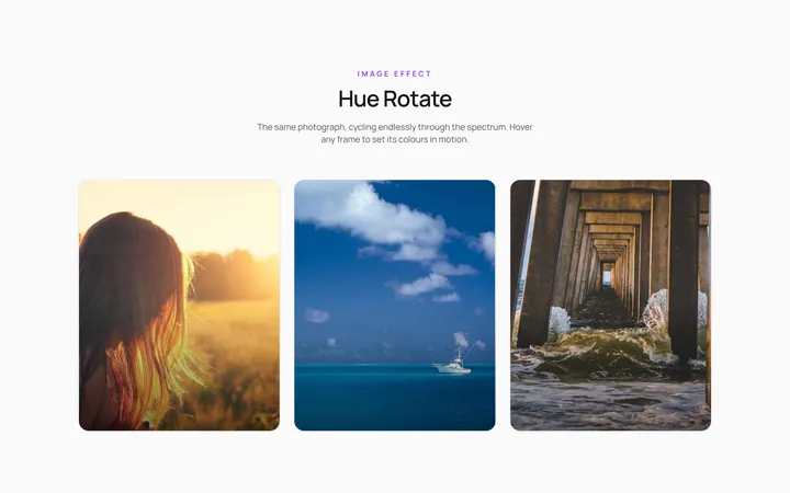
Hue Rotate Effect
OriginalImage hue-shifts through colours on hover.