

Gradient Title Effect
Original · freeA gradient-text title sits over a dimmed image.
Copy prompt gives Claude Code, Cursor or v0 a ready-to-paste prompt that recreates this exact component.
npx shadcn@latest add https://webinnoventix.com/r/imgfx-gradient-title.json"use client";
import { useRef } from "react";
import { motion, useInView, useReducedMotion } from "motion/react";
export default function ImgfxGradientTitle() {
const reduceMotion = useReducedMotion();
const ref = useRef<HTMLDivElement>(null);
const inView = useInView(ref, { once: true, amount: 0.4 });
const shouldAnimate = !reduceMotion && inView;
return (
<section className="relative w-full bg-white px-6 py-24 dark:bg-neutral-950 sm:px-10 lg:py-32">
<style>{`
@keyframes gtitle-sheen {
0% { background-position: 0% 50%; }
100% { background-position: 200% 50%; }
}
@keyframes gtitle-rise {
from { opacity: 0; transform: translateY(14px); }
to { opacity: 1; transform: translateY(0); }
}
@media (prefers-reduced-motion: reduce) {
.gtitle-sheen-anim { animation: none !important; }
.gtitle-rise-anim { animation: none !important; opacity: 1 !important; transform: none !important; }
}
`}</style>
<div className="mx-auto max-w-6xl">
<div className="mb-8 flex items-center gap-3">
<span className="h-px w-8 bg-gradient-to-r from-indigo-500 to-violet-500" />
<p className="text-xs font-semibold uppercase tracking-[0.28em] text-indigo-600 dark:text-indigo-400">
Gradient Title
</p>
</div>
<div
ref={ref}
className="group relative overflow-hidden rounded-3xl bg-neutral-900 shadow-2xl ring-1 ring-black/10 dark:ring-white/10"
>
{/* eslint-disable-next-line @next/next/no-img-element */}
<img
src="/img/gallery/g14.webp"
alt="Aerial view of a winding coastal road at dusk"
loading="lazy"
draggable={false}
className="h-[26rem] w-full scale-105 object-cover brightness-[0.42] saturate-[0.9] transition-[filter,transform] duration-700 ease-out group-hover:scale-100 group-hover:brightness-[0.5] sm:h-[32rem] lg:h-[38rem]"
/>
<div className="pointer-events-none absolute inset-0 bg-gradient-to-t from-black/70 via-black/20 to-transparent" />
<div className="absolute inset-0 flex flex-col justify-end p-8 sm:p-12 lg:p-16">
<motion.h2
initial={reduceMotion ? false : { opacity: 0, y: 18 }}
animate={shouldAnimate ? { opacity: 1, y: 0 } : undefined}
transition={{ duration: 0.7, ease: [0.22, 1, 0.36, 1] }}
className="max-w-3xl text-4xl font-black leading-[0.95] tracking-tight sm:text-6xl lg:text-7xl"
>
<span
className="gtitle-sheen-anim bg-gradient-to-r from-indigo-300 via-fuchsia-300 to-amber-200 bg-clip-text text-transparent"
style={{ backgroundSize: "200% 100%", animation: "gtitle-sheen 6s linear infinite alternate" }}
>
Where the road
<br />
meets the light
</span>
</motion.h2>
<motion.p
initial={reduceMotion ? false : { opacity: 0, y: 14 }}
animate={shouldAnimate ? { opacity: 1, y: 0 } : undefined}
transition={{ duration: 0.7, delay: 0.12, ease: [0.22, 1, 0.36, 1] }}
className="mt-5 max-w-md text-sm font-medium text-neutral-300 sm:text-base"
>
A gradient headline drifts across the dimmed frame, keeping the words
legible while the photo stays the mood.
</motion.p>
</div>
</div>
<p className="mt-6 text-sm text-neutral-500 dark:text-neutral-400">
Hover to lift the dim and settle the frame.
</p>
</div>
</section>
);
}Dependencies
Licence
Built by Web Innoventix. Free for personal and commercial use, no attribution required.
Built by Web Innoventix
Need a custom interface, a full website, or SEO that gets you cited by AI? We design, build and rank it end to end.
Get a free quoteSimilar components
Browse all →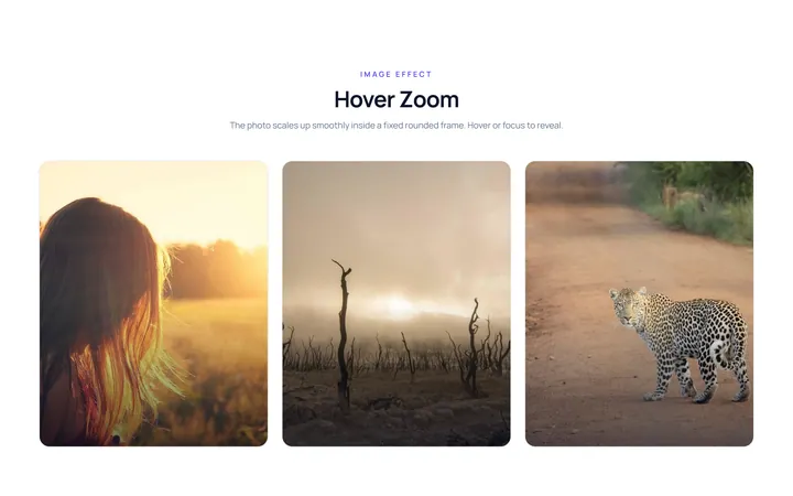
Hover Zoom Effect
OriginalImage zooms in smoothly inside a fixed rounded frame on hover.
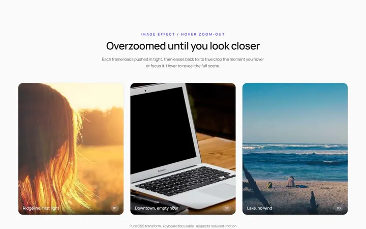
Hover Zoom Out Effect
OriginalImage starts zoomed and settles to normal on hover.
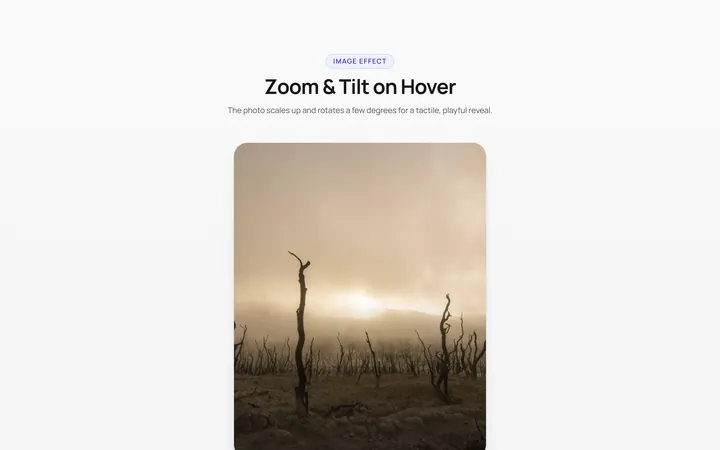
Zoom Rotate Effect
OriginalImage zooms and rotates slightly on hover.
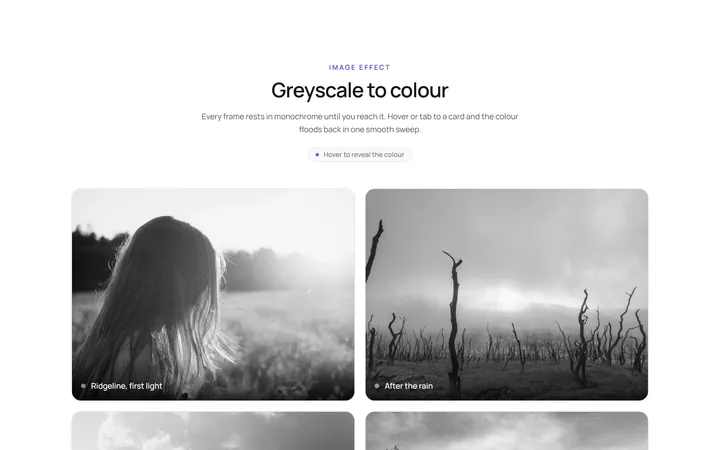
Grayscale Color Effect
OriginalGreyscale image turns to full colour on hover.
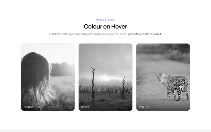
Color Grayscale Effect
OriginalFull-colour image fades to greyscale on hover.
Blur Sharp Effect
OriginalBlurred image sharpens on hover.
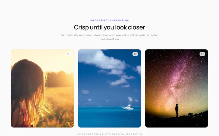
Sharp Blur Effect
OriginalSharp image blurs with a caption appearing on hover.
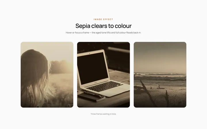
Sepia Clear Effect
OriginalSepia-toned image clears to full colour on hover.
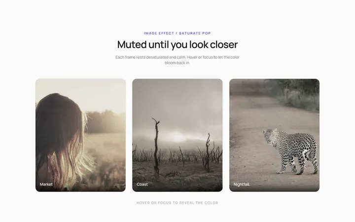
Saturate Pop Effect
OriginalMuted image saturates and pops on hover.
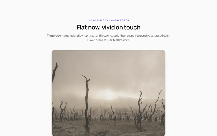
Contrast Pop Effect
OriginalLow-contrast image gains punchy contrast on hover.
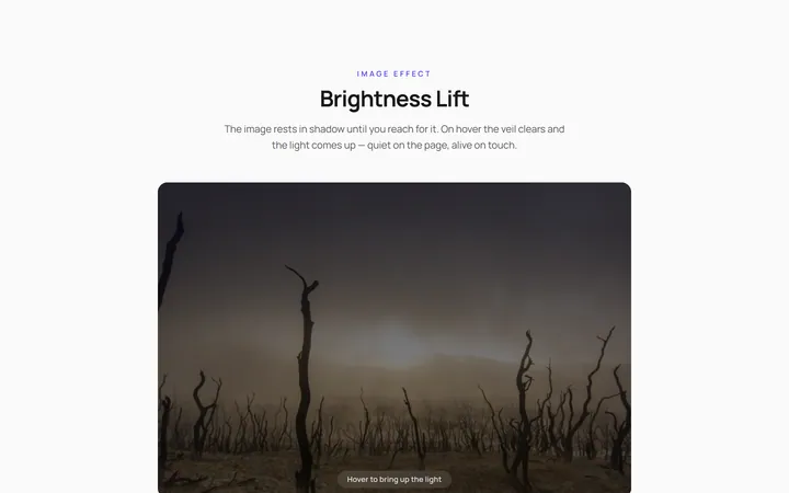
Brightness Lift Effect
OriginalDim image brightens on hover.
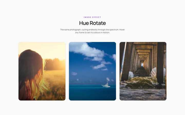
Hue Rotate Effect
OriginalImage hue-shifts through colours on hover.