

Grayscale Scroll Effect
Original · freeImage gains colour from greyscale as you scroll through it.
Copy prompt gives Claude Code, Cursor or v0 a ready-to-paste prompt that recreates this exact component.
npx shadcn@latest add https://webinnoventix.com/r/imgfx-grayscale-scroll.json"use client";
import { useRef } from "react";
import {
motion,
useScroll,
useTransform,
useReducedMotion,
useMotionTemplate,
} from "motion/react";
export default function ImgfxGrayscaleScroll() {
const reduce = useReducedMotion();
const trackRef = useRef<HTMLDivElement>(null);
const { scrollYProgress } = useScroll({
target: trackRef,
offset: ["start 85%", "center 55%"],
});
// 1 = fully desaturated, 0 = full colour.
const gray = useTransform(scrollYProgress, [0, 1], [1, 0]);
const sat = useTransform(scrollYProgress, [0, 1], [0.85, 1.12]);
const contrast = useTransform(scrollYProgress, [0, 1], [0.94, 1.04]);
const filter = useMotionTemplate`grayscale(${gray}) saturate(${sat}) contrast(${contrast})`;
// A colour bar that fills as scroll progress advances.
const meterWidth = useTransform(scrollYProgress, [0, 1], ["8%", "100%"]);
const meterOpacity = useTransform(scrollYProgress, [0, 0.15], [0.4, 1]);
const staticFilter = reduce ? "grayscale(0) saturate(1.05)" : undefined;
return (
<section className="relative w-full overflow-hidden bg-neutral-50 px-6 py-24 text-neutral-900 sm:px-10 lg:py-32 dark:bg-neutral-950 dark:text-neutral-100">
<style>{`
@keyframes gsc_scrollHint {
0%, 100% { transform: translateY(0); opacity: 0.55; }
50% { transform: translateY(6px); opacity: 1; }
}
@keyframes gsc_sweep {
0% { transform: translateX(-120%); }
100% { transform: translateX(120%); }
}
.gsc_hint { animation: gsc_scrollHint 1.8s ease-in-out infinite; }
.gsc_sweep { animation: gsc_sweep 3.4s ease-in-out infinite; }
@media (prefers-reduced-motion: reduce) {
.gsc_hint, .gsc_sweep { animation: none !important; }
}
`}</style>
{/* soft ambient wash */}
<div
aria-hidden="true"
className="pointer-events-none absolute inset-0 bg-[radial-gradient(60%_50%_at_50%_0%,rgba(99,102,241,0.10),transparent_70%)] dark:bg-[radial-gradient(60%_50%_at_50%_0%,rgba(129,140,248,0.14),transparent_70%)]"
/>
<div className="relative mx-auto max-w-4xl">
<header className="mb-12 text-center">
<p className="mb-3 text-xs font-semibold uppercase tracking-[0.22em] text-indigo-600 dark:text-indigo-400">
Scroll to reveal
</p>
<h2 className="text-balance text-3xl font-semibold tracking-tight sm:text-4xl lg:text-5xl">
Colour blooms as you read down the page
</h2>
<p className="mx-auto mt-4 max-w-xl text-pretty text-base leading-relaxed text-neutral-600 dark:text-neutral-400">
The photo starts muted and grey. Keep scrolling and its true palette
floods back in, tying the image to the moment it enters view.
</p>
</header>
<div ref={trackRef} className="group relative">
{/* colour progress meter */}
<div className="mb-4 flex items-center gap-3">
<span className="text-[11px] font-medium uppercase tracking-widest text-neutral-500 dark:text-neutral-500">
Grey
</span>
<div className="relative h-1.5 flex-1 overflow-hidden rounded-full bg-neutral-200 dark:bg-neutral-800">
<motion.div
style={reduce ? { width: "100%" } : { width: meterWidth, opacity: meterOpacity }}
className="h-full rounded-full bg-gradient-to-r from-indigo-400 via-violet-500 to-rose-400"
/>
</div>
<span className="text-[11px] font-medium uppercase tracking-widest text-indigo-600 dark:text-indigo-400">
Colour
</span>
</div>
<figure className="relative overflow-hidden rounded-3xl ring-1 ring-black/5 shadow-2xl shadow-neutral-900/10 dark:ring-white/10 dark:shadow-black/40">
{/* eslint-disable-next-line @next/next/no-img-element */}
<motion.img
src="/img/gallery/g14.webp"
alt="Sunlit landscape that shifts from monochrome to full colour on scroll"
loading="lazy"
draggable={false}
style={reduce ? { filter: staticFilter } : { filter }}
className="block aspect-[4/3] w-full object-cover"
/>
{/* moving sheen to add life on hover */}
<div
aria-hidden="true"
className="pointer-events-none absolute inset-0 overflow-hidden opacity-0 transition-opacity duration-500 group-hover:opacity-100"
>
<div className="gsc_sweep absolute inset-y-0 -left-1/3 w-1/3 bg-gradient-to-r from-transparent via-white/25 to-transparent dark:via-white/10" />
</div>
{/* subtle bottom gradient for caption legibility */}
<div
aria-hidden="true"
className="pointer-events-none absolute inset-x-0 bottom-0 h-24 bg-gradient-to-t from-black/40 to-transparent"
/>
<figcaption className="absolute bottom-4 left-5 right-5 flex items-end justify-between gap-4">
<span className="text-sm font-medium text-white drop-shadow-sm">
Golden hour, Dolomites
</span>
<span className="hidden text-xs text-white/75 sm:inline">
g14.webp
</span>
</figcaption>
</figure>
<p className="mt-5 flex items-center justify-center gap-2 text-sm text-neutral-500 dark:text-neutral-500">
<span className="gsc_hint inline-block" aria-hidden="true">
↓
</span>
Scroll the image through the viewport to paint it back to life
</p>
</div>
</div>
</section>
);
}Dependencies
Licence
Built by Web Innoventix. Free for personal and commercial use, no attribution required.
Built by Web Innoventix
Need a custom interface, a full website, or SEO that gets you cited by AI? We design, build and rank it end to end.
Get a free quoteSimilar components
Browse all →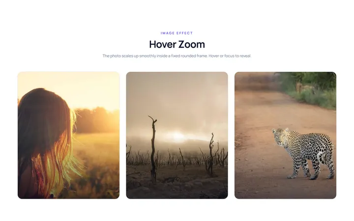
Hover Zoom Effect
OriginalImage zooms in smoothly inside a fixed rounded frame on hover.
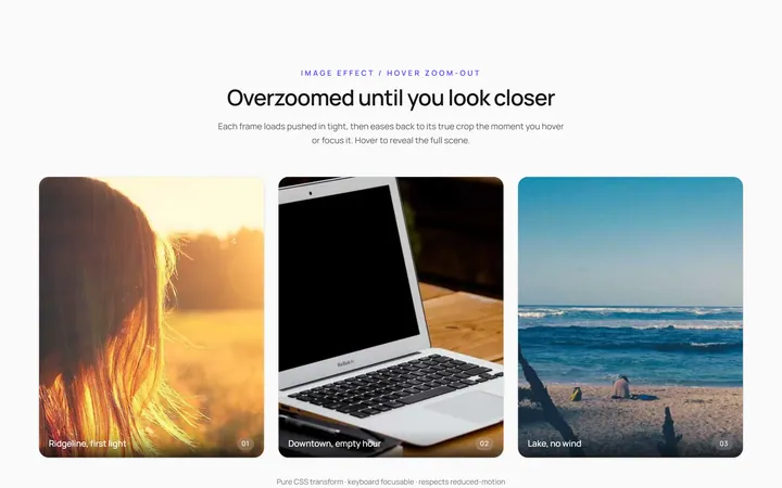
Hover Zoom Out Effect
OriginalImage starts zoomed and settles to normal on hover.
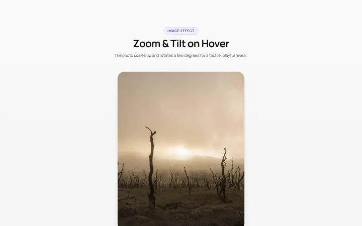
Zoom Rotate Effect
OriginalImage zooms and rotates slightly on hover.
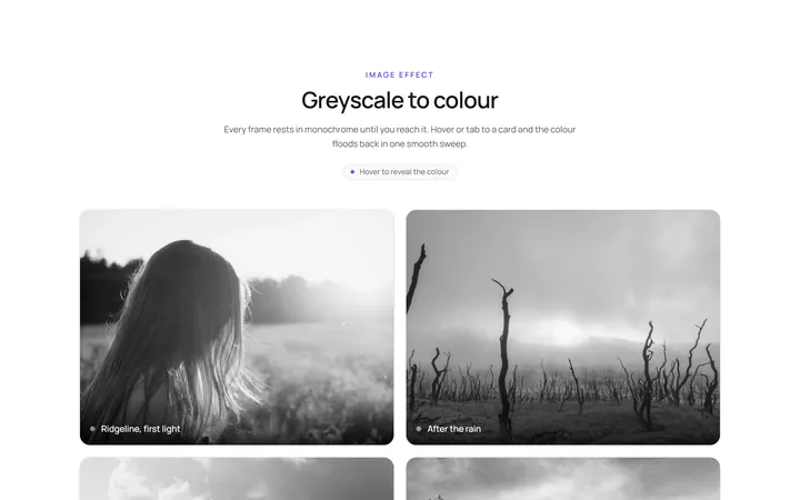
Grayscale Color Effect
OriginalGreyscale image turns to full colour on hover.
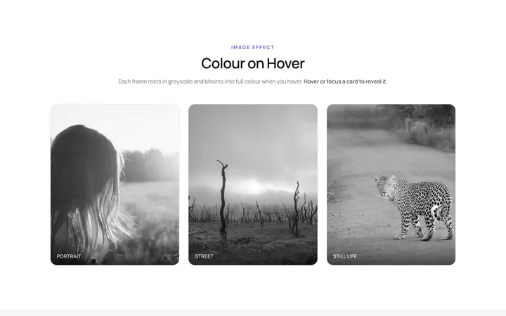
Color Grayscale Effect
OriginalFull-colour image fades to greyscale on hover.
Blur Sharp Effect
OriginalBlurred image sharpens on hover.
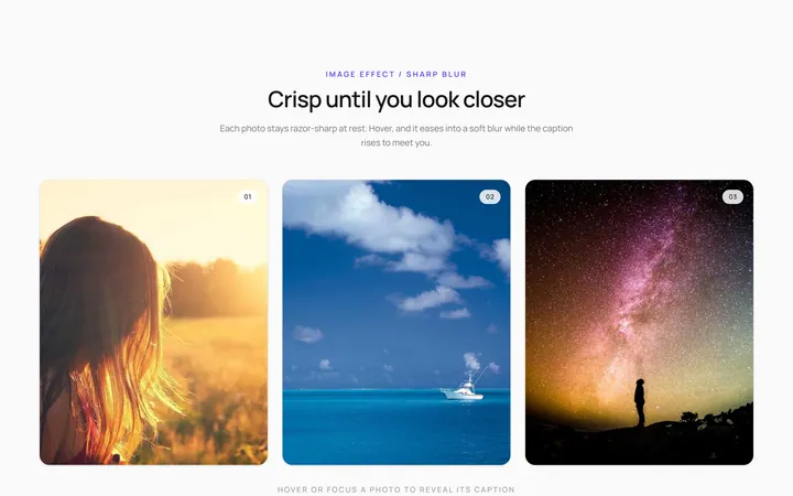
Sharp Blur Effect
OriginalSharp image blurs with a caption appearing on hover.
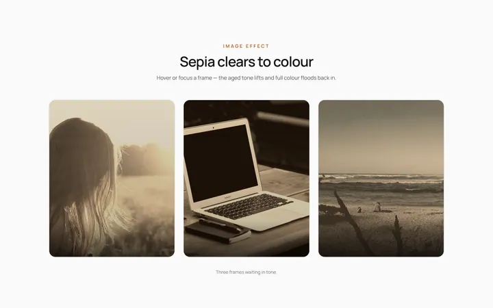
Sepia Clear Effect
OriginalSepia-toned image clears to full colour on hover.
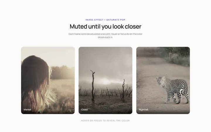
Saturate Pop Effect
OriginalMuted image saturates and pops on hover.
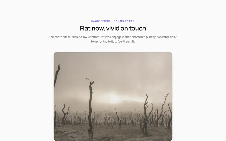
Contrast Pop Effect
OriginalLow-contrast image gains punchy contrast on hover.
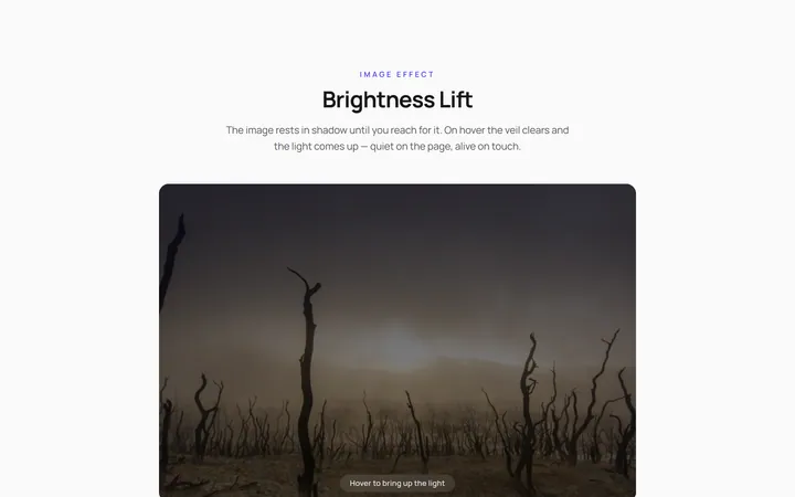
Brightness Lift Effect
OriginalDim image brightens on hover.
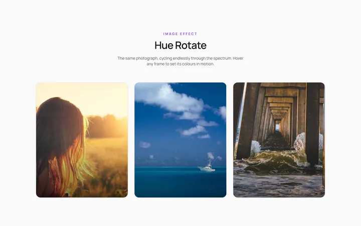
Hue Rotate Effect
OriginalImage hue-shifts through colours on hover.