

Kanban Column
Original · freesingle kanban column with add-card
Copy prompt gives Claude Code, Cursor or v0 a ready-to-paste prompt that recreates this exact component.
npx shadcn@latest add https://webinnoventix.com/r/kanban-column.json"use client";
import {
useEffect,
useId,
useRef,
useState,
type KeyboardEvent,
} from "react";
import { AnimatePresence, motion, useReducedMotion } from "motion/react";
type Priority = "high" | "medium" | "low";
type Card = {
id: string;
title: string;
priority: Priority;
assignee: string;
tag: string;
due: string;
comments: number;
};
const WIP_LIMIT = 6;
const PRIORITY_LABEL: Record<Priority, string> = {
high: "High",
medium: "Medium",
low: "Low",
};
const PRIORITY_CHIP: Record<Priority, string> = {
high: "bg-rose-100 text-rose-700 ring-rose-600/20 dark:bg-rose-500/15 dark:text-rose-300 dark:ring-rose-400/25",
medium:
"bg-amber-100 text-amber-800 ring-amber-600/20 dark:bg-amber-500/15 dark:text-amber-300 dark:ring-amber-400/25",
low: "bg-sky-100 text-sky-700 ring-sky-600/20 dark:bg-sky-500/15 dark:text-sky-300 dark:ring-sky-400/25",
};
const PRIORITY_DOT: Record<Priority, string> = {
high: "bg-rose-500",
medium: "bg-amber-500",
low: "bg-sky-500",
};
const AVATAR_TONES = [
"bg-indigo-500",
"bg-violet-500",
"bg-emerald-600",
"bg-sky-600",
"bg-amber-600",
"bg-rose-500",
];
const INITIAL_CARDS: Card[] = [
{
id: "kbc-seed-1",
title: "Migrate the checkout form to the new validation schema",
priority: "high",
assignee: "Rina Okafor",
tag: "Payments",
due: "Fri 24",
comments: 4,
},
{
id: "kbc-seed-2",
title: "Cut LCP on the pricing page below 2.5s on 4G",
priority: "high",
assignee: "Dan Mercer",
tag: "Performance",
due: "Mon 27",
comments: 2,
},
{
id: "kbc-seed-3",
title: "Write empty-state copy for the reports dashboard",
priority: "low",
assignee: "Aisha Verma",
tag: "Content",
due: "Wed 29",
comments: 7,
},
{
id: "kbc-seed-4",
title: "Replace the legacy toast with the alert primitive",
priority: "medium",
assignee: "Tom Byrne",
tag: "Design system",
due: "Thu 30",
comments: 1,
},
];
function toneFor(name: string): string {
let sum = 0;
for (let i = 0; i < name.length; i += 1) sum += name.charCodeAt(i);
return AVATAR_TONES[sum % AVATAR_TONES.length];
}
function initialsFor(name: string): string {
return name
.split(" ")
.filter(Boolean)
.map((part) => part[0])
.join("")
.slice(0, 2)
.toUpperCase();
}
const FOCUS_RING =
"outline-none focus-visible:ring-2 focus-visible:ring-indigo-500 focus-visible:ring-offset-2 focus-visible:ring-offset-slate-100 dark:focus-visible:ring-indigo-400 dark:focus-visible:ring-offset-slate-900";
function ChevronUpIcon() {
return (
<svg viewBox="0 0 16 16" aria-hidden="true" className="h-3.5 w-3.5">
<path
d="M4 10l4-4 4 4"
fill="none"
stroke="currentColor"
strokeWidth="1.75"
strokeLinecap="round"
strokeLinejoin="round"
/>
</svg>
);
}
function ChevronDownIcon() {
return (
<svg viewBox="0 0 16 16" aria-hidden="true" className="h-3.5 w-3.5">
<path
d="M4 6l4 4 4-4"
fill="none"
stroke="currentColor"
strokeWidth="1.75"
strokeLinecap="round"
strokeLinejoin="round"
/>
</svg>
);
}
function TrashIcon() {
return (
<svg viewBox="0 0 16 16" aria-hidden="true" className="h-3.5 w-3.5">
<path
d="M3 4.5h10M6.5 4.5V3h3v1.5M4.5 4.5l.6 8a1 1 0 001 .9h3.8a1 1 0 001-.9l.6-8M6.8 7v4M9.2 7v4"
fill="none"
stroke="currentColor"
strokeWidth="1.5"
strokeLinecap="round"
strokeLinejoin="round"
/>
</svg>
);
}
function PlusIcon() {
return (
<svg viewBox="0 0 16 16" aria-hidden="true" className="h-4 w-4">
<path
d="M8 3.5v9M3.5 8h9"
fill="none"
stroke="currentColor"
strokeWidth="1.75"
strokeLinecap="round"
/>
</svg>
);
}
function CommentIcon() {
return (
<svg viewBox="0 0 16 16" aria-hidden="true" className="h-3.5 w-3.5">
<path
d="M13.5 8.5a4.5 4.5 0 01-4.5 4.5H6l-3 2v-2.6A4.5 4.5 0 013 8.5v-1A4.5 4.5 0 017.5 3h1.5a4.5 4.5 0 014.5 4.5z"
fill="none"
stroke="currentColor"
strokeWidth="1.4"
strokeLinejoin="round"
/>
</svg>
);
}
function ClockIcon() {
return (
<svg viewBox="0 0 16 16" aria-hidden="true" className="h-3.5 w-3.5">
<circle
cx="8"
cy="8"
r="5.25"
fill="none"
stroke="currentColor"
strokeWidth="1.4"
/>
<path
d="M8 5.2V8l2 1.4"
fill="none"
stroke="currentColor"
strokeWidth="1.4"
strokeLinecap="round"
strokeLinejoin="round"
/>
</svg>
);
}
export default function KanbanColumn() {
const reduce = useReducedMotion();
const baseId = useId();
const [cards, setCards] = useState<Card[]>(INITIAL_CARDS);
const [composerOpen, setComposerOpen] = useState(false);
const [draft, setDraft] = useState("");
const [draftPriority, setDraftPriority] = useState<Priority>("medium");
const [status, setStatus] = useState("");
const [lastAdded, setLastAdded] = useState<string | null>(null);
const nextId = useRef(1);
const pendingFocus = useRef<string | null>(null);
const returnFocus = useRef(false);
const btnRefs = useRef<Map<string, HTMLButtonElement>>(new Map());
const addBtnRef = useRef<HTMLButtonElement | null>(null);
const textareaRef = useRef<HTMLTextAreaElement | null>(null);
const listEndRef = useRef<HTMLDivElement | null>(null);
const count = cards.length;
const over = count > WIP_LIMIT;
const atLimit = count === WIP_LIMIT;
const fill = Math.min(100, Math.round((count / WIP_LIMIT) * 100));
useEffect(() => {
if (composerOpen) {
textareaRef.current?.focus();
return;
}
if (returnFocus.current) {
returnFocus.current = false;
addBtnRef.current?.focus();
}
}, [composerOpen]);
useEffect(() => {
const key = pendingFocus.current;
if (!key) return;
pendingFocus.current = null;
const el = btnRefs.current.get(key);
if (el && !el.disabled) {
el.focus();
return;
}
const [id, which] = key.split(":");
const fallback = btnRefs.current.get(
`${id}:${which === "up" ? "down" : "up"}`,
);
if (fallback && !fallback.disabled) fallback.focus();
}, [cards]);
const move = (index: number, dir: -1 | 1) => {
const target = index + dir;
if (target < 0 || target >= cards.length) return;
const next = cards.slice();
const [item] = next.splice(index, 1);
next.splice(target, 0, item);
setCards(next);
setStatus(
`"${item.title}" moved to position ${target + 1} of ${next.length}.`,
);
pendingFocus.current = `${item.id}:${dir === -1 ? "up" : "down"}`;
};
const remove = (index: number) => {
const card = cards[index];
const next = cards.filter((_, i) => i !== index);
setCards(next);
setStatus(
`"${card.title}" removed. ${next.length} ${next.length === 1 ? "card" : "cards"} left in this column.`,
);
if (next.length > 0) {
const neighbour = next[Math.min(index, next.length - 1)];
pendingFocus.current = `${neighbour.id}:del`;
return;
}
if (composerOpen) textareaRef.current?.focus();
else addBtnRef.current?.focus();
};
const submit = () => {
const title = draft.trim();
if (!title) return;
const id = `kbc-new-${nextId.current}`;
nextId.current += 1;
const card: Card = {
id,
title,
priority: draftPriority,
assignee: "You",
tag: "Untriaged",
due: "No date",
comments: 0,
};
setCards((prev) => [...prev, card]);
setDraft("");
setLastAdded(id);
setStatus(
`"${title}" added to In Progress as ${PRIORITY_LABEL[draftPriority].toLowerCase()} priority. ${count + 1} cards in this column.`,
);
listEndRef.current?.scrollIntoView({
block: "nearest",
behavior: reduce ? "auto" : "smooth",
});
textareaRef.current?.focus();
};
const closeComposer = () => {
returnFocus.current = true;
setComposerOpen(false);
setDraft("");
};
const onDraftKeyDown = (e: KeyboardEvent<HTMLTextAreaElement>) => {
if (e.key === "Enter" && !e.shiftKey) {
e.preventDefault();
submit();
return;
}
if (e.key === "Escape") {
e.preventDefault();
closeComposer();
}
};
const onCardKeyDown = (e: KeyboardEvent<HTMLLIElement>, index: number) => {
if (!e.altKey) return;
if (e.key === "ArrowUp") {
e.preventDefault();
move(index, -1);
} else if (e.key === "ArrowDown") {
e.preventDefault();
move(index, 1);
}
};
const setBtnRef = (key: string) => (el: HTMLButtonElement | null) => {
if (el) btnRefs.current.set(key, el);
else btnRefs.current.delete(key);
};
return (
<section className="relative w-full bg-slate-100 px-4 py-20 sm:py-28 dark:bg-slate-950">
<style>{`
@keyframes kbcol-sheen {
0% { transform: translateX(-110%); }
100% { transform: translateX(210%); }
}
@keyframes kbcol-flash {
0% { box-shadow: 0 0 0 0 rgba(99, 102, 241, 0.55); }
100% { box-shadow: 0 0 0 9px rgba(99, 102, 241, 0); }
}
.kbcol-sheen { animation: kbcol-sheen 3.6s cubic-bezier(0.4, 0, 0.2, 1) infinite; }
.kbcol-flash { animation: kbcol-flash 850ms ease-out 1; }
@media (prefers-reduced-motion: reduce) {
.kbcol-sheen, .kbcol-flash { animation: none !important; }
}
`}</style>
<div className="mx-auto w-full max-w-md">
<div className="flex flex-col rounded-2xl border border-slate-200 bg-slate-50 shadow-sm dark:border-slate-800 dark:bg-slate-900">
<div className="px-5 pt-5">
<div className="flex items-start justify-between gap-3">
<div>
<h2
id={`${baseId}-title`}
className="text-base font-semibold tracking-tight text-slate-900 dark:text-slate-50"
>
In Progress
</h2>
<p className="mt-0.5 text-xs text-slate-500 dark:text-slate-400">
Sprint 24 · Web platform
</p>
</div>
<span
className={`inline-flex h-6 min-w-[3.25rem] items-center justify-center rounded-full px-2 text-xs font-semibold tabular-nums ring-1 ${
over
? "bg-rose-100 text-rose-700 ring-rose-600/20 dark:bg-rose-500/15 dark:text-rose-300 dark:ring-rose-400/25"
: "bg-slate-200 text-slate-700 ring-slate-900/5 dark:bg-slate-800 dark:text-slate-300 dark:ring-white/10"
}`}
>
{count} / {WIP_LIMIT}
</span>
</div>
<div
className="relative mt-4 h-1 overflow-hidden rounded-full bg-slate-200 dark:bg-slate-800"
role="progressbar"
aria-valuenow={count}
aria-valuemin={0}
aria-valuemax={WIP_LIMIT}
aria-label={`Work in progress limit: ${count} of ${WIP_LIMIT} cards used`}
>
<div
className={`h-full rounded-full transition-[width] duration-300 ease-out ${
over
? "bg-rose-500"
: atLimit
? "bg-amber-500"
: "bg-indigo-500"
}`}
style={{ width: `${fill}%` }}
/>
{!over && (
<div className="pointer-events-none absolute inset-y-0 left-0 w-1/3">
<div className="kbcol-sheen h-full w-1/2 bg-gradient-to-r from-transparent via-white/70 to-transparent dark:via-white/30" />
</div>
)}
</div>
<p
className={`mt-2 text-[11px] font-medium ${
over
? "text-rose-600 dark:text-rose-400"
: atLimit
? "text-amber-700 dark:text-amber-400"
: "text-slate-500 dark:text-slate-400"
}`}
>
{over
? `Over the WIP limit by ${count - WIP_LIMIT}. Ship something before pulling more.`
: atLimit
? "At the WIP limit. Finish a card before starting another."
: `${WIP_LIMIT - count} slot${WIP_LIMIT - count === 1 ? "" : "s"} left before the WIP limit.`}
</p>
</div>
<ul
aria-labelledby={`${baseId}-title`}
className="mt-4 flex max-h-[26rem] flex-col gap-2.5 overflow-y-auto px-3 pb-1"
>
<AnimatePresence initial={false}>
{cards.map((card, i) => (
<motion.li
key={card.id}
layout={!reduce}
initial={reduce ? false : { opacity: 0, y: 10, scale: 0.98 }}
animate={{ opacity: 1, y: 0, scale: 1 }}
exit={
reduce
? { opacity: 0 }
: { opacity: 0, x: -14, scale: 0.97 }
}
transition={
reduce
? { duration: 0 }
: { type: "spring", stiffness: 460, damping: 36, mass: 0.7 }
}
onKeyDown={(e) => onCardKeyDown(e, i)}
className={`group relative rounded-xl border border-slate-200 bg-white p-3 shadow-sm transition-colors hover:border-slate-300 focus-within:border-indigo-400 dark:border-slate-700/70 dark:bg-slate-800 dark:hover:border-slate-600 dark:focus-within:border-indigo-500 ${
card.id === lastAdded ? "kbcol-flash" : ""
}`}
>
<span
aria-hidden="true"
className={`absolute left-0 top-3 bottom-3 w-0.5 rounded-full ${PRIORITY_DOT[card.priority]}`}
/>
<div className="flex items-start justify-between gap-2">
<div className="flex flex-wrap items-center gap-1.5">
<span
className={`inline-flex items-center rounded-md px-1.5 py-0.5 text-[10px] font-semibold uppercase tracking-wide ring-1 ring-inset ${PRIORITY_CHIP[card.priority]}`}
>
{PRIORITY_LABEL[card.priority]}
</span>
<span className="inline-flex items-center rounded-md bg-slate-100 px-1.5 py-0.5 text-[10px] font-medium text-slate-600 ring-1 ring-inset ring-slate-900/5 dark:bg-slate-700/60 dark:text-slate-300 dark:ring-white/10">
{card.tag}
</span>
</div>
<div className="flex shrink-0 items-center gap-0.5 opacity-60 transition-opacity group-hover:opacity-100 group-focus-within:opacity-100">
<button
type="button"
ref={setBtnRef(`${card.id}:up`)}
onClick={() => move(i, -1)}
disabled={i === 0}
aria-label={`Move "${card.title}" up to position ${i}`}
className={`inline-flex h-6 w-6 items-center justify-center rounded-md text-slate-500 transition-colors hover:bg-slate-100 hover:text-slate-900 disabled:pointer-events-none disabled:opacity-30 dark:text-slate-400 dark:hover:bg-slate-700 dark:hover:text-slate-100 ${FOCUS_RING} focus-visible:ring-offset-white dark:focus-visible:ring-offset-slate-800`}
>
<ChevronUpIcon />
</button>
<button
type="button"
ref={setBtnRef(`${card.id}:down`)}
onClick={() => move(i, 1)}
disabled={i === cards.length - 1}
aria-label={`Move "${card.title}" down to position ${i + 2}`}
className={`inline-flex h-6 w-6 items-center justify-center rounded-md text-slate-500 transition-colors hover:bg-slate-100 hover:text-slate-900 disabled:pointer-events-none disabled:opacity-30 dark:text-slate-400 dark:hover:bg-slate-700 dark:hover:text-slate-100 ${FOCUS_RING} focus-visible:ring-offset-white dark:focus-visible:ring-offset-slate-800`}
>
<ChevronDownIcon />
</button>
<button
type="button"
ref={setBtnRef(`${card.id}:del`)}
onClick={() => remove(i)}
aria-label={`Delete "${card.title}"`}
className={`inline-flex h-6 w-6 items-center justify-center rounded-md text-slate-500 transition-colors hover:bg-rose-50 hover:text-rose-600 dark:text-slate-400 dark:hover:bg-rose-500/15 dark:hover:text-rose-400 ${FOCUS_RING} focus-visible:ring-offset-white dark:focus-visible:ring-offset-slate-800`}
>
<TrashIcon />
</button>
</div>
</div>
<p className="mt-2 text-sm font-medium leading-snug text-slate-800 dark:text-slate-100">
{card.title}
</p>
<div className="mt-3 flex items-center justify-between gap-2">
<div className="flex items-center gap-2">
<span
aria-hidden="true"
className={`inline-flex h-6 w-6 items-center justify-center rounded-full text-[10px] font-bold text-white ${toneFor(card.assignee)}`}
>
{initialsFor(card.assignee)}
</span>
<span className="text-xs text-slate-500 dark:text-slate-400">
{card.assignee}
</span>
</div>
<div className="flex items-center gap-3 text-slate-400 dark:text-slate-500">
<span className="inline-flex items-center gap-1 text-[11px] tabular-nums">
<CommentIcon />
<span className="sr-only">Comments:</span>
{card.comments}
</span>
<span className="inline-flex items-center gap-1 text-[11px]">
<ClockIcon />
<span className="sr-only">Due:</span>
{card.due}
</span>
</div>
</div>
</motion.li>
))}
</AnimatePresence>
{cards.length === 0 && (
<li className="rounded-xl border border-dashed border-slate-300 px-4 py-8 text-center text-sm text-slate-500 dark:border-slate-700 dark:text-slate-400">
Nothing in progress. Pull a card from Backlog or add one below.
</li>
)}
<div ref={listEndRef} aria-hidden="true" />
</ul>
<div className="border-t border-slate-200 p-3 dark:border-slate-800">
{composerOpen ? (
<div className="rounded-xl border border-slate-200 bg-white p-3 shadow-sm dark:border-slate-700 dark:bg-slate-800">
<label
htmlFor={`${baseId}-draft`}
className="block text-xs font-medium text-slate-600 dark:text-slate-300"
>
New card title
</label>
<textarea
id={`${baseId}-draft`}
ref={textareaRef}
rows={2}
maxLength={90}
value={draft}
onChange={(e) => setDraft(e.target.value)}
onKeyDown={onDraftKeyDown}
placeholder="Audit the onboarding emails for broken links"
aria-describedby={`${baseId}-hint`}
className={`mt-1.5 w-full resize-none rounded-lg border border-slate-300 bg-white px-2.5 py-2 text-sm text-slate-900 placeholder:text-slate-400 dark:border-slate-600 dark:bg-slate-900 dark:text-slate-100 dark:placeholder:text-slate-500 ${FOCUS_RING} focus-visible:ring-offset-white dark:focus-visible:ring-offset-slate-800`}
/>
<fieldset className="mt-3">
<legend className="text-xs font-medium text-slate-600 dark:text-slate-300">
Priority
</legend>
<div className="mt-1.5 flex gap-1.5">
{(["high", "medium", "low"] as const).map((p) => (
<div key={p}>
<input
type="radio"
id={`${baseId}-p-${p}`}
name={`${baseId}-priority`}
value={p}
checked={draftPriority === p}
onChange={() => setDraftPriority(p)}
className="peer sr-only"
/>
<label
htmlFor={`${baseId}-p-${p}`}
className="inline-flex cursor-pointer items-center gap-1.5 rounded-lg border border-slate-300 px-2.5 py-1 text-xs font-medium text-slate-600 transition-colors hover:bg-slate-50 peer-checked:border-indigo-500 peer-checked:bg-indigo-50 peer-checked:text-indigo-700 peer-focus-visible:ring-2 peer-focus-visible:ring-indigo-500 peer-focus-visible:ring-offset-2 peer-focus-visible:ring-offset-white dark:border-slate-600 dark:text-slate-300 dark:hover:bg-slate-700/50 dark:peer-checked:border-indigo-400 dark:peer-checked:bg-indigo-500/15 dark:peer-checked:text-indigo-300 dark:peer-focus-visible:ring-indigo-400 dark:peer-focus-visible:ring-offset-slate-800"
>
<span
aria-hidden="true"
className={`h-1.5 w-1.5 rounded-full ${PRIORITY_DOT[p]}`}
/>
{PRIORITY_LABEL[p]}
</label>
</div>
))}
</div>
</fieldset>
<div className="mt-3 flex items-center justify-between gap-2">
<p
id={`${baseId}-hint`}
className="text-[11px] text-slate-400 dark:text-slate-500"
>
Enter to add · Esc to cancel ·{" "}
<span className="tabular-nums">{draft.length}/90</span>
</p>
<div className="flex items-center gap-1.5">
<button
type="button"
onClick={closeComposer}
className={`rounded-lg px-2.5 py-1.5 text-xs font-medium text-slate-600 transition-colors hover:bg-slate-100 dark:text-slate-300 dark:hover:bg-slate-700 ${FOCUS_RING} focus-visible:ring-offset-white dark:focus-visible:ring-offset-slate-800`}
>
Cancel
</button>
<button
type="button"
onClick={submit}
disabled={draft.trim().length === 0}
className={`rounded-lg bg-indigo-600 px-3 py-1.5 text-xs font-semibold text-white shadow-sm transition-colors hover:bg-indigo-500 disabled:cursor-not-allowed disabled:opacity-40 disabled:hover:bg-indigo-600 dark:bg-indigo-500 dark:hover:bg-indigo-400 ${FOCUS_RING} focus-visible:ring-offset-white dark:focus-visible:ring-offset-slate-800`}
>
Add card
</button>
</div>
</div>
</div>
) : (
<button
type="button"
ref={addBtnRef}
onClick={() => setComposerOpen(true)}
className={`flex w-full items-center justify-center gap-1.5 rounded-xl border border-dashed border-slate-300 px-3 py-2.5 text-sm font-medium text-slate-600 transition-colors hover:border-indigo-400 hover:bg-white hover:text-indigo-700 dark:border-slate-700 dark:text-slate-300 dark:hover:border-indigo-500 dark:hover:bg-slate-800 dark:hover:text-indigo-300 ${FOCUS_RING}`}
>
<PlusIcon />
Add a card
</button>
)}
</div>
</div>
<p className="mt-4 text-center text-xs text-slate-500 dark:text-slate-400">
Tip: focus a card and press{" "}
<kbd className="rounded border border-slate-300 bg-white px-1 py-0.5 font-sans text-[10px] font-medium text-slate-700 dark:border-slate-600 dark:bg-slate-800 dark:text-slate-200">
Alt
</kbd>{" "}
+{" "}
<kbd className="rounded border border-slate-300 bg-white px-1 py-0.5 font-sans text-[10px] font-medium text-slate-700 dark:border-slate-600 dark:bg-slate-800 dark:text-slate-200">
↑
</kbd>{" "}
/{" "}
<kbd className="rounded border border-slate-300 bg-white px-1 py-0.5 font-sans text-[10px] font-medium text-slate-700 dark:border-slate-600 dark:bg-slate-800 dark:text-slate-200">
↓
</kbd>{" "}
to reorder it.
</p>
<p aria-live="polite" className="sr-only">
{status}
</p>
</div>
</section>
);
}Dependencies
Licence
Built by Web Innoventix. Free for personal and commercial use, no attribution required.
Built by Web Innoventix
Need a custom interface, a full website, or SEO that gets you cited by AI? We design, build and rank it end to end.
Get a free quoteSimilar components
Browse all →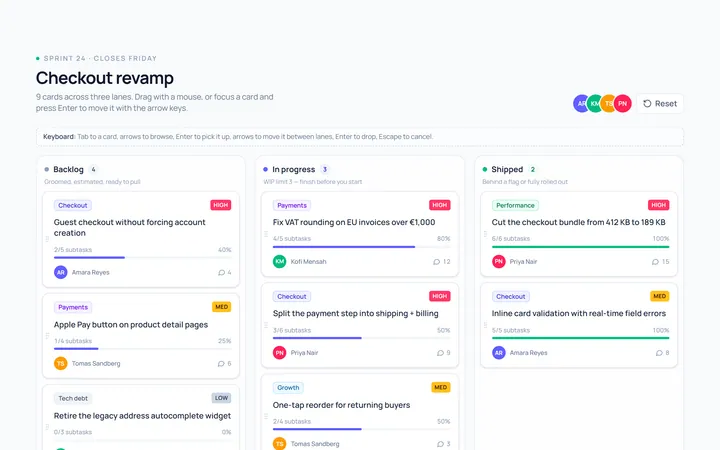
Kanban Board
Originalkanban board with 3 columns and cards
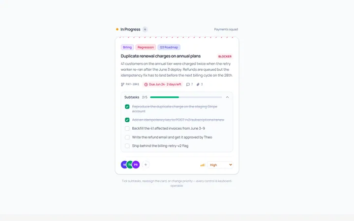
Kanban Task Card
Originaldetailed task card with labels and avatars
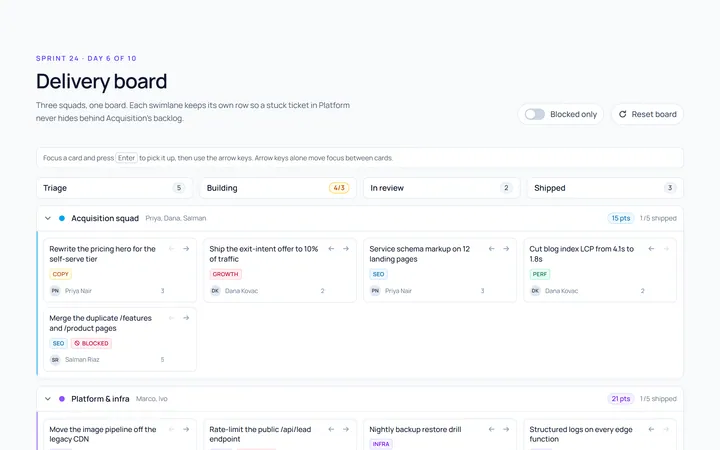
Kanban Swimlane
Originalswimlane grouped board
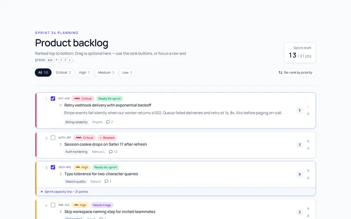
Kanban Backlog
Originalbacklog list with priorities
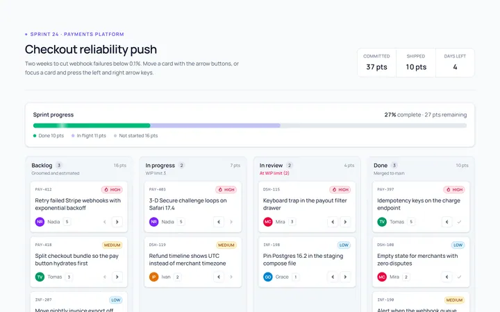
Kanban Sprint
Originalsprint board with progress
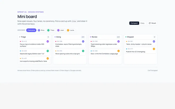
Kanban Compact
Originalcompact mini board
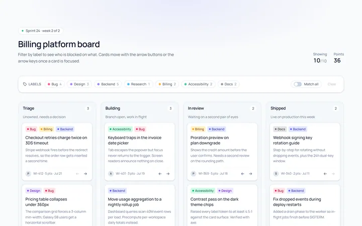
Kanban Labels
Originalboard cards with coloured labels

Spotlight Hero
OriginalA centred hero with a soft radial spotlight, badge and dual call-to-action.

Split Hero
OriginalA two-column hero pairing a headline and CTAs with a product mock and social proof.

Gradient Spotlight Hero
OriginalA minimal centred hero with a soft gradient-mesh backdrop, announcement pill and dual call-to-action buttons.

App Preview Hero
OriginalA centred hero that pairs headline copy with a realistic product dashboard mock built entirely from markup, complete with browser chrome and a floating notification card.

Waitlist Capture Hero
OriginalA dark, focused hero with an inline email capture form and avatar social proof, ready for pre-launch waitlists.