

Kanban Task Card
Original · freedetailed task card with labels and avatars
Copy prompt gives Claude Code, Cursor or v0 a ready-to-paste prompt that recreates this exact component.
npx shadcn@latest add https://webinnoventix.com/r/kanban-task-card.json"use client";
import { useCallback, useId, useMemo, useRef, useState } from "react";
import { AnimatePresence, motion, useReducedMotion } from "motion/react";
type LabelTone = "indigo" | "violet" | "emerald" | "rose" | "amber" | "sky";
type Label = {
id: string;
name: string;
tone: LabelTone;
};
type Member = {
id: string;
name: string;
role: string;
initials: string;
tone: LabelTone;
};
type ChecklistItem = {
id: string;
text: string;
done: boolean;
};
type Priority = "low" | "medium" | "high" | "urgent";
const LABEL_TONES: Record<LabelTone, string> = {
indigo:
"bg-indigo-100 text-indigo-700 ring-indigo-600/20 dark:bg-indigo-500/15 dark:text-indigo-300 dark:ring-indigo-400/25",
violet:
"bg-violet-100 text-violet-700 ring-violet-600/20 dark:bg-violet-500/15 dark:text-violet-300 dark:ring-violet-400/25",
emerald:
"bg-emerald-100 text-emerald-700 ring-emerald-600/20 dark:bg-emerald-500/15 dark:text-emerald-300 dark:ring-emerald-400/25",
rose: "bg-rose-100 text-rose-700 ring-rose-600/20 dark:bg-rose-500/15 dark:text-rose-300 dark:ring-rose-400/25",
amber:
"bg-amber-100 text-amber-800 ring-amber-600/20 dark:bg-amber-500/15 dark:text-amber-300 dark:ring-amber-400/25",
sky: "bg-sky-100 text-sky-700 ring-sky-600/20 dark:bg-sky-500/15 dark:text-sky-300 dark:ring-sky-400/25",
};
const AVATAR_TONES: Record<LabelTone, string> = {
indigo: "bg-indigo-600 text-white dark:bg-indigo-500",
violet: "bg-violet-600 text-white dark:bg-violet-500",
emerald: "bg-emerald-600 text-white dark:bg-emerald-500",
rose: "bg-rose-600 text-white dark:bg-rose-500",
amber: "bg-amber-600 text-white dark:bg-amber-500",
sky: "bg-sky-600 text-white dark:bg-sky-500",
};
const PRIORITY_META: Record<
Priority,
{ name: string; dot: string; text: string; bars: number }
> = {
low: {
name: "Low priority",
dot: "bg-slate-400 dark:bg-slate-500",
text: "text-slate-600 dark:text-slate-400",
bars: 1,
},
medium: {
name: "Medium priority",
dot: "bg-sky-500",
text: "text-sky-700 dark:text-sky-400",
bars: 2,
},
high: {
name: "High priority",
dot: "bg-amber-500",
text: "text-amber-700 dark:text-amber-400",
bars: 3,
},
urgent: {
name: "Urgent",
dot: "bg-rose-500",
text: "text-rose-700 dark:text-rose-400",
bars: 4,
},
};
const LABELS: Label[] = [
{ id: "lbl-billing", name: "Billing", tone: "violet" },
{ id: "lbl-regression", name: "Regression", tone: "rose" },
{ id: "lbl-q3", name: "Q3 Roadmap", tone: "indigo" },
];
const MEMBERS: Member[] = [
{
id: "usr-nadia",
name: "Nadia Iqbal",
role: "Backend engineer",
initials: "NI",
tone: "indigo",
},
{
id: "usr-theo",
name: "Theo Marchetti",
role: "Payments lead",
initials: "TM",
tone: "emerald",
},
{
id: "usr-priya",
name: "Priya Raghunathan",
role: "QA",
initials: "PR",
tone: "violet",
},
{
id: "usr-daniel",
name: "Daniel Osei",
role: "Design",
initials: "DO",
tone: "amber",
},
];
const INITIAL_CHECKLIST: ChecklistItem[] = [
{
id: "chk-1",
text: "Reproduce the duplicate charge on the staging Stripe account",
done: true,
},
{
id: "chk-2",
text: "Add an idempotency key to POST /v2/subscriptions/renew",
done: true,
},
{ id: "chk-3", text: "Backfill the 41 affected invoices from June 3–9", done: false },
{ id: "chk-4", text: "Write the refund email and get it approved by Theo", done: false },
{ id: "chk-5", text: "Ship behind the billing-retry-v2 flag", done: false },
];
function CheckIcon() {
return (
<svg viewBox="0 0 16 16" fill="none" aria-hidden="true" className="h-3 w-3">
<path
d="M3.5 8.5L6.5 11.5L12.5 4.5"
stroke="currentColor"
strokeWidth="2.2"
strokeLinecap="round"
strokeLinejoin="round"
/>
</svg>
);
}
function ChevronIcon({ open }: { open: boolean }) {
return (
<svg
viewBox="0 0 16 16"
fill="none"
aria-hidden="true"
className={`h-4 w-4 transition-transform duration-200 ${open ? "rotate-180" : ""}`}
>
<path
d="M4 6.5L8 10.5L12 6.5"
stroke="currentColor"
strokeWidth="1.6"
strokeLinecap="round"
strokeLinejoin="round"
/>
</svg>
);
}
function CommentIcon() {
return (
<svg viewBox="0 0 16 16" fill="none" aria-hidden="true" className="h-3.5 w-3.5">
<path
d="M13.5 9.5a1.8 1.8 0 0 1-1.8 1.8H5.4L2.5 14V4.2A1.8 1.8 0 0 1 4.3 2.4h7.4a1.8 1.8 0 0 1 1.8 1.8v5.3Z"
stroke="currentColor"
strokeWidth="1.4"
strokeLinecap="round"
strokeLinejoin="round"
/>
</svg>
);
}
function PaperclipIcon() {
return (
<svg viewBox="0 0 16 16" fill="none" aria-hidden="true" className="h-3.5 w-3.5">
<path
d="M12.6 7.3 7.9 12a2.9 2.9 0 0 1-4.1-4.1l5-5a1.9 1.9 0 0 1 2.7 2.7l-5 5a.9.9 0 1 1-1.3-1.3l4.3-4.3"
stroke="currentColor"
strokeWidth="1.4"
strokeLinecap="round"
strokeLinejoin="round"
/>
</svg>
);
}
function BranchIcon() {
return (
<svg viewBox="0 0 16 16" fill="none" aria-hidden="true" className="h-3.5 w-3.5">
<circle cx="4.5" cy="3.5" r="1.8" stroke="currentColor" strokeWidth="1.4" />
<circle cx="4.5" cy="12.5" r="1.8" stroke="currentColor" strokeWidth="1.4" />
<circle cx="11.5" cy="3.5" r="1.8" stroke="currentColor" strokeWidth="1.4" />
<path
d="M4.5 5.3v5.4M11.5 5.3v.9a2.7 2.7 0 0 1-2.7 2.7H7.2a2.7 2.7 0 0 0-2.7 2.7"
stroke="currentColor"
strokeWidth="1.4"
strokeLinecap="round"
/>
</svg>
);
}
function ClockIcon() {
return (
<svg viewBox="0 0 16 16" fill="none" aria-hidden="true" className="h-3.5 w-3.5">
<circle cx="8" cy="8" r="5.8" stroke="currentColor" strokeWidth="1.4" />
<path
d="M8 4.8V8l2.2 1.5"
stroke="currentColor"
strokeWidth="1.4"
strokeLinecap="round"
strokeLinejoin="round"
/>
</svg>
);
}
function PlusIcon() {
return (
<svg viewBox="0 0 16 16" fill="none" aria-hidden="true" className="h-3.5 w-3.5">
<path
d="M8 3.5v9M3.5 8h9"
stroke="currentColor"
strokeWidth="1.6"
strokeLinecap="round"
/>
</svg>
);
}
function PriorityBars({ level }: { level: Priority }) {
const meta = PRIORITY_META[level];
return (
<span className="flex items-end gap-[2px]" aria-hidden="true">
{[1, 2, 3, 4].map((bar) => (
<span
key={bar}
className={`w-[3px] rounded-full ${
bar <= meta.bars ? meta.dot : "bg-slate-200 dark:bg-slate-700"
}`}
style={{ height: `${3 + bar * 2}px` }}
/>
))}
</span>
);
}
export default function KanbanTaskCard() {
const reduceMotion = useReducedMotion();
const baseId = useId();
const panelId = `${baseId}-checklist-panel`;
const cardTitleId = `${baseId}-title`;
const [checklist, setChecklist] = useState<ChecklistItem[]>(INITIAL_CHECKLIST);
const [expanded, setExpanded] = useState<boolean>(true);
const [assignees, setAssignees] = useState<string[]>([
"usr-nadia",
"usr-theo",
"usr-priya",
]);
const [assignOpen, setAssignOpen] = useState<boolean>(false);
const [priority, setPriority] = useState<Priority>("high");
const [status, setStatus] = useState<string>("");
const assignMenuRef = useRef<HTMLDivElement | null>(null);
const assignButtonRef = useRef<HTMLButtonElement | null>(null);
const doneCount = useMemo(
() => checklist.filter((item) => item.done).length,
[checklist],
);
const progress = Math.round((doneCount / checklist.length) * 100);
const toggleItem = useCallback((id: string) => {
setChecklist((prev) => {
const next = prev.map((item) =>
item.id === id ? { ...item, done: !item.done } : item,
);
const changed = next.find((item) => item.id === id);
if (changed) {
setStatus(
`${changed.text} marked ${changed.done ? "complete" : "incomplete"}. ${
next.filter((i) => i.done).length
} of ${next.length} subtasks done.`,
);
}
return next;
});
}, []);
const toggleAssignee = useCallback((id: string) => {
setAssignees((prev) => {
const isOn = prev.includes(id);
const member = MEMBERS.find((m) => m.id === id);
if (member) {
setStatus(
`${member.name} ${isOn ? "removed from" : "assigned to"} this task.`,
);
}
return isOn ? prev.filter((a) => a !== id) : [...prev, id];
});
}, []);
const closeMenu = useCallback(() => {
setAssignOpen(false);
assignButtonRef.current?.focus();
}, []);
const assigned = MEMBERS.filter((m) => assignees.includes(m.id));
const visible = assigned.slice(0, 3);
const overflow = assigned.length - visible.length;
const priorityMeta = PRIORITY_META[priority];
return (
<section
className="relative w-full bg-slate-50 px-4 py-16 sm:px-6 sm:py-24 dark:bg-slate-950"
aria-labelledby={cardTitleId}
>
<style>{`
@keyframes ktc-stripe-drift {
from { background-position: 0 0; }
to { background-position: 28px 0; }
}
@keyframes ktc-pulse-ring {
0% { box-shadow: 0 0 0 0 rgb(244 63 94 / 0.35); }
70% { box-shadow: 0 0 0 6px rgb(244 63 94 / 0); }
100% { box-shadow: 0 0 0 0 rgb(244 63 94 / 0); }
}
.ktc-stripe {
background-image: repeating-linear-gradient(
135deg,
currentColor 0 2px,
transparent 2px 14px
);
animation: ktc-stripe-drift 1.6s linear infinite;
}
.ktc-pulse { animation: ktc-pulse-ring 2.4s ease-out infinite; }
@media (prefers-reduced-motion: reduce) {
.ktc-stripe, .ktc-pulse { animation: none !important; }
}
`}</style>
<div className="mx-auto w-full max-w-md">
<div className="mb-4 flex items-center justify-between px-1">
<div className="flex items-center gap-2">
<span className="h-2 w-2 rounded-full bg-amber-500" aria-hidden="true" />
<h2 className="text-sm font-semibold tracking-tight text-slate-900 dark:text-slate-100">
In Progress
</h2>
<span className="rounded-full bg-slate-200 px-1.5 py-0.5 text-[11px] font-medium tabular-nums text-slate-600 dark:bg-slate-800 dark:text-slate-400">
4
</span>
</div>
<span className="text-[11px] font-medium text-slate-500 dark:text-slate-500">
Payments squad
</span>
</div>
<motion.article
initial={reduceMotion ? false : { opacity: 0, y: 12 }}
animate={{ opacity: 1, y: 0 }}
transition={{ duration: reduceMotion ? 0 : 0.4, ease: [0.22, 1, 0.36, 1] }}
className="group relative overflow-hidden rounded-2xl border border-slate-200 bg-white shadow-sm ring-1 ring-slate-900/[0.02] transition-shadow duration-200 hover:shadow-md dark:border-slate-800 dark:bg-slate-900 dark:ring-white/[0.03]"
aria-labelledby={cardTitleId}
>
<div
className="ktc-stripe h-[3px] w-full text-rose-500/70 dark:text-rose-400/60"
aria-hidden="true"
/>
<div className="p-4 sm:p-5">
<ul className="flex flex-wrap gap-1.5" aria-label="Task labels">
{LABELS.map((label) => (
<li key={label.id}>
<span
className={`inline-flex items-center rounded-md px-2 py-0.5 text-[11px] font-medium ring-1 ring-inset ${LABEL_TONES[label.tone]}`}
>
{label.name}
</span>
</li>
))}
</ul>
<div className="mt-3 flex items-start justify-between gap-3">
<h3
id={cardTitleId}
className="text-[15px] font-semibold leading-snug tracking-tight text-slate-900 dark:text-slate-50"
>
Duplicate renewal charges on annual plans
</h3>
<span
className="ktc-pulse mt-0.5 shrink-0 rounded-md bg-rose-50 px-1.5 py-0.5 text-[10px] font-bold uppercase tracking-wide text-rose-700 ring-1 ring-inset ring-rose-600/20 dark:bg-rose-500/10 dark:text-rose-300 dark:ring-rose-400/25"
title="Blocking the June billing close"
>
Blocker
</span>
</div>
<p className="mt-1.5 text-[13px] leading-relaxed text-slate-600 dark:text-slate-400">
41 customers on the annual tier were charged twice when the retry worker
re-ran after the June 3 deploy. Refunds are queued but the idempotency fix
has to land before the next billing cycle on the 28th.
</p>
<div className="mt-3 flex flex-wrap items-center gap-x-3 gap-y-2 text-[11px] text-slate-500 dark:text-slate-400">
<span className="inline-flex items-center gap-1 font-mono text-[11px] font-medium text-slate-500 dark:text-slate-400">
<BranchIcon />
PAY-2841
</span>
<span className="inline-flex items-center gap-1 rounded-md bg-rose-50 px-1.5 py-0.5 font-medium text-rose-700 dark:bg-rose-500/10 dark:text-rose-300">
<ClockIcon />
Due Jun 24 · 2 days left
</span>
<span className="inline-flex items-center gap-1">
<CommentIcon />7
</span>
<span className="inline-flex items-center gap-1">
<PaperclipIcon />3
</span>
</div>
<div className="mt-4 rounded-xl border border-slate-200 bg-slate-50/70 dark:border-slate-800 dark:bg-slate-950/40">
<h4>
<button
type="button"
onClick={() => setExpanded((v) => !v)}
aria-expanded={expanded}
aria-controls={panelId}
className="flex w-full items-center justify-between gap-3 rounded-xl px-3 py-2.5 text-left focus-visible:outline-none focus-visible:ring-2 focus-visible:ring-indigo-500 focus-visible:ring-offset-2 focus-visible:ring-offset-white dark:focus-visible:ring-offset-slate-900"
>
<span className="flex min-w-0 flex-1 items-center gap-2.5">
<span className="text-[12px] font-semibold text-slate-700 dark:text-slate-300">
Subtasks
</span>
<span className="text-[12px] font-medium tabular-nums text-slate-500 dark:text-slate-500">
{doneCount}/{checklist.length}
</span>
<span
className="relative h-1.5 flex-1 overflow-hidden rounded-full bg-slate-200 dark:bg-slate-800"
role="progressbar"
aria-valuenow={progress}
aria-valuemin={0}
aria-valuemax={100}
aria-label="Subtask completion"
>
<motion.span
className="absolute inset-y-0 left-0 rounded-full bg-emerald-500 dark:bg-emerald-400"
initial={false}
animate={{ width: `${progress}%` }}
transition={{
duration: reduceMotion ? 0 : 0.35,
ease: [0.22, 1, 0.36, 1],
}}
/>
</span>
</span>
<span className="shrink-0 text-slate-400 dark:text-slate-500">
<ChevronIcon open={expanded} />
</span>
</button>
</h4>
<AnimatePresence initial={false}>
{expanded ? (
<motion.div
id={panelId}
key="panel"
initial={reduceMotion ? false : { height: 0, opacity: 0 }}
animate={{ height: "auto", opacity: 1 }}
exit={reduceMotion ? { opacity: 0 } : { height: 0, opacity: 0 }}
transition={{
duration: reduceMotion ? 0 : 0.28,
ease: [0.22, 1, 0.36, 1],
}}
className="overflow-hidden"
>
<ul className="space-y-0.5 px-2 pb-2">
{checklist.map((item) => (
<li key={item.id}>
<label className="flex cursor-pointer items-start gap-2.5 rounded-lg px-1.5 py-1.5 transition-colors hover:bg-slate-100 dark:hover:bg-slate-800/60">
<span className="relative mt-[1px] flex h-4 w-4 shrink-0 items-center justify-center">
<input
type="checkbox"
checked={item.done}
onChange={() => toggleItem(item.id)}
className="peer absolute inset-0 h-full w-full cursor-pointer appearance-none rounded-[5px] border border-slate-300 bg-white transition-colors checked:border-emerald-600 checked:bg-emerald-600 focus-visible:outline-none focus-visible:ring-2 focus-visible:ring-indigo-500 focus-visible:ring-offset-2 focus-visible:ring-offset-slate-50 dark:border-slate-600 dark:bg-slate-900 dark:checked:border-emerald-500 dark:checked:bg-emerald-500 dark:focus-visible:ring-offset-slate-950"
/>
<span className="pointer-events-none relative text-white opacity-0 transition-opacity peer-checked:opacity-100">
<CheckIcon />
</span>
</span>
<span
className={`text-[12.5px] leading-snug transition-colors ${
item.done
? "text-slate-400 line-through dark:text-slate-600"
: "text-slate-700 dark:text-slate-300"
}`}
>
{item.text}
</span>
</label>
</li>
))}
</ul>
</motion.div>
) : null}
</AnimatePresence>
</div>
<div className="mt-4 flex items-center justify-between gap-3 border-t border-slate-100 pt-3.5 dark:border-slate-800">
<div className="flex items-center gap-2">
<ul
className="flex items-center -space-x-2"
aria-label={`Assigned to ${assigned.length ? assigned.map((m) => m.name).join(", ") : "nobody yet"}`}
>
{visible.map((member) => (
<li key={member.id}>
<span
title={`${member.name} — ${member.role}`}
className={`flex h-7 w-7 items-center justify-center rounded-full text-[10px] font-bold ring-2 ring-white dark:ring-slate-900 ${AVATAR_TONES[member.tone]}`}
>
{member.initials}
</span>
</li>
))}
{overflow > 0 ? (
<li>
<span className="flex h-7 w-7 items-center justify-center rounded-full bg-slate-200 text-[10px] font-bold text-slate-600 ring-2 ring-white dark:bg-slate-800 dark:text-slate-300 dark:ring-slate-900">
+{overflow}
</span>
</li>
) : null}
</ul>
<div
className="relative"
ref={assignMenuRef}
onBlur={(event) => {
if (
!assignMenuRef.current?.contains(event.relatedTarget as Node | null)
) {
setAssignOpen(false);
}
}}
onKeyDown={(event) => {
if (event.key === "Escape" && assignOpen) {
event.stopPropagation();
closeMenu();
}
}}
>
<button
ref={assignButtonRef}
type="button"
onClick={() => setAssignOpen((v) => !v)}
aria-expanded={assignOpen}
aria-haspopup="true"
className="flex h-7 w-7 items-center justify-center rounded-full border border-dashed border-slate-300 text-slate-400 transition-colors hover:border-indigo-500 hover:text-indigo-600 focus-visible:outline-none focus-visible:ring-2 focus-visible:ring-indigo-500 focus-visible:ring-offset-2 focus-visible:ring-offset-white dark:border-slate-700 dark:text-slate-500 dark:hover:border-indigo-400 dark:hover:text-indigo-400 dark:focus-visible:ring-offset-slate-900"
>
<PlusIcon />
<span className="sr-only">Manage assignees</span>
</button>
<AnimatePresence>
{assignOpen ? (
<motion.div
key="assign"
initial={reduceMotion ? false : { opacity: 0, y: 6, scale: 0.97 }}
animate={{ opacity: 1, y: 0, scale: 1 }}
exit={
reduceMotion
? { opacity: 0 }
: { opacity: 0, y: 4, scale: 0.97 }
}
transition={{ duration: reduceMotion ? 0 : 0.16 }}
className="absolute bottom-full left-0 z-20 mb-2 w-60 origin-bottom-left rounded-xl border border-slate-200 bg-white p-1.5 shadow-lg dark:border-slate-700 dark:bg-slate-900"
>
<p className="px-2 pb-1 pt-1 text-[10px] font-semibold uppercase tracking-wide text-slate-400 dark:text-slate-500">
Payments squad
</p>
<ul className="space-y-0.5">
{MEMBERS.map((member) => {
const on = assignees.includes(member.id);
return (
<li key={member.id}>
<button
type="button"
role="menuitemcheckbox"
aria-checked={on}
onClick={() => toggleAssignee(member.id)}
className="flex w-full items-center gap-2.5 rounded-lg px-2 py-1.5 text-left transition-colors hover:bg-slate-100 focus-visible:outline-none focus-visible:ring-2 focus-visible:ring-indigo-500 dark:hover:bg-slate-800"
>
<span
className={`flex h-6 w-6 shrink-0 items-center justify-center rounded-full text-[9px] font-bold ${AVATAR_TONES[member.tone]}`}
>
{member.initials}
</span>
<span className="min-w-0 flex-1">
<span className="block truncate text-[12px] font-medium text-slate-800 dark:text-slate-200">
{member.name}
</span>
<span className="block truncate text-[10.5px] text-slate-500 dark:text-slate-500">
{member.role}
</span>
</span>
<span
className={`flex h-4 w-4 shrink-0 items-center justify-center rounded-[5px] border transition-colors ${
on
? "border-emerald-600 bg-emerald-600 text-white dark:border-emerald-500 dark:bg-emerald-500"
: "border-slate-300 text-transparent dark:border-slate-600"
}`}
aria-hidden="true"
>
<CheckIcon />
</span>
</button>
</li>
);
})}
</ul>
</motion.div>
) : null}
</AnimatePresence>
</div>
</div>
<div className="flex items-center gap-1.5">
<PriorityBars level={priority} />
<label className="sr-only" htmlFor={`${baseId}-priority`}>
Task priority
</label>
<select
id={`${baseId}-priority`}
value={priority}
onChange={(event) => {
const next = event.target.value as Priority;
setPriority(next);
setStatus(`Priority set to ${PRIORITY_META[next].name}.`);
}}
className={`cursor-pointer rounded-md border border-slate-200 bg-white py-1 pl-1.5 pr-6 text-[11px] font-semibold focus-visible:outline-none focus-visible:ring-2 focus-visible:ring-indigo-500 focus-visible:ring-offset-2 focus-visible:ring-offset-white dark:border-slate-700 dark:bg-slate-900 dark:focus-visible:ring-offset-slate-900 ${priorityMeta.text}`}
>
<option value="low">Low</option>
<option value="medium">Medium</option>
<option value="high">High</option>
<option value="urgent">Urgent</option>
</select>
</div>
</div>
</div>
</motion.article>
<p className="mt-4 px-1 text-center text-[11px] text-slate-400 dark:text-slate-600">
Tick subtasks, reassign the card, or change priority — every control is
keyboard-operable.
</p>
<p aria-live="polite" className="sr-only">
{status}
</p>
</div>
</section>
);
}Dependencies
Licence
Built by Web Innoventix. Free for personal and commercial use, no attribution required.
Built by Web Innoventix
Need a custom interface, a full website, or SEO that gets you cited by AI? We design, build and rank it end to end.
Get a free quoteSimilar components
Browse all →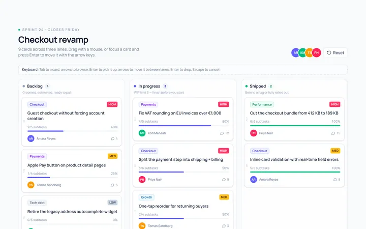
Kanban Board
Originalkanban board with 3 columns and cards
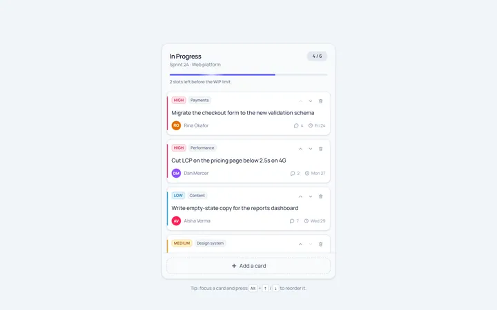
Kanban Column
Originalsingle kanban column with add-card
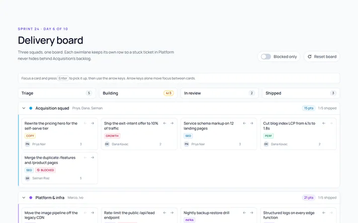
Kanban Swimlane
Originalswimlane grouped board
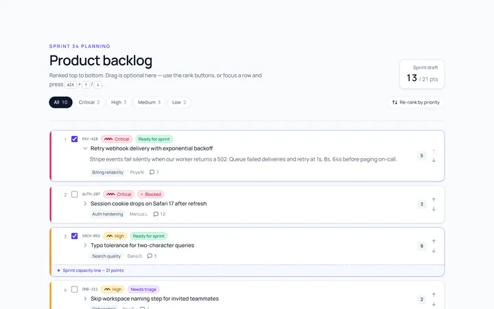
Kanban Backlog
Originalbacklog list with priorities
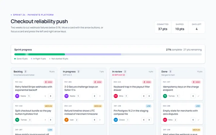
Kanban Sprint
Originalsprint board with progress
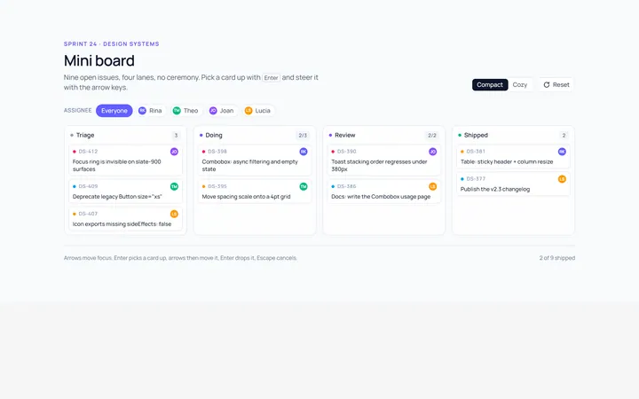
Kanban Compact
Originalcompact mini board
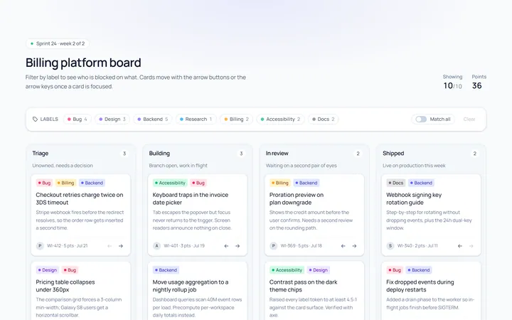
Kanban Labels
Originalboard cards with coloured labels

Spotlight Hero
OriginalA centred hero with a soft radial spotlight, badge and dual call-to-action.

Split Hero
OriginalA two-column hero pairing a headline and CTAs with a product mock and social proof.

Gradient Spotlight Hero
OriginalA minimal centred hero with a soft gradient-mesh backdrop, announcement pill and dual call-to-action buttons.

App Preview Hero
OriginalA centred hero that pairs headline copy with a realistic product dashboard mock built entirely from markup, complete with browser chrome and a floating notification card.

Waitlist Capture Hero
OriginalA dark, focused hero with an inline email capture form and avatar social proof, ready for pre-launch waitlists.