

Left Logo Navbar With CTA
Original · freeA classic left-aligned logo navbar with centred navigation links and a prominent pill call-to-action button on the right.
Copy prompt gives Claude Code, Cursor or v0 a ready-to-paste prompt that recreates this exact component.
npx shadcn@latest add https://webinnoventix.com/r/navbar-left-logo-cta.jsonexport default function NavbarLeftLogoCta() {
return (
<section className="bg-white px-6 py-16 dark:bg-zinc-950 md:py-24">
<header className="mx-auto max-w-6xl">
<nav
aria-label="Primary"
className="flex items-center justify-between gap-6 border-b border-zinc-200 pb-4 dark:border-zinc-800"
>
<a
href="#"
className="flex items-center gap-2 text-lg font-semibold tracking-tight text-zinc-900 dark:text-white"
>
<span className="inline-flex h-8 w-8 items-center justify-center rounded-lg bg-indigo-600 text-white">
<svg
viewBox="0 0 24 24"
fill="none"
stroke="currentColor"
strokeWidth="2"
strokeLinecap="round"
strokeLinejoin="round"
aria-hidden="true"
className="h-5 w-5"
>
<path d="M4 12a8 8 0 0 1 8-8" />
<path d="M20 12a8 8 0 0 1-8 8" />
<circle cx="12" cy="12" r="2.5" />
</svg>
</span>
Northwind
</a>
<ul className="hidden items-center gap-8 text-sm font-medium text-zinc-600 lg:flex dark:text-zinc-300">
<li>
<a href="#" className="transition hover:text-zinc-950 dark:hover:text-white">
Platform
</a>
</li>
<li>
<a href="#" className="transition hover:text-zinc-950 dark:hover:text-white">
Customers
</a>
</li>
<li>
<a href="#" className="transition hover:text-zinc-950 dark:hover:text-white">
Resources
</a>
</li>
<li>
<a href="#" className="transition hover:text-zinc-950 dark:hover:text-white">
Company
</a>
</li>
</ul>
<div className="flex items-center gap-3">
<a
href="#"
className="hidden text-sm font-medium text-zinc-600 transition hover:text-zinc-950 md:inline dark:text-zinc-300 dark:hover:text-white"
>
Log in
</a>
<a
href="#"
className="group inline-flex items-center gap-2 rounded-full bg-indigo-600 px-5 py-2.5 text-sm font-semibold text-white shadow-sm transition hover:bg-indigo-500"
>
Book a demo
<svg
viewBox="0 0 24 24"
fill="none"
stroke="currentColor"
strokeWidth="2"
strokeLinecap="round"
strokeLinejoin="round"
aria-hidden="true"
className="h-4 w-4 transition group-hover:translate-x-0.5"
>
<path d="M5 12h14" />
<path d="M13 6l6 6-6 6" />
</svg>
</a>
</div>
</nav>
</header>
</section>
);
}Dependencies
Licence
Built by Web Innoventix. Free for personal and commercial use, no attribution required.
Built by Web Innoventix
Need a custom interface, a full website, or SEO that gets you cited by AI? We design, build and rank it end to end.
Get a free quoteSimilar components
Browse all →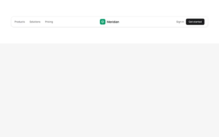
Centred Logo Navbar
OriginalA three-column navbar with the brand logo centred between the primary links and the account actions, wrapped in a soft rounded card.
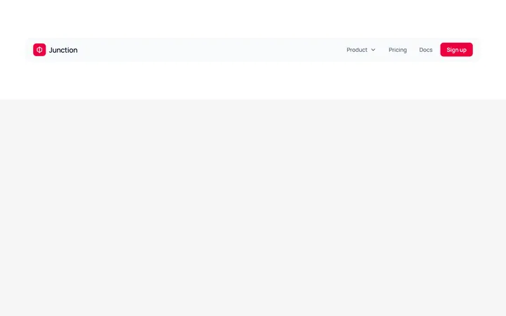
Navbar With Dropdown Menu
OriginalA navbar featuring a JS-free product dropdown built with native details and summary, revealing a two-item mega-menu panel with icons.
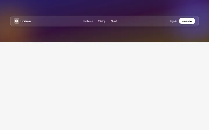
Glass Transparent Navbar
OriginalA frosted glass navbar floating over a colourful gradient hero backdrop, using backdrop blur and translucent borders for a modern overlay header.
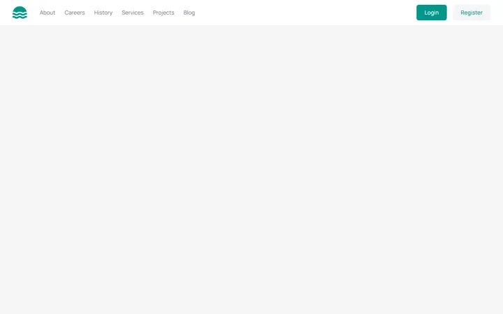
Responsive Navbar with Mobile Menu
MITA marketing site header with a logo, inline nav links, login/register buttons, and a working hamburger toggle that reveals a stacked mobile menu below the md breakpoint. Fully keyboard/ARIA accessible with light and dark variants.
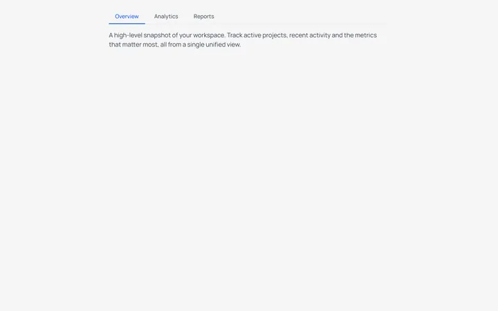
Underline Tabs
MITAn accessible underline-style tab switcher with a bottom-border active indicator and a live content panel. State-driven with proper role=tablist/tab/tabpanel and aria-selected wiring, styled for light and dark modes.
Split Button Dropdown Menu
MITA split-button control with a chevron trigger that opens a divided action menu, including a destructive delete item. Closes on outside-click and Escape, with a rotating chevron and full ARIA menu roles for both light and dark themes.

Spotlight Hero
OriginalA centred hero with a soft radial spotlight, badge and dual call-to-action.

Split Hero
OriginalA two-column hero pairing a headline and CTAs with a product mock and social proof.

Gradient Spotlight Hero
OriginalA minimal centred hero with a soft gradient-mesh backdrop, announcement pill and dual call-to-action buttons.

App Preview Hero
OriginalA centred hero that pairs headline copy with a realistic product dashboard mock built entirely from markup, complete with browser chrome and a floating notification card.

Waitlist Capture Hero
OriginalA dark, focused hero with an inline email capture form and avatar social proof, ready for pre-launch waitlists.

Image Backdrop Hero
OriginalA cinematic full-bleed hero with a layered image-style backdrop, overlaid left-aligned copy and a trusted-by logos strip.