

Responsive Navbar with Mobile Menu
MIT · attributedA marketing site header with a logo, inline nav links, login/register buttons, and a working hamburger toggle that reveals a stacked mobile menu below the md breakpoint. Fully keyboard/ARIA accessible with light and dark variants.
Copy prompt gives Claude Code, Cursor or v0 a ready-to-paste prompt that recreates this exact component.
npx shadcn@latest add https://webinnoventix.com/r/src-responsive-navbar.json/* Source: Mark Mead (HyperUI) — https://github.com/markmead/hyperui/blob/main/public/examples/marketing/headers/1.html — MIT. Included under its original licence. */
/* Copyright (c) Mark Mead — HyperUI (https://www.hyperui.dev). Licensed under the MIT License. */
"use client";
import { useState } from "react";
const LINKS = ["About", "Careers", "History", "Services", "Projects", "Blog"];
export default function SrResponsiveNavbar() {
const [open, setOpen] = useState(false);
return (
<header className="bg-white dark:bg-gray-900">
<div className="mx-auto flex h-16 max-w-7xl items-center gap-8 px-4 sm:px-6 lg:px-8">
<a className="block text-teal-600 dark:text-teal-300" href="#">
<span className="sr-only">Home</span>
<svg
className="h-8"
viewBox="0 0 28 24"
fill="none"
xmlns="http://www.w3.org/2000/svg"
aria-hidden="true"
>
<path
d="M0.41 10.3847C1.14777 7.4194 2.85643 4.7861 5.2639 2.90424C7.6714 1.02234 10.6393 0 13.695 0C16.7507 0 19.7186 1.02234 22.1261 2.90424C24.5336 4.7861 26.2422 7.4194 26.98 10.3847H25.78C23.7557 10.3549 21.7729 10.9599 20.11 12.1147C20.014 12.1842 19.9138 12.2477 19.81 12.3047H19.67C19.5662 12.2477 19.466 12.1842 19.37 12.1147C17.6924 10.9866 15.7166 10.3841 13.695 10.3841C11.6734 10.3841 9.6976 10.9866 8.02 12.1147C7.924 12.1842 7.8238 12.2477 7.72 12.3047H7.58C7.4762 12.2477 7.376 12.1842 7.28 12.1147C5.6171 10.9599 3.6343 10.3549 1.61 10.3847H0.41ZM23.62 16.6547C24.236 16.175 24.9995 15.924 25.78 15.9447H27.39V12.7347H25.78C24.4052 12.7181 23.0619 13.146 21.95 13.9547C21.3243 14.416 20.5674 14.6649 19.79 14.6649C19.0126 14.6649 18.2557 14.416 17.63 13.9547C16.4899 13.1611 15.1341 12.7356 13.745 12.7356C12.3559 12.7356 11.0001 13.1611 9.86 13.9547C9.2343 14.416 8.4774 14.6649 7.7 14.6649C6.9226 14.6649 6.1657 14.416 5.54 13.9547C4.4144 13.1356 3.0518 12.7072 1.66 12.7347H0V15.9447H1.61C2.39051 15.924 3.154 16.175 3.77 16.6547C4.908 17.4489 6.2623 17.8747 7.65 17.8747C9.0377 17.8747 10.392 17.4489 11.53 16.6547C12.1468 16.1765 12.9097 15.9257 13.69 15.9447C14.4708 15.9223 15.2348 16.1735 15.85 16.6547C16.9901 17.4484 18.3459 17.8738 19.735 17.8738C21.1241 17.8738 22.4799 17.4484 23.62 16.6547ZM23.62 22.3947C24.236 21.915 24.9995 21.664 25.78 21.6847H27.39V18.4747H25.78C24.4052 18.4581 23.0619 18.886 21.95 19.6947C21.3243 20.156 20.5674 20.4049 19.79 20.4049C19.0126 20.4049 18.2557 20.156 17.63 19.6947C16.4899 18.9011 15.1341 18.4757 13.745 18.4757C12.3559 18.4757 11.0001 18.9011 9.86 19.6947C9.2343 20.156 8.4774 20.4049 7.7 20.4049C6.9226 20.4049 6.1657 20.156 5.54 19.6947C4.4144 18.8757 3.0518 18.4472 1.66 18.4747H0V21.6847H1.61C2.39051 21.664 3.154 21.915 3.77 22.3947C4.908 23.1889 6.2623 23.6147 7.65 23.6147C9.0377 23.6147 10.392 23.1889 11.53 22.3947C12.1468 21.9165 12.9097 21.6657 13.69 21.6847C14.4708 21.6623 15.2348 21.9135 15.85 22.3947C16.9901 23.1884 18.3459 23.6138 19.735 23.6138C21.1241 23.6138 22.4799 23.1884 23.62 22.3947Z"
fill="currentColor"
/>
</svg>
</a>
<div className="flex flex-1 items-center justify-end md:justify-between">
<nav aria-label="Global" className="hidden md:block">
<ul className="flex items-center gap-6 text-sm">
{LINKS.map((label) => (
<li key={label}>
<a
className="text-gray-500 transition hover:text-gray-500/75 dark:text-white dark:hover:text-white/75"
href="#"
>
{label}
</a>
</li>
))}
</ul>
</nav>
<div className="flex items-center gap-4">
<div className="sm:flex sm:gap-4">
<a
className="block rounded-md bg-teal-600 px-5 py-2.5 text-sm font-medium text-white transition hover:bg-teal-700 dark:hover:bg-teal-500"
href="#"
>
Login
</a>
<a
className="hidden rounded-md bg-gray-100 px-5 py-2.5 text-sm font-medium text-teal-600 transition hover:text-teal-600/75 sm:block dark:bg-gray-800 dark:text-white dark:hover:text-white/75"
href="#"
>
Register
</a>
</div>
<button
type="button"
onClick={() => setOpen((prev) => !prev)}
aria-expanded={open}
aria-controls="mobile-nav"
className="block rounded-sm bg-gray-100 p-2.5 text-gray-600 transition hover:text-gray-600/75 md:hidden dark:bg-gray-800 dark:text-white dark:hover:text-white/75"
>
<span className="sr-only">Toggle menu</span>
<svg
aria-hidden="true"
xmlns="http://www.w3.org/2000/svg"
className="size-5"
fill="none"
viewBox="0 0 24 24"
stroke="currentColor"
strokeWidth="2"
>
{open ? (
<path strokeLinecap="round" strokeLinejoin="round" d="M6 18 18 6M6 6l12 12" />
) : (
<path strokeLinecap="round" strokeLinejoin="round" d="M4 6h16M4 12h16M4 18h16" />
)}
</svg>
</button>
</div>
</div>
</div>
{open && (
<nav
id="mobile-nav"
aria-label="Mobile"
className="border-t border-gray-100 md:hidden dark:border-gray-800"
>
<ul className="space-y-1 px-4 py-4 sm:px-6">
{LINKS.map((label) => (
<li key={label}>
<a
className="block rounded-md px-3 py-2 text-sm font-medium text-gray-500 transition hover:bg-gray-100 hover:text-gray-700 dark:text-white dark:hover:bg-gray-800 dark:hover:text-white/75"
href="#"
>
{label}
</a>
</li>
))}
</ul>
</nav>
)}
</header>
);
}Dependencies
Licence
Mark Mead (original) · Licensed under MIT.
Built by Web Innoventix
Need a custom interface, a full website, or SEO that gets you cited by AI? We design, build and rank it end to end.
Get a free quoteSimilar components
Browse all →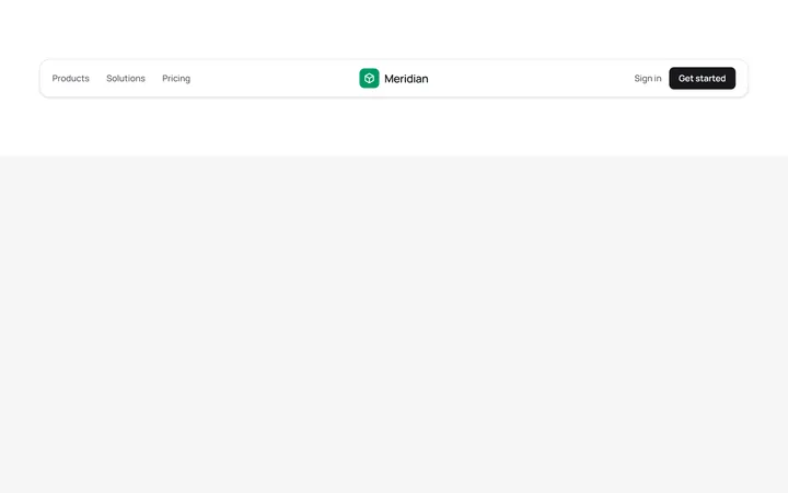
Centred Logo Navbar
OriginalA three-column navbar with the brand logo centred between the primary links and the account actions, wrapped in a soft rounded card.
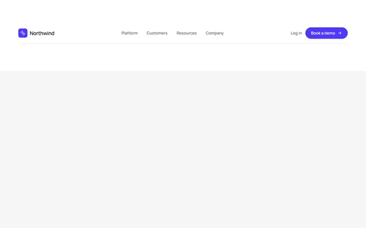
Left Logo Navbar With CTA
OriginalA classic left-aligned logo navbar with centred navigation links and a prominent pill call-to-action button on the right.
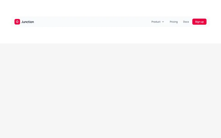
Navbar With Dropdown Menu
OriginalA navbar featuring a JS-free product dropdown built with native details and summary, revealing a two-item mega-menu panel with icons.
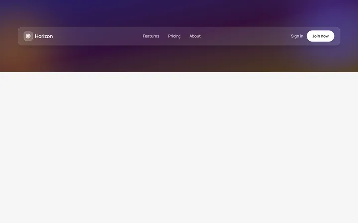
Glass Transparent Navbar
OriginalA frosted glass navbar floating over a colourful gradient hero backdrop, using backdrop blur and translucent borders for a modern overlay header.
Underline Tabs
MITAn accessible underline-style tab switcher with a bottom-border active indicator and a live content panel. State-driven with proper role=tablist/tab/tabpanel and aria-selected wiring, styled for light and dark modes.
Split Button Dropdown Menu
MITA split-button control with a chevron trigger that opens a divided action menu, including a destructive delete item. Closes on outside-click and Escape, with a rotating chevron and full ARIA menu roles for both light and dark themes.

Spotlight Hero
OriginalA centred hero with a soft radial spotlight, badge and dual call-to-action.

Split Hero
OriginalA two-column hero pairing a headline and CTAs with a product mock and social proof.

Gradient Spotlight Hero
OriginalA minimal centred hero with a soft gradient-mesh backdrop, announcement pill and dual call-to-action buttons.

App Preview Hero
OriginalA centred hero that pairs headline copy with a realistic product dashboard mock built entirely from markup, complete with browser chrome and a floating notification card.

Waitlist Capture Hero
OriginalA dark, focused hero with an inline email capture form and avatar social proof, ready for pre-launch waitlists.

Image Backdrop Hero
OriginalA cinematic full-bleed hero with a layered image-style backdrop, overlaid left-aligned copy and a trusted-by logos strip.