

FAQ Combo Pricing
Original · freepricing with an FAQ below
Copy prompt gives Claude Code, Cursor or v0 a ready-to-paste prompt that recreates this exact component.
npx shadcn@latest add https://webinnoventix.com/r/pricex-faq-combo.json"use client";
import { useState } from "react";
import { motion, AnimatePresence, useReducedMotion } from "motion/react";
type BillingCycle = "monthly" | "annual";
interface Tier {
id: string;
name: string;
tagline: string;
monthly: number;
annual: number;
cta: string;
features: string[];
popular?: boolean;
}
interface Faq {
q: string;
a: string;
}
const TIERS: Tier[] = [
{
id: "starter",
name: "Starter",
tagline: "For individuals shipping their first automations.",
monthly: 15,
annual: 12,
cta: "Start free",
features: [
"Up to 3 active workflows",
"2,000 tasks per month",
"Core integrations library",
"7-day run history",
"Community support",
],
},
{
id: "team",
name: "Team",
tagline: "For growing teams that need control and speed.",
monthly: 39,
annual: 31,
cta: "Start 14-day trial",
popular: true,
features: [
"Everything in Starter",
"Unlimited workflows",
"50,000 tasks per month",
"Advanced branching & error handling",
"Role-based access controls",
"90-day run history",
"Priority email support",
],
},
{
id: "scale",
name: "Scale",
tagline: "For organizations with security and SLA needs.",
monthly: 89,
annual: 71,
cta: "Contact sales",
features: [
"Everything in Team",
"Unlimited tasks",
"SSO & SCIM provisioning",
"Audit logs & data residency",
"99.9% uptime SLA",
"Dedicated success manager",
],
},
];
const FAQS: Faq[] = [
{
q: "Can I switch plans or cancel at any time?",
a: "Yes. Upgrades take effect immediately and we prorate the difference, so you only pay for what you use. Downgrades and cancellations apply at the end of your current billing period, and you keep full access until then.",
},
{
q: "What exactly counts as a task?",
a: "A task is a single automated action a workflow performs, such as sending a message, updating a record, or calling an external API. Steps that only route or filter data do not count, so most teams use far fewer tasks than they expect.",
},
{
q: "Is there a free trial, and do I need a card?",
a: "Every paid plan includes a 14-day trial with no credit card required. You get the full Team feature set during the trial so you can test real workflows before committing to anything.",
},
{
q: "How much do I save with annual billing?",
a: "Annual billing is roughly 20% cheaper than paying month to month. The savings are shown live on each plan when you switch the toggle, and you are charged once per year instead of every month.",
},
{
q: "How is my data secured?",
a: "All data is encrypted in transit and at rest, and we run on SOC 2 Type II certified infrastructure. On the Scale plan you can add audit logs, single sign-on, and choose the region where your data is stored.",
},
{
q: "Do you offer discounts for startups or nonprofits?",
a: "We do. Registered nonprofits and early-stage startups can apply for up to 30% off any plan. Reach out to our team with a bit of context and we will get you set up within a day or two.",
},
];
function CheckIcon({ className }: { className?: string }) {
return (
<svg
className={className}
viewBox="0 0 20 20"
fill="none"
stroke="currentColor"
strokeWidth={2}
strokeLinecap="round"
strokeLinejoin="round"
aria-hidden="true"
>
<path d="M4 10.5l3.5 3.5L16 5.5" />
</svg>
);
}
function SparkIcon({ className }: { className?: string }) {
return (
<svg className={className} viewBox="0 0 24 24" fill="currentColor" aria-hidden="true">
<path d="M12 2l1.9 5.6L19.5 9l-4.6 3.3L16.4 18 12 14.7 7.6 18l1.5-5.7L4.5 9l5.6-1.4z" />
</svg>
);
}
function ChevronIcon({ className }: { className?: string }) {
return (
<svg
className={className}
viewBox="0 0 20 20"
fill="none"
stroke="currentColor"
strokeWidth={2}
strokeLinecap="round"
strokeLinejoin="round"
aria-hidden="true"
>
<path d="M5 7.5l5 5 5-5" />
</svg>
);
}
function formatUsd(value: number): string {
return `$${value.toLocaleString("en-US")}`;
}
export default function PricexFaqCombo() {
const reduce = useReducedMotion();
const [cycle, setCycle] = useState<BillingCycle>("annual");
const [openFaq, setOpenFaq] = useState<number | null>(0);
const enter = (delay: number) =>
reduce
? {}
: {
initial: { opacity: 0, y: 22 },
whileInView: { opacity: 1, y: 0 },
viewport: { once: true, margin: "-80px" },
transition: { duration: 0.5, delay, ease: [0.22, 1, 0.36, 1] as const },
};
return (
<section className="relative w-full overflow-hidden bg-gradient-to-b from-slate-50 via-white to-slate-50 py-24 text-slate-900 sm:py-32 dark:from-slate-950 dark:via-slate-950 dark:to-slate-900 dark:text-slate-100">
<style>{`
@keyframes pfc-blob-drift {
0%, 100% { transform: translate3d(0, 0, 0) scale(1); }
50% { transform: translate3d(0, -28px, 0) scale(1.08); }
}
@keyframes pfc-badge-shimmer {
0% { background-position: -160% 0; }
100% { background-position: 260% 0; }
}
.pfc-blob { animation: pfc-blob-drift 14s ease-in-out infinite; }
.pfc-blob-slow { animation: pfc-blob-drift 20s ease-in-out infinite; }
.pfc-shimmer {
background-size: 220% 100%;
animation: pfc-badge-shimmer 3.2s linear infinite;
}
@media (prefers-reduced-motion: reduce) {
.pfc-blob, .pfc-blob-slow, .pfc-shimmer { animation: none !important; }
}
`}</style>
{/* decorative background */}
<div className="pointer-events-none absolute inset-0 overflow-hidden" aria-hidden="true">
<div className="pfc-blob absolute -left-24 top-10 h-72 w-72 rounded-full bg-indigo-400/20 blur-3xl dark:bg-indigo-500/20" />
<div className="pfc-blob-slow absolute -right-16 top-1/3 h-80 w-80 rounded-full bg-violet-400/20 blur-3xl dark:bg-violet-600/20" />
<div className="absolute inset-0 bg-[radial-gradient(circle_at_center,rgba(99,102,241,0.05),transparent_60%)]" />
</div>
<div className="relative mx-auto max-w-6xl px-6">
{/* header */}
<motion.div className="mx-auto max-w-2xl text-center" {...enter(0)}>
<span className="inline-flex items-center gap-2 rounded-full border border-indigo-200 bg-indigo-50 px-4 py-1.5 text-xs font-semibold uppercase tracking-wider text-indigo-700 dark:border-indigo-500/30 dark:bg-indigo-500/10 dark:text-indigo-300">
<SparkIcon className="h-3.5 w-3.5" />
Nimbus pricing
</span>
<h2 className="mt-6 text-4xl font-bold tracking-tight text-slate-900 sm:text-5xl dark:text-white">
Automation that scales with you
</h2>
<p className="mt-4 text-lg text-slate-600 dark:text-slate-400">
Start free, upgrade when your workflows grow. Simple, predictable pricing with no
per-seat surprises and no long-term lock-in.
</p>
</motion.div>
{/* billing toggle */}
<motion.div className="mt-10 flex flex-col items-center gap-3" {...enter(0.06)}>
<div
role="group"
aria-label="Billing period"
className="relative flex w-72 rounded-full border border-slate-200 bg-white p-1 shadow-sm dark:border-slate-700 dark:bg-slate-900"
>
<span
aria-hidden="true"
className="absolute inset-y-1 left-1 w-[calc(50%-0.25rem)] rounded-full bg-gradient-to-r from-indigo-600 to-violet-600 shadow-lg shadow-indigo-500/30"
style={{
transform: cycle === "annual" ? "translateX(100%)" : "translateX(0)",
transition: reduce ? "none" : "transform 0.32s cubic-bezier(0.22,1,0.36,1)",
}}
/>
<button
type="button"
onClick={() => setCycle("monthly")}
aria-pressed={cycle === "monthly"}
className={`relative z-10 flex-1 rounded-full px-4 py-2 text-sm font-semibold transition-colors ${
cycle === "monthly"
? "text-white"
: "text-slate-600 hover:text-slate-900 dark:text-slate-400 dark:hover:text-slate-200"
}`}
>
Monthly
</button>
<button
type="button"
onClick={() => setCycle("annual")}
aria-pressed={cycle === "annual"}
className={`relative z-10 flex-1 rounded-full px-4 py-2 text-sm font-semibold transition-colors ${
cycle === "annual"
? "text-white"
: "text-slate-600 hover:text-slate-900 dark:text-slate-400 dark:hover:text-slate-200"
}`}
>
Annual
</button>
</div>
<span className="inline-flex items-center gap-1.5 rounded-full bg-emerald-100 px-3 py-1 text-xs font-semibold text-emerald-700 dark:bg-emerald-500/15 dark:text-emerald-300">
<SparkIcon className="h-3 w-3" />
Save 20% with annual billing
</span>
</motion.div>
{/* pricing cards */}
<div className="mt-14 grid grid-cols-1 gap-6 lg:grid-cols-3 lg:items-stretch">
{TIERS.map((tier, i) => {
const price = cycle === "annual" ? tier.annual : tier.monthly;
const yearlyTotal = tier.annual * 12;
return (
<motion.div
key={tier.id}
className={`relative flex flex-col rounded-3xl border p-8 ${
tier.popular
? "border-indigo-300 bg-white shadow-2xl shadow-indigo-500/10 lg:-my-4 lg:pb-12 dark:border-indigo-500/40 dark:bg-slate-900"
: "border-slate-200 bg-white/70 shadow-sm dark:border-slate-800 dark:bg-slate-900/60"
}`}
{...enter(0.1 + i * 0.08)}
>
{tier.popular && (
<span className="pfc-shimmer absolute -top-3 left-1/2 -translate-x-1/2 rounded-full bg-[linear-gradient(110deg,#4f46e5,45%,#a78bfa,55%,#4f46e5)] px-4 py-1 text-xs font-bold uppercase tracking-wide text-white shadow-lg">
Most popular
</span>
)}
<h3 className="text-lg font-semibold text-slate-900 dark:text-white">
{tier.name}
</h3>
<p className="mt-2 min-h-[2.5rem] text-sm text-slate-600 dark:text-slate-400">
{tier.tagline}
</p>
<div className="mt-6 flex items-baseline gap-1">
<span className="text-5xl font-bold tracking-tight text-slate-900 dark:text-white">
{formatUsd(price)}
</span>
<span className="text-sm font-medium text-slate-500 dark:text-slate-400">
/mo
</span>
</div>
<p className="mt-1 h-5 text-xs text-slate-500 dark:text-slate-400">
{cycle === "annual"
? `Billed ${formatUsd(yearlyTotal)} per year`
: "Billed monthly"}
</p>
<button
type="button"
className={`mt-6 w-full rounded-xl px-5 py-3 text-sm font-semibold transition-transform duration-200 hover:-translate-y-0.5 focus-visible:outline focus-visible:outline-2 focus-visible:outline-offset-2 focus-visible:outline-indigo-500 ${
tier.popular
? "bg-gradient-to-r from-indigo-600 to-violet-600 text-white shadow-lg shadow-indigo-500/30 hover:shadow-xl hover:shadow-indigo-500/40"
: "border border-slate-300 bg-white text-slate-900 hover:bg-slate-50 dark:border-slate-700 dark:bg-slate-800 dark:text-white dark:hover:bg-slate-700"
}`}
>
{tier.cta}
</button>
<ul className="mt-8 space-y-3.5" role="list">
{tier.features.map((feature) => (
<li key={feature} className="flex items-start gap-3">
<span className="mt-0.5 flex h-5 w-5 shrink-0 items-center justify-center rounded-full bg-emerald-100 text-emerald-600 dark:bg-emerald-500/15 dark:text-emerald-400">
<CheckIcon className="h-3.5 w-3.5" />
</span>
<span className="text-sm text-slate-700 dark:text-slate-300">
{feature}
</span>
</li>
))}
</ul>
</motion.div>
);
})}
</div>
<motion.p
className="mt-8 text-center text-sm text-slate-500 dark:text-slate-400"
{...enter(0.1)}
>
All plans include unlimited team members, 250+ integrations, and a 30-day money-back
guarantee.
</motion.p>
{/* FAQ */}
<div className="mx-auto mt-24 max-w-3xl">
<motion.div className="text-center" {...enter(0)}>
<h3 className="text-3xl font-bold tracking-tight text-slate-900 sm:text-4xl dark:text-white">
Frequently asked questions
</h3>
<p className="mt-3 text-slate-600 dark:text-slate-400">
Everything you need to know about plans and billing. Still stuck?{" "}
<span className="font-semibold text-indigo-600 dark:text-indigo-400">
Talk to our team.
</span>
</p>
</motion.div>
<motion.div
className="mt-10 divide-y divide-slate-200 overflow-hidden rounded-2xl border border-slate-200 bg-white dark:divide-slate-800 dark:border-slate-800 dark:bg-slate-900/60"
{...enter(0.06)}
>
{FAQS.map((faq, i) => {
const isOpen = openFaq === i;
const panelId = `pfc-faq-panel-${i}`;
const buttonId = `pfc-faq-button-${i}`;
return (
<div key={faq.q}>
<h4>
<button
type="button"
id={buttonId}
aria-expanded={isOpen}
aria-controls={panelId}
onClick={() => setOpenFaq(isOpen ? null : i)}
className="flex w-full items-center justify-between gap-4 px-6 py-5 text-left transition-colors hover:bg-slate-50 focus-visible:outline focus-visible:outline-2 focus-visible:-outline-offset-2 focus-visible:outline-indigo-500 dark:hover:bg-slate-800/50"
>
<span className="text-base font-semibold text-slate-900 dark:text-white">
{faq.q}
</span>
<span
className="flex h-7 w-7 shrink-0 items-center justify-center rounded-full bg-slate-100 text-slate-600 dark:bg-slate-800 dark:text-slate-300"
style={{
transform: isOpen ? "rotate(180deg)" : "rotate(0deg)",
transition: reduce ? "none" : "transform 0.28s ease",
}}
>
<ChevronIcon className="h-4 w-4" />
</span>
</button>
</h4>
<AnimatePresence initial={false}>
{isOpen && (
<motion.div
key="content"
id={panelId}
role="region"
aria-labelledby={buttonId}
initial={reduce ? false : { height: 0, opacity: 0 }}
animate={{ height: "auto", opacity: 1 }}
exit={reduce ? { opacity: 0 } : { height: 0, opacity: 0 }}
transition={{ duration: reduce ? 0 : 0.3, ease: [0.22, 1, 0.36, 1] }}
className="overflow-hidden"
>
<p className="px-6 pb-5 text-sm leading-relaxed text-slate-600 dark:text-slate-400">
{faq.a}
</p>
</motion.div>
)}
</AnimatePresence>
</div>
);
})}
</motion.div>
{/* bottom CTA */}
<motion.div
className="mt-10 flex flex-col items-center justify-between gap-5 rounded-2xl border border-indigo-200 bg-gradient-to-r from-indigo-50 to-violet-50 px-8 py-7 text-center sm:flex-row sm:text-left dark:border-indigo-500/30 dark:from-indigo-500/10 dark:to-violet-500/10"
{...enter(0.1)}
>
<div>
<p className="text-base font-semibold text-slate-900 dark:text-white">
Still have questions?
</p>
<p className="mt-1 text-sm text-slate-600 dark:text-slate-400">
Our team replies within one business day, no bots.
</p>
</div>
<button
type="button"
className="shrink-0 rounded-xl bg-gradient-to-r from-indigo-600 to-violet-600 px-6 py-3 text-sm font-semibold text-white shadow-lg shadow-indigo-500/30 transition-transform duration-200 hover:-translate-y-0.5 focus-visible:outline focus-visible:outline-2 focus-visible:outline-offset-2 focus-visible:outline-indigo-500"
>
Contact support
</button>
</motion.div>
</div>
</div>
</section>
);
}Dependencies
Licence
Built by Web Innoventix. Free for personal and commercial use, no attribution required.
Built by Web Innoventix
Need a custom interface, a full website, or SEO that gets you cited by AI? We design, build and rank it end to end.
Get a free quoteSimilar components
Browse all →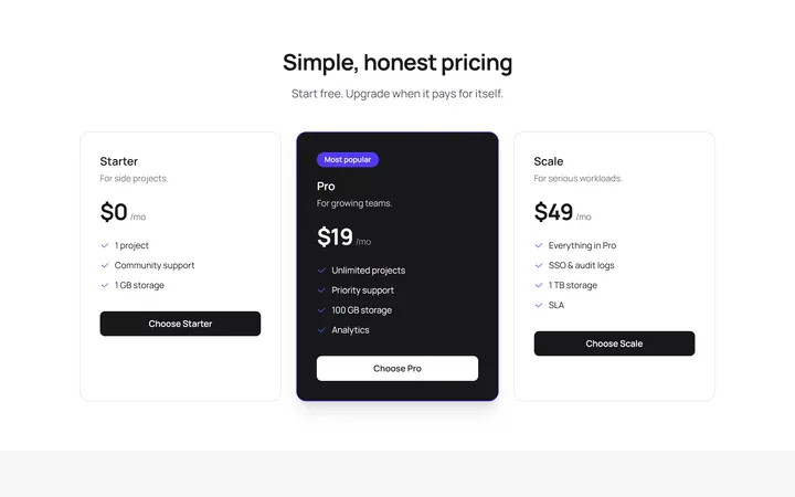
Simple Pricing
OriginalA three-tier pricing section with a highlighted popular plan.
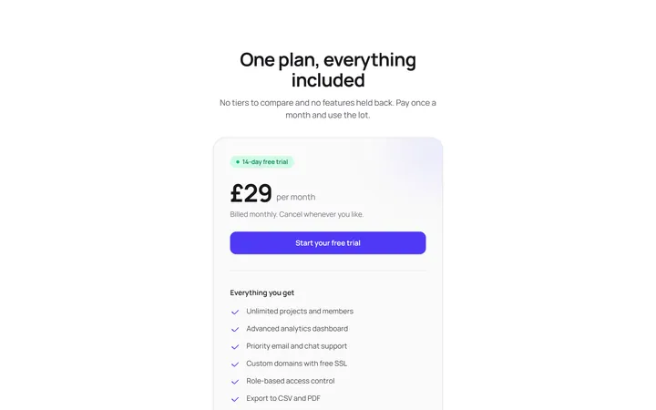
Single Plan Pricing Card
OriginalA focused one-plan pricing card with price, trial badge, feature list, call to action and a money-back trust note, ideal when you sell a single flat-rate product.
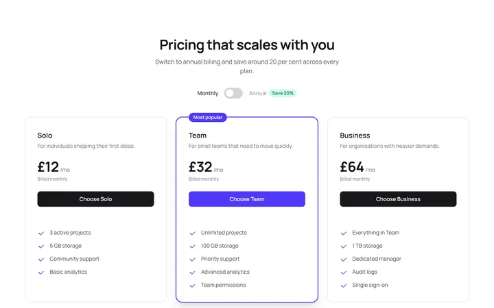
Three Tier Pricing With Monthly Annual Toggle
OriginalA three-tier pricing grid with a pure-CSS monthly and annual billing toggle that swaps every price with no JavaScript, using a native checkbox and Tailwind group-has state.
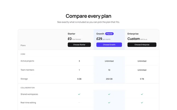
Plan Feature Comparison Table
OriginalA responsive, semantic feature comparison table across three plans with grouped rows, tick and dash indicators and screen-reader labels so visitors can weigh every feature side by side.
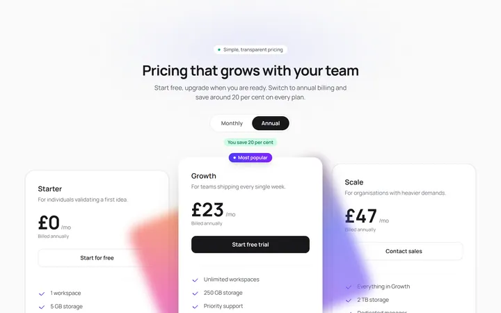
Staggered Glow Pricing Tiers
OriginalA three-tier pricing section whose cards reveal in a staggered spring cascade, with a rotating conic-gradient glow on the popular plan and prices that count up smoothly when you toggle monthly and annual billing.
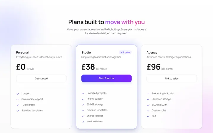
Spotlight Cursor Pricing Cards
OriginalPricing cards that light up with a cursor-following radial spotlight, drift over floating background orbs and rise into view with a staggered spring entrance, plus a pulsing glow on the popular plan.
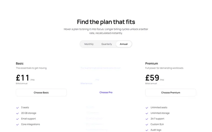
Highlight Follow Pricing Plans
OriginalA pricing row where an animated gradient highlight glides via shared layout animation to whichever plan you hover, a three-way billing switch slides its pill, prices recount instantly and a perks marquee scrolls beneath.
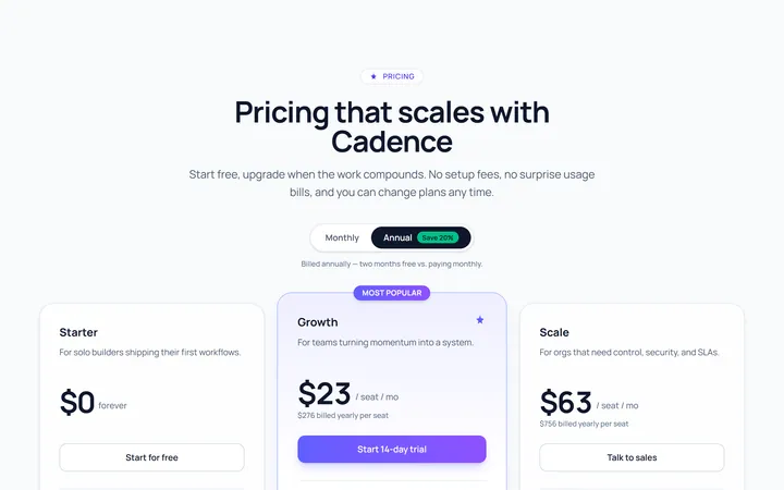
Three Tier Pricing
Originalthree-tier pricing cards
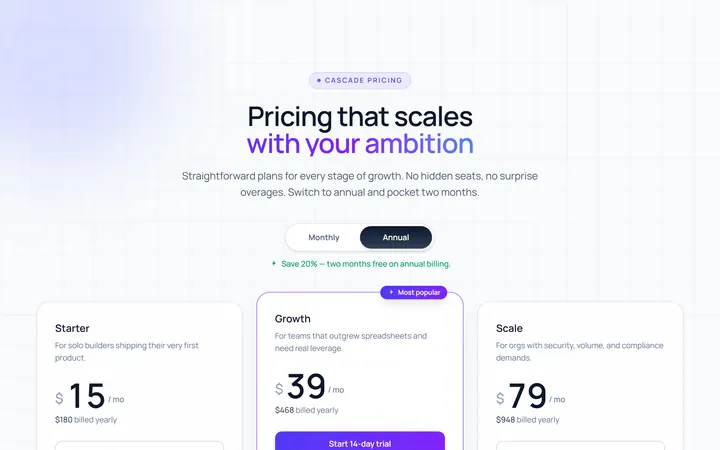
Toggle Annual Pricing
Originalpricing with monthly/annual toggle
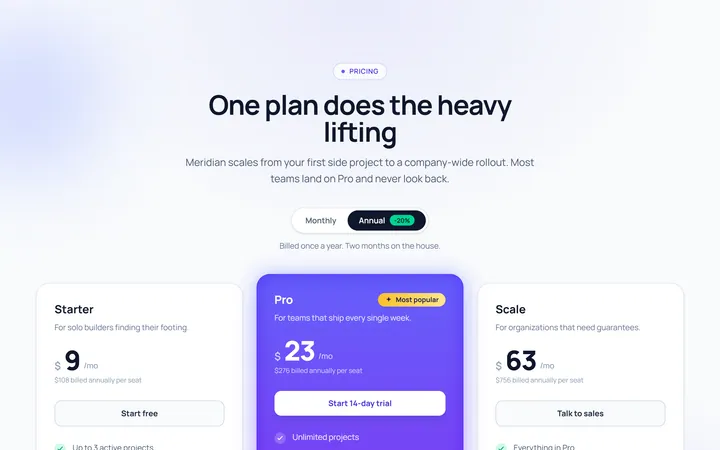
Single Highlight Pricing
Originalsingle highlighted plan
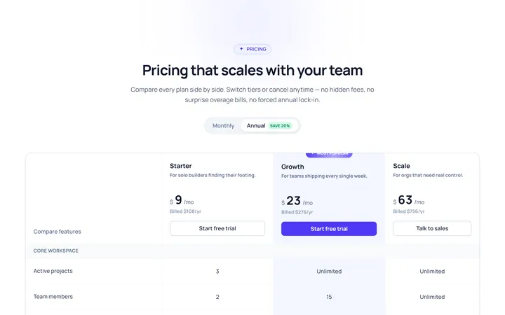
Comparison Table Pricing
Originalpricing comparison table
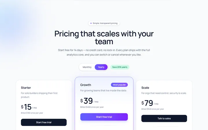
Cards Gradient Pricing
Originalgradient pricing cards