

Profile Cover
Original · freelarge cover profile hero
Copy prompt gives Claude Code, Cursor or v0 a ready-to-paste prompt that recreates this exact component.
npx shadcn@latest add https://webinnoventix.com/r/profile-cover.json"use client";
import { useCallback, useEffect, useId, useMemo, useRef, useState } from "react";
import type { KeyboardEvent as ReactKeyboardEvent } from "react";
import { AnimatePresence, motion, useReducedMotion } from "motion/react";
type CoverId = "route190" | "contrail" | "ardennes" | "northshore" | "marine";
type Cover = {
id: CoverId;
src: string;
label: string;
alt: string;
place: string;
};
type Stat = {
label: string;
value: string;
hint: string;
};
const COVERS: Cover[] = [
{
id: "route190",
src: "/img/gallery/g20.webp",
label: "Sunset, Route 190",
place: "Panamint Valley, CA",
alt: "A white camper van kicking up dust on a desert dirt road as the sun sets behind low mountains",
},
{
id: "contrail",
src: "/img/gallery/g12.webp",
label: "Contrail, 7:40pm",
place: "Rotterdam, NL",
alt: "A single aircraft contrail cutting across a deep teal sky above a sunlit bank of cloud",
},
{
id: "ardennes",
src: "/img/gallery/g05.webp",
label: "Burn-off",
place: "Ardennes, BE",
alt: "Sun burning through heavy fog above the silhouettes of two trees on a ridge",
},
{
id: "northshore",
src: "/img/gallery/g28.webp",
label: "North shore, 6am",
place: "Byron Bay, AU",
alt: "An empty beach seen through bare branches, with a single figure sitting near breaking waves",
},
{
id: "marine",
src: "/img/gallery/g33.webp",
label: "Marine layer",
place: "Point Dume, CA",
alt: "A grey marine layer swallowing a curving coastline dotted with distant swimmers",
},
];
const STATS: Stat[] = [
{ label: "Followers", value: "18,240", hint: "+412 in the last 30 days" },
{ label: "Projects", value: "47", hint: "31 of them still maintained" },
{ label: "Talks", value: "12", hint: "Next: Rotterdam, October" },
];
const CHIPS = ["TypeScript", "Rendering perf", "Virtualised tables", "Focus management"];
const FOLLOWERS_BASE = 18240;
const PROFILE_URL = "https://priya.build/@priyaships";
function CheckBadgeIcon() {
return (
<svg viewBox="0 0 24 24" fill="none" aria-hidden="true" className="h-full w-full">
<path
d="M12 2.6l2.2 1.7 2.7-.4 1.1 2.5 2.5 1.1-.4 2.7 1.7 2.2-1.7 2.2.4 2.7-2.5 1.1-1.1 2.5-2.7-.4L12 21.4l-2.2-1.7-2.7.4-1.1-2.5-2.5-1.1.4-2.7L2.2 12l1.7-2.2-.4-2.7 2.5-1.1 1.1-2.5 2.7.4L12 2.6z"
fill="currentColor"
/>
<path
d="M8.4 12.2l2.4 2.4 4.8-5"
stroke="#fff"
strokeWidth="1.9"
strokeLinecap="round"
strokeLinejoin="round"
/>
</svg>
);
}
function PinIcon() {
return (
<svg viewBox="0 0 24 24" fill="none" aria-hidden="true" className="h-4 w-4">
<path
d="M12 21s6.5-5.2 6.5-10a6.5 6.5 0 10-13 0c0 4.8 6.5 10 6.5 10z"
stroke="currentColor"
strokeWidth="1.6"
strokeLinejoin="round"
/>
<circle cx="12" cy="11" r="2.4" stroke="currentColor" strokeWidth="1.6" />
</svg>
);
}
function LinkIcon() {
return (
<svg viewBox="0 0 24 24" fill="none" aria-hidden="true" className="h-4 w-4">
<path
d="M10.5 13.5a3.5 3.5 0 005 0l3-3a3.54 3.54 0 00-5-5l-1.2 1.2"
stroke="currentColor"
strokeWidth="1.6"
strokeLinecap="round"
/>
<path
d="M13.5 10.5a3.5 3.5 0 00-5 0l-3 3a3.54 3.54 0 005 5l1.2-1.2"
stroke="currentColor"
strokeWidth="1.6"
strokeLinecap="round"
/>
</svg>
);
}
function CalendarIcon() {
return (
<svg viewBox="0 0 24 24" fill="none" aria-hidden="true" className="h-4 w-4">
<rect x="3.5" y="5.5" width="17" height="15" rx="2.5" stroke="currentColor" strokeWidth="1.6" />
<path d="M3.5 10.5h17M8.5 3.5v4M15.5 3.5v4" stroke="currentColor" strokeWidth="1.6" strokeLinecap="round" />
</svg>
);
}
function CameraIcon() {
return (
<svg viewBox="0 0 24 24" fill="none" aria-hidden="true" className="h-4 w-4">
<path
d="M4 8.5h2.6l1.3-2.2c.2-.4.6-.6 1-.6h6.2c.4 0 .8.2 1 .6l1.3 2.2H20a1.5 1.5 0 011.5 1.5v7.5A1.5 1.5 0 0120 19.5H4a1.5 1.5 0 01-1.5-1.5V10A1.5 1.5 0 014 8.5z"
stroke="currentColor"
strokeWidth="1.6"
strokeLinejoin="round"
/>
<circle cx="12" cy="13.5" r="3.2" stroke="currentColor" strokeWidth="1.6" />
</svg>
);
}
function CheckIcon() {
return (
<svg viewBox="0 0 24 24" fill="none" aria-hidden="true" className="h-4 w-4">
<path d="M5 12.5l4.5 4.5L19 7" stroke="currentColor" strokeWidth="2" strokeLinecap="round" strokeLinejoin="round" />
</svg>
);
}
function PlusIcon() {
return (
<svg viewBox="0 0 24 24" fill="none" aria-hidden="true" className="h-4 w-4">
<path d="M12 5v14M5 12h14" stroke="currentColor" strokeWidth="2" strokeLinecap="round" />
</svg>
);
}
function CloseIcon() {
return (
<svg viewBox="0 0 24 24" fill="none" aria-hidden="true" className="h-4 w-4">
<path d="M6 6l12 12M18 6L6 18" stroke="currentColor" strokeWidth="1.8" strokeLinecap="round" />
</svg>
);
}
function CopyIcon() {
return (
<svg viewBox="0 0 24 24" fill="none" aria-hidden="true" className="h-4 w-4">
<rect x="9" y="9" width="11" height="11" rx="2.2" stroke="currentColor" strokeWidth="1.6" />
<path d="M15 6.5A2.5 2.5 0 0012.5 4H6.5A2.5 2.5 0 004 6.5v6A2.5 2.5 0 006.5 15" stroke="currentColor" strokeWidth="1.6" strokeLinecap="round" />
</svg>
);
}
export default function ProfileCover() {
const reduced = useReducedMotion();
const uid = useId();
const [committedCover, setCommittedCover] = useState<CoverId>("route190");
const [committedFocal, setCommittedFocal] = useState(46);
const [draftCover, setDraftCover] = useState<CoverId>("route190");
const [draftFocal, setDraftFocal] = useState(46);
const [editing, setEditing] = useState(false);
const [following, setFollowing] = useState(false);
const [copied, setCopied] = useState(false);
const [status, setStatus] = useState("");
const editButtonRef = useRef<HTMLButtonElement | null>(null);
const thumbRefs = useRef<Array<HTMLButtonElement | null>>([]);
const copyTimer = useRef<number | null>(null);
useEffect(() => {
return () => {
if (copyTimer.current !== null) window.clearTimeout(copyTimer.current);
};
}, []);
const activeId = editing ? draftCover : committedCover;
const activeFocal = editing ? draftFocal : committedFocal;
const active = useMemo(() => COVERS.find((c) => c.id === activeId) ?? COVERS[0], [activeId]);
const followerLabel = useMemo(
() => (FOLLOWERS_BASE + (following ? 1 : 0)).toLocaleString("en-US"),
[following],
);
const openEditor = useCallback(() => {
setDraftCover(committedCover);
setDraftFocal(committedFocal);
setEditing(true);
}, [committedCover, committedFocal]);
const cancelEditor = useCallback(() => {
setEditing(false);
setStatus("Cover edit discarded.");
editButtonRef.current?.focus();
}, []);
const saveEditor = useCallback(() => {
setCommittedCover(draftCover);
setCommittedFocal(draftFocal);
setEditing(false);
const picked = COVERS.find((c) => c.id === draftCover);
setStatus(`Cover updated to ${picked ? picked.label : "a new photo"}.`);
editButtonRef.current?.focus();
}, [draftCover, draftFocal]);
const onThumbKeyDown = useCallback(
(event: ReactKeyboardEvent<HTMLDivElement>) => {
const current = COVERS.findIndex((c) => c.id === draftCover);
let next = -1;
if (event.key === "ArrowRight" || event.key === "ArrowDown") next = (current + 1) % COVERS.length;
else if (event.key === "ArrowLeft" || event.key === "ArrowUp") next = (current - 1 + COVERS.length) % COVERS.length;
else if (event.key === "Home") next = 0;
else if (event.key === "End") next = COVERS.length - 1;
else return;
event.preventDefault();
setDraftCover(COVERS[next].id);
thumbRefs.current[next]?.focus();
},
[draftCover],
);
const onPanelKeyDown = useCallback(
(event: ReactKeyboardEvent<HTMLDivElement>) => {
if (event.key === "Escape") {
event.preventDefault();
cancelEditor();
}
},
[cancelEditor],
);
const handleCopy = useCallback(() => {
void navigator.clipboard
.writeText(PROFILE_URL)
.then(() => {
setCopied(true);
setStatus("Profile link copied to clipboard.");
if (copyTimer.current !== null) window.clearTimeout(copyTimer.current);
copyTimer.current = window.setTimeout(() => setCopied(false), 1800);
})
.catch(() => {
setStatus("Could not copy the profile link.");
});
}, []);
const panelId = `${uid}-cover-panel`;
const focalId = `${uid}-focal`;
const ring =
"outline-none focus-visible:ring-2 focus-visible:ring-indigo-500 focus-visible:ring-offset-2 focus-visible:ring-offset-white dark:focus-visible:ring-offset-zinc-950";
return (
<section className="relative w-full overflow-hidden bg-gradient-to-b from-slate-50 via-white to-slate-50 py-16 sm:py-24 dark:from-zinc-950 dark:via-black dark:to-zinc-950">
<style>{`
@keyframes pcvr-drift {
0% { transform: scale(1.06) translate3d(0, 0, 0); }
50% { transform: scale(1.11) translate3d(-1.4%, -1%, 0); }
100% { transform: scale(1.06) translate3d(0, 0, 0); }
}
@keyframes pcvr-sheen {
0% { transform: translateX(-140%) skewX(-18deg); opacity: 0; }
18% { opacity: 0.9; }
100% { transform: translateX(240%) skewX(-18deg); opacity: 0; }
}
@keyframes pcvr-pulse {
0%, 100% { opacity: 0.55; }
50% { opacity: 1; }
}
.pcvr-drift { animation: pcvr-drift 26s ease-in-out infinite; will-change: transform; }
.pcvr-sheen { animation: pcvr-sheen 4.6s ease-in-out infinite; }
.pcvr-pulse { animation: pcvr-pulse 2.4s ease-in-out infinite; }
@media (prefers-reduced-motion: reduce) {
.pcvr-drift, .pcvr-sheen, .pcvr-pulse { animation: none !important; }
}
`}</style>
<div
aria-hidden="true"
className="pointer-events-none absolute -top-40 left-1/2 h-96 w-[52rem] -translate-x-1/2 rounded-full bg-indigo-400/15 blur-3xl dark:bg-indigo-500/10"
/>
<div className="relative mx-auto w-full max-w-5xl px-4 sm:px-6">
<motion.div
initial={reduced ? false : { opacity: 0, y: 20 }}
animate={{ opacity: 1, y: 0 }}
transition={{ duration: 0.55, ease: [0.22, 1, 0.36, 1] }}
className="overflow-hidden rounded-3xl bg-white shadow-xl shadow-slate-900/5 ring-1 ring-slate-900/10 dark:bg-zinc-950 dark:shadow-black/40 dark:ring-white/10"
>
{/* Cover */}
<div className="relative h-56 w-full overflow-hidden bg-slate-200 sm:h-72 lg:h-80 dark:bg-zinc-900">
{/* eslint-disable-next-line @next/next/no-img-element */}
<img
src={active.src}
alt={active.alt}
loading="lazy"
draggable={false}
style={{ objectPosition: `50% ${activeFocal}%` }}
className={`absolute inset-0 h-full w-full select-none object-cover transition-[object-position] duration-200 ease-out ${
editing || reduced ? "scale-[1.06]" : "pcvr-drift"
}`}
/>
<div
aria-hidden="true"
className="absolute inset-0 bg-gradient-to-t from-black/65 via-black/10 to-black/25"
/>
<div className="absolute right-3 top-3 flex items-center gap-2 sm:right-4 sm:top-4">
<button
ref={editButtonRef}
type="button"
onClick={() => (editing ? cancelEditor() : openEditor())}
aria-expanded={editing}
aria-controls={panelId}
className={`inline-flex items-center gap-2 rounded-full border border-white/25 bg-black/45 px-3.5 py-2 text-xs font-medium text-white backdrop-blur-md transition hover:bg-black/65 sm:text-sm ${ring} focus-visible:ring-offset-black/40`}
>
{editing ? <CloseIcon /> : <CameraIcon />}
{editing ? "Close editor" : "Edit cover"}
</button>
</div>
<div className="absolute bottom-3 right-3 hidden max-w-[15rem] sm:bottom-4 sm:right-4 sm:block">
<p className="truncate rounded-full border border-white/15 bg-black/40 px-3 py-1.5 text-[11px] font-medium text-white/90 backdrop-blur-md">
{active.label}
<span className="text-white/50"> · {active.place}</span>
</p>
</div>
</div>
{/* Cover editor */}
<AnimatePresence initial={false}>
{editing ? (
<motion.div
key="editor"
id={panelId}
onKeyDown={onPanelKeyDown}
initial={reduced ? { opacity: 0 } : { height: 0, opacity: 0 }}
animate={reduced ? { opacity: 1 } : { height: "auto", opacity: 1 }}
exit={reduced ? { opacity: 0 } : { height: 0, opacity: 0 }}
transition={{ duration: 0.32, ease: [0.22, 1, 0.36, 1] }}
className="overflow-hidden border-b border-slate-200 bg-slate-50 dark:border-white/10 dark:bg-zinc-900/70"
>
<div className="flex flex-col gap-5 px-5 py-5 sm:px-8 sm:py-6">
<div className="flex flex-wrap items-center justify-between gap-3">
<div>
<h3 className="text-sm font-semibold text-slate-900 dark:text-zinc-100">Cover photo</h3>
<p className="mt-0.5 text-xs text-slate-500 dark:text-zinc-400">
Pick a shot, then drag the slider to move the crop up or down. Escape discards.
</p>
</div>
<div className="flex items-center gap-2">
<button
type="button"
onClick={cancelEditor}
className={`rounded-full border border-slate-300 bg-white px-4 py-2 text-xs font-medium text-slate-700 transition hover:bg-slate-100 dark:border-white/15 dark:bg-zinc-950 dark:text-zinc-200 dark:hover:bg-zinc-900 ${ring}`}
>
Discard
</button>
<button
type="button"
onClick={saveEditor}
className={`inline-flex items-center gap-1.5 rounded-full bg-indigo-600 px-4 py-2 text-xs font-semibold text-white transition hover:bg-indigo-500 dark:bg-indigo-500 dark:hover:bg-indigo-400 ${ring}`}
>
<CheckIcon />
Save cover
</button>
</div>
</div>
<div
role="radiogroup"
aria-label="Choose a cover photo"
onKeyDown={onThumbKeyDown}
className="-mx-1 flex gap-3 overflow-x-auto px-1 pb-1"
>
{COVERS.map((cover, index) => {
const selected = cover.id === draftCover;
return (
<button
key={cover.id}
ref={(el) => {
thumbRefs.current[index] = el;
}}
type="button"
role="radio"
aria-checked={selected}
tabIndex={selected ? 0 : -1}
onClick={() => setDraftCover(cover.id)}
className={`group relative shrink-0 rounded-2xl p-1 transition ${ring} ${
selected
? "bg-indigo-600 dark:bg-indigo-500"
: "bg-slate-200 hover:bg-slate-300 dark:bg-zinc-800 dark:hover:bg-zinc-700"
}`}
>
<span className="block overflow-hidden rounded-xl">
{/* eslint-disable-next-line @next/next/no-img-element */}
<img
src={cover.src}
alt={cover.label}
loading="lazy"
draggable={false}
className="h-14 w-24 select-none object-cover transition duration-300 group-hover:scale-105 sm:h-16 sm:w-28"
/>
</span>
{selected ? (
<span
aria-hidden="true"
className="absolute -right-1 -top-1 grid h-5 w-5 place-items-center rounded-full bg-indigo-600 text-white ring-2 ring-slate-50 dark:bg-indigo-500 dark:ring-zinc-900"
>
<svg viewBox="0 0 24 24" fill="none" className="h-3 w-3">
<path
d="M5 12.5l4.5 4.5L19 7"
stroke="currentColor"
strokeWidth="3"
strokeLinecap="round"
strokeLinejoin="round"
/>
</svg>
</span>
) : null}
</button>
);
})}
</div>
<div className="flex flex-col gap-2">
<div className="flex items-baseline justify-between gap-3">
<label htmlFor={focalId} className="text-xs font-medium text-slate-700 dark:text-zinc-300">
Vertical crop
</label>
<span className="font-mono text-[11px] tabular-nums text-slate-500 dark:text-zinc-400">
{draftFocal}% from top
</span>
</div>
<input
id={focalId}
type="range"
min={0}
max={100}
step={1}
value={draftFocal}
onChange={(event) => setDraftFocal(Number(event.target.value))}
aria-valuetext={`${draftFocal} percent from the top of the photo`}
className={`h-2 w-full cursor-pointer appearance-none rounded-full bg-slate-300 accent-indigo-600 dark:bg-zinc-700 dark:accent-indigo-400 ${ring} focus-visible:ring-offset-slate-50 dark:focus-visible:ring-offset-zinc-900`}
/>
</div>
</div>
</motion.div>
) : null}
</AnimatePresence>
{/* Identity */}
<div className="px-5 pb-8 sm:px-8 sm:pb-10">
<div className="flex flex-wrap items-end justify-between gap-4">
<div className="-mt-12 sm:-mt-14">
<div className="relative grid h-24 w-24 place-items-center overflow-hidden rounded-3xl bg-gradient-to-br from-indigo-500 via-violet-500 to-sky-500 ring-4 ring-white sm:h-28 sm:w-28 dark:ring-zinc-950">
<span className="select-none text-3xl font-semibold tracking-tight text-white sm:text-4xl">
PR
</span>
<span
aria-hidden="true"
className="pcvr-sheen absolute inset-y-0 -left-1/3 w-1/3 bg-gradient-to-r from-transparent via-white/45 to-transparent"
/>
</div>
</div>
<div className="ml-auto flex items-center gap-2 pb-1">
<button
type="button"
onClick={handleCopy}
className={`inline-flex items-center gap-2 rounded-full border border-slate-300 bg-white px-4 py-2.5 text-sm font-medium text-slate-700 transition hover:bg-slate-100 dark:border-white/15 dark:bg-zinc-950 dark:text-zinc-200 dark:hover:bg-zinc-900 ${ring}`}
>
{copied ? (
<span className="text-emerald-600 dark:text-emerald-400">
<CheckIcon />
</span>
) : (
<CopyIcon />
)}
<span className="hidden sm:inline">{copied ? "Copied" : "Copy link"}</span>
</button>
<button
type="button"
aria-pressed={following}
onClick={() => setFollowing((value) => !value)}
className={`inline-flex items-center gap-2 rounded-full px-5 py-2.5 text-sm font-semibold transition ${ring} ${
following
? "border border-emerald-500/40 bg-emerald-50 text-emerald-700 hover:bg-emerald-100 dark:border-emerald-400/30 dark:bg-emerald-500/10 dark:text-emerald-300 dark:hover:bg-emerald-500/20"
: "bg-slate-900 text-white hover:bg-slate-700 dark:bg-white dark:text-zinc-950 dark:hover:bg-zinc-200"
}`}
>
{following ? <CheckIcon /> : <PlusIcon />}
{following ? "Following" : "Follow"}
</button>
</div>
</div>
<motion.div
initial={reduced ? false : "hidden"}
animate="shown"
variants={{ shown: { transition: { staggerChildren: 0.07, delayChildren: 0.12 } } }}
className="mt-5"
>
<motion.div
variants={{ hidden: { opacity: 0, y: 10 }, shown: { opacity: 1, y: 0 } }}
transition={{ duration: 0.45, ease: [0.22, 1, 0.36, 1] }}
className="flex flex-wrap items-center gap-x-3 gap-y-2"
>
<h2 className="text-2xl font-semibold tracking-tight text-slate-900 sm:text-3xl dark:text-zinc-50">
Priya Raghunathan
</h2>
<span
title="Verified maintainer"
className="inline-flex h-5 w-5 text-sky-500 dark:text-sky-400"
>
<CheckBadgeIcon />
<span className="sr-only">Verified maintainer</span>
</span>
<span className="inline-flex items-center gap-1.5 rounded-full bg-emerald-50 px-2.5 py-1 text-xs font-medium text-emerald-700 ring-1 ring-emerald-500/20 dark:bg-emerald-500/10 dark:text-emerald-300 dark:ring-emerald-400/20">
<span aria-hidden="true" className="pcvr-pulse h-1.5 w-1.5 rounded-full bg-emerald-500" />
Open to advisory work
</span>
</motion.div>
<motion.p
variants={{ hidden: { opacity: 0, y: 10 }, shown: { opacity: 1, y: 0 } }}
transition={{ duration: 0.45, ease: [0.22, 1, 0.36, 1] }}
className="mt-1 text-sm text-slate-500 dark:text-zinc-400"
>
<span className="font-mono">@priyaships</span>
<span className="px-2 text-slate-300 dark:text-zinc-700">/</span>
Staff Design Engineer at Meridian Labs
</motion.p>
<motion.p
variants={{ hidden: { opacity: 0, y: 10 }, shown: { opacity: 1, y: 0 } }}
transition={{ duration: 0.45, ease: [0.22, 1, 0.36, 1] }}
className="mt-5 max-w-2xl text-base leading-relaxed text-slate-600 dark:text-zinc-300"
>
I build the parts of an interface that have to survive real users — tables that stay smooth at
40,000 rows, forms that recover when the network dies mid-submit, focus that lands exactly where
you expected it to. This year I'm rebuilding Meridian's editor surface. Six years on infra
tooling before that, which is why I'm insufferable about latency.
</motion.p>
<motion.ul
variants={{ hidden: { opacity: 0, y: 10 }, shown: { opacity: 1, y: 0 } }}
transition={{ duration: 0.45, ease: [0.22, 1, 0.36, 1] }}
className="mt-5 flex flex-wrap items-center gap-x-5 gap-y-2 text-sm text-slate-500 dark:text-zinc-400"
>
<li className="inline-flex items-center gap-1.5">
<PinIcon />
Rotterdam, NL
</li>
<li className="inline-flex items-center gap-1.5">
<LinkIcon />
<a
href="https://priya.build"
target="_blank"
rel="noopener"
className={`rounded-sm text-indigo-600 underline-offset-4 hover:underline dark:text-indigo-400 ${ring}`}
>
priya.build
</a>
</li>
<li className="inline-flex items-center gap-1.5">
<CalendarIcon />
Joined March 2019
</li>
</motion.ul>
<motion.ul
variants={{ hidden: { opacity: 0, y: 10 }, shown: { opacity: 1, y: 0 } }}
transition={{ duration: 0.45, ease: [0.22, 1, 0.36, 1] }}
className="mt-4 flex flex-wrap gap-2"
>
{CHIPS.map((chip) => (
<li
key={chip}
className="rounded-full bg-slate-100 px-3 py-1 text-xs font-medium text-slate-600 dark:bg-zinc-900 dark:text-zinc-300"
>
{chip}
</li>
))}
</motion.ul>
<motion.dl
variants={{ hidden: { opacity: 0, y: 10 }, shown: { opacity: 1, y: 0 } }}
transition={{ duration: 0.45, ease: [0.22, 1, 0.36, 1] }}
className="mt-7 grid grid-cols-1 gap-px overflow-hidden rounded-2xl bg-slate-200 ring-1 ring-slate-200 sm:grid-cols-3 dark:bg-white/10 dark:ring-white/10"
>
{STATS.map((stat, index) => (
<div key={stat.label} className="bg-white px-4 py-4 dark:bg-zinc-950">
<dt className="text-xs font-medium uppercase tracking-wider text-slate-400 dark:text-zinc-500">
{stat.label}
</dt>
<dd
aria-live={index === 0 ? "polite" : undefined}
className="mt-1 text-xl font-semibold tabular-nums text-slate-900 dark:text-zinc-50"
>
{index === 0 ? followerLabel : stat.value}
</dd>
<dd className="mt-0.5 text-xs text-slate-500 dark:text-zinc-400">{stat.hint}</dd>
</div>
))}
</motion.dl>
</motion.div>
</div>
</motion.div>
<p role="status" aria-live="polite" className="sr-only">
{status}
</p>
</div>
</section>
);
}Dependencies
Licence
Built by Web Innoventix. Free for personal and commercial use, no attribution required.
Built by Web Innoventix
Need a custom interface, a full website, or SEO that gets you cited by AI? We design, build and rank it end to end.
Get a free quoteSimilar components
Browse all →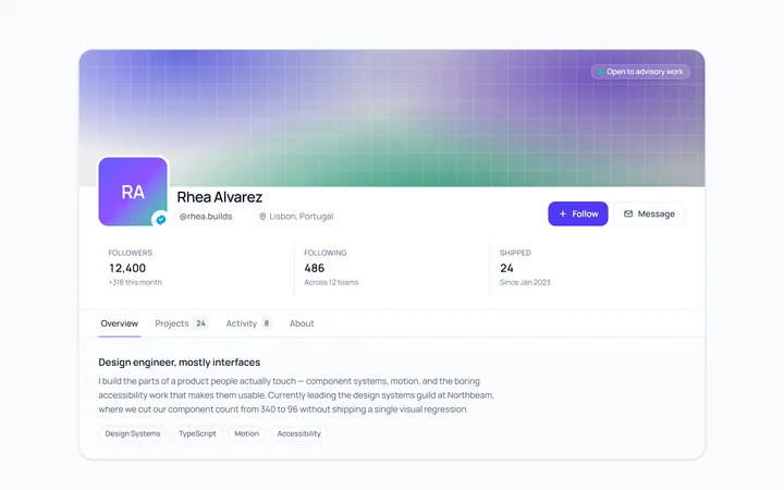
Profile Header
Originalprofile header with cover and avatar
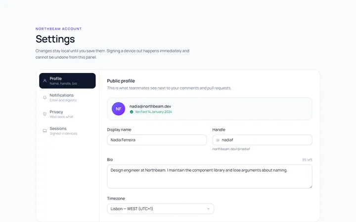
Profile Settings
Originalaccount settings panel
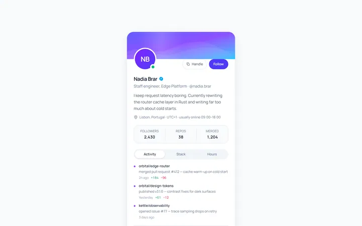
Profile User Card
Originalcompact user profile card
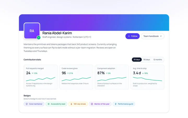
Profile Stats
Originalprofile with stats and badges
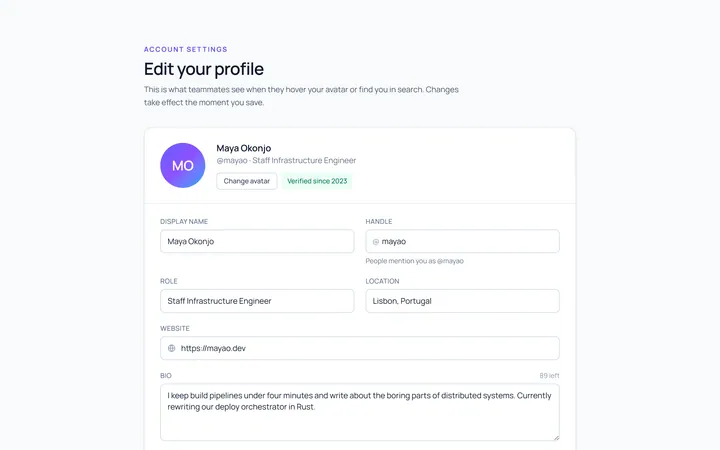
Profile Edit
Originaledit profile form
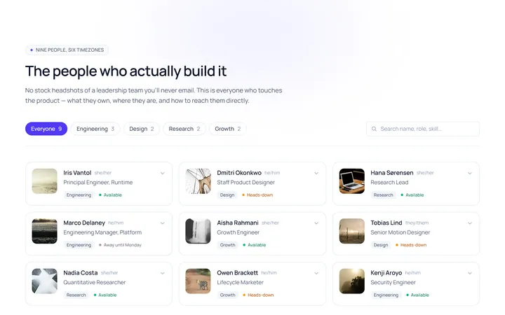
Profile Team
Originalteam member profile grid
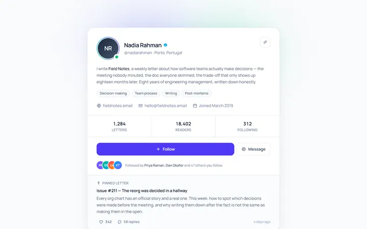
Profile Social
Originalsocial profile with follow
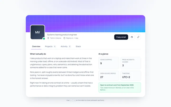
Profile Tabs
Originalprofile page with tabbed content
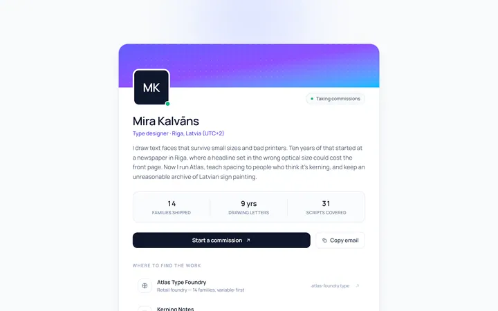
Profile Bio
Originalbio card with links

Spotlight Hero
OriginalA centred hero with a soft radial spotlight, badge and dual call-to-action.

Split Hero
OriginalA two-column hero pairing a headline and CTAs with a product mock and social proof.

Gradient Spotlight Hero
OriginalA minimal centred hero with a soft gradient-mesh backdrop, announcement pill and dual call-to-action buttons.