

Profile Stats
Original · freeprofile with stats and badges
Copy prompt gives Claude Code, Cursor or v0 a ready-to-paste prompt that recreates this exact component.
npx shadcn@latest add https://webinnoventix.com/r/profile-stats.json"use client";
import { useCallback, useId, useMemo, useRef, useState, type KeyboardEvent } from "react";
import { motion, useReducedMotion } from "motion/react";
type RangeKey = "30d" | "90d" | "12m";
type Stat = {
key: string;
label: string;
hint: string;
values: Record<RangeKey, number>;
deltas: Record<RangeKey, number>;
suffix?: string;
spark: Record<RangeKey, number[]>;
};
type Badge = {
id: string;
name: string;
earned: string;
detail: string;
tone: "indigo" | "emerald" | "amber" | "violet" | "sky";
icon: "shield" | "spark" | "flame" | "compass" | "bolt";
};
const RANGES: { key: RangeKey; label: string }[] = [
{ key: "30d", label: "30 days" },
{ key: "90d", label: "90 days" },
{ key: "12m", label: "12 months" },
];
const STATS: Stat[] = [
{
key: "merged",
label: "Pull requests merged",
hint: "Across 11 repositories in the design-systems org",
values: { "30d": 24, "90d": 71, "12m": 268 },
deltas: { "30d": 12, "90d": 8, "12m": 31 },
spark: {
"30d": [4, 6, 5, 9, 7, 11, 8, 12],
"90d": [18, 22, 19, 27, 24, 31, 29, 34],
"12m": [12, 19, 24, 21, 28, 33, 30, 38],
},
},
{
key: "reviews",
label: "Code reviews given",
hint: "Median first response under 3 hours",
values: { "30d": 96, "90d": 284, "12m": 1142 },
deltas: { "30d": 21, "90d": 14, "12m": 47 },
spark: {
"30d": [9, 14, 11, 17, 15, 21, 19, 24],
"90d": [31, 44, 38, 52, 47, 61, 55, 68],
"12m": [62, 78, 71, 94, 88, 112, 101, 126],
},
},
{
key: "adoption",
label: "Component adoption",
hint: "Share of product surfaces on the shared kit",
values: { "30d": 87, "90d": 82, "12m": 64 },
deltas: { "30d": 5, "90d": 9, "12m": 23 },
suffix: "%",
spark: {
"30d": [79, 81, 80, 83, 84, 86, 85, 87],
"90d": [71, 74, 73, 77, 78, 80, 81, 82],
"12m": [41, 47, 52, 50, 56, 59, 61, 64],
},
},
{
key: "ship",
label: "Avg. time to ship",
hint: "Draft to production, weighted by scope",
values: { "30d": 3.4, "90d": 4.1, "12m": 5.8 },
deltas: { "30d": -18, "90d": -11, "12m": -29 },
suffix: " d",
spark: {
"30d": [5.1, 4.7, 4.9, 4.2, 4.0, 3.7, 3.6, 3.4],
"90d": [6.2, 5.8, 5.9, 5.1, 4.8, 4.5, 4.3, 4.1],
"12m": [8.4, 7.9, 7.2, 7.5, 6.8, 6.3, 6.0, 5.8],
},
},
];
const BADGES: Badge[] = [
{
id: "maintainer",
name: "Core maintainer",
earned: "Since Mar 2023",
detail: "Owns release trains for the tokens and primitives packages.",
tone: "indigo",
icon: "shield",
},
{
id: "a11y",
name: "Accessibility lead",
earned: "Earned Aug 2024",
detail: "Drove the WCAG 2.2 AA audit across 340 screens; zero blockers left open.",
tone: "emerald",
icon: "spark",
},
{
id: "streak",
name: "180-day streak",
earned: "Active now",
detail: "At least one merged change every working day since 19 Jan.",
tone: "amber",
icon: "flame",
},
{
id: "mentor",
name: "Mentor of the year",
earned: "Earned Dec 2025",
detail: "Guided 7 engineers through their first design-system contribution.",
tone: "violet",
icon: "compass",
},
{
id: "perf",
name: "Performance guild",
earned: "Earned May 2025",
detail: "Cut the component bundle by 41 kB gzipped without dropping a single API.",
tone: "sky",
icon: "bolt",
},
];
const TONE_CLASS: Record<Badge["tone"], string> = {
indigo:
"border-indigo-200 bg-indigo-50 text-indigo-700 dark:border-indigo-500/30 dark:bg-indigo-500/10 dark:text-indigo-300",
emerald:
"border-emerald-200 bg-emerald-50 text-emerald-700 dark:border-emerald-500/30 dark:bg-emerald-500/10 dark:text-emerald-300",
amber:
"border-amber-200 bg-amber-50 text-amber-700 dark:border-amber-500/30 dark:bg-amber-500/10 dark:text-amber-300",
violet:
"border-violet-200 bg-violet-50 text-violet-700 dark:border-violet-500/30 dark:bg-violet-500/10 dark:text-violet-300",
sky: "border-sky-200 bg-sky-50 text-sky-700 dark:border-sky-500/30 dark:bg-sky-500/10 dark:text-sky-300",
};
function BadgeIcon({ name }: { name: Badge["icon"] }) {
const common = {
viewBox: "0 0 24 24",
fill: "none",
stroke: "currentColor",
strokeWidth: 1.6,
strokeLinecap: "round" as const,
strokeLinejoin: "round" as const,
"aria-hidden": true,
className: "h-4 w-4",
};
if (name === "shield") {
return (
<svg {...common}>
<path d="M12 3 5 6v5.2c0 4.3 2.9 8.2 7 9.8 4.1-1.6 7-5.5 7-9.8V6l-7-3Z" />
<path d="m9.2 12 2 2 3.6-3.9" />
</svg>
);
}
if (name === "spark") {
return (
<svg {...common}>
<path d="M12 3v4M12 17v4M3 12h4M17 12h4M5.6 5.6l2.8 2.8M15.6 15.6l2.8 2.8M18.4 5.6l-2.8 2.8M8.4 15.6l-2.8 2.8" />
<circle cx="12" cy="12" r="2.6" />
</svg>
);
}
if (name === "flame") {
return (
<svg {...common}>
<path d="M12 3c.4 2.6-1.2 3.6-2.4 5C8.2 9.6 7 11 7 13.4A5 5 0 0 0 17 14c0-3.4-2.3-4.6-2.9-7.4-1 .7-1.6 1.6-1.8 2.7-.9-1-1.4-2-1.4-3.4" />
<path d="M12 20a2.4 2.4 0 0 1-2.4-2.4c0-1.5 2.4-3.2 2.4-3.2s2.4 1.7 2.4 3.2A2.4 2.4 0 0 1 12 20Z" />
</svg>
);
}
if (name === "compass") {
return (
<svg {...common}>
<circle cx="12" cy="12" r="9" />
<path d="m15.2 8.8-1.9 4.5-4.5 1.9 1.9-4.5 4.5-1.9Z" />
</svg>
);
}
return (
<svg {...common}>
<path d="M13.4 2.5 4.8 13.2h5.6l-.8 8.3 8.6-10.7h-5.6l.8-8.3Z" />
</svg>
);
}
function Sparkline({ points, positive }: { points: number[]; positive: boolean }) {
const path = useMemo(() => {
const min = Math.min(...points);
const max = Math.max(...points);
const span = max - min || 1;
const w = 100;
const h = 28;
return points
.map((p, i) => {
const x = (i / (points.length - 1)) * w;
const y = h - ((p - min) / span) * (h - 4) - 2;
return `${i === 0 ? "M" : "L"}${x.toFixed(2)} ${y.toFixed(2)}`;
})
.join(" ");
}, [points]);
return (
<svg
viewBox="0 0 100 28"
preserveAspectRatio="none"
aria-hidden="true"
className="h-7 w-full overflow-visible"
>
<path
d={path}
fill="none"
strokeWidth={2}
strokeLinecap="round"
strokeLinejoin="round"
className={
positive
? "stroke-emerald-500 dark:stroke-emerald-400"
: "stroke-indigo-500 dark:stroke-indigo-400"
}
vectorEffect="non-scaling-stroke"
/>
</svg>
);
}
export default function ProfileStats() {
const reduce = useReducedMotion();
const [range, setRange] = useState<RangeKey>("30d");
const [openBadge, setOpenBadge] = useState<string | null>(null);
const [following, setFollowing] = useState(false);
const tabRefs = useRef<(HTMLButtonElement | null)[]>([]);
const panelId = useId();
const tabsId = useId();
const onTabKeyDown = useCallback(
(e: KeyboardEvent<HTMLButtonElement>, index: number) => {
let next = -1;
if (e.key === "ArrowRight") next = (index + 1) % RANGES.length;
else if (e.key === "ArrowLeft") next = (index - 1 + RANGES.length) % RANGES.length;
else if (e.key === "Home") next = 0;
else if (e.key === "End") next = RANGES.length - 1;
if (next === -1) return;
e.preventDefault();
setRange(RANGES[next].key);
tabRefs.current[next]?.focus();
},
[],
);
const fmt = (n: number, suffix?: string) => {
const base = Number.isInteger(n) ? n.toLocaleString("en-US") : n.toFixed(1);
return `${base}${suffix ?? ""}`;
};
return (
<section className="relative w-full bg-white px-4 py-20 text-slate-900 sm:px-6 sm:py-24 dark:bg-slate-950 dark:text-slate-100">
<style>{`
@keyframes pfst-ring-pulse {
0%, 100% { transform: scale(1); opacity: 0.55; }
50% { transform: scale(1.14); opacity: 0; }
}
@keyframes pfst-rise {
from { opacity: 0; transform: translateY(10px); }
to { opacity: 1; transform: translateY(0); }
}
.pfst-ring { animation: pfst-ring-pulse 2.8s ease-out infinite; }
.pfst-rise { animation: pfst-rise 520ms cubic-bezier(0.22, 1, 0.36, 1) both; }
@media (prefers-reduced-motion: reduce) {
.pfst-ring, .pfst-rise { animation: none !important; }
}
`}</style>
<div
aria-hidden="true"
className="pointer-events-none absolute inset-x-0 top-0 h-64 bg-[radial-gradient(60rem_24rem_at_50%_-8rem,rgba(99,102,241,0.14),transparent)] dark:bg-[radial-gradient(60rem_24rem_at_50%_-8rem,rgba(129,140,248,0.16),transparent)]"
/>
<div className="relative mx-auto max-w-5xl">
<div className="overflow-hidden rounded-3xl border border-slate-200 bg-white shadow-sm dark:border-slate-800 dark:bg-slate-900">
<div className="h-24 w-full bg-[linear-gradient(110deg,#4f46e5_0%,#7c3aed_45%,#0ea5e9_100%)] sm:h-28" />
<div className="px-5 pb-8 sm:px-8">
<div className="-mt-12 flex flex-col gap-6 sm:-mt-14 sm:flex-row sm:items-end sm:justify-between">
<div className="flex items-end gap-4">
<div className="relative shrink-0">
{!reduce && (
<span
aria-hidden="true"
className="pfst-ring absolute inset-0 rounded-2xl bg-indigo-400/40"
/>
)}
<div className="relative grid h-24 w-24 place-items-center rounded-2xl border-4 border-white bg-gradient-to-br from-indigo-500 to-violet-600 text-2xl font-semibold tracking-tight text-white shadow-lg sm:h-28 sm:w-28 dark:border-slate-900">
RA
</div>
<span
className="absolute -right-1 -bottom-1 grid h-7 w-7 place-items-center rounded-full border-2 border-white bg-emerald-500 dark:border-slate-900"
title="Available for reviews"
>
<span className="sr-only">Available for reviews</span>
<svg
viewBox="0 0 24 24"
fill="none"
stroke="currentColor"
strokeWidth={3}
strokeLinecap="round"
strokeLinejoin="round"
aria-hidden="true"
className="h-3.5 w-3.5 text-white"
>
<path d="m5 12.5 4.2 4.2L19 7" />
</svg>
</span>
</div>
<div className="pb-1">
<h2 className="text-xl font-semibold tracking-tight sm:text-2xl">
Rania Abdel-Karim
</h2>
<p className="mt-0.5 text-sm text-slate-600 dark:text-slate-400">
Staff engineer, design systems · Rotterdam (UTC+1)
</p>
</div>
</div>
<div className="flex flex-wrap items-center gap-2">
<button
type="button"
aria-pressed={following}
onClick={() => setFollowing((v) => !v)}
className={`inline-flex h-10 items-center gap-2 rounded-full px-4 text-sm font-medium transition focus-visible:ring-2 focus-visible:ring-indigo-500 focus-visible:ring-offset-2 focus-visible:outline-none dark:focus-visible:ring-offset-slate-900 ${
following
? "border border-slate-300 bg-white text-slate-700 hover:bg-slate-50 dark:border-slate-700 dark:bg-slate-900 dark:text-slate-200 dark:hover:bg-slate-800"
: "bg-indigo-600 text-white hover:bg-indigo-500"
}`}
>
<svg
viewBox="0 0 24 24"
fill="none"
stroke="currentColor"
strokeWidth={1.8}
strokeLinecap="round"
strokeLinejoin="round"
aria-hidden="true"
className="h-4 w-4"
>
{following ? (
<path d="m5 12.5 4.2 4.2L19 7" />
) : (
<path d="M12 5v14M5 12h14" />
)}
</svg>
{following ? "Following" : "Follow"}
</button>
<a
href="https://example.com/rania/handbook"
target="_blank"
rel="noopener"
className="inline-flex h-10 items-center gap-2 rounded-full border border-slate-300 px-4 text-sm font-medium text-slate-700 transition hover:bg-slate-50 focus-visible:ring-2 focus-visible:ring-indigo-500 focus-visible:ring-offset-2 focus-visible:outline-none dark:border-slate-700 dark:text-slate-200 dark:hover:bg-slate-800 dark:focus-visible:ring-offset-slate-900"
>
Team handbook
<svg
viewBox="0 0 24 24"
fill="none"
stroke="currentColor"
strokeWidth={1.8}
strokeLinecap="round"
strokeLinejoin="round"
aria-hidden="true"
className="h-3.5 w-3.5"
>
<path d="M8 16 16 8M9 8h7v7" />
</svg>
</a>
</div>
</div>
<p className="mt-6 max-w-2xl text-sm leading-relaxed text-slate-600 dark:text-slate-400">
Maintains the primitives and tokens packages that back 340 product screens.
Currently untangling theming so every surface can flip to dark mode without a
per-team migration. Reviews are open on Tuesdays and Thursdays.
</p>
<div className="mt-7">
<div className="flex flex-wrap items-center justify-between gap-3">
<h3 className="text-sm font-semibold tracking-tight text-slate-900 dark:text-slate-100">
Contribution stats
</h3>
<div
role="tablist"
aria-label="Stats time range"
id={tabsId}
className="inline-flex rounded-full border border-slate-200 bg-slate-50 p-1 dark:border-slate-800 dark:bg-slate-950/60"
>
{RANGES.map((r, i) => {
const selected = r.key === range;
return (
<button
key={r.key}
ref={(el) => {
tabRefs.current[i] = el;
}}
type="button"
role="tab"
id={`${tabsId}-${r.key}`}
aria-selected={selected}
aria-controls={panelId}
tabIndex={selected ? 0 : -1}
onClick={() => setRange(r.key)}
onKeyDown={(e) => onTabKeyDown(e, i)}
className={`relative rounded-full px-3 py-1.5 text-xs font-medium transition focus-visible:ring-2 focus-visible:ring-indigo-500 focus-visible:ring-offset-2 focus-visible:outline-none dark:focus-visible:ring-offset-slate-900 ${
selected
? "text-white"
: "text-slate-600 hover:text-slate-900 dark:text-slate-400 dark:hover:text-slate-100"
}`}
>
{selected && (
<motion.span
layoutId="pfst-range-pill"
aria-hidden="true"
transition={
reduce
? { duration: 0 }
: { type: "spring", stiffness: 420, damping: 34 }
}
className="absolute inset-0 rounded-full bg-slate-900 dark:bg-indigo-600"
/>
)}
<span className="relative">{r.label}</span>
</button>
);
})}
</div>
</div>
<div
role="tabpanel"
id={panelId}
aria-labelledby={`${tabsId}-${range}`}
tabIndex={0}
className="mt-4 grid gap-3 rounded-xl focus-visible:ring-2 focus-visible:ring-indigo-500 focus-visible:outline-none sm:grid-cols-2 lg:grid-cols-4"
>
{STATS.map((s) => {
const delta = s.deltas[range];
const good = s.key === "ship" ? delta < 0 : delta > 0;
return (
<div
key={`${s.key}-${range}`}
className="pfst-rise rounded-xl border border-slate-200 bg-slate-50/70 p-4 dark:border-slate-800 dark:bg-slate-950/40"
>
<p className="text-xs font-medium text-slate-500 dark:text-slate-400">
{s.label}
</p>
<div className="mt-1.5 flex items-baseline gap-2">
<span className="text-2xl font-semibold tracking-tight tabular-nums">
{fmt(s.values[range], s.suffix)}
</span>
<span
className={`inline-flex items-center gap-0.5 text-xs font-medium tabular-nums ${
good
? "text-emerald-600 dark:text-emerald-400"
: "text-rose-600 dark:text-rose-400"
}`}
>
<svg
viewBox="0 0 24 24"
fill="none"
stroke="currentColor"
strokeWidth={2.2}
strokeLinecap="round"
strokeLinejoin="round"
aria-hidden="true"
className={`h-3 w-3 ${delta < 0 ? "rotate-180" : ""}`}
>
<path d="M12 19V5M6 11l6-6 6 6" />
</svg>
{Math.abs(delta)}%
</span>
</div>
<p className="sr-only">
{good ? "Improved" : "Declined"} {Math.abs(delta)} percent over the
last {RANGES.find((r) => r.key === range)?.label}.
</p>
<div className="mt-3">
<Sparkline points={s.spark[range]} positive={good} />
</div>
<p className="mt-2 text-[11px] leading-snug text-slate-500 dark:text-slate-500">
{s.hint}
</p>
</div>
);
})}
</div>
</div>
<div className="mt-8">
<h3 className="text-sm font-semibold tracking-tight text-slate-900 dark:text-slate-100">
Badges
</h3>
<p className="mt-1 text-xs text-slate-500 dark:text-slate-400">
Select a badge to see how it was earned.
</p>
<ul className="mt-3 flex flex-wrap gap-2">
{BADGES.map((b) => {
const open = openBadge === b.id;
return (
<li key={b.id}>
<button
type="button"
aria-expanded={open}
aria-controls={`${panelId}-${b.id}`}
onClick={() => setOpenBadge(open ? null : b.id)}
className={`inline-flex items-center gap-2 rounded-full border px-3 py-1.5 text-xs font-medium transition focus-visible:ring-2 focus-visible:ring-indigo-500 focus-visible:ring-offset-2 focus-visible:outline-none dark:focus-visible:ring-offset-slate-900 ${
TONE_CLASS[b.tone]
} ${open ? "ring-2 ring-slate-900/10 dark:ring-white/20" : ""}`}
>
<BadgeIcon name={b.icon} />
{b.name}
</button>
</li>
);
})}
</ul>
<div aria-live="polite" className="mt-3">
{BADGES.filter((b) => b.id === openBadge).map((b) => (
<motion.div
key={b.id}
id={`${panelId}-${b.id}`}
initial={reduce ? false : { opacity: 0, y: -6 }}
animate={{ opacity: 1, y: 0 }}
transition={reduce ? { duration: 0 } : { duration: 0.22, ease: "easeOut" }}
className="rounded-xl border border-slate-200 bg-slate-50/70 p-4 dark:border-slate-800 dark:bg-slate-950/40"
>
<p className="text-sm font-medium text-slate-900 dark:text-slate-100">
{b.name}
<span className="ml-2 text-xs font-normal text-slate-500 dark:text-slate-400">
{b.earned}
</span>
</p>
<p className="mt-1 text-sm leading-relaxed text-slate-600 dark:text-slate-400">
{b.detail}
</p>
</motion.div>
))}
</div>
</div>
</div>
</div>
</div>
</section>
);
}Dependencies
Licence
Built by Web Innoventix. Free for personal and commercial use, no attribution required.
Built by Web Innoventix
Need a custom interface, a full website, or SEO that gets you cited by AI? We design, build and rank it end to end.
Get a free quoteSimilar components
Browse all →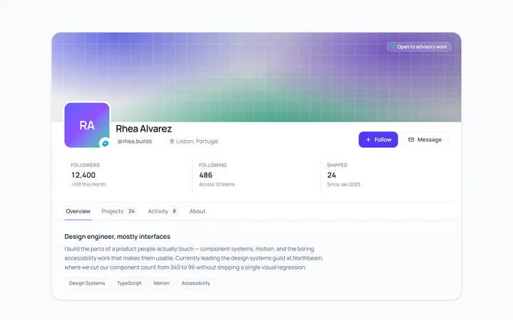
Profile Header
Originalprofile header with cover and avatar
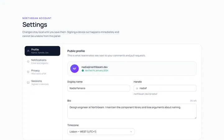
Profile Settings
Originalaccount settings panel
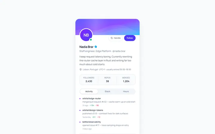
Profile User Card
Originalcompact user profile card
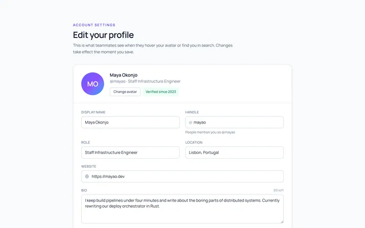
Profile Edit
Originaledit profile form
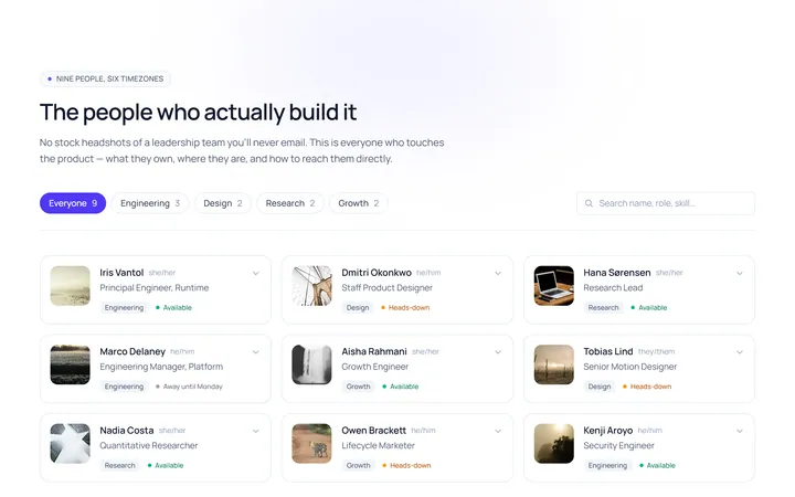
Profile Team
Originalteam member profile grid
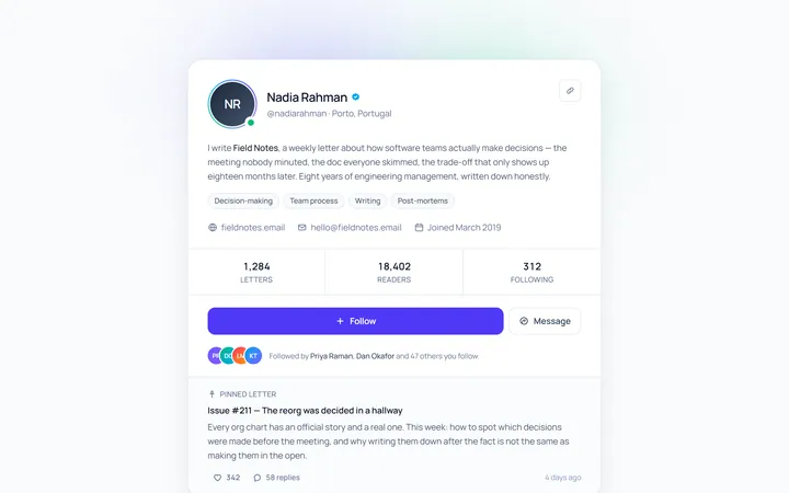
Profile Social
Originalsocial profile with follow
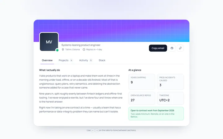
Profile Tabs
Originalprofile page with tabbed content
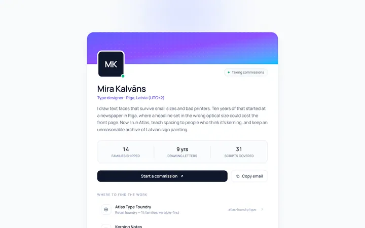
Profile Bio
Originalbio card with links
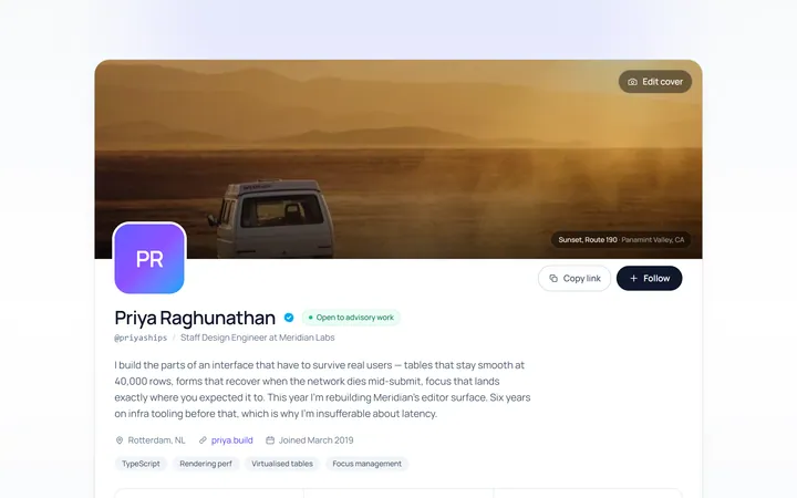
Profile Cover
Originallarge cover profile hero

Spotlight Hero
OriginalA centred hero with a soft radial spotlight, badge and dual call-to-action.

Split Hero
OriginalA two-column hero pairing a headline and CTAs with a product mock and social proof.

Gradient Spotlight Hero
OriginalA minimal centred hero with a soft gradient-mesh backdrop, announcement pill and dual call-to-action buttons.