

Auto-Rotating Quote Carousel
Original · freeAn auto-advancing testimonial carousel that slides and crossfades between quotes with a live progress bar, pause-on-hover, and dot plus arrow navigation.
Copy prompt gives Claude Code, Cursor or v0 a ready-to-paste prompt that recreates this exact component.
npx shadcn@latest add https://webinnoventix.com/r/atest-auto-rotate-carousel.json"use client";
import { useEffect, useRef, useState } from "react";
import { AnimatePresence, motion, useReducedMotion } from "motion/react";
const testimonials = [
{
quote:
"We shipped our redesign three weeks ahead of schedule and, somehow, the whole team enjoyed the process. It is rare for a tool to change how people feel about their own work, but this one genuinely did.",
name: "Amara Okafor",
role: "VP Product, Northwind",
initials: "AO",
ring: "from-violet-500 to-indigo-500",
rating: 5,
},
{
quote:
"The migration I had been dreading for two years took a single afternoon. Support answered like an actual human, and nothing broke. I keep waiting for the catch.",
name: "Tobias Reinhardt",
role: "Head of Engineering, Cadence",
initials: "TR",
ring: "from-sky-500 to-cyan-500",
rating: 5,
},
{
quote:
"Our reporting used to be a weekly argument. Now the numbers are simply there, trusted by the board and the interns alike. That quiet confidence is worth more than any feature list.",
name: "Priya Venkatesh",
role: "CFO, Meridian",
initials: "PV",
ring: "from-fuchsia-500 to-pink-500",
rating: 5,
},
{
quote:
"I have tried most of the tools in this space and they all fight you eventually. This is the first one that just gets out of the way and lets good people do good work.",
name: "Daniel Brooks",
role: "Founder, Palisade",
initials: "DB",
ring: "from-emerald-500 to-teal-500",
rating: 5,
},
];
const slide = {
enter: (dir: number) => ({ opacity: 0, x: dir > 0 ? 48 : -48, scale: 0.98 }),
center: { opacity: 1, x: 0, scale: 1 },
exit: (dir: number) => ({ opacity: 0, x: dir > 0 ? -48 : 48, scale: 0.98 }),
};
const INTERVAL = 6500;
export default function AtestAutoRotateCarousel() {
const reduce = useReducedMotion();
const [index, setIndex] = useState(0);
const [direction, setDirection] = useState(1);
const [progress, setProgress] = useState(0);
const [paused, setPaused] = useState(false);
const progressRef = useRef(0);
const count = testimonials.length;
const goTo = (next: number, dir: number) => {
setDirection(dir);
setIndex((next + count) % count);
progressRef.current = 0;
setProgress(0);
};
useEffect(() => {
if (paused || reduce) return;
let raf = 0;
let last = performance.now();
const tick = (now: number) => {
const dt = now - last;
last = now;
progressRef.current += (dt / INTERVAL) * 100;
if (progressRef.current >= 100) {
progressRef.current = 0;
setDirection(1);
setIndex((i) => (i + 1) % count);
}
setProgress(progressRef.current);
raf = requestAnimationFrame(tick);
};
raf = requestAnimationFrame(tick);
return () => cancelAnimationFrame(raf);
}, [paused, reduce, count]);
const active = testimonials[index];
return (
<section className="relative overflow-hidden bg-zinc-50 px-6 py-20 dark:bg-zinc-950 md:py-28">
{/* Ambient floating glow */}
<div aria-hidden="true" className="pointer-events-none absolute inset-0 overflow-hidden">
<motion.div
className="absolute -left-24 top-0 h-80 w-80 rounded-full bg-violet-400/20 blur-3xl dark:bg-violet-600/20"
animate={reduce ? undefined : { x: [0, 40, 0], y: [0, 30, 0] }}
transition={{ duration: 14, repeat: Infinity, ease: "easeInOut" }}
/>
<motion.div
className="absolute -right-24 bottom-0 h-96 w-96 rounded-full bg-sky-400/20 blur-3xl dark:bg-sky-600/20"
animate={reduce ? undefined : { x: [0, -50, 0], y: [0, -20, 0] }}
transition={{ duration: 18, repeat: Infinity, ease: "easeInOut" }}
/>
</div>
<div className="relative mx-auto max-w-3xl text-center">
<span className="inline-flex items-center gap-2 rounded-full border border-zinc-200 bg-white/70 px-4 py-1.5 text-xs font-medium tracking-wide text-zinc-600 backdrop-blur dark:border-zinc-800 dark:bg-zinc-900/70 dark:text-zinc-400">
<span className="relative flex h-2 w-2">
{!reduce && (
<span className="absolute inline-flex h-full w-full animate-ping rounded-full bg-violet-500 opacity-75" />
)}
<span className="relative inline-flex h-2 w-2 rounded-full bg-violet-500" />
</span>
Loved by 4,000+ teams
</span>
<h2 className="mt-5 text-3xl font-bold tracking-tight text-balance text-zinc-900 sm:text-4xl dark:text-white">
What people say when the deadline is over
</h2>
</div>
<div
className="relative mx-auto mt-12 max-w-3xl"
onMouseEnter={() => setPaused(true)}
onMouseLeave={() => setPaused(false)}
onFocusCapture={() => setPaused(true)}
onBlurCapture={() => setPaused(false)}
>
<div className="relative overflow-hidden rounded-3xl border border-zinc-200 bg-white/80 p-8 shadow-xl shadow-zinc-900/5 backdrop-blur-sm sm:p-12 dark:border-zinc-800 dark:bg-zinc-900/80 dark:shadow-black/20">
{/* Decorative quote mark */}
<svg
aria-hidden="true"
viewBox="0 0 48 48"
className="absolute right-8 top-6 h-16 w-16 fill-zinc-900/5 dark:fill-white/5"
>
<path d="M18 10c-6 2-10 7-10 15v13h13V25h-7c0-5 2-8 6-9l-2-6zm18 0c-6 2-10 7-10 15v13h13V25h-7c0-5 2-8 6-9l-2-6z" />
</svg>
<div className="relative min-h-[16rem]" aria-live="polite">
<AnimatePresence mode="wait" custom={direction}>
<motion.figure
key={index}
custom={direction}
variants={slide}
initial="enter"
animate="center"
exit="exit"
transition={{ duration: 0.45, ease: [0.22, 1, 0.36, 1] }}
>
<div className="flex items-center gap-0.5" aria-label={`Rated ${active.rating} out of 5`}>
{[0, 1, 2, 3, 4].map((s) => (
<motion.svg
key={s}
viewBox="0 0 24 24"
className="h-5 w-5 fill-amber-400"
aria-hidden="true"
initial={reduce ? false : { opacity: 0, scale: 0.4, rotate: -30 }}
animate={{ opacity: 1, scale: 1, rotate: 0 }}
transition={{ delay: 0.15 + s * 0.06, type: "spring", stiffness: 400, damping: 18 }}
>
<path d="M11.48 3.5a.56.56 0 011.04 0l2.12 5.11a.56.56 0 00.48.35l5.52.44c.5.04.7.66.32.99l-4.2 3.6a.56.56 0 00-.19.56l1.29 5.38a.56.56 0 01-.84.61l-4.73-2.88a.56.56 0 00-.58 0l-4.73 2.88a.56.56 0 01-.84-.61l1.29-5.38a.56.56 0 00-.19-.56l-4.2-3.6a.56.56 0 01.32-.99l5.52-.44a.56.56 0 00.48-.35L11.48 3.5z" />
</motion.svg>
))}
</div>
<blockquote className="mt-6 font-serif text-xl leading-relaxed text-balance text-zinc-800 sm:text-2xl dark:text-zinc-100">
{active.quote}
</blockquote>
<figcaption className="mt-8 flex items-center gap-4">
<span
className={`grid h-12 w-12 shrink-0 place-items-center rounded-full bg-gradient-to-br ${active.ring} text-sm font-semibold text-white shadow-lg`}
aria-hidden="true"
>
{active.initials}
</span>
<span>
<span className="block text-sm font-semibold text-zinc-900 dark:text-white">
{active.name}
</span>
<span className="block text-sm text-zinc-500 dark:text-zinc-400">
{active.role}
</span>
</span>
</figcaption>
</motion.figure>
</AnimatePresence>
</div>
{/* Progress bar */}
<div className="mt-10 h-1 w-full overflow-hidden rounded-full bg-zinc-200 dark:bg-zinc-800">
<div
className="h-full rounded-full bg-gradient-to-r from-violet-500 to-sky-500"
style={{ width: `${reduce ? 100 : progress}%` }}
/>
</div>
{/* Controls */}
<div className="mt-6 flex items-center justify-between">
<div className="flex items-center gap-2" role="tablist" aria-label="Select testimonial">
{testimonials.map((t, i) => (
<button
key={t.name}
type="button"
role="tab"
aria-selected={i === index}
aria-label={`Show testimonial from ${t.name}`}
onClick={() => goTo(i, i > index ? 1 : -1)}
className="group relative h-2.5 py-2"
>
<span
className={`block h-2.5 rounded-full transition-all duration-300 ${
i === index
? "w-7 bg-violet-500"
: "w-2.5 bg-zinc-300 group-hover:bg-zinc-400 dark:bg-zinc-700 dark:group-hover:bg-zinc-600"
}`}
/>
</button>
))}
</div>
<div className="flex items-center gap-2">
<button
type="button"
onClick={() => goTo(index - 1, -1)}
aria-label="Previous testimonial"
className="grid h-10 w-10 place-items-center rounded-full border border-zinc-200 bg-white text-zinc-600 transition hover:scale-105 hover:text-zinc-900 active:scale-95 dark:border-zinc-800 dark:bg-zinc-900 dark:text-zinc-400 dark:hover:text-white"
>
<svg viewBox="0 0 24 24" className="h-5 w-5" fill="none" stroke="currentColor" strokeWidth="2" aria-hidden="true">
<path d="M15 18l-6-6 6-6" strokeLinecap="round" strokeLinejoin="round" />
</svg>
</button>
<button
type="button"
onClick={() => goTo(index + 1, 1)}
aria-label="Next testimonial"
className="grid h-10 w-10 place-items-center rounded-full border border-zinc-200 bg-white text-zinc-600 transition hover:scale-105 hover:text-zinc-900 active:scale-95 dark:border-zinc-800 dark:bg-zinc-900 dark:text-zinc-400 dark:hover:text-white"
>
<svg viewBox="0 0 24 24" className="h-5 w-5" fill="none" stroke="currentColor" strokeWidth="2" aria-hidden="true">
<path d="M9 6l6 6-6 6" strokeLinecap="round" strokeLinejoin="round" />
</svg>
</button>
</div>
</div>
</div>
</div>
</section>
);
}Dependencies
Licence
Built by Web Innoventix. Free for personal and commercial use, no attribution required.
Built by Web Innoventix
Need a custom interface, a full website, or SEO that gets you cited by AI? We design, build and rank it end to end.
Get a free quoteSimilar components
Browse all →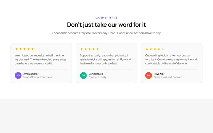
Three Card Testimonial Grid
OriginalA clean three-column grid of testimonial cards, each with a star rating, quote and an initial avatar with name and role.
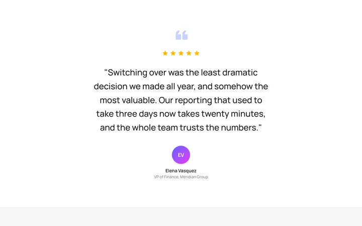
Single Featured Quote
OriginalA large centred pull quote with a decorative quotation mark, five-star rating and a prominent author avatar for a single standout testimonial.
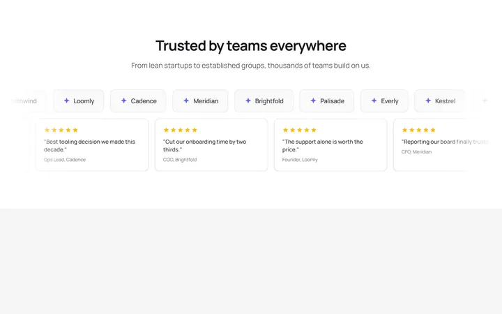
Logo Wall Marquee
OriginalA pair of infinitely scrolling, pause-on-hover marquees pairing a customer logo wall with compact quote cards, with reduced-motion support.
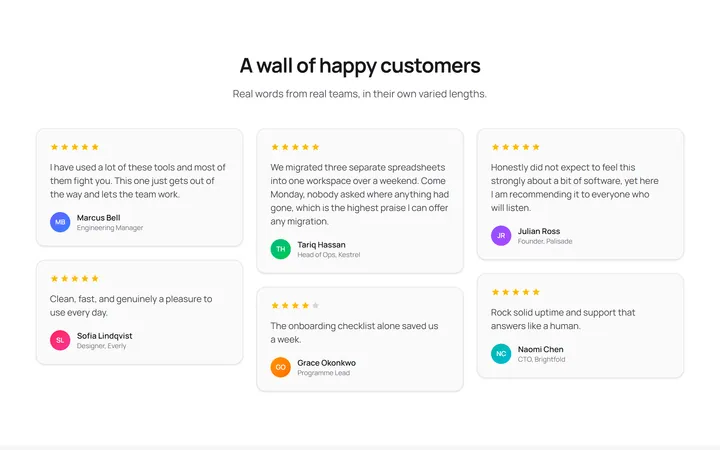
Masonry Testimonial Wall
OriginalA CSS-columns masonry wall of testimonial cards in varied lengths, each with a star rating and initial avatar for a natural, organic layout.
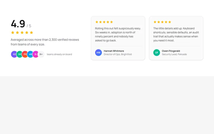
Aggregate Rating Spotlight
OriginalA split layout pairing a large aggregate rating score, star row and overlapping avatar stack with two featured review cards.
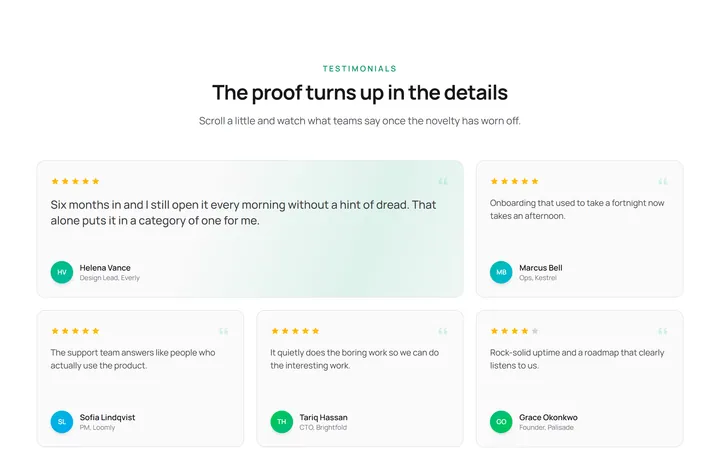
Staggered Reveal Testimonial Grid
OriginalA testimonial grid whose cards spring in with a staggered scroll reveal and light up with an animated gradient border on hover.
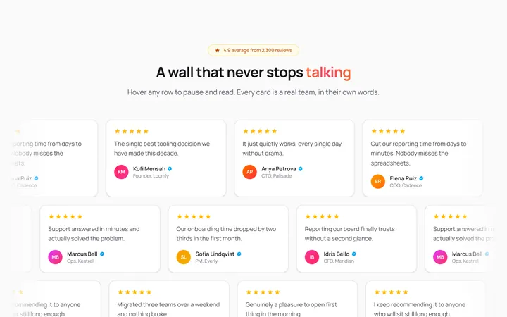
Infinite Marquee Testimonial Wall
OriginalA three-row marquee wall of review cards scrolling in alternating directions that pause on hover, with a shimmering gradient headline and faded edges.

Spotlight Hero
OriginalA centred hero with a soft radial spotlight, badge and dual call-to-action.

Split Hero
OriginalA two-column hero pairing a headline and CTAs with a product mock and social proof.

Gradient Spotlight Hero
OriginalA minimal centred hero with a soft gradient-mesh backdrop, announcement pill and dual call-to-action buttons.

App Preview Hero
OriginalA centred hero that pairs headline copy with a realistic product dashboard mock built entirely from markup, complete with browser chrome and a floating notification card.

Waitlist Capture Hero
OriginalA dark, focused hero with an inline email capture form and avatar social proof, ready for pre-launch waitlists.