

Three Card Testimonial Grid
Original · freeA clean three-column grid of testimonial cards, each with a star rating, quote and an initial avatar with name and role.
Copy prompt gives Claude Code, Cursor or v0 a ready-to-paste prompt that recreates this exact component.
npx shadcn@latest add https://webinnoventix.com/r/testimonial-grid-cards.jsonconst reviews = [
{
quote:
"We shipped our redesign in half the time we planned. The team handled every edge case before we even noticed it.",
name: "Amara Okafor",
role: "Head of Product, Northwind",
initials: "AO",
tint: "from-indigo-500 to-violet-500",
rating: 5,
},
{
quote:
"Support actually reads what you write. I raised a tricky billing question at 11pm and had a real answer by breakfast.",
name: "Daniel Reyes",
role: "Founder, Loomly",
initials: "DR",
tint: "from-emerald-500 to-teal-500",
rating: 5,
},
{
quote:
"Onboarding took an afternoon, not a fortnight. Our whole ops team was live and comfortable by the end of day one.",
name: "Priya Nair",
role: "Operations Lead, Cadence",
initials: "PN",
tint: "from-rose-500 to-orange-500",
rating: 4,
},
];
export default function TestimonialGridCards() {
return (
<section className="bg-white px-6 py-16 dark:bg-zinc-950 md:py-24">
<div className="mx-auto max-w-2xl text-center">
<p className="text-sm font-semibold uppercase tracking-widest text-indigo-600 dark:text-indigo-400">
Loved by teams
</p>
<h2 className="mt-3 text-3xl font-bold tracking-tight text-balance text-zinc-900 sm:text-4xl dark:text-white">
Don't just take our word for it
</h2>
<p className="mt-4 text-lg text-zinc-600 dark:text-zinc-400">
Thousands of teams rely on us every day. Here is what a few of them have to say.
</p>
</div>
<div className="mx-auto mt-12 grid max-w-6xl gap-6 md:grid-cols-3">
{reviews.map((review) => (
<figure
key={review.name}
className="flex flex-col rounded-2xl border border-zinc-200 bg-zinc-50 p-6 shadow-sm transition hover:-translate-y-1 hover:shadow-md dark:border-zinc-800 dark:bg-zinc-900"
>
<div
className="flex items-center gap-1"
aria-label={`Rated ${review.rating} out of 5 stars`}
>
{[0, 1, 2, 3, 4].map((i) => (
<svg
key={i}
viewBox="0 0 24 24"
className={
i < review.rating
? "h-5 w-5 fill-amber-400"
: "h-5 w-5 fill-zinc-300 dark:fill-zinc-700"
}
aria-hidden="true"
>
<path d="M11.48 3.5a.56.56 0 011.04 0l2.12 5.11a.56.56 0 00.48.35l5.52.44c.5.04.7.66.32.99l-4.2 3.6a.56.56 0 00-.19.56l1.29 5.38a.56.56 0 01-.84.61l-4.73-2.88a.56.56 0 00-.58 0l-4.73 2.88a.56.56 0 01-.84-.61l1.29-5.38a.56.56 0 00-.19-.56l-4.2-3.6a.56.56 0 01.32-.99l5.52-.44a.56.56 0 00.48-.35L11.48 3.5z" />
</svg>
))}
</div>
<blockquote className="mt-4 flex-1 text-pretty text-zinc-700 dark:text-zinc-300">
{review.quote}
</blockquote>
<figcaption className="mt-6 flex items-center gap-3 border-t border-zinc-200 pt-4 dark:border-zinc-800">
<span
className={`grid h-10 w-10 shrink-0 place-items-center rounded-full bg-gradient-to-br ${review.tint} text-sm font-semibold text-white`}
aria-hidden="true"
>
{review.initials}
</span>
<span className="min-w-0">
<span className="block truncate text-sm font-semibold text-zinc-900 dark:text-white">
{review.name}
</span>
<span className="block truncate text-sm text-zinc-500 dark:text-zinc-400">
{review.role}
</span>
</span>
</figcaption>
</figure>
))}
</div>
</section>
);
}Dependencies
Licence
Built by Web Innoventix. Free for personal and commercial use, no attribution required.
Built by Web Innoventix
Need a custom interface, a full website, or SEO that gets you cited by AI? We design, build and rank it end to end.
Get a free quoteSimilar components
Browse all →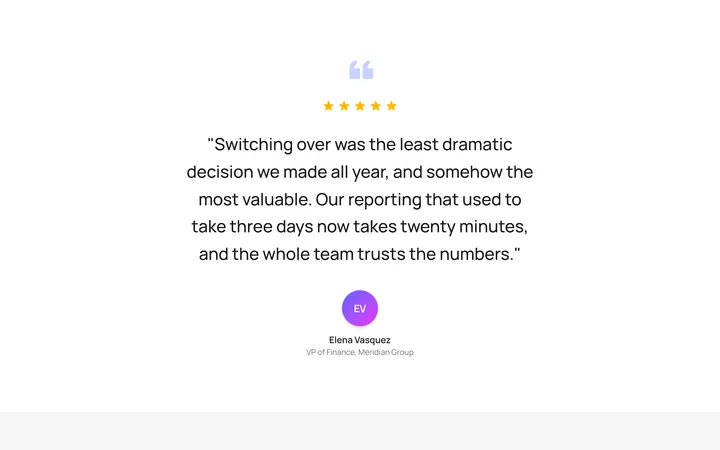
Single Featured Quote
OriginalA large centred pull quote with a decorative quotation mark, five-star rating and a prominent author avatar for a single standout testimonial.
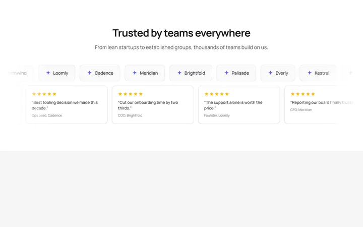
Logo Wall Marquee
OriginalA pair of infinitely scrolling, pause-on-hover marquees pairing a customer logo wall with compact quote cards, with reduced-motion support.
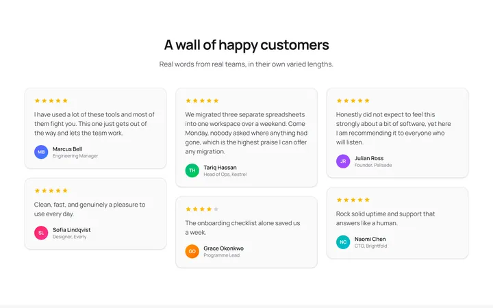
Masonry Testimonial Wall
OriginalA CSS-columns masonry wall of testimonial cards in varied lengths, each with a star rating and initial avatar for a natural, organic layout.
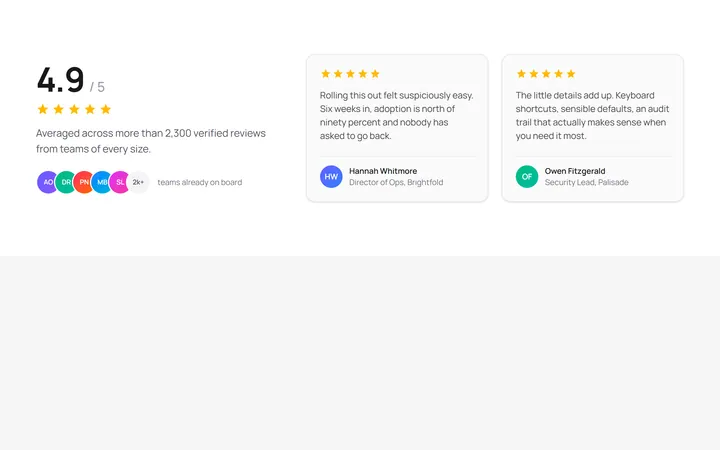
Aggregate Rating Spotlight
OriginalA split layout pairing a large aggregate rating score, star row and overlapping avatar stack with two featured review cards.
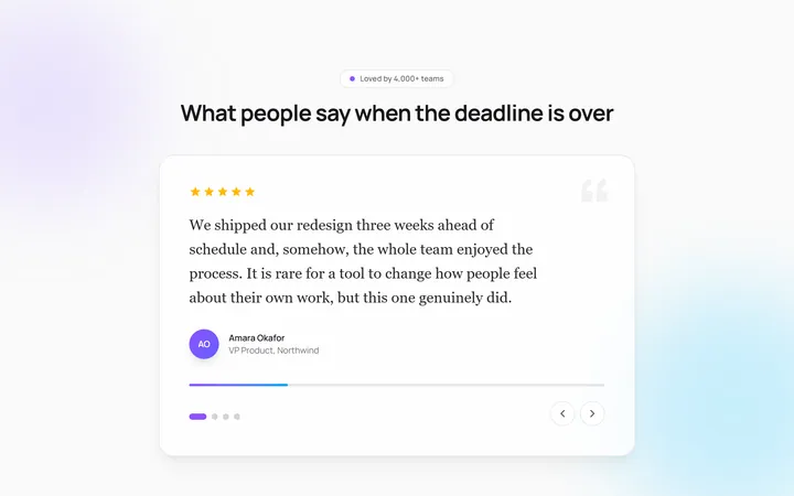
Auto-Rotating Quote Carousel
OriginalAn auto-advancing testimonial carousel that slides and crossfades between quotes with a live progress bar, pause-on-hover, and dot plus arrow navigation.
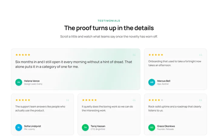
Staggered Reveal Testimonial Grid
OriginalA testimonial grid whose cards spring in with a staggered scroll reveal and light up with an animated gradient border on hover.
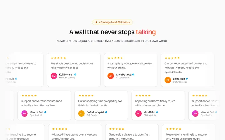
Infinite Marquee Testimonial Wall
OriginalA three-row marquee wall of review cards scrolling in alternating directions that pause on hover, with a shimmering gradient headline and faded edges.

Spotlight Hero
OriginalA centred hero with a soft radial spotlight, badge and dual call-to-action.

Split Hero
OriginalA two-column hero pairing a headline and CTAs with a product mock and social proof.

Gradient Spotlight Hero
OriginalA minimal centred hero with a soft gradient-mesh backdrop, announcement pill and dual call-to-action buttons.

App Preview Hero
OriginalA centred hero that pairs headline copy with a realistic product dashboard mock built entirely from markup, complete with browser chrome and a floating notification card.

Waitlist Capture Hero
OriginalA dark, focused hero with an inline email capture form and avatar social proof, ready for pre-launch waitlists.