

Icon Toast
Original · freetoasts with icon and title
Copy prompt gives Claude Code, Cursor or v0 a ready-to-paste prompt that recreates this exact component.
npx shadcn@latest add https://webinnoventix.com/r/toast-icon.json"use client";
import { useCallback, useEffect, useRef, useState, type ReactNode } from "react";
import { AnimatePresence, motion, useReducedMotion } from "motion/react";
type ToastVariant = "success" | "error" | "warning" | "info";
interface ToastAction {
label: string;
kind: "dismiss" | "retry";
}
interface Toast {
id: number;
variant: ToastVariant;
title: string;
message: string;
duration: number;
}
interface VariantConfig {
label: string;
icon: ReactNode;
badge: string;
bar: string;
triggerBtn: string;
triggerRing: string;
action: ToastAction | null;
}
const VARIANTS: Record<ToastVariant, VariantConfig> = {
success: {
label: "Success",
badge:
"bg-emerald-100 text-emerald-600 dark:bg-emerald-500/15 dark:text-emerald-400",
bar: "bg-emerald-500 dark:bg-emerald-400",
triggerBtn:
"border-emerald-200 text-emerald-700 hover:bg-emerald-50 dark:border-emerald-500/30 dark:text-emerald-300 dark:hover:bg-emerald-500/10",
triggerRing:
"focus-visible:ring-emerald-500 dark:focus-visible:ring-emerald-400",
action: { label: "View", kind: "dismiss" },
icon: (
<svg
viewBox="0 0 24 24"
fill="none"
stroke="currentColor"
strokeWidth={2.2}
strokeLinecap="round"
strokeLinejoin="round"
className="h-5 w-5"
aria-hidden="true"
>
<path d="M20 6 9 17l-5-5" />
</svg>
),
},
error: {
label: "Error",
badge: "bg-rose-100 text-rose-600 dark:bg-rose-500/15 dark:text-rose-400",
bar: "bg-rose-500 dark:bg-rose-400",
triggerBtn:
"border-rose-200 text-rose-700 hover:bg-rose-50 dark:border-rose-500/30 dark:text-rose-300 dark:hover:bg-rose-500/10",
triggerRing: "focus-visible:ring-rose-500 dark:focus-visible:ring-rose-400",
action: { label: "Retry", kind: "retry" },
icon: (
<svg
viewBox="0 0 24 24"
fill="none"
stroke="currentColor"
strokeWidth={2.2}
strokeLinecap="round"
strokeLinejoin="round"
className="h-5 w-5"
aria-hidden="true"
>
<circle cx="12" cy="12" r="9" />
<path d="M15 9l-6 6M9 9l6 6" />
</svg>
),
},
warning: {
label: "Warning",
badge:
"bg-amber-100 text-amber-600 dark:bg-amber-500/15 dark:text-amber-400",
bar: "bg-amber-500 dark:bg-amber-400",
triggerBtn:
"border-amber-200 text-amber-700 hover:bg-amber-50 dark:border-amber-500/30 dark:text-amber-300 dark:hover:bg-amber-500/10",
triggerRing:
"focus-visible:ring-amber-500 dark:focus-visible:ring-amber-400",
action: { label: "Upgrade", kind: "dismiss" },
icon: (
<svg
viewBox="0 0 24 24"
fill="none"
stroke="currentColor"
strokeWidth={2.2}
strokeLinecap="round"
strokeLinejoin="round"
className="h-5 w-5"
aria-hidden="true"
>
<path d="M10.3 3.9 1.8 18a2 2 0 0 0 1.7 3h17a2 2 0 0 0 1.7-3L13.7 3.9a2 2 0 0 0-3.4 0Z" />
<path d="M12 9v4M12 17h.01" />
</svg>
),
},
info: {
label: "Info",
badge: "bg-sky-100 text-sky-600 dark:bg-sky-500/15 dark:text-sky-400",
bar: "bg-sky-500 dark:bg-sky-400",
triggerBtn:
"border-sky-200 text-sky-700 hover:bg-sky-50 dark:border-sky-500/30 dark:text-sky-300 dark:hover:bg-sky-500/10",
triggerRing: "focus-visible:ring-sky-500 dark:focus-visible:ring-sky-400",
action: null,
icon: (
<svg
viewBox="0 0 24 24"
fill="none"
stroke="currentColor"
strokeWidth={2.2}
strokeLinecap="round"
strokeLinejoin="round"
className="h-5 w-5"
aria-hidden="true"
>
<circle cx="12" cy="12" r="9" />
<path d="M12 11v5M12 8h.01" />
</svg>
),
},
};
const COPY: Record<ToastVariant, ReadonlyArray<{ title: string; message: string }>> = {
success: [
{ title: "Changes published", message: "Your site is live at webinnoventix.com — reindexed in 3.2s." },
{ title: "Backup complete", message: "42 files (1.8 GB) archived to cold storage." },
{ title: "Invite accepted", message: "Priya joined the Growth workspace as an editor." },
],
error: [
{ title: "Upload failed", message: "hero-banner.psd exceeds the 25 MB limit. Compress and retry." },
{ title: "Payment declined", message: "Card ending 4291 was declined by the issuing bank." },
{ title: "Sync error", message: "Couldn't reach the API. We'll retry automatically in 30s." },
],
warning: [
{ title: "Storage almost full", message: "You've used 92% of your 50 GB plan. Upgrade to keep syncing." },
{ title: "Session expiring", message: "You'll be signed out in 5 minutes due to inactivity." },
{ title: "Unsaved changes", message: "Leaving now will discard edits to the pricing page." },
],
info: [
{ title: "New feature", message: "Scheduled reports now live in Analytics → Exports." },
{ title: "Maintenance window", message: "Read-only mode Sunday 02:00–02:30 UTC for upgrades." },
{ title: "Keyboard tip", message: "Press ⌘K anywhere to jump between projects instantly." },
],
};
const MAX_STACK = 4;
const DURATION = 5200;
function CloseIcon() {
return (
<svg
viewBox="0 0 24 24"
fill="none"
stroke="currentColor"
strokeWidth={2}
strokeLinecap="round"
strokeLinejoin="round"
className="h-4 w-4"
aria-hidden="true"
>
<path d="M18 6 6 18M6 6l12 12" />
</svg>
);
}
function ToastItem({
toast,
reduced,
onDismiss,
onAction,
}: {
toast: Toast;
reduced: boolean;
onDismiss: (id: number) => void;
onAction: (toast: Toast) => void;
}) {
const config = VARIANTS[toast.variant];
const [progress, setProgress] = useState(100);
const [paused, setPaused] = useState(false);
const remainingRef = useRef(toast.duration);
const lastTickRef = useRef<number | null>(null);
useEffect(() => {
if (paused) {
lastTickRef.current = null;
return;
}
let raf = 0;
const tick = (now: number) => {
if (lastTickRef.current === null) lastTickRef.current = now;
const dt = now - lastTickRef.current;
lastTickRef.current = now;
remainingRef.current -= dt;
const pct = Math.max(0, (remainingRef.current / toast.duration) * 100);
setProgress(pct);
if (remainingRef.current <= 0) {
onDismiss(toast.id);
return;
}
raf = requestAnimationFrame(tick);
};
raf = requestAnimationFrame(tick);
return () => cancelAnimationFrame(raf);
}, [paused, toast.id, toast.duration, onDismiss]);
const isAlert = toast.variant === "error";
return (
<motion.li
layout={reduced ? false : "position"}
initial={reduced ? { opacity: 0 } : { opacity: 0, y: 22, scale: 0.95 }}
animate={reduced ? { opacity: 1 } : { opacity: 1, y: 0, scale: 1 }}
exit={reduced ? { opacity: 0 } : { opacity: 0, x: 36, scale: 0.94 }}
transition={
reduced
? { duration: 0.15 }
: { type: "spring", stiffness: 380, damping: 30, mass: 0.7 }
}
role={isAlert ? "alert" : "status"}
aria-live={isAlert ? "assertive" : "polite"}
aria-atomic="true"
onMouseEnter={() => setPaused(true)}
onMouseLeave={() => setPaused(false)}
onFocus={() => setPaused(true)}
onBlur={() => setPaused(false)}
onKeyDown={(e) => {
if (e.key === "Escape") onDismiss(toast.id);
}}
className="pointer-events-auto w-full overflow-hidden rounded-2xl border border-zinc-200/80 bg-white shadow-lg shadow-zinc-900/[0.06] ring-1 ring-black/[0.02] dark:border-zinc-800 dark:bg-zinc-900 dark:shadow-black/40 dark:ring-white/[0.03]"
>
<div className="flex gap-3.5 p-4">
<span
className={`tsticn-badge grid h-9 w-9 shrink-0 place-items-center rounded-xl ${config.badge}`}
>
{config.icon}
</span>
<div className="min-w-0 flex-1">
<div className="flex items-start justify-between gap-3">
<p className="text-sm font-semibold tracking-tight text-zinc-900 dark:text-zinc-50">
{toast.title}
</p>
<button
type="button"
onClick={() => onDismiss(toast.id)}
aria-label={`Dismiss ${toast.title} notification`}
className="-mr-1 -mt-1 grid h-7 w-7 shrink-0 place-items-center rounded-lg text-zinc-400 transition-colors hover:bg-zinc-100 hover:text-zinc-700 focus-visible:outline-none focus-visible:ring-2 focus-visible:ring-zinc-400 focus-visible:ring-offset-2 focus-visible:ring-offset-white dark:text-zinc-500 dark:hover:bg-zinc-800 dark:hover:text-zinc-200 dark:focus-visible:ring-zinc-500 dark:focus-visible:ring-offset-zinc-900"
>
<CloseIcon />
</button>
</div>
<p className="mt-1 text-sm leading-relaxed text-zinc-600 dark:text-zinc-400">
{toast.message}
</p>
{config.action ? (
<div className="mt-3">
<button
type="button"
onClick={() => onAction(toast)}
className="rounded-lg px-2.5 py-1 text-xs font-semibold text-indigo-600 transition-colors hover:bg-indigo-50 focus-visible:outline-none focus-visible:ring-2 focus-visible:ring-indigo-500 focus-visible:ring-offset-2 focus-visible:ring-offset-white dark:text-indigo-400 dark:hover:bg-indigo-500/10 dark:focus-visible:ring-indigo-400 dark:focus-visible:ring-offset-zinc-900"
>
{config.action.label}
</button>
</div>
) : null}
</div>
</div>
<div
className="h-1 w-full bg-zinc-100 dark:bg-zinc-800"
aria-hidden="true"
>
<div
className={`h-full ${config.bar}`}
style={{ width: `${progress}%` }}
/>
</div>
</motion.li>
);
}
export default function ToastIcon() {
const [toasts, setToasts] = useState<Toast[]>([]);
const idRef = useRef(0);
const prefersReduced = useReducedMotion();
const reduced = prefersReduced ?? false;
const dismiss = useCallback((id: number) => {
setToasts((prev) => prev.filter((t) => t.id !== id));
}, []);
const addToast = useCallback((variant: ToastVariant) => {
setToasts((prev) => {
const pool = COPY[variant];
const pick = pool[Math.floor(Math.random() * pool.length)];
const id = (idRef.current += 1);
const next: Toast[] = [
...prev,
{ id, variant, title: pick.title, message: pick.message, duration: DURATION },
];
return next.slice(-MAX_STACK);
});
}, []);
const handleAction = useCallback(
(toast: Toast) => {
const action = VARIANTS[toast.variant].action;
dismiss(toast.id);
if (action?.kind === "retry") {
window.setTimeout(() => addToast(toast.variant), 220);
}
},
[dismiss, addToast],
);
const clearAll = useCallback(() => setToasts([]), []);
const order: ToastVariant[] = ["success", "error", "warning", "info"];
return (
<section className="relative w-full overflow-hidden bg-gradient-to-b from-zinc-50 to-white px-6 py-24 dark:from-zinc-950 dark:to-black sm:px-10 md:min-h-[600px]">
<style>{`
@keyframes tsticn-pop {
0% { transform: scale(0.6); opacity: 0; }
60% { transform: scale(1.08); }
100% { transform: scale(1); opacity: 1; }
}
.tsticn-badge { animation: tsticn-pop 0.42s cubic-bezier(0.34, 1.56, 0.64, 1) both; }
@keyframes tsticn-orbit {
0% { transform: translate3d(0,0,0) rotate(0deg); }
100% { transform: translate3d(0,0,0) rotate(360deg); }
}
.tsticn-glow { animation: tsticn-orbit 40s linear infinite; }
@media (prefers-reduced-motion: reduce) {
.tsticn-badge, .tsticn-glow { animation: none !important; }
}
`}</style>
{/* Ambient backdrop */}
<div
aria-hidden="true"
className="tsticn-glow pointer-events-none absolute -right-24 -top-24 h-72 w-72 rounded-full bg-gradient-to-br from-indigo-300/30 to-violet-300/20 blur-3xl dark:from-indigo-600/20 dark:to-violet-700/10"
/>
<div className="relative mx-auto max-w-2xl">
<span className="inline-flex items-center gap-1.5 rounded-full border border-zinc-200 bg-white px-3 py-1 text-xs font-medium text-zinc-600 dark:border-zinc-800 dark:bg-zinc-900 dark:text-zinc-400">
<span className="h-1.5 w-1.5 rounded-full bg-indigo-500" />
Notification system
</span>
<h2 className="mt-5 text-3xl font-semibold tracking-tight text-zinc-900 dark:text-zinc-50 sm:text-4xl">
Toasts with icon & title
</h2>
<p className="mt-3 max-w-lg text-base leading-relaxed text-zinc-600 dark:text-zinc-400">
Accessible, auto-dismissing notifications. Each toast pairs a status
icon with a title and detail. Hover or focus a toast to pause its
timer; press{" "}
<kbd className="rounded border border-zinc-300 bg-zinc-100 px-1.5 py-0.5 text-[11px] font-medium text-zinc-700 dark:border-zinc-700 dark:bg-zinc-800 dark:text-zinc-300">
Esc
</kbd>{" "}
while focused to dismiss.
</p>
<div className="mt-8 flex flex-wrap items-center gap-3">
{order.map((variant) => {
const config = VARIANTS[variant];
return (
<button
key={variant}
type="button"
onClick={() => addToast(variant)}
className={`inline-flex items-center gap-2 rounded-xl border bg-white px-4 py-2.5 text-sm font-semibold transition-colors focus-visible:outline-none focus-visible:ring-2 focus-visible:ring-offset-2 focus-visible:ring-offset-zinc-50 dark:bg-zinc-900 dark:focus-visible:ring-offset-zinc-950 ${config.triggerBtn} ${config.triggerRing}`}
>
<span className="[&>svg]:h-4 [&>svg]:w-4">{config.icon}</span>
{config.label}
</button>
);
})}
<button
type="button"
onClick={clearAll}
disabled={toasts.length === 0}
className="ml-auto inline-flex items-center gap-2 rounded-xl px-4 py-2.5 text-sm font-medium text-zinc-500 transition-colors hover:text-zinc-800 focus-visible:outline-none focus-visible:ring-2 focus-visible:ring-zinc-400 focus-visible:ring-offset-2 focus-visible:ring-offset-zinc-50 disabled:cursor-not-allowed disabled:opacity-40 dark:text-zinc-400 dark:hover:text-zinc-100 dark:focus-visible:ring-zinc-500 dark:focus-visible:ring-offset-zinc-950"
>
Dismiss all
</button>
</div>
</div>
{/* Toast region */}
<div
role="region"
aria-label="Notifications"
className="pointer-events-none absolute inset-x-4 bottom-4 z-10 sm:inset-x-auto sm:bottom-6 sm:right-6 sm:w-[22rem]"
>
<ul className="flex flex-col items-end gap-3">
<AnimatePresence initial={false}>
{toasts.map((toast) => (
<ToastItem
key={toast.id}
toast={toast}
reduced={reduced}
onDismiss={dismiss}
onAction={handleAction}
/>
))}
</AnimatePresence>
</ul>
</div>
</section>
);
}Dependencies
Licence
Built by Web Innoventix. Free for personal and commercial use, no attribution required.
Built by Web Innoventix
Need a custom interface, a full website, or SEO that gets you cited by AI? We design, build and rank it end to end.
Get a free quoteSimilar components
Browse all →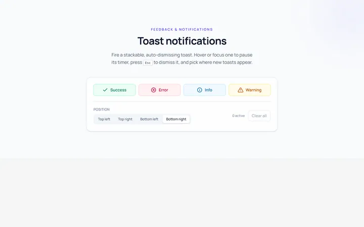
Basic Toast
Originalbasic toast notifications
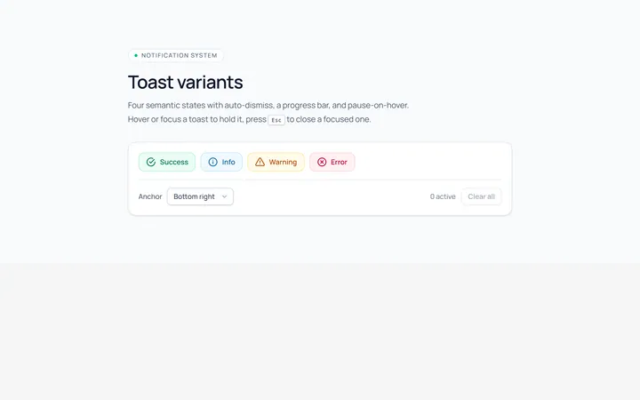
Variants Toast
Originalsuccess/info/warning/error toasts
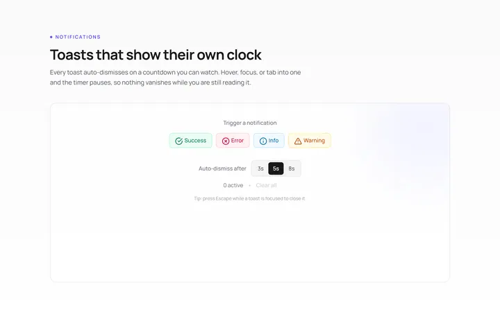
Progress Toast
Originaltoast with auto-dismiss progress
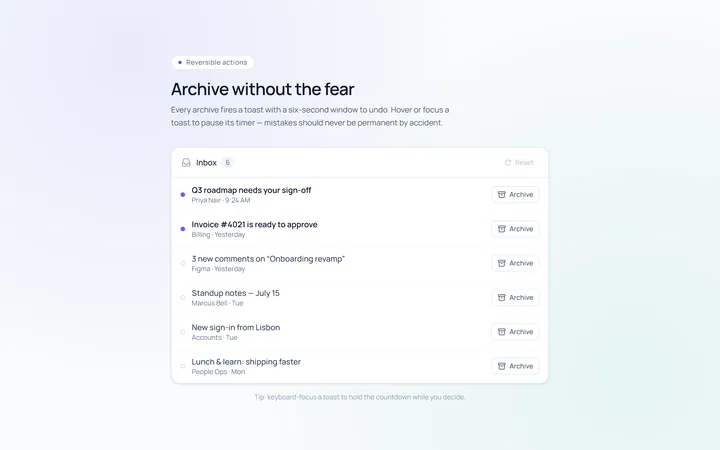
Action Toast
Originaltoast with an undo action
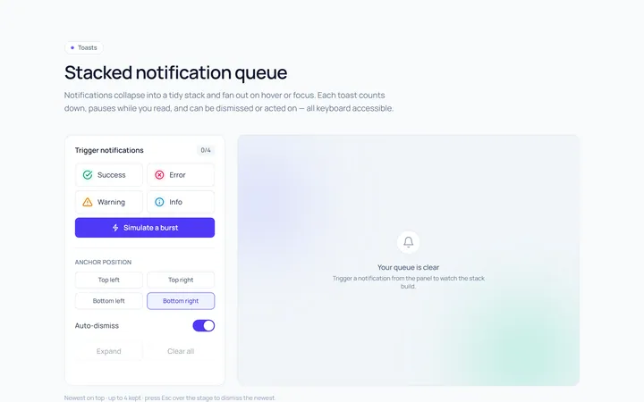
Stacked Toast
Originalstacked toast queue
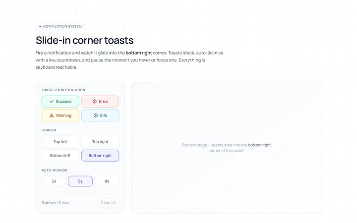
Slide In Toast
Originalslide-in corner toasts
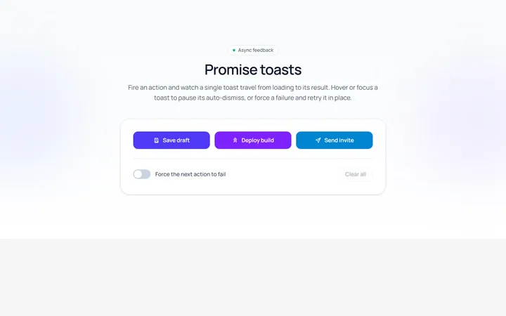
Promise Toast
Originalloading-to-result promise toast
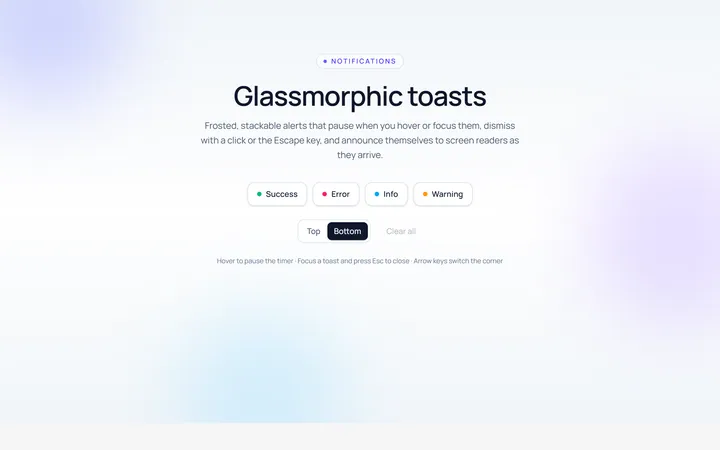
Glass Toast
Originalglassmorphic toasts
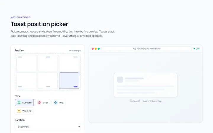
Position Toast
Originaltoast position picker demo

Spotlight Hero
OriginalA centred hero with a soft radial spotlight, badge and dual call-to-action.

Split Hero
OriginalA two-column hero pairing a headline and CTAs with a product mock and social proof.

Gradient Spotlight Hero
OriginalA minimal centred hero with a soft gradient-mesh backdrop, announcement pill and dual call-to-action buttons.