

Variants Toast
Original · freesuccess/info/warning/error toasts
Copy prompt gives Claude Code, Cursor or v0 a ready-to-paste prompt that recreates this exact component.
npx shadcn@latest add https://webinnoventix.com/r/toast-variants.json"use client";
import { useCallback, useEffect, useRef, useState } from "react";
import { AnimatePresence, motion, useReducedMotion } from "motion/react";
type ToastVariant = "success" | "info" | "warning" | "error";
type ToastPosition = "top-right" | "top-left" | "bottom-right" | "bottom-left";
interface ToastData {
id: number;
variant: ToastVariant;
title: string;
message: string;
action: string;
duration: number;
}
interface VariantStyle {
label: string;
role: "status" | "alert";
live: "polite" | "assertive";
chip: string;
bar: string;
accent: string;
trigger: string;
ring: string;
}
const VARIANTS: Record<ToastVariant, VariantStyle> = {
success: {
label: "Success",
role: "status",
live: "polite",
chip: "bg-emerald-100 text-emerald-600 dark:bg-emerald-500/15 dark:text-emerald-400",
bar: "bg-emerald-500 dark:bg-emerald-400",
accent: "text-emerald-700 hover:text-emerald-800 dark:text-emerald-400 dark:hover:text-emerald-300",
trigger:
"border-emerald-200 bg-emerald-50 text-emerald-700 hover:bg-emerald-100 dark:border-emerald-500/25 dark:bg-emerald-500/10 dark:text-emerald-300 dark:hover:bg-emerald-500/20",
ring: "focus-visible:ring-emerald-500",
},
info: {
label: "Info",
role: "status",
live: "polite",
chip: "bg-sky-100 text-sky-600 dark:bg-sky-500/15 dark:text-sky-400",
bar: "bg-sky-500 dark:bg-sky-400",
accent: "text-sky-700 hover:text-sky-800 dark:text-sky-400 dark:hover:text-sky-300",
trigger:
"border-sky-200 bg-sky-50 text-sky-700 hover:bg-sky-100 dark:border-sky-500/25 dark:bg-sky-500/10 dark:text-sky-300 dark:hover:bg-sky-500/20",
ring: "focus-visible:ring-sky-500",
},
warning: {
label: "Warning",
role: "alert",
live: "assertive",
chip: "bg-amber-100 text-amber-600 dark:bg-amber-500/15 dark:text-amber-400",
bar: "bg-amber-500 dark:bg-amber-400",
accent: "text-amber-700 hover:text-amber-800 dark:text-amber-400 dark:hover:text-amber-300",
trigger:
"border-amber-200 bg-amber-50 text-amber-700 hover:bg-amber-100 dark:border-amber-500/25 dark:bg-amber-500/10 dark:text-amber-300 dark:hover:bg-amber-500/20",
ring: "focus-visible:ring-amber-500",
},
error: {
label: "Error",
role: "alert",
live: "assertive",
chip: "bg-rose-100 text-rose-600 dark:bg-rose-500/15 dark:text-rose-400",
bar: "bg-rose-500 dark:bg-rose-400",
accent: "text-rose-700 hover:text-rose-800 dark:text-rose-400 dark:hover:text-rose-300",
trigger:
"border-rose-200 bg-rose-50 text-rose-700 hover:bg-rose-100 dark:border-rose-500/25 dark:bg-rose-500/10 dark:text-rose-300 dark:hover:bg-rose-500/20",
ring: "focus-visible:ring-rose-500",
},
};
const PRESETS: Record<ToastVariant, Omit<ToastData, "id">> = {
success: {
variant: "success",
title: "Deployment live",
message: "webinnoventix.com shipped to production in 42s across 14 edge regions.",
action: "View build",
duration: 6000,
},
info: {
variant: "info",
title: "New teammate invited",
message: "Priya Nair now has editor access to the Marketing workspace.",
action: "Manage roles",
duration: 6000,
},
warning: {
variant: "warning",
title: "Storage almost full",
message: "You've used 92% of your 50 GB plan. Archive old assets to keep exporting.",
action: "Upgrade plan",
duration: 7000,
},
error: {
variant: "error",
title: "Payment failed",
message: "The card ending 4218 was declined. Update billing to keep publishing.",
action: "Retry payment",
duration: 8000,
},
};
const ORDER: ToastVariant[] = ["success", "info", "warning", "error"];
const MAX_TOASTS = 4;
function VariantIcon({ variant }: { variant: ToastVariant }) {
const common = {
width: 20,
height: 20,
viewBox: "0 0 24 24",
fill: "none",
stroke: "currentColor",
strokeWidth: 2,
strokeLinecap: "round" as const,
strokeLinejoin: "round" as const,
"aria-hidden": true,
};
if (variant === "success") {
return (
<svg {...common}>
<path d="M21.5 12a9.5 9.5 0 1 1-4.9-8.3" />
<path d="m8.5 11.5 3 3 8-8.5" />
</svg>
);
}
if (variant === "info") {
return (
<svg {...common}>
<circle cx="12" cy="12" r="9.5" />
<path d="M12 11v5" />
<path d="M12 7.6h.01" />
</svg>
);
}
if (variant === "warning") {
return (
<svg {...common}>
<path d="M10.3 3.3 1.9 17.6A2 2 0 0 0 3.6 20.6h16.8a2 2 0 0 0 1.7-3l-8.4-14.3a2 2 0 0 0-3.4 0Z" />
<path d="M12 9.5v4" />
<path d="M12 17h.01" />
</svg>
);
}
return (
<svg {...common}>
<circle cx="12" cy="12" r="9.5" />
<path d="m15 9-6 6" />
<path d="m9 9 6 6" />
</svg>
);
}
function CloseIcon() {
return (
<svg
width={16}
height={16}
viewBox="0 0 24 24"
fill="none"
stroke="currentColor"
strokeWidth={2}
strokeLinecap="round"
strokeLinejoin="round"
aria-hidden="true"
>
<path d="M18 6 6 18" />
<path d="m6 6 12 12" />
</svg>
);
}
interface ToastItemProps {
toast: ToastData;
onDismiss: (id: number) => void;
reduce: boolean;
side: 1 | -1;
edge: 1 | -1;
}
function ToastItem({ toast, onDismiss, reduce, side, edge }: ToastItemProps) {
const style = VARIANTS[toast.variant];
const [paused, setPaused] = useState(false);
const timerRef = useRef<number | null>(null);
const remainingRef = useRef(toast.duration);
const startRef = useRef(0);
const clearTimer = useCallback(() => {
if (timerRef.current !== null) {
window.clearTimeout(timerRef.current);
timerRef.current = null;
}
}, []);
const startTimer = useCallback(() => {
startRef.current = Date.now();
timerRef.current = window.setTimeout(() => onDismiss(toast.id), remainingRef.current);
}, [onDismiss, toast.id]);
useEffect(() => {
if (paused) {
clearTimer();
remainingRef.current = Math.max(0, remainingRef.current - (Date.now() - startRef.current));
} else {
startTimer();
}
return clearTimer;
}, [paused, startTimer, clearTimer]);
const enter = reduce
? { opacity: 0 }
: { opacity: 0, x: side * 36, y: edge * 6, scale: 0.94 };
const shown = reduce
? { opacity: 1 }
: { opacity: 1, x: 0, y: 0, scale: 1 };
const leave = reduce
? { opacity: 0 }
: { opacity: 0, x: side * 36, scale: 0.92 };
return (
<motion.li
layout={reduce ? false : "position"}
initial={enter}
animate={shown}
exit={leave}
transition={{ type: "spring", stiffness: 420, damping: 34, mass: 0.7 }}
role={style.role}
aria-live={style.live}
aria-atomic="true"
tabIndex={0}
onMouseEnter={() => setPaused(true)}
onMouseLeave={() => setPaused(false)}
onFocus={() => setPaused(true)}
onBlur={() => setPaused(false)}
onKeyDown={(e) => {
if (e.key === "Escape") {
e.stopPropagation();
onDismiss(toast.id);
}
}}
className="pointer-events-auto relative w-full max-w-sm overflow-hidden rounded-2xl border border-slate-200 bg-white/95 shadow-xl shadow-slate-900/10 outline-none backdrop-blur transition-shadow focus-visible:ring-2 focus-visible:ring-slate-400 focus-visible:ring-offset-2 focus-visible:ring-offset-white dark:border-slate-700/70 dark:bg-slate-900/95 dark:shadow-black/40 dark:focus-visible:ring-slate-500 dark:focus-visible:ring-offset-slate-950"
>
<div className="flex items-start gap-3 p-4 pr-10">
<span
className={`mt-0.5 grid h-9 w-9 shrink-0 place-items-center rounded-xl ${style.chip}`}
>
<span className={reduce ? "" : "tv-pop"}>
<VariantIcon variant={toast.variant} />
</span>
</span>
<div className="min-w-0 flex-1">
<p className="text-sm font-semibold leading-5 text-slate-900 dark:text-slate-50">
{toast.title}
</p>
<p className="mt-1 text-sm leading-5 text-slate-600 dark:text-slate-300">
{toast.message}
</p>
<div className="mt-2.5 flex items-center gap-3">
<button
type="button"
onClick={() => onDismiss(toast.id)}
className={`rounded-md text-sm font-semibold underline-offset-2 hover:underline focus-visible:outline-none focus-visible:ring-2 focus-visible:ring-offset-2 focus-visible:ring-offset-white dark:focus-visible:ring-offset-slate-900 ${style.accent} ${style.ring}`}
>
{toast.action}
</button>
<button
type="button"
onClick={() => onDismiss(toast.id)}
className="rounded-md text-sm font-medium text-slate-500 underline-offset-2 hover:text-slate-700 hover:underline focus-visible:outline-none focus-visible:ring-2 focus-visible:ring-slate-400 focus-visible:ring-offset-2 focus-visible:ring-offset-white dark:text-slate-400 dark:hover:text-slate-200 dark:focus-visible:ring-slate-500 dark:focus-visible:ring-offset-slate-900"
>
Dismiss
</button>
</div>
</div>
</div>
<button
type="button"
onClick={() => onDismiss(toast.id)}
aria-label={`Close ${style.label.toLowerCase()} notification: ${toast.title}`}
className="absolute right-2.5 top-2.5 grid h-7 w-7 place-items-center rounded-lg text-slate-400 transition-colors hover:bg-slate-100 hover:text-slate-600 focus-visible:outline-none focus-visible:ring-2 focus-visible:ring-slate-400 dark:text-slate-500 dark:hover:bg-slate-800 dark:hover:text-slate-200 dark:focus-visible:ring-slate-500"
>
<CloseIcon />
</button>
<div className="absolute inset-x-0 bottom-0 h-1 bg-slate-200/70 dark:bg-slate-800">
<div
className={`h-full origin-left ${style.bar} ${reduce ? "" : "tv-shrink"}`}
style={
reduce
? { transform: "scaleX(1)" }
: {
animationDuration: `${toast.duration}ms`,
animationPlayState: paused ? "paused" : "running",
}
}
/>
</div>
</motion.li>
);
}
const POS_CLASS: Record<ToastPosition, string> = {
"top-right": "top-0 right-0 items-end",
"top-left": "top-0 left-0 items-start",
"bottom-right": "bottom-0 right-0 items-end flex-col-reverse",
"bottom-left": "bottom-0 left-0 items-start flex-col-reverse",
};
const POS_LABEL: Record<ToastPosition, string> = {
"top-right": "Top right",
"top-left": "Top left",
"bottom-right": "Bottom right",
"bottom-left": "Bottom left",
};
const POSITIONS: ToastPosition[] = ["top-right", "top-left", "bottom-right", "bottom-left"];
export default function ToastVariants() {
const prefersReduced = useReducedMotion();
const reduce = !!prefersReduced;
const [toasts, setToasts] = useState<ToastData[]>([]);
const [position, setPosition] = useState<ToastPosition>("bottom-right");
const idRef = useRef(1);
const dismiss = useCallback((id: number) => {
setToasts((prev) => prev.filter((t) => t.id !== id));
}, []);
const push = useCallback((variant: ToastVariant) => {
setToasts((prev) => {
const next: ToastData = { ...PRESETS[variant], id: idRef.current++ };
const merged = [next, ...prev];
return merged.slice(0, MAX_TOASTS);
});
}, []);
const side: 1 | -1 = position.endsWith("right") ? 1 : -1;
const edge: 1 | -1 = position.startsWith("top") ? -1 : 1;
return (
<section className="relative w-full overflow-hidden bg-slate-50 px-5 py-20 text-slate-900 dark:bg-slate-950 dark:text-slate-100 sm:px-8 sm:py-24">
<style>{`
@keyframes tv-shrink {
from { transform: scaleX(1); }
to { transform: scaleX(0); }
}
@keyframes tv-pop {
0% { transform: scale(0.4); opacity: 0; }
60% { transform: scale(1.12); opacity: 1; }
100% { transform: scale(1); opacity: 1; }
}
.tv-shrink {
animation-name: tv-shrink;
animation-timing-function: linear;
animation-fill-mode: forwards;
}
.tv-pop {
display: inline-flex;
animation: tv-pop 420ms cubic-bezier(0.34, 1.56, 0.64, 1) both;
}
@media (prefers-reduced-motion: reduce) {
.tv-shrink, .tv-pop { animation: none !important; }
}
`}</style>
<div
aria-hidden="true"
className="pointer-events-none absolute inset-0 opacity-[0.6] [background-image:radial-gradient(circle_at_1px_1px,rgb(100_116_139/0.14)_1px,transparent_0)] [background-size:22px_22px] dark:opacity-40 dark:[background-image:radial-gradient(circle_at_1px_1px,rgb(148_163_184/0.12)_1px,transparent_0)]"
/>
<div className="relative mx-auto max-w-3xl">
<span className="inline-flex items-center gap-2 rounded-full border border-slate-200 bg-white px-3 py-1 text-xs font-semibold uppercase tracking-widest text-slate-500 dark:border-slate-800 dark:bg-slate-900 dark:text-slate-400">
<span className="h-1.5 w-1.5 rounded-full bg-emerald-500" />
Notification system
</span>
<h2 className="mt-5 text-3xl font-semibold tracking-tight text-slate-900 dark:text-white sm:text-4xl">
Toast variants
</h2>
<p className="mt-3 max-w-xl text-base leading-7 text-slate-600 dark:text-slate-400">
Four semantic states with auto-dismiss, a progress bar, and pause-on-hover. Hover
or focus a toast to hold it, press{" "}
<kbd className="rounded border border-slate-300 bg-white px-1.5 py-0.5 font-mono text-xs text-slate-700 shadow-sm dark:border-slate-700 dark:bg-slate-800 dark:text-slate-200">
Esc
</kbd>{" "}
to close a focused one.
</p>
<div className="mt-8 rounded-2xl border border-slate-200 bg-white p-5 shadow-sm dark:border-slate-800 dark:bg-slate-900/60">
<div className="flex flex-wrap items-center gap-2.5">
{ORDER.map((v) => (
<button
key={v}
type="button"
onClick={() => push(v)}
className={`inline-flex items-center gap-2 rounded-xl border px-3.5 py-2 text-sm font-semibold transition-colors focus-visible:outline-none focus-visible:ring-2 focus-visible:ring-offset-2 focus-visible:ring-offset-white dark:focus-visible:ring-offset-slate-900 ${VARIANTS[v].trigger} ${VARIANTS[v].ring}`}
>
<VariantIcon variant={v} />
{VARIANTS[v].label}
</button>
))}
</div>
<div className="mt-4 flex flex-wrap items-center justify-between gap-4 border-t border-slate-200 pt-4 dark:border-slate-800">
<div className="flex items-center gap-2.5">
<label
htmlFor="tv-position"
className="text-sm font-medium text-slate-600 dark:text-slate-400"
>
Anchor
</label>
<div className="relative">
<select
id="tv-position"
value={position}
onChange={(e) => setPosition(e.target.value as ToastPosition)}
className="appearance-none rounded-lg border border-slate-300 bg-white py-1.5 pl-3 pr-9 text-sm font-medium text-slate-700 shadow-sm focus-visible:outline-none focus-visible:ring-2 focus-visible:ring-indigo-500 focus-visible:ring-offset-2 focus-visible:ring-offset-white dark:border-slate-700 dark:bg-slate-800 dark:text-slate-200 dark:focus-visible:ring-indigo-400 dark:focus-visible:ring-offset-slate-900"
>
{POSITIONS.map((p) => (
<option key={p} value={p}>
{POS_LABEL[p]}
</option>
))}
</select>
<svg
aria-hidden="true"
className="pointer-events-none absolute right-2.5 top-1/2 -translate-y-1/2 text-slate-400"
width={16}
height={16}
viewBox="0 0 24 24"
fill="none"
stroke="currentColor"
strokeWidth={2}
strokeLinecap="round"
strokeLinejoin="round"
>
<path d="m6 9 6 6 6-6" />
</svg>
</div>
</div>
<div className="flex items-center gap-3">
<span
aria-live="polite"
className="text-sm tabular-nums text-slate-500 dark:text-slate-400"
>
{toasts.length} active
</span>
<button
type="button"
onClick={() => setToasts([])}
disabled={toasts.length === 0}
className="rounded-lg border border-slate-300 bg-white px-3 py-1.5 text-sm font-semibold text-slate-700 shadow-sm transition-colors hover:bg-slate-50 disabled:cursor-not-allowed disabled:opacity-45 focus-visible:outline-none focus-visible:ring-2 focus-visible:ring-slate-400 focus-visible:ring-offset-2 focus-visible:ring-offset-white dark:border-slate-700 dark:bg-slate-800 dark:text-slate-200 dark:hover:bg-slate-700 dark:focus-visible:ring-slate-500 dark:focus-visible:ring-offset-slate-900"
>
Clear all
</button>
</div>
</div>
</div>
</div>
<div
role="region"
aria-label="Notifications"
className={`pointer-events-none absolute z-20 flex w-full max-w-sm flex-col gap-3 p-4 sm:p-6 ${POS_CLASS[position]}`}
>
<AnimatePresence initial={false}>
{toasts.map((t) => (
<ToastItem
key={t.id}
toast={t}
onDismiss={dismiss}
reduce={reduce}
side={side}
edge={edge}
/>
))}
</AnimatePresence>
</div>
</section>
);
}Dependencies
Licence
Built by Web Innoventix. Free for personal and commercial use, no attribution required.
Built by Web Innoventix
Need a custom interface, a full website, or SEO that gets you cited by AI? We design, build and rank it end to end.
Get a free quoteSimilar components
Browse all →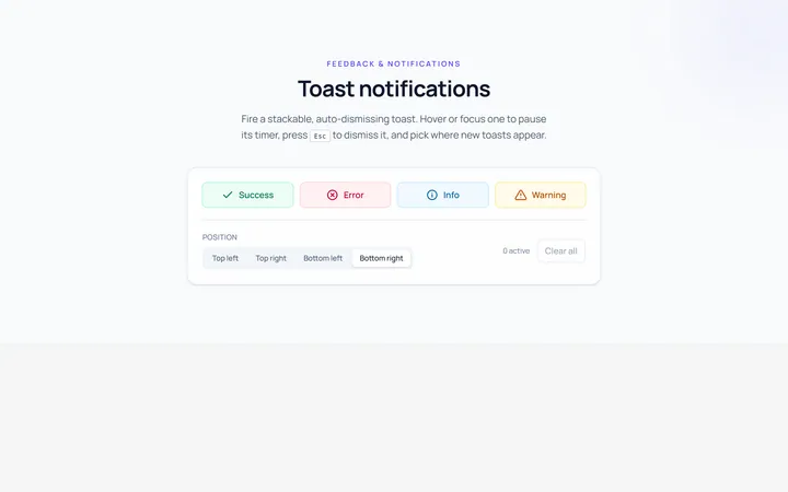
Basic Toast
Originalbasic toast notifications
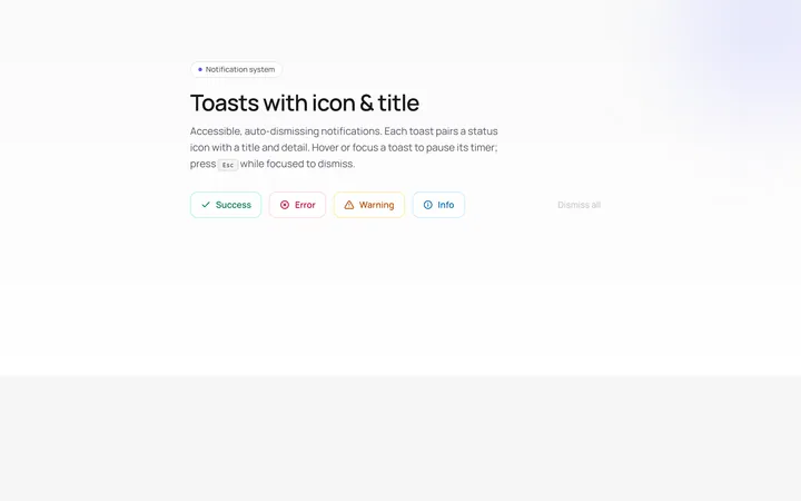
Icon Toast
Originaltoasts with icon and title
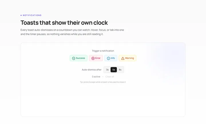
Progress Toast
Originaltoast with auto-dismiss progress
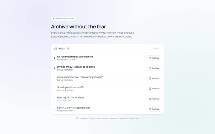
Action Toast
Originaltoast with an undo action
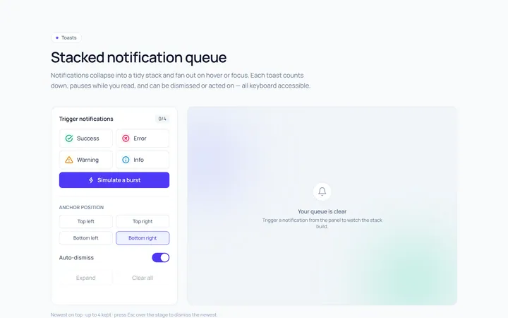
Stacked Toast
Originalstacked toast queue
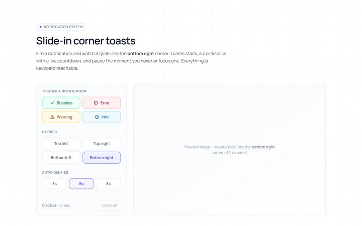
Slide In Toast
Originalslide-in corner toasts
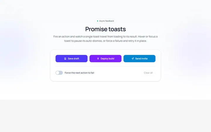
Promise Toast
Originalloading-to-result promise toast
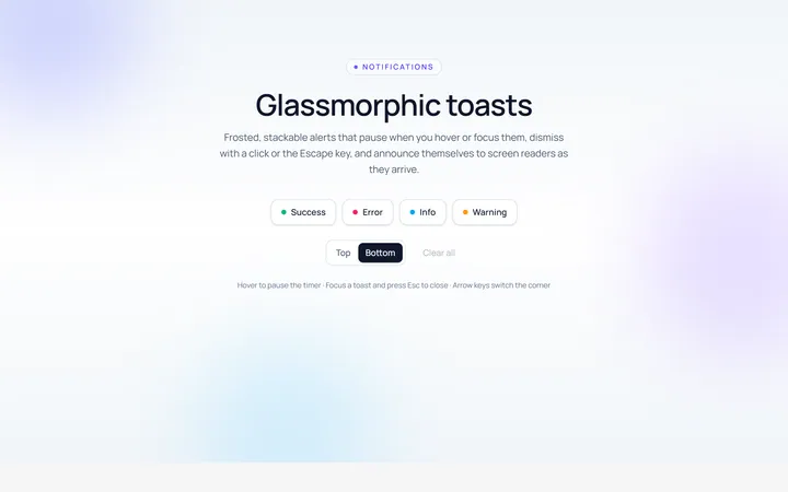
Glass Toast
Originalglassmorphic toasts
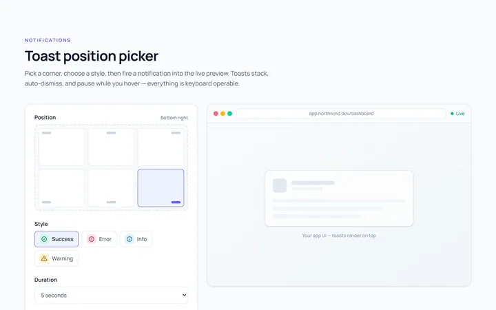
Position Toast
Originaltoast position picker demo

Spotlight Hero
OriginalA centred hero with a soft radial spotlight, badge and dual call-to-action.

Split Hero
OriginalA two-column hero pairing a headline and CTAs with a product mock and social proof.

Gradient Spotlight Hero
OriginalA minimal centred hero with a soft gradient-mesh backdrop, announcement pill and dual call-to-action buttons.