Overview
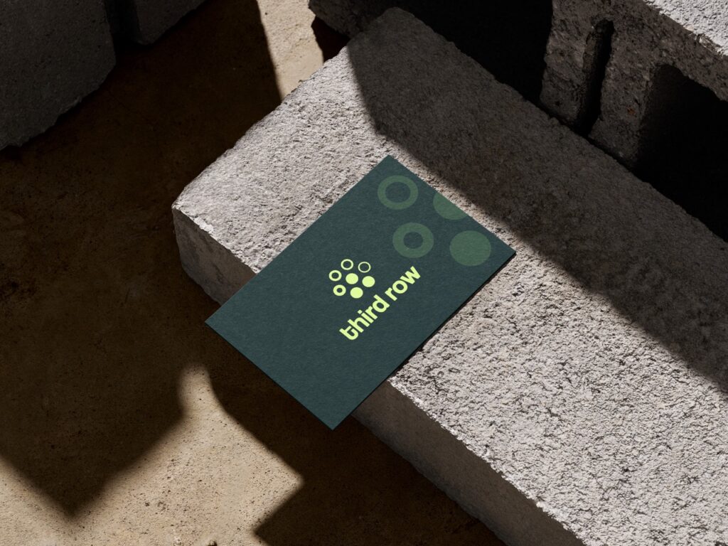
Third Row is a ticket booking app designed for everyday audiences — not the VIP crowd, but the fans in the third row. The platform focuses on accessibility, inclusivity, and creating shared event experiences for concerts, hackathons, and community gatherings. The brand needed a logo that would symbolize participation, connection, and upward growth — all while staying simple, bold, and mobile-friendly.
Focus Areas: Logo Design, Brand Symbolism, App Identity
Platform: Mobile App, Website, Event Collateral
Objective
To design a brandmark that embodies Third Row’s values of inclusivity, accessibility, and growth by:
Visually representing both booked and available seats in a symbolic form
Creating a modern and friendly identity using geometric elements
Using a color scheme that reflects energy, connection, and approachability
Ensuring the logo is scalable and app-ready for digital environments

Our Approach
To bring Third Row’s vision to life, we focused on designing a logo that visually communicates accessibility, growth, and a sense of belonging for everyday event-goers.
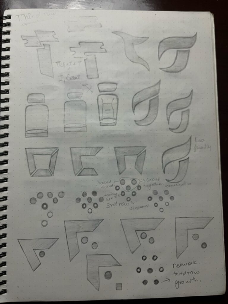
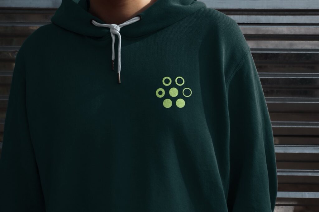
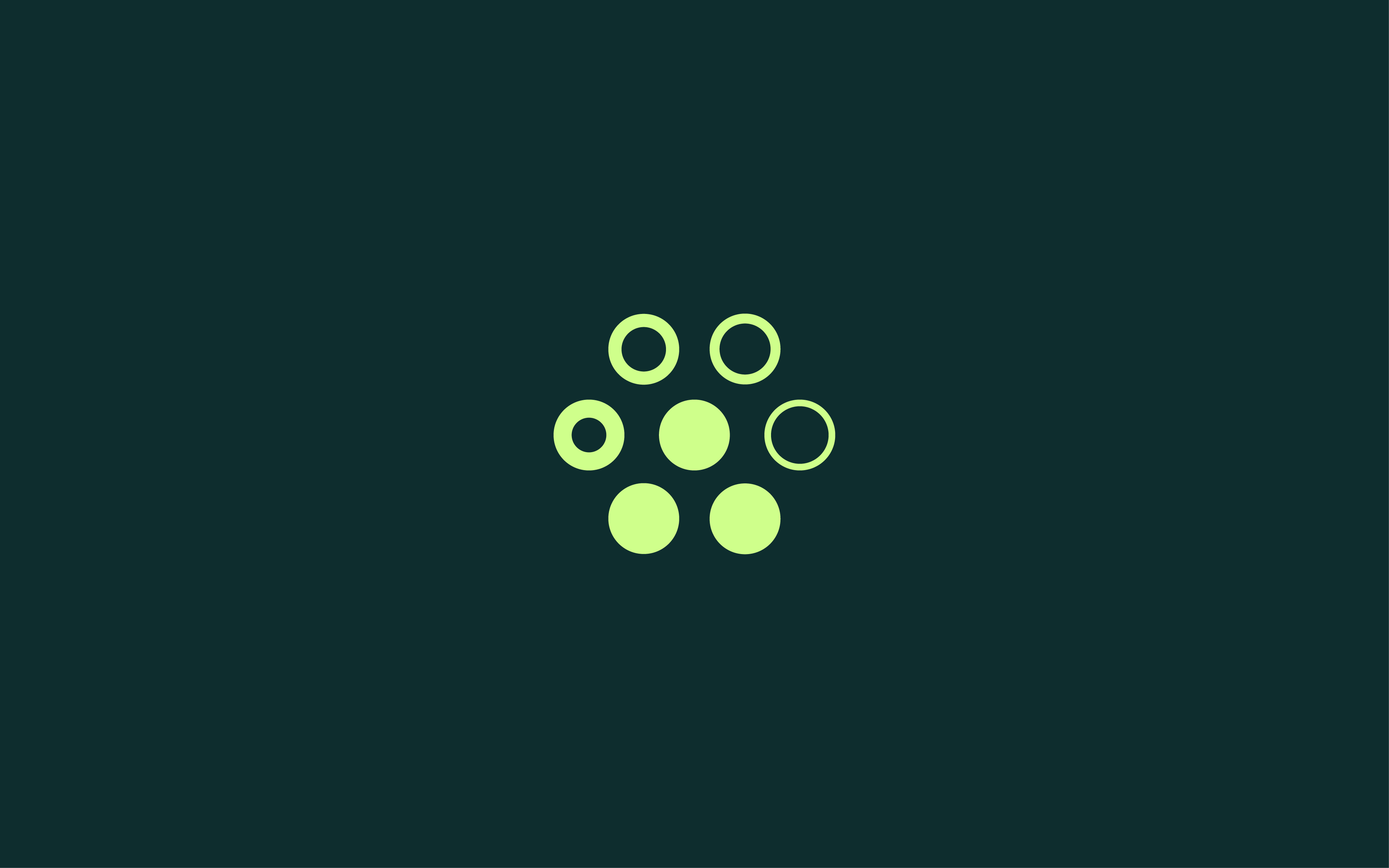
Developed a 7-circle icon, symbolizing unity and audience participation.
Positioned 3 filled circles below and 4 semi-filled above, forming an upward arrow to represent booked seats, availability, and growth.
Selected a dual-tone green palette to reflect freshness, positivity, and event excitement.
Used Coolvetica, a modern and bold typeface, to give the logo a vibrant, youthful presence.

Our Process
Understanding the Spirit of Shared Experiences
We began by exploring what makes Third Row unique — not front-row exclusivity, but the collective energy of shared events and community participation. Our focus was to visually represent a brand built for inclusivity and excitement.
Conducted discovery sessions with the client to understand brand values, goals, and audience sentiment
Identified key emotional drivers: belonging, accessibility, and momentum
Analyzed ticketing and community-based apps for insights into symbolism and layout clarity
Defined core brand pillars: inclusive energy, movement, and digital-friendliness
This groundwork ensured the logo would reflect both the identity and purpose behind Third Row.
Designing for Symbolism and Simplicity
With a strong strategic foundation, we began sketching ideas that translate seating, participation, and connection into a simple yet meaningful mark.
Explored visual concepts based on rows, audiences, tickets, and movement
Developed the 7-circle structure, representing both audience seats and upward progress
Conceptualized an arrow-like form using filled and semi-filled circles to depict booking and availability
Presented multiple layouts (icon-only, vertical lockup, horizontal pairing) for flexibility
We chose the upward-facing design as it most effectively conveyed Third Row’s sense of community and aspiration.
Bringing Clarity and Boldness to the Symbol
Once the concept was chosen, we refined the logo to ensure consistency, clarity, and impact across all scales and use cases.
Perfected spacing and alignment between the seven circles for optimal visual harmony
Tested icon legibility at small sizes, ensuring clarity on mobile app icons and favicons
Paired the symbol with a bold sans-serif typeface (Coolvetica) to balance friendliness with strength
Created logo variations (monochrome, flat, inverse) for flexibility across print and digital
This phase resulted in a dynamic symbol that’s simple yet expressive — designed for modern users on the move.
Reflecting Energy and Connection
The color palette and typography were chosen to amplify Third Row’s values of energy, freshness, and human connection.
Applied a dual green palette to symbolize renewal, growth, and excitement
Balanced vibrant tones with soft visual edges for digital friendliness
Selected typeface weights that feel bold yet inviting — a nod to inclusivity without compromising clarity
Built spacing and padding rules to ensure adaptability across marketing and UI applications
The resulting system is vibrant, optimistic, and clearly aligned with the brand’s identity and voice.
Building for Real-World Use
We tested the logo in real-world scenarios to validate usability across all environments — from app icons to banners.
Placed the logo in mobile screens, app stores, social banners, and print templates
Adjusted visual weight for strong contrast in dark/light modes
Confirmed visibility in compact formats like buttons and toolbars
Delivered pre-launch visual mockups to preview brand impact in action
Each iteration ensured the logo retained integrity and meaning across channels and use cases.
Scalable Identity, Ready for Rollout
Our final delivery empowered Third Row with a complete, flexible identity system — from vector-ready logos to branding tools.
Deliverables included:
Logo files in SVG, PNG, PDF, EPS formats (color, mono, inverse versions)
Typography and color codes with usage guidelines
Icon-only and lockup variants for app, signage, and merchandise
Mini brand guide with safe zone, scaling tips, and visual do’s/don’ts
The result: a playful yet purpose-driven identity that resonates with Third Row’s mission — bringing people together through inclusive, engaging event experiences.
Key Outcomes
The final logo system creates a visual metaphor for inclusivity and progress, delivering a unique identity that speaks directly to Third Row’s audience.
Symbolic and Memorable: The 7-circle structure stands out and communicates both availability and engagement
User-Centric Identity: Friendly design with a strong upward motif resonates with everyday event-goers
Digital-Ready: Highly scalable and clear for mobile, app icons, and digital marketing materials
Brand-Aligned Aesthetic: Color palette and typography reflect the brand’s core values of connection, positivity, and growth
More Portfolios
"Web Innoventix understood exactly what we needed — not just a logo, but a brand that speaks to our purpose. The way they translated our vision into a symbol of growth and connection was brilliant. It’s now something our users instantly resonate with."
Vikrant, Founder of Third row

Monday – Saturday : 9.00 am – 10:30 pm