Overview
Smart Side is a web development company known for delivering smart, user-focused, and innovative digital solutions. The brand helps businesses build strong online identities through intuitive websites and smart design thinking. When they approached us, they were looking for a logo that would capture the dual essence of innovation and growth — visually representing their name and values.
Objective
To design a logo that reflects Smart Side’s creative problem-solving and technological expertise by:
Combining nature and innovation in a single visual metaphor
Communicating intelligence, clarity, and professionalism through symbolic design
Using negative space creatively to stand out
Ensuring adaptability across digital and brand platforms
Our Approach
We developed a logo concept that fuses the shape of a tree and a bulb to deliver a modern yet meaningful identity.
Tree as a Symbol of Growth: The tree structure represents development, evolution, and Smart Side’s ability to help clients scale and grow digitally
Bulb in Negative Space: At the center of the tree sits a bulb crafted from negative space — symbolizing bright ideas, innovation, and the “smart” thinking behind their web solutions
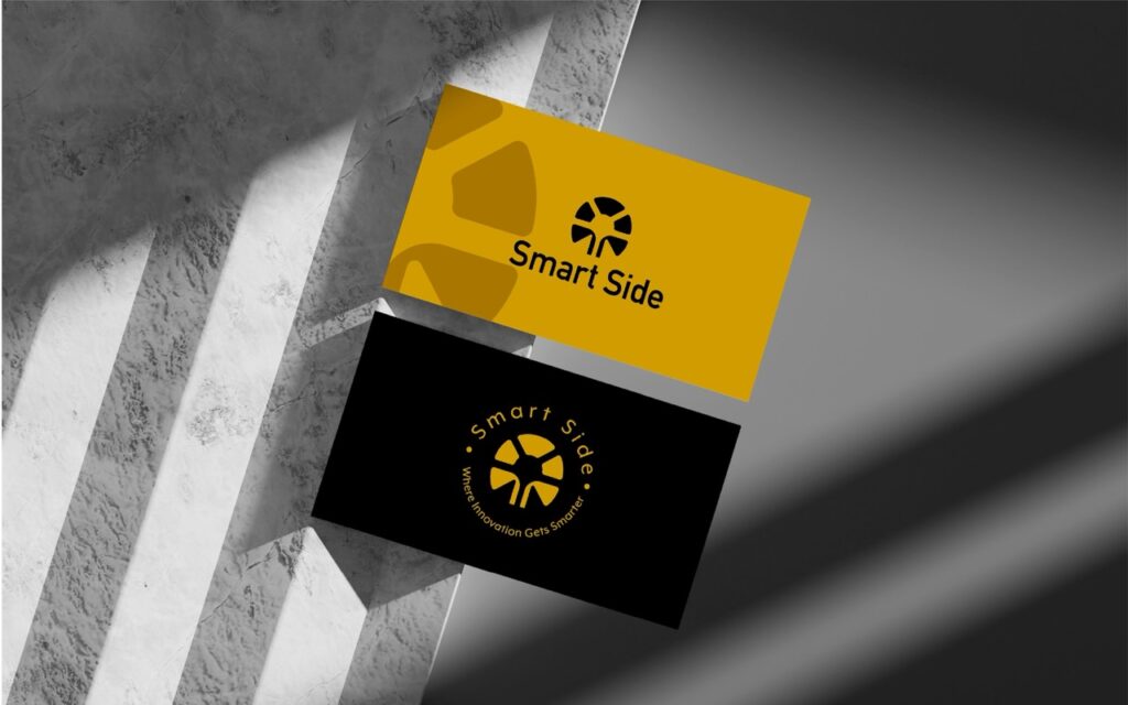
Color Palette:
Yellow: Stands for energy, positivity, and creative ideas — aligning with the dynamic nature of their work
Black: Adds contrast, strength, and professionalism
White: Used for clarity and contrast, enhancing the impact of the negative space bulb
Minimalist Execution: Designed to be sharp, scalable, and instantly recognizable across formats
Our Process
Understanding the Smart Side Philosophy
We kicked off the project with discovery workshops to understand Smart Side’s unique personality and business goals. The team emphasized their dual focus: technical excellence and human-centered design.
Key Areas of Exploration:
How do clients perceive “smart” design, and how can we reflect that?
What visual metaphors can unify innovation with growth?
Which brand traits are essential: trust, creativity, or structure?
We translated these insights into a clear creative direction that positioned Smart Side as a forward-thinking, approachable tech partner — not just a service provider..
Blending Symbolism with Structure
With strategy in place, we began exploring visual metaphors that combine growth (tree) and bright ideas (bulb) — forming a strong symbol that reflects both client growth and digital problem-solving.
Design Focus:
Designed a tree with a bulb formed from negative space — subtle, smart, and scalable
Explored balance between minimalism and symbolic depth
Sketched multiple arrangements to find the most harmonious visual form
This phase involved rigorous sketching and iteration to ensure the identity felt clever but not gimmicky, symbolic yet professional.
Infusing Energy and Elegance
We selected typography and a color system that would reflect clarity, creativity, and professionalism — supporting the logo’s impact without overwhelming it.
Typography & Color Decisions:
Used a rounded sans-serif font to enhance readability and modernity
Applied yellow to represent creativity, clarity, and optimism
Paired with black and white to anchor the design and maintain contrast
Ensured ADA-compliant color ratios for accessibility
We also defined color usage rules across print and digital for consistent brand recall — from pitch decks to social banners.
Designing for Real-World Impact
With client feedback, we refined the logo to ensure pixel-perfect scalability and visual harmony across sizes and formats.
Final Refinements Included:
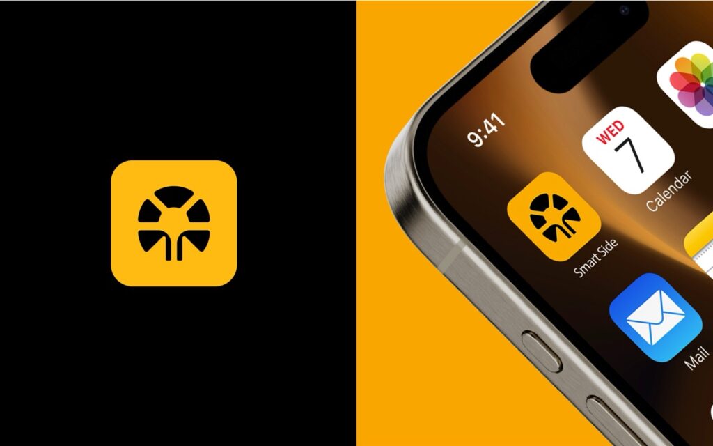
Created variants for web icons, footers, app interfaces, and developer platforms
Tuned line weights and spacing for high-resolution and mobile clarity
Developed logo lockups with taglines for marketing needs
We ensured Smart Side’s identity performs whether it’s displayed on a laptop header or engraved on a pen — keeping the same visual impact.
Validating the Logo in Action
To ensure adaptability, we tested the logo across real-world scenarios and brand applications.
Mockup Use Cases:
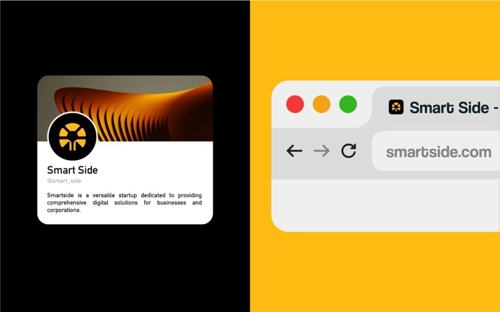
Website headers, browser tabs, and favicons
Digital proposals, investor pitch decks, and case studies
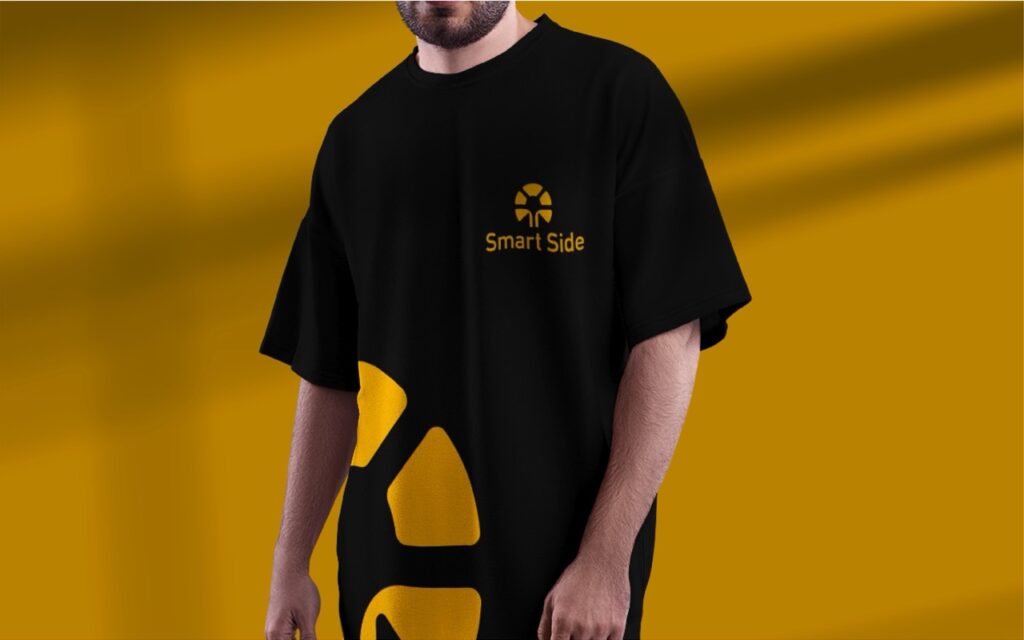
Swag items like tote bags, mousepads, and branded apparel
Each version held up across print, digital, and merchandise — ensuring consistency and professionalism wherever the brand appeared.
Future-Ready for Digital Growth
We didn’t just deliver a great logo — we delivered a future-ready brand system that can grow with Smart Side’s evolving services and audience.
Scalability Highlights:
Modular identity adaptable to new services or branded tools
Versatile across video intros, email footers, social icons, and developer portals
Included brand guidelines, safe zones, logo misuse rules, and alternate layouts
Created a monochrome and grayscale version for technical integrations
Bonus: We also packaged a simple starter brand kit so Smart Side’s internal team and collaborators can use the assets efficiently across platforms.
Key Outcomes
The final logo captured the spirit of Smart Side with a refined yet clever design that blends innovation with purpose.
Creative + Professional Identity: The tree-bulb combo communicates a forward-thinking, solution-driven mindset
Memorable Symbolism: The creative use of negative space for the bulb enhances uniqueness and brand recall
Adaptable and Clean: Works across dark/light backgrounds and all brand touchpoints
Modern but Relatable: Balances abstract creativity with a structured, clean finish
More Portfolios
"Working with Web Innoventix was a turning point for our brand. We had a concept in mind but weren’t sure how to bring it to life. They created a logo that wasn’t just visually striking but carried meaning — innovation, growth, and clarity. It’s become a key part of how we present ourselves, and we've seen real traction in connecting with our target audience."
Rajiv, Founder of Smart side

Monday – Saturday : 9.00 am – 10:30 pm