Overview
Skylark is a tech-driven startup focused on enhancing camera visibility in foggy and smoky conditions. Their innovative solutions are designed to provide clarity in low-visibility environments, improving surveillance, monitoring, and security across critical applications. The brand needed a powerful visual identity that reflects its technological edge, commitment to protection, and reliability in challenging conditions.
Focus Areas: Logo Design
Platform: Surveillance Tech, Security Infrastructure, B2B Applications
Objective
To craft a logo that communicates Skylark’s innovation, clarity, and focus on visibility enhancement by:
Designing a symbol that represents security and technology through clear visual metaphors
Incorporating modern and meaningful negative space into the logo form
Selecting a palette that conveys trust, professionalism, and innovation
Ensuring the identity is bold, recognizable, and scalable across tech interfaces and print materials
Our Approach
We developed a strategic identity that visually connects technology and protection in a sleek and intelligent manner.
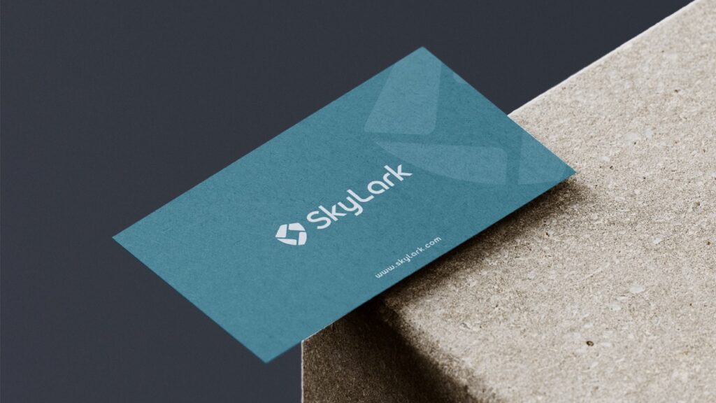
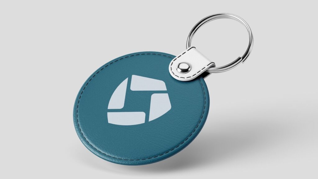
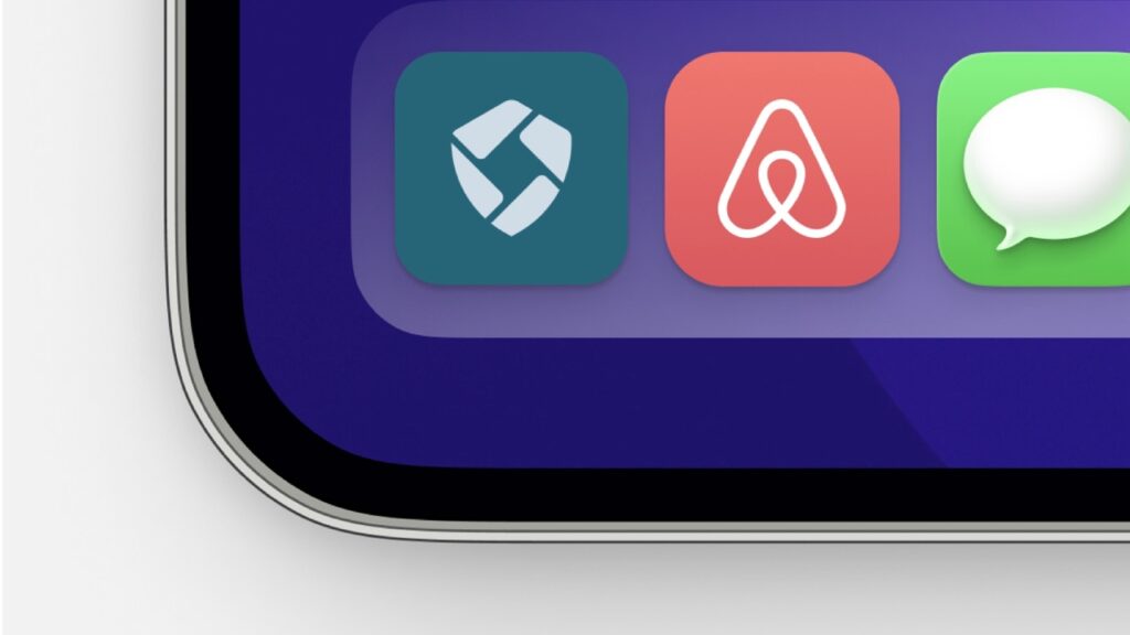
Shield Iconography: The primary shape of the logo is a shield — symbolizing strength, protection, and the secure nature of Skylark’s solution
Camera Frame in Negative Space: A square frame within the shield cleverly represents a security camera, aligning the brand with vision, precision, and clarity
Color Psychology: A tech-forward bluish green reflects innovation and trust, while light grey adds a sophisticated, modern contrast
Minimal Yet Meaningful: The design maintains simplicity while integrating core brand themes of clarity and protection for a high-impact result
Our Process
Understanding the Technology and Its Impact
We began the project by learning how Skylark’s solution enhances visibility in harsh conditions like fog and smoke. This helped us define a visual direction that reflects the brand’s protective, precision-focused value proposition.
Key areas of exploration:
What visual language best reflects clarity and vision in low-visibility scenarios?
How can we balance innovation with a sense of trust and protection?
What symbols would resonate with both B2B clients and tech adopters?
Our discovery phase laid the foundation for a logo that feels smart, strong, and reliable.
Designing for Clarity and Strength
With clarity and security as our design pillars, we began developing initial logo concepts that merged technical form with symbolic depth.
Concept decisions:
A shield structure was chosen to represent protection and safety
Integrated a square frame in negative space — mimicking a camera lens to tie in visual precision
Created a sharp, geometric outline for a modern, futuristic look
The goal was to communicate the brand’s core mission with a single, compact visual.
Expressing Innovation and Trust
We refined the visual tone of the brand through thoughtful selection of colors and type.
Highlights include:
Bluish Green: Represents clarity, tech-forward thinking, and dependability
Light Grey: Adds contrast and a sense of stability and neutrality
Typography: Chose a bold, modern sans-serif that feels clean and confident
This combination allowed the logo to stay visually accessible while emphasizing Skylark’s cutting-edge nature.
Making Every Element Work
We refined the logo to ensure perfect balance between form and function — ensuring clarity at all scales.
Key refinements:
Adjusted line weights and spacing to maintain icon sharpness on all screen sizes
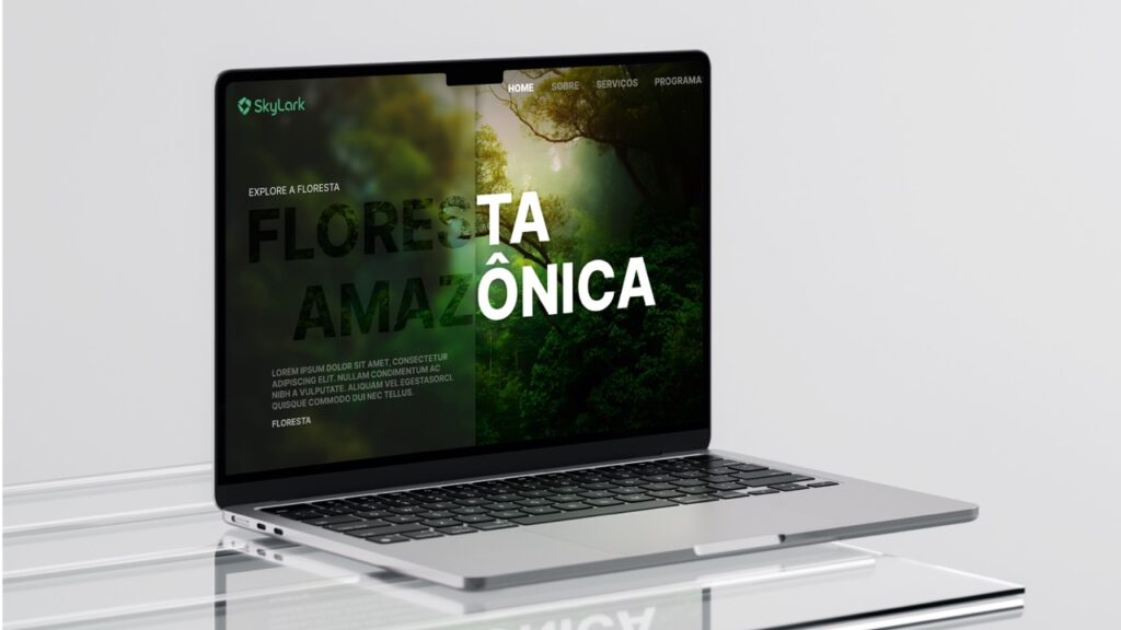
Created variations (full lockup, icon-only, horizontal) for use in different tech environments
Verified visual consistency with monochrome and reversed color options
This phase ensured the identity was visually reliable, just like Skylark’s technology.
Real-World Performance Checks
To confirm versatility:
we tested the logo in various real-world applications relevant to Skylark’s B2B focus.
Tested formats included:
Security dashboard interfaces and system overlays
Hardware labels, packaging, and datasheets
Presentation decks and investor materials
These tests confirmed that the logo retained legibility, sharpness, and relevance across print and digital ecosystems.
Future-Ready, Built for Growth
We ensured the identity system could grow with Skylark as it expands its product line and customer base.
Scalability highlights:
Clean vector-based design for easy scalability on everything from small tags to signage
Modular system prepared for potential product sub-brands or features
Color and form choices built for strong screen readability, even in low-light UI scenarios
Delivered brand usage guide and icon set for consistent application across departments
Skylark now has a high-performance visual identity that reflects protection, clarity, and innovation — just like the technology behind it.
Key Outcomes
The final logo positions Skylark with a strong presence in the tech sector, capturing both form and function in its visual identity.
Tech-Driven Symbolism: The use of the shield and camera frame clearly communicates Skylark’s core service — visibility in low-visibility zones
Memorable Visual Identity: A bold, clean design that is instantly recognizable in digital and physical formats
Trust and Modernity: The color palette reinforces Skylark’s reliability while giving the brand a sleek, innovative edge
Scalability and Versatility: Designed for flexibility across multiple formats — from dashboards to packaging
More Portfolios
Monday – Saturday : 9.00 am – 10:30 pm