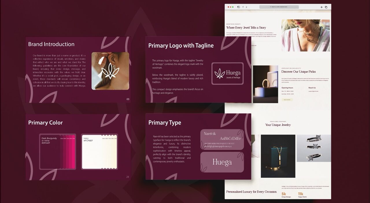
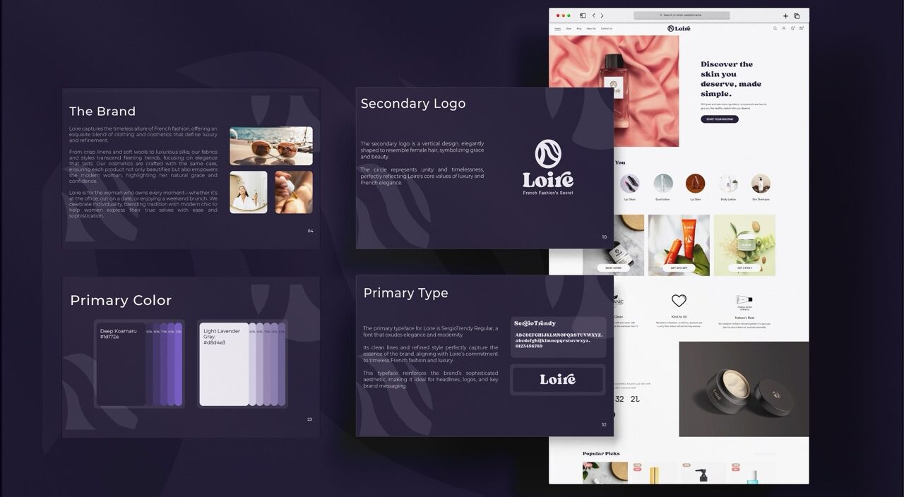
Your homepage is the most valuable piece of real estate you own on the entire internet. It’s your grand entrance, your digital storefront, your 24/7 global representative.
So, here’s the question: is it welcoming visitors and confidently guiding them to a destination, or is it a cluttered, confusing lobby where they get frustrated, get lost, and leave for good?
A high-converting homepage isn’t a random collection of pretty pictures and catchy phrases. It’s a strategically engineered psychological path. It’s designed, from top to bottom, to build trust, answer questions before they’re even asked, and inspire a specific, valuable action.
Forget the guesswork. Forget trying to copy your competitor’s weird design choices. This article provides a clear, section-by-section blueprint for the ideal homepage layout for conversions. We’ll cover the essential homepage sections to include and the overarching homepage design strategy that turns casual visitors into loyal customers.
TL;DR
A great homepage flows like a persuasive conversation. The first thing they see must be your five-second pitch with a crystal-clear headline and a big, obvious button. As they start to scroll, you immediately show them logos or awards to prove you’re legit. Next, you show you understand their pain points and present your services as the clear solution. Then, you back it all up with real customer testimonials as undeniable proof. Finally, you end with another strong call-to-action before the footer. That’s the path that turns clicks into customers.
Mastering the ‘Above the Fold’ Experience
This is it. The make-or-break moment. The “first fold” (or “above the fold”) is everything a visitor sees on their screen without scrolling. You have roughly five seconds to pass their test. In that time, your site must definitively answer two critical questions: “What is this place?” and “What’s in it for me?”. Usability studies like the Nielsen Norman Group research on user attention spans, this first impression happens incredibly fast.
If you fail here, nothing else on your page matters, because they’ll never scroll down to see it. This is where your most vital homepage header tips come into play, and getting this right is the foundation of the entire page. A visitor’s first impression is formed here, and it sets the tone for their entire interaction with your brand.
Your Blueprint Elements for the First Fold:
- A Crystal-Clear Value Proposition (Your Headline): This is not the time for a clever, vague tagline. Be brutally, unapologetically clear about the benefit you provide. Your goal is instant comprehension.
- Bad: “Reimagining Your Financial Future.” (This is fluff. What does it even mean?)
- Good: “Effortless Invoicing Software for Freelancers.” (Perfect. I get it instantly.)
- An Explanatory Sub-headline: This is your one-two punch. Use this space to quickly elaborate on your headline and add tangible context or a secondary benefit. For example: “Save up to 10 hours a month on paperwork and get paid 2x faster.”
- A Primary Call-to-Action (CTA): There should be one main button you want people to click. Not three. One. Make it a bright, high-contrast color that stands out from everything else on the page. Use strong, action-oriented text like “Start My Free Trial” or “Get a Free Quote.” Understanding How to Use Visual Design to Boost Website Conversions will help you choose the right colors and placement for this critical element.
- An Engaging Visual: Humans are visual creatures. Show, don’t just tell. Use a high-quality photo or a short, silent background video that shows your product in action or, even better, reflects the successful outcome your customer will feel after using your service.
- Simple, Uncluttered Navigation: Your menu should be a model of simplicity, with 5-7 essential links at most. Don’t overwhelm users with choices. The strategic arrangement of these pieces creates a strong layout hierarchy that guides the eye exactly where you want it to go. This entire first fold design is the most critical of all the Top 10 Elements Every High-Converting Website Must Have.
The Instant Credibility Check
Okay, you passed the 5-second test. They’re interested enough to scroll. But they’re also skeptical. The internet is full of empty promises, and they’re looking for reasons to disqualify you. Your very next move must be to back up your claims and crush their anxiety. Social proof is the fastest and most effective way to build that initial layer of credibility.
Showcase 2-3 of your absolute best customer testimonials. Don’t use anonymous quotes like “Great service! – John S.” Use a real name, a real company, and a real photo for maximum impact. A great trick is to pull out the single most powerful and benefit-driven sentence from the testimonial and use it as a big, bold headline for that section. Using the customer’s own words is a key technique we discuss in our guide on Website Copy That Converts: A Guide to Writing That Wins Customers.
Proving You Understand Their Problem
Now that you have their attention and a sliver of their trust, it’s time to build a deeper connection. This is where you move from what you do to why it matters to them. You need to articulate their pain points better than they can themselves and position your offerings as the perfect, tailored solution. This is one of the most important homepage sections to include because it’s where you prove you have empathy.
Your Blueprint Elements for the Pitch:
- Introduce the Problem: Start this section with a headline that speaks directly to a frustration your target customer faces. Something like, “Tired of wasting hours on confusing spreadsheets?” or “Struggling to keep your remote team in sync?” This shows empathy and tells them they’re in the right place.
- Present Your Solutions: Don’t just list your services in a boring block of text. Group them into 3-4 core categories. Give each one a benefit-oriented headline, a short description of the outcome it delivers, and a clean, clear icon or image. This creates an easy-to-scan layout hierarchy that respects their time.
- Show “How it Works”: Demystify your process. People are more likely to buy if they understand what they’re getting into and feel like it will be easy. Use a simple 3-step graphic to make it look straightforward. For example: 1. Choose Your Plan → 2. We Build Your Site → 3. You Launch & Grow. This removes uncertainty and builds confidence.
The Undeniable Proof
You’ve told them you can solve their problem. But people have been burned before by slick marketing. They’re still skeptical. This is the section where you provide concrete, undeniable evidence that you deliver on your promises. A solid proof section is a non-negotiable part of any homepage layout for conversions. Don’t just tell them; show them.
Your Blueprint Elements for Proof:
- Showcase 2-3 of your absolute best customer testimonials. Don’t use anonymous quotes like “Great service! – John S.” Use a real name, a real company, and a real photo for maximum impact. A great trick is to pull out the single most powerful and benefit-driven sentence from the testimonial and use it as a big, bold headline for that section.
- If you can, include a short, punchy case study with a measurable, jaw-dropping result. Numbers are incredibly persuasive. For example: “How Company X Increased Their Leads by 300% in 90 Days.” This provides tangible proof of the ROI you can deliver.
The Next Step
You’ve made your case. You’ve presented your evidence. They’re nodding along, feeling understood and impressed. Now what? You have to guide them to the finish line. Don’t assume they’ll scroll all the way back up to the top of the page. You need to close your argument with a final, strong, and clear call-to-action.
This section should feel like a powerful conclusion. It’s often visually distinct, perhaps with a solid color background to make it stand out. Lead with a compelling headline that overcomes one final objection or summarizes the main benefit of taking action. Something like, “Ready to Finally Stop Worrying About [Pain Point]?” Then, repeat your primary CTA button from the hero section. Make it big, bold, and impossible to miss.
The Foundation: Your Footer as a Trust Signal
The footer is the last stop. It’s the place people instinctively scroll to when they’re looking for specific, logistical information they couldn’t find elsewhere. A well-organized, comprehensive footer is a massive trust signal. It shows you’re a professional, established business with nothing to hide.
- Include links to all your key pages: About, Contact, Blog, Careers, FAQ, Pricing, etc.
- Provide your physical address and phone number. Even if you’re a digital-only business, this adds a huge layer of credibility and is considered a best practice for local SEO, as explained in a the guide to Local SEO.
- Add a secondary, low-commitment CTA. A newsletter signup like “Get Weekly Tips” is perfect here. It’s a great way to capture leads who might not be ready for your primary CTA but are still interested in your brand.
Conclusion: From Blueprint to a High-Converting Homepage
Let’s recap the journey this blueprint creates. You start with a powerful 5-second pitch in your first fold design and immediately build trust with social proof. You show you understand their problem and present your solution in a clear, compelling way. Provide undeniable proof that it works. And you close with a clear, final call to action.
A strategic homepage layout for conversions isn’t a matter of artistic taste or personal opinion. It’s a proven structure that respects the user’s psychology, values their time, and guides them on a seamless journey from visitor to customer. All of these individual elements are part of a larger, cohesive system, which we cover in The Ultimate Guide to High-Converting Business Websites.
Ready to Build a Homepage That Actually Works?
Reading about the essential elements of a high-converting website is one thing. Building an engine that uses them all correctly is another. If this guide has sparked a desire to stop leaving money on the table and start getting real results from your website, then let’s have a conversation.
Book a free strategy session with our team. In 30 minutes, we’ll help you diagnose the biggest fixes in your current homepage and provide a clear, actionable roadmap to transform it into a predictable source of leads and sales.


