

Gradient Alert
Original · freeA gradient promo banner alert with a call to action.
Copy prompt gives Claude Code, Cursor or v0 a ready-to-paste prompt that recreates this exact component.
npx shadcn@latest add https://webinnoventix.com/r/alert-gradient.json"use client";
import { useState } from "react";
import { AnimatePresence, motion, useReducedMotion } from "motion/react";
export default function AlertGradient() {
const [open, setOpen] = useState(true);
const reduce = useReducedMotion();
return (
<section className="relative w-full px-4 py-16 sm:px-6 sm:py-24">
<style>{`
@keyframes agp_shimmer {
0% { background-position: 0% 50%; }
50% { background-position: 100% 50%; }
100% { background-position: 0% 50%; }
}
.agp_flow {
background-size: 220% 220%;
animation: agp_shimmer 9s ease-in-out infinite;
}
@media (prefers-reduced-motion: reduce) {
.agp_flow { animation: none; background-size: 100% 100%; }
}
`}</style>
<div className="mx-auto max-w-4xl">
<AnimatePresence initial={false}>
{open && (
<motion.div
role="region"
aria-label="Promotional announcement"
initial={reduce ? false : { opacity: 0, y: -12, scale: 0.98 }}
animate={{ opacity: 1, y: 0, scale: 1 }}
exit={reduce ? { opacity: 0 } : { opacity: 0, y: -12, scale: 0.98 }}
transition={{ duration: 0.35, ease: [0.22, 1, 0.36, 1] }}
className="relative overflow-hidden rounded-2xl p-[1.5px] shadow-xl shadow-indigo-500/10 dark:shadow-violet-900/30"
>
{/* Animated gradient border/frame */}
<div className="agp_flow absolute inset-0 bg-[linear-gradient(115deg,#6366f1,#8b5cf6,#d946ef,#f43f5e,#8b5cf6,#6366f1)]" />
<div className="relative rounded-[calc(1rem-1.5px)] bg-gradient-to-br from-indigo-600 via-violet-600 to-fuchsia-600 dark:from-indigo-700 dark:via-violet-700 dark:to-fuchsia-700">
{/* subtle glow accents */}
<div className="pointer-events-none absolute -left-16 -top-16 h-48 w-48 rounded-full bg-white/20 blur-3xl" aria-hidden="true" />
<div className="pointer-events-none absolute -bottom-20 right-4 h-52 w-52 rounded-full bg-fuchsia-300/20 blur-3xl" aria-hidden="true" />
<div className="relative flex flex-col gap-5 p-6 sm:flex-row sm:items-center sm:justify-between sm:gap-6 sm:p-7">
<div className="flex items-start gap-4">
<span className="mt-0.5 flex h-11 w-11 shrink-0 items-center justify-center rounded-xl bg-white/15 ring-1 ring-inset ring-white/25 backdrop-blur-sm">
{/* sparkle icon */}
<svg
viewBox="0 0 24 24"
fill="none"
className="h-6 w-6 text-white"
aria-hidden="true"
>
<path
d="M12 3v3M12 18v3M4.2 4.2l2.1 2.1M17.7 17.7l2.1 2.1M3 12h3M18 12h3M4.2 19.8l2.1-2.1M17.7 6.3l2.1-2.1"
stroke="currentColor"
strokeWidth="1.6"
strokeLinecap="round"
opacity="0.7"
/>
<path
d="M12 8.5l1.1 2.4 2.4 1.1-2.4 1.1L12 15.5l-1.1-2.4L8.5 12l2.4-1.1L12 8.5z"
fill="currentColor"
/>
</svg>
</span>
<div className="min-w-0">
<p className="inline-flex items-center gap-2">
<span className="rounded-full bg-white/20 px-2.5 py-0.5 text-[11px] font-semibold uppercase tracking-wider text-white ring-1 ring-inset ring-white/25">
Launch week
</span>
</p>
<h3 className="mt-2 text-lg font-semibold leading-tight text-white sm:text-xl">
Ship faster with 40% off annual plans
</h3>
<p className="mt-1 text-sm leading-relaxed text-indigo-50/90">
Offer ends July 21. Use code{" "}
<span className="font-mono font-semibold text-white">SHIP40</span> at
checkout — no card required to start.
</p>
</div>
</div>
<div className="flex shrink-0 items-center gap-2 sm:flex-col sm:items-stretch lg:flex-row">
<a
href="#claim-offer"
className="group inline-flex items-center justify-center gap-1.5 rounded-xl bg-white px-4 py-2.5 text-sm font-semibold text-indigo-700 shadow-sm transition-all hover:bg-indigo-50 hover:shadow-md focus-visible:outline-none focus-visible:ring-2 focus-visible:ring-white focus-visible:ring-offset-2 focus-visible:ring-offset-violet-600 active:scale-[0.98]"
>
Claim offer
<svg
viewBox="0 0 24 24"
fill="none"
className="h-4 w-4 transition-transform group-hover:translate-x-0.5"
aria-hidden="true"
>
<path
d="M5 12h14M13 6l6 6-6 6"
stroke="currentColor"
strokeWidth="2"
strokeLinecap="round"
strokeLinejoin="round"
/>
</svg>
</a>
<button
type="button"
onClick={() => setOpen(false)}
aria-label="Dismiss announcement"
className="inline-flex h-9 w-9 shrink-0 items-center justify-center self-end rounded-xl text-white/80 transition-colors hover:bg-white/15 hover:text-white focus-visible:outline-none focus-visible:ring-2 focus-visible:ring-white focus-visible:ring-offset-2 focus-visible:ring-offset-violet-600 sm:self-center"
>
<svg
viewBox="0 0 24 24"
fill="none"
className="h-5 w-5"
aria-hidden="true"
>
<path
d="M6 6l12 12M18 6L6 18"
stroke="currentColor"
strokeWidth="2"
strokeLinecap="round"
/>
</svg>
</button>
</div>
</div>
</div>
</motion.div>
)}
</AnimatePresence>
{!open && (
<div className="text-center">
<button
type="button"
onClick={() => setOpen(true)}
className="inline-flex items-center gap-2 rounded-xl border border-slate-300 bg-white px-4 py-2 text-sm font-medium text-slate-700 shadow-sm transition-colors hover:bg-slate-50 focus-visible:outline-none focus-visible:ring-2 focus-visible:ring-indigo-500 dark:border-slate-700 dark:bg-slate-900 dark:text-slate-200 dark:hover:bg-slate-800"
>
<svg viewBox="0 0 24 24" fill="none" className="h-4 w-4" aria-hidden="true">
<path
d="M12 8.5l1.1 2.4 2.4 1.1-2.4 1.1L12 15.5l-1.1-2.4L8.5 12l2.4-1.1L12 8.5z"
fill="currentColor"
/>
</svg>
Show the offer again
</button>
</div>
)}
</div>
</section>
);
}Dependencies
Licence
Built by Web Innoventix. Free for personal and commercial use, no attribution required.
Built by Web Innoventix
Need a custom interface, a full website, or SEO that gets you cited by AI? We design, build and rank it end to end.
Get a free quoteSimilar components
Browse all →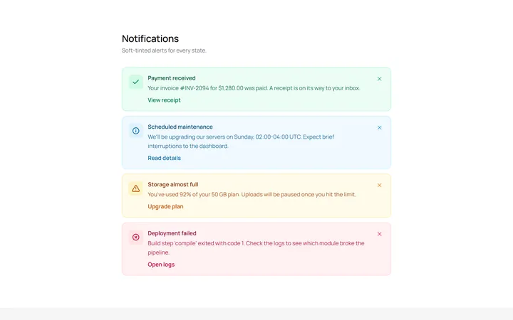
Soft Variants Alert
OriginalSoft-tinted alerts: success, info, warning and error, each with an icon.
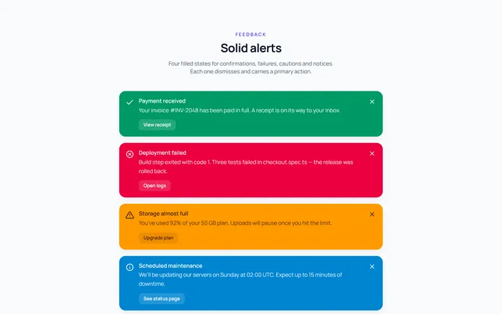
Solid Variants Alert
OriginalSolid-colour alerts across the four states.
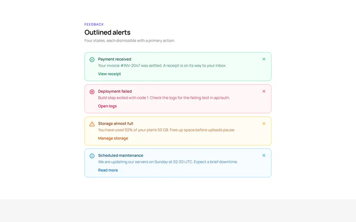
Outline Variants Alert
OriginalOutlined alerts across the four states.
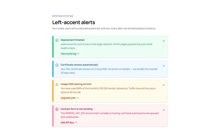
Left Accent Alert
OriginalAlerts with a coloured left accent bar and icon.
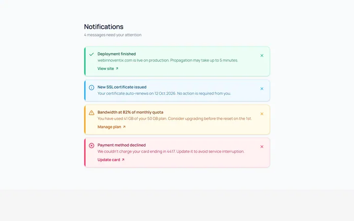
Dismissible Alert
OriginalDismissible alerts with a working close button.
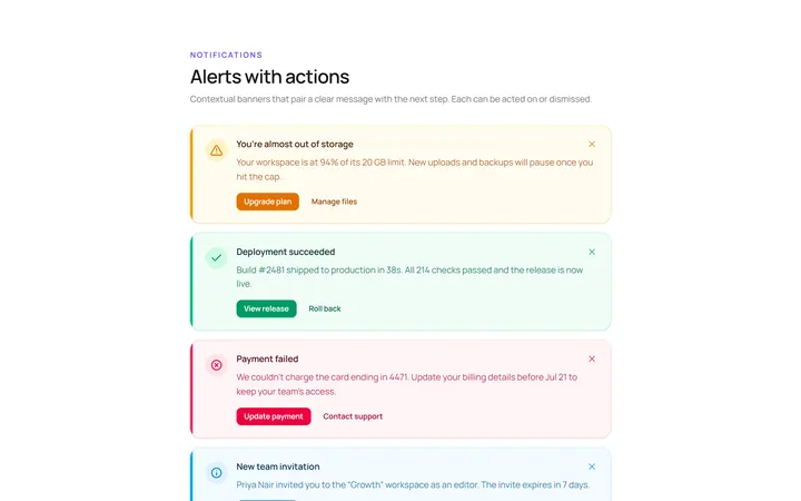
With Action Alert
OriginalAn alert with title, body and action buttons.
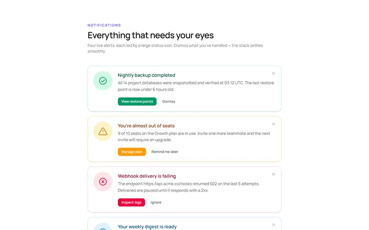
Icon Large Alert
OriginalAn alert led by a large circular icon.
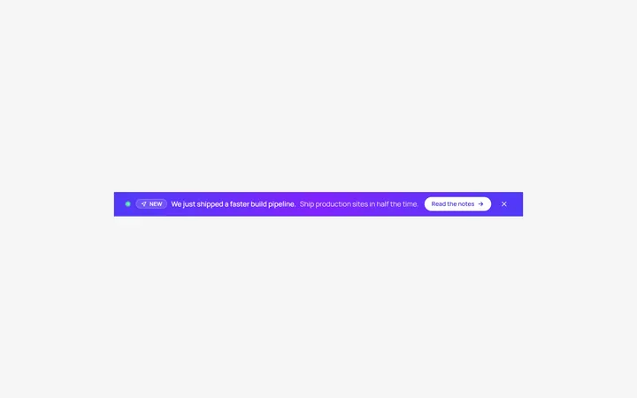
Banner Top Alert
OriginalA full-width top announcement banner, dismissible.
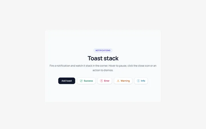
Toast Stack Alert
OriginalA stack of dismissible toasts in a corner.
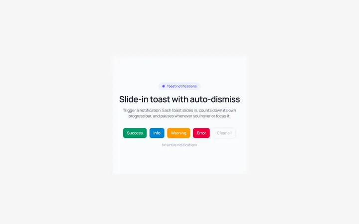
Toast Slide Alert
OriginalA toast that slides in with an icon and auto-dismiss progress.
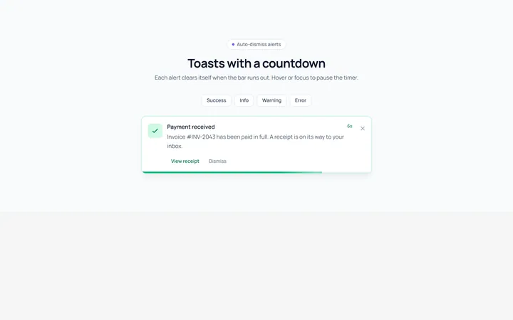
Progress Alert
OriginalAn alert with a countdown progress bar.
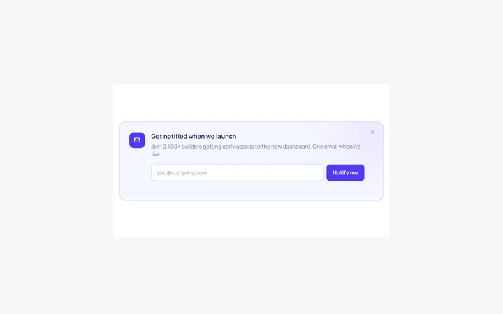
Inline Form Alert
OriginalAn alert containing an inline email input and button.